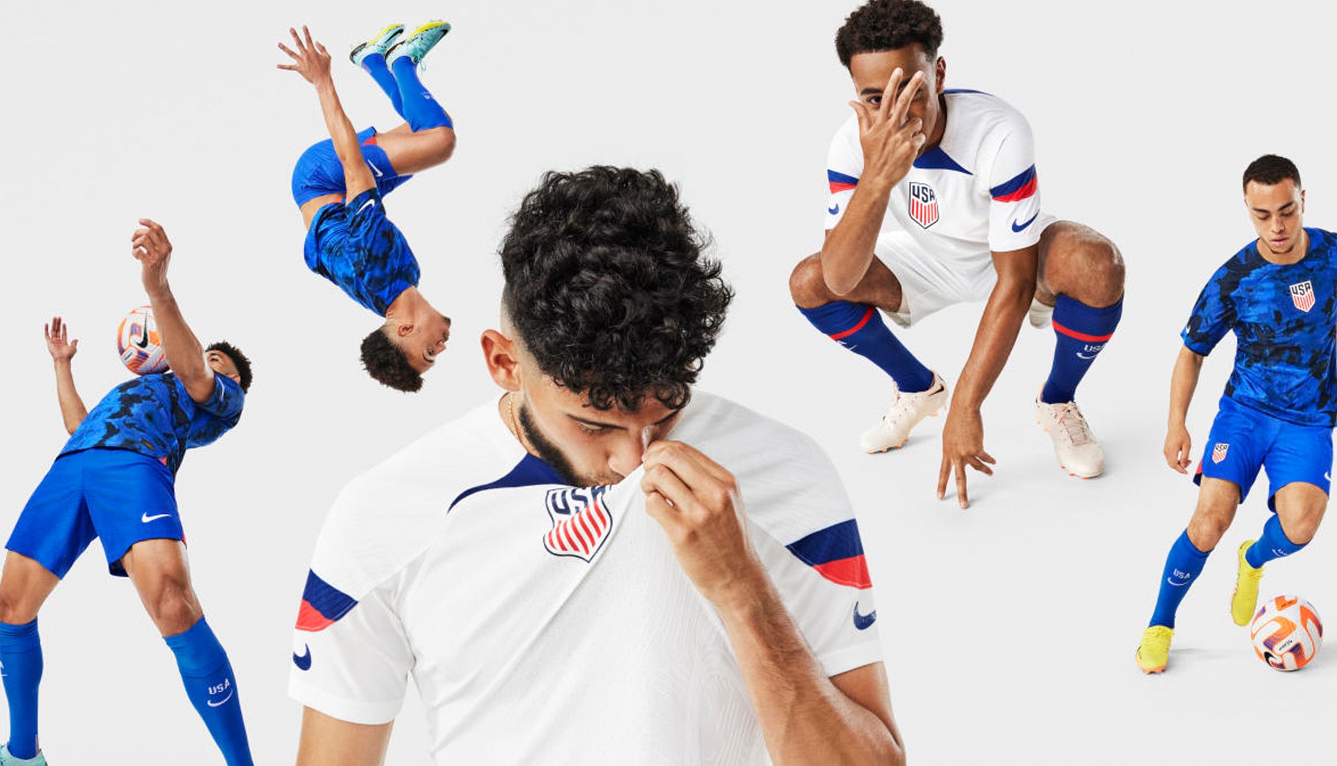
Nike revealed its federation home and away kits this week, and the USMNT offerings received some fairly damning criticism. But head coach Greg Berhalter has since leapt to their defence. So was he right, or is he just playing the political game?
Having missed out on the 2018 tournament, it seems as though United States Men’s Team fans were hoping for something a bit more special than what they got when Nike revealed the team’s new home and away kits for the 2022 Qatar World Cup. However, the overwhelming reaction seems to be one of disappointment; of a chance missed to do something special with the kits. Nike are American after all, so there was some expectancy that they would take care of their own first and foremost, go big, go bold, and go… well, American.
Both Weston Mckennie and Tim Weah were quick to show their disappointment on social media following earlier leaks, but are we all missing the bigger picture with these designs, and is it a case of less is more? That certainly seems to be the opinion of national team coach, Greg Berhalter, who gave his views recently, reflecting positively not only on the two designs, but on the wider collections as well.
“I think that the whole collection is amazing," He said. "There’s a lot of work over the last two years, but I think that the results speak for themselves. I know when the guys walk on the field they’re going to be proud.
“There’s been some criticism, especially from the player pool, but I don’t think they’ve got the full context, and what I mean by that is that I don’t know if it was shown with the whole collection first of all, and second of all I don’t know if they saw the whole kit, because when you do, when I saw it live, it’s a good kit. I think when they see it live they’re going to be excited to put it on.”
The fact is that the new shirts aren’t anywhere near as radical as some versions that the USMNT has enjoyed in the past. The "Bomb Pop" jersey of 2014, the red-striped "Where’s Wally" (Waldo for the Americans) shirt of 2012, even the now iconic denim-style kit the U.S. wore as World Cup hosts in 1994… all of these shirts are looked upon fondly now, carrying cult status, but each of them — the denim kit especially — were widely criticised when they came out.
See, football fans are a fickle bunch. The USMNT will debut the home kits later this month in its final two World Cup matches, against Japan and Saudi Arabia. They’ll also wear the whites in their opening match in Qatar before switching to the away against England and Iran. Now, you see a string of positive results in those games, particularly against England, and you can guarantee that those shirts will all of a sudden be looked upon slightly more favourably. Sure, people won’t shout about it straight away, but like any great artist, the appreciation will come after they’re gone. "People always hate the new jerseys at first," Aaron Barnett, Nike’s senior director of soccer apparel, said to Fox at the kit's pre-launch event in August. "Then your team wins its first game, and it’s the best jersey they’ve ever had.”
So what’s being missed with these designs on first glance? "We were really drawn into this idea of sports culture in the country, and we started looking at classic American jerseys across different sports.” said Nike’s Rolando Cruz, who was involved in the creative process from start to finish.
With that in mind, both shirts adopt key aspects from other popular sports Stateside, so you get those enlarged central crests akin to basketball jerseys ("We went to the rulebook, and we said what’s the largest crest that FIFA will allow us to put on this kit, and we did that," Cruz said), double Swooshes on the sleeves reminiscent of those used on American football jerseys (a move Nike first debuted with Paris Saint-Germain’s third shirt last season), the unique shoulder and sleeve cut-and-sew construction and pattern of a hockey jersey, and timeless block lettering – something we’ve yet to see but that could potentially be the final flourish that the designs may otherwise be missing. Each of the 13 Nike teams will have their own unique font for names and numbers at the tournament, and the USMNT’s features blocky, old-school digits and lettering in keeping with the traditional American sports theme. All of these are small elements individually, but together they tell a story, and that’s what a lot of fans aren’t seeing, instead blinded by what’s perceived as bland.
Designers always run the risk of going too radical and incurring the wrath of traditionalists, or not going enough and receiving backlash from those that favour a more progressive approach. Could Nike have done more with the USMNT kits? Sure. But does that make the new kits bad? Not at all. They instead arrive with a less is more approach, and yet the story is there, it just has to be told. And if that story ends up going hand in hand with a positive World Cup run, you can guarantee these shirts will take their place amongst the iconic USMNT kits of the past.
The USMNT 2022 home and away shirts will be available at prodirectsoccer.com from 21 September.
