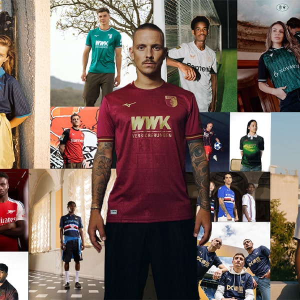
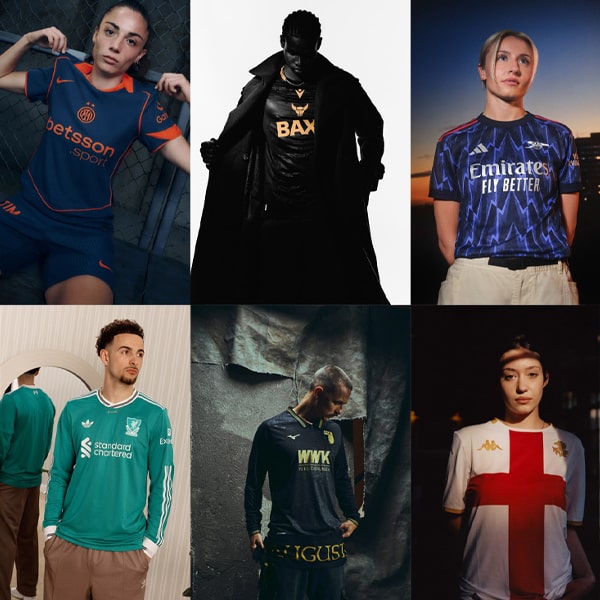
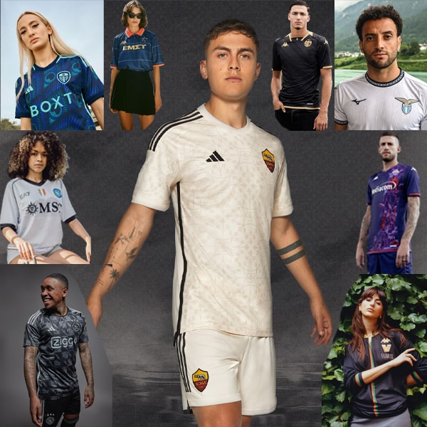
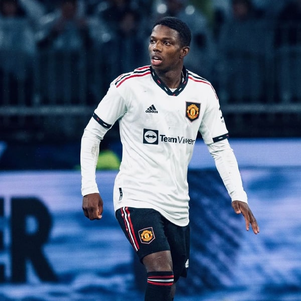
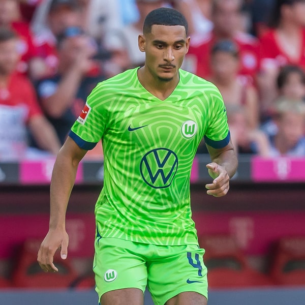
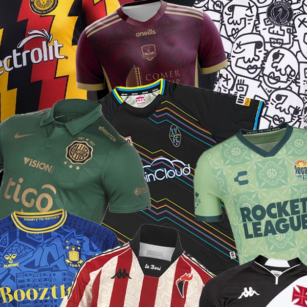
With almost all full kit sets now released for the 22/23 season, we’ve rounded up what we think are the best from across the globe. It’s a collection of beautifully bespoke designs, so sit back and try not to get too jealous because your team looks so crap.
Most teams get one great shirt per season, if they’re lucky. Some are fortunate enough to even get two. But what we have here are the rare teams that get three absolute beauties, all for the one campaign. Seems somewhat unfair, but them’s the breaks. With offerings from Italy, England, Brazil, Holland and Spain, it’s an eclectic lineup that features some diverse designs from the likes of adidas, Nike, Kappa, Errea, Hummel and Joma. Feast your eyes.
So, the rules: to qualify for this exclusive list, a club must have a home, away and third shirt – no counting goalkeeper shirts amongst the ranks – and they must have been released in 2022, for use in the current campaign. Are they in order? Not necessarily. If you want to rank them in your head, be our guest.
Coventry City
Hummel have brought three great individual designs to the table for Championship side Coventry City this season, and they're all linked by the world-famous Coventry Cathedral, which is celebrating the 60th anniversary of its consecration this year. Great through story, beautifully bespoke designs, easy entry on this list.
Parma Calcio
A modern take on the club's traditional look makes the Parma home shirt really standout from what's come before, and again we see a simple carry through of the lightning effect on the away and third, linking all three designs. The sponsor also slots in seamlessly across all three for a triumvirate of standout looks for the Italian Serie B side. Yeah, we used triumvirate. S'what dictionary toilet paper will do for you.
Barcelona
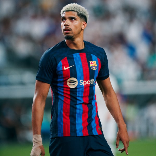
While Barca go about reinventing themselves on the pitch, they've been graced with arguably three of the best kits in their recent history.
The home is a welcome turn towards tradition after the garish effort last season, while the detail contained within the away demands a closer inspection, and both are linked by the anniversary of the Olympic Games, hosted in the city 30 years ago this year. Finally there's that third shirt, which keeps the classic blaugrana combo close to heart – quite literally.
Venezia
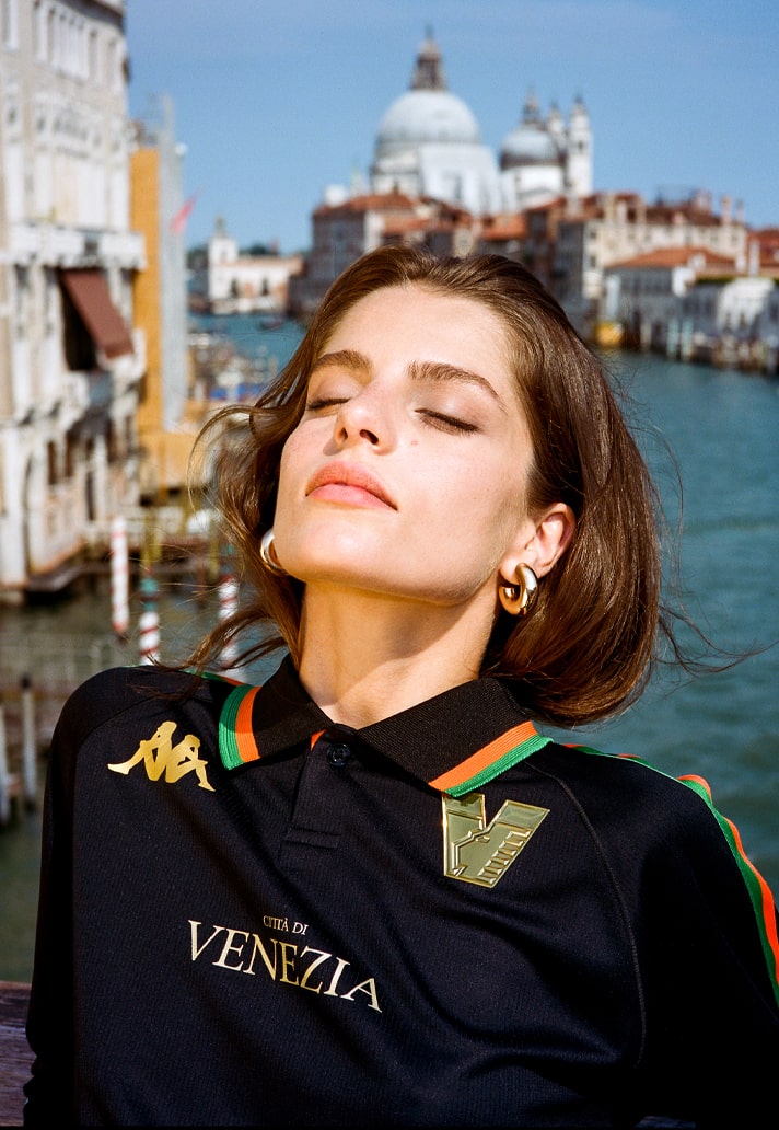
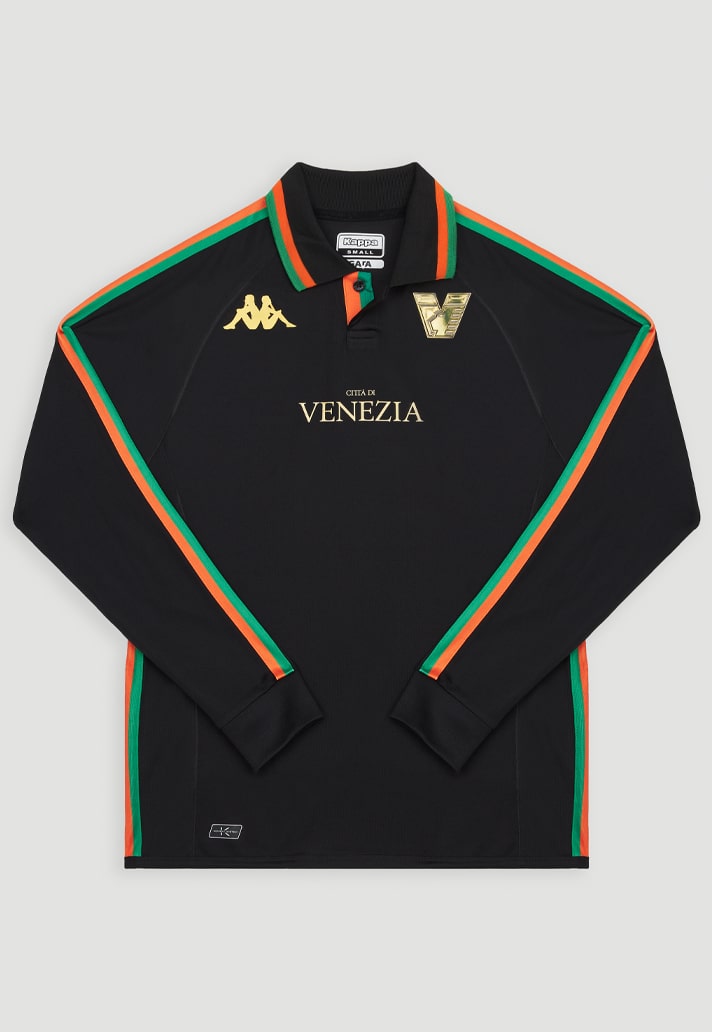
Where could Venezia go after the heights of last season? Some would say from the top there's only one way, but the Italian side instead decided to carve it's own path, rebranding itself and leaning into the football x fashion realm, with the help of world-renowned Munich-based design studio Bureau Borsche.
What that has given us is a fresh take on the home look, complete with classic collar, a style-driven away shirt, and an outlandishly golden third option. All available in long sleeve too, just to add that final flourish.
Corinthians
When Corinthians dropped their new home shirt from Nike back in April, it was one that caught attention thanks to the subtle inclusion of gold trim, nodding to the 10th anniversary of the club's huge success in 2012.
Then the away arrived with a design that featured the image of the outline of the map of Sao Paulo State in black and grey tones, again gilded in gold in recognition of 2012. The final piece of this pleasurable puzzle landed five months later in October, with a homage-filled design acknowledging a fusion of Japanese elements in reference to the host nation of the ninth edition of the FIFA Club World Cup – that being the one Corinthians won in 2012, but you got that, right? Course you did. A triple hit of recognition for pone of the club's most successful seasons, presented in three outstanding designs.
Palermo
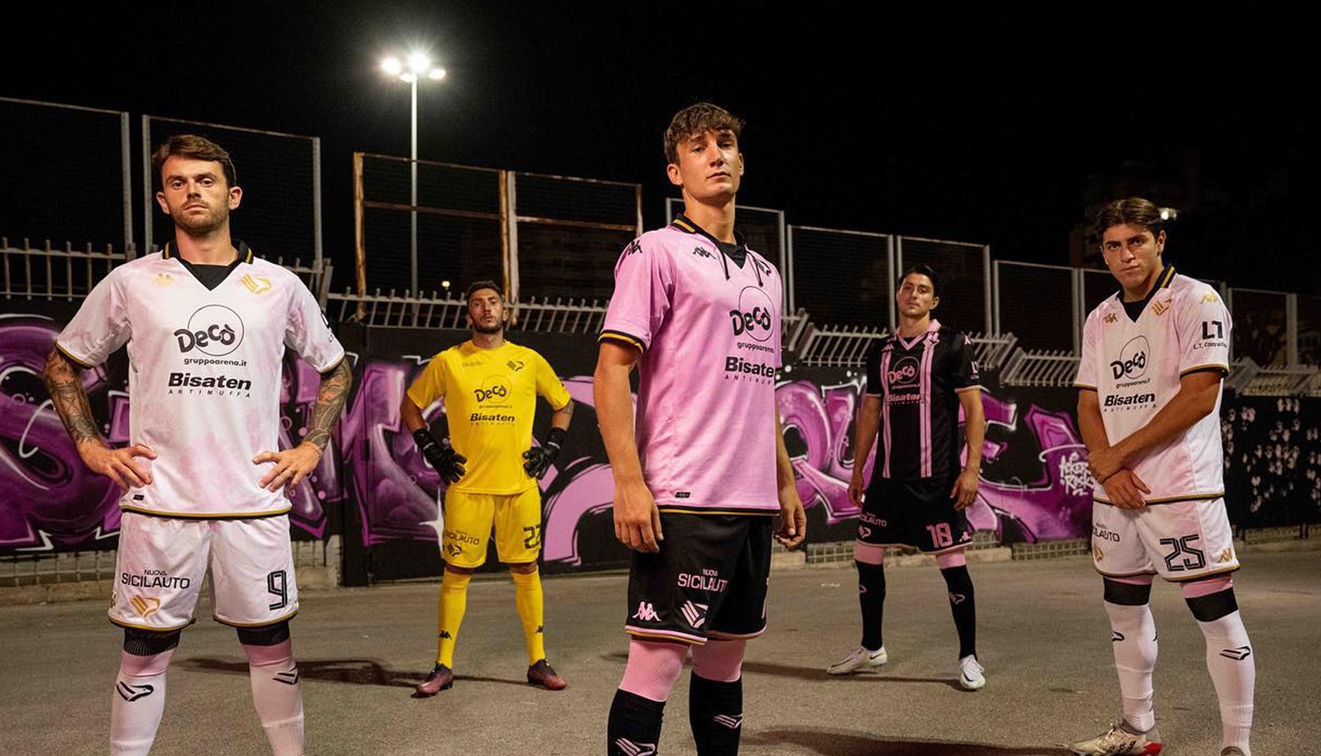
And just where did this come from?!? Kappa really are the masters of dropping some of the most surprisingly pleasing kits, and for Palermo they have served up something special. The kits were created in collaboration with the agency Gomez & Mortisia from Palermo, the designer Luca D'Agostino, the Kappa R&D centre and with the special participation of TvBoy, one of the most famous street artists in the world, who was inspired by the Patroness of Palermo, Santa Rosalia.
The home shirt features that beautiful wide collar held together by laces that recall vintage aesthetics, while the away is a tribute to the presidency of Renzo Barbera and in particular to the 1973-74 Palermo team, recreating the so-called braced jersey with a contemporary twist. Finally, the third shirt is an absolute novelty, created the aforementioned TvBoy, who was inspired by the Patroness of Palermo, Santa Rosalia.
Are they all better without the sponsor? Absolutely, but that doesn't mean that this set isn't well worthy of its place on this list.
Arsenal
The first of two adidas teams that seem to be consistently blessed with great sets from the Three Stripes, Arsenal see a classic look with a contemporary twist for their home shirt, emphasised by that striking collar.
The Away then combines a bronze cannon badge and bronze metallic trims with shades of black and carbon that showcase an AFC all-over graphic inspired by the Arsenal lettering that fans pass on their way to Emirates Stadium on matchdays.
Then, rounding off the set and going pink for the first time ever, this season’s third shirt saw a return of the iconic Ermine pattern, first seen on the club’s crest in the late 1940s.
Gunners finally playing as good as they look.
Norwich
From out of absolutely nowhere, Spanish brand Joma have dropped three of the best kits you're likely to see this season. Individually outstanding, but together it's a set that can stand against virtually any in the world.
Inspired by the 1980s era of football kits, Norwich’s home shirt features a sublimated pin-stripe design with yellow and green V-neck collar and sleeve trim detailing.
Arguably the pick of the three, the away shirt is a regal ruby and gold with embossed stripe detailing through the front body of the shirt. Finally, the third shirt uses a modern tie dye sublimation print using pastel shades of purple, pink, xenon blue and turquoise green.
Vasco da Gama
Kappa back at it again. This time it's for Brazilian Serie B outfit, Vasco da Gama, and boy is it a bit special. First up they get a retro feeling home shirt, which comes in both long and short sleeve, with the Kappa Banda switching from forearms to side depending on which you opt for.
That's backed up by an away shirt (which actually came out before the home) that inverts the colourway of the home, still coming complete with that delicious collar and sash combo. Then they get a third shirt that really needs to be viewed to fully appreciate. And not only that, the third kit was also bolstered by two of the best goalkeeper shirts you're ever likely to see. Now they don't particularly count in this set ranking, but it certainly doesn't hurt either. New favourite Brazilian team right here for you.
Ajax
Any team that already has, what is in our opinion, the best European away shirt of the season is in with a good shout of making this list. But add to that a traditional home shirt once again executed to perfection and a third shirt that brings in one of the most progressive fashion labels out there in Daily Paper and, well, the rest of us can simply look on in wonder. The fact this is the third season in a row that adidas have absolutely knocked it out of the park for the Eredivisie side is just unfair.
Shop all 22/23 season replica at prodirectsoccer.com
