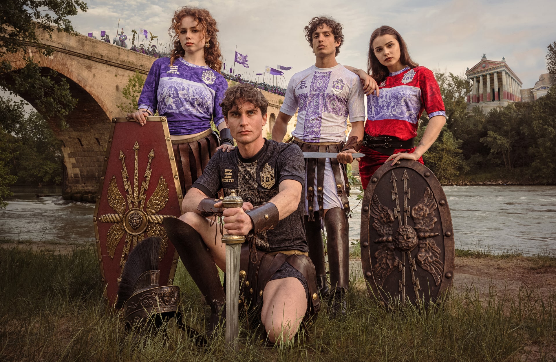
Continuing to implement their distinctive style to great effect, Rome-based design studio, Ezeta has unveiled its latest set of football jerseys, this time for Eccellenza side Boreale, taking inspiration from the historic Battle of the Milvian Bridge.
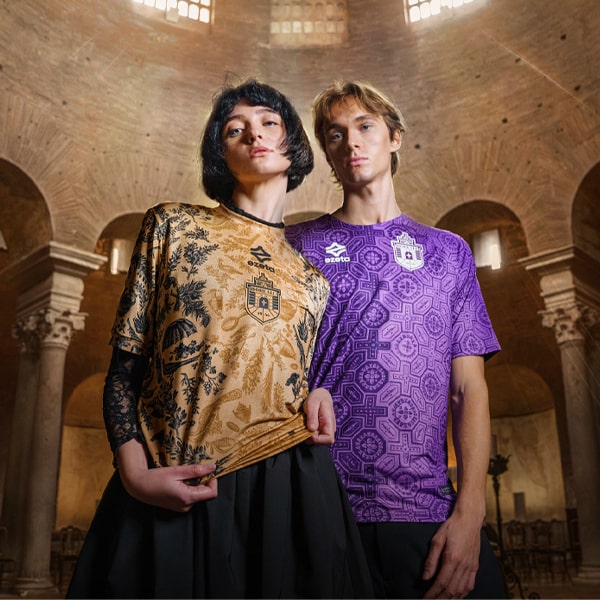
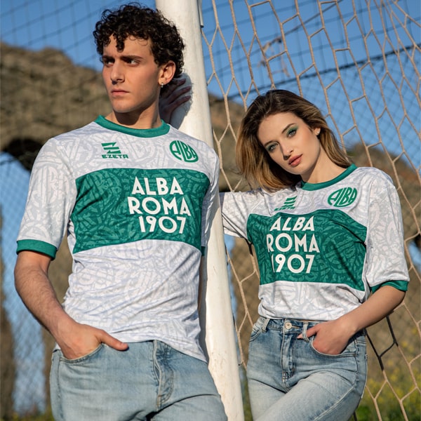
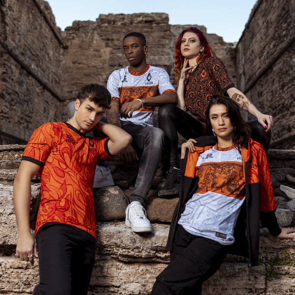
Ezeta have been carving a reputation for themselves over the last few years, partnering with Italian non-league sides from the Rome district and reinventing their identities, often using the history of the region to produce some extravagant football shirt designs. The latest in this line comes for Eccellenza side Boreale ASD, who receive a full complement of four kits, all with designs inspired by The Battle of the Milvian Bridge, presented in the studio’s signature lavish photoshoot style.
Right, ready for a bit of history? The Battle of the Milvian Bridge took place between the Roman Emperors Constantine I and Maxentius on 28 October, 312 AD. It takes its name from the Milvian Bridge, an important route over the River Tiber. Constantine won the battle and started on the path that led him to end the Tetrarchy and become the sole ruler of the Roman Empire. Maxentius drowned in the Tiber during the battle; his body was later taken from the river and decapitated, and his head was paraded through the streets of Rome on the day following the battle before being taken to Africa. Pleasant, eh? In short, the battle marked the beginning of the imperial rule of Constantine, representing the victory of Christianity and the end of the Pagan world. Got all that? Good.
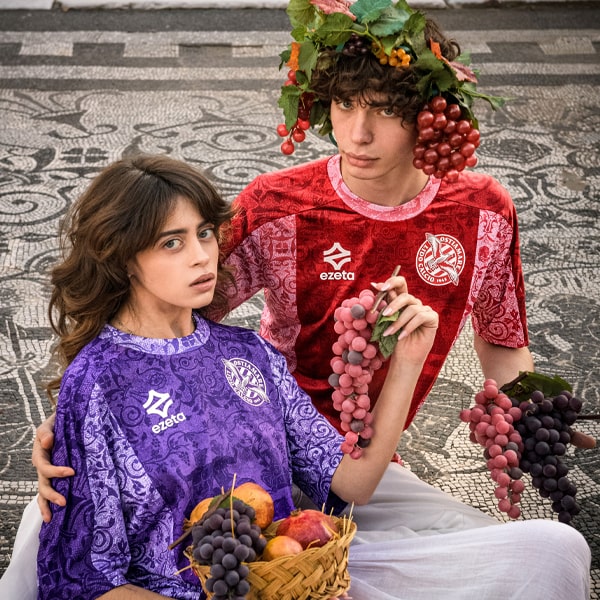
So, what we get then for Boreale are four shirt designs for the 23/24 season that are steeped in history. Split into two design templates, the violet home shirt and the red fourth (goalkeeper) shirt feature a band construction similar to the style that Ezeta implemented for Alba Roma. Here though, the shirts are a canvas upon which the famous painting of The Battle of the Milvian Bridge by Giulio Romano is sublimated into the very fabric, emphasised by that central band across the chest. The subtle switch of the colours in use on each shirt plays nicely through the collar and cuff detail.
For the away and third shirts, further inspiration is taken from Constantine’s tale, and specifically from Chi-Rho, a Christian symbol used as part of the Emperor’s standard. The legend narrates that Christ appeared in a dream to Constantine and ordered him to post his symbol "Chi-Rho" sign on the shield of own soldiers, and it is this symbol (the cross with the “P” on top) that appears in each of the squares on the front of the jerseys, (violet on white for the away and gold on black for the third) combining to make the cross.
The detail in each shirt is really something to feast your eyes upon, and the whole design process and identity reinvention is complemented by the work of designer Dan Norris, who has once again refined the club crest, which, along with the Ezeta branding, appears in a 3D silicone print on all the jerseys.
The Boreale shirts have been selling out rapidly, but some are still available on classicfootballshirts.co.uk, while you can also preorder at calcioitalia.com
