As they’ve done for several years now, Fenerbahçe debuted their new home kit next season in the last game of this season – just so happens that it was the Turkish Cup final against Başakşehir. Thankfully for them, the gamble paid off with Sarı Kanaryalar sealing a 2-0 win.
Seems to be a funny old tradition these days of showing off next season’s kit in the last games of the current campaign, with the risk of cursing it with a bad performance clearly being outweighed by the chance to give it a bit of marketing. It’s a risk that Turkish side Fenerbahçe took, deciding to reveal and debut their new home kit for 23/24 at the same time at Gürsel Aksel Stadyumu, in their cup final clash with Başakşehir, a match they won 2-0 thanks to a double from Michy Batshuayi.
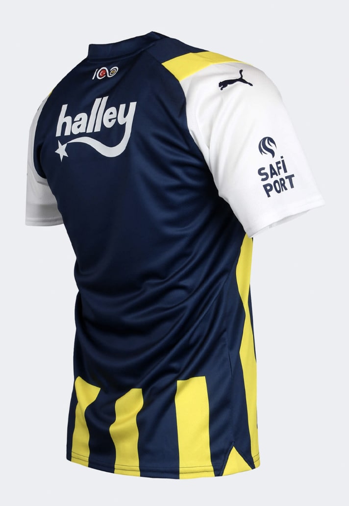
The design of the new Fenerbahçe home shirt is inspired by the 1996/98 home kit made by adidas. It features the club’s usual yellow and navy stripes, but they are joined by white sleeves and collar – the first time this has been used since the late 90s, a period when it was often the look. However, here, the collar is a v-neck style rather than the traditional fold over style that was used in the 90s.
The club crest, PUMA branding and sponsor all appear in regular positions, while the Turkish symbol sits central on the chest. The back of the shirt features a large navy panel for the name and number.
The Fenerbahce 23/24 home shirt is available at fenerium.com


