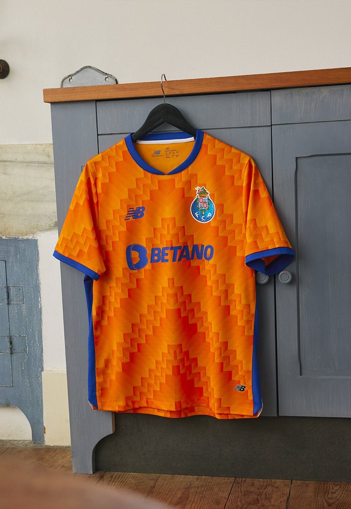
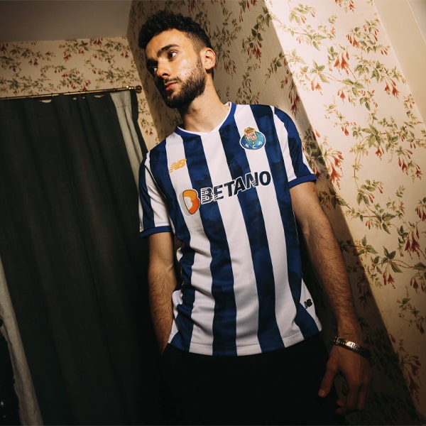
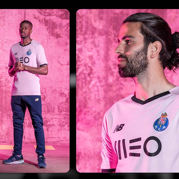
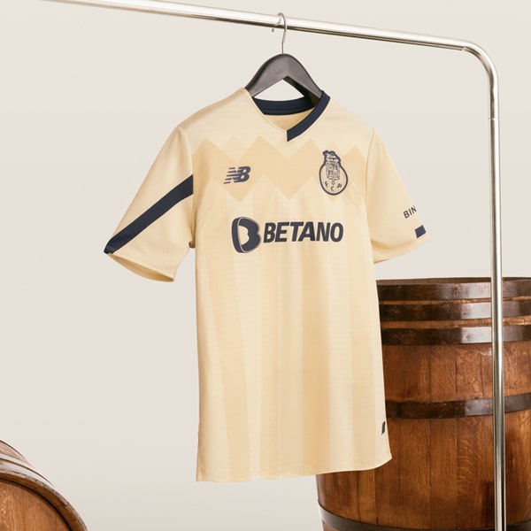
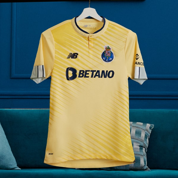
As with the recently released home shirt, FC Porto’s new away shirt for the 24/25 season from New Balance takes inspiration from the Dragon – symbol of the city and the club.
The Dragon, which is a key symbol of both the city of Porto and the football club, serves as the inspiration for FC Porto’s new away jersey from New Balance, where orange, which represents the Dragon's flame, is the dominant colour. It makes a welcome return to the alternate kit, having last been seen in 17/18 season, and before that in the 09/10 season. That link to fire is further bolstered through the geometric gradient effect pattern, which is repeated in a V shape, creating the desired interpretation of Dragon fire. Proper Minecraft vibes we’re getting.
The design then sees blue and white accents in the collar, cuffs and side panels, reinforcing the connection to the traditional club look that we saw with the recent home shirt.
Midfielder Alan Varela said of the shirt: “I know that orange is a colour with history in FC Porto's alternative shirts and, therefore, I welcome this return. I like the shirt, but I will enjoy wearing it on the field much more and making it remembered for excellent reasons.”
On the New Balance side, General Manager Kenny McCallum said: “It’s an honour to bring a new dynamic to the historic collection of equipment of this special club, with such a rich history in football. We look forward to seeing the players wear this jersey with pride this season.”
FC Porto's away shirt is now available at FC Porto's online store.

