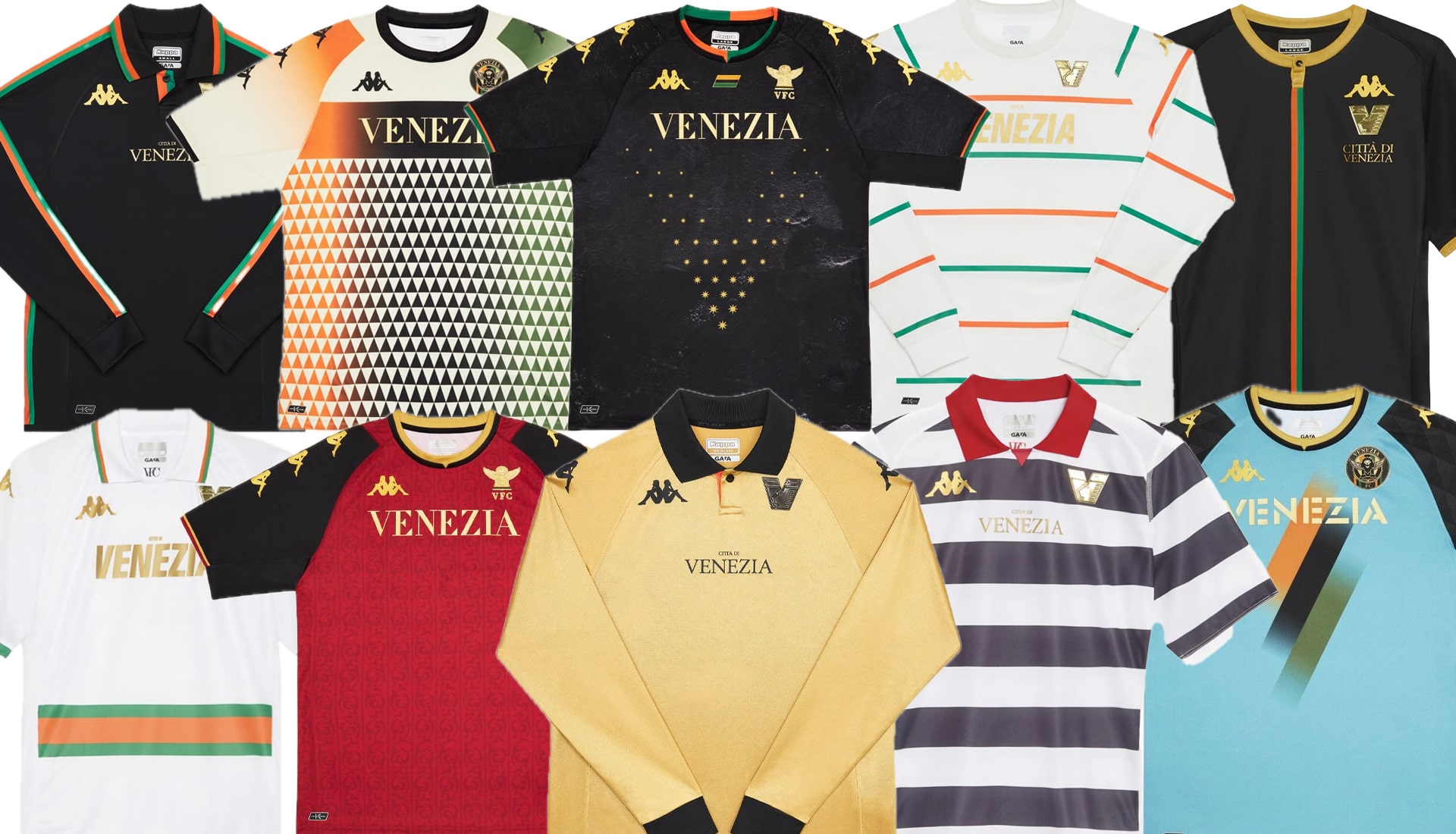
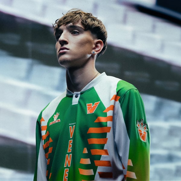
Three years and ten kits later and the fairytale that has been Venezia x Kappa looks as though it’s coming to an end. So what better time to take a beat and appreciate all the kit goodness that the partnership has laid upon us.
It’s a sad day in the kit design world, with reports coming out of Italy suggesting that Kappa and Venezia are not renewing their partnership, with Nike’s Drake-led sub-brand Nocta set to step in and take the reins. It’s been three years of absolute fire when it comes to their kits, with the partnership going on to define a whole new branch of jersey culture – one that traversed the football x fashion border with ease, paving the way for many more teams to follow. It began to coincide with their return to the top tier of Italian football, so it's fitting that the curtain is also lowered with the same achievement. We’re not crying, you are.
From that unbelievably strong beginning that almost broke the internet right up to the shirt inspired by those iconic gondoliers that are such a strong part of the visual identity of the city, we’re taking a moment to reminisce and look back at all 10 kits from the Venezia x Kappa era.
2021/22
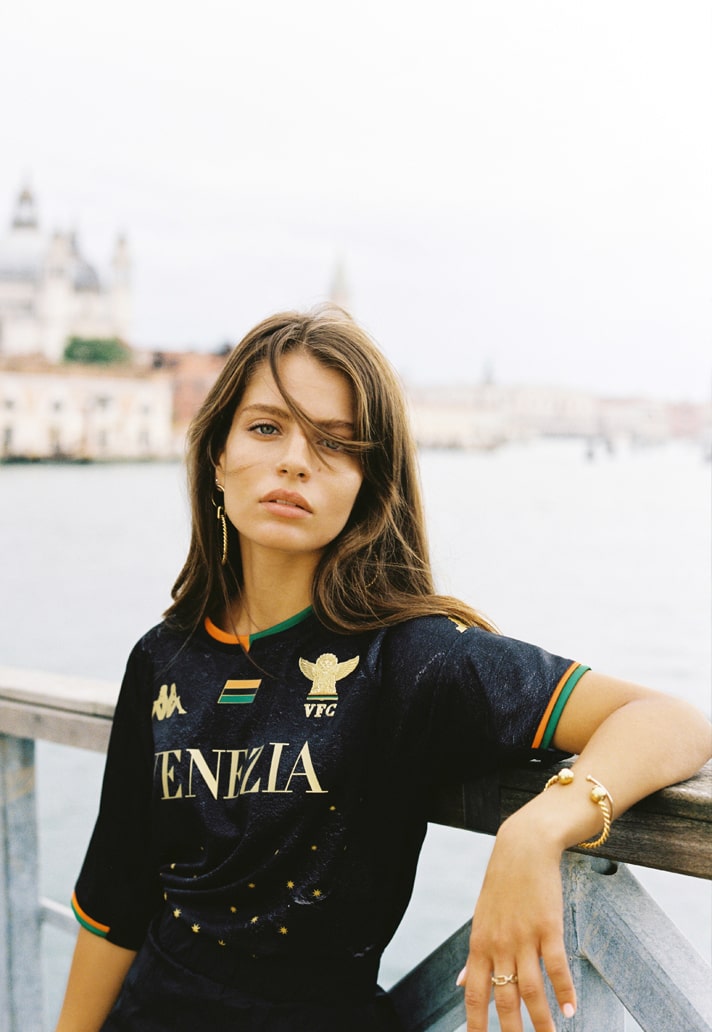
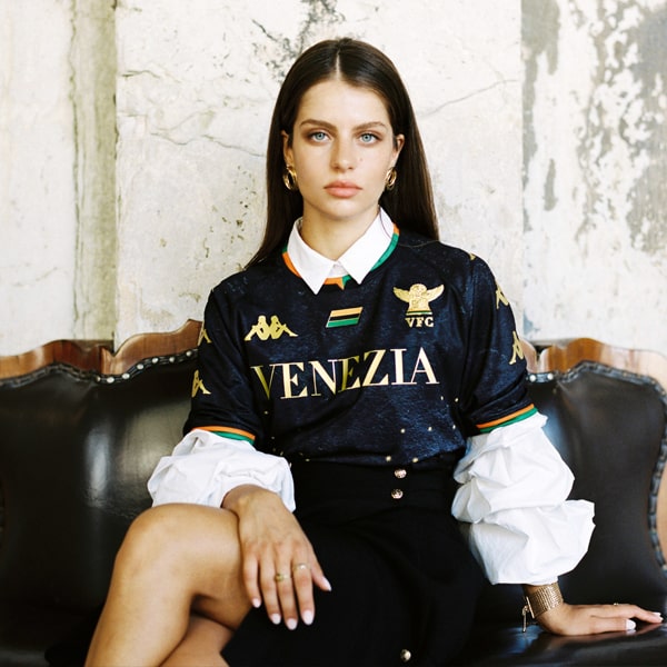
Pure elegance, this was a hell of a statement upon its release. A beautiful design that was rooted in the history of the city, created by Fly Nowhere. Gold embellishments, classic club colours in the trim...yep, they had us at hello.
Barely caught our breath off the back of the home shirt reveal when this beauty dropped. That repeating triangle pattern referencing the tradition of Venetian mosaics was so unique and at the same time was such a contrast to the home shirt, the two living in perfect harmony. But of course there weren't just two...
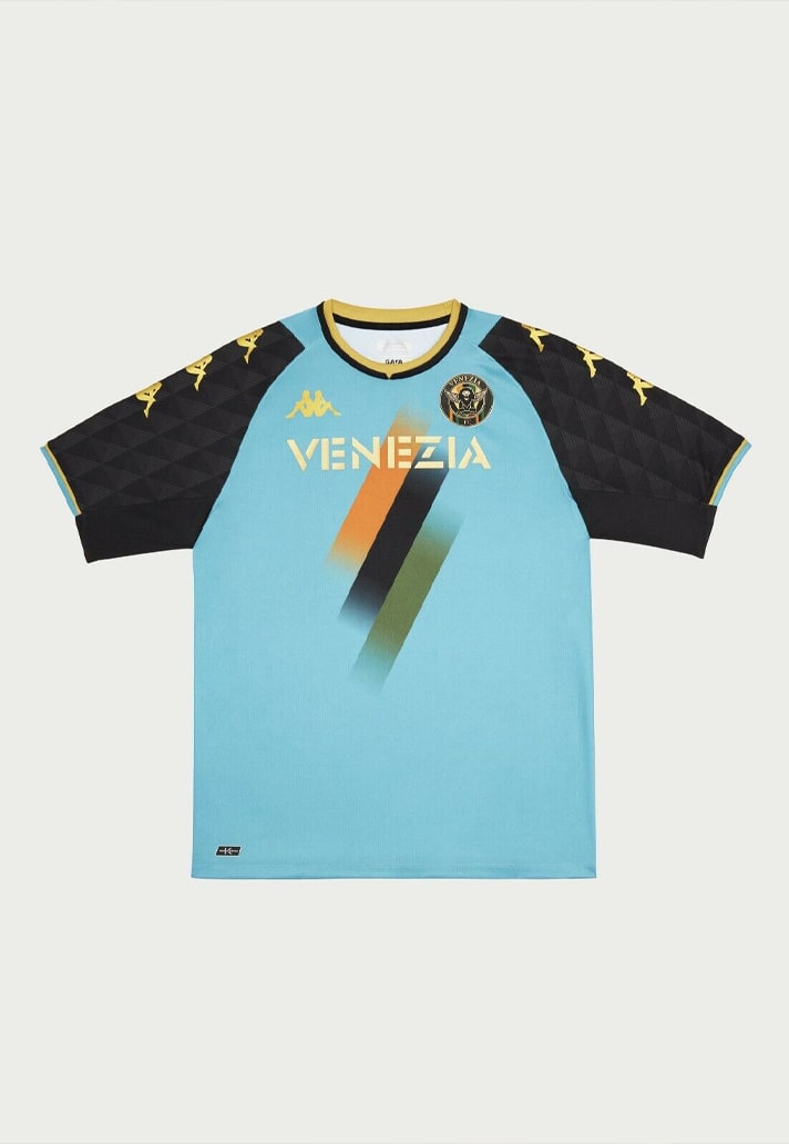
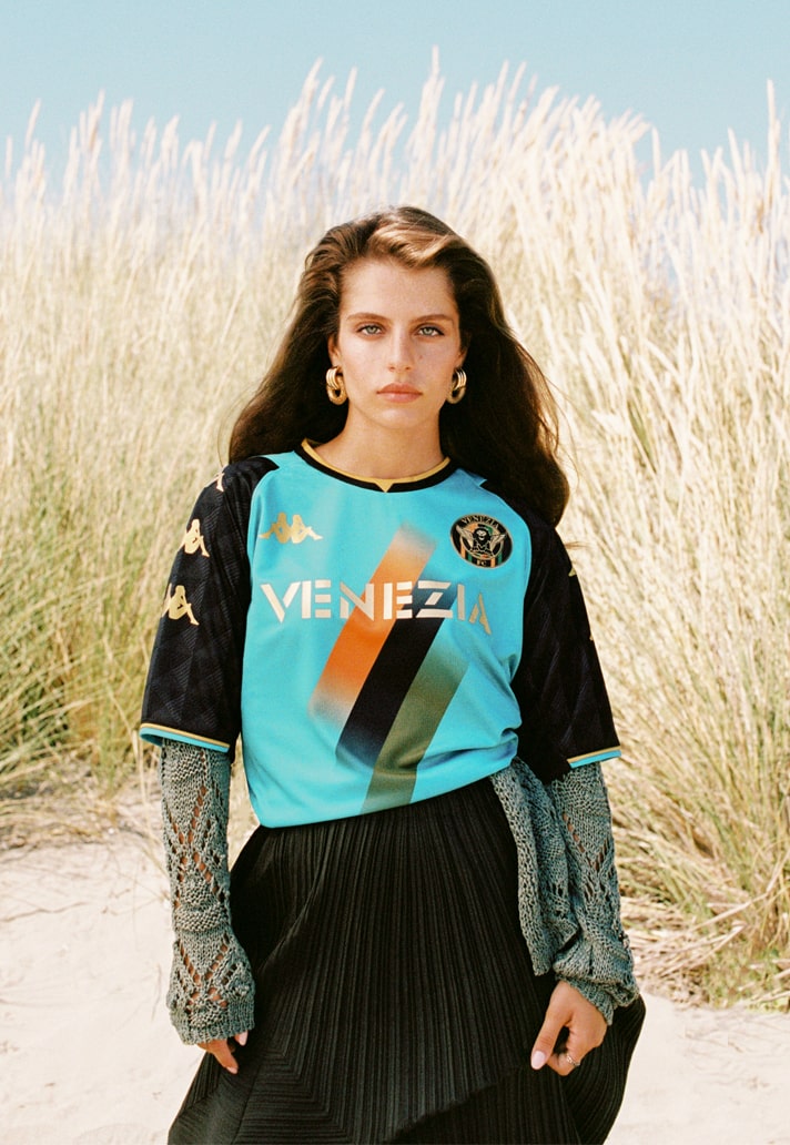
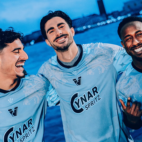
The beautiful third shirt design was an aqua-coloured offering inspired by the Venetian lagoon. Part of the proceeds were dedicated to local conservation as well, so supporting a good cause and getting a cracking shirt.
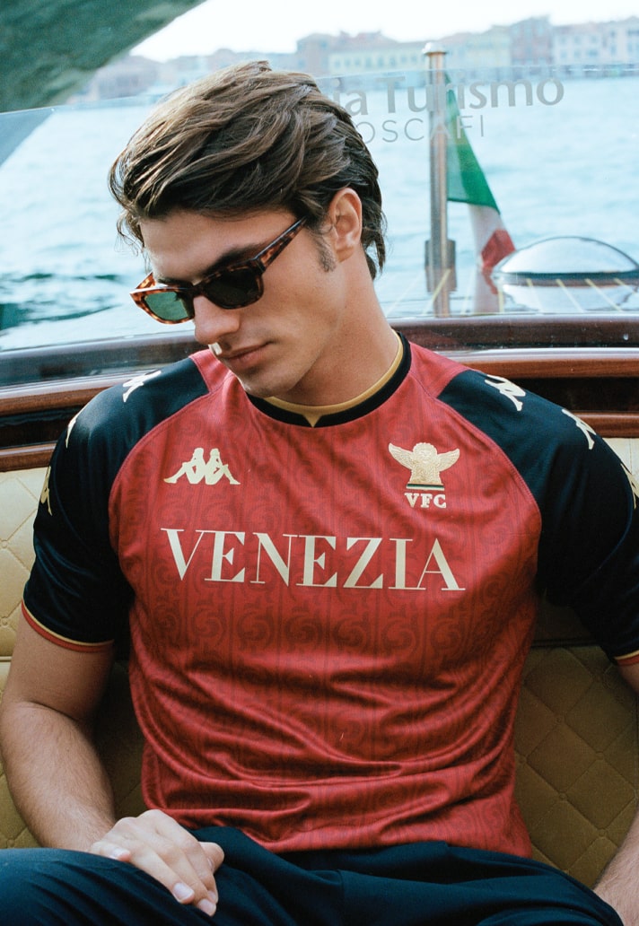
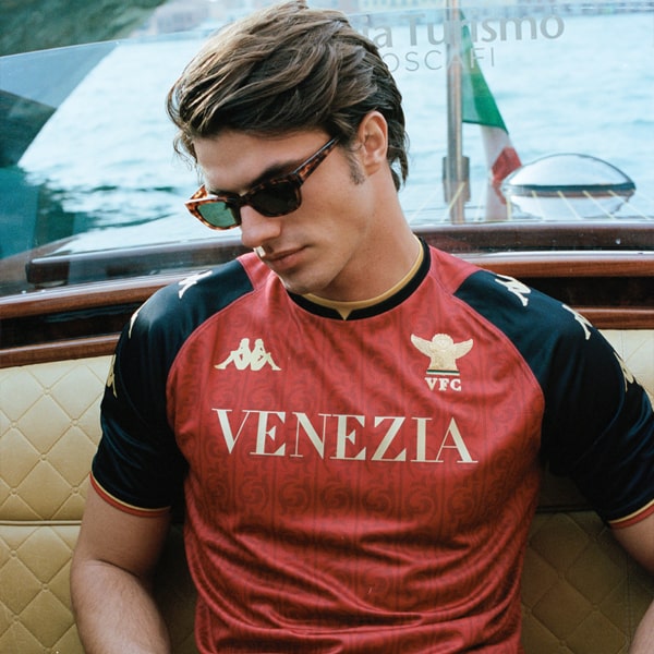
Completing what is arguably one of the greatest kit sets of all time, the fourth shirt brought a sophisticated look inspired by the iconic flag of the Republic of Venice. Gold on red worked a treat.
2022/23
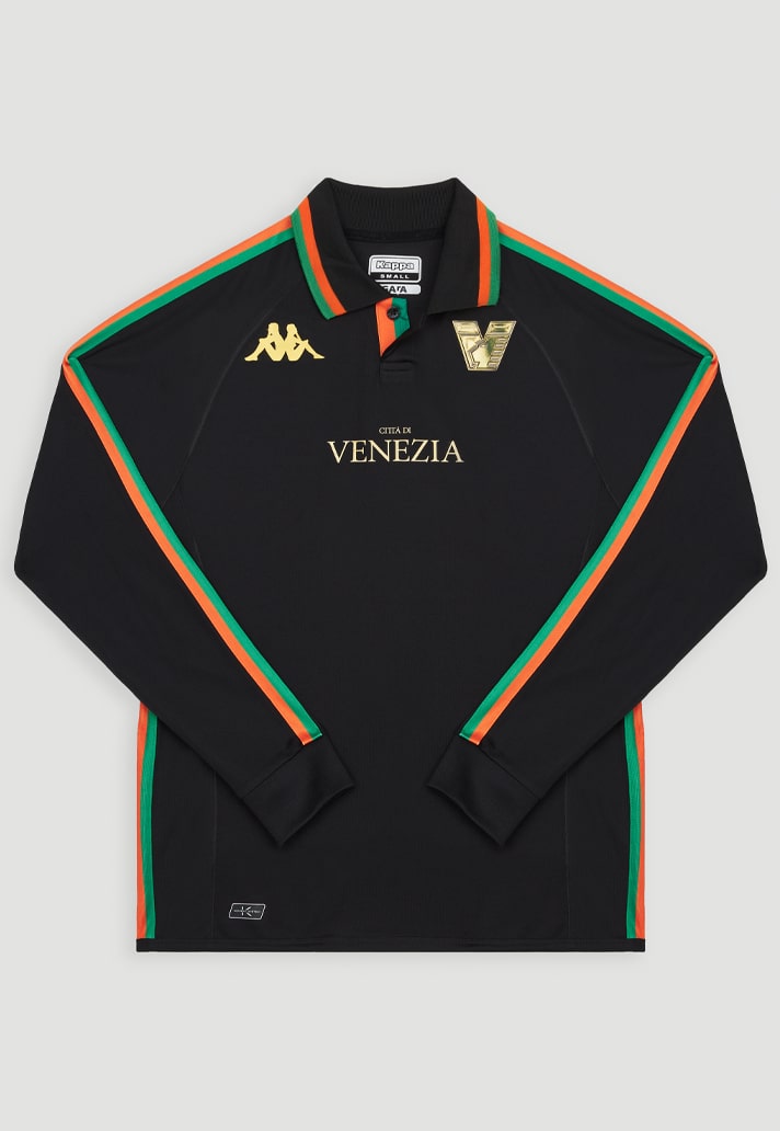
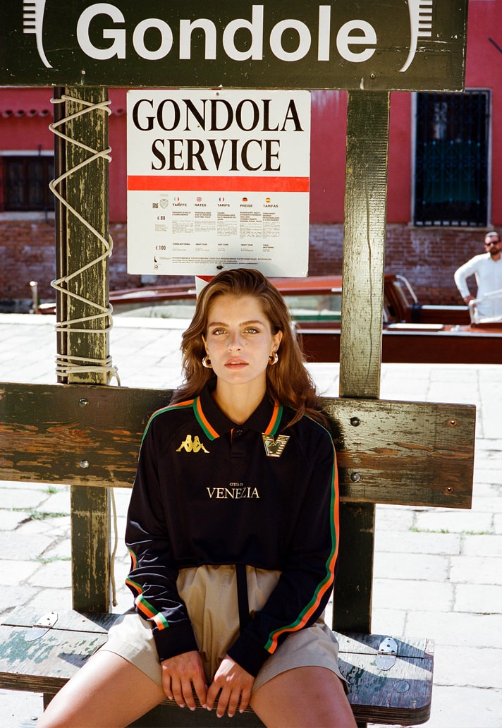
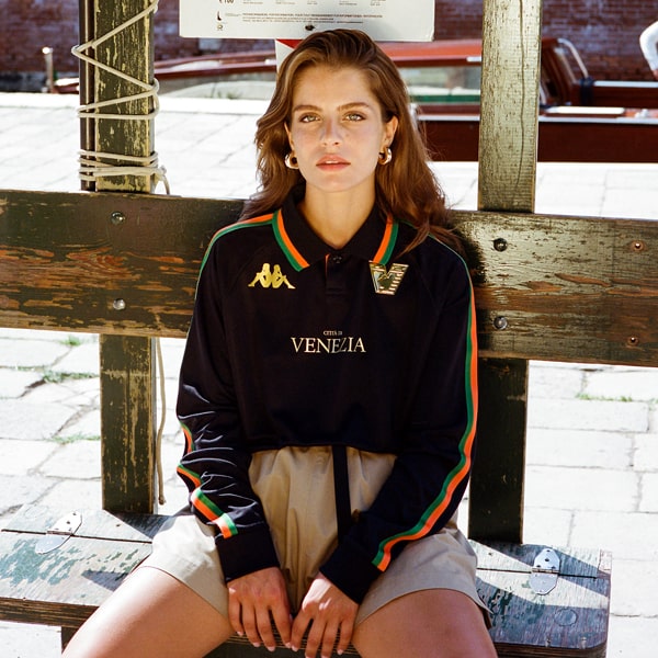
The question on everyone's lips ahead of the 22/23 season was just how would Venezia and Kappa be able to follow up such a strong set from the previous season? And this was the emphatic answer, bolstered by a identity refresh: elegant, minimalist, returning collar and long sleeve option. Bellissimo.
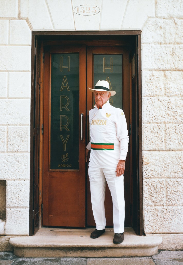
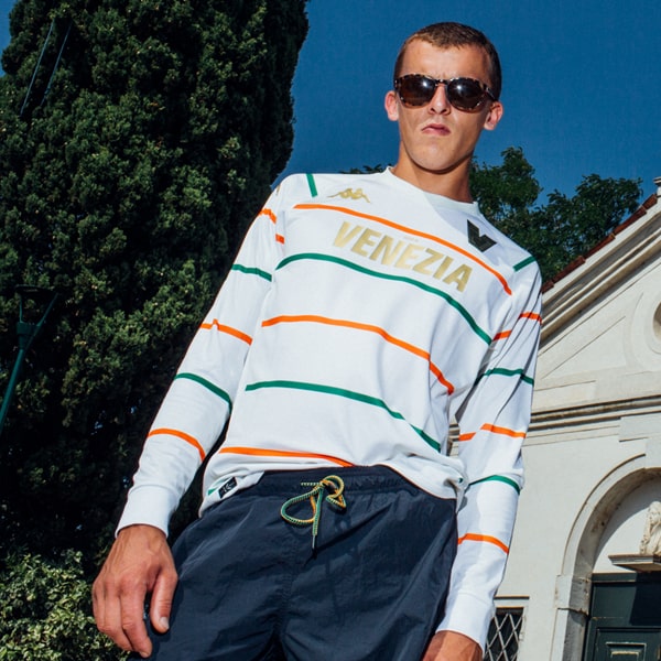
Seven days on from that launch was the underrated 22/23 away shirt, which offered up a more sporty and relaxed vibe, presenting the green and orange as hoops on a white base. Crew collar and new crest combined with long sleeve kept it chill.
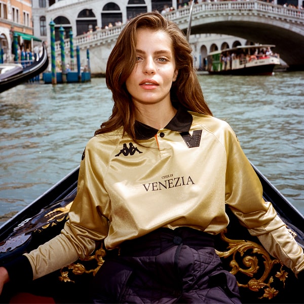
Going gold is just straight up balls out, isn't it. But Venezia and Kappa were confident in what they were doing and the third shirt did not miss.
2023/24
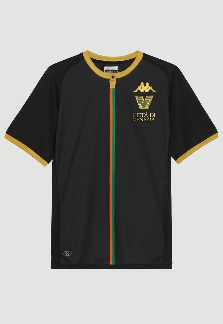
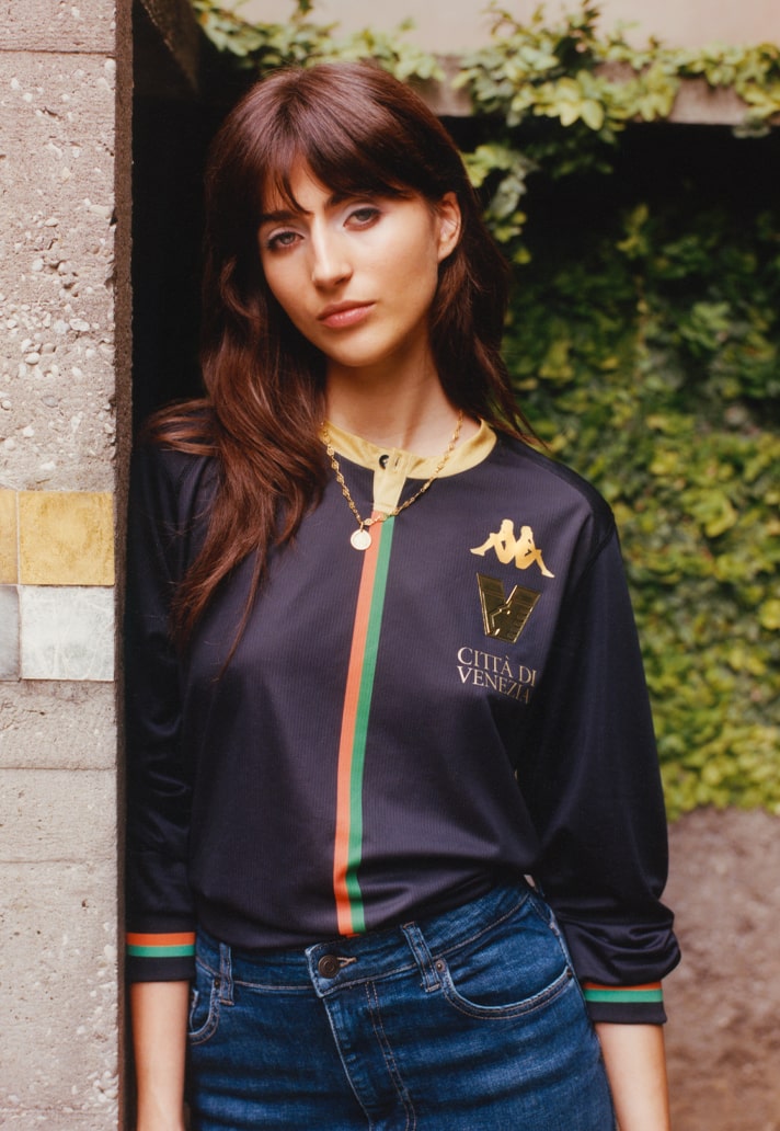
Another season, another home shirt...but how to keep things fresh? Easy when you know how. Bureau Borsche's new brand identity from last season just working wonders, and setting new trends, everything was shifted to the left of a central stripe, made up of the traditional green and orange: Omini branding, club crest, Citta di Venezia callout. On paper it shouldn't have worked, but in reality it just did.
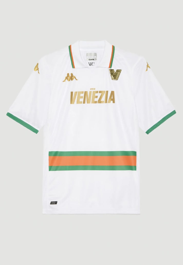
Probably the most controversial of the 10, the 23/24 away shirt dropped a solitary hoop to belt level...jarring at first, but it certainly grew in appeal, and now sits comfortably amongst its peers in the complete Venezia x Kappa collection.
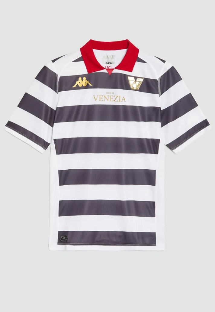
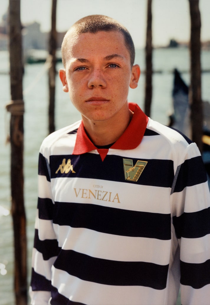
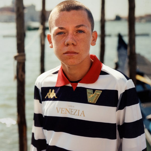
Honouring the iconic Venetian gondoliere and their traditions, the third shirt for this season was yet another unique number, with those black and white hoops being topped off by that red collar.
Quite the collection, and that's not even taking in the prematch shirts and wider apparel. Have you got them all?
