With the majority of teams having now revealed their full wardrobes for the current campaign, we take a look at the 10 best kit sets from the 24/25 season from across Europe.
Some teams get all the luck; while some of us have to be content with one wearable jersey design from our team for the season, others get the pick of three and maybe even four absolute bangers. In line with the latter, what follows here is a list of the 10 best 24/25 kit sets from clubs across Europe. To qualify, a team has to have released at least three kits, and all three have to be strong designs (appreciate this is objective). There may be a tidy through-thread weaved into the design inspiration, or there may just be three great standalone designs. You’ll notice a big presence from the likes of Macron and Kappa here, showing a real level of consistency to their 24/25 output, while there may well be a surprise number one for some in terms of the brand. Good to see healthy competition at the top level of the game.
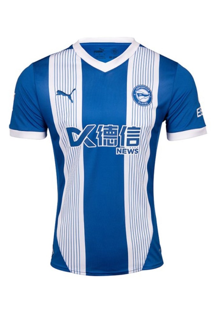
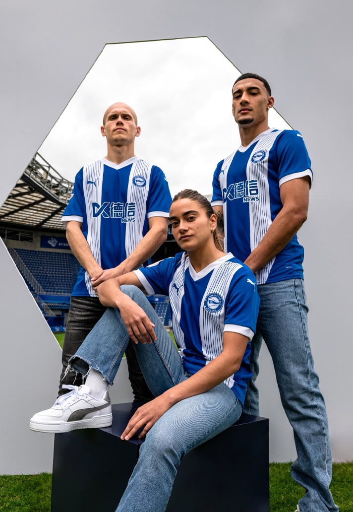
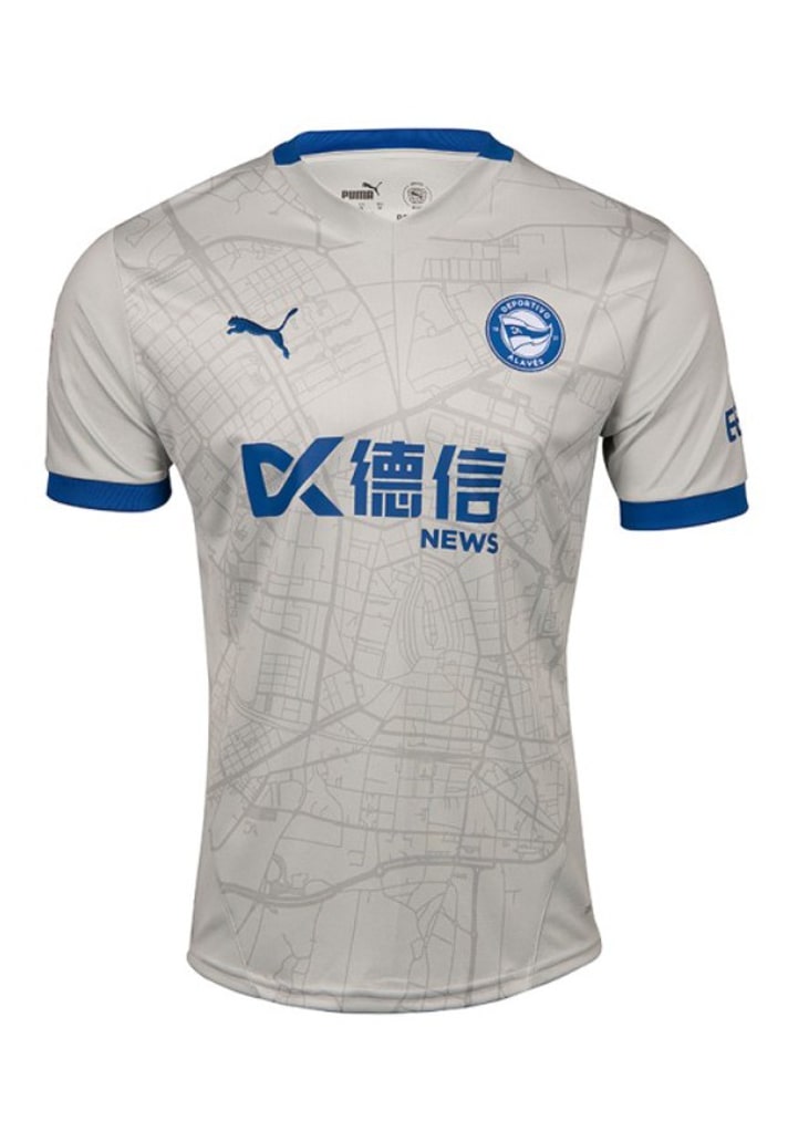
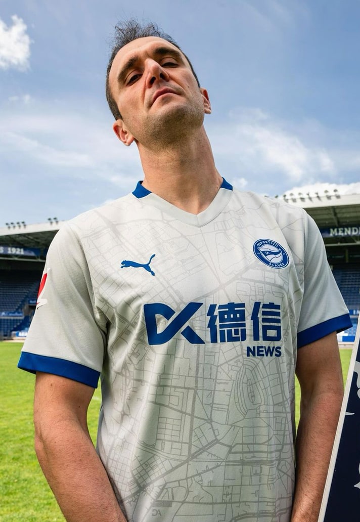
10. Deportivo Alaves (PUMA)
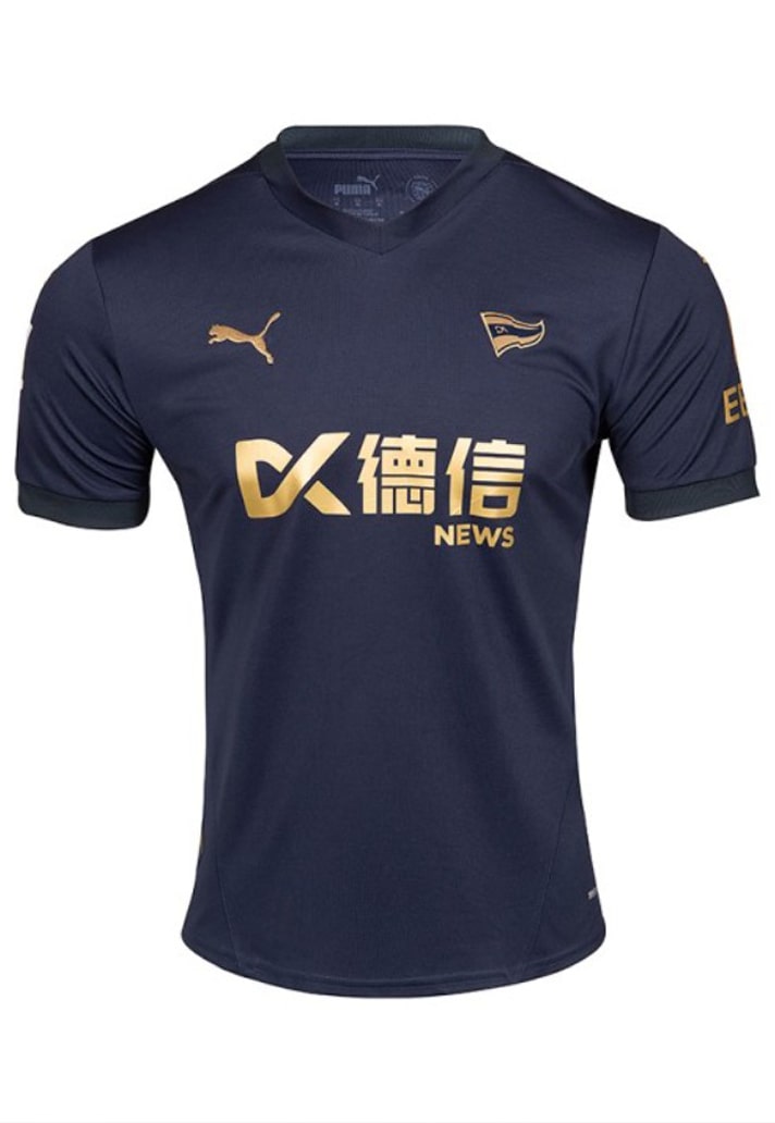
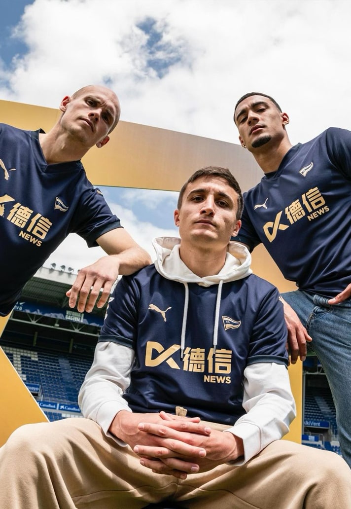
La Liga side Deportivo Alavés take their place on this list thanks to three starkly contrasting kits from PUMA (kind of the point to alternate strips you might say, but not always the case). The home shirt takes a fresh approach to the club's traditional blue and white stripes, with two wider white stripes featuring thin blue pinstripes within; the away shirt then sees a homage to Vitoria-Gasteiz, the region the club calls home, with the design showcasing a city map with notable landmarks; and finally, the third links up a navy base with gold accents – always a winner in my eyes – and the stripped back club crest here is the cherry on top.
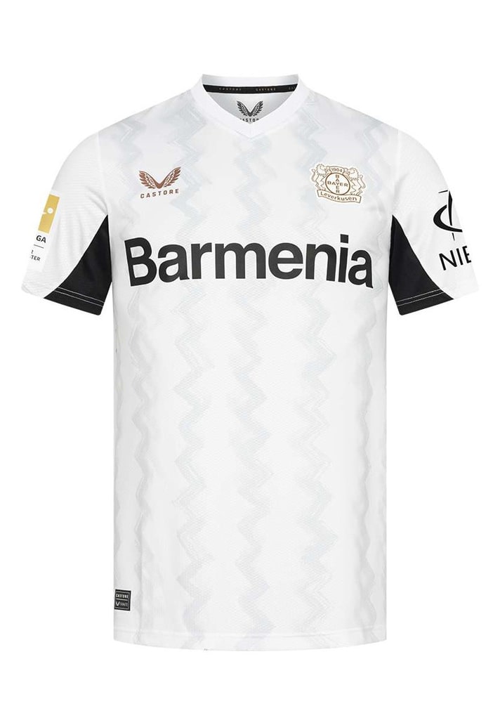
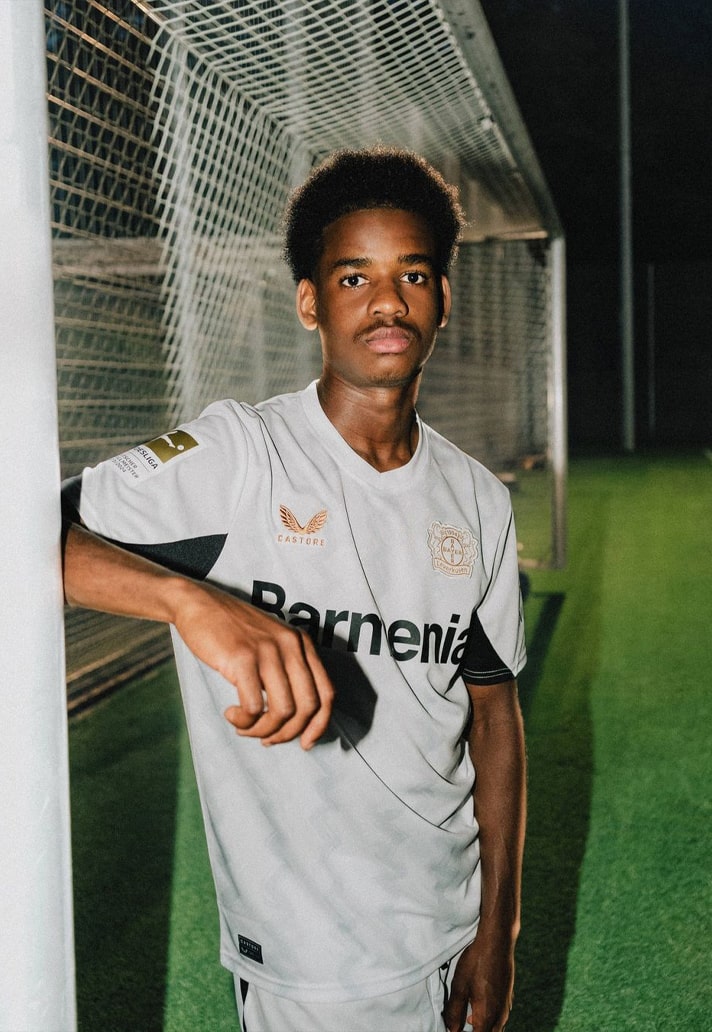
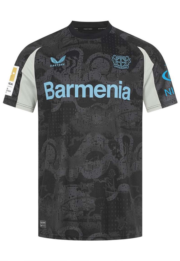
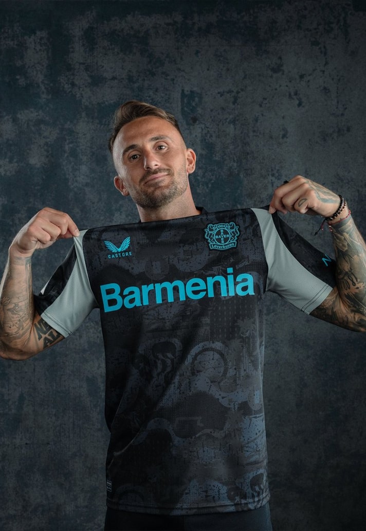
9. Bayer Leverkusen (Castore)
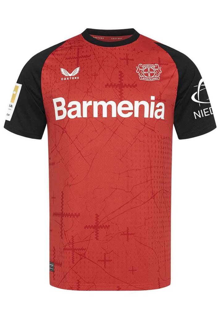
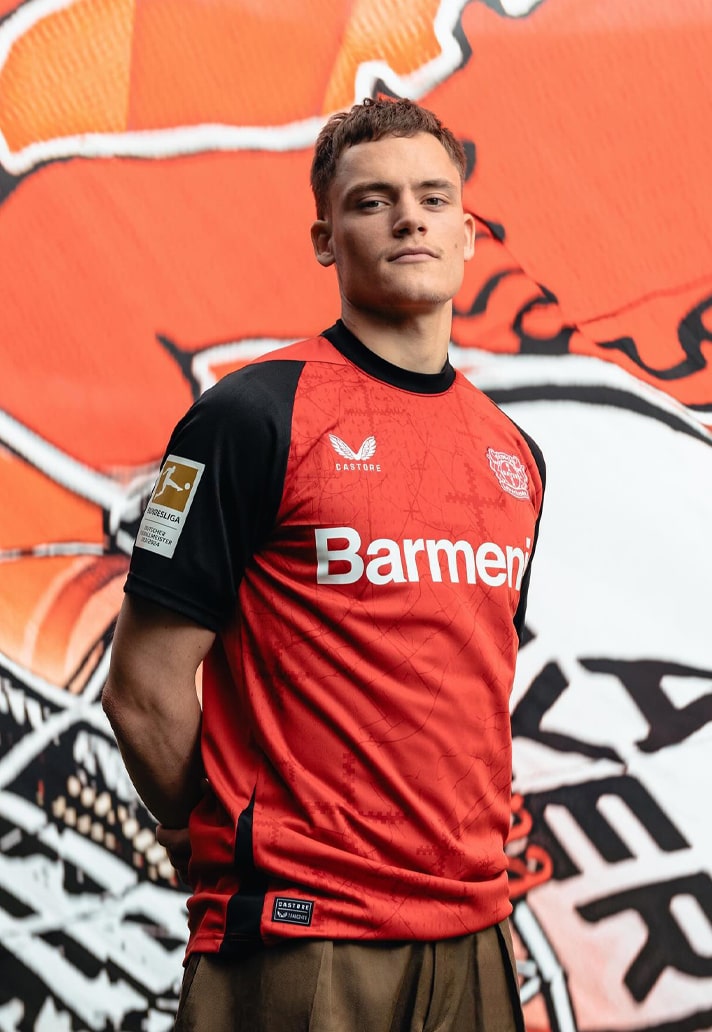
The Bundesliga champions come at their title defence with not three, but four top-drawer designs. However, there's no room for the recently released 120th anniversary fourth shirt here (despite it probably being the best of the bunch). Instead, I've stuck with the home, which features tonal graphics including crosses formed from the battlement on the city of Leverkusen’s coat of arms, the away, with its subtle zig-zag graphics, and the third, with its graffiti-inspired sublimated pattern.
8. Blackburn Rovers (Macron)
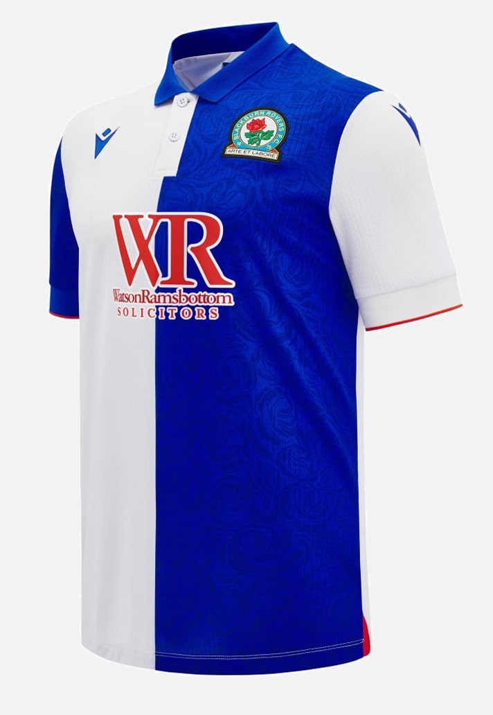
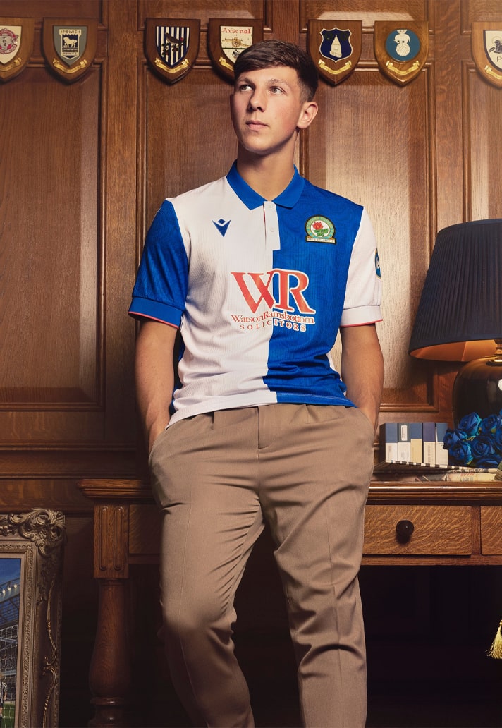
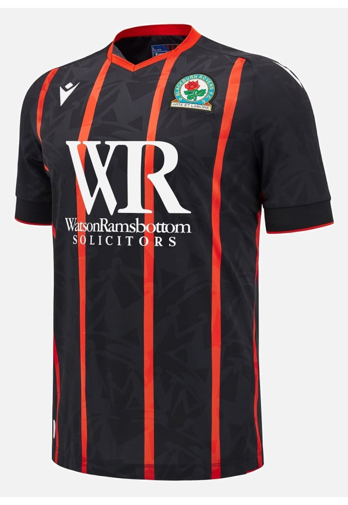
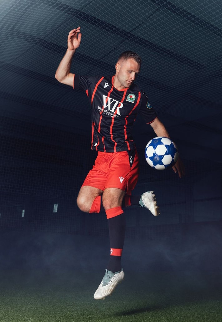
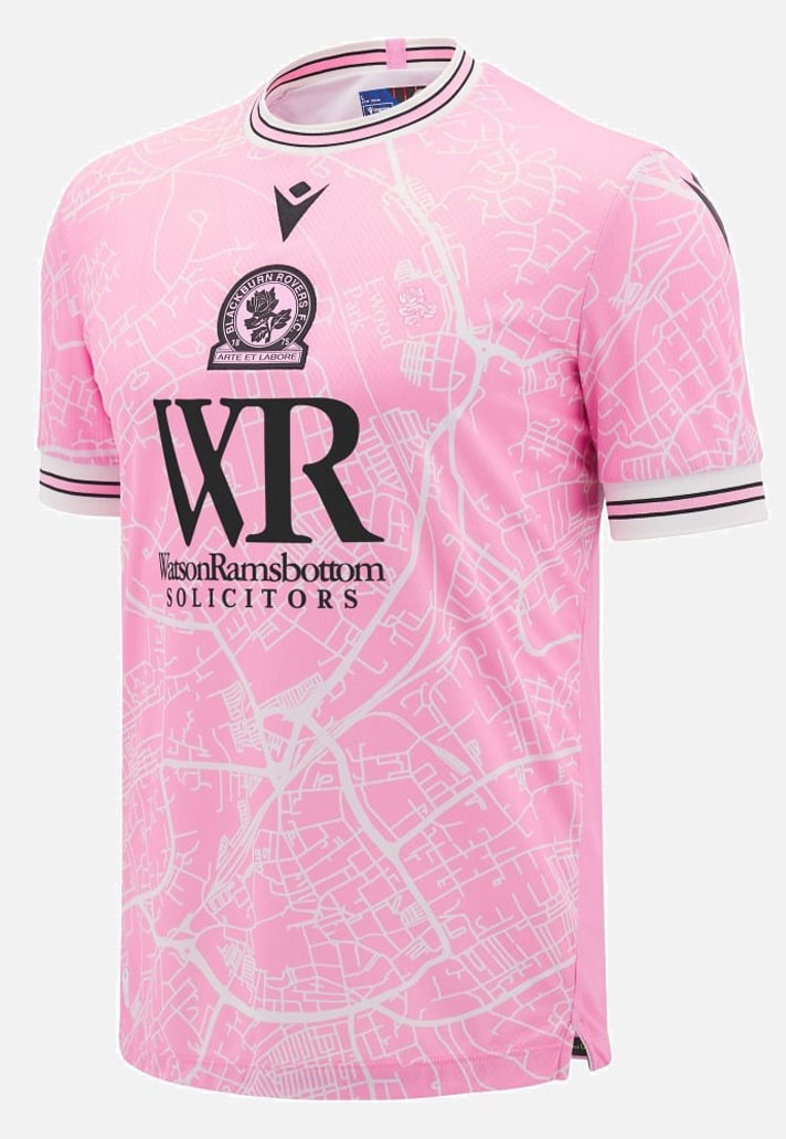
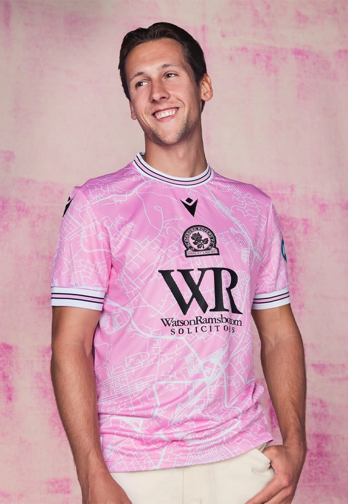
The first of three entries from Italian brand Macron, who have really elevated their output over the last few campaigns. And one of the lucky recipients are Championship side and former Premier League winners, Blackburn Rovers, and it's in that latter point that the design inspiration for the home and away shirts comes, paying homage to 1994/95 with a return for the classic collar for the home, and the same black base and red stripes for the away. They're coupled with a vibrant pink third shirt that features a map of Blackburn, with Ewood Park near the heart, marked by a Lancashire rose.
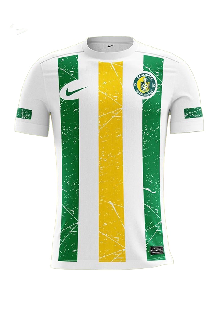
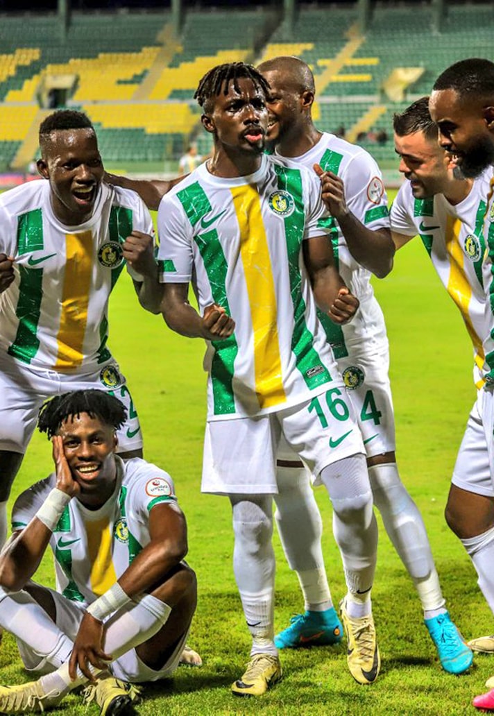
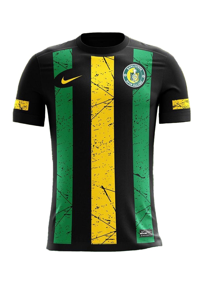
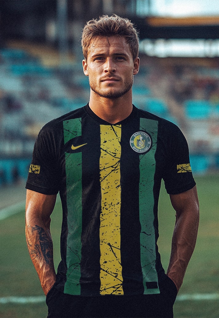
7. Şanlıurfaspor (Nike)
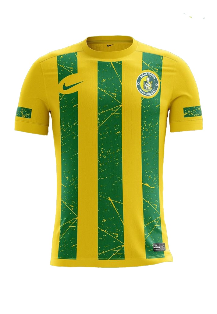
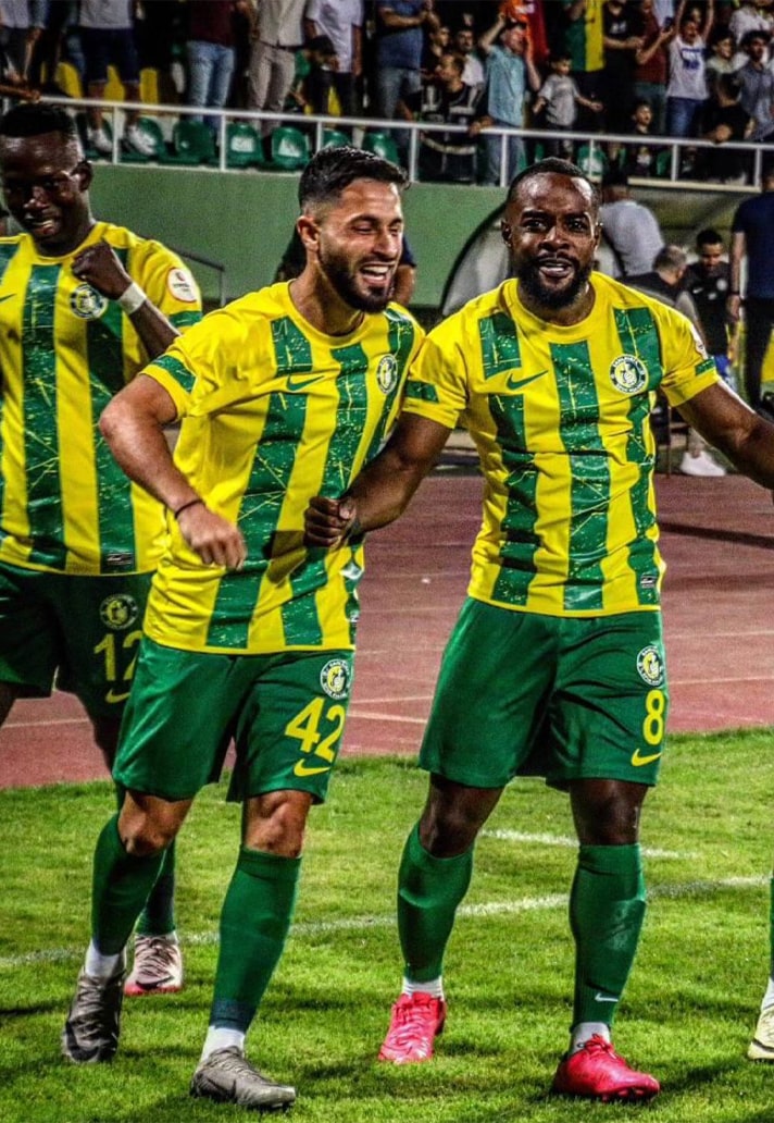
Turkish TFF First League side Şanlıurfaspor take their place on this list thanks to a beautifully executed 1, 2, 3 from Nike. The design carries across all three, with the club's traditional colours taking residence on the home shirt, before shifting out on the away and third. The block base colour with grainy stripe execution is then lifted by the way the stripes are interrupted by the club crest and Swoosh logo. Really tidy, and a nice use of the club's primary colours across the trio.
6. Arsenal (adidas)
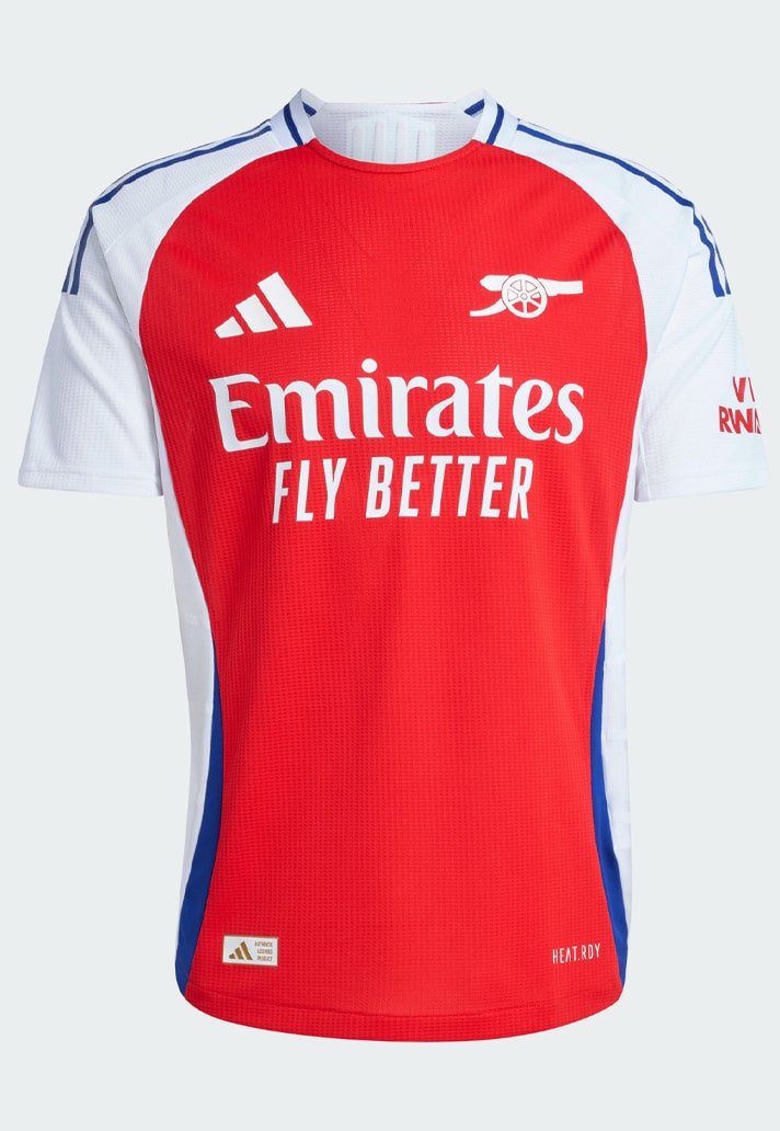
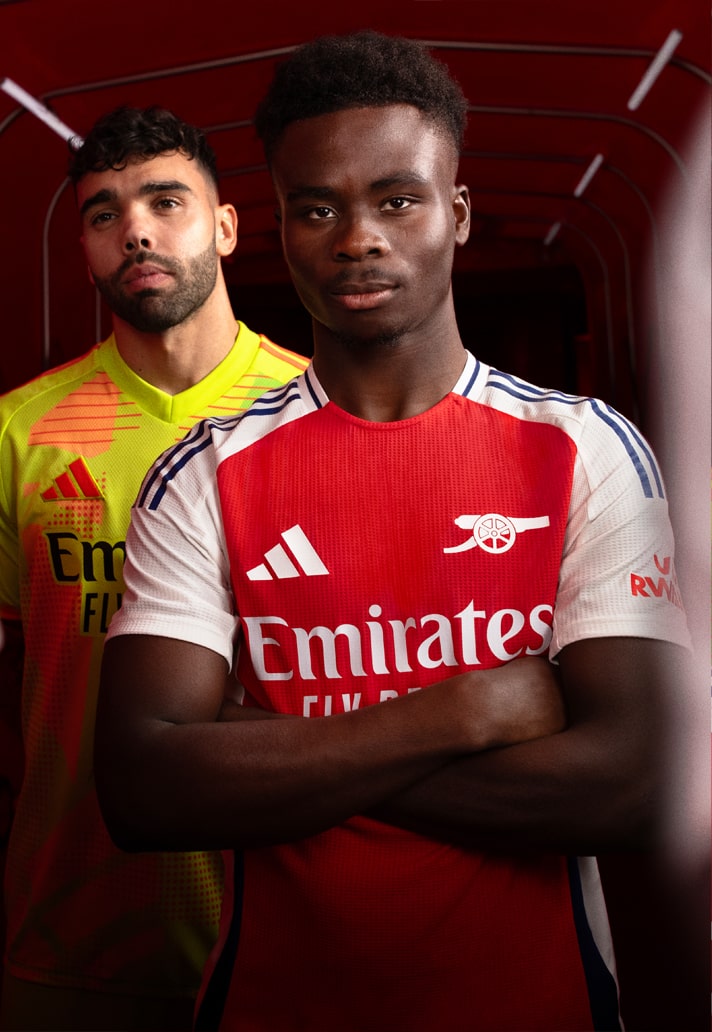
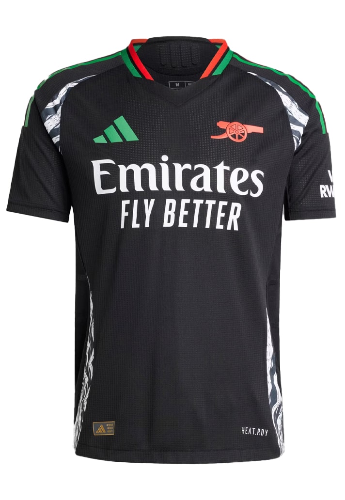
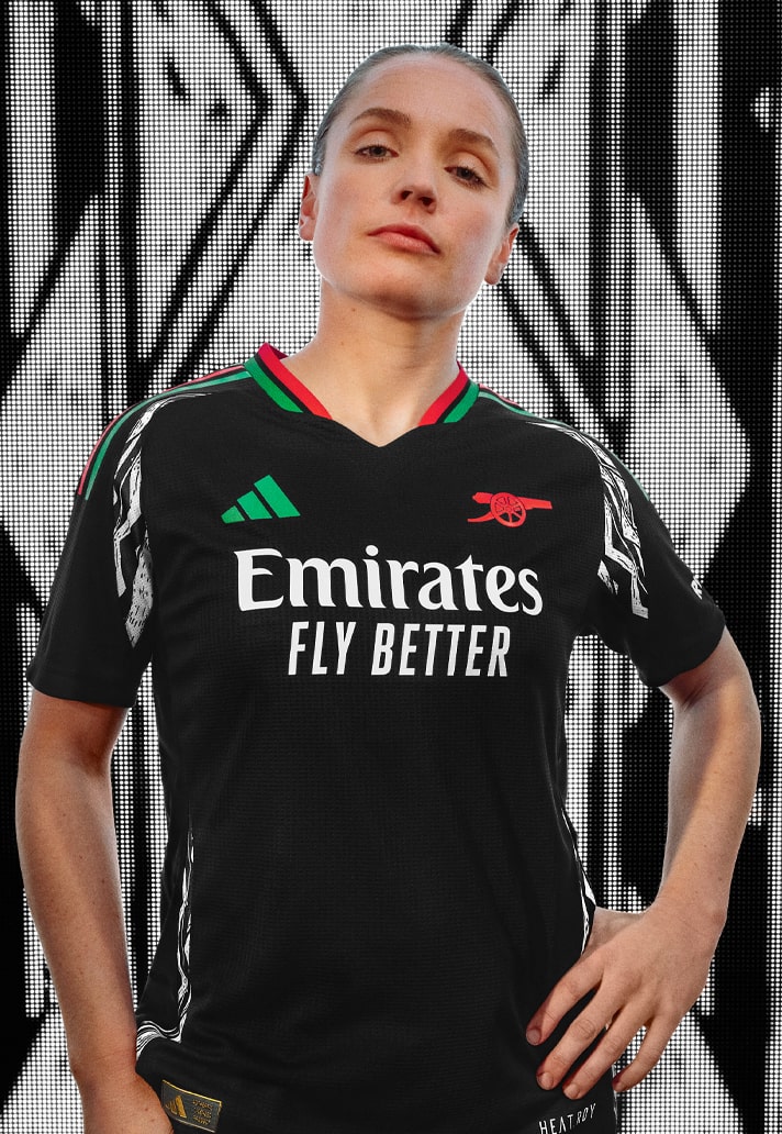
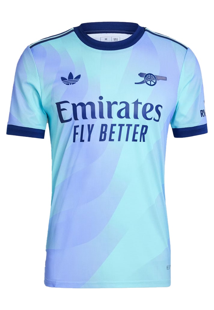
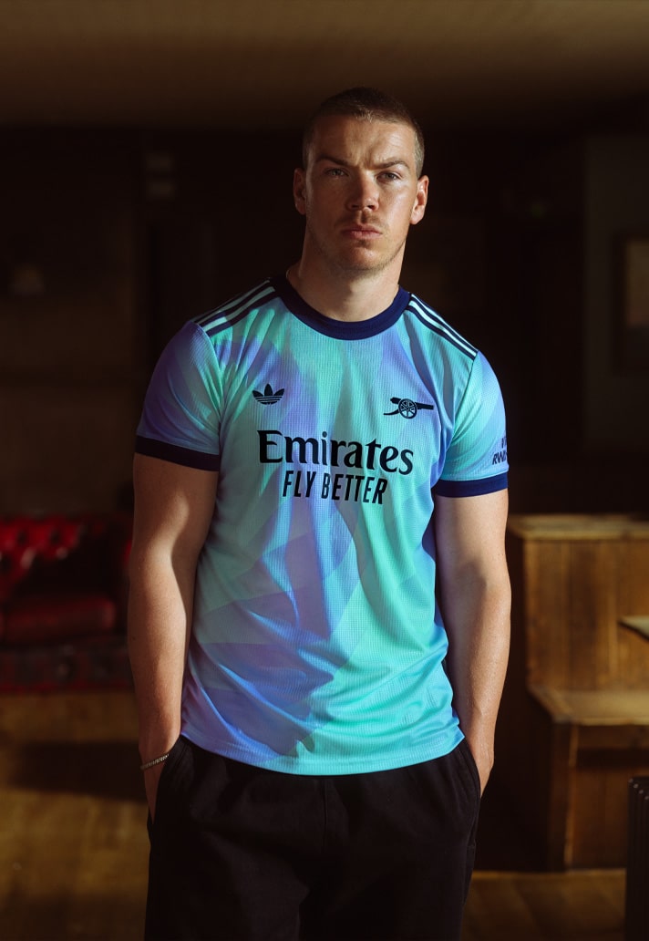
There's a few teams that you can almost always guarantee will turn out well dressed for any occasion, and Arsenal (since re-partnering with adidas) are one of those. The Three Stripes shirt designs over the last couple of years has arguably been second to none, and while there are some seriously strong solo contenders out there this season, the Gunners take the adidas-shaped biscuit with their 24/25 wardrobe. A clean home design, that strong partnership offering from Labrum, and the Trefoil-emblazoned tie-dye third. Firing yet again.
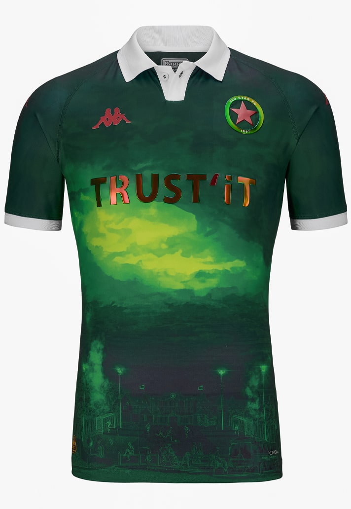
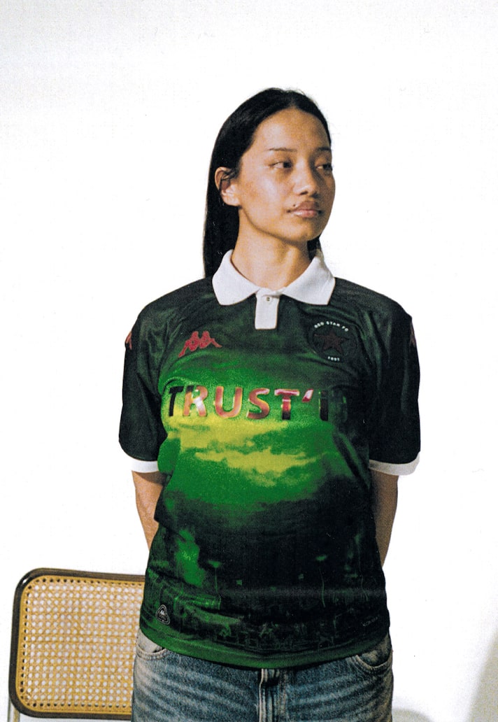
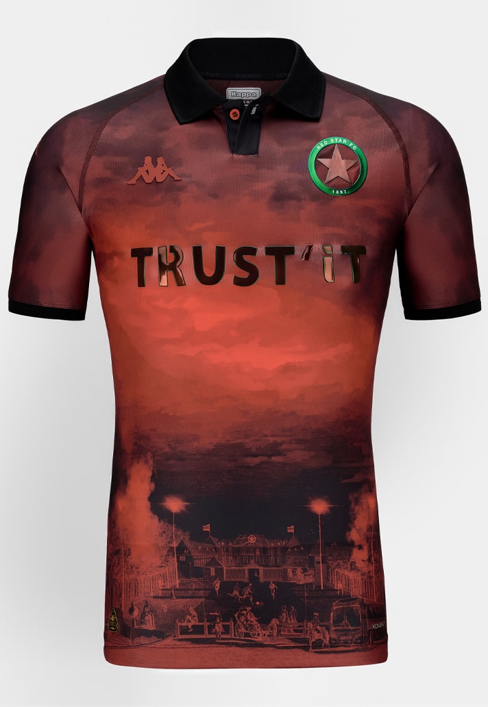
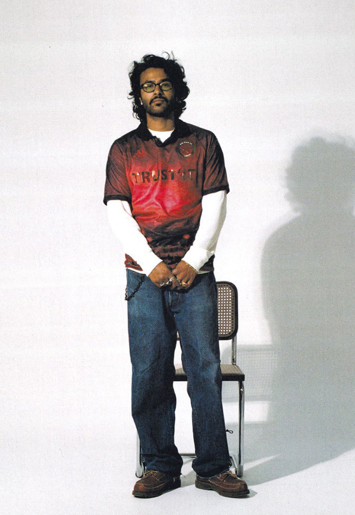
5. Red Star Paris (Kappa)
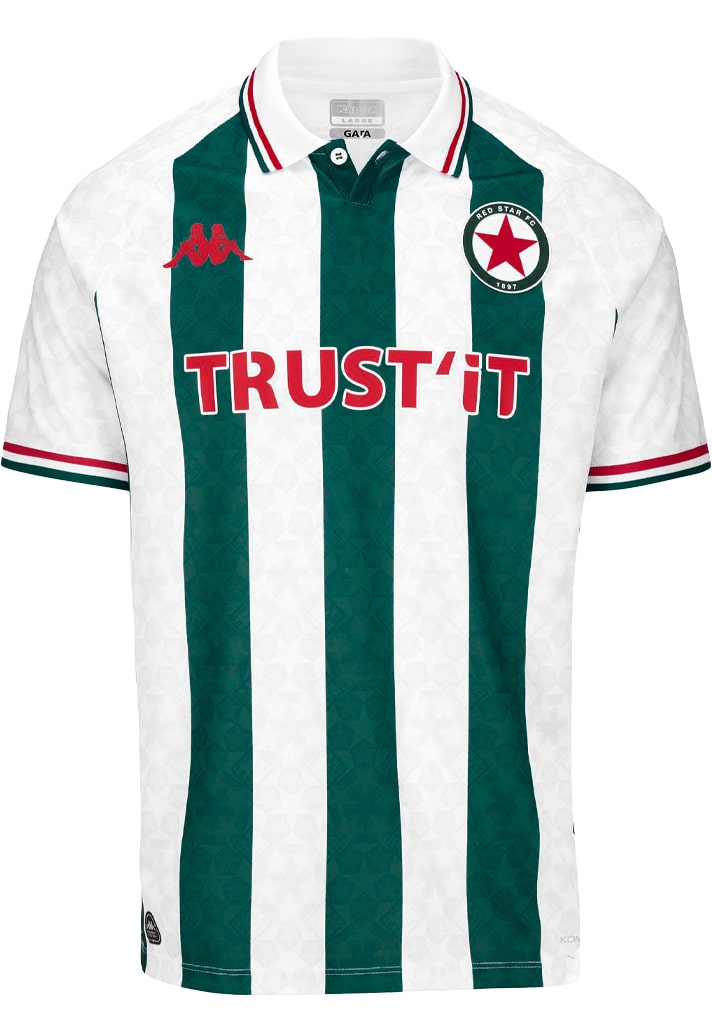
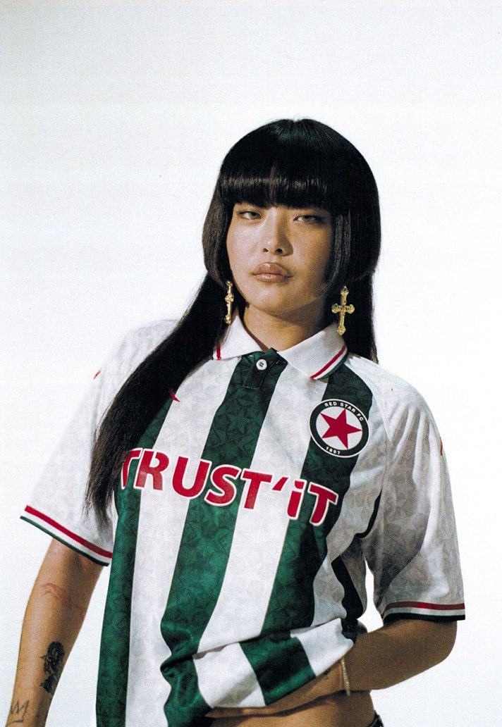
Before Venezia there was Red Star Paris. Despite being the fourth oldest French football club, the Ligue 2 side are trail blazers when it comes to style. While Kappa always deliver, this is arguably the best trio of kits the partnership has delivered in their four years together. A clean home shirt and then two really bespoke looks for away and third. Strong start to the top 5.
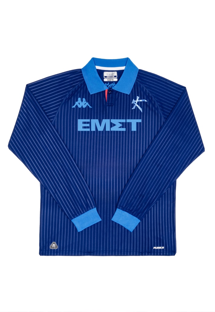
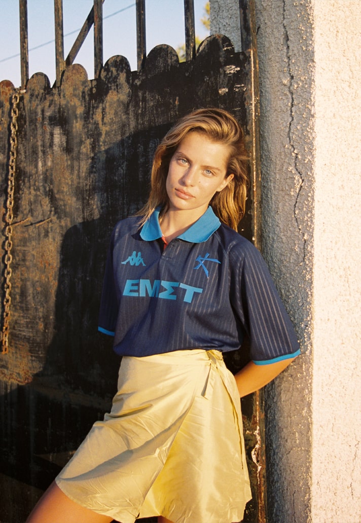
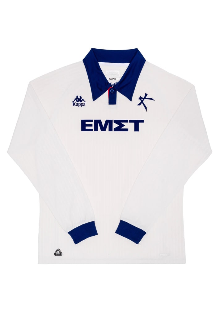
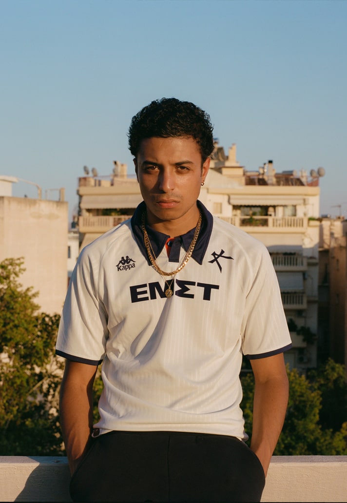
4. Athens Kallithea (Kappa)
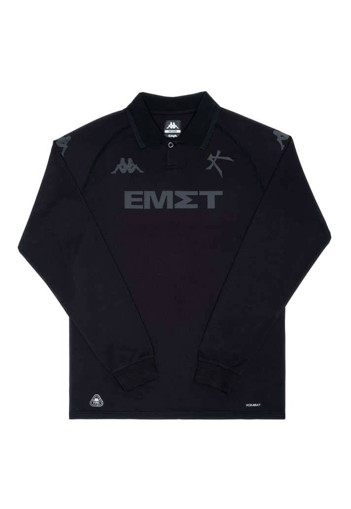
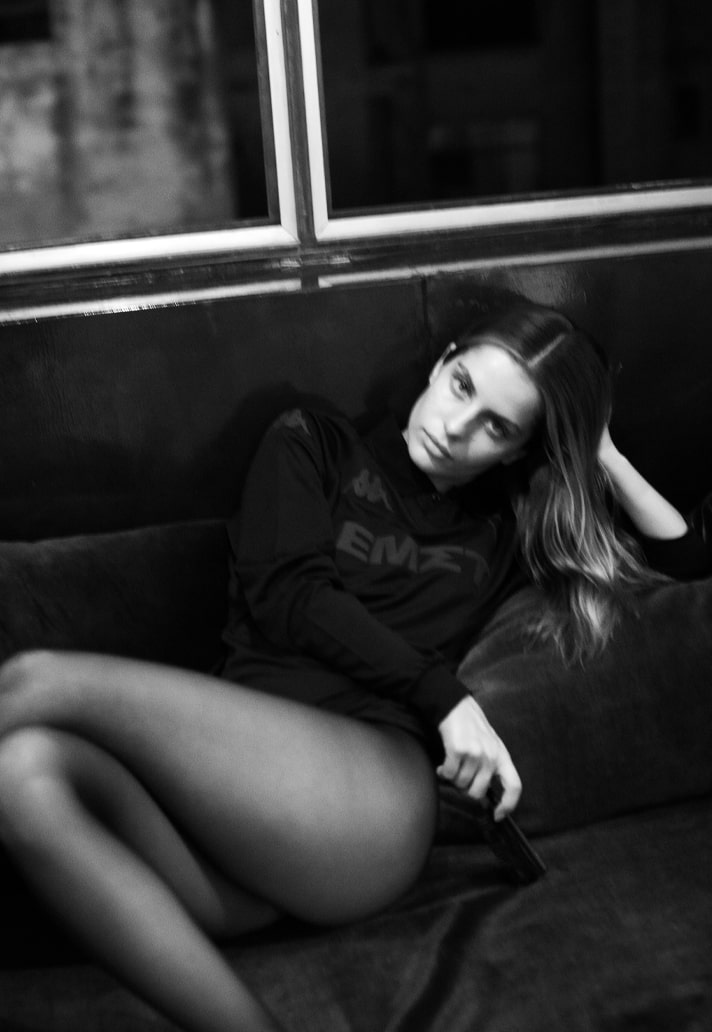
The natural heirs to Venezia's style throne, Athens Kallithea have leapt into pole position when it comes to fashion-forward kit designs. Ahead of the curve, to look at the work of Bureau Borsche and Kappa for the Greek side is to see the likely direction jersey design will take in the coming seasons, and with that in mind, it's clean and minimalist. For their first season back in the Greek top division, Athens Kallithea get the same template presented in blue, white and black out respectively.
3. Basel (Macron)
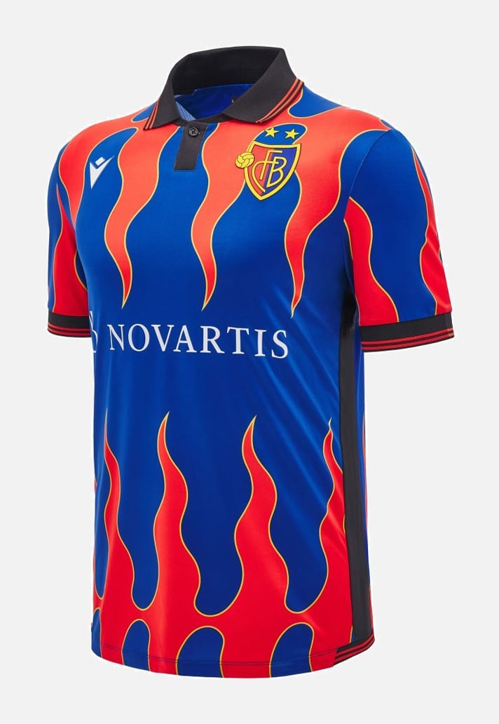
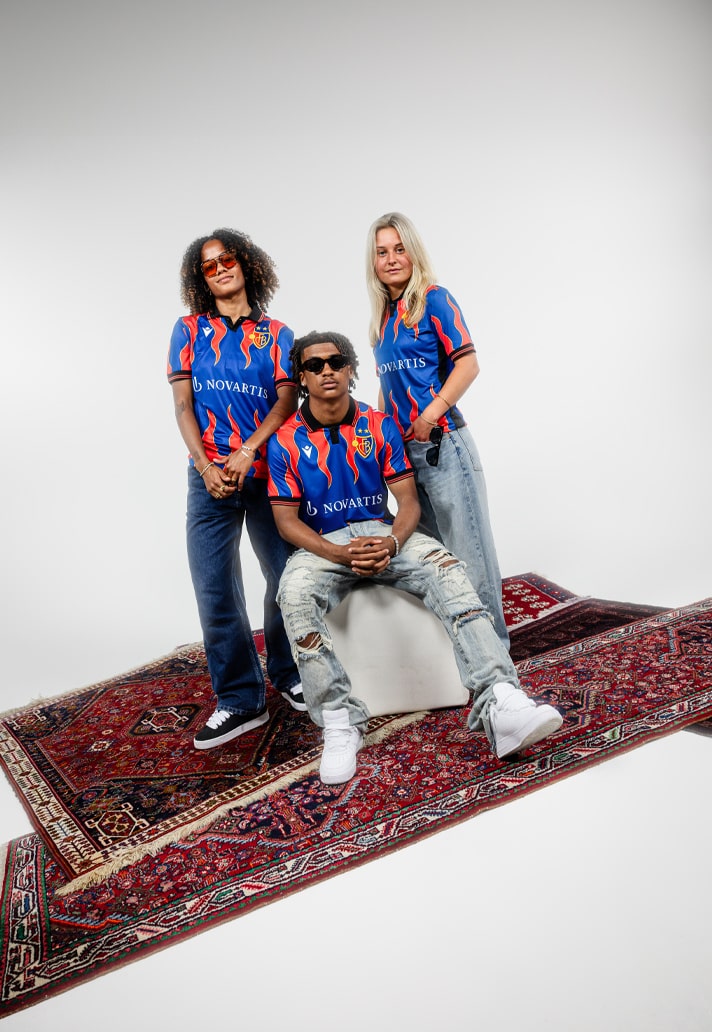
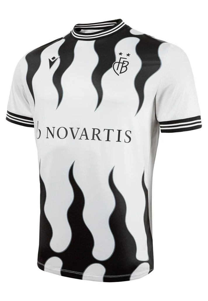
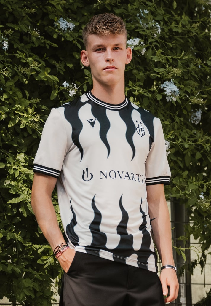
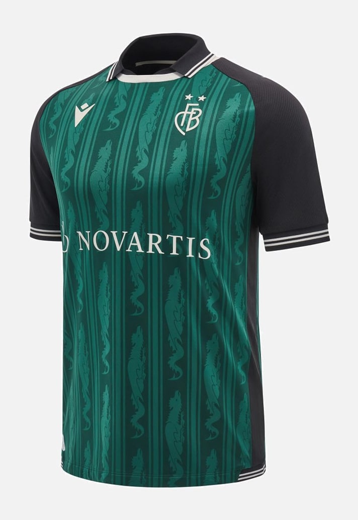
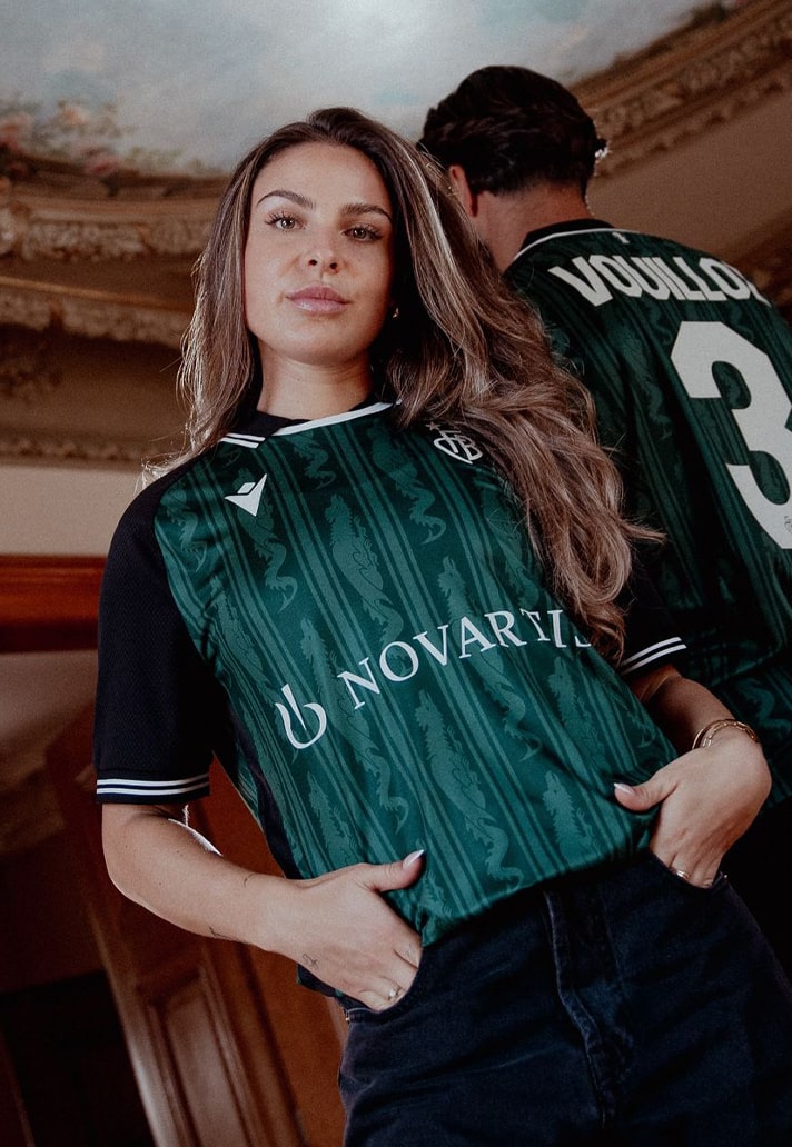
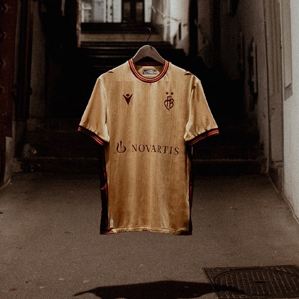
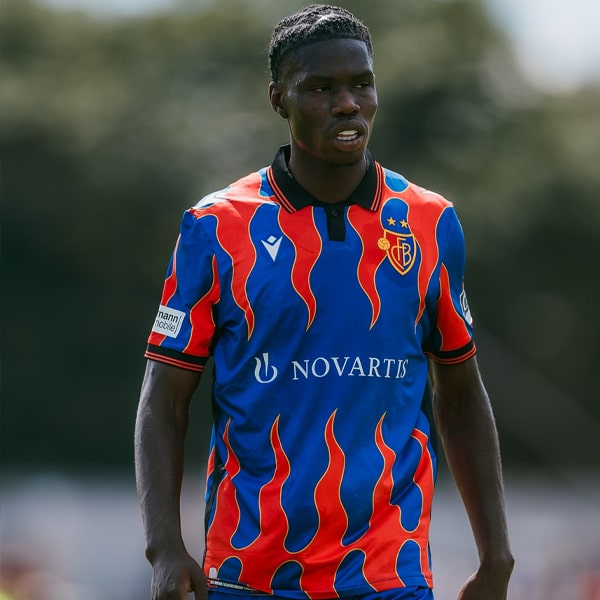
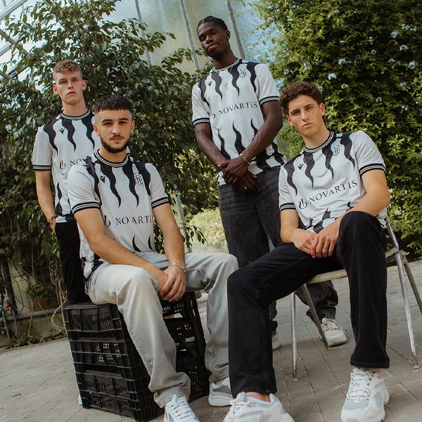
Saying a kit design is fire is one thing, but Macron take that sentiment to a whole new level for Basel's home and away shirts, which feature designs inspired by the city’s "flamed flag”. The third shirt then punctuates the set with a beautiful design that sees the body in aquamarine, nodding to the city's famous baselisk fountains, while a depiction of the baselisk – an important symbol for the club and their fanbase – is repeated as a sublimated graphic within the ghost stripes. Unique all round.
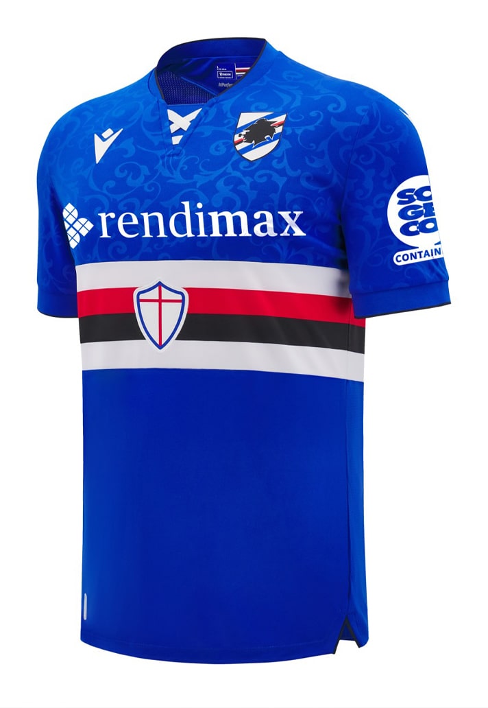
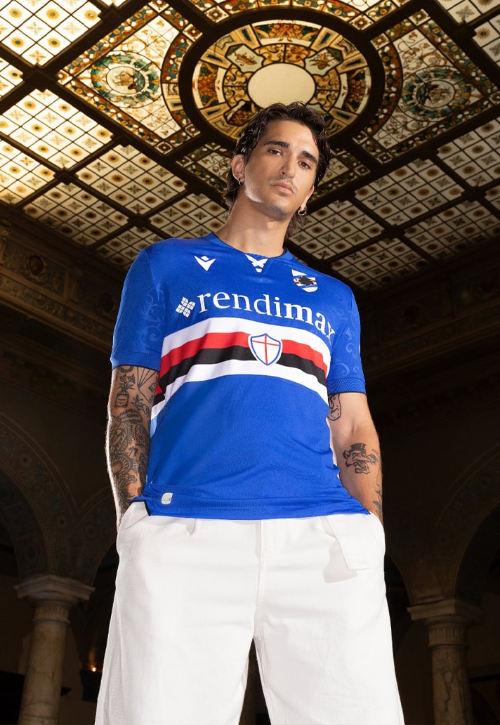
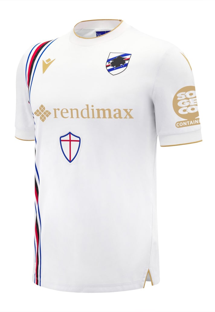
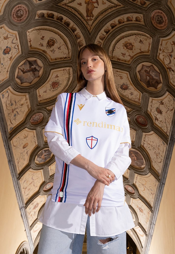
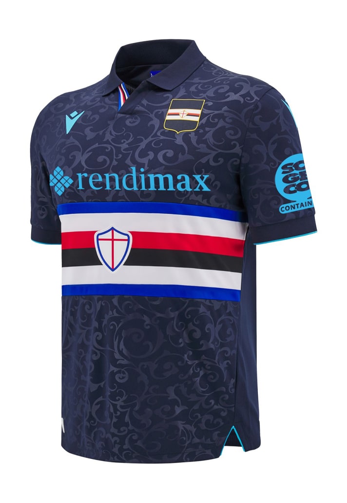
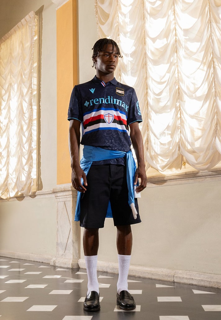
2. Sampdoria (Macron)
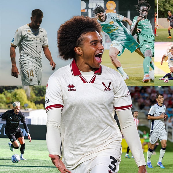
Sampdoria are one of those teams whose kits pretty much always look good, thanks to them sticking steadfastly (stubbornly?) to the classic banded design that has served them so well since the 1950s (if it ain't broke don't fix it!). That's in play once again for the home and third shirts, both of which are married up with a subtle sublimated design. The away is the nice and clean, pairing a white base with gold details, topped off with that off-centre vertical stripe in traditional club colours. Very effective combos across the board.
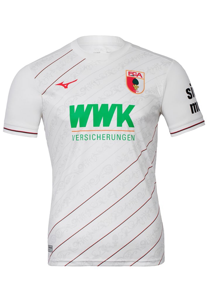
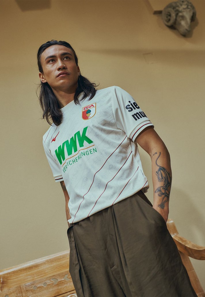
1. Augsburg (Mizuno)
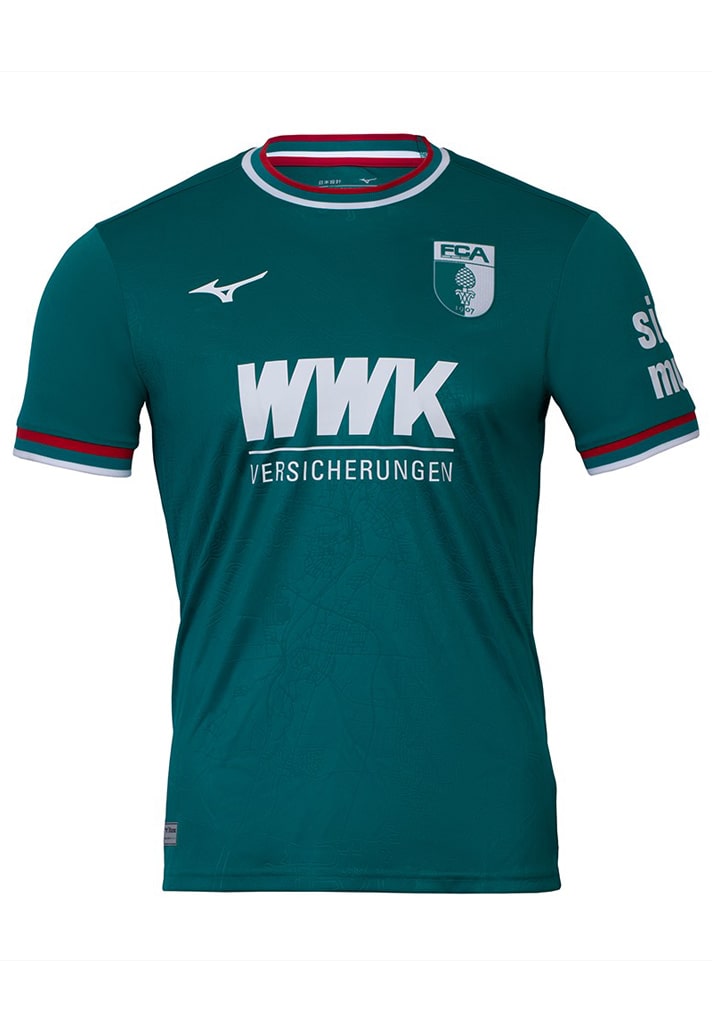
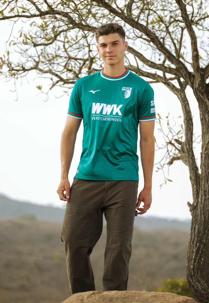
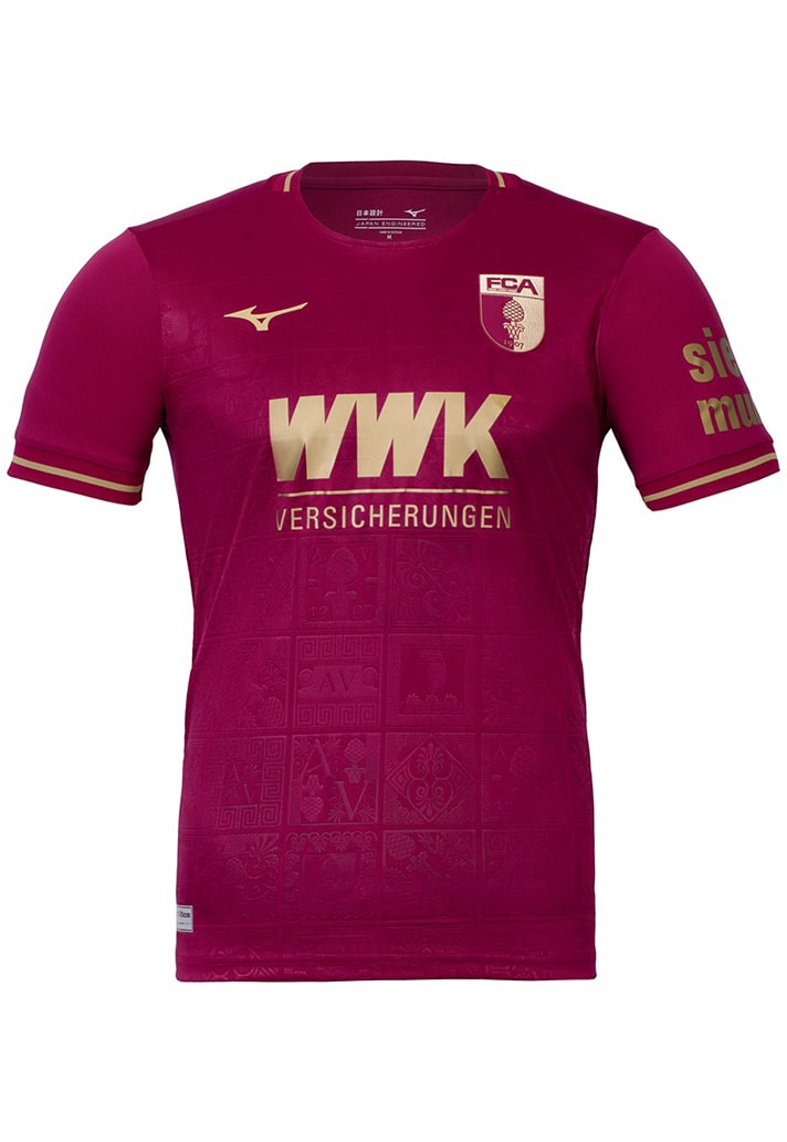
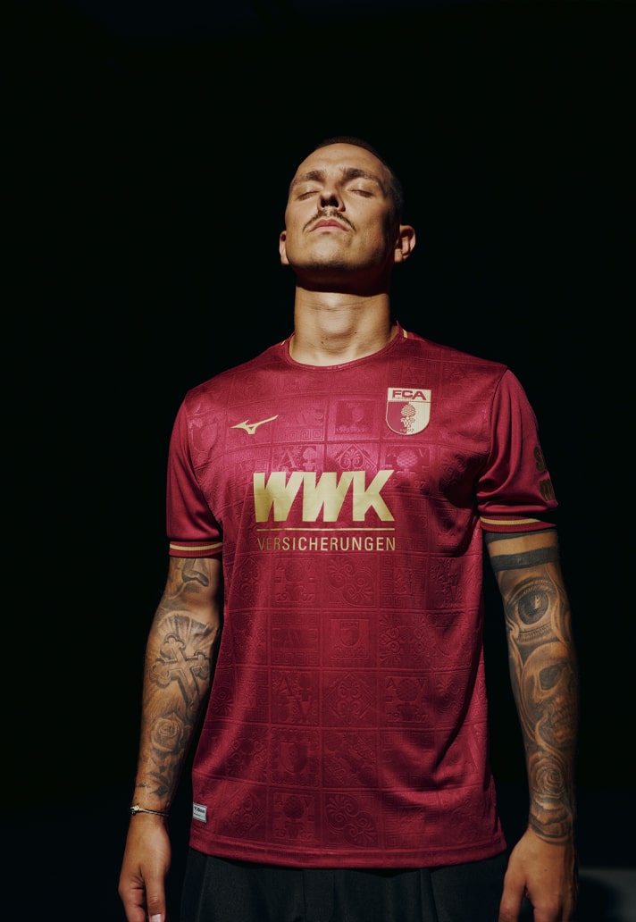
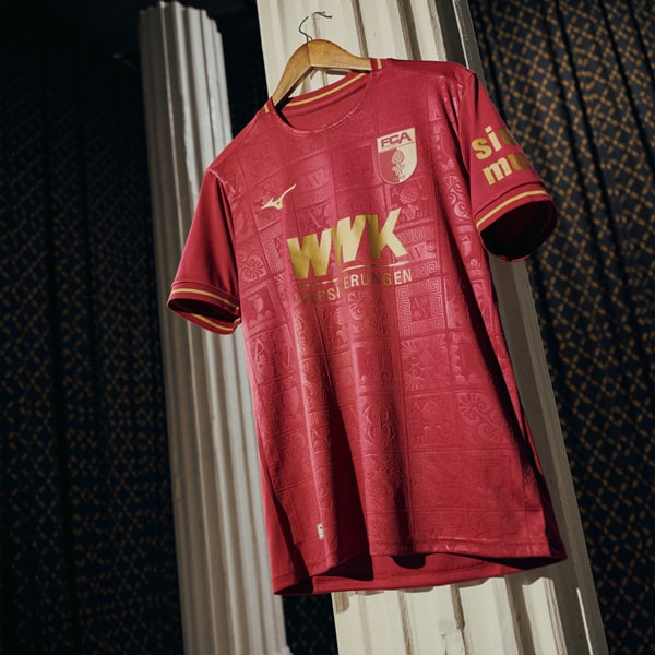
Who saw this one coming? Not me, I'll admit it. Following Mizuno's recent reappearance at the top level of the game last season with Lazio the Japanese brand are back with Bundesliga side FC Augsburg. It an absolutely premium set of shirt designs that just got better with every release. That home shirt, keeping it simple but with subtle diagonal pinstripes, then that equally clean away shirt in that striking turquoise colour scheme, topped off with arguably the shirt of the season in the Bordeaux-coloured "roman Kit" third shirt. Simply sublime.
Compare this season's best kit sets with those of the 23/24 season – which year was better?
Shop 24/25 season replica at prodirectsport.com/soccer
