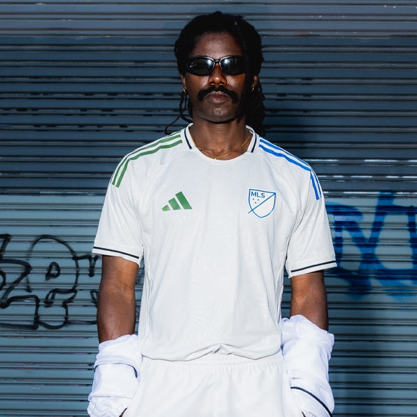
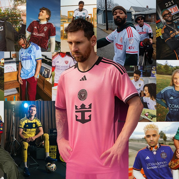
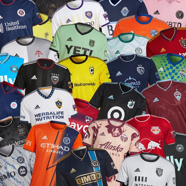
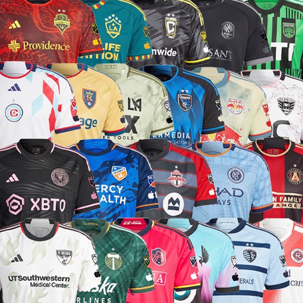
Over the weekend the last of the MLS kit drops were unveiled so, as per usual, we are here to do a roundup and rating of every single new kit. From beauties to mediocracy, we’re here to give you our opinions on who will be dressed to impress for the 2025 season.
The countdown to the start of the 2025 MLS season is ticking away, anticipation building for the 30 teams set to compete. Last week saw all 30 MLS clubs drop their latest kits for the new season. If you aren't too knowledgable on the MLS, each team only get one new kit a season – alternating between either a primary (home) or secondary (away). Unlike most leagues, every MLS club has their kits produced by adidas, due to the brands affiliation with the league. Making it pretty interesting to see which clubs can put their own twist on an adidas template and stand out from the crowd. Enough of all that, let's get into the ratings.


Atlanta United Primary – 6/10
Starting off with Atlanta United who stick with the club's core 5-stripe look for this year's primary kit. They take on a refreshed look with gold accents highlighting the club badge and adidas logo, giving this kit a little more class. Tidy in its execution. Not saying 'wow' yet but it's a solid start.


Austin FC Primary – 7/10
Inspired by the 'Heartbeat of Austin' ritual performed by fans before each game, the 'Heartbeat' kit celebrates Austin FC's vibrant fan culture. Featuring a unique take on the traditional primary colours, Austin continue to keep 'verde' as the heart and soul of the jersey. All-in-all, a nice shirt. Extra points for Matthew Mcconaughey featuring in the release video.


Charlotte FC Secondary – 8/10
A design inspired by the pre match hype videos and coronation traditions unique to the club, Charlotte FC have produced a clean new look. The detailing on the front is lush, this is how you execute simplicity well.


Chicago Fire Secondary – 5/10
The 'Municipal' kit takes inspiration from the Municipal Device that represents the main branches of the Chicago River, hence the blue-ish detailing on the jersey. Doesn't do too much for me personally, but a nice idea.


FC Cincinatti Primary – 4/10
For a kit celebrating their 10th anniversary, I expected more. A kit that serves as tribute to the club's roots and honours their early days in the USL. Appreciate the loyalty to club colours, but the design doesn't give that aesthetic beauty we all want to see from a jersey.


Colorado Rapids Secondary – 7/10
The 'Headwaters' kit pulls inspiration from the rivers originating high in the Rocky Mountains. The pattern is designed to mirror the rushing waters that give the club its name. It's different, we like it.


Columbus Crew Secondary – 9/10
Not only does the 'Goosebumps' kit have a great name, it has the story to go behind it. The kit honours Columbus' own R.L. Stine – the writer behind the globally recognised Goosebumps series. The kit embraces the 'spooky' design, even including first-of-its-kind technology where the yellow pattern glows under UV lighting. From the colours and pattern, to the finer detailing – unreal.


D.C United Primary – 9/10
The 'soul' kit pays homage to Washington D.C.'s rich funk and soul heritage, showcasing a vibrant influence of art and music. I think this kit could go under the radar but the swirl design is a thing of beauty, all colours perfectly complimenting each other. Definitely can feel the soul of this jersey.


FC Dallas Secondary – 3/10
Unfortunately the 'Inferno' kit just doesn't quite live up to its name, it would've been nice to see some more patterns. Not a lot to say about the jersey, very simple design. We'd like to see a bit more next year.


Houston Dynamo Primary – 6/10
Dressed in Houston's signature orange, this kit is definitely a stand-out on the pitch – or from a mile away. Extra credit for the design detailing on the front of the jersey and the bold colours but, other than that, not a lot going on.


Sporting Kansas City Primary – 4/10
A very simple design and colourway. I see what they are trying to do but we know they can give so much more.


LA Galaxy Secondary – 8/10
Got to give credit to the concept behind this one. Inspired by the magic hour skyline of Los Angeles – a city known for spirit and endless possibilities. The designs blends purple and blues in a stunning gradient across the jersey. You could probably either love or hate this one.


LAFC Secondary – 8/10
Can't fault too much about this one. White and gold always looks so clean. Add in a fold-over collar and I'm all over it. A kit inspired by high fashion and luxury, it conveys timeless elegance. Simple. Effective.


Inter Miami Primary – 8/10
The 'Euforia' kit captures the anticipation of what is next for Inter Miami. With their first Club World Cup coming up, plus the opening of their new stadium next year, Miami want to look dressed the part for these big milestones. The stripes dressed in different shades of pink add that extra touch that was missing last year.


Minnesota United Secondary – 7/10
A design reflecting the movement and colours of the Mississippi and Minnesota rivers colliding, the jersey pay homage to the Loons' home state. Like what they're trying to do here, just not a big fan of the sponsor.


CF Montreal Primary – 6/10
Staying loyal to tradition, Montreal are dressed in the five blue and black stripes that have been a defining element of their history. Its nothing special, but I can appreciate the dedication to their traditions. It's giving Inter Milan. Still looks good.


Nashville SC Secondary – 5/10
Feels like a bit of a let down after seeing how Columbus Crew designed their jersey in similar colours. Inspired by Nashville's vibrant art scene, the jersey is fashioned in a deep navy base and solar yellow accents. I will give credit to the detailing on the back of the collar though, the word 'Nashville' is merged into music sound wave lines in the shape of a heart. Lovely detailing.


New England Revolution Secondary – 8/10
This jersey is inspired by the flag of New England on the 250th anniversary of its first use by New England colonies in the Revolutionary war. Great design, great colours, great kit.


New York City FC Primary – 7/10
The city group owners must love that light blue. A simple concept inspired by the iconic New York Skyline. It's a nice looking kit with a tidy finish.


New York Red Bulls Secondary – 8/10
A kit inspired by the architectural grid pattern that's originated at Stone street in Manhattan, the 'Stone' kit embodies the continuous growth of soccer across New York's urban landscape. The graphics on this jersey look class, definitely a kit that would thrive in casual-wear as well as on the pitch.


Orlando City Primary – 9/10
Arriving in Orlando's traditional purple, the jersey design emulates a digital storm pattern. The 'Perfect Storm' kit is a nod to the unpredictable weather conditions of central Florida, with each jersey having a unique pattern.. I personally really like the detailing on this kit and the individuality, ticks the boxes for me.


Philadelphia Union Secondary – 8/10
Philly Union hit the marks again with this years drop of the secondary kit. Last year, the club smashed it with the primary kit and I think it's fair to say they still don't miss this year. The 'Voltage' kit features a lightning design that represents the energy and electricity of the atmosphere in their stadium, whilst the bright yellow and blue colourway is drawn from the Philadelphia City flag. It's unique and we like it.


Portland Timbers Primary – 7/10
Again, another team who nailed it last year. This year, in honour of the clubs 50th anniversary, the kit celebrates Timbers history in 'Forever Green and Gold'. Nothing crazy here, but a persuasive shirt the more I look at it.


Real Salt Lake Secondary - 6/10
The architecturally famous grid system that shapes Salt Lake City's urban form serves as inspiration for this jersey, with white and navy check squares organised across the front of the shirt. A nice concept true to their city, but not a stand-out kit for the year.


San Jose Earthquakes Primary – 8/10
Got to hand it to San Jose, the turnaround from last season is outstanding. After a mediocre kit last year they have turned up to the races with the 'Headliner' kit. Designed in partnership with punk icon Lars Frederiksen, this kit celebrates the Bay Area's rich history of punk rock. Fashioned with handwritten/newspaper-clipped artwork, it's bringing a distinct look to the adidas template. Great effort.


Seattle Sounders Secondary – 8/10
The 'Salish Sea' kit is designed in collaboration with artists representing the Puyallup, Muckleshoot and Suquamish tribes – paying homage to the Sounders deep connection to the Puget Sound. The stunning pattern is a nod to the flowing nature of the water, though the voices of women who have continued Coast Salish weaving practises for generations. A simple black base, complemented with multiple shades of blue and a beautiful story to go behind it – chef's kiss.


St. Louis City Primary – 6/10
St. Louis' signature colour is at the heart of this kit, celebrating culture and traditions in head-to-toe CITY red. The fold over collar saves this kit from being pretty average, so extra points for that.


Toronto FC Primary – 5/10
No this isn't the same kit twice. Toronto have just also chosen the all-red theme for the 2025 season. The design pattern and different shades of red add a little something to this jersey, definitely not the stand-out of the year.


Vancouver Whitecaps Primary – 5/10
The 'Peak' jersey won't be the winner of best MLS drop this year. It's dressed in an all white base, paired with a navy strip across the sponsor logo. It's not bad but there's definitely better.
All jersey are available to purchase at mlsstore.com