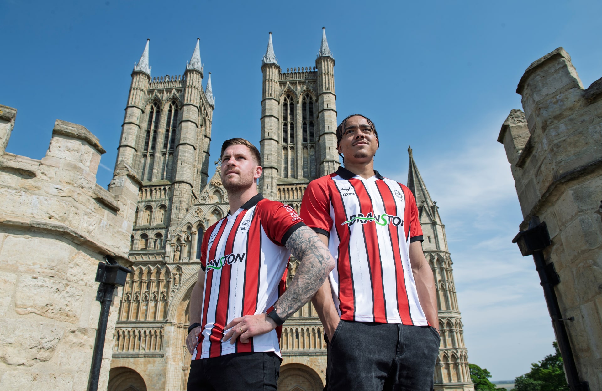
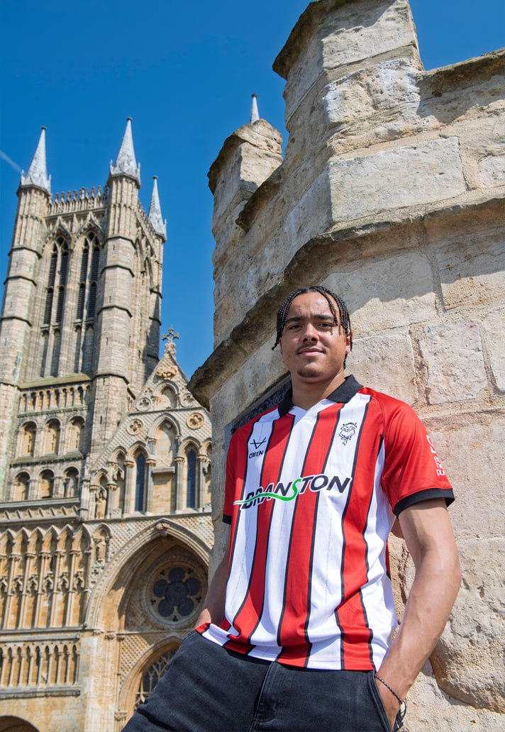
History. Heritage. Binary. Lincoln City have just unveiled their home kit for the 2025/26 season, and it’s a design that fuses club tradition with a tip of the hat to one of the city’s greatest minds – the legendary mathematician George Boole.
In amongst the melee of kit drops at this time of year, it's always nice to focus on designs that have a bit more of a story behind them. Step forward Lincoln City, who've looked to the history of their home city. Designed by Oxen, their new home strip isn’t just a return to the iconic red and white stripes that fans know and love – it’s a coded message to the world. Literally. Down the three central white stripes runs binary code spelling out We Are Imps, a digital tribute that links the club directly to George Boole’s groundbreaking work in the 19th century. His development of Boolean algebra laid the foundations for modern computing – from the microchips in our phones to the algorithms running this very website.
Visually, it’s a classic look with a sharp, future-forward edge. Red dominates the sleeves, finished off with a crisp black trim and ribbed cuffs, while that binary code runs subtly through the white stripes. The black collar adds a refined finish to a shirt that balances pitch presence with off-pitch wearability. It’s bold, it’s brainy, it’s brimming with club identity.
Embroidered finishes include the iconic Lincoln City badge and Oxen branding, rounding out a shirt that doesn’t just celebrate the club’s roots – it celebrates the city’s contribution to the digital world. For the Imps, this season, history isn’t just worn on the sleeve – it’s written in code across the chest.


You can pick up the Lincoln City 25/26 home shirt at eliteprosports.co.uk/lincoln-city