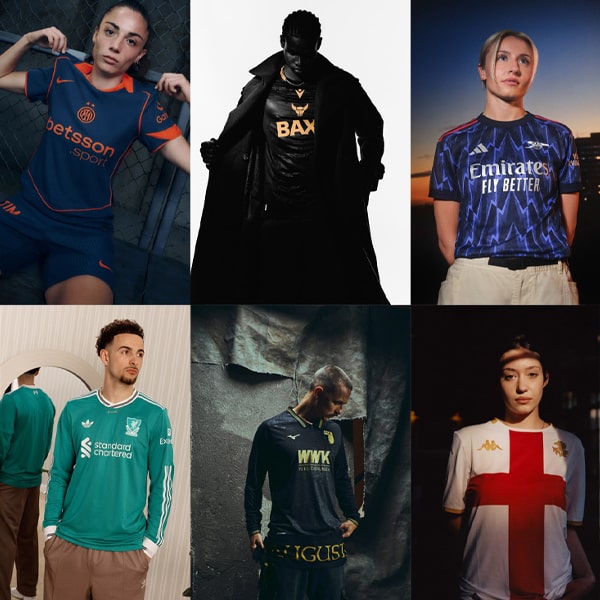
It’s that time of the year when the kit drops are coming thick and fast – so thick and fast, in fact, that it can be hard to keep up, and some absolute pearls can fly under the radar. Not our radar though! Here’s 10 of the best kit drops from this week that you might have missed.
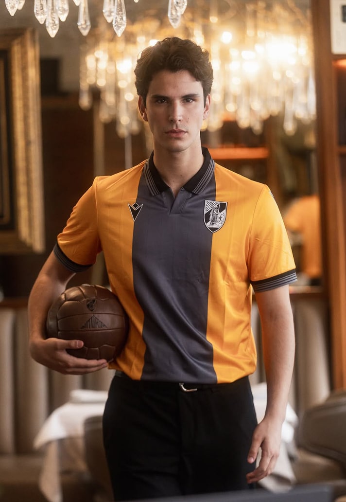
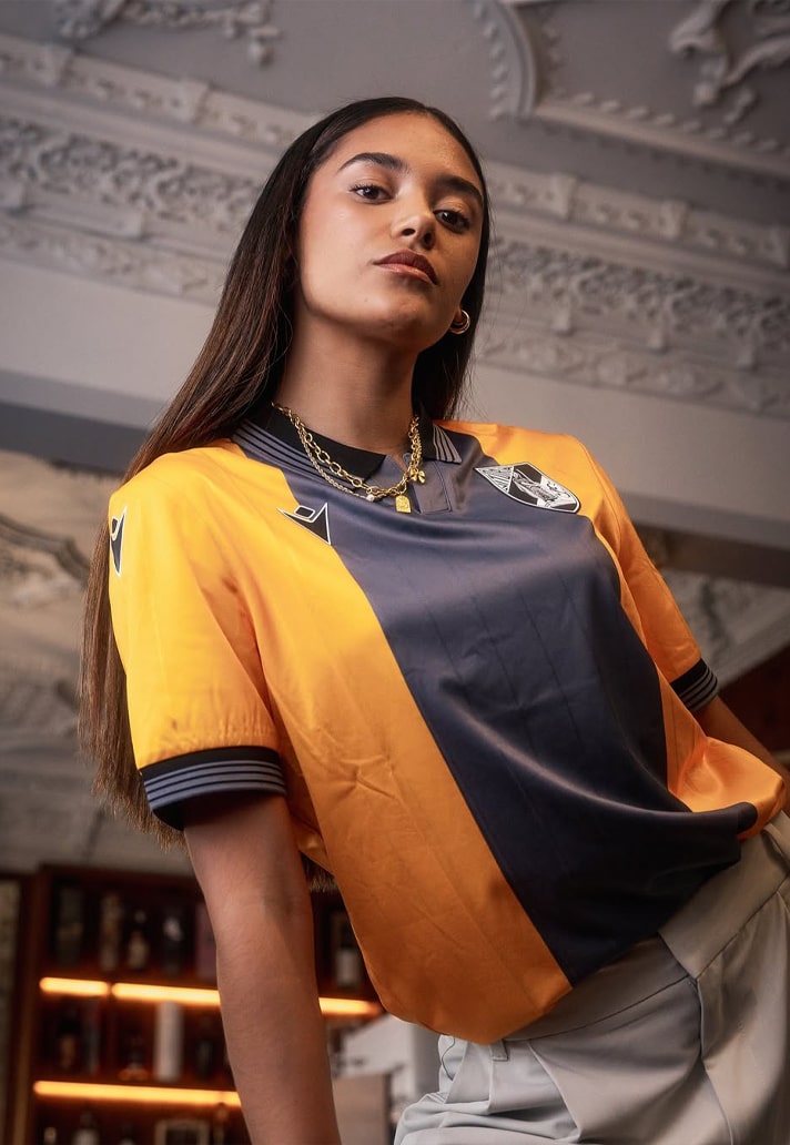
Vitoria SC Third
Just straight up different, isn't it? Honestly, when was the last time you saw an orange and grey kit, done in this execution? The collar, the central stripe – Macron delivering on so many levels that the club didn't even feel the need to iron the shirts before the models slipped them on.
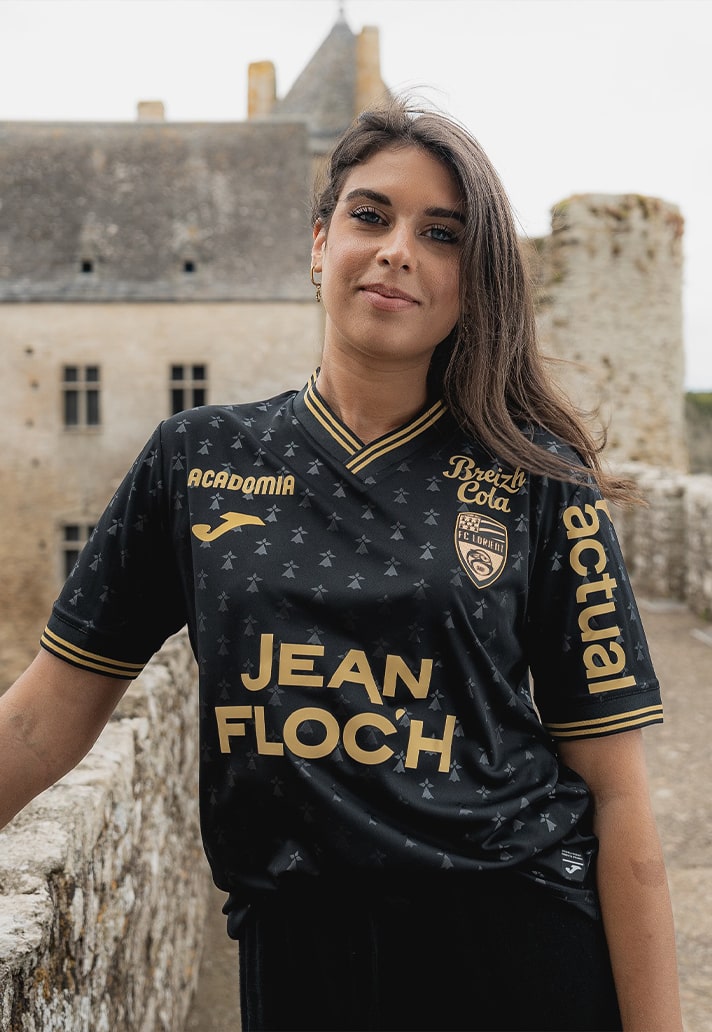
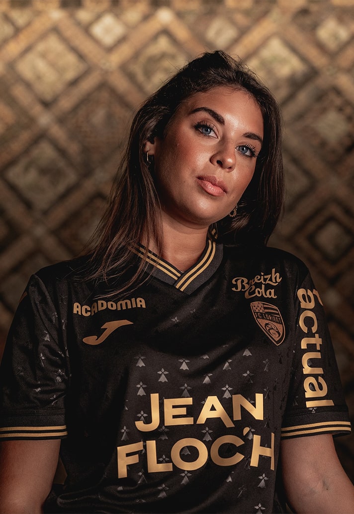
FC Lorient Third
Ah, the old tried-and-trusted black and gold combo – never fails. Sleek, seductive and perfect for a centenary season and the club's return to Ligue 1.
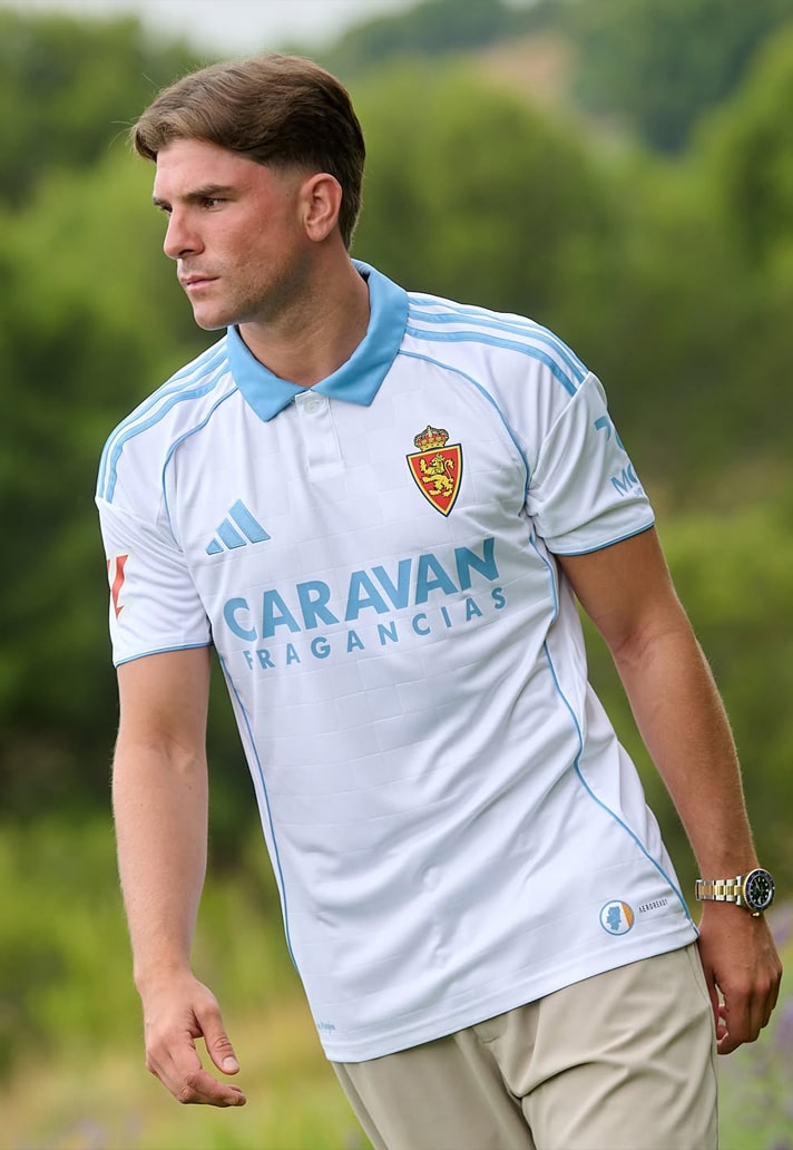
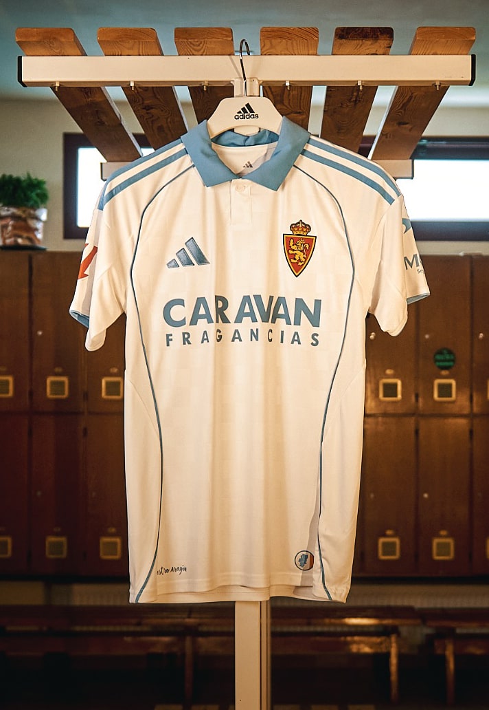
Zaragoza Home
There's a beautiful crossover of busy-being-better and cleaner-being-sweeter going on this season, and this one definitely falls into the latter category, with adidas letting that white and light blue combination do most of the talking. Great to see the sponsor get in line with that too; could've been a deal-breaker.
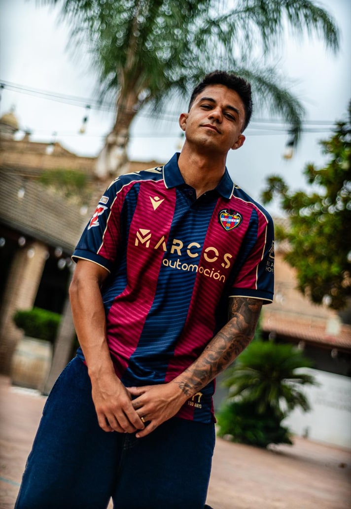
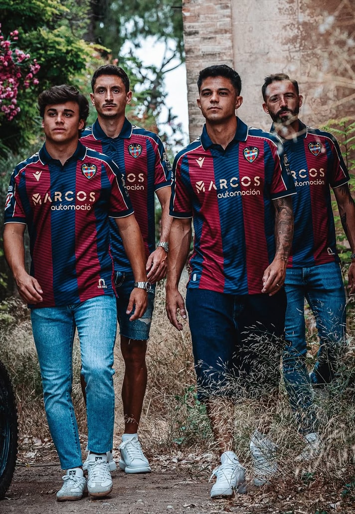
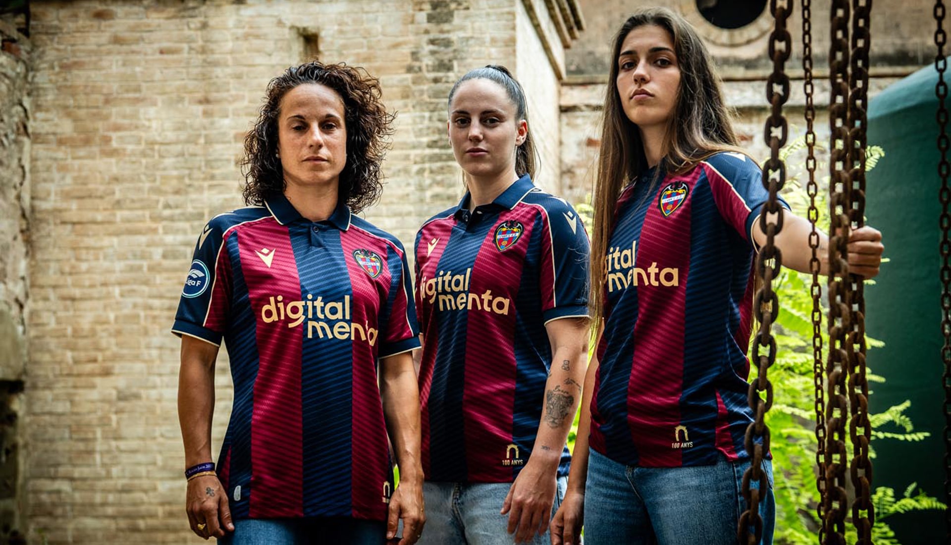
Levante Home
Partners since 2016, Macron continue to do Levante well. This design retains the traditional combination of navy blue and claret, with broad vertical stripes on both the front and back, within which, tone-on-tone, there are fine diagonal lines, lending a rich texture to the overall look. Add a touch of gold and voila!
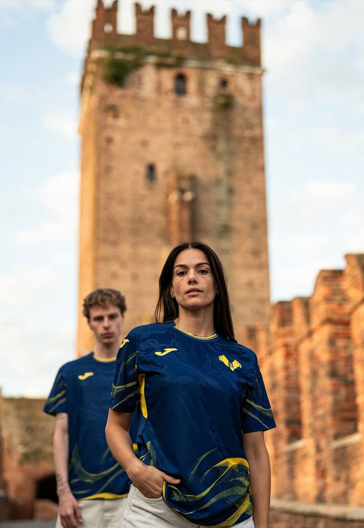
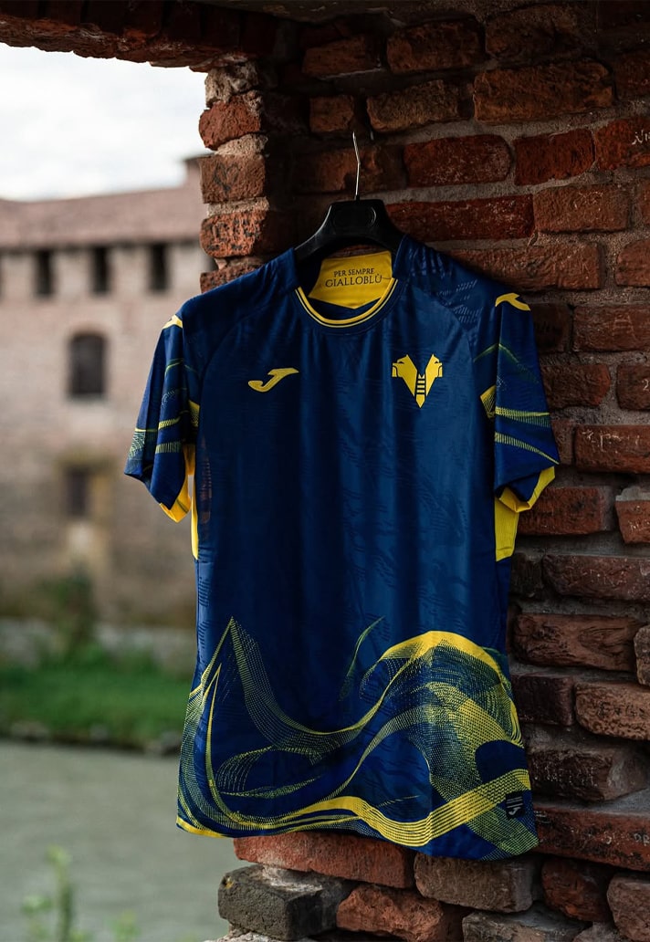
Hellas Verona Home
Now this is the way to mix up tradition and progression. The club's classic blue and yellow colours are used, but they're given a nice contemporary spin that marks it out as pretty unique. Hopefully whatever sponsor the club opt for will fall in line with the yellow.
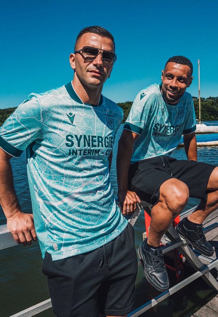
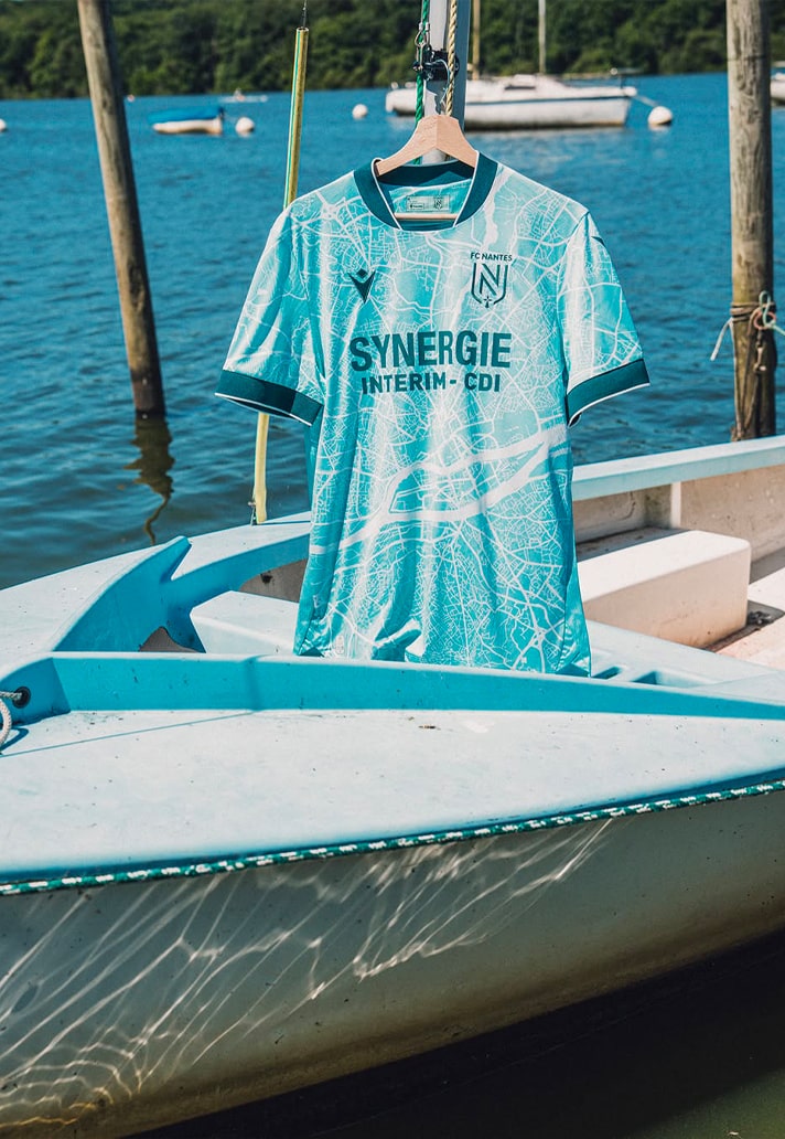
FC Nantes Away
Given the aqua green tone of this shirt and the fact it's shot on water you may be forgiven for thinking it has anything to do with links to the sea or rivers. It does not. The shirt actually features a sublimated print on the front that depicts a detailed map of Nantes in a graphic homage to the club’s roots. Now you know.
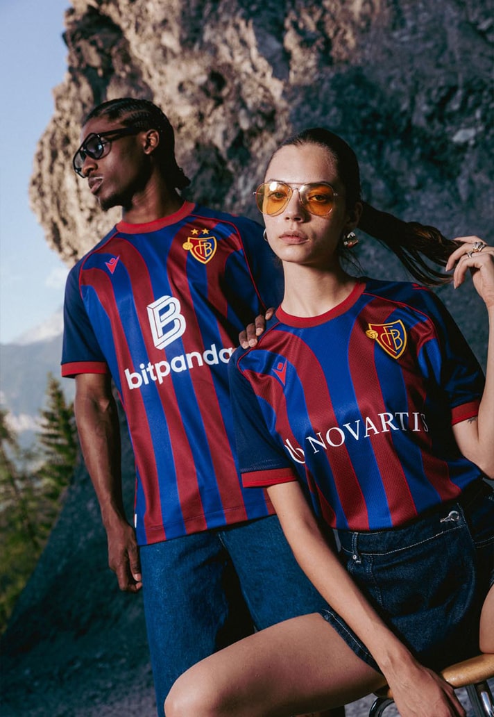
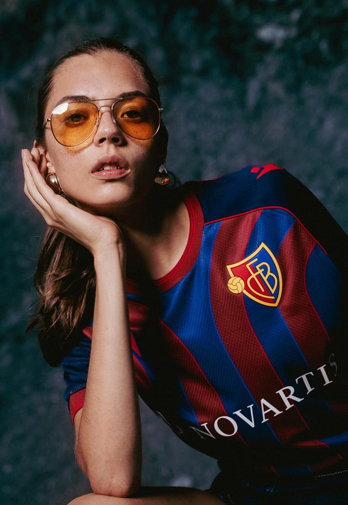
Basel Home
Another great example of how tradition and progression can seamlessly coexist, as Macron take the red and blue stripes of Basel, and flick them out at the top. Simple but effective. Women's sponsor looks far better.
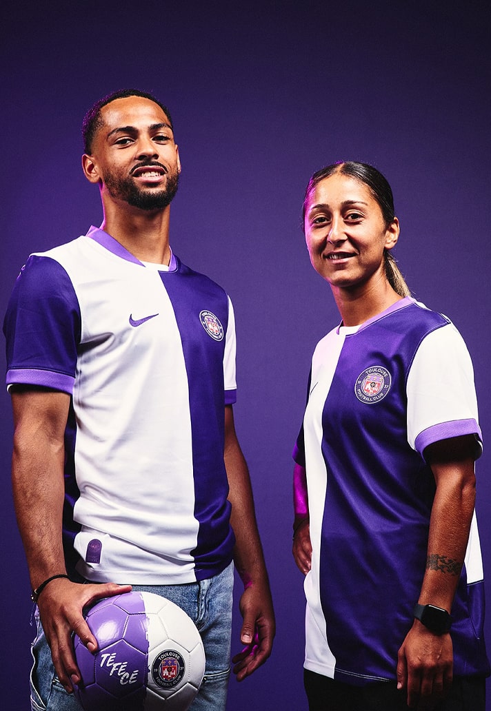
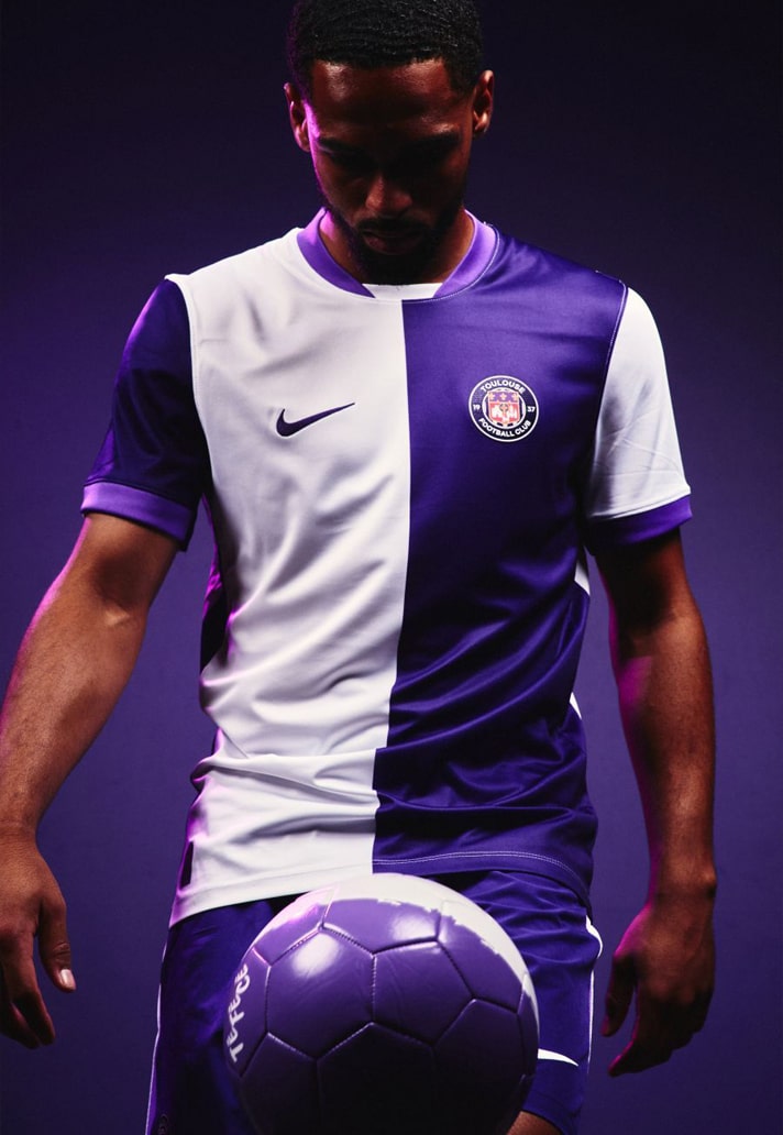
Toulouse Home
We spoke previously about clean designs with Zaragoza, and this is another one. That 50-50 split of white and purple is so effective. Will probably get ruined by a garish sponsor at some point, but for now just sit back and admire.
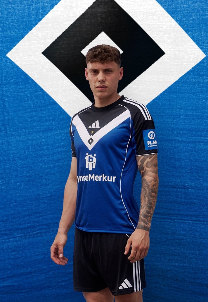
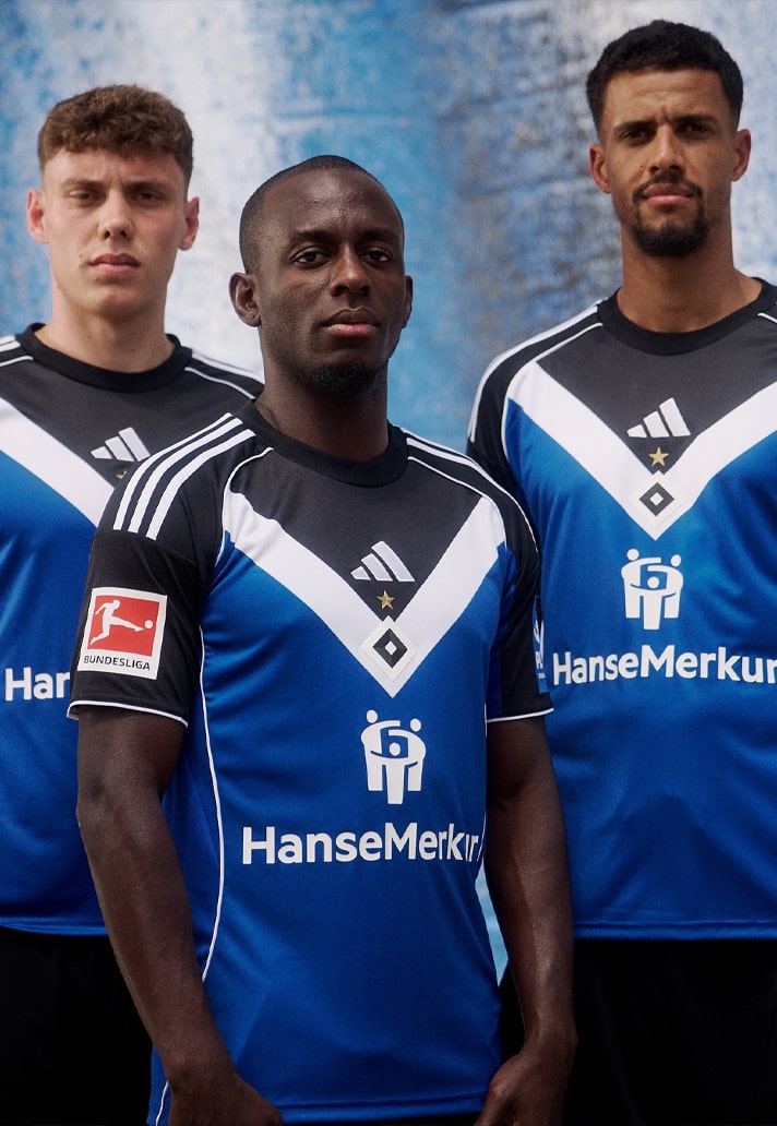
Hamburger SV Home
This is one of those designs that just smacks you in the face and demands your attention and admiration. The central alignment of Three Stripe branding, club crest and sponsor all riding on top of that chevron... [chef's kiss].
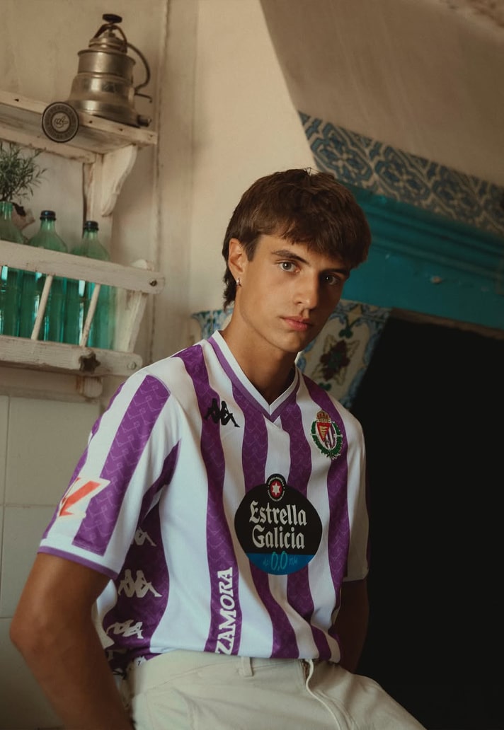
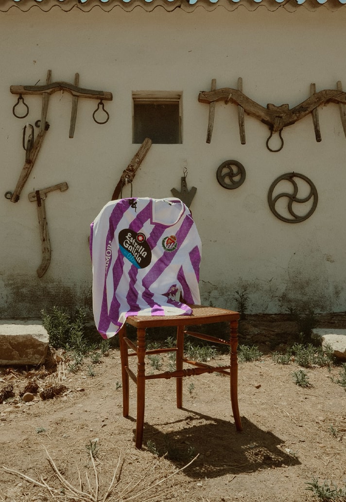
Real Valladolid Home
You can always bank on Valladolid and Kappa for a solid set of kits, and 25/26 is shaping up as per. The second combination of white and purple on this list, here taking up stripe formation, and elevated by the Kappa banda formation on the sides.
Shop 25/26 season replica at prodirectsport.com/soccer