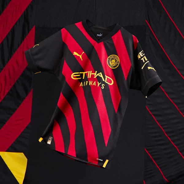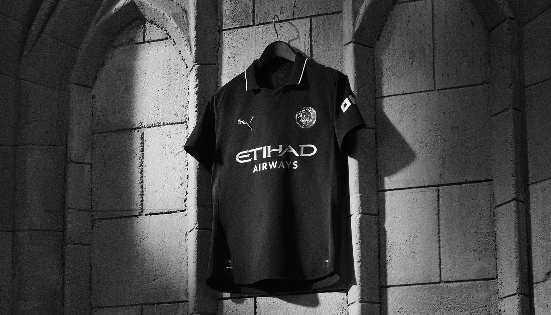
Manchester City and PUMA have unveiled the club’s 2025/26 away kit — a stripped-back, monochromatic statement piece that merges history with innovation.
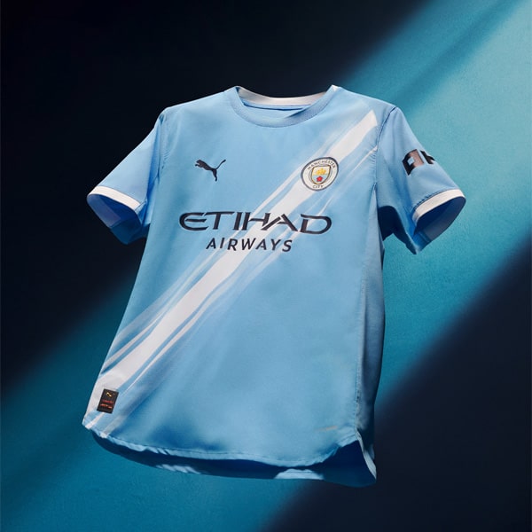
Manchester City's home shirt design for 25/26 from PUMA reaches deep into the archives, taking inspiration from the earliest known City kit worn back in 1884, when the club called Gorton home. Back then, things were different. No Treble. No Etihad. No Haaland hat-tricks. Just grit, ambition, and the beginnings of a footballing identity that would one day define an era. For 25/26, that humble origin story is reimagined with clean lines and confident execution, bringing the past forward with a modern twist.
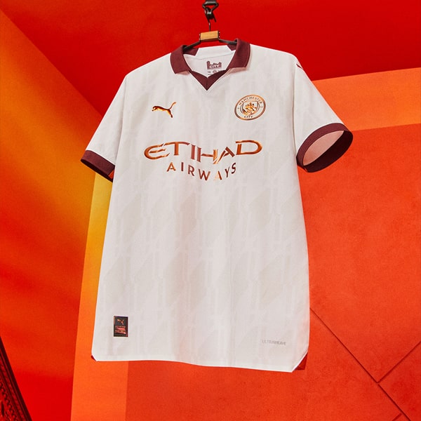
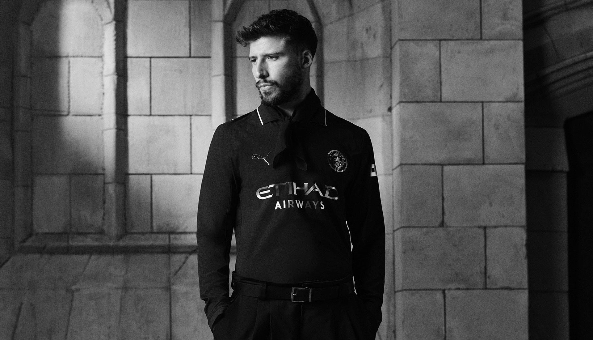
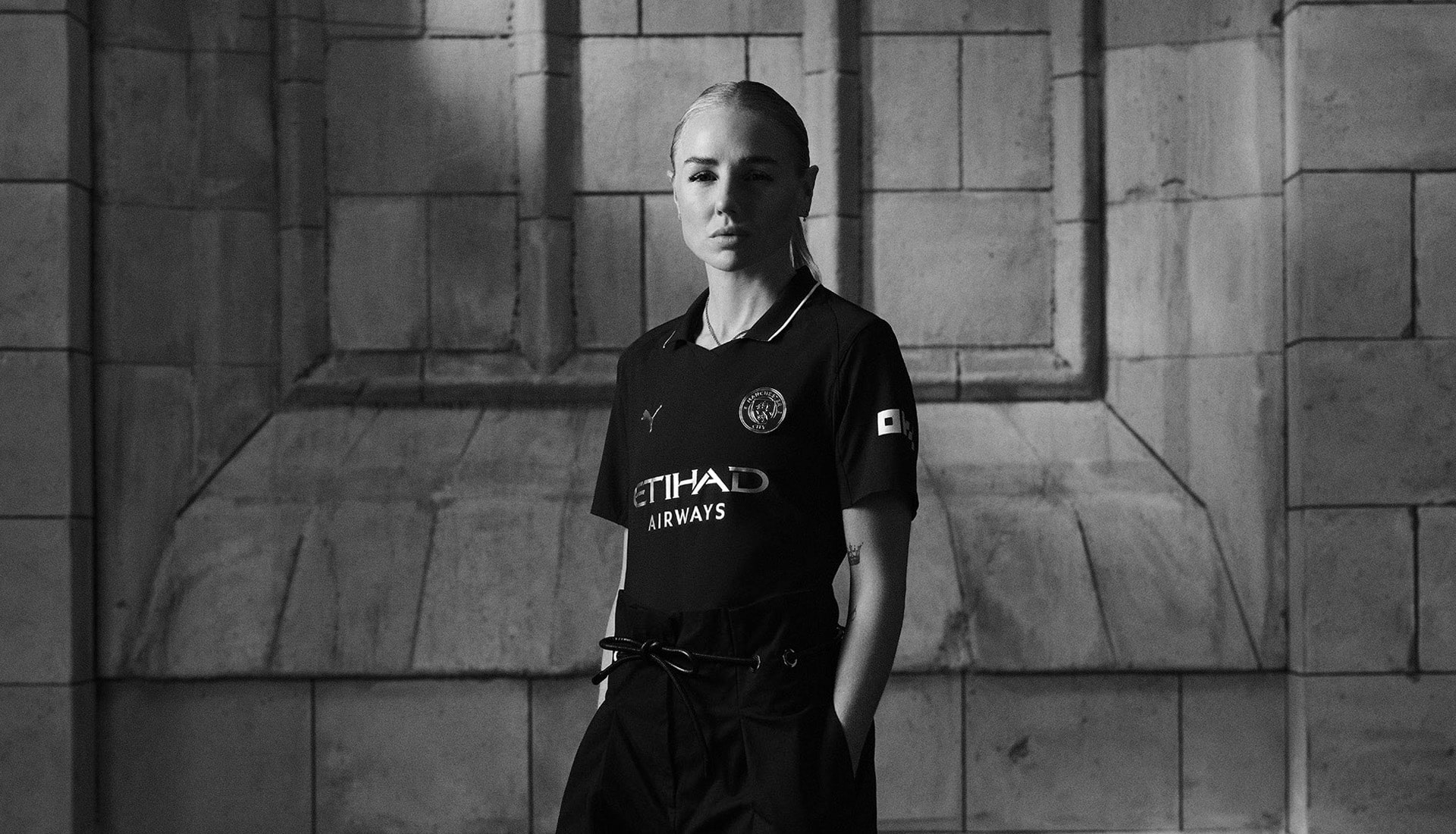
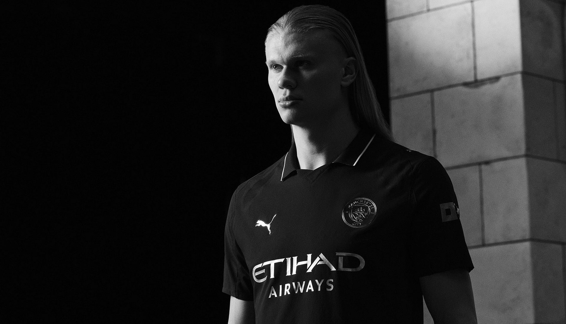
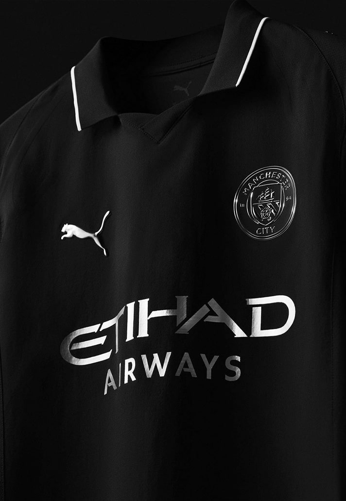
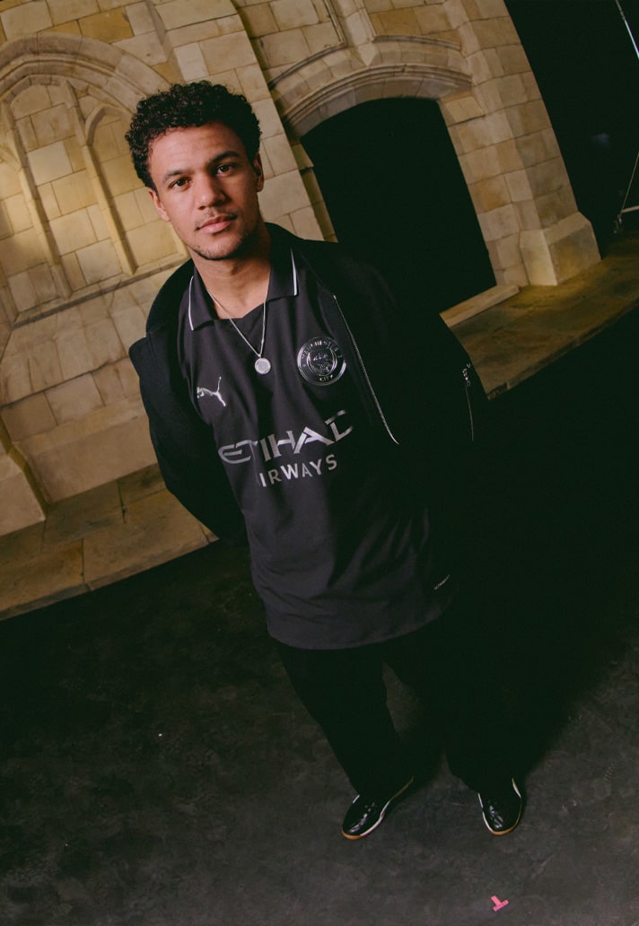
The new away shirt arrives dipped in all-black — sleek, sharp, and unapologetically minimal. Metallic silver detailing throughout — from the PUMA logo to the iconic club crest — adds a contemporary gleam to the old-school base, catching the light like a trophy lifted under floodlights. It's a quiet flex. A whisper that says, “we’ve been here since the start.”
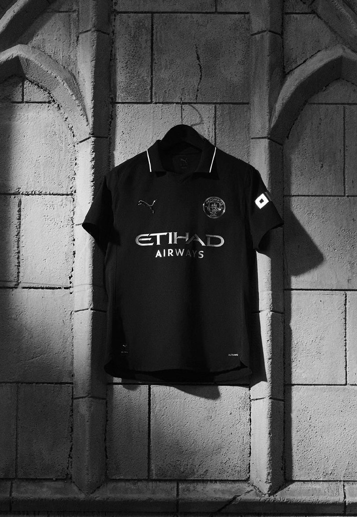
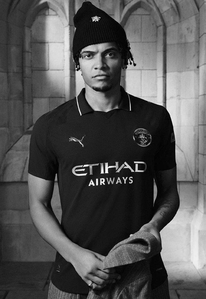
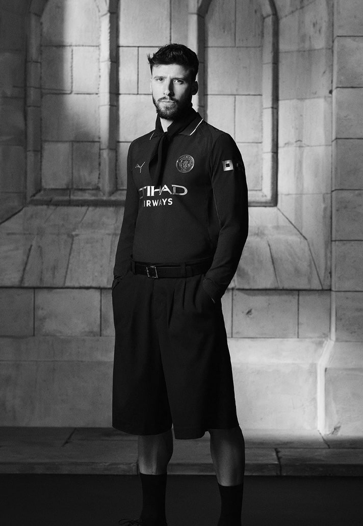
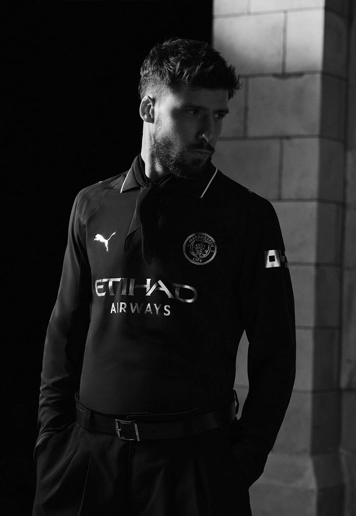
The shirt is finished with a polo collar, subtly trimmed in silver, dialing up the class without overplaying the nostalgia. It’s heritage with swagger. Timeless with teeth.
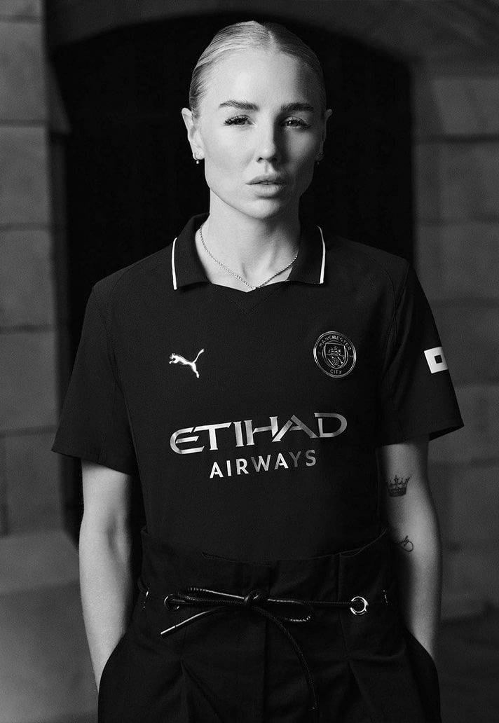
As always with City, it’s not just about looking good — it’s about identity. This kit isn’t just a throwback. It’s a tribute to the early Cityzens, and a reminder that before the silverware and the world-beating football, there was black, there was steel, and there was belief.

Pick up the Manchester City 25/26 away shirt at prodirectsport.com/soccer