Ahead of the new USL season, Oakland Roots have revealed their new Primary and Secondary kits from Charly, with designs rooted in myth, movement and the town.
There are a few clubs around the world whose kit releases I always look out for, and USL side Oakland Roots SC are firmly among them. The USL can feel a little like the Wild West of kit design – less bound by long-standing tradition or restrictive, league-wide supplier deals that sometimes limit creative freedom. That sense of openness makes it a fascinating space to watch.
Clubs are free to explore and express their evolving identities, building shirts around meaningful stories and local connections. The results are often bold, inventive and refreshingly original. Last year, no one did it better for me than Oakland Roots with their outstanding third kit, so naturally I was eager to see what they would deliver with their new primary and secondary offerings for 2026.
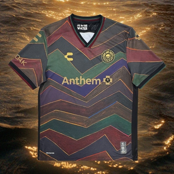
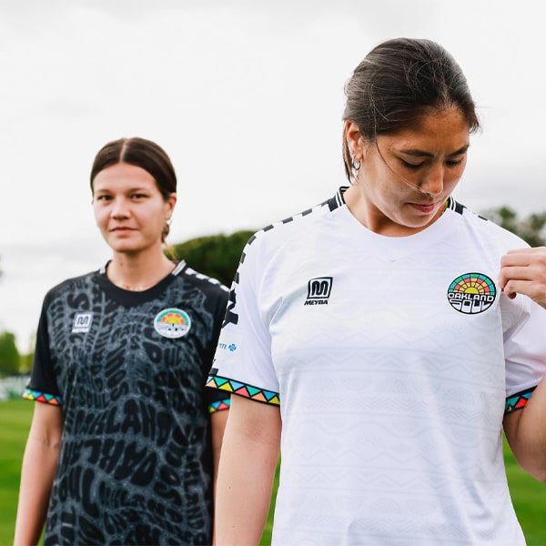
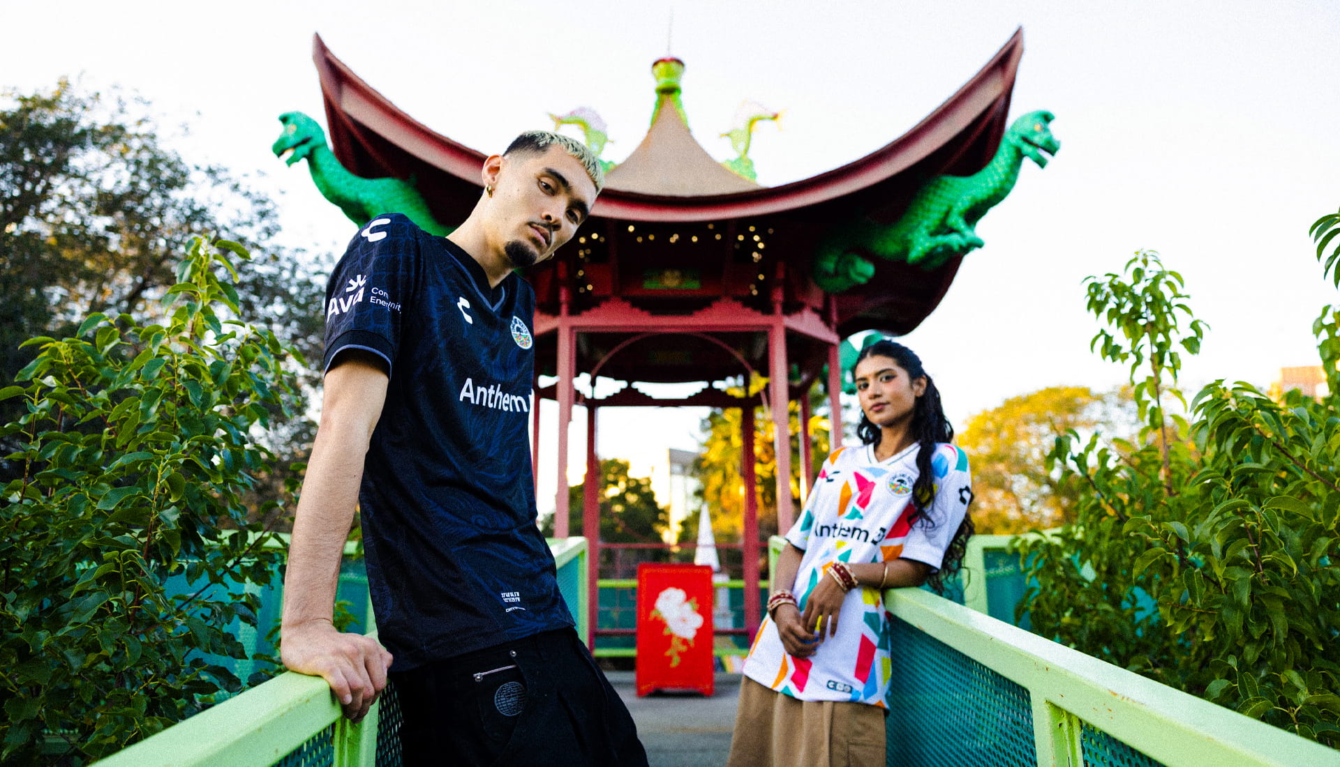
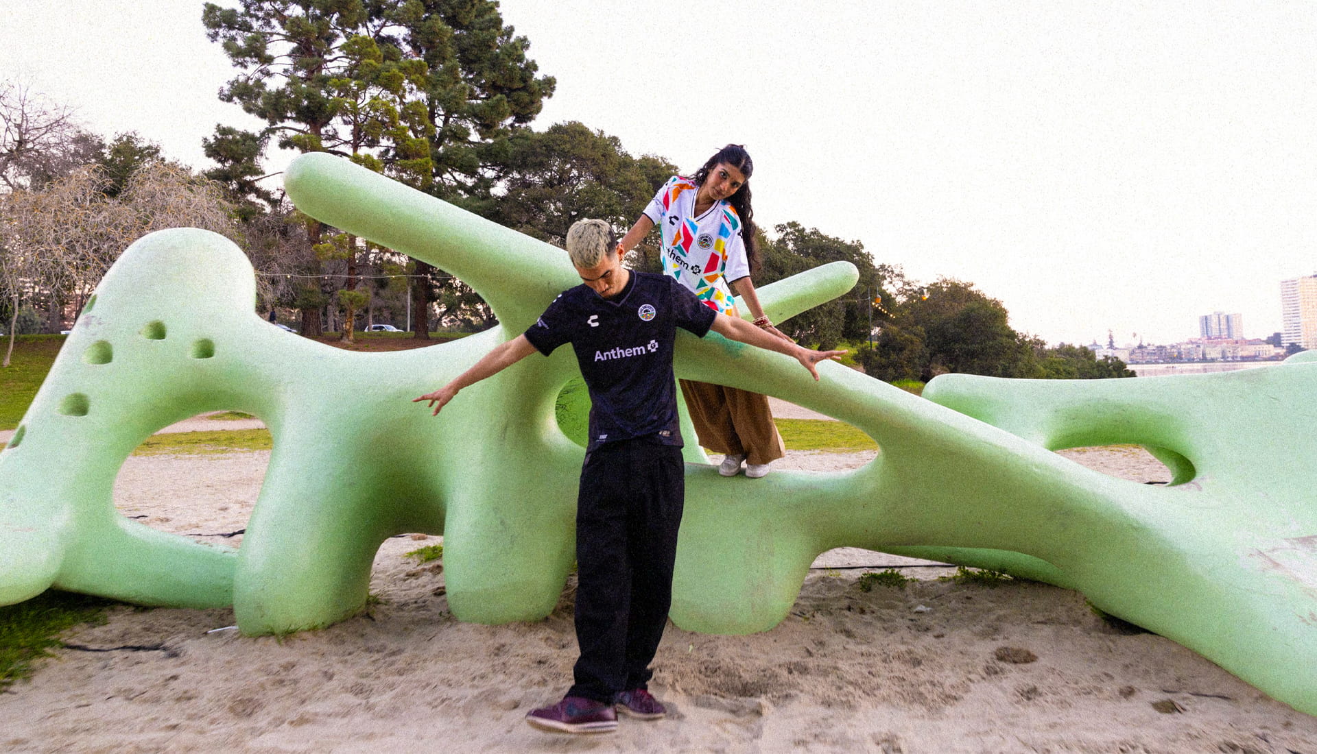
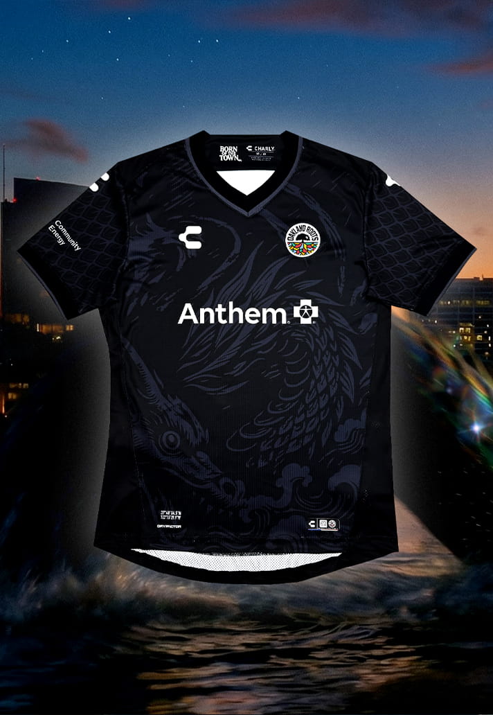
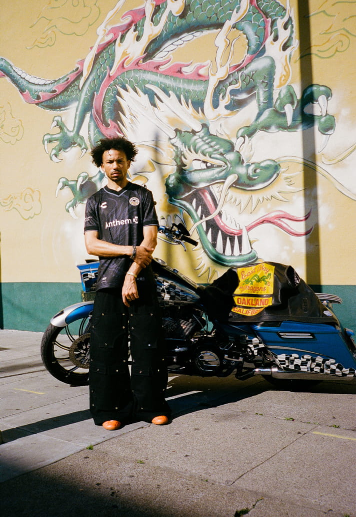
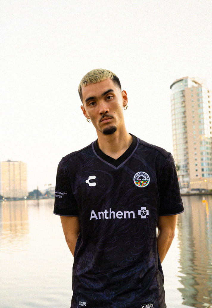
For 2026, The Roots anchor their primary kit in local folklore with “The Oak-ness Awakens” – a concept rooted in the myth of the Oak-ness Monster, said to dwell beneath the surface of Lake Merritt.
“Oakland always tells its story through culture, creativity, and community,” said Chief Marketing Officer Edreece Arghandiwal. “This jersey is inspired by Lake Merritt and the belief that no matter what’s beneath the surface, something strong always rises. Honoring a place so vital to the spirit of The Town made this kit deeply personal.”
It’s a compelling starting point. Stories of a mysterious, serpentine presence in the lake have lingered for decades – glimpses in the corner of the eye, ripples moving against the wind, shapes disappearing as quickly as they appear. Whether dismissed as reflection or embraced as folklore, the myth has endured because it belongs to Oakland.
Here, the Oak-ness Monster becomes metaphor: unseen by many, but deeply felt by those who know. A symbol of resilience, of quiet strength, of something powerful shaping the surface from below.
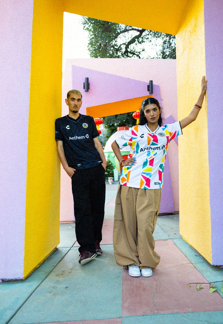
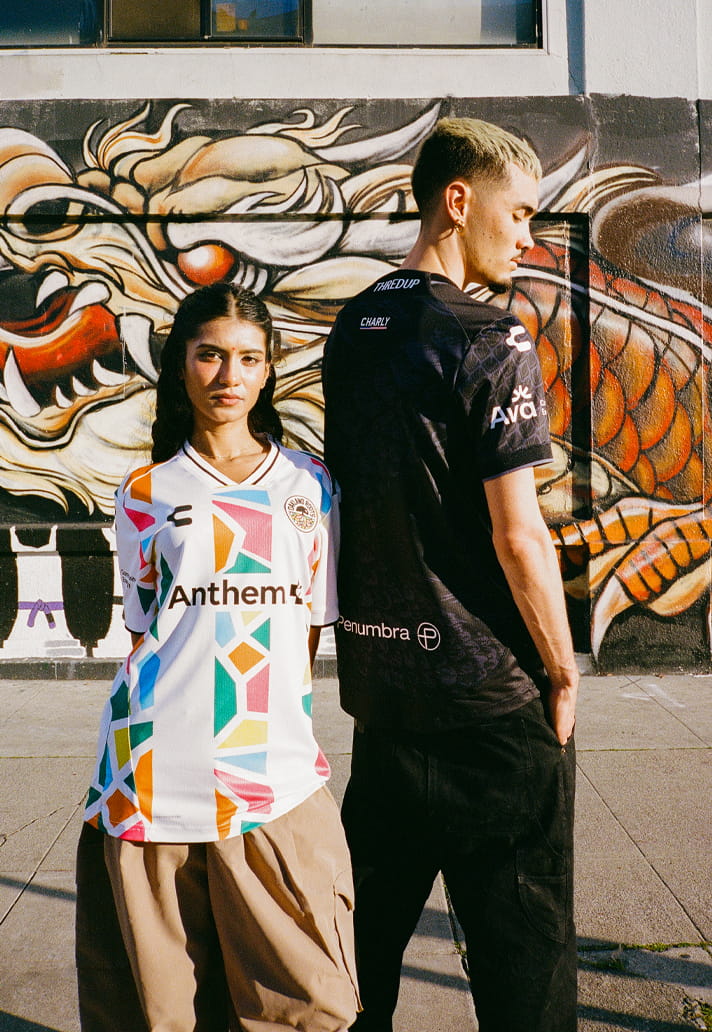
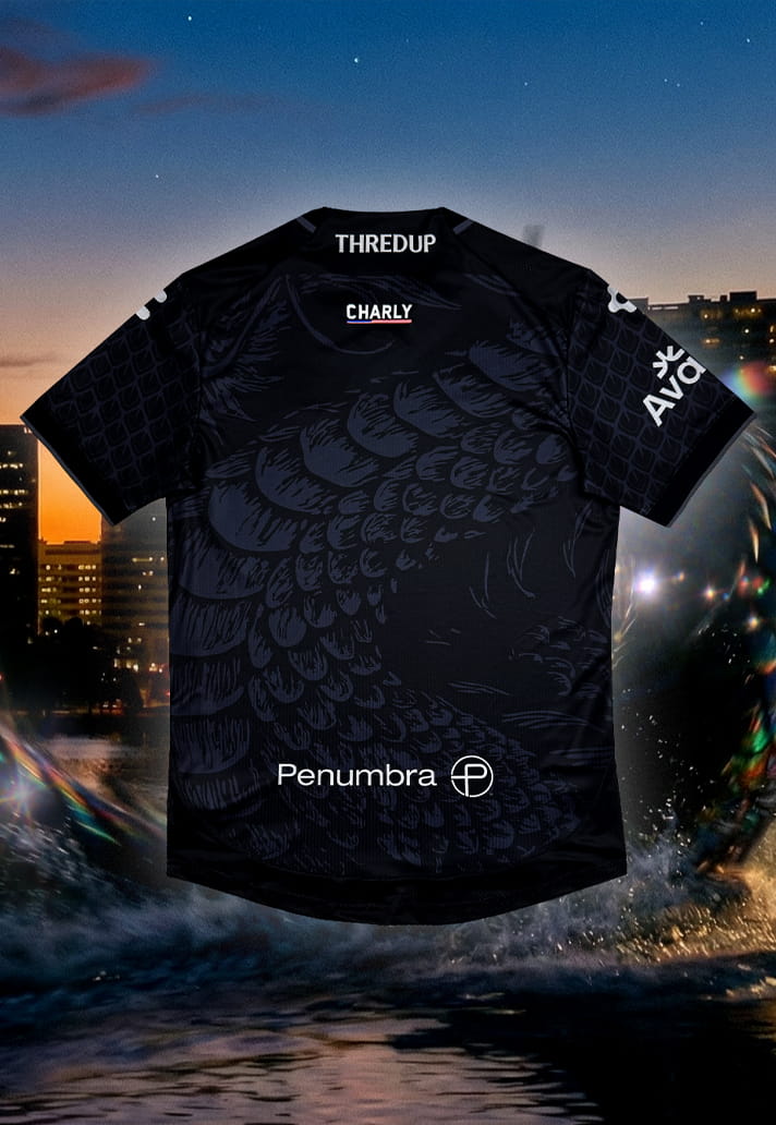
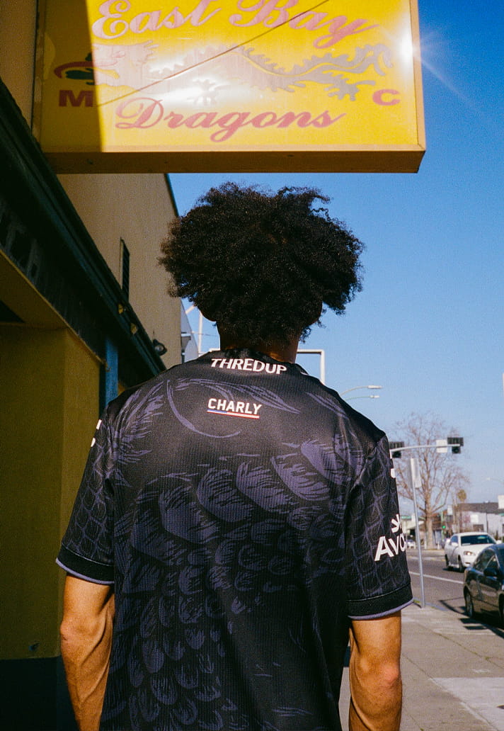
The shirt itself reflects that subtlety. A deep matte black base is overlaid with a gloss-black ripple pattern, mimicking the movement of water. Hidden within those ripples is an abstract dragon-eel hybrid – the Oak-ness Monster – visible only in certain light. Silver detailing sharpens the crest, numbers and trim, while the inner collar reads “Born of The Town,” with the coordinates of Lake Merritt etched beneath – myth grounded in geography.
It’s intelligent, layered design, and I love the restraint. The storytelling is thoughtful and authentic, and the execution is refined. If there’s a slight drawback, it’s that the very subtlety that makes it so conceptually strong also softens its visual punch. From a distance, it reads simply as a black kit. The reward comes only when you look closely, which is admirable in theory, though perhaps a touch understated in practice. Still, there’s something fitting about that: a shirt about what lies beneath the surface shouldn’t give everything away at first glance.
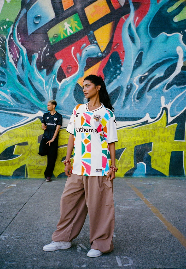
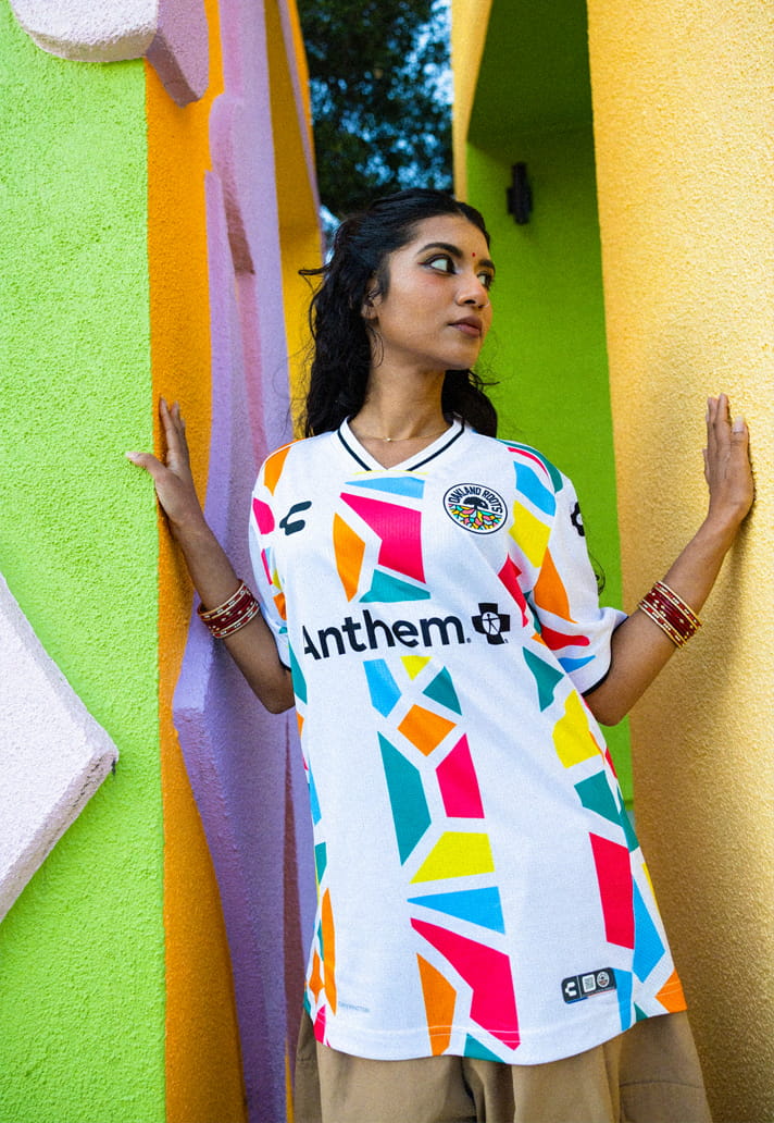
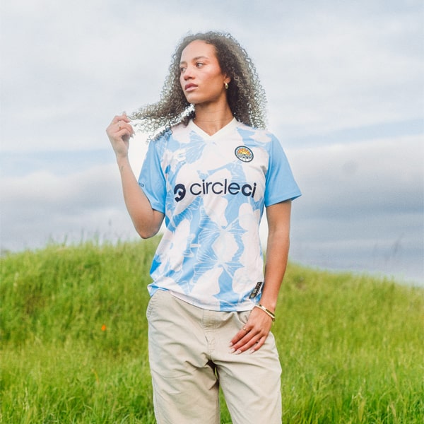
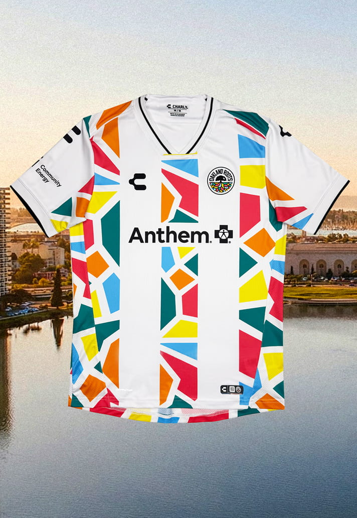
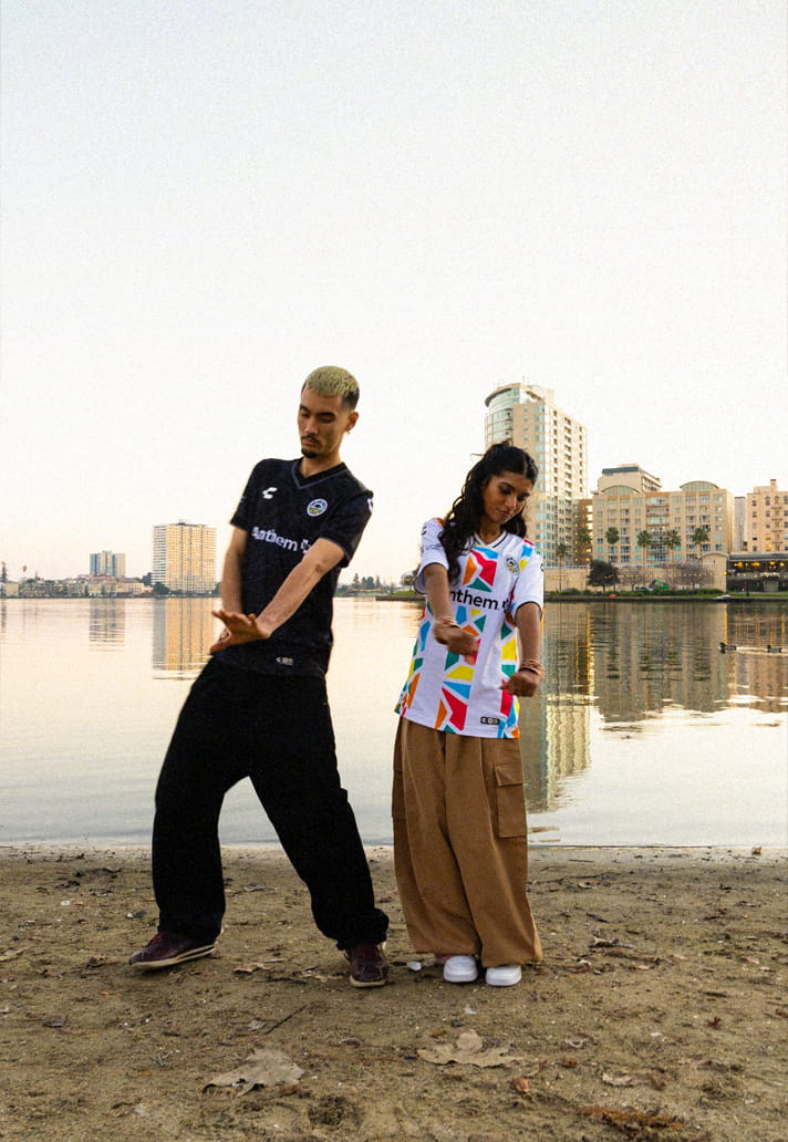
If the primary kit lives in shadow, the secondary shirt steps into the light.
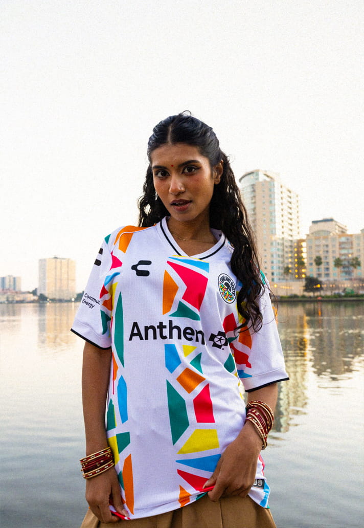
“Mosaic in Motion” acts as the daylight counterpart – flipping last season’s black base to white and leaning into colour, culture and connection. Where the 2025 primary felt like a night mural, this feels like morning: vibrant, open and optimistic.
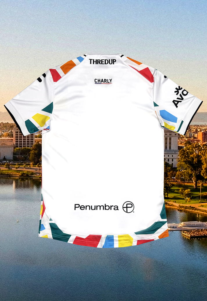
A white base plays host to a striking mosaic of geometric shapes, forming a kaleidoscope of colour that symbolises diversity and unity. The full-colour crest pops against the lighter canvas, while subtle mosaic detailing on the collar and sleeves ties everything together. In many ways, it feels like a continuation of a visual language established over the past two seasons – stable, recognisable, and unmistakably Oakland.
There’s comfort in that continuity. The club clearly understands its identity and isn’t afraid to build on it. If I were being gently critical, I’d say that because this design evolves directly from last season’s primary shirt, it perhaps doesn’t land with quite the same freshness it might have had as an immediate follow-up. By stretching the mosaic narrative across multiple years, some of the initial impact is diluted.
That said, the execution is still strong, and as a standalone piece it’s bright, wearable and rich with meaning – a celebration of Oakland’s multicultural soul and forward-looking energy.
While the shirts themselves may not quite scale the heights of last season’s standout third kit, the wider creative direction absolutely reinforces why Oakland remain one of the most compelling clubs in American kit culture.
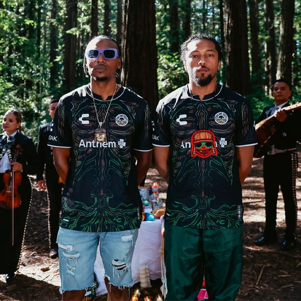
To launch the 2026 range, Oakland Roots partnered with Sun Creature Studio, the multi-award-winning and Oscar-nominated animation house known for its narrative-driven craft. The collaboration sits perfectly at the intersection of sport, fashion and folklore.
“Collaborating on something that sits at the intersection of sport, fashion, and folklore is something that made us really excited,” the studio said. “Drawing from Oakland’s local mythology and energy, the animation is designed to be quick, impactful, and full of hidden details. It was a privilege to work with such a great team, and we can’t wait for the animation to take on a life of its own!”
The resulting animated short brings the spirit of both kits into motion, blending myth, community energy and modern animation into something cinematic and distinctly Oakland. More than a straightforward reveal, it tells a story that mirrors the duality at the heart of the club: shadow and light, grit and beauty, past and future.
And that’s ultimately why, even with minor reservations, these kits work. They feel intentional. They feel rooted. They feel like Oakland.
In a league where creative freedom still thrives, Oakland Roots continue to use the canvas of a football shirt to say something meaningful. Whether through hidden monsters beneath matte-black ripples or mosaics bursting into morning light, they’re simply building culture and I continue to be a fan of that approach.
The Oakland Roots 2026 kits are available on the club's online store.