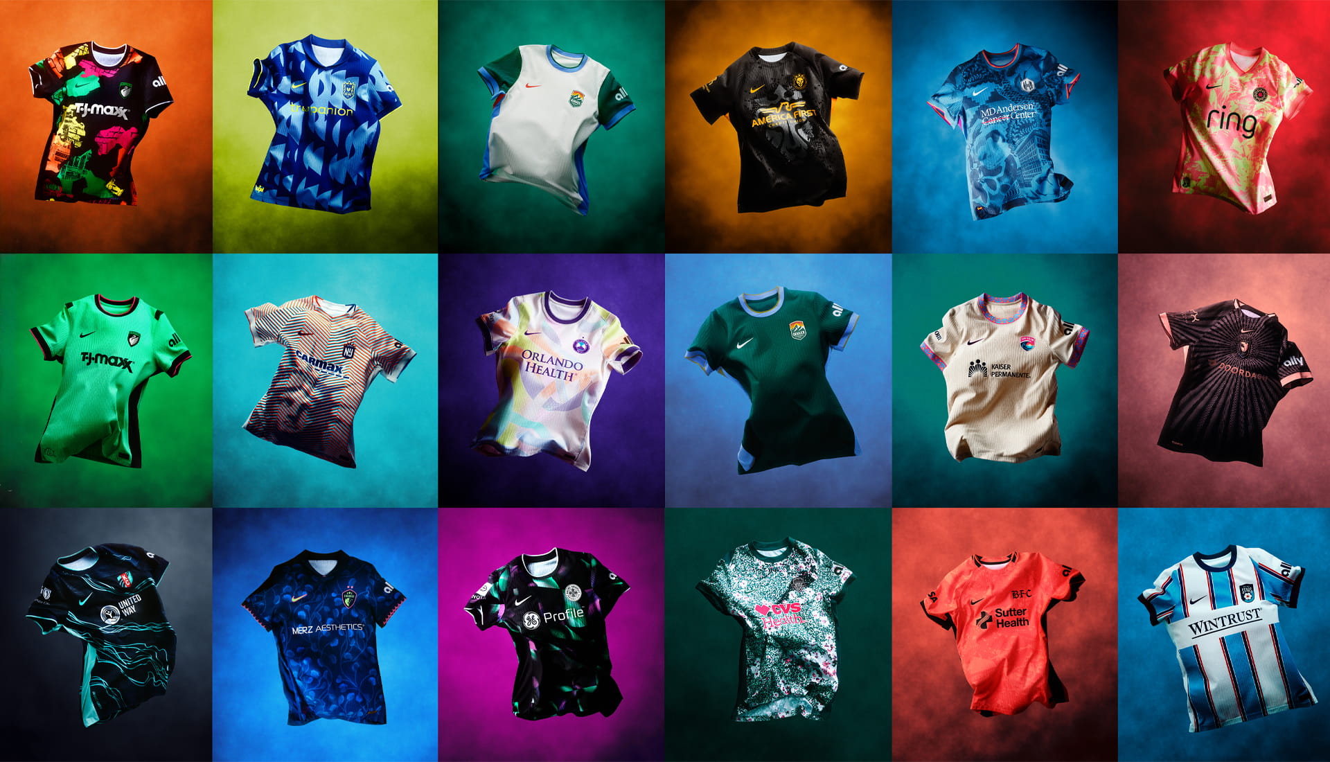
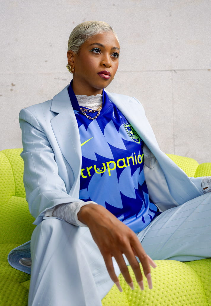
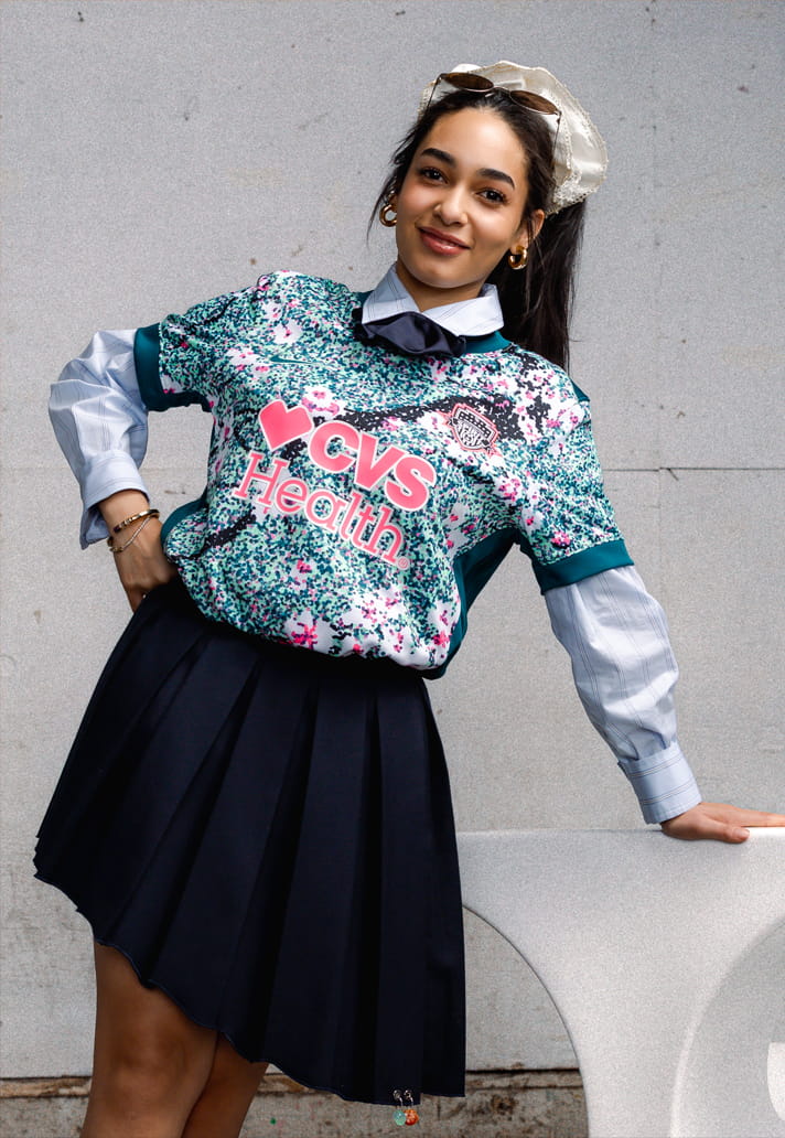
Following on from the reveal of the 2026 MLS kits recently, now it’s the women’s turn, with the reveal of the NWSL kits for the coming campaign. Here you’ll find all 16, ranked from weakest to strongest design.
There’s something about a new season that feels like possibility stitched into fabric, and the 2026 NWSL kit drop might be the boldest expression of that feeling yet. Nike and the league have rolled out a full suite of fresh jerseys, each one carrying the heartbeat of the cities and communities that live and breathe these clubs. From punchy colour palettes to hyper‑local storytelling, this year’s designs wear their identity with pride.
What I love about this collection is how intentionally it blends aesthetic expression with genuine community roots. Across all 16 clubs, you can see the narratives of place: regional motifs, cultural cues, and the kind of subtle details you only spot when you lean in. And with the world’s sporting gaze locked on North America in 2026, the league clearly wanted kits that stand out. As NWSL VP of Consumer Products Katie Eaton put it, these designs celebrate “local pride” while capturing the “energy, culture and passion” driving the league’s rise.
So, with that ethos in mind, I’ve taken it upon myself to rank all 16 of the new 2026 NWSL kits. Some stunned me instantly, others took a second look, and a few… well, you’ll see. Let’s get into it.
16. BOSTON LEGACY
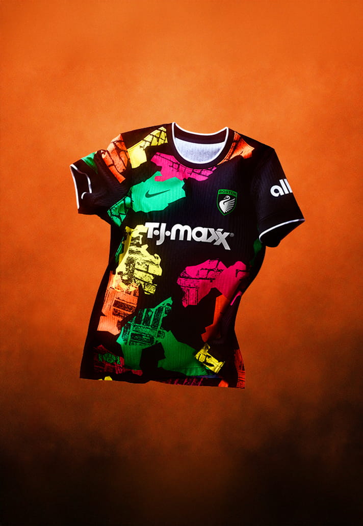
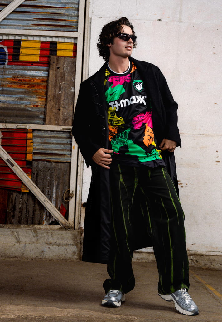
The first of two debut clubs. Named the 'Common Ground' kit, the shapes are meant to represent Boston neighbourhoods and the brick pattern represents the roads. It's a fine line between bold and brash, and this one falls just on the wrong side of the latter for me. Here's hoping the team makes a better first impression on the pitch than this jersey.
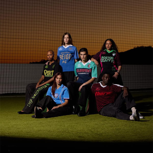
15. SEATTLE REIGN FC
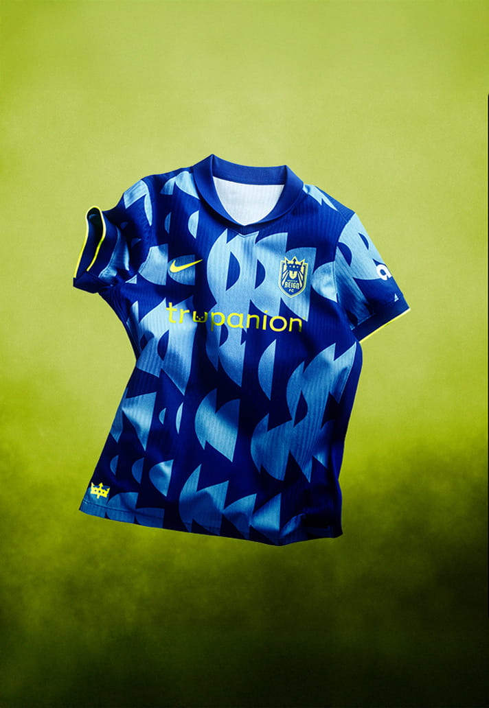
The Surge Kit is supposed to represent legacy in motion, a tribute to the foundation built over time and the next generation stepping forward to carry it on.
I'm just not convinced by the execution here though. Too disjointed.
14. GOTHAM FC
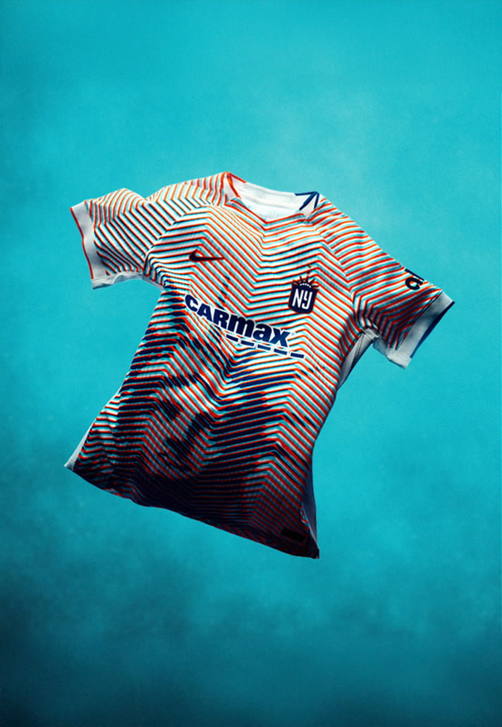
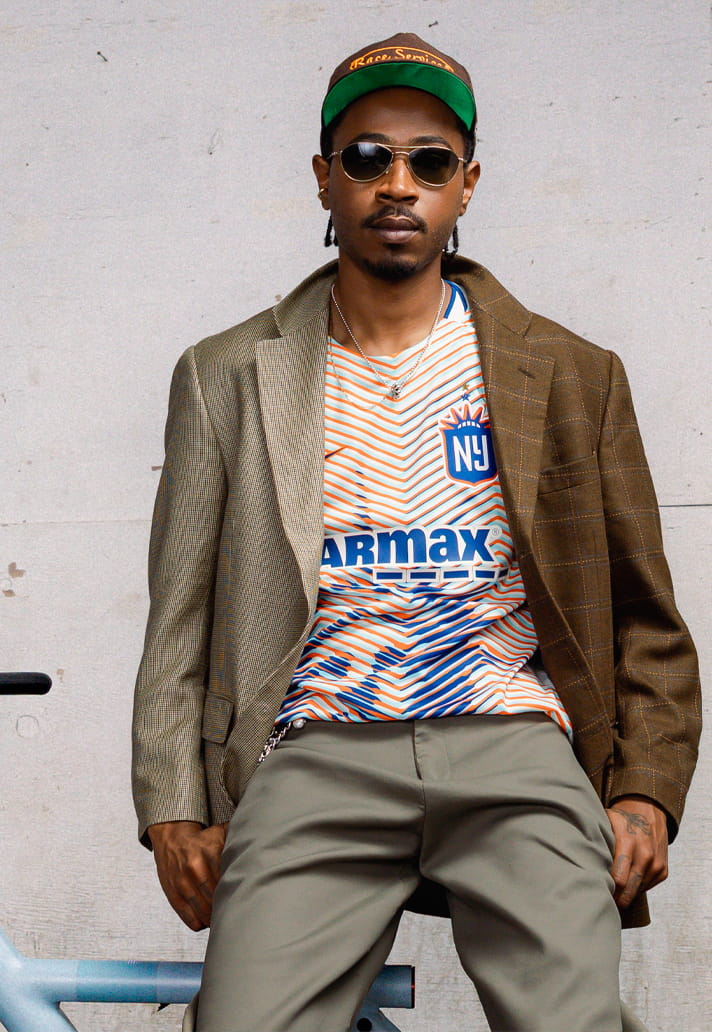
Fairly obvious where the inspiration for the 'Lady Liberty' kit came from. And that's pretty much the problem with the kit design – a little too on the nose.
13. WASHINGTON SPIRIT
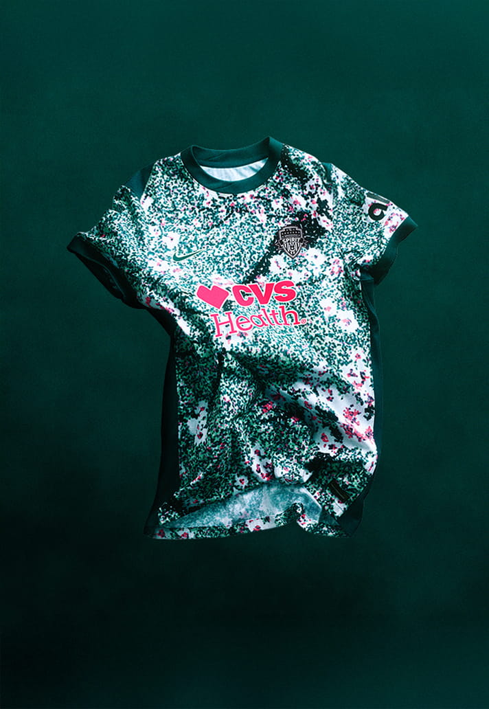
I really like the attempt here with 'The Spirit in Bloom Kit', which features DC’s iconic cherry blossoms and a dark green Potomac River motif. However, in reality it's just a little bit too busy. Like one of those 3D eye puzzles that you stare at for ages without seeing anything.
12. DENVER SUMMIT FC
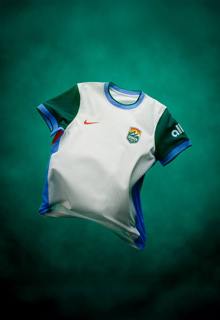
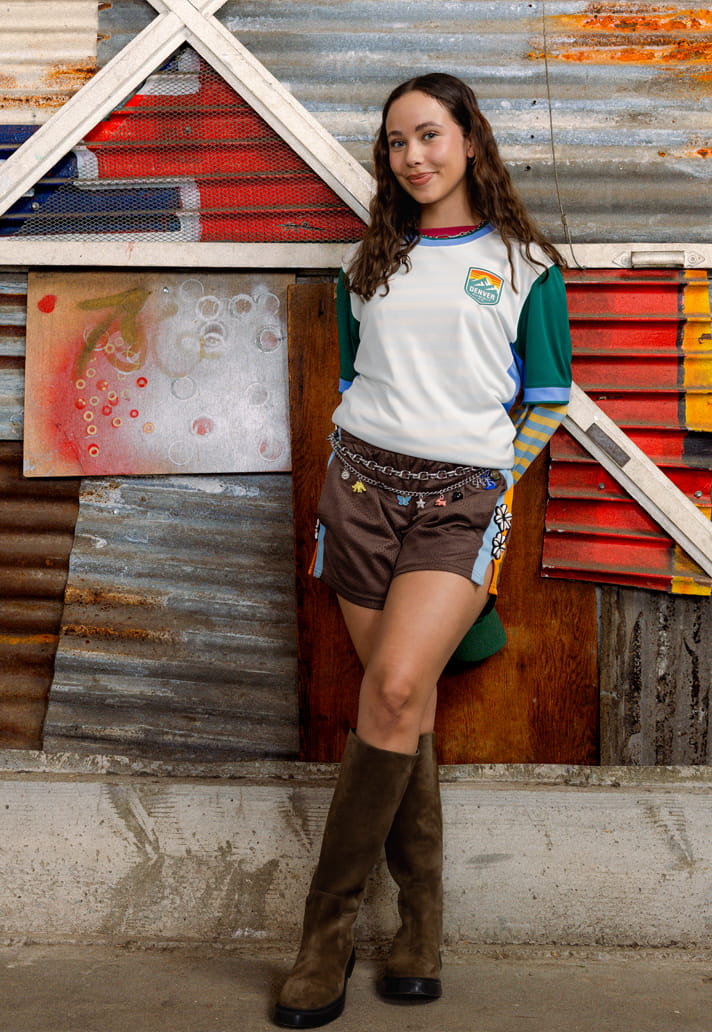
The second debut side for 2026, but they don't fair much better that Boston. Named the 'Summit Snow Kit', it's inspired by fresh snowfall, capturing stillness, clarity, and cold-weather resilience. So a white kit then, yeah? Saved from utter mediocrity by the block colouring of the sleeves and side panels.
11. ORLANDO PRIDE
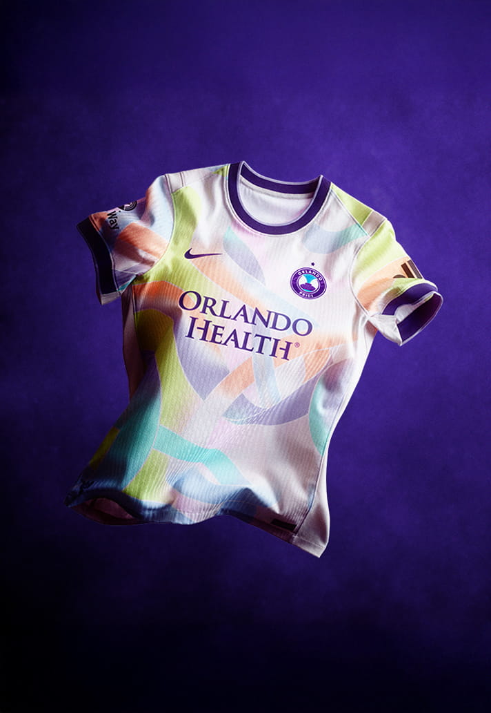
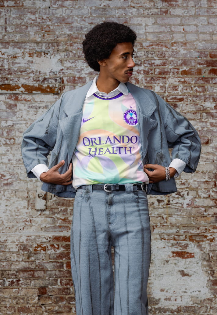
The Orlando Pride 2026 Unity Kit commemorates the 10-year remembrance of the Pulse Nightclub tragedy, symbolising the strength, resilience, and unity of the City of Orlando. If it were just down to meaning and sentiment, then this would take top spot. The meaning is so strong, but the design is a little washy.
10. BAY FC
The strength of Bay FC's Poppy Kit is in that bold primary colour – a first appearance of this colour as a primary kit application in club history. But there's not a lot else to shout about, and one bold colour alone isn't enough in this day and age of kit design.
9. RACING LOUISVILLE FC
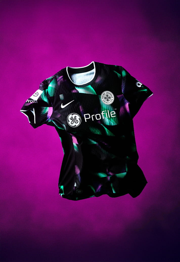
The Disco Kit pays homage to what makes Louisville truly unique – disco balls! (Louisville is famous for its disco balls, once producing 90 percent of the world’s supply during the disco era – now you know!). Askits go though, it's not bad, it's just not great.
8. UTAH ROYALS FC
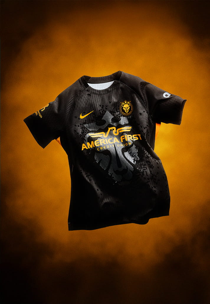
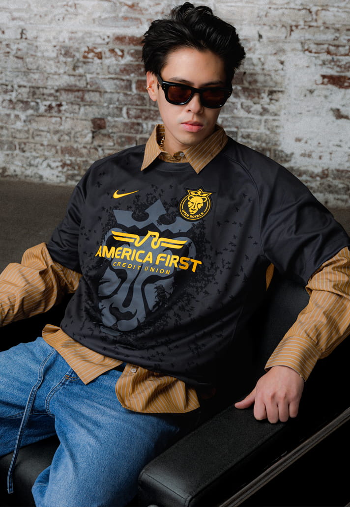
The Swarm Kit honours Utah’s identity as the Beehive State. With that in mind, this sleek number might've benefitted more from leaning into the bee element, rather than giving such prominence to the lion. Love the sublimated detail though and the combination of black and yellow.
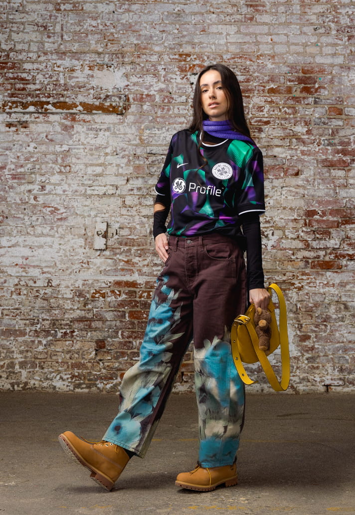
7. NORTH CAROLINA COURAGE
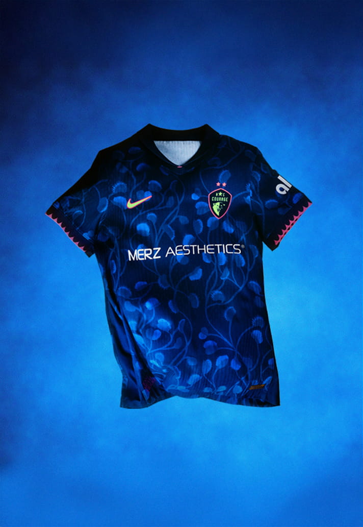
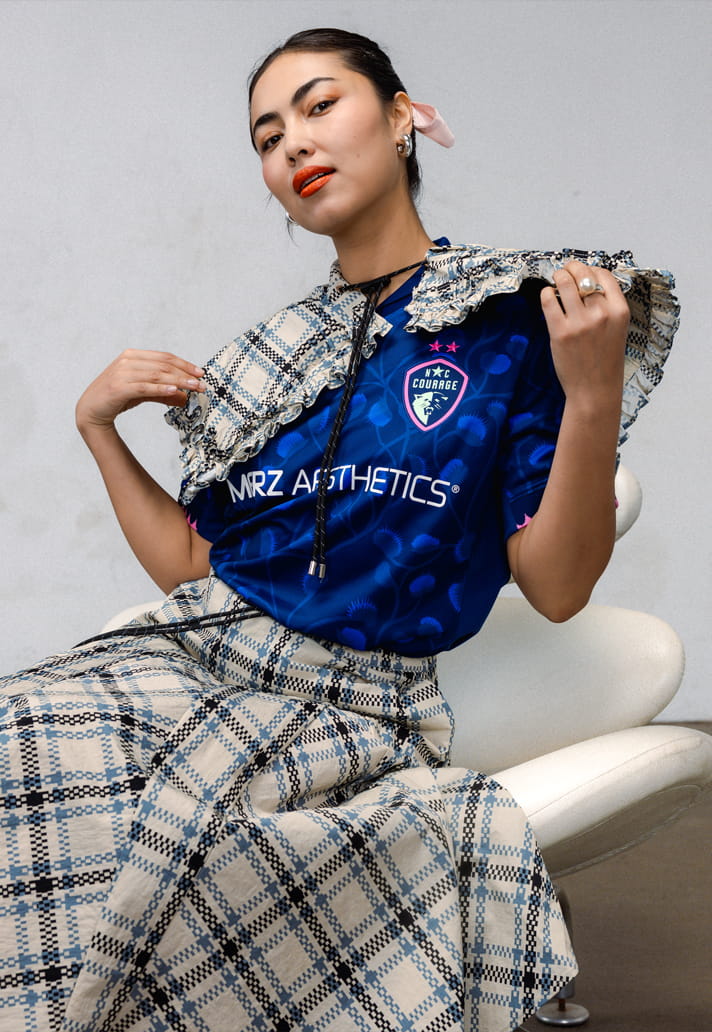
The Venus flytrap pattern here represents evolution, knowing when to wait and when to act. Indigenous to North Carolina and recognised as the state’s official carnivorous plant, the Venus flytrap is woven throughout the jersey in a custom pattern. I love the deep tonal blues of the 'Believe kit', the club's first ever third kit, but should it have been green?
6. PORTLAND THORNS
Striking a harmonious balance of grit and grace, the 'Electric Bllom' kit features a bold pattern of atomic pink and voltage yellow roses. It's a strong and unique look, befitting of the club's identity.
5. SAN DIEGO WAVE FC
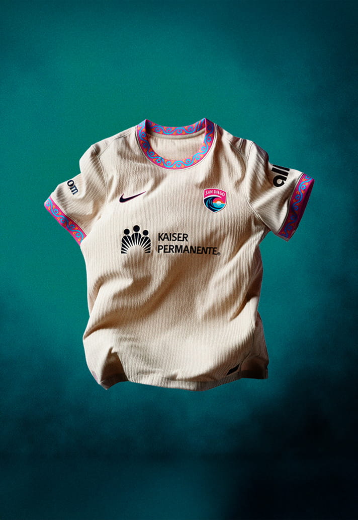
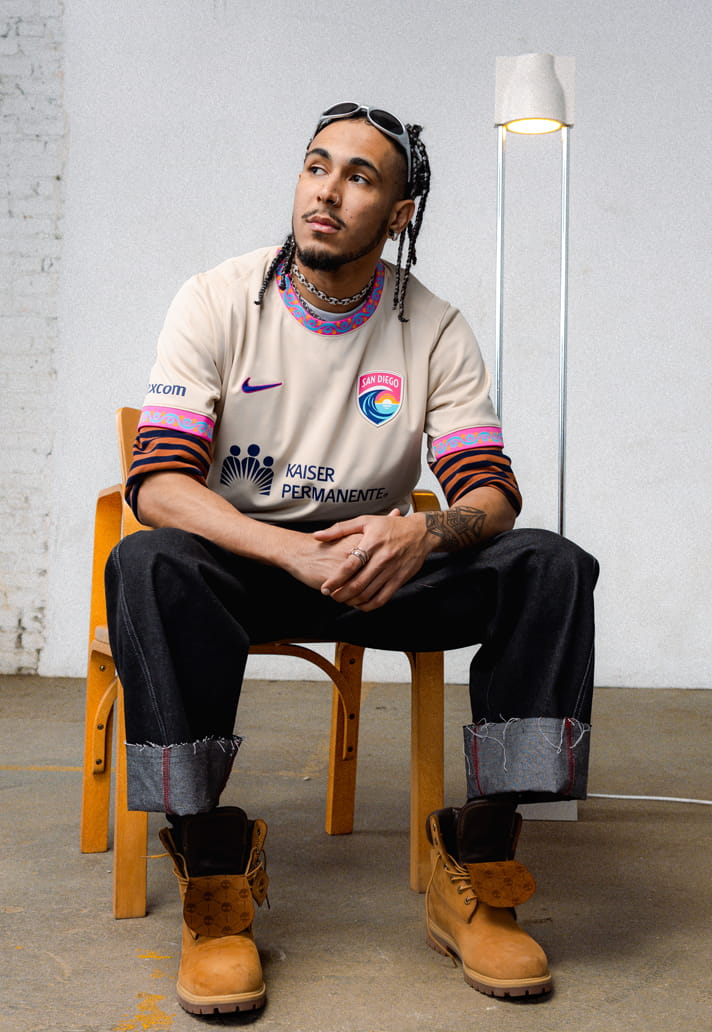
At first glance the 'Balboa Park kit' could be dismissed as a bit bland. But a second look reveals the beautiful work on the collar and cuffs, inspired by San Diego's 1,200-acre urban oasis that has served as the cultural heart of the city since 1868, with the beige base allowing the trim to draw your attention.
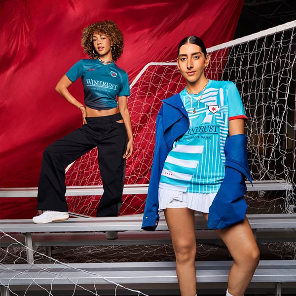
4. CHICAGO STARS FC
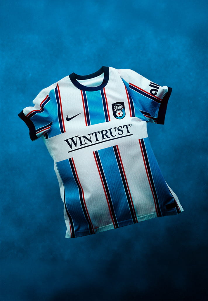
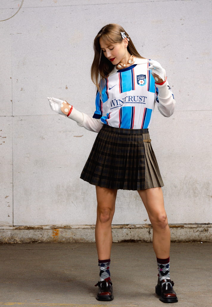
This is a really strong look, drawing inspiration from the city’s most recognisable landmarks and fortitude. It's bold in execution, carrying a hint of traditional jersey design with a progressive edge.
3. ANGEL CITY
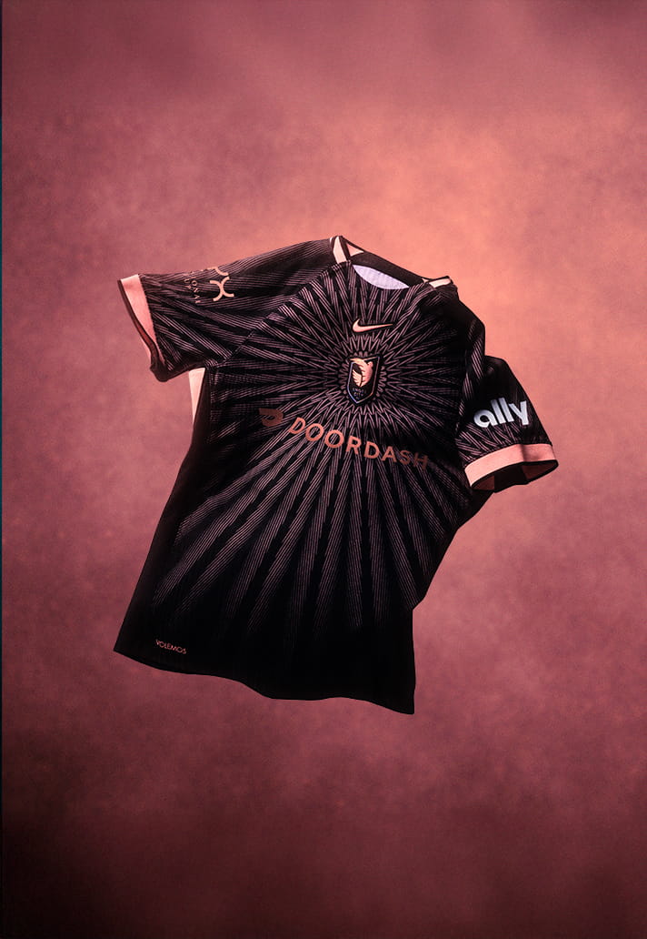
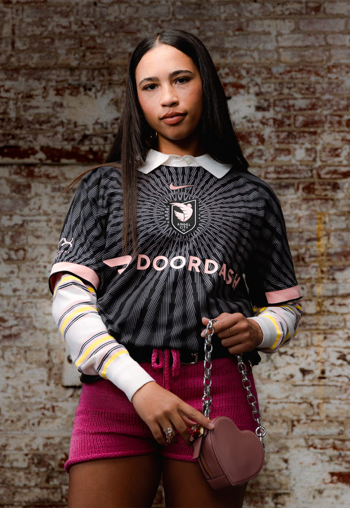
Named 'The Flare Kit', Angel City's new kit features a central crest, with a special sol rosa sunburst pattern shining outwardly from it. It's eye-catching and really smartly done, working beautifully in the club's traditional colours. Nice way to see in five years.
2. KANSAS CITY CURRENT
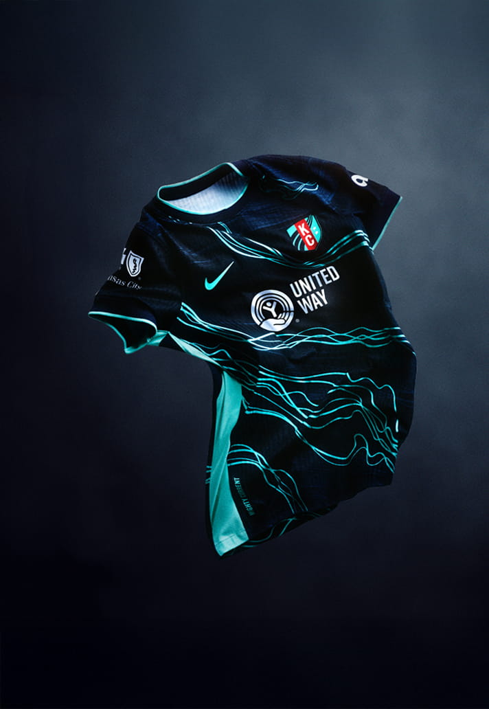
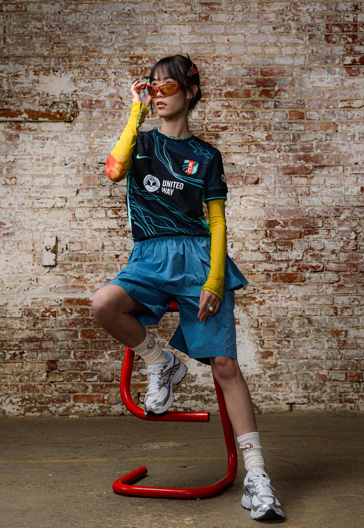
With a team name like "Current" Kansas City could either have ended up with a representation of a dried up grape or something related to electricity. Most likely because of the spelling being with an E, thankfully it's the latter, and it's a really strong execution. Striking you might say.
1. HOUSTON DASH
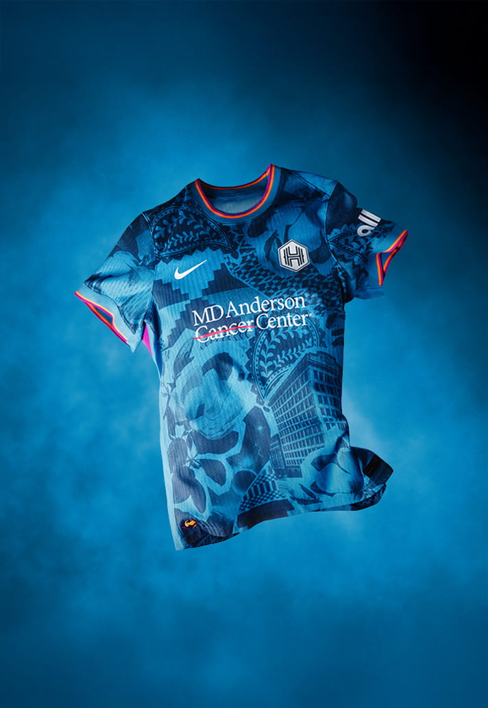
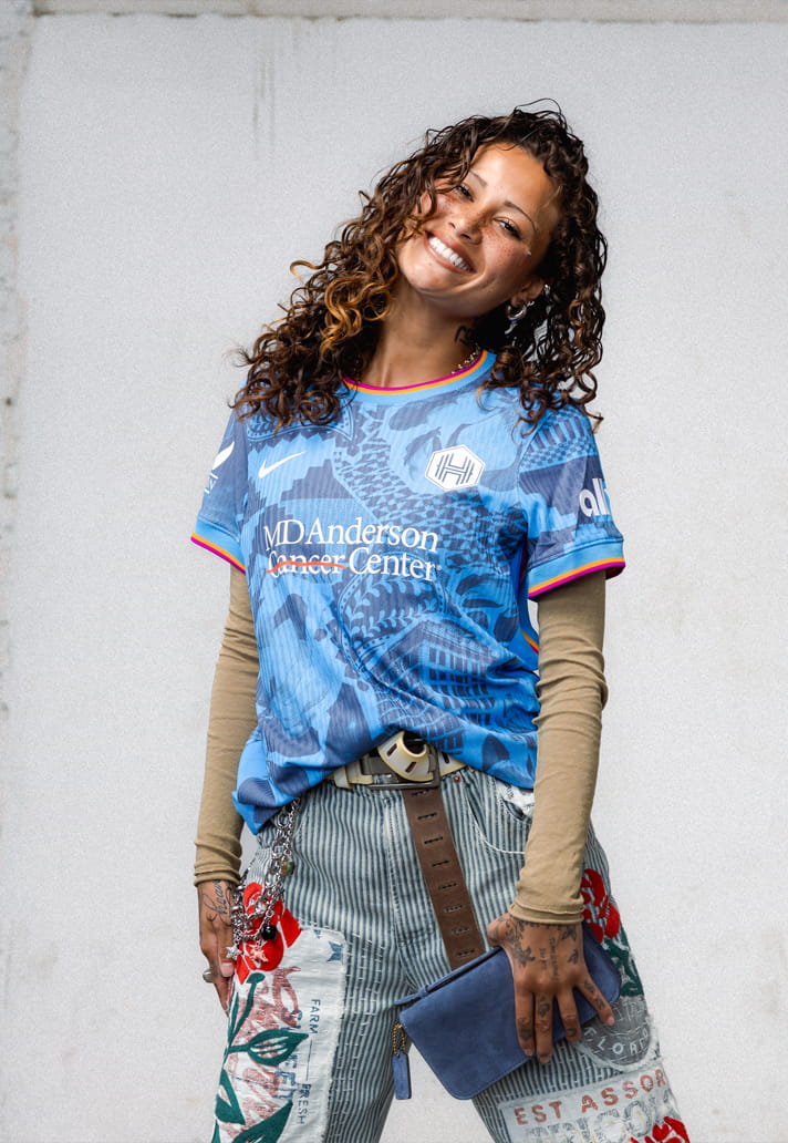
The 'Houston Chronicles kit' highlights five key elements: the original Houston Chronicle building calls out iconic Houston architecture; magnolia flowers representing Houston’s “Magnolia City”; a paisley cowboy motif inspired by classic bandanas; geometric textiles symbolising the city’s diversity; and “Space City” representing NASA.
It's a lot to cram into one jersey design, and it probably shouldn't work. But it does. And then some.