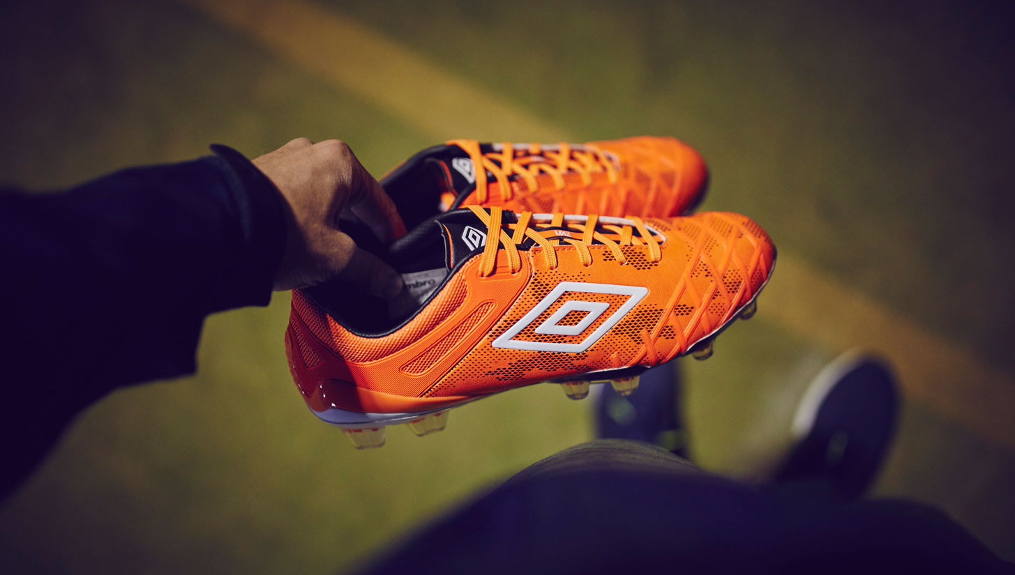
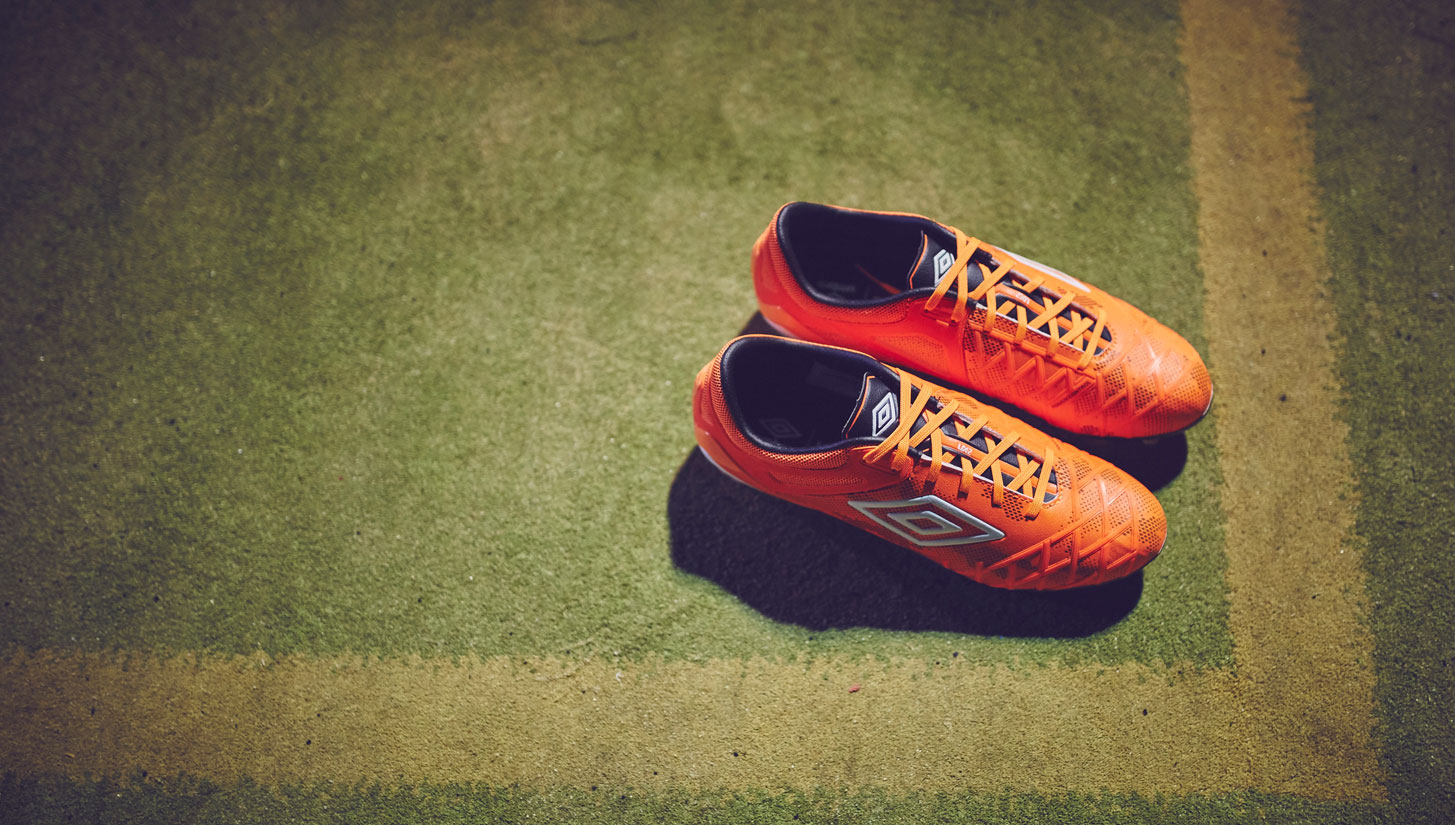
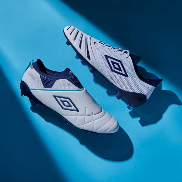
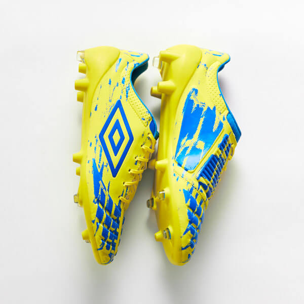
Looking to bring back the glory days Umbro have kicked off the new season with a versatile boot collection equipped to compete with the best. The Velocita marked a new era for the brand and the Speciali Eternal pleased every traditionalist, now it's time to see if the latest UX model could continue the upward trend.
What is the UX 2.0 hoping to accomplish?
The original UX-1 seemed to merely be Umbro’s attempt at making a boot that was akin to a tank. The concept version was a neat form of innovation with the Armor-Tek upper, but there wasn’t much uptake of the UX-1 and there were quite a few issues that Umbro had to address with the boot. When the second version showed up, the first thing that you notice is how much Umbro has changed the boot. Some of those changes are fairly extensive, so will these updates result in a good boot? Or, is the UX 2.0 going to be the anchor that holds down a possible Umbro rebirth?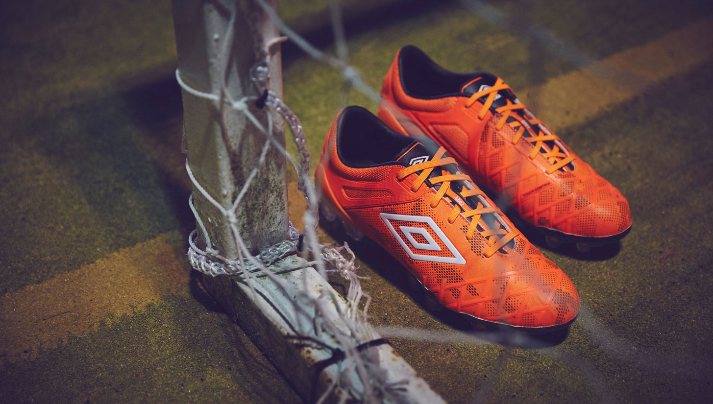
How does the UX 2.0 look in person?
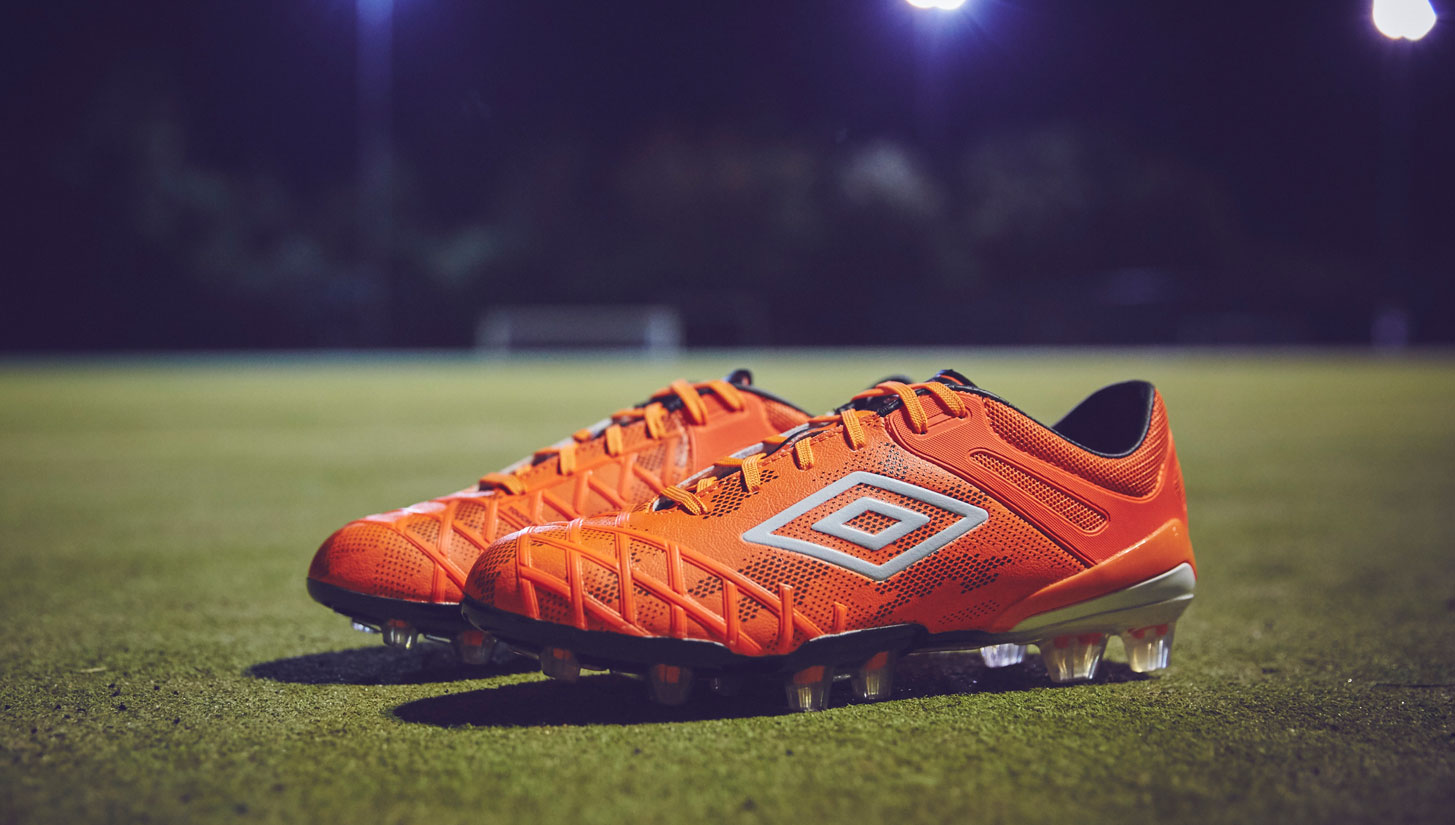
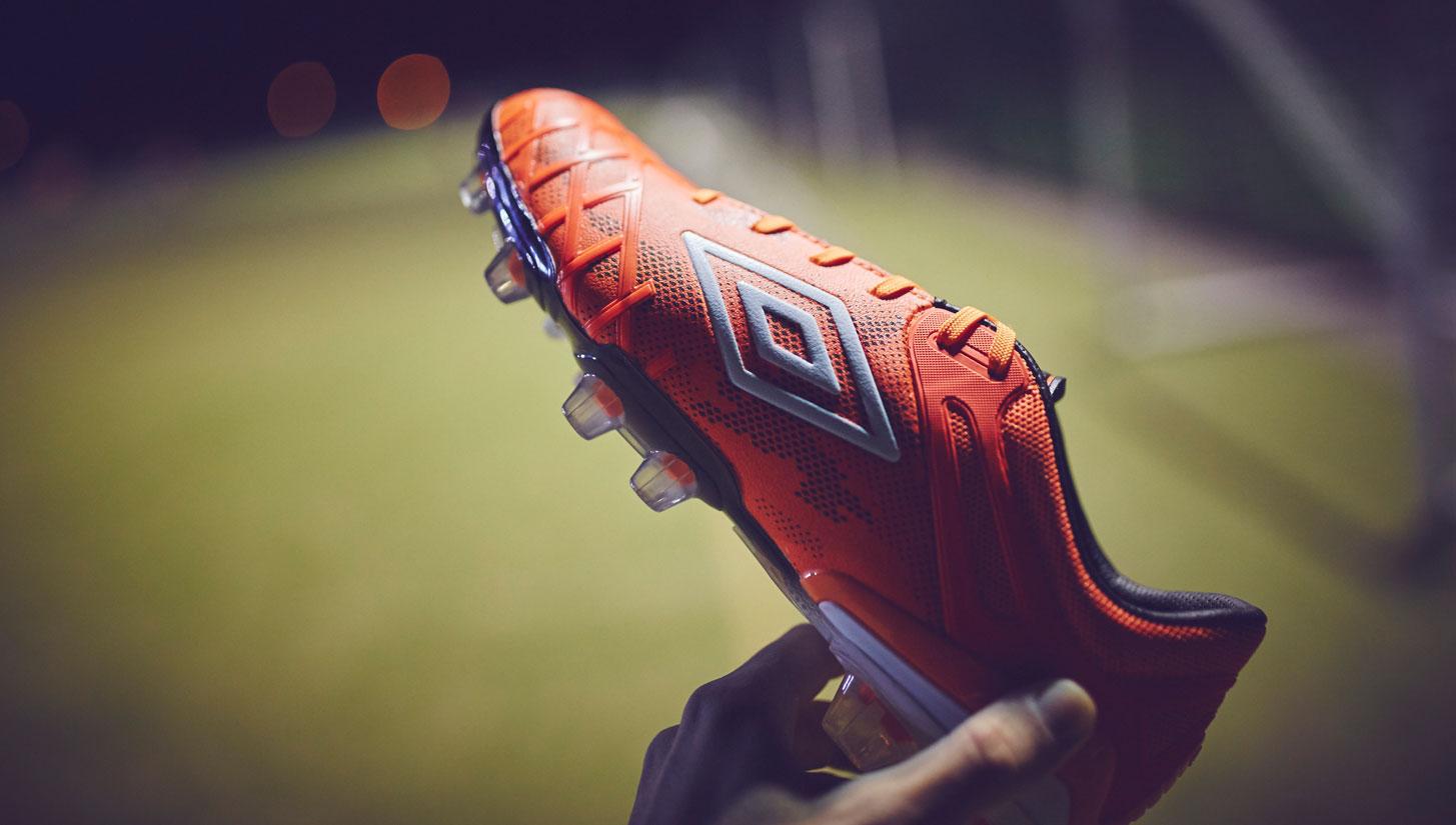
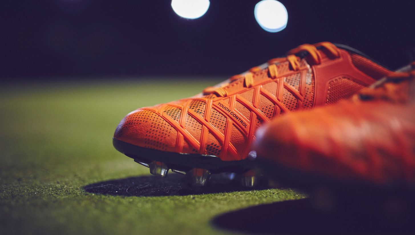
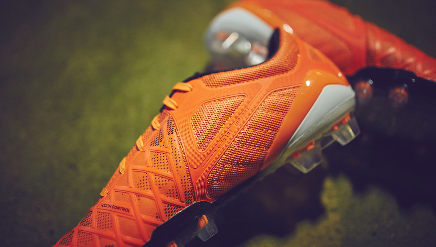
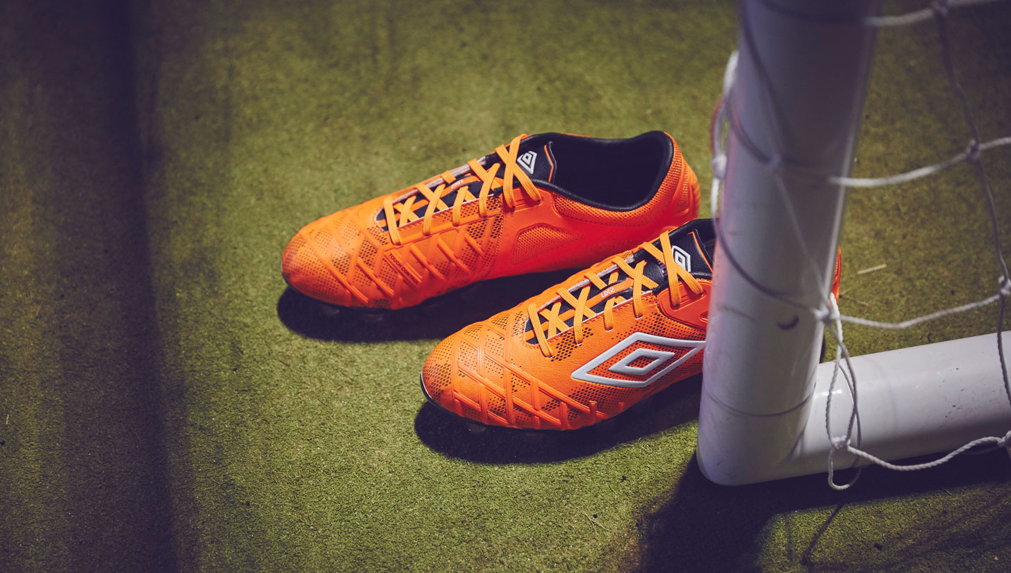
The UX 2.0 looks like Umbro had hundreds of ideas and finally shrunk down as many as they could fit into one boot. The back half of the boot is covered by a textured rubber synthetic, and the part not covered by that synthetic (on the back half) is covered by mesh. The rest of the boot is covered by a thick synthetic, with a criss-cross pattern of raised synthetic running across the majority of the forefoot that makes up the “Touch Control.”
With all the stuff going on with the UX 2.0, it should come as no surprise that the boot definitely sits on the heavier side of the spectrum. Naturally, anyone looking for something really lightweight should stay as far away as possible.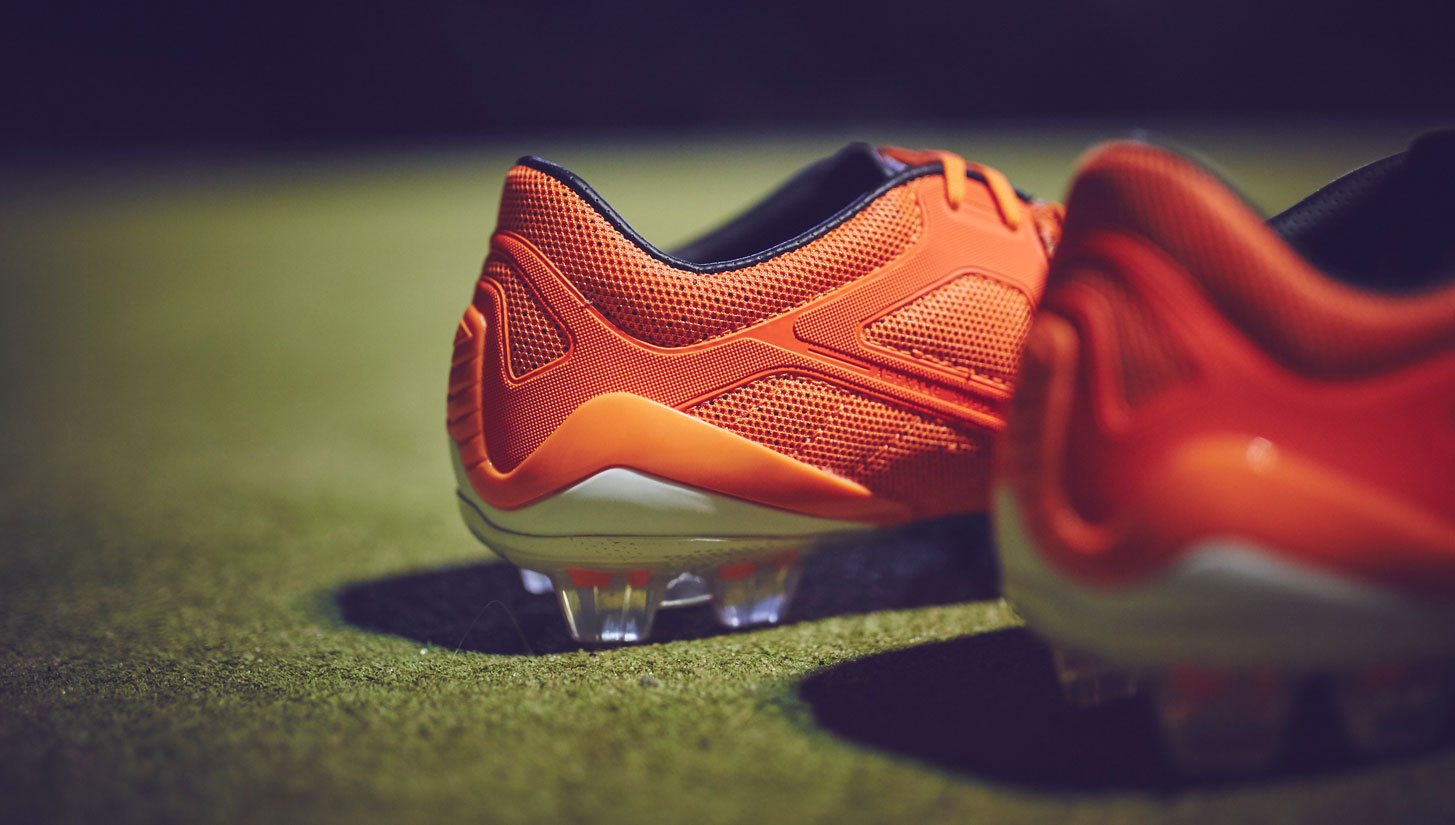
Is the UX 2.0 comfy? Or, is all that padding for show?
To be completely honest, the UX 2.0 arrives in a very underwhelming fashion. The synthetic is thick and it feels like the boot is going to be a bit of a brick when you're running around the pitch. We were all quite certain that the UX 2.0 might end up being a disappointment, but everything changes once the boot gets broken in after a few wears. The thickness of the synthetic and all the padding that initially leaves an unsatsifying first impression actually become the most redeeming qualities.
The boot is not overly tight, and the amount of padding inside the boot allows you to wear the UX 2.0 straight into a game. The insole might be the plainest insole currently on the market, but it is comfortable and gets the job done. After getting the boot laced up, you can really get the boot to squeeze and fit around your foot however you want it. It all comes together to create a smooth situation.
The soleplate on the UX 2.0 is relatively unchanged from the original version. A fairly thick soleplate with conical studs in the forefoot and blades in the heel, everything under the hood of this boot just screams that the set-up is going for durability and being super dependable. Something we definitely think Umbro has accomplished in all of their soleplates.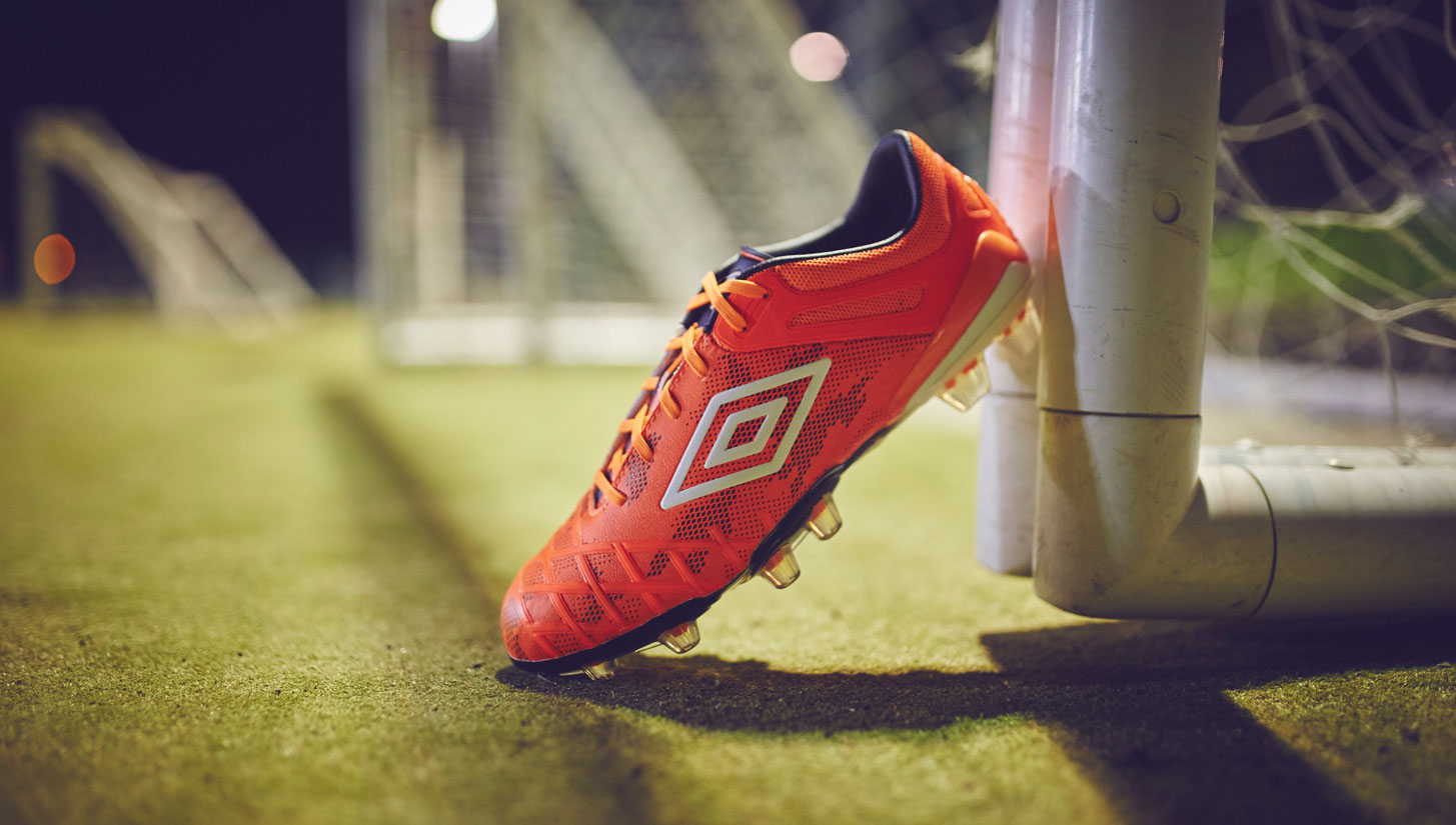
How does the UX 2.0 function once you let it loose on the pitch?
As we mentioned earlier, the first experiences with the UX 2.0 in hand had us concerned. The synthetic upper, in comparison to what we see on most boots on the market today, felt thick, and was combined with a control element that seemed to be reduced to the point of being fairly pointless. However, after a few wears, the UX 2.0 reminded us of a style of boot that we have been missing for quite some time: an old-school power boot. Despite PUMA giving us the evoPOWER and despite there being a plethora of boots that are fun to strike the ball with, the days of the sturdy power boot seemed to be gone. The UX 2.0 might feel thick in your hands, but the synthetic and build on your feet blends together to give us a strong creation.
It seems odd that a boot that feels like something from yesteryear actually feels like something new and different. Launching long range passes and blasting shots with these boots immediately transported us back to some of our favorite power boots of the past. That nice padded feel, coupled with the warm sensation when you put your foot straight into the back of a ball... it makes the UX 2.0 a very enjoyable boot and instantly brings on the nostalgia factor. While there might be “Touch Control” web across most of the boot, we never quite saw a major change in how the ball was affected. The one piece of tech that we were intrigued by is the GeoMetra/CTR/LZ-esque pass pad on the instep, but it still doesn’t really change your experience enough to really bring anything new to the table.
The soleplate’s build is going to be perfect on any FG surfaces and, considering Umbro market it as an “HG” set-up, it is going to be able to function on several different types of pitches. Add in the dependability of the set-up with the boot’s durability, and you have a well-built boot.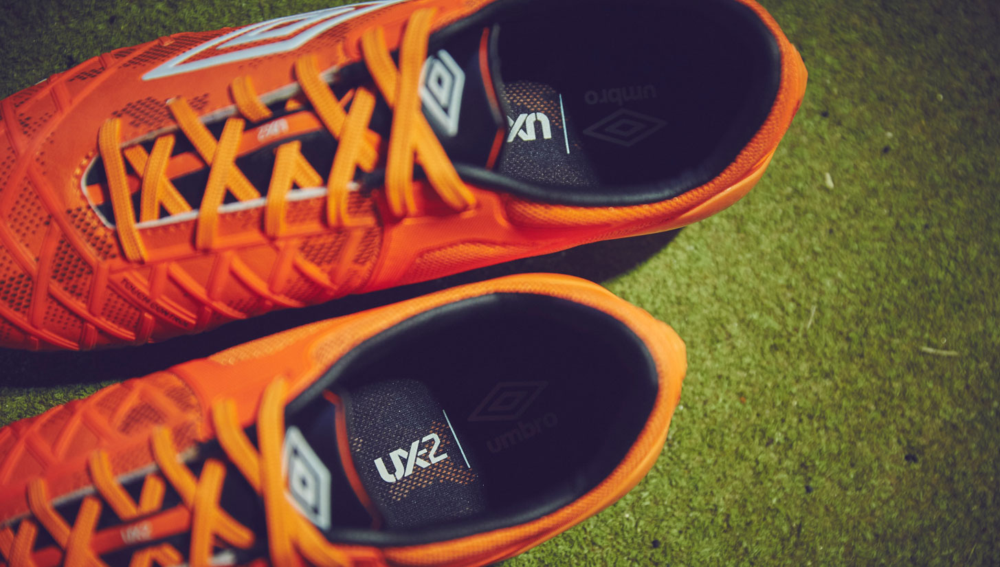
Is this the boot that can round out Umbro’s line-up for the brand’s resurgence?
The Umbro UX 2.0 was not a boot that we were excited about testing. The synthetic seemed like it would be too thick and the tech seemed to be too reduced to have any change on the ball. Then, we started testing the boot. It’s amazing that a boot that feels like it would have been created right after the turn of the century can actually feel different and modern... all at the same time. The UX 2.0 still has a few kinks that Umbro could work out of the system. The insole doesn’t seem to match the quality of the rest of the boot, the upper should either be devoid of shooting/control elements or they should be enhanced to actually have a real effect on the ball, and the mesh areas of the boot are absolutely IMPOSSIBLE to clean. But, overall we were pleasantly surprised.
For anyone looking for that old-school power boot feel that has been put together with a few modern spins the UX 2.0 is the boot for you. It won’t be getting a lot of press or praise with the modern footballer that is looking for the lightest, thinnest boot available, but there is definitely something special here. Long live the power boot...
