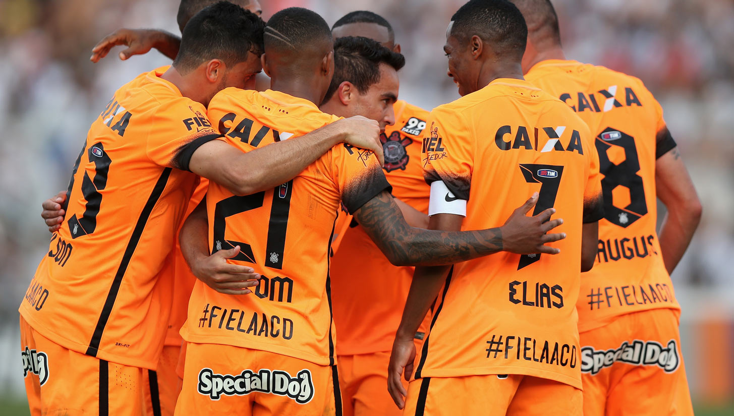
Continuing the exploration into the beautiful world of typography and it's subtle brilliance across the game, most notably on that of kit, the next team under the microscope is that of Corinthians.
Giants of the Brazilian game, their third kit by Nike is more succulent than any prime carrot cake. Orange to symbolise the clay pitches that many of the squad grew up playing on, the font is sharp yet full of character. There's more on that, here.
The numbers though are the real show stealers, with each carrying diagonal tram lines dividing the edges subtly. This type set, which is up there with the best of them, is a strong expression of under the radar design, but when indulged is one that's ripe for picking.
Top marks to them.


