


In bringing two worlds together and embracing the creative side of the game, the Scottish FA have worked with Glasgow based design agency D8 to create a new typeface that will run throughout all forms of communication in support of the Men's National Team.
A typeface that stands up in its own right, the basis of 'Hampden Display' has been moulded from a multitude of environments. D8 described the process, "It was drawn using a mix of inspiration from display type dating from the era of the Scotland team’s inception circa 1870, with the personality and details informed by the shapes found in the the modern Scottish FA crest.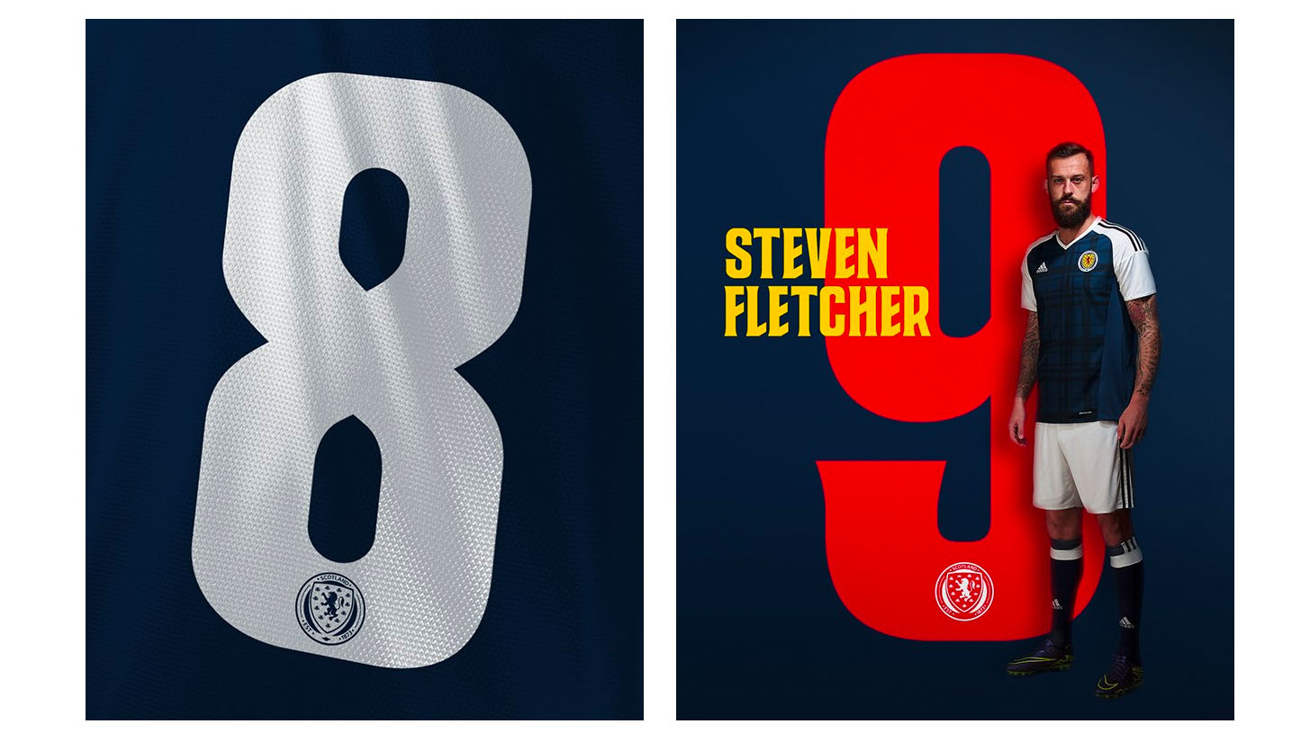
A craft very much perfected, the development of a typeface always comes with great intrigue. Naturally, the finished product is the results of much deliberation. "We spent time designing a variety of letterforms to get a feel for how they would interact with each other, then recreated the final design as Bézier curves after which we could tweak and adjust weight to give us a display face that would be individual, recognisable and carry a sense of dynamism which is always important when promoting our team. We needed to make it feel epic."
A stylised addition to the Scottish game, the pitch is well kept off the pitch. You can find out more here.


