


Continuing our closer look at the way in which typography plays a beautiful part in a contemporary kit, we speak to Ulrich Planer at PUMA to get an inside look at the design process involved when creating fonts befitting the greatest tournaments on the planet.
Creativity touching every single part of kit design, football typography is arguably the most understated art form to bless a football pitch. Speaking to Ulrich Planer, Senior Graphic Designer in Teamsport Apparel at PUMA, he has brought an educated and experienced insight in answering our questions.
Where is the natural starting point when designing typography for a kit?
When we start looking into the typography, we are already in the middle of the jersey design process - so we know what the jersey will look like. This is very important, as the jersey itself is our starting point. We look into the trims, cut lines, pipings that have been used on the jersey and try to extend that design language onto the numbers. When designing the numbers, they have to fit graphically with the jersey. The main goal we want to achieve is that the whole kit with all features, looks like one cohesive unit.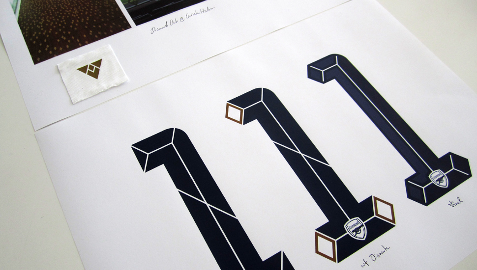
How early before a kit is released do you start working on the typographic elements like this?
The design of the typography is usually right in the middle of the process from the design to the launch of the kit. About year before the launch, we look into the first ideas of the typography.
Does the club get involved in the process?
Yes, absolutely they are involved in the process, likewise with the complete shirt. We present proposals and incorporate their feedback, true to the wider product development process.
Graphic design coming into football like this, it's a perfect relationship between the creative and football worlds - it's a unique form of art. It must be very satisfying to see the teams wearing these fonts?
The beauty of this job is almost everything you design is televised. Last week we saw the Europa League qualification game between Wolfsberg from Austria and Dortmund. I'm very interested in the way the numbers look through a TV broadcast - is the sizing good, what could have been done better, is it visible enough? I´d say, since during my time at PUMA I have changed the way I watch football games.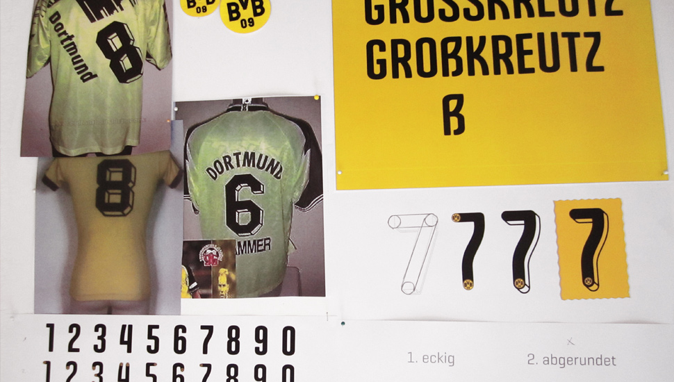
Are you already working on fonts for clubs beyond this season?
We just finished the fonts for the Euro 2016. There is one generic typeface that all the national teams will play in, and one special treatment for Italy, which has a similar look but with slight adjustments.
Has there been a font within or outside football that has provided most inspiration?
All our fonts link back to the PUMA brand font "Geogrotesque", which was designed by Eduardo Manso. "Geogrotesque" itself is too wide to fit on the back of the jerseys, therefore our glyphs are more condensed. This also allows double digits and long names like "El Shaarawy" to fit on the back. In general, all our jersey fonts are distant relatives to "Geogrotesque" and design features like the beveled edges will be included in most of the glyphs.
What are the most important elements to consider when designing a kit type face?
Most important are the UEFA/FIFA regulations. Limiting, but very necessary. There are quite a few points to consider. The height of the typeface, the distance, the colour - to name a few. The stem has to be between 2-5 cm for example. You are not allowed to print any graphic within the numbers. There is a very tight grid within you can play. It is then up to us to find creative scope to develop an interesting typeface, that stands out, but fits to all regulations.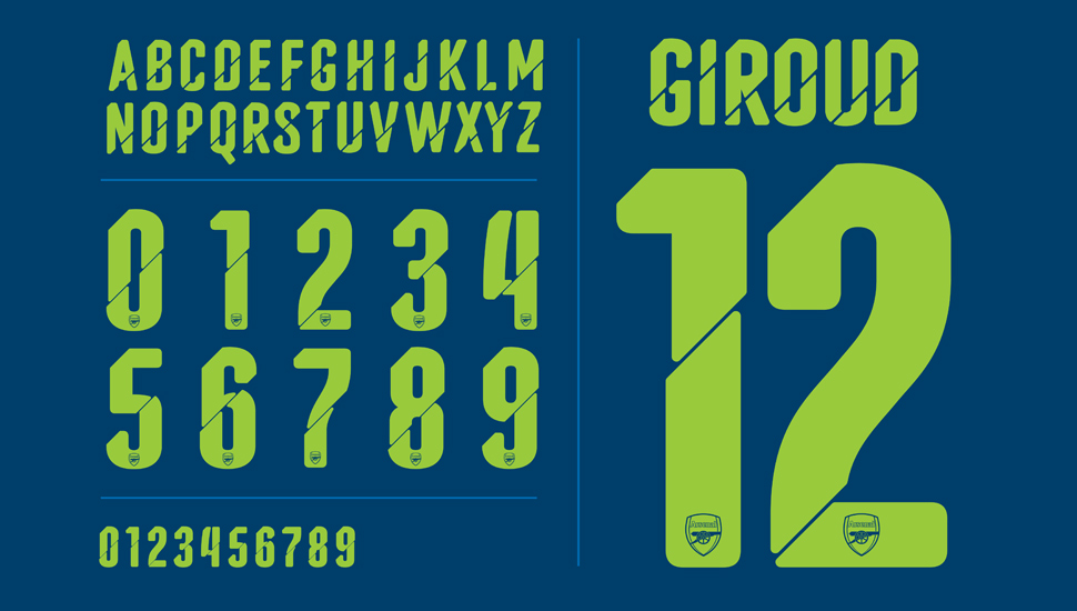
A truly unique take on football kits and the finer glorious details that are most certainly appreciated. Many thanks to Ulrich and the team at PUMA for allowing the time to help us indulge our passion for football and its art forms that much more. The creative minds are clearly in fine form over in Herzogenaurach and PUMA HQ.


