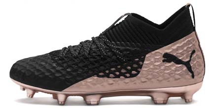
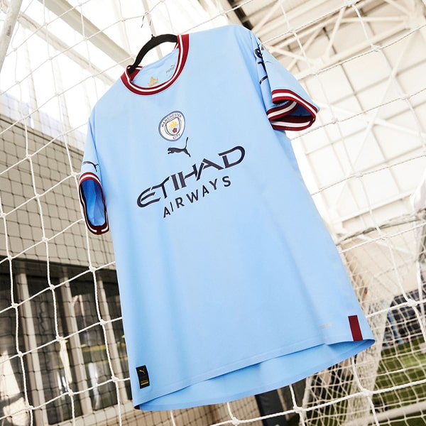
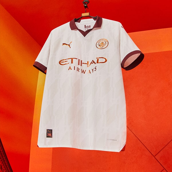
October 2018 saw the confirmation of a longstanding rumour when it was announced that PUMA would be the official kit supplier for Manchester City, taking the reigns from Nike for the 2019/20 season onwards in a deal that was estimated to be worth in the region of £50m per season for City.
Concept designers need little encouragement when it comes to creating new kits, and this presented the perfect opportunity for them to flex their creative muscles. You may think that with the home colour pretty much locked in along with the sponsor and the brand, there would not be much to play with, but you'd be wrong. There have been numerous efforts at home, away and third kits with some looking very decent, and others... less so. With that in mind, we’ve taken it upon ourselves to round up five worthy efforts so far...
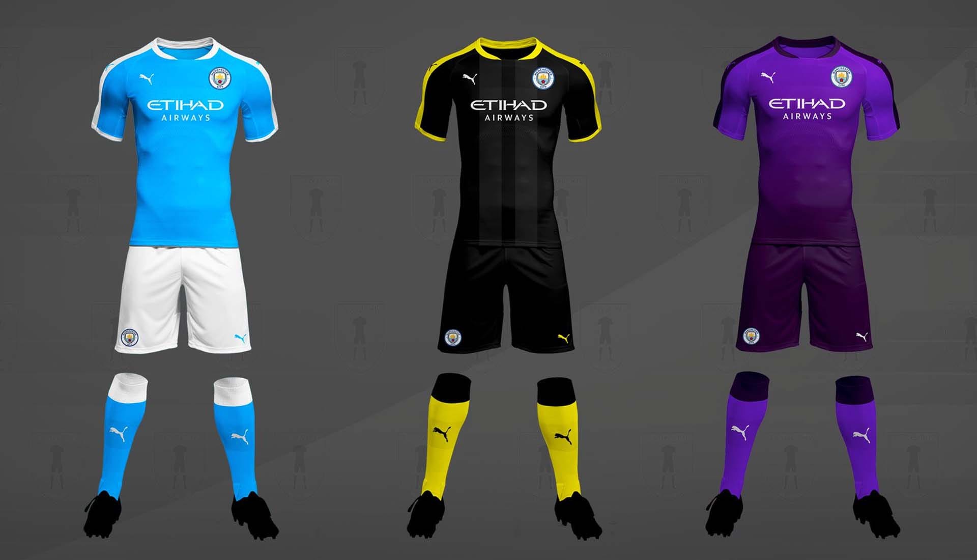
A tonal shift in the sky blue works nicely with some well placed white trim on the shoulders. The away kit opts for black with yellow trim, while the third kit shows Liverpool fans what could be done with purple in the right hands. Decent effort all round this. One that City fans wouldn't argue too much with.
Just a home shirt here, and it harks back to the blue shade used in the late 90s and early 00s. Picture Richard Dunne clattering people in it left, right and centre. Stick a proper collar on it and change Etihad for Eidos and you’re there. Own goals all round.
Utilising the same template for the home, away and third shirt, this is a tidy little effort. The only downside is that the home kit instantly conjures images of Coventry kits circa the late 90s while the third looks like an Aston Villa shirt. We like the away kit though…
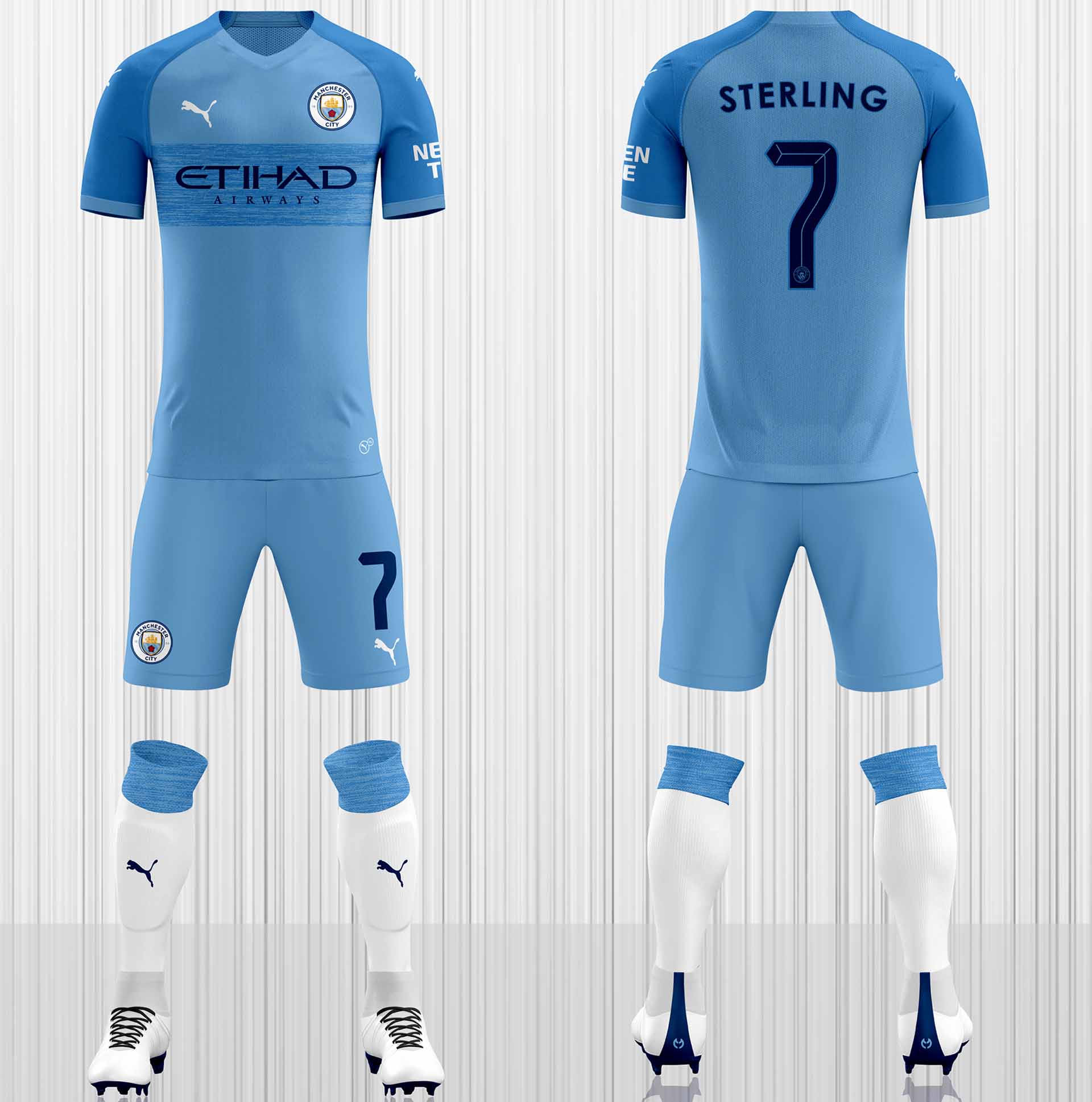
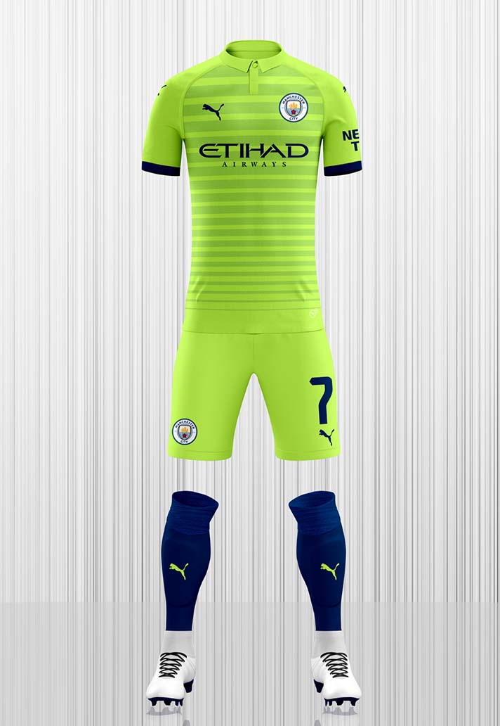
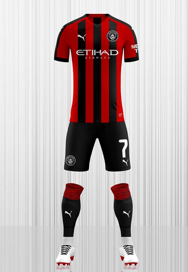
A nice two-tone blue effect on the home kit along with a smart high-vis green with graded banding for the away, which also has a nice micro-collar and navy trim. The third kit reverts to a staple in City’s back catalogue with red and black horizontal stripes. Strong stuff.
The home shirt sticks with the same blue that we’ve seen in the last few seasons, but utilises both white and navy trim to good effect. But it’s when you get to the away and third shirts that the real magic happens. The away shirt features grey and white banding on the lower section that runs to a black and red band across the upper chest for a great design that would look the part on-pitch. Then the third shirt just goes nuts. Food for thought PUMA...
What you thinking City fans?