Inter Miami CF are set to make their MLS bow in 2020, and with the unveiling of the club crest and team colours back in September, concept designers have been taking the opportunity to thrash out their visions of what the players will be wearing when they take to the pitch.
Other than the colours and the fact that all MLS franchises are contracted to adidas, it’s a relatively open playing field regarding the look of the kits and we're open to a little bit of imagination and thinking outside of the box here. Even with the colours set, designers have been playing with which will be the core for the home, away and – with some going the extra mile – third shirts. What you’ll find below are some of the best efforts out there. Take note Mr Beckham...


A simple v-neck collar and performance fit which uses the wings from the club crest as the inspiration. The home shirt has a strong white core, while the away shirt is almost a complete invert. The third shirt mixes it up a bit, taking pink as its core colour along with that statement graphic coming off the shoulders. Could be our pick of the bunch that.
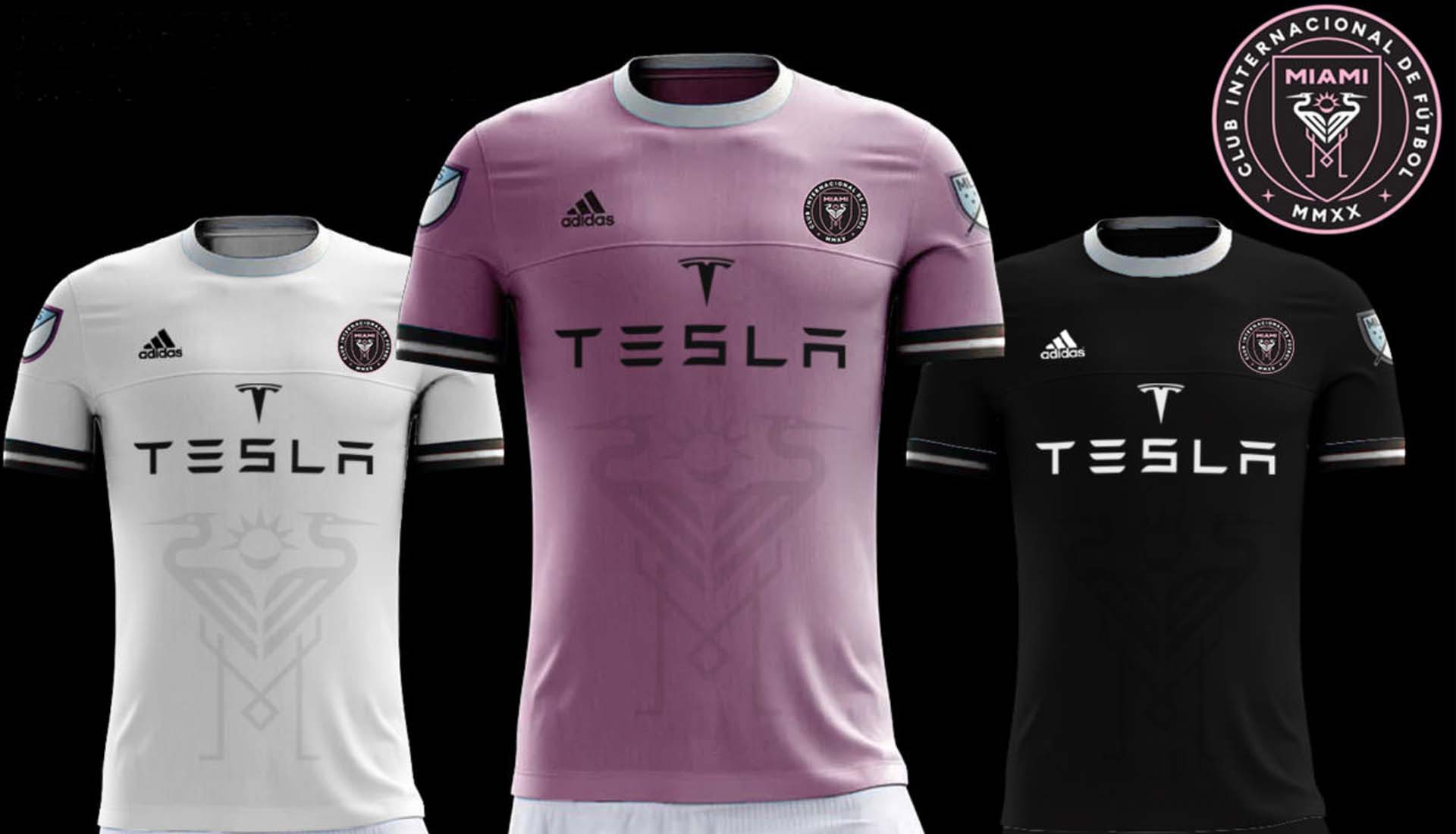
A simple crew neck using solid and relatively uninterrupted core colours features in each of these offerings. What stands out here is the sublimated design on the front that places the two birds from the club crest front and centre. Simple but effective. An ambitious link up with Tesla rounds thing off smartly. We wouldn't rule out one of Beckham's own brands fronting the shirts. Haig Club or House 99, perhaps?


More pink, black and white combines for this full set of adidas home, away and third jerseys, but it's the third kit that really catches the eye, taking that combo but adding grey to the mix for something a little different. At the absolute least it made us reminisce about playing Snake 2 on a 3310. So, cheers for that Warrigal.
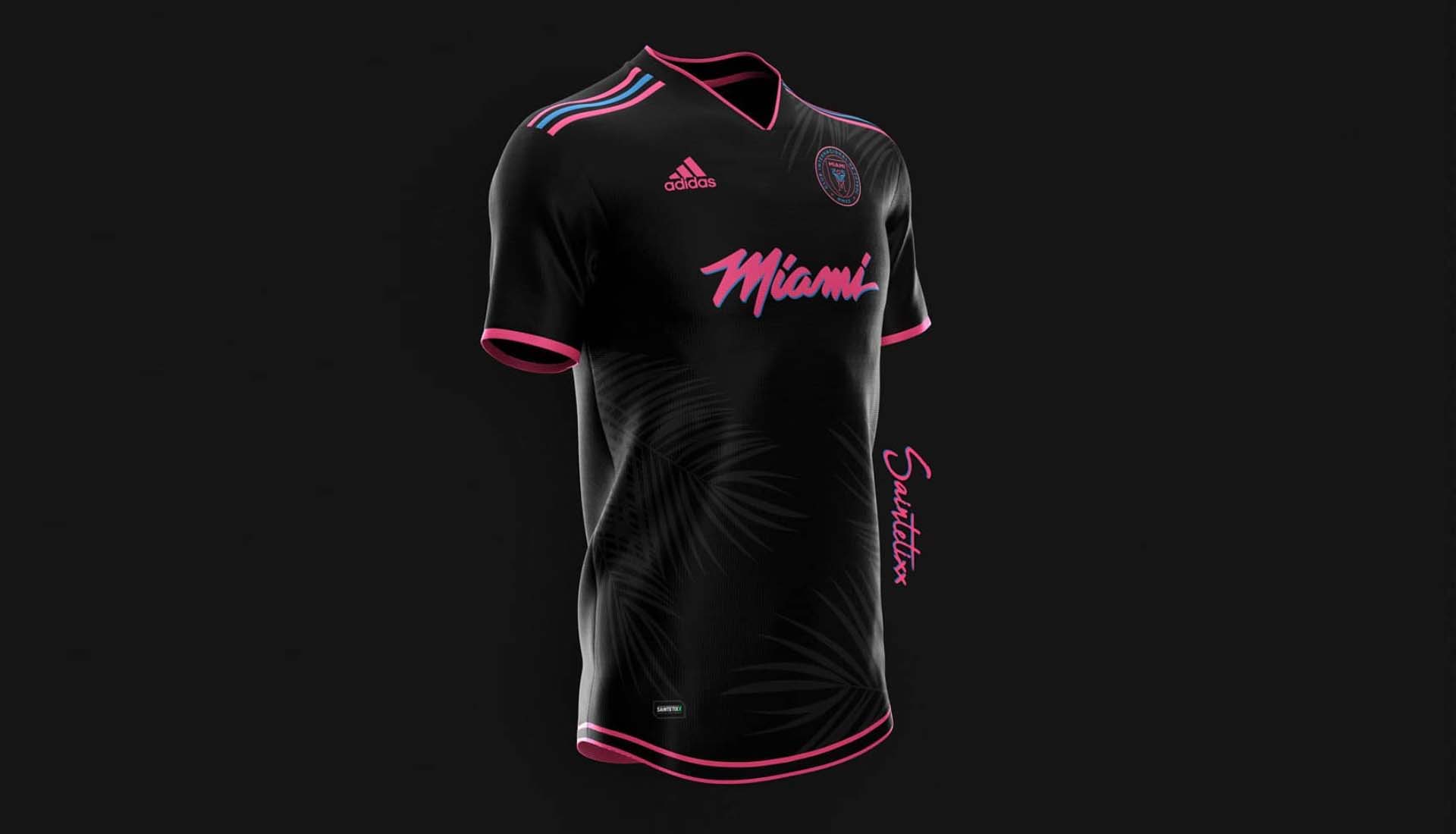
Throwing down some serious Miami-vice vibes, this shirt features a neon effect font and colouring. The sublimated plant design on the body adds to the tropical feel of the jersey and the Three Stripes appear on the shoulders with the outer two in pink separated by the middle blue stripe. The only thing that's missing from this 80s throwback are some shoulder pads. Good effort.
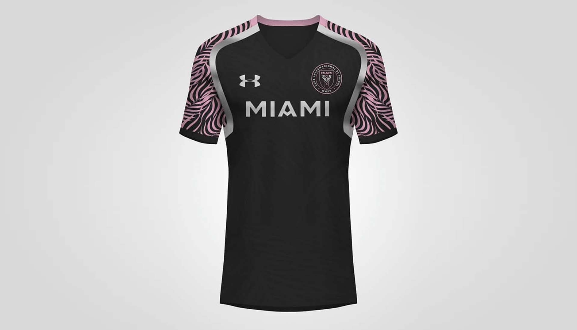
Thinking outside the adidas-shaped box, Kifth Graphics goes with an Under Armour shirt that utilises a radical black and pink design on the raglan sleeves that’s separated from the core black body by a silver trim. Nice, like it. Let's hope any potential sponsor doesn't murder the eventual shirt with a big old ugly logo, eh?


This one is basically Inter Miami on Nike’s aeroswift template. Yes, it would look great on any kit, and no Nike won't be making MLS kits anytime soon. It will be 2026 when the current adidas contract with MLS expires. Nice execution with minimal effort.


For effort alone, this should be commended. The home shirt goes core black with a pink zigzag interruption entering from opposite corners, while the away shirt takes another disruptive sublimated pattern in different shades of pink, which is complemented by the Three Stripes and sponsor in black. For the third shirt, the tropical hues are ramped up with a white and light pink plant design. Slapping a big old 'Predator' font on the front of each shirt ain't ever gonna offered anyone either.
Some decent efforts in there. Some better than others...