
The 21/22 season has provided an abundance of great shirts, as brands get ever-more adventurous with their designs, spurred on by the greater appetite for Jersey Culture and the increasing levels of competition within that world.
The build up to a new season always brings with it an air of anticipation, the fresh start packed full with the promise of potential. That lasts for a few weeks at least, before the realities of a weak squad, poor form, sub-par manager and an unsupportive board bring your hopes crashing down around your ears. Before that fall though is the launch of the club’s new kit for the campaign, acting like a herald for what’s to come: your team gets an absolute banger and you feel invincible – for a time at least. But get a stinker and you know you’re stuck with it for the next 12 months. However, this season more than any other has seen far more of the former, with an arguably higher standard and more expressive range of shirt design than ever before. So why?
The influence of Football Culture has been expanding at a rapid rate over the last decade, to the point where it’s no longer unusual to see a jersey displayed on a catwalk, or sported by a musician at a gig, or even by players of another sport on a matchday. A big part of Football Culture and its acceptance is actually down to the increasing popularity of the sub-bracketed Jersey Culture, and brands have had to be reactive to that, supplying shirt designs that not only satisfy fans – as was once the only real prerequisite for any release – but that can also now be seamlessly carried across into lifestyle circles. Admittedly, this is less of a consideration for the majority of lower tier teams, but it’s certainly an essential requirement of the premium clubs across the world and particularly in Europe, with shirt sales and brand endorsements forming a reasonable part of their overall revenue.
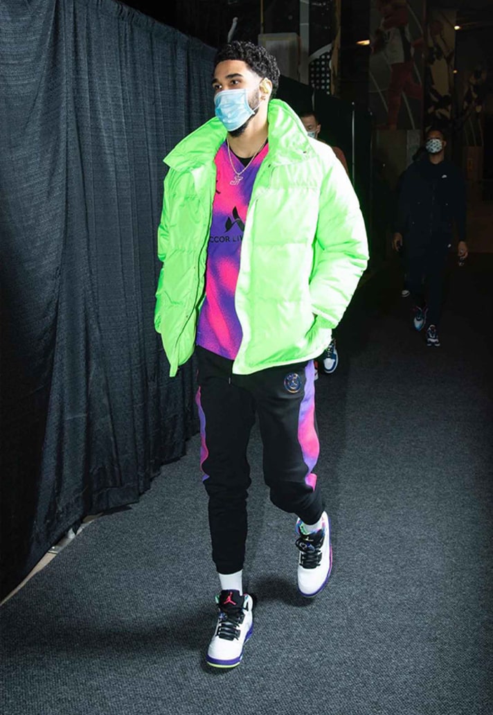
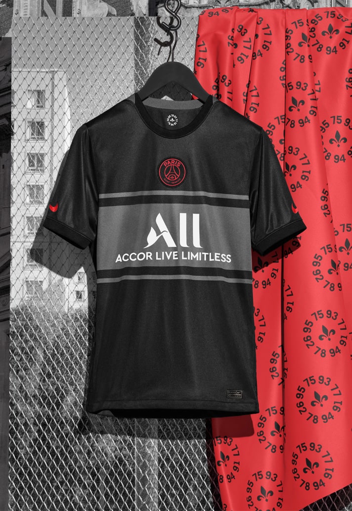
This shift in shirt design was in part kickstarted by PSG, with the Parisians and their affiliation with Jordan opening all-new avenues for exploration. Suddenly a football shirt didn’t have to be just what the players would wear on the pitch – it could also boost the identity of a club. The sight of a musician or NBA star in a football shirt is a sure-fire way to increase the visibility of that club, promoting it and helping it to gain traction in previously unexplored territories. Blazing new trails, PSG in particular have never shied away from what were once considered left-field collaborations, and this cross-pollination with other cultures has subsequently built on the appeal of football shirts.
Initially, experimentation on shirt design was restricted to prematch shirts and third or fourth shirts only, with wilder designs being worked in away from the confines of tradition and, to a certain extent, expectation. Having to adhere to the traditions of a club while also of having to please the fans meant that home and away shirts are often restrictive by their very nature. But the 21/22 season has seen a real shift in this dynamic, bucking trends with braver, more expressive designs spilling onto the home and away setups. Sticking with PSG and the promotion of Jordan to home kit is evidence of this move. It’s a refreshing change to the status quo.
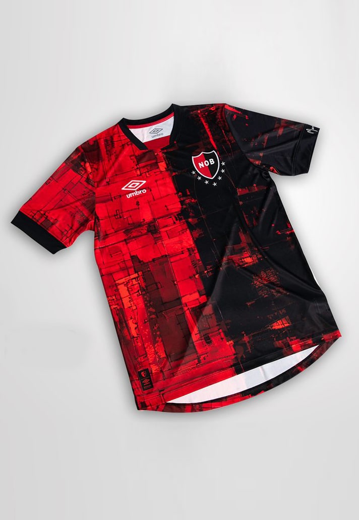
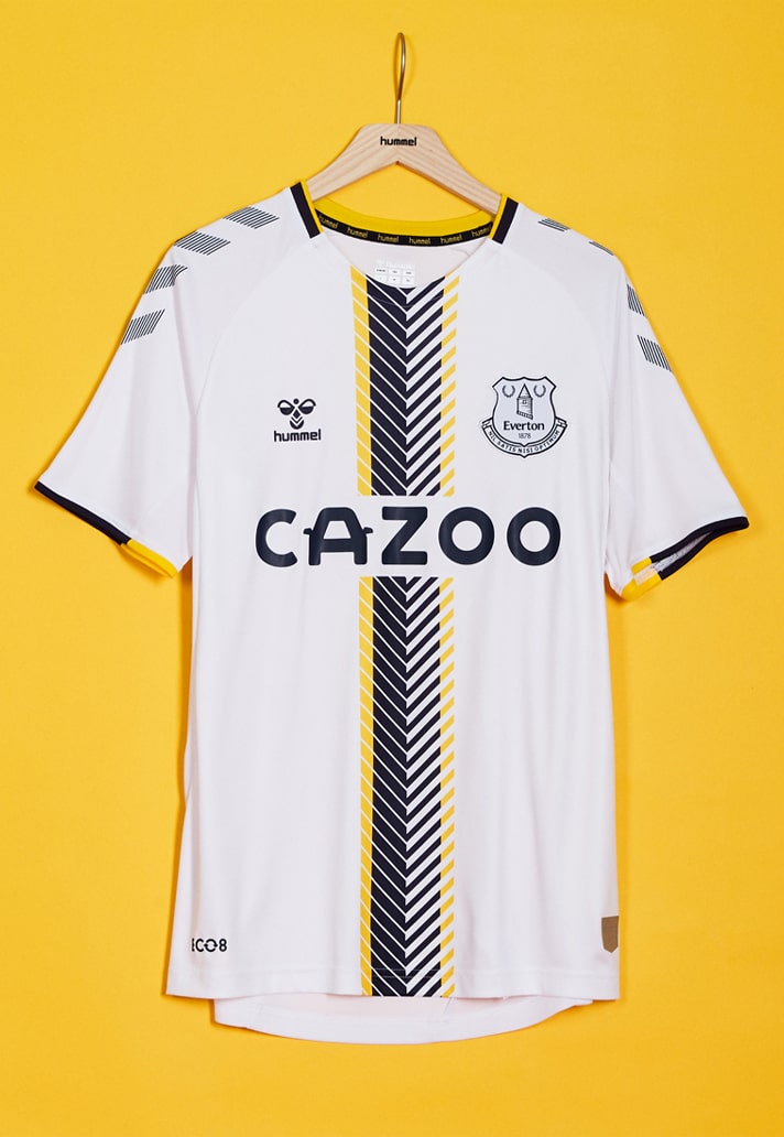
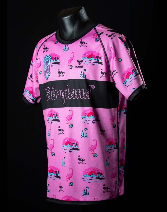
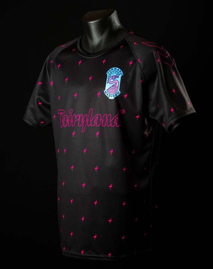
While the so-called bigger brands at times in the recent past have seemed reluctant to allow too much freedom of design, it’s the emergence of smaller heritage brands that has really served to drive design forward; brands such as Umbro, Hummel, and Kappa to name but a few, and this has never been more evident than in the 21/22 season.
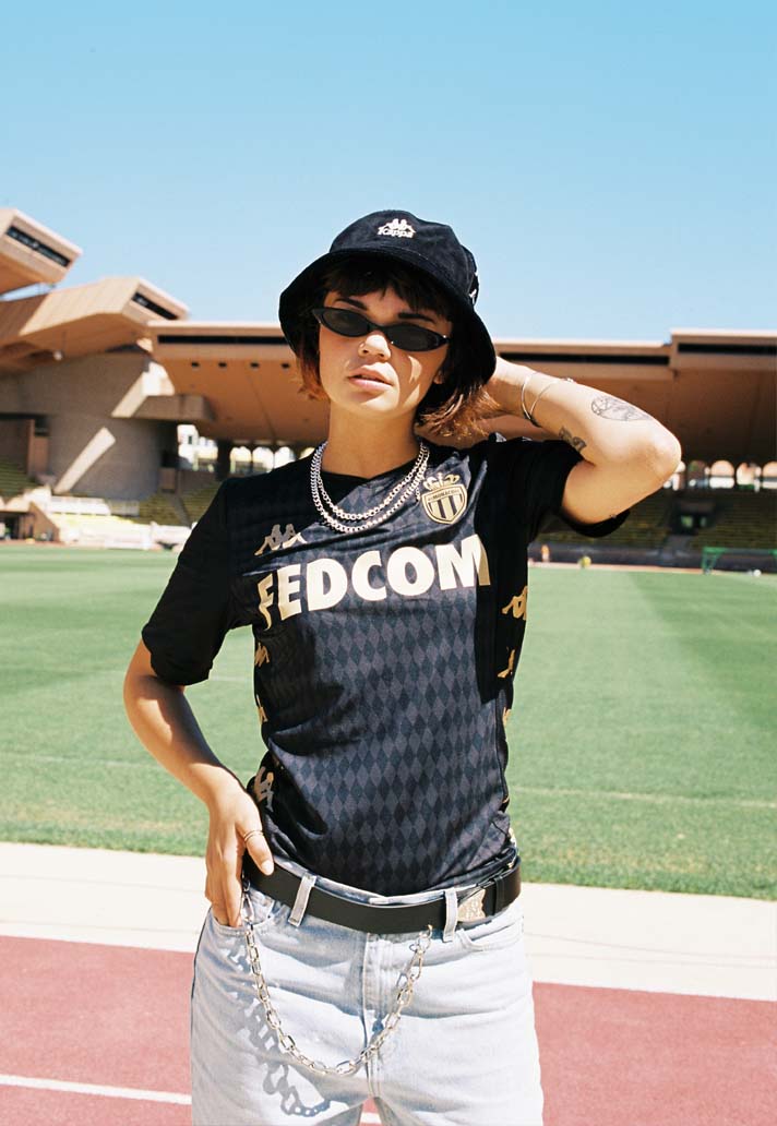
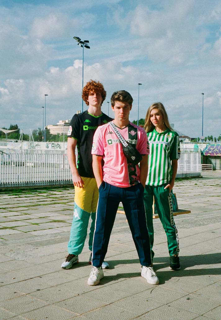
To focus on the latter of the aforementioned brands, Kappa have a rich history in the game, and while it may feel like the Italian brand have almost come out of nowhere to supply the likes of Venezia with some of the best kits of the season – if not ever – they’ve actually been building towards this for a while now, outfitting the likes of Monaco, Betis, Aston Villa and Genoa with some great shirt designs in recent years.
The new partnership with Venezia seemed to be the perfect storm when it was announced earlier this year: here was a club that already boasted a ready built reputation for great shirt design, partnering with a brand that was rich in heritage and that also had a progressive ethos. But, with all the lusting for what are three outstanding designs, there’s something else in the Venezia x Kappa story that has been somewhat overlooked, and that’s the presence of New York creative agency Fly Nowhere, who were integral to the design of all three kits. So while Kappa are rightly applauded for the Venezia 21/22 trio, what they should also be applauded for is being brave enough to bring in a third party to assist with the design process, something that has undoubtedly provided a freshness to the approach.
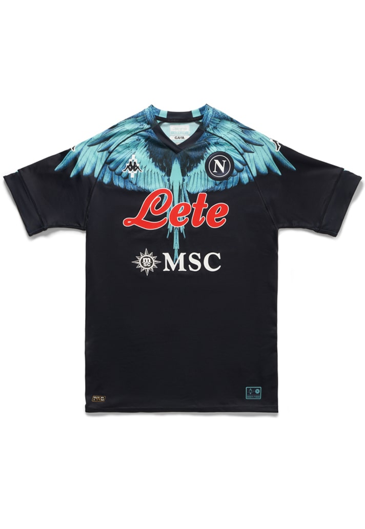
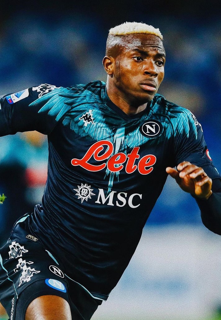
Of course, this is not the first time a brand has called upon a third party for an added boost to their output. Arsenal partnered with 424 for a lifestyle-infused collaborative capsule recently, while Napoli took that one step further by partnering with Marcelo Burlon County of Milan – with a nod once again to kit producers Kappa – for a special edition shirt that was actually worn on pitch. Napoli have since signed a partnership that sees Giorgio Armani’s EA7 brand making its debut in the beautiful game. The world’s of football and fashion have never been closer, it seems, and that can only be a good thing as far as design is concerned.
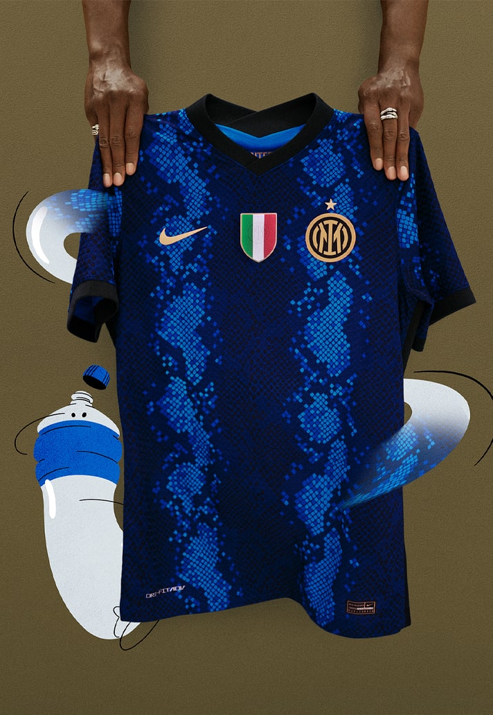
An advantageous side-effect of heritage brands consistently improving the quality of their output over the last few seasons is that the bigger brands have had to up their game as a result. Nike were brave enough to tread new ground with the Inter Milan home shirt this season, flirting with the Nerazzurri's classic stripe aesthetic, but bringing back the Biscione snakeskin design not seen for a decade. This is the type of thing you would have expected to see on a prematch shirt a mere couple of years back, but here it is, set to be on display for every one of the Serie A champions' home games this season. There were purists that didn’t like it, and those few are the type that would settle for bland, season upon season, but so long as you’re being respectful of the club and its history, surely progressive designs such as this should be encouraged…

And that leads us on to PUMA. On the whole, PUMA’s 21/22 repertoire has been a bit bland, with no real standout looks across their premium teams. At least not in the home and away shirts anyway. No, it seems that PUMA saved up all of its experimentation and adventure for its controversial third shirt set.
Looking to defy the conventional, the German brand stepped away from the rules of traditional shirt design with the central placement of the club’s name, emblazoned across the front of the jersey in each clubs’ bespoke font, with the PUMA branding and sponsors also centrally positioned to add balance to the visionary design. Perhaps most controversial was the removing the clubs’ badges, repositioning them on the back of the jersey beneath the collar. Select jerseys complemented this with an innovative use of the club’s crest as a tonal repeat graphic embossed into the fabric of the jerseys, though this was not at all obvious for some, much to the fans fury.
The template approach understandably received almost widespread criticism, condemned for their lack of imagination. But to say that is to miss the point. While the mistake may have been rolling out the same looks for each team, the principle of pushing the boundaries should certainly be encouraged – that’s how progress is made after all: trial and error. Who says that the old conventions of shirt design have to be rigidly stuck to? These are rules and regulations that were written in another generation. Shirt design has moved on and the governing bodies need to catch up.
Two sides that have fallen foul of these regulations recently coincidently boast two of the best shirt designs this season. Ajax had to alter their Bob Marley-inspired third shirt for European competition, removing the three little birds that usually appear on the back under the collar, with UEFA stating: “The European Football Association sees it as a different expression than the club logo, logo clothing sponsor, or sleeve sponsor. Other expressions are not allowed.”
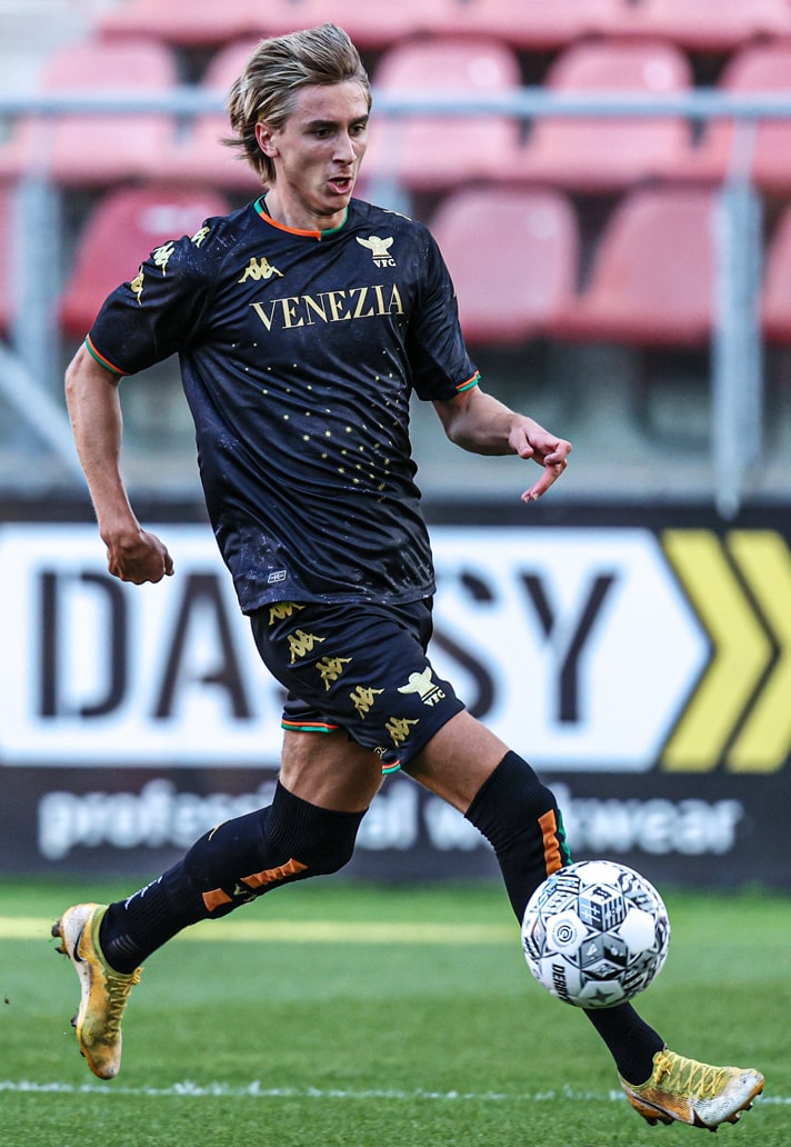
The other team to be affected by regulations was Venezia. Their outstanding designs see the wording “Venezia” in place of a traditional sponsor, but Serie A allows only "one club logo" on a football shirt. With the Venezia text on the front considered a club logo, it meant that the Venetians had to play in shirts without their club crest. It appears that there may have been special dispensation made for the club though, as they wore their kit as it was intended on the fourth match day, when they faced Spezia.

All in all, it shows that the world of shirt design is continuing to evolve, pushing forward in mostly the right directions and feeding the demand of jersey culture in what is a cyclical relationship. What it means is that we get consistently improving shirt designs, as evidenced by the output this season – long may that continue.
Shop all 21/22 replica at prodirectsoccer.com


