
The 21/22 season kick off is right around the corner, and while we wait for all teams to release their full setup of kits for the campaign, many have already unveiled – and in some cases debuted – their prematch shirts. Here, we round up the best of the bunch.
Prematch shirts have become a staple part of a club’s wardrobe, offering some outstanding designs that are free from the confines of rules, regulations, traditions, and often sponsors, while also being a cheaper alternative to the home, away and third shirts for fans. The designs often take the essence of the club’s current look for the coming campaign, mixing them for a fresh presentation. It’s a realm that a lot of the smaller brands are yet to fully explore, leaving the big boys to lead the way. Undoubtedly front of the pack are Nike, who have provided bespoke designs for all of their top tier teams, while adidas have once again explored the route of similar templates that are adjusted to match club colours, much as they did last year. PUMA have also gone down the template route, stripping back any design influence to the point where they simply do not warrant a place on this list.
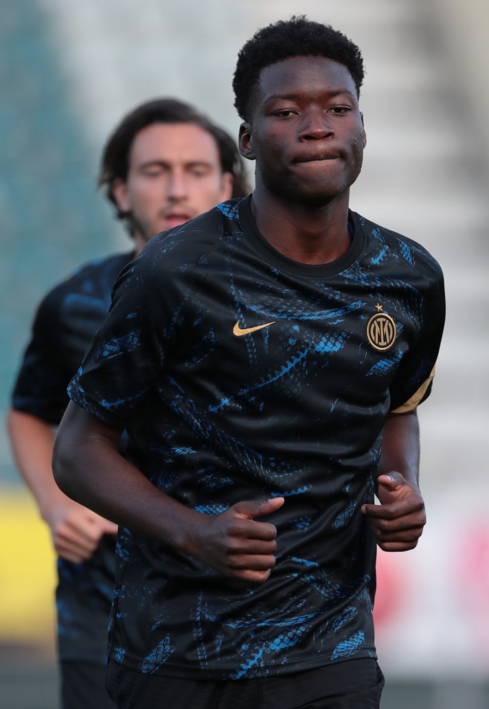

First up, we have Inter, whose snake-infused style from both their home and away shirts is carried across to the prematch. Black base, blue snake, gold crest, much like the home shirt, although sans sponsors. Absolute beauty, this.
PSG unveiled their first-ever home shirt from Jordan for the 21/22 season, and the prematch shirt follows suit, with the Jumpman replacing the Swoosh on what is a striking navy design that sees the word "Paris" in a repeating pattern throughout. All the style you've come to expect from the Parisians.

Next up is a pair of Premier League teams, both of whom have dropped divisive designs for their on-pitch shirts. The Spurs away shirt is proper marmite, although it has become a grower after seeing it in action. In a bizarre role reversal, the wildness is toned down for the prematch shirt, leaving a design that many Spurs fans probably would've preferred as their away shirt for the season.
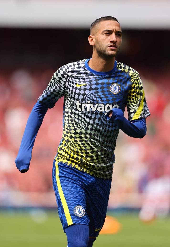
Chelsea similarly had a mixed reaction to their new home shirt, but unlike Spurs, the wildness levels are ramped up for the prematch shirt, with the introduction of yellows and blacks, taken from the away shirt, spread on that wavy graphic.

Sticking with the Premier League, and Liverpool are presented with a contemporary design that sees hoops containing the "Flash Crimson" colouring from the home shirt.
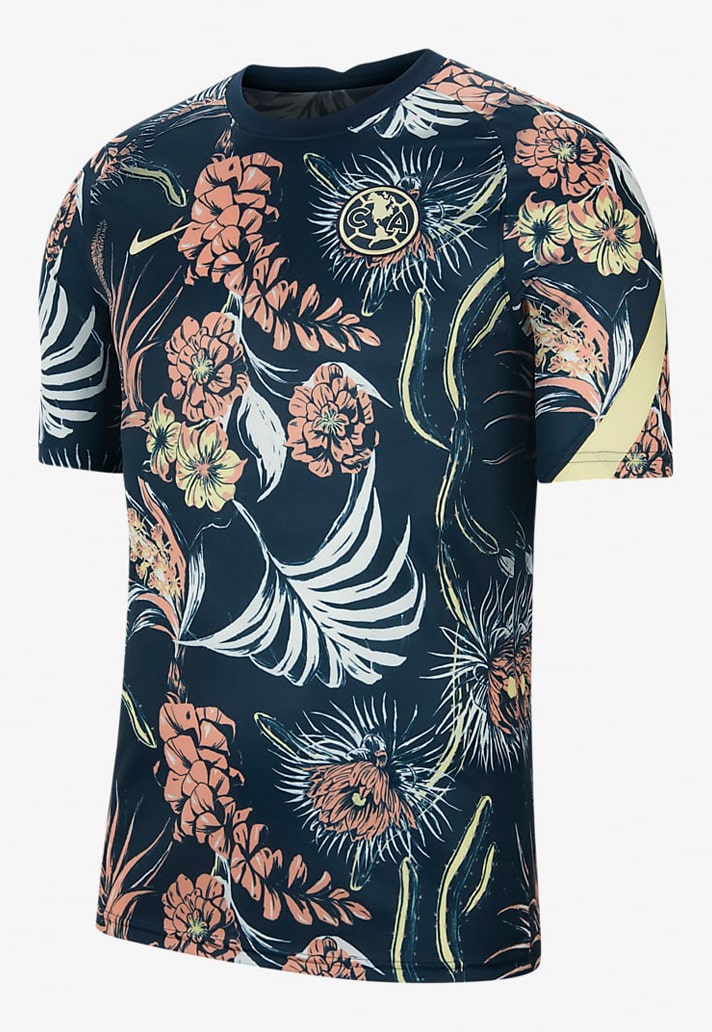
Then we travel into the Wild West... Mexico and Club América. reknowned for their unique looks, the Club América 21/22 prematch shirt doesn't disappoint, with a floral graphic running across the whole jersey. One step away from being just a full-blown Hawaiian shirt in football form, the design is unlike anything else in the game. Magnificent.


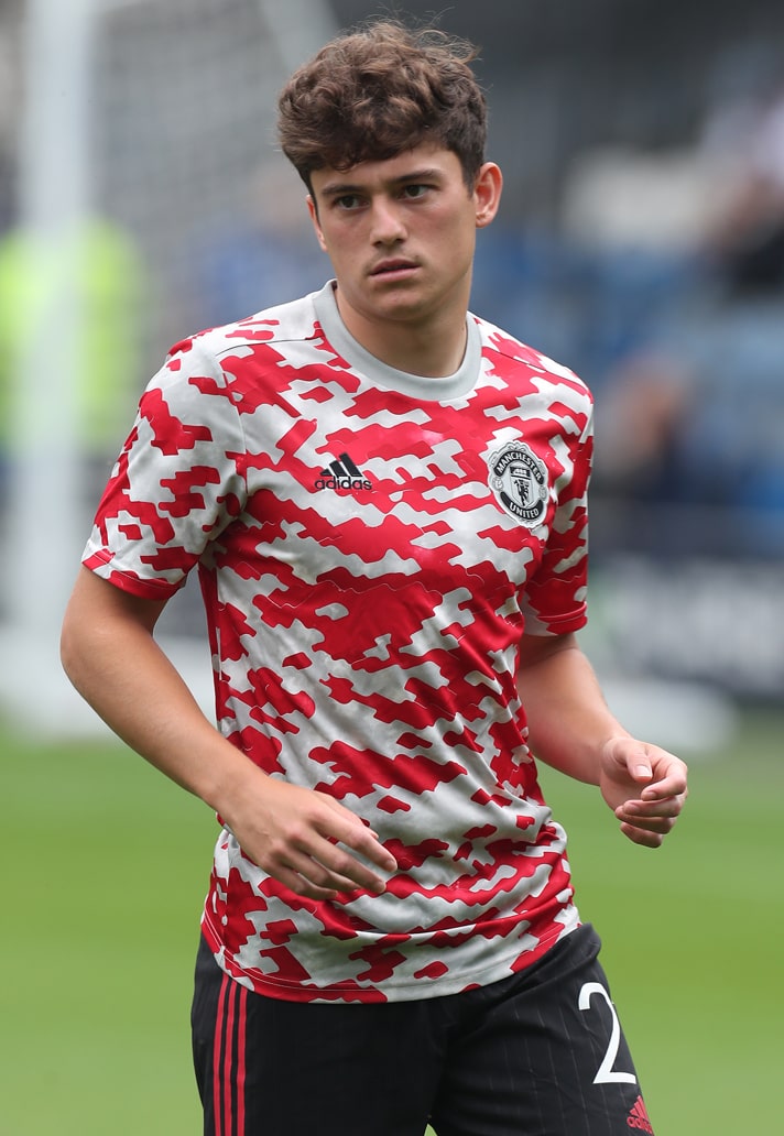
As mentioned previously, adidas role out a template design for its top tier teams, with a camo graphic running throughout. It's then a simple switch up of the colours for the respective teams, so that's a combo of blue and red for Bayern Munich, greys and blacks for Juventus, white and red for Manchester United, and reds and blacks for Arsenal.

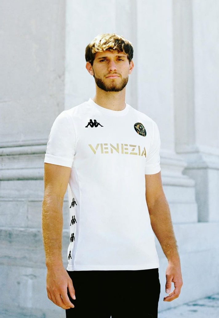
Venezia FC have already had two of the standout shirt designs of the season, and they're joined by a contrasting white prematch shirt that is just as sleek and outstanding. The perfect complementary piece to the outstanding collection from Kappa.
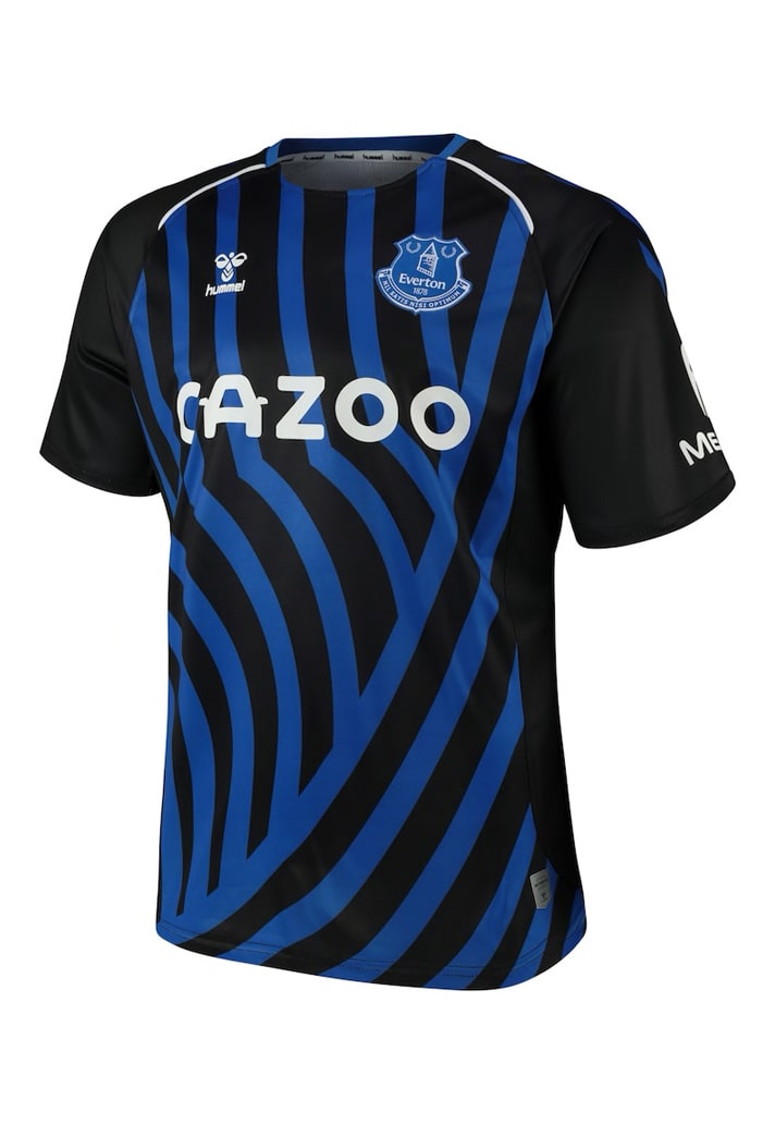
And then Everton get in on the act, with Hummel providing them with a design that's reminiscent of some more recent Inter Milan shirts. It sees black and blue stripes presented in a wavy execution. Smart.

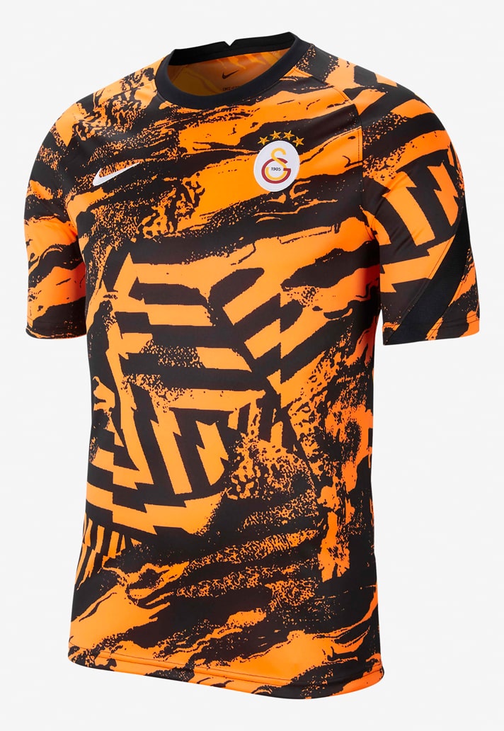
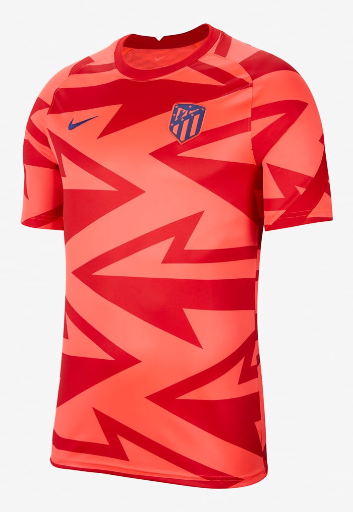
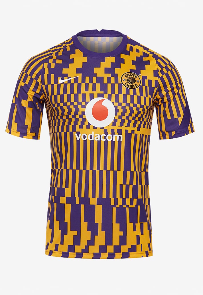
Then we're back with Nike. For Barcelona, it's another trip into the contemporary, with a design that leans on the iconic blaugrana colourings. Galatasaray get a distorted all-over graphic in orange and black, while Atletico Madrid get a design that highlights the points of the trident, a famous link to the club. Finally, Kaiser Chiefs get a pixelated design in yellow and purple. It's a design that's been used across a range of Nike's second tier teams, including Eintracht Frankfurt, Hertha BSC, RB Leipzig and Zenit.
Shop prematch shirts at prodirectsoccer.com


