
The 2021/22 Premier League season kick off is right around the corner, and, while we wait for a few stragglers (ahem, Burnley away) most teams have unveiled their new kits for the coming campaign. So while we wait for Messi to officially be unveiled as a PSG player, what else is there to do other than pick out our Top 10 best shirts.
The kit scene is getting a bit of a shake up this season, with heritage brands Umbro, Hummel and Kappa showing their pedigree against the big boys of Nike, adidas and PUMA, while this year also sees two Premier League debuts, with British brand Castore providing kits for Wolves and Newcastle, and Spanish outfit Kelme dressing the returning Watford.
With the season start almost upon us, we’ve picked out the best shirts of the 21/22 season, with the caveat “so far”, as we still await Burnley away and several third shirts. As always, the list is compiled using our very scientific algorithm of whether we like them or not. Sure there will be some controversy, but we’ve got our tin hat on, so let’s go…
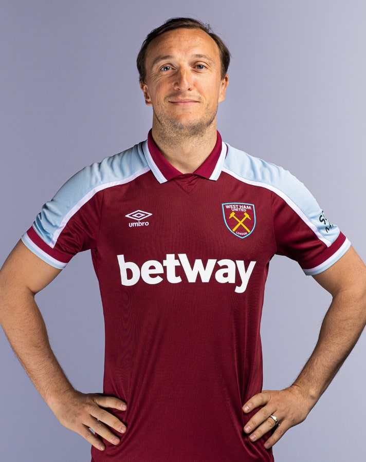
10) West Ham United Away
Starting things off with a solid effort from Umbro, with a design that brings back memories of the colours worn by the promotion-winning 1992/93 side, when Billy Bonds’ Hammers earned their place in the Premier League for the first time. Sky Blue and White stripes on the shirt’s body are complemented by Claret detailing on the collar and cuffs. Tidy.
9) Crystal Palace Third
Celebrating the origins of the club, the Palace third shirt provides the club with a completely fresh look that's balanced out nicely by the sponsor adopting neutral colours in line with the added accents on the collar and cuffs – a sure fire way to earn some extra points and not the last time you'll see it on this list. Said it before, but sponsors can make or break a shirt design. Thankfully for Palace in this instance it's the former.
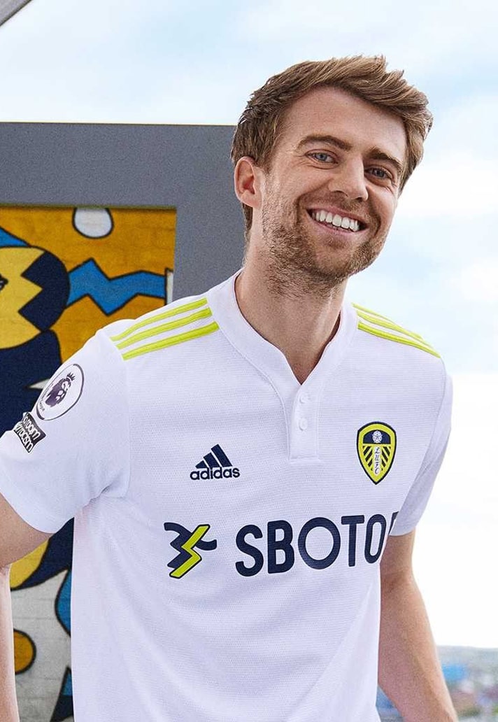
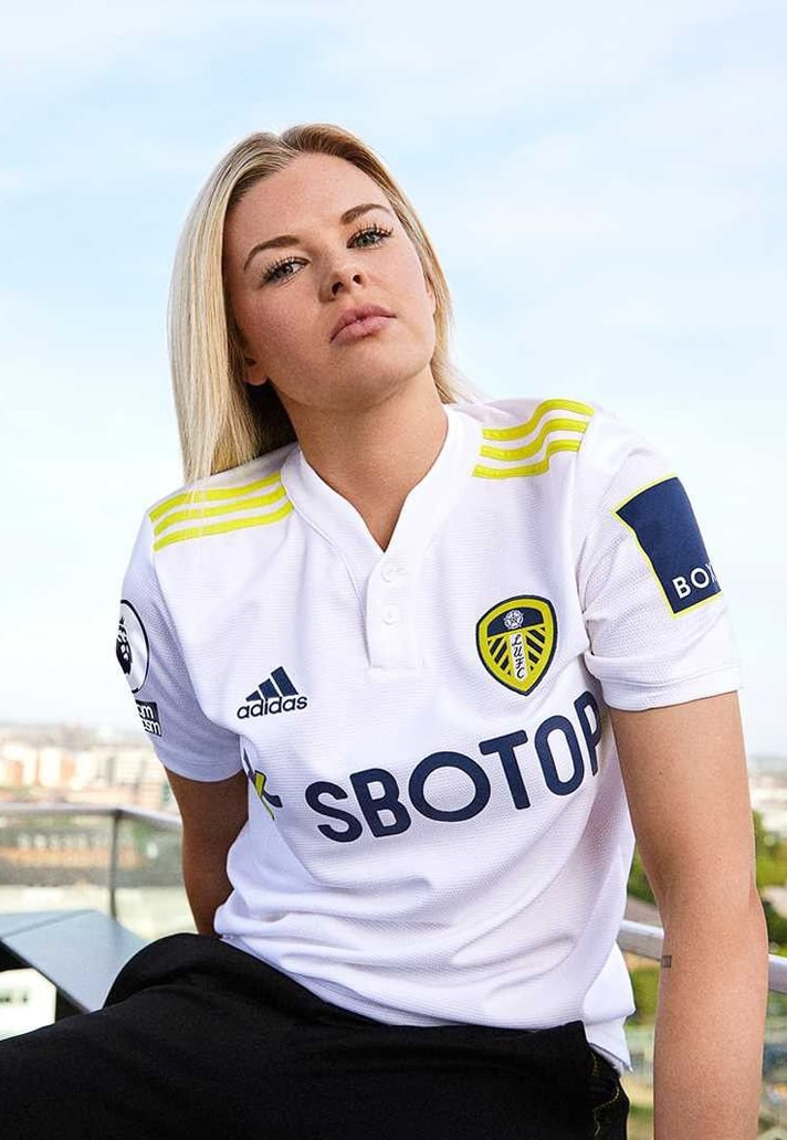
8) Leeds United Home
Always a tough ask to keep the design of a predominantly white shirt fresh, but adidas have nailed it through the simple introduction of vibrant yellow accents, lifted straight from the club crest, providing a look that is Leeds United through and through. The yellow pops through the branding and crest, with the sponsor again getting in on the act to great effect.
7) Aston Villa Home
Simple but effective way to freshen up the classic Claret and Blue look from Kappa, who introduced contrasting pinstripes within bigger vertical stripes through the centre of the body. Some very interesting transfer business from Villa in the build up to the 21/22 season. It'll be interesting to see whether they can back it up with performances on the pitch, but at least they'll look the part at Villa Park.
6) Everton Away
Everton have been graced with three great kits for the coming campaign from Hummel, and the home and third shirts only narrowly missed out on a place on this list. But our pick of the three is the away shirt, which is inspired by the kit worn by the Everton team of 1881/82 – a side that came to be nicknamed ‘The Black Watch’. A similar look to the Southampton third kit – also from Hummel – though the Sash takes it for us, with the sponsor also falling in line with the colour scheme.
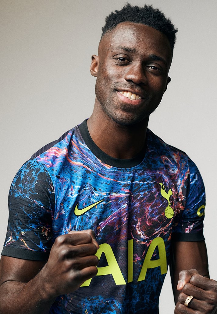
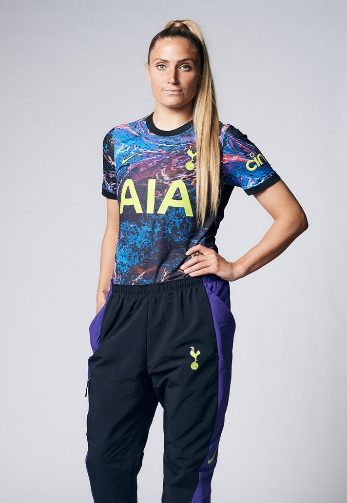
5) Tottenham Hotspur Away
Always going to be a controversial one, this. Sure we can see why some would hate this, but we're in the camp of celebrating the bravery and uniqueness of the design. Definitely looked better on the pitch when Spurs wore it recently. Where some may have accused the home shirt of being a little bland, clearly all the spice was saved up for this. Although there's still a third shirt that's yet to be released...
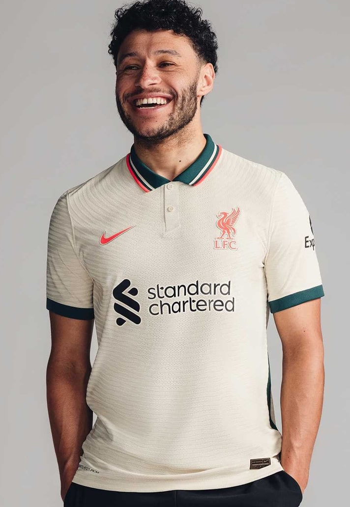
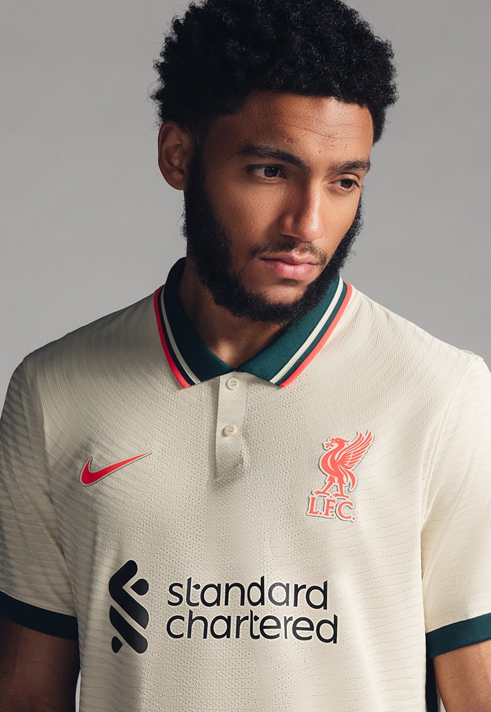
4) Liverpool Away
With its off-white stone and teal colourway, the new away shirt nods back to the cult classic kit of the 96/97 season. It has a strong off-pitch vibe to it, but we can't help but think how much better it looks with a retro sponsor. Still, as a follow up to the heights of last season's away shirt, this ain't a bad effort from Nike.
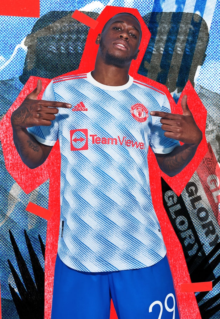
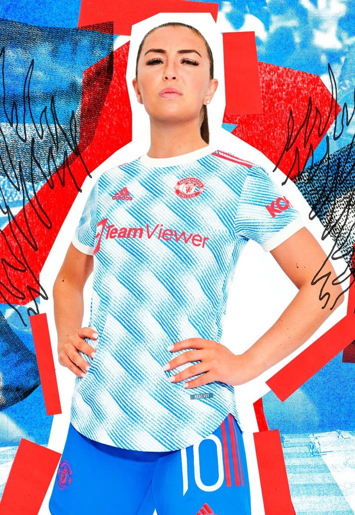
3) Manchester United Away
The Man United away shirt was inspired by the iconic design from ’92 – one of the most recognisable in the club’s history. The reworking of the iconic snowflake design by adidas takes the “Cloud White” and “Glory Blue” and brings them together as part of an optical art pattern engineered into the fabric. Bit retro, bit future. Perfect United shirt.
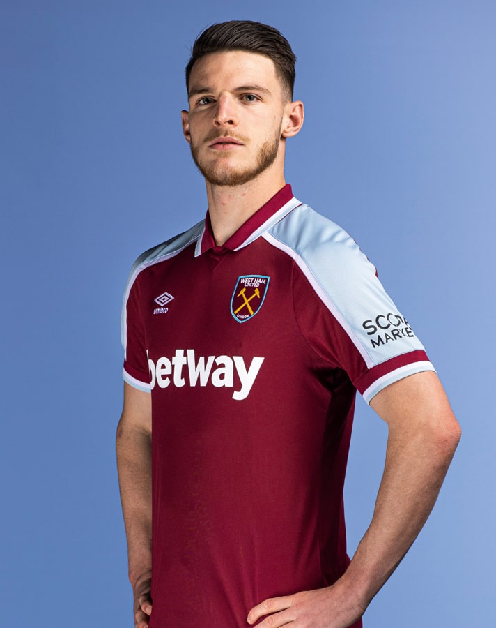
2) West Ham United Home
A second appearance for West Ham, and a second appearance for Mark Noble in almost exactly the same pose. Been practicing that for nigh-on 17 years now. Nailed it. Umbro go the retro route with a design inspired by the iconic shirt worn by Paolo Di Canio when he scored one of the club’s greatest ever goals at the turn of the Millennium. The Hammers are set for their first-ever UEFA Europa League group campaign, and they've got a solid set of kits for it.
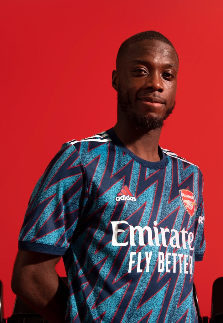
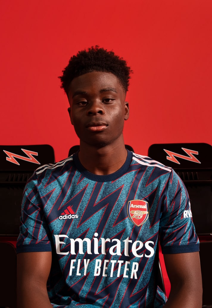
1) Arsenal Third
And they've done it again. Adidas once again supplying Arsenal with a trio of terrific designs, headlined by the quite outstanding third shirt, which revamps the iconic design from 95/96. Striking is the only word for this one. Looking forward to seeing it in action for the curtain raiser on Friday night when the Gunners travel to newly promoted Brentford.
Honourable mentions for Newcastle United away, Palace home, Liverpool home, Chelsea home, and Blackpool away. All solid contenders, but there's only room for 10, so...
Shop Premier League shirts at prodirectsoccer.com


