Japan remains something of an untapped resource for western jersey culture, and the J.League have begun to make in-roads into bringing their vibrant culture to light, notably through the ‘20J1’ Project. But for one club, that just wasn’t enough…
Nagoya Grampus Eight (or Nagoya Grampus, since 2008) is a club with a rich Japanese footballing culture and one of the ten founding clubs of the Japanese professional football era, which began in 1993. Since then they have gone on to build a bright and vibrant identity, centred around a philosophy to promote football to as many citizens as possible and contribute to communication with fans worldwide. With that philosophy firmly in mind, the club have taken the initiative to build off the J.League’s ‘20J1’ Project, bringing their own unique brand to the wider world through a series of special releases, launched in conjunction with Mizuno.


First up in that series was the Heritage Collection, which saw the club and Mizuno rereleasing the iconic 1993 jersey design, replicated in its original presentation. The club’s first-ever competitive kit, and still arguably one of their best, It was joined by a simply outstanding jacket and trouser combo, both fuelled by the retro flavour of the era.
The drop served to introduce the uninitiated to the world of J.League, and specifically Nagoya Grampus, showing the roots of the club and instantly giving a flavour of its creative direction. Don’t forget, this was a shirt design that was first introduced almost 30 years ago, now sitting perfectly in a culture that thirsts for all things 90s. Such striking colours and truly unique detail, it’s a heritage piece that is as fitting on the street as it is in the archives; it’s even more relevant today, flexing fluidly across performance and lifestyle arenas as if to highlight its position as herald to a new era of shirt design. Nagoya Grampus were putting themselves on the map, and not just in the East.


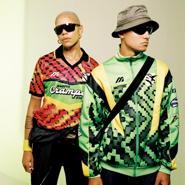
The Heritage Collection was then followed up by a radical retake of that ‘93 jersey design, courtesy of a steer from us at SoccerBible, and a design influence from independent football art house Fokohaela. The aim was to see what would happen if that design was brought into a contemporary space, combining its vintage vibrancy with a progressive visage, and the result was a visceral collection that combined bright and brazen, reworking it into an age where football and fashion so seamlessly meet. Where the original was fuelled by a retro resurgence, this was boldly exploring new territory.
Taking focus on the role of sponsors in shirt design lead to the world of Motocross, which played a big part in the overall design of both the SoccerBible x Mizuno Nagoya Grampus Eight Heritage Jersey and Track Jacket that made up the capsule. Big, bold, and unapologetically brash, this was Nagoya Grampus flexing its creativity and showing a willingness to reach out to external agencies to extend their reach to a global market.
But while that release stood out in a way that showed how you can take a minimalist approach whilst dropping a suitably strong palette of colour, some people want a slightly more lowkey approach. Tailoring for that audience somewhat, Mizuno and Nagoya Grampus then launched the special edition blackout jersey, which continued to celebrate the legacy of the Japanese club’s iconic ‘93 shirt by blacking out all details, with the ‘Nagoya Grampus Eight’ writing standing out with a shiny gloss finish. And who doesn't have time for a blackout design? Sleek and simple, it's a look that carries into lifestyle circles without breaking stride.


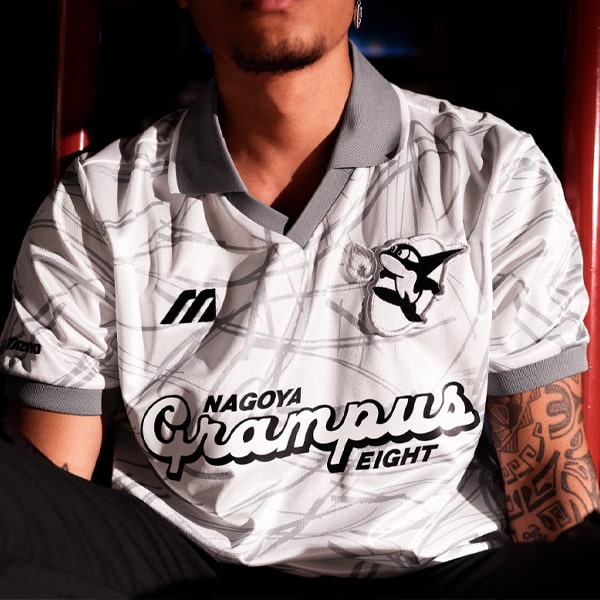
Then, to round off the collection Mizuno approached HANON, who took inspiration for their design from the club’s iconic dolphin crest. Again offering up a completely fresh take that still kept its roots firmly embedded in the J.League's visage, the jersey featured grey markings applied on top of a white base contrasted by grey ribbed sleeves and collar, a distinctive look that was lifted straight from the Risso’s dolphin, which itself has a distinctive grey body characterised by its unique ‘scored’ markings that appear over time.
The drop marked the fourth and final release from the Mizuno x Nagoya Grampus Project, completing what was a successful way to introduce the mystique of the East to a wider audience. Since its inception in 1992, the J.League has given us an abundance of gloriously exuberant football shirt designs, brought to life through the remarkable diversity, unique club cultures, and iconic, vibrant fashions that are at the heart of Japanese football, but outside of Japan it's still somewhat under appreciated and under-acknowledged. While the 20J1 Project was all about the J.League trying to rectify that by shining a spotlight on its growing global footprint by sending its eye-catching kits to cities around the world, the Mizuno x Nagoya Grampus Project took that a step further, actively seeking out further ways to enhance, elevate, and ultimately bring focus to what is a relatively untapped resource outside of Europe.


Fans are forever clamouring for fresh and bespoke designs for their clubs that breakaway from the unimaginative world of templates. This just shows that clubs and brands could do a lot worse than look towards the Land of the Rising Sun for some inspiration...
Shop the Mizuno x Nagoya Grampus Collection at prodirectsoccer.com


