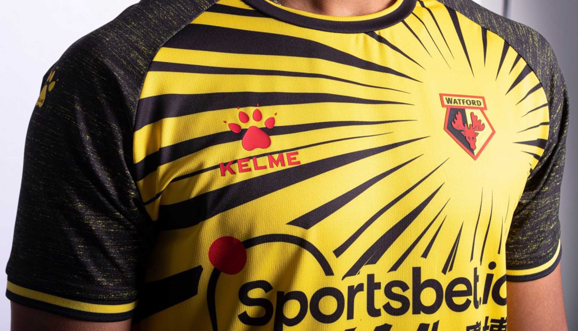
They may well be set to be playing their football in the Championship this coming season, but Watford have got a fresh new style to show off in English football’s second tier, thanks to wild design on the 20/21 home shirt from new technical partners Kelme.
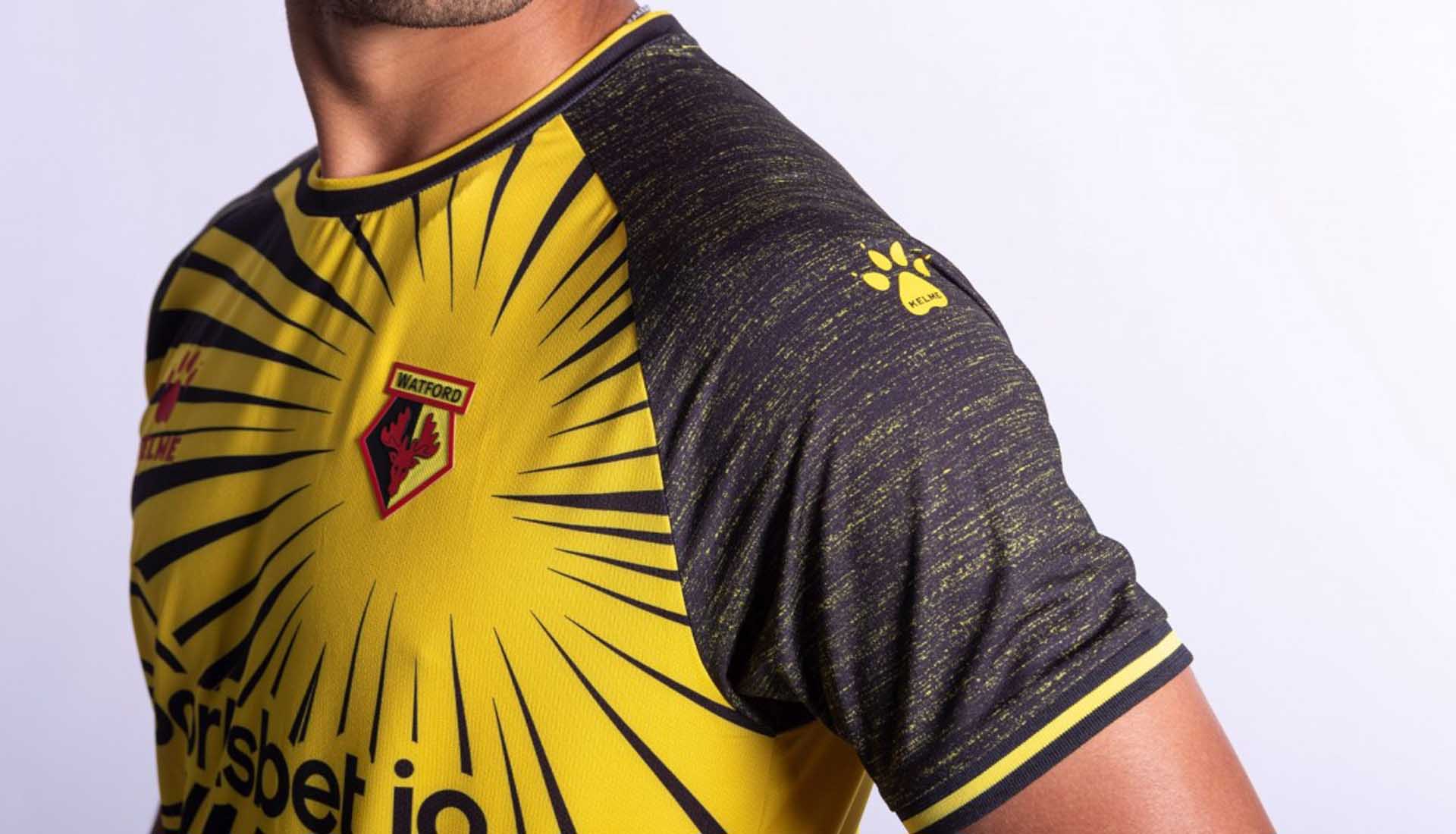
Kelme and Watford announced a new £10 million deal back in May, and now we have the first product of that new partnership. Carrying with it a healthy dose of Kaiser Chiefs vibes, the Watford 20/21 home shirt features a bold reinvention of the club’s traditional look. Watford fans have been less than receptive to change in the past – last season's move away from stripes to that 50/50 split being one such example – so it will be interesting to see how they deal with something as radical as this. The bespoke design is the first to be produced exclusively for the Hornets by the club’s new technical partner Kelme.
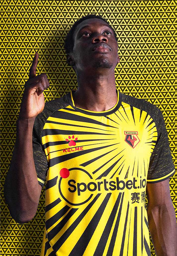

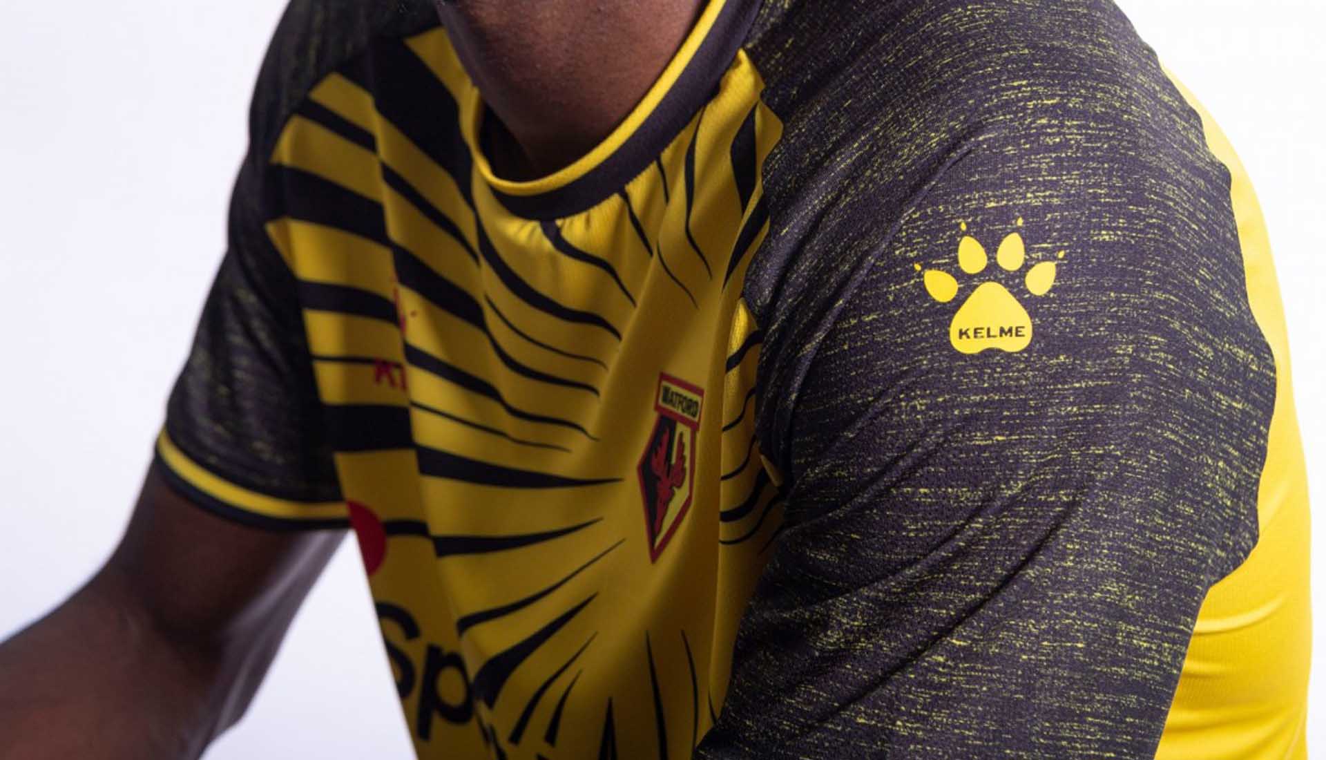
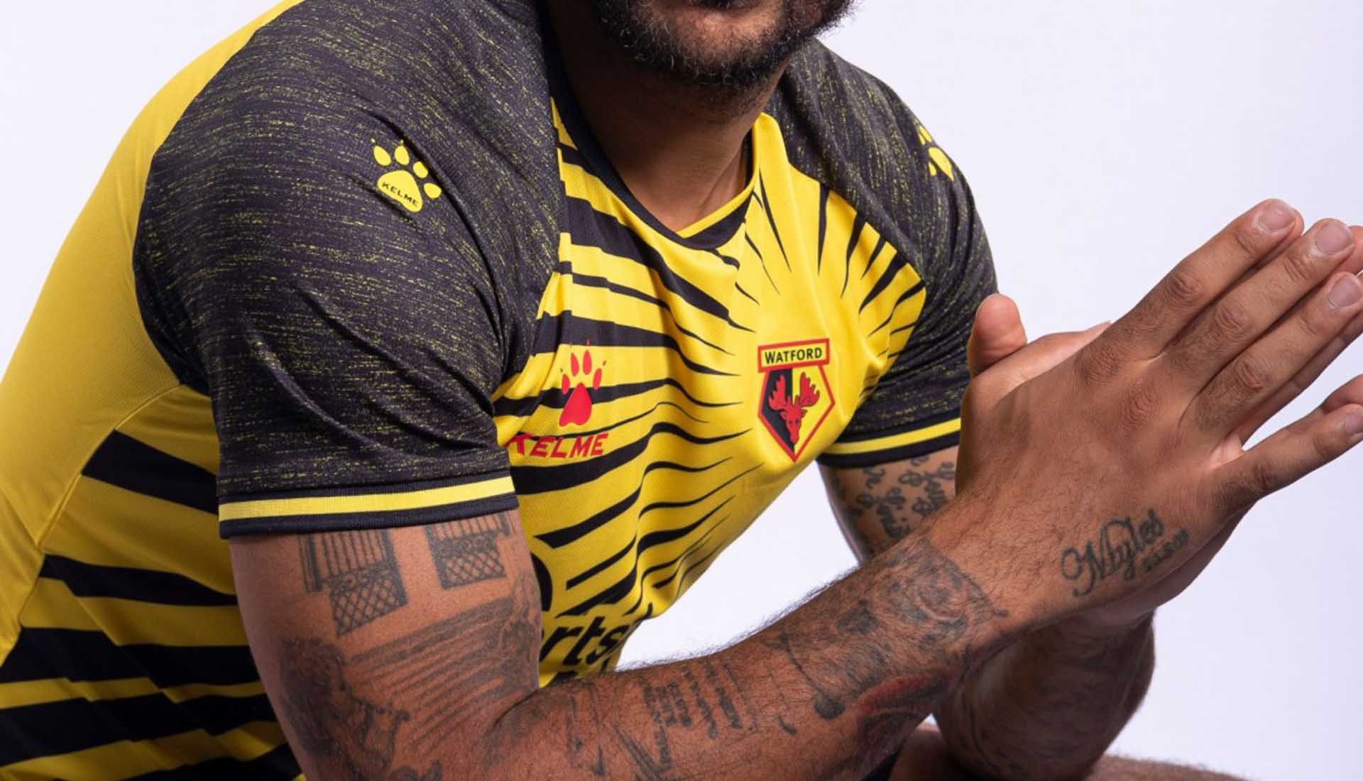
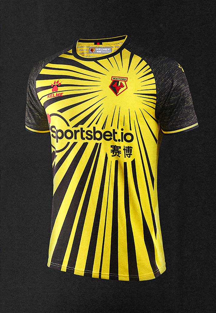
The design sees the traditional colours of the club reinterpreted in a series of rays, radiating out from the club crest on the left of the chest. The sponsor logo has been tastefully incorporated into the design, appearing in black so as not to jar the overall aesthetics. The raglan sleeves feature a distressed design, with hints of yellow fading through the black. In a move away from what tends to be the case with some of the bigger brands, the shirt available for supporters is exactly the same as the shirt that will be worn by the players.
Sure to be divisive, but we like it.

The Watford 20/21 home shirt is available now from the club's web store.
