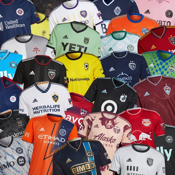
With the 2023 MLS Season kick off right around the corner, teams have been busy unveiling their new strips from adidas. Here, we take a look at every one, ranking them out of 10.
If you’re not a U.S. or Canada native, you may be unaware of the way Major League Soccer does kits. To start with, the league has an affiliation with adidas, meaning the Three Stripes produce kits for all 29 teams. Then there’s the fact that teams only get one new kit per season, alternating between Primary (home for us Europeans) and Secondary (away) – something we wouldn’t be opposed to seeing reintroduced on this side of the pond. Club’s will usually always have a lighter shirt and a darker shirt, ensuring kits fulfil their main function and all teams have kits that will not clash with their opponents.
With the 2023 MLS season set to get underway on 25 February, all teams have been busy lifting the veil on their new kits, and we've rounded them all up in one place for you to cast your eye over. We've also cast our critical eye over them, marking them out of 10. How you feeling about your team's new threads, and do you agree with how we've marked them?
EASTERN CONFERENCE
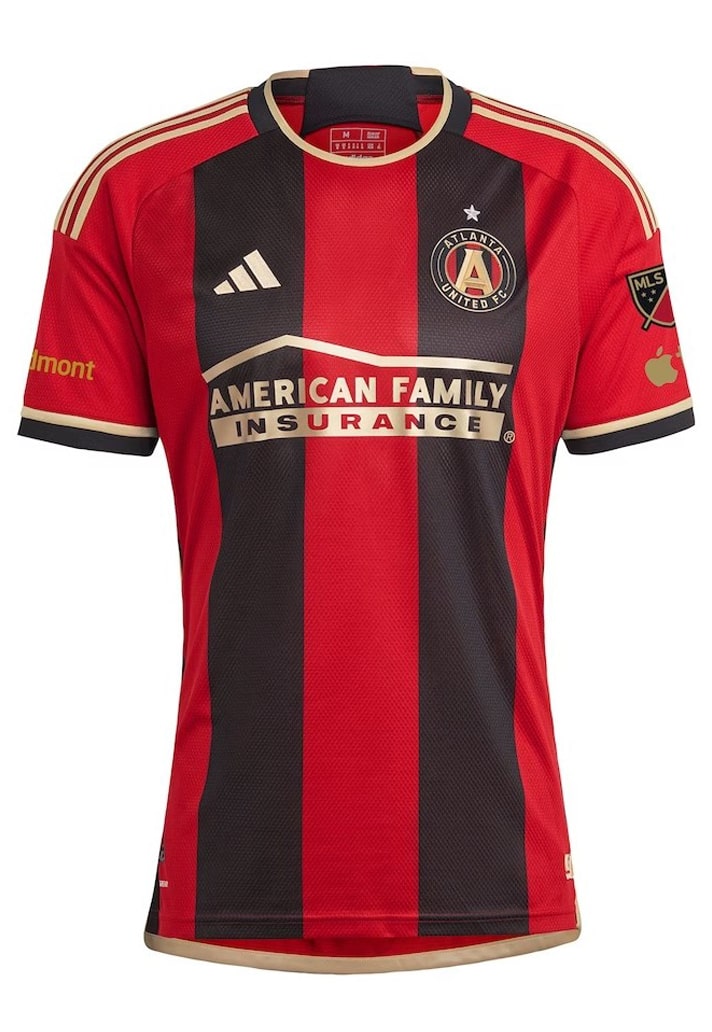
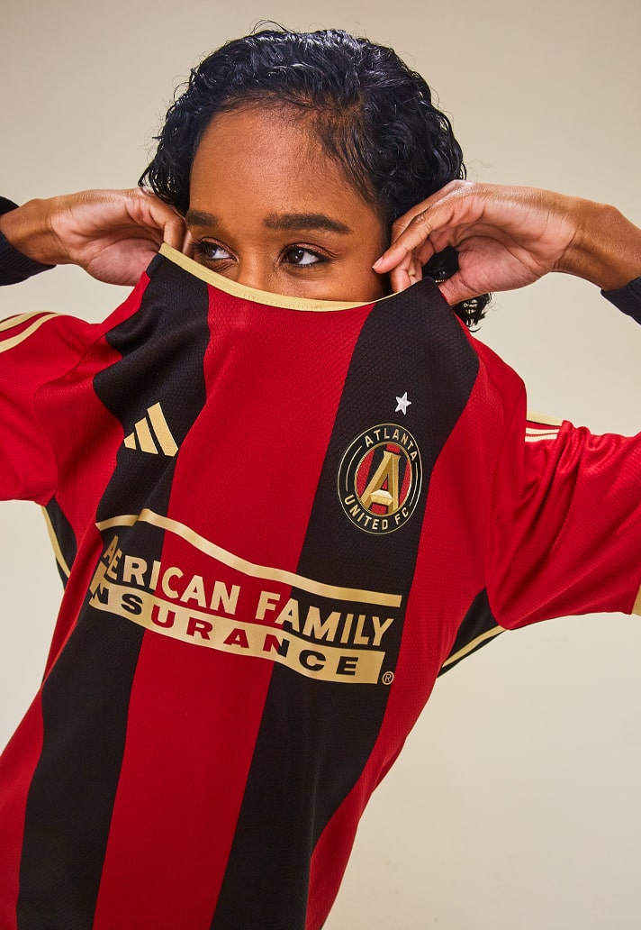
Atlanta United Primary – 7/10
Dubbed "The 17s’ Kit" in honour of the club's fans, Atlanta's new home jersey arrives as just the fourth in the club's short history. It reverts back to a more classic take on the club's primary look following the 2021 version, and it's good... but not as good as its predecessor in our opinion.
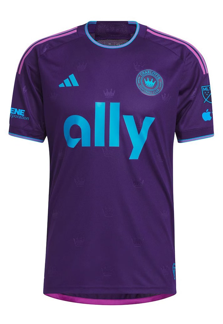
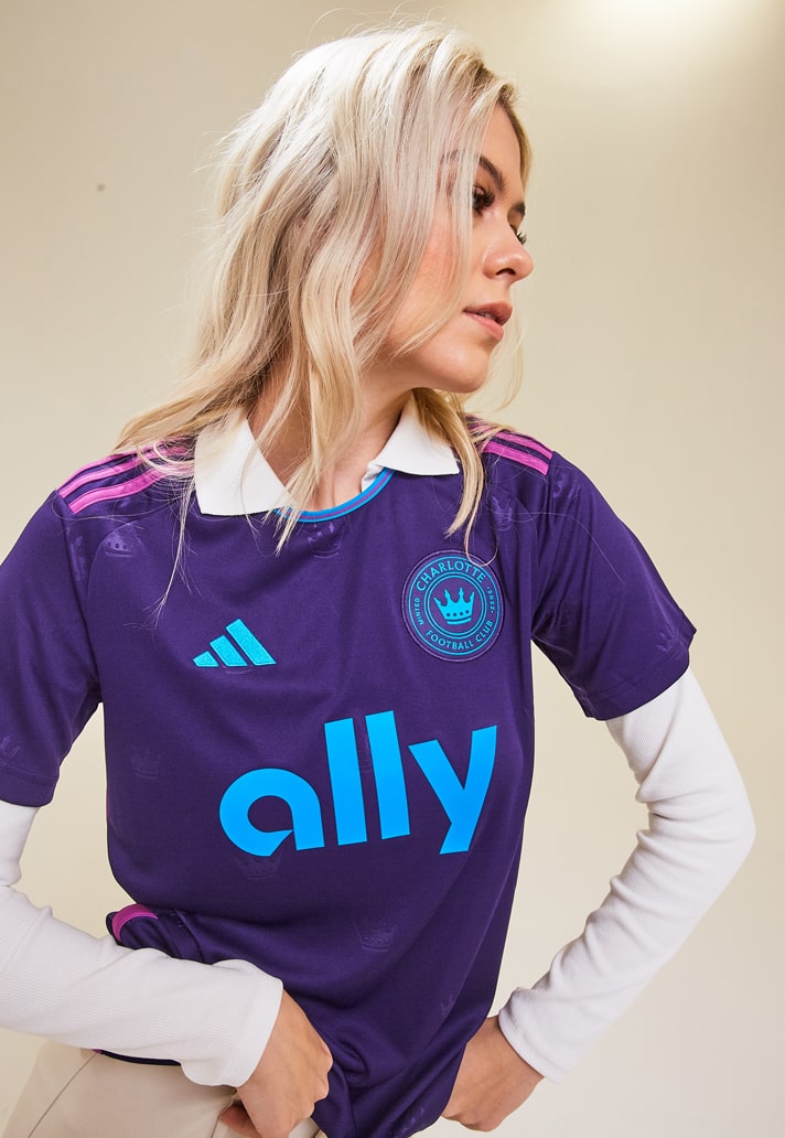
Charlotte FC Secondary – 7/10
Second season and second Secondary jersey for Charlotte. This one is called 'The Crown Jewel Kit', though we're not totally sold on the reasoning behind that – redefine royalty and inspire a new era for the Queen City? Mmm. Still, the deep purple is a reasonably unique look for this campaign, aside from Orlando.
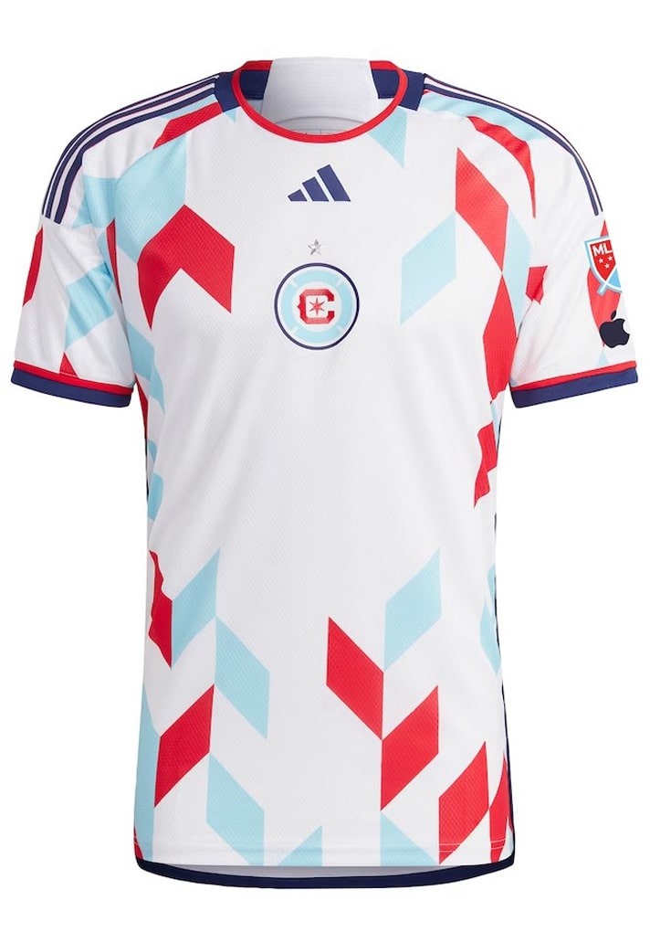
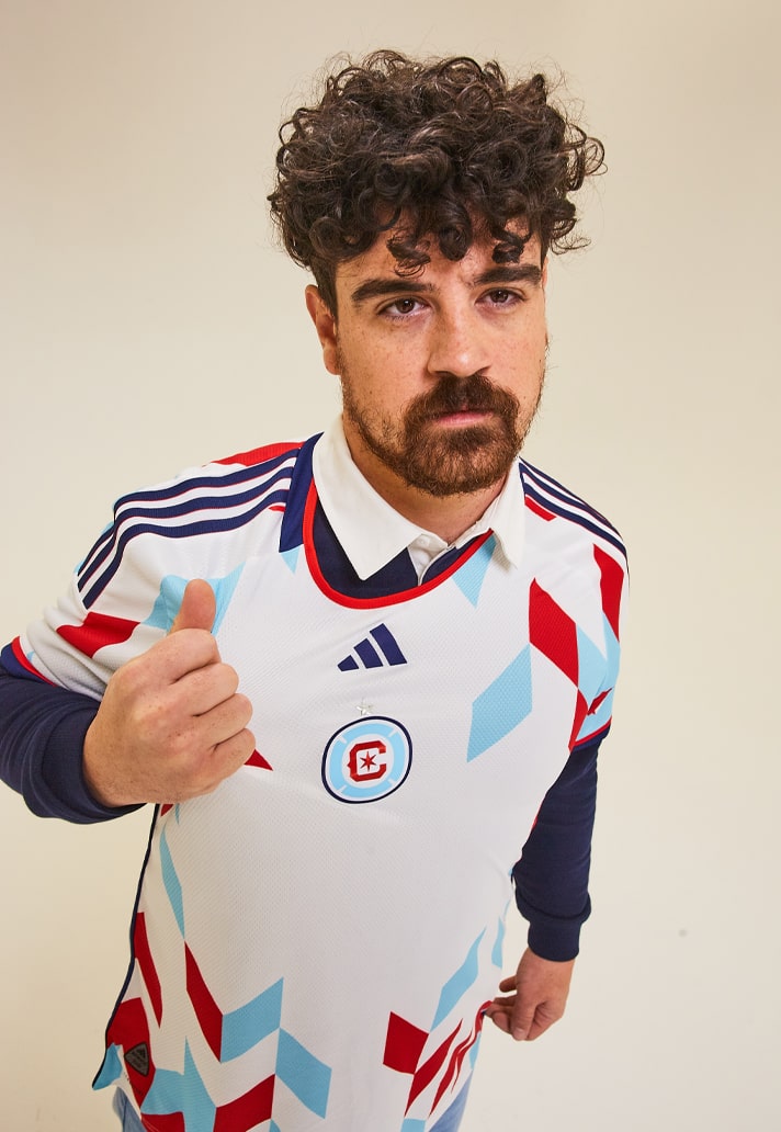
Chicago Fire FC Secondary – 7/10
"A Kit For All", as it's known, is the first jersey specifically designed for the club's new crest, which debuted in 2022. It takes residence in a central position – also a first for the club. Illinois' state flag is the primary inspiration for the rest of the design, with Fire red and navy blue trim accenting the sides, sleeves and bottom. While their may have been a design better suited to The Fire further down the list, this is a decent look for the road.
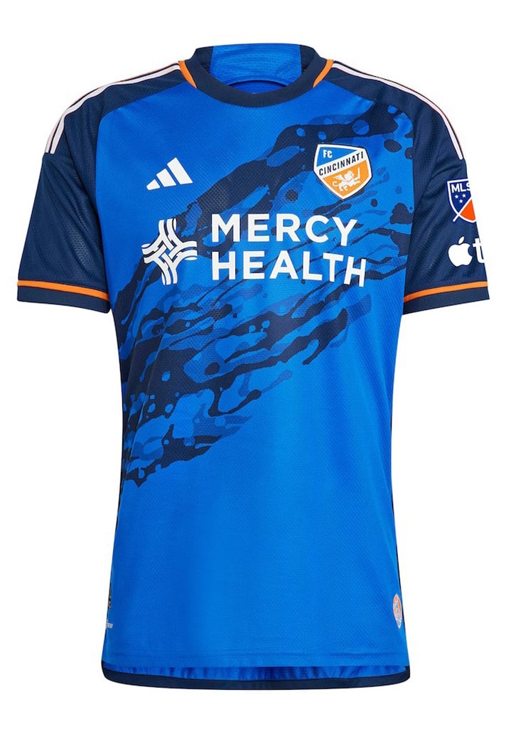
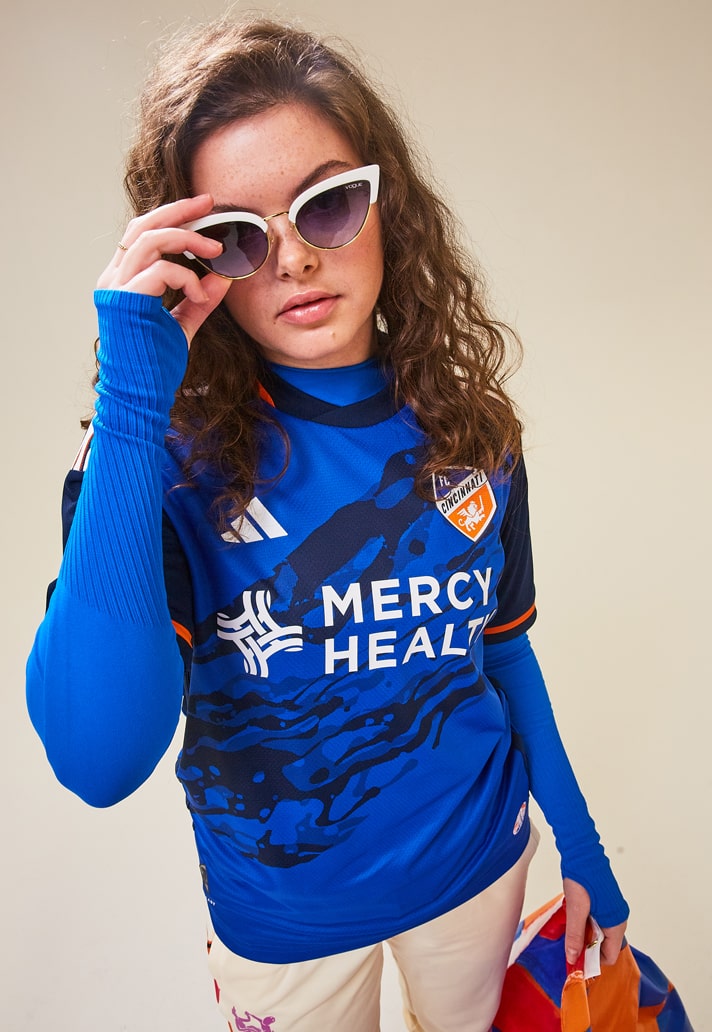
FC Cincinnati Primary – 6/10
Paying tribute to the Ohio River, FC Cincinnati's new primary jersey feels like it has a good idea at it's heart... but ultimately just sort of looks like it's been run over – see also Belgium's Euro 2020 home shirt.
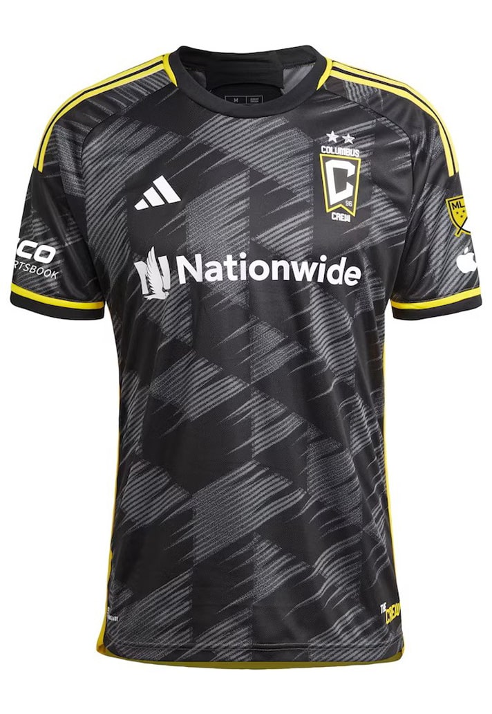
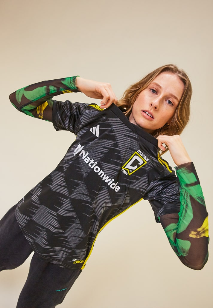
Colombus Crew Secondary – 7/10
Yeah, digging this. The Colombus Crew away jersey features a grey on black graphic that represents speed, velocity and movement – attributes that embody both the club and the city of Columbus, and that's why it's called the "VeloCITY Kit". Yellow accents pop on the otherwise dark base.
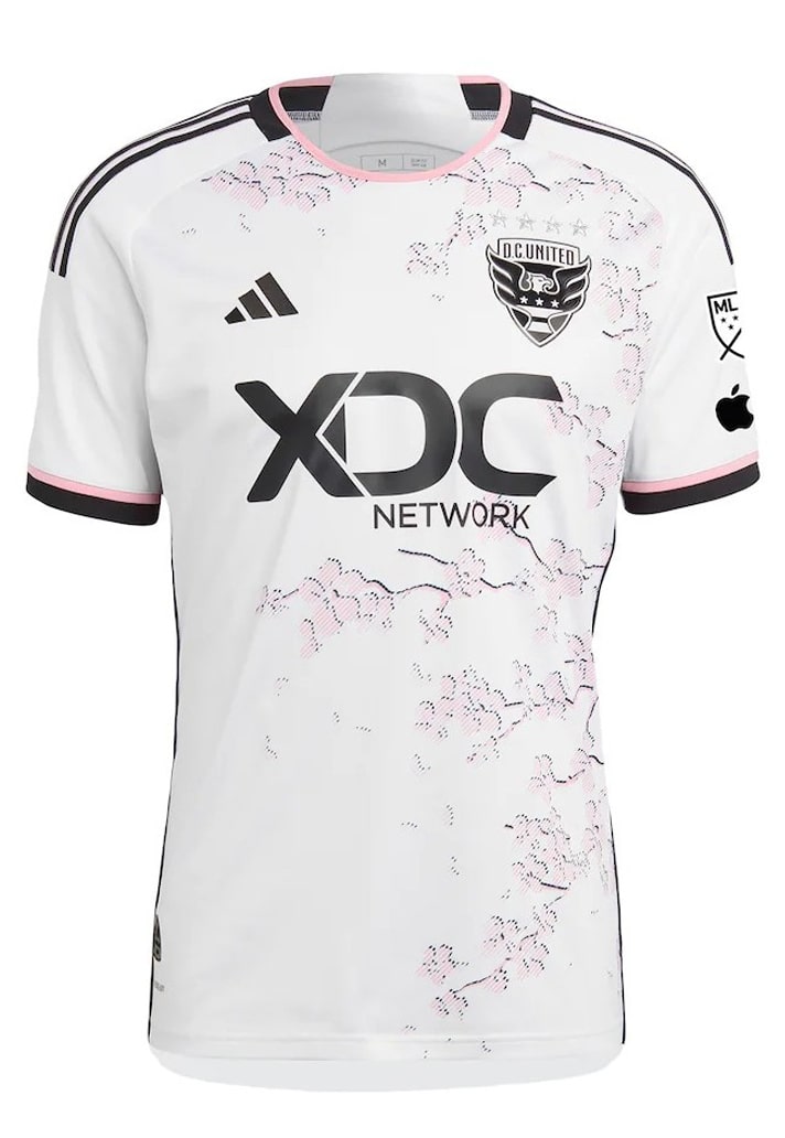
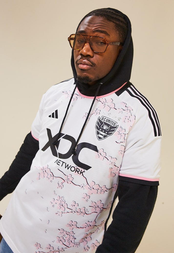
DC United Secondary – 8/10
Coming with some proper Japan 2022 World Cup away vibes – and that's certainly no bad thing – the DC United away jersey is called the "Cherry Blossom Kit". Visually, it's fairly obvious where that comes from, with one of the city’s most recognisable – and natural – landmarks in the cherry blossom trees appearing as a patterned design of branches across the front of the shirt.
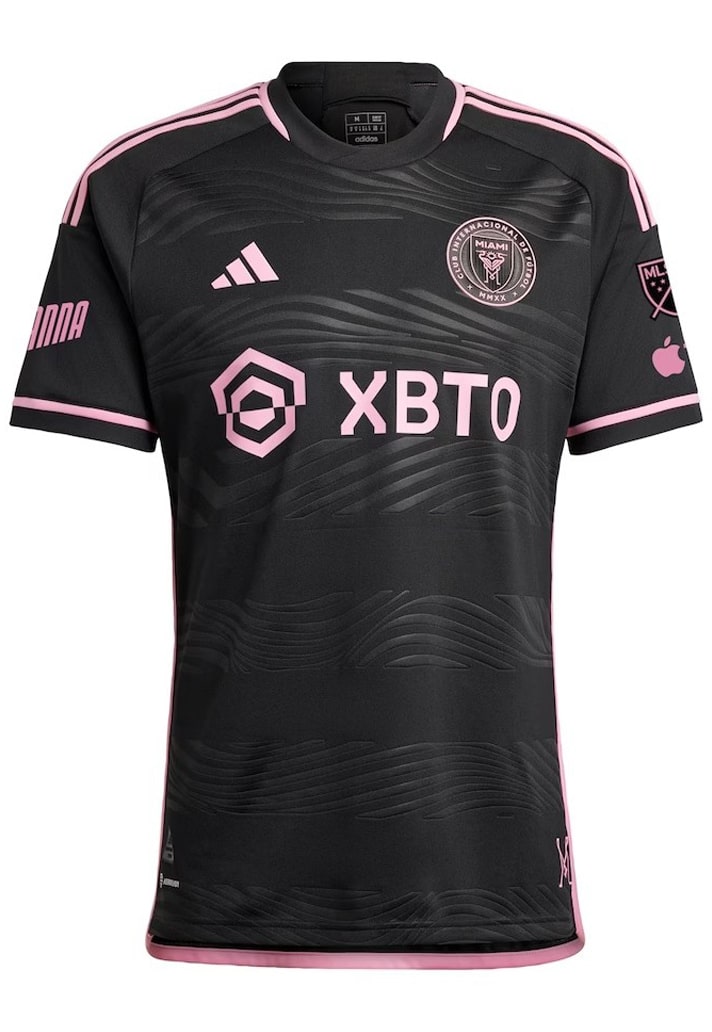
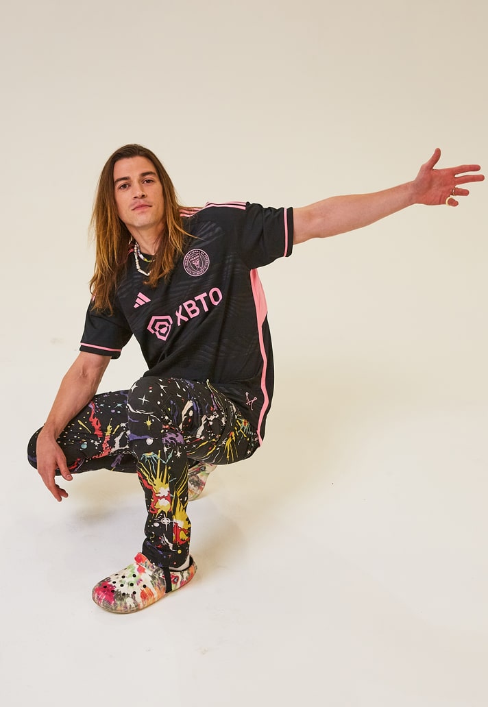
Inter Miami Secondary – 7/10
The third away kit in the club’s history is inspired by the energy and excitement of both Inter Miami fans and the City of Miami at night. "La Noche Kit" features an embossed wave pattern to portray the energy of what happens on and off the field after dusk. Some detail lost at a distance, but a great look.
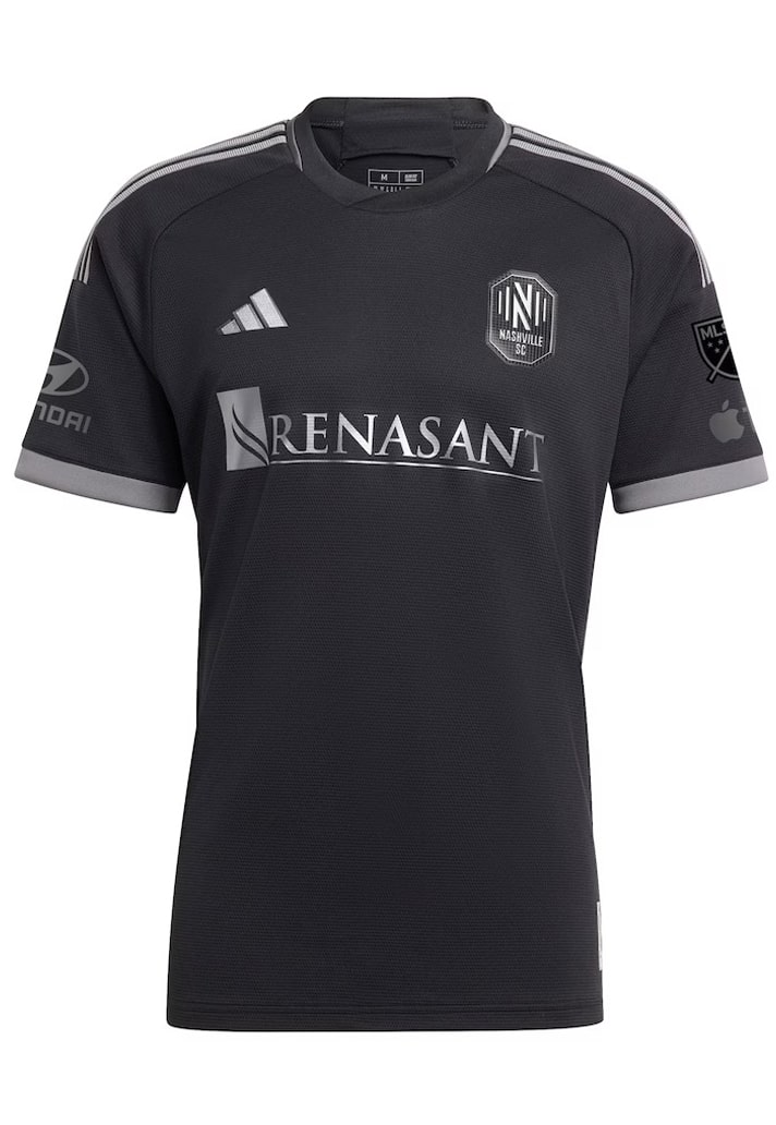
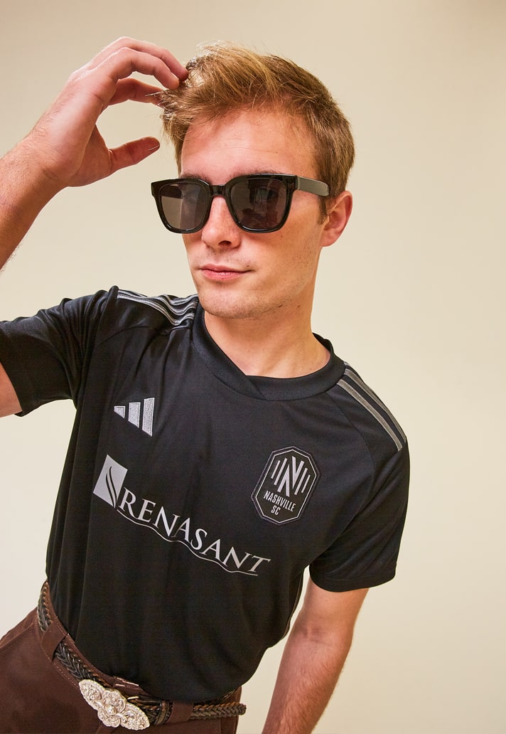
Nashville SC Secondary – 8/10
On its own the Nashville SC Secondary jersey is a tidy monochrome affair. But what makes this one is the story behind the design, with "The Man in Black Kit" honouring one of the most influential singer-songwriters of all time, Johnny Cash. It includes a jocktag of Johnny Cash’s iconic photo at Folsom Prison and Cash’s autograph on the back of the neck. Nice touches that elevate the overall design.
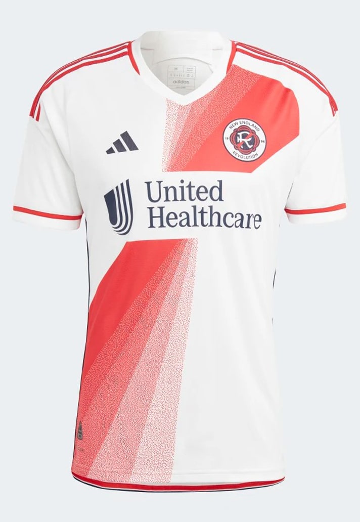
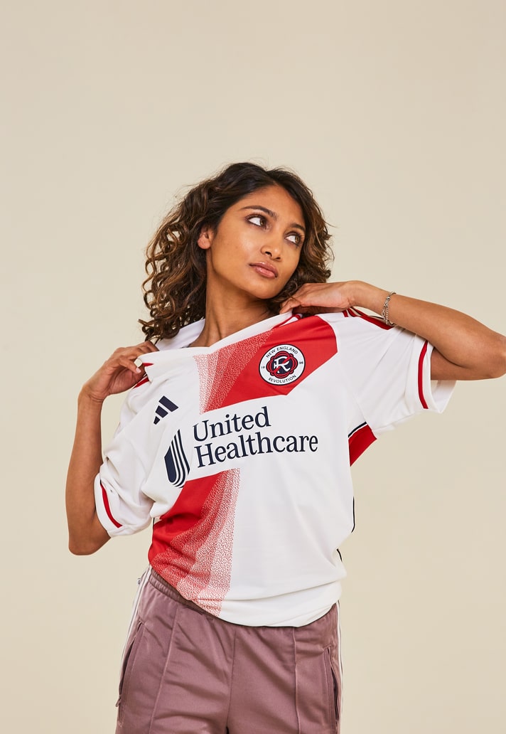
New England Revolution Secondary – 5/10
Can't help but feel that "The Defiance Kit" has had its legs taken out from under it by that sponsor, interrupting what would otherwise have been a strong design.
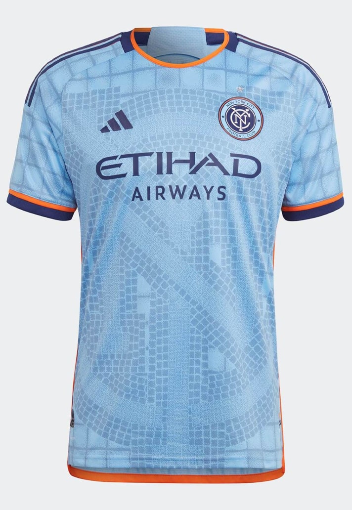
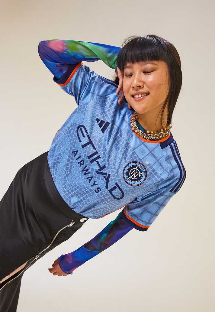
New York City Primary – 9/10
If you're looking for a way to keep a home design fresh, then look no further than NYCFC's "Interboro Kit". The kit features the navy and orange colours of the NYC flag, alongside the club's City Blue, making it NYCFC's most colourful home shirt yet. But that's not where the attention resides. Instead, it is the mosaic of the clubs logo that draws the eye, dominating the base of the shirt.
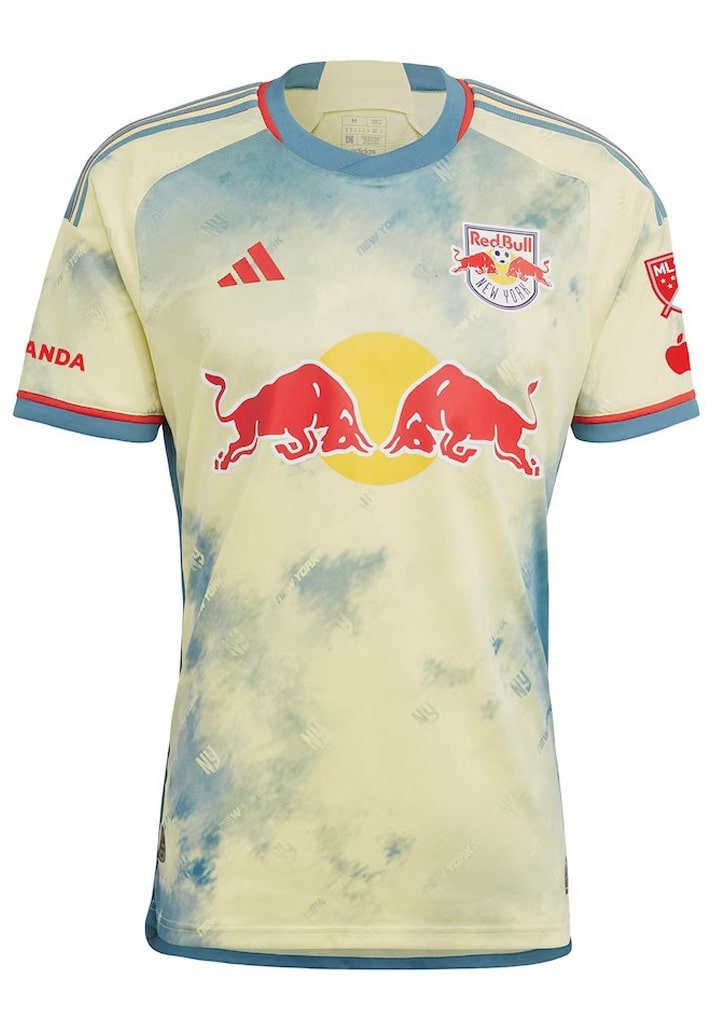
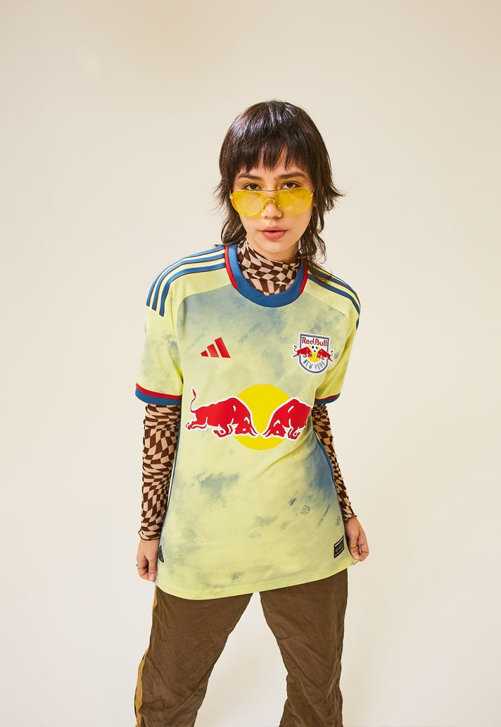
New York Red Bulls Secondary – 6/10
Coming with some proper adidas x Humanrace vibes, New York Red Bulls called on the help of luxury sportswear designer Daniel Patrick for their latest secondary jersey. Plenty of meaning and hidden messages on the tye-dye-esque design and we applaud the endeavour, but just shooting wide of the mark.
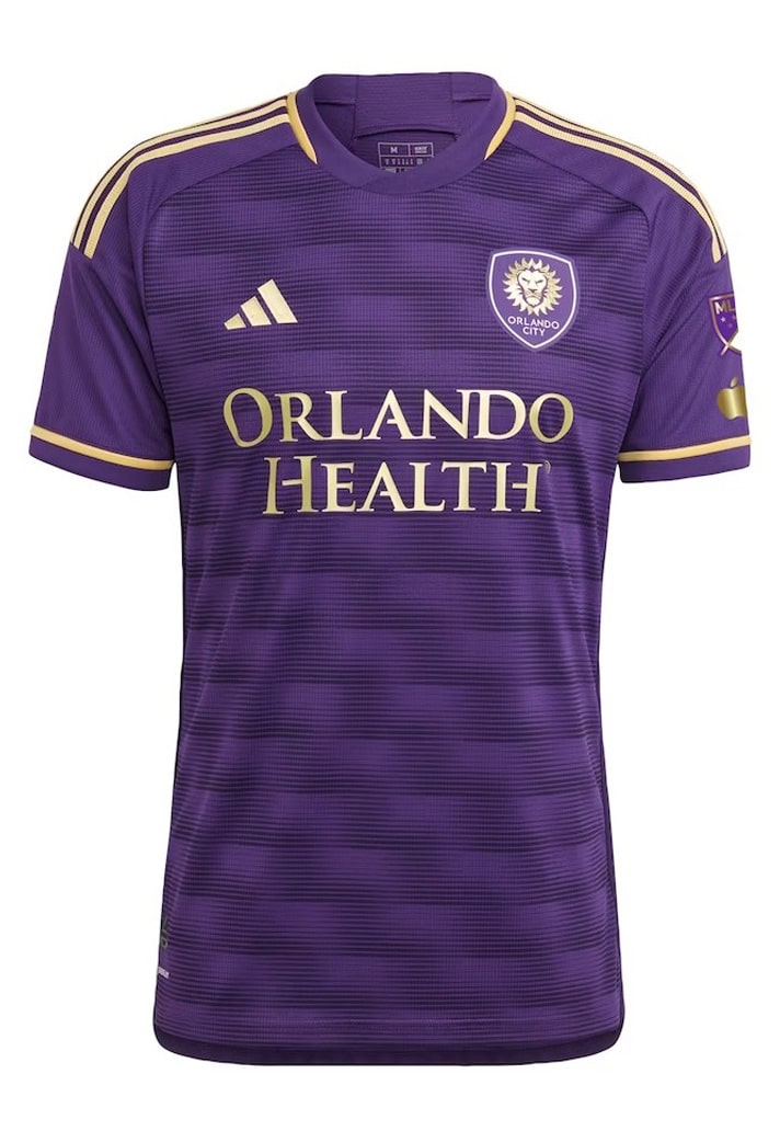
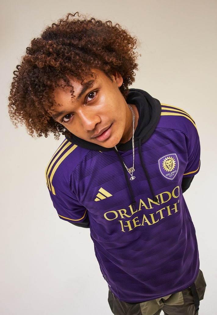
Orlando City Primary – 7/10
Another strong entry for Orlando, "The Wall Kit" is inspired by fans that pack the club’s first-of-its-kind safe-standing supporter section at Exploria Stadium. Not the most inspiring name, but the deep textured graphic that represents its namesake.
Philadelphia Union Secondary – 6/10
Like the NYRB shirt, this is another that conjures adidas x Humanrace vibes. But again, it just doesn't quite land right, looking like it's been lifted straight off the page it was drawn on. On teh plus side, it does look better on the pitch than the page.
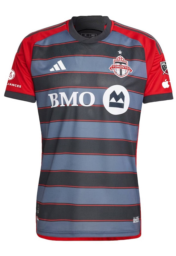
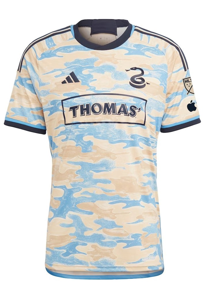
Toronto FC Primary – 5/10
Is this shirt actually good, or not? Hard to tell. You can kind of see what the design was going for, but the hoops with solid block shoulders just ends up feeling jarring if we're being honest.
WESTERN CONFERENCE
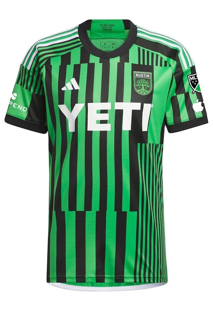
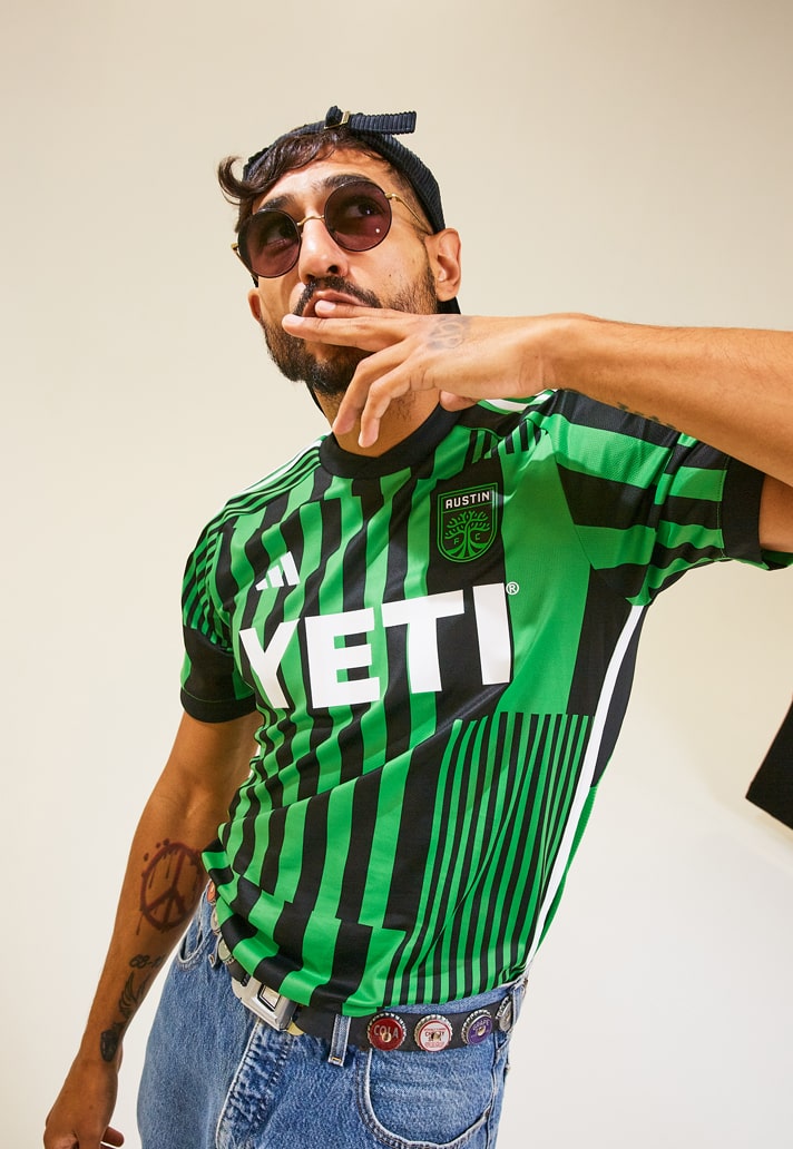
Austin FC Primary – 5/10
Another design where you have to applaud the effort and the intention to keep the home look fresh, but Austin FC's "Las Voces Kit" misses the target.
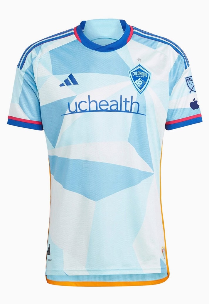
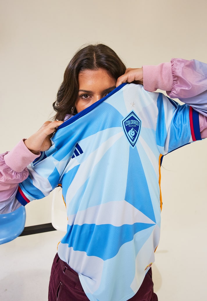
Colorado Rapids Secondary Jersey – 6/10
The Colorado Rapids "New Day Kit" was co-designed by local artist Pat Milbery and is the first-ever artist collaboration on an MLS jersey. Its design is inspired by Colorado’s sunrises and sunsets as well as the possibilities each new day brings. And it's alright. Not ground breaking, but a smart enough look.
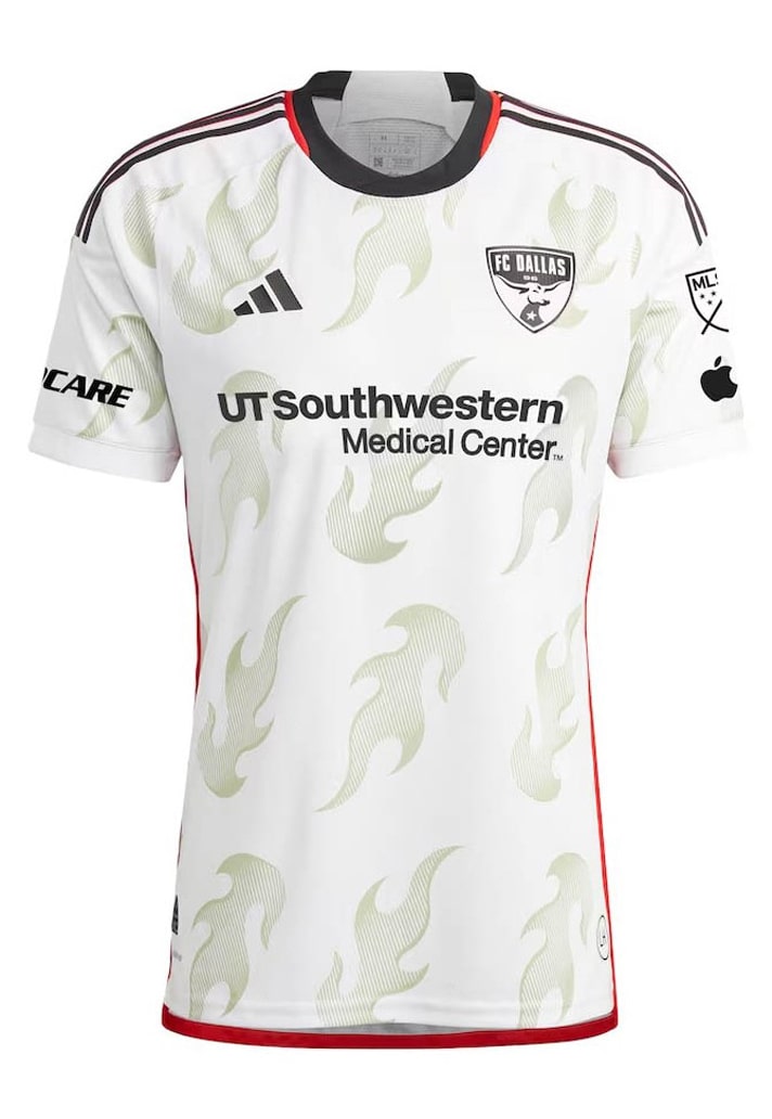
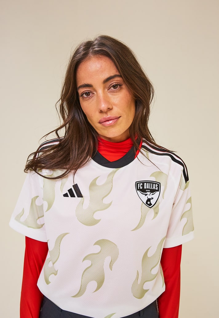
FC Dallas Secondary – 7/10
Remember when we said about there being a more appropriate design for Chicago Fire? Well... the "Burn Baby, Burn Kit" pays tribute to FC Dallas’ roots as one of Major League Soccer’s original 10 franchises when the league launched in 1996, back when they were known as Dallas Burn. Definitely could've been better executed, but we're still in to it.
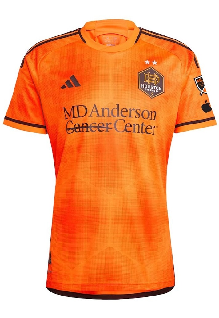
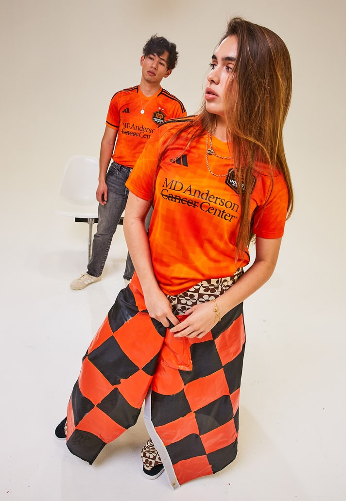
Houston Dynamo Primary – 6/10
The new Houston Dynamo "El Sol Kit" is... alright, isn't it? Follows very faithfully in the club's previously trodden path. A Pixelated graphic representation of a heat map nods to the Texas sun. Yeah, it's OK.
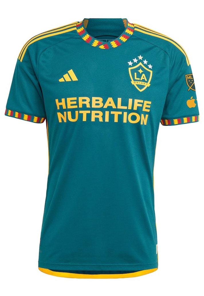
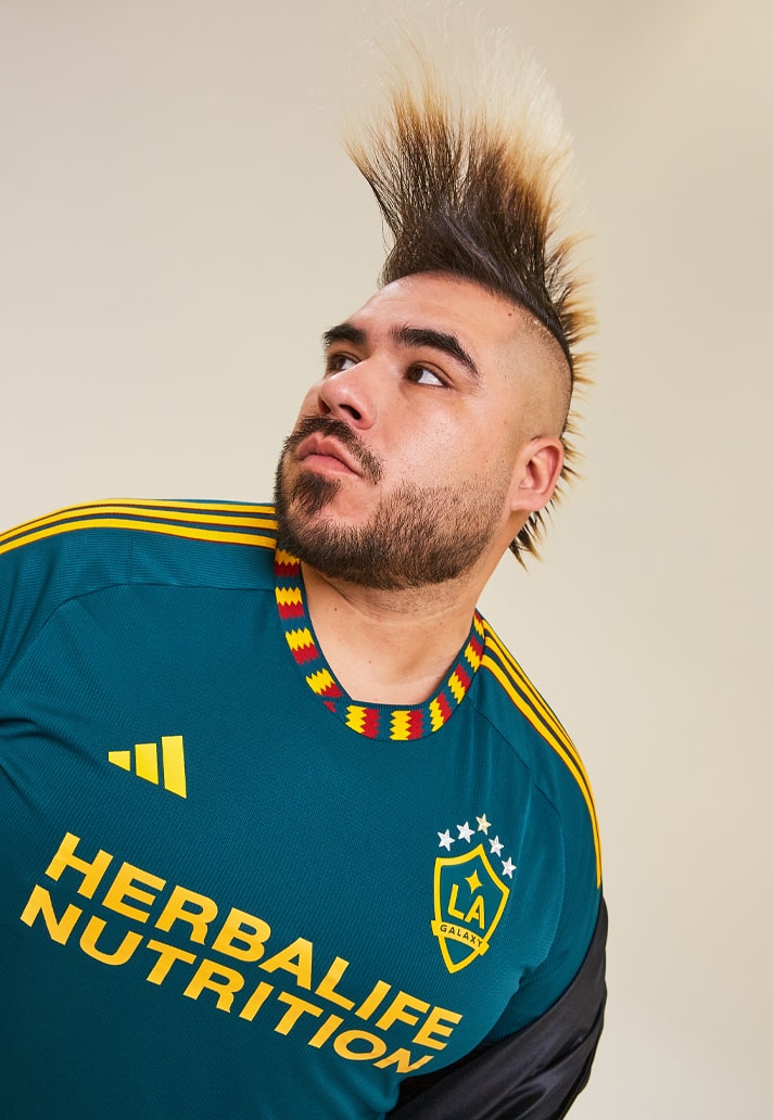
LA Galaxy Secondary – 9/10
What a little rascal the LA Galaxy Secondary kit is. Those collar and cuff details just propel this one to another level. And as if it wasn't enough on its own, it also has a nice bit of meaning behind it, with the design of "The LA Kit" honouring the city and its history by embracing the colours of the City of Los Angeles Flag.
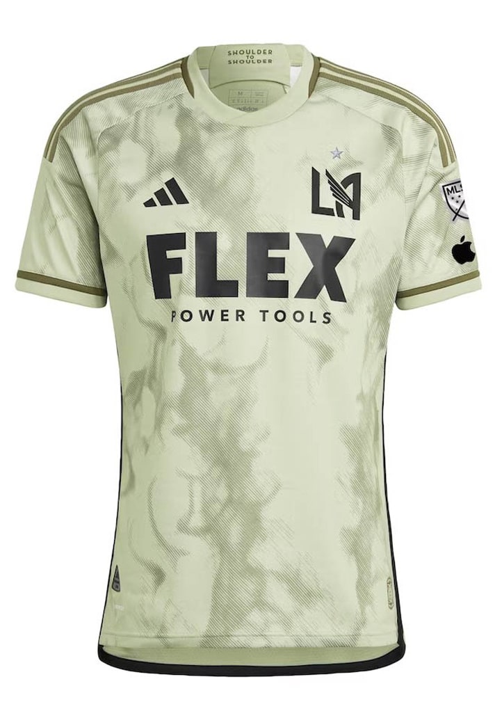
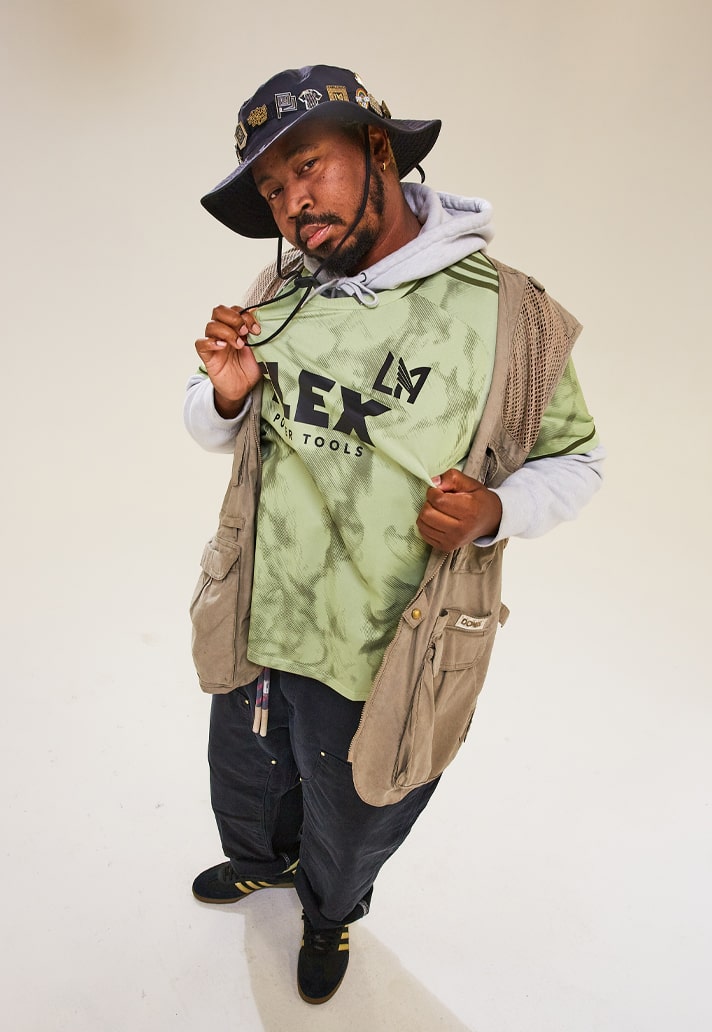
LAFC Secondary – 7/10
"The Smokescreen Kit" pays homage to LAFC's winning culture and iconic smoke-filled goal celebrations, quite literally translating it as a smokey graphic on a yellow-tinged base. Not LAFC's best, but not a bad effort at all.
Minnesota United Secondary – 7/10
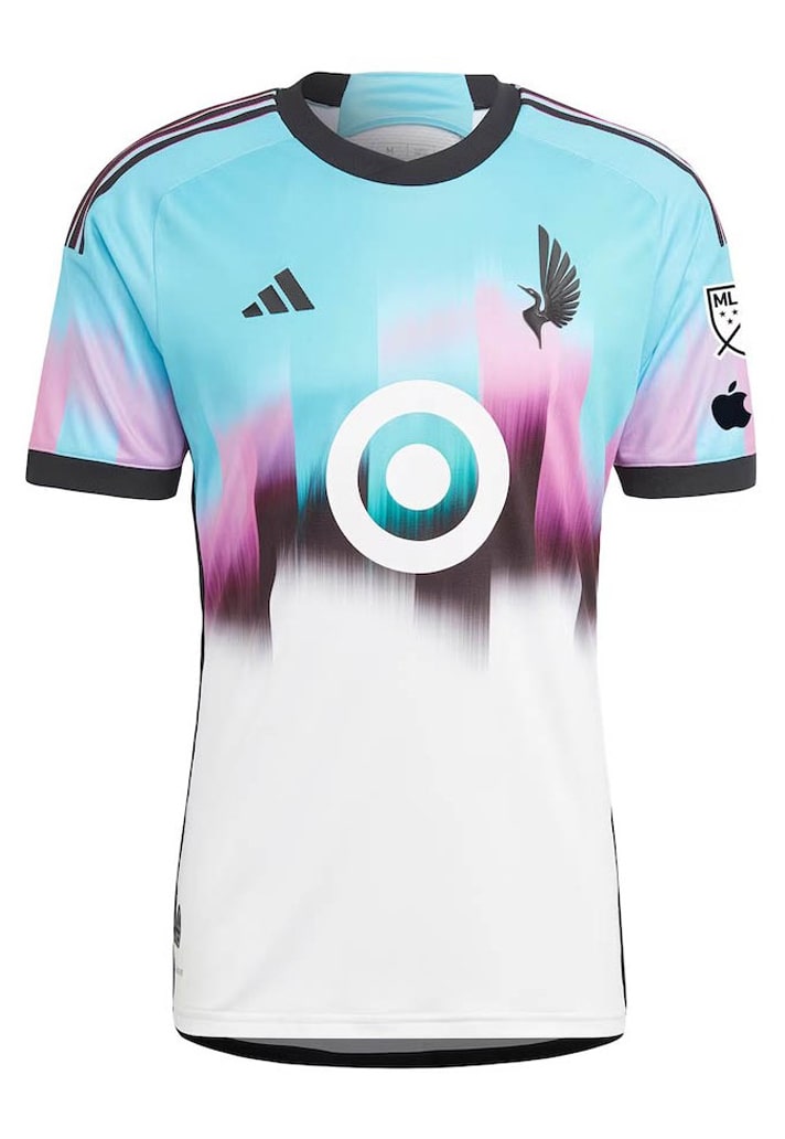
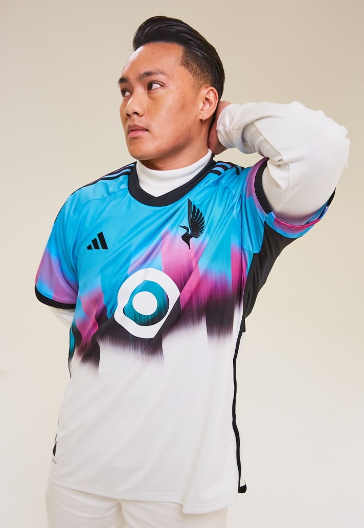
Taking the Earth’s greatest natural light show as its inspiration, "The Northern Lights Kit" features a bold, vibrant array of colours, just like its namesake. It sees the top half in sky blue and the bottom half in a snow white, split by a blast of contrasting black and pink. The target logo switches to white in an attempt to blend in, but it fails miserably. Shame, as it's a blotch on an otherwise strong design, where the club's Loon logo is featured without the club’s crest as the backdrop for the first time.
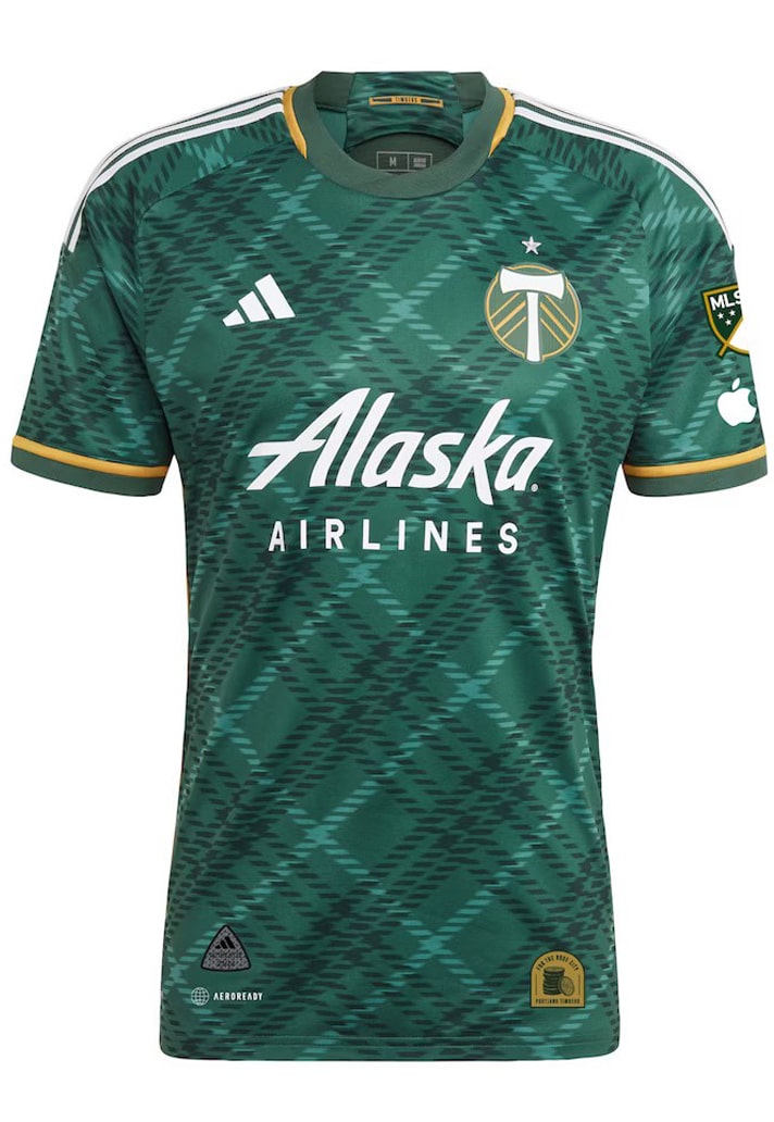
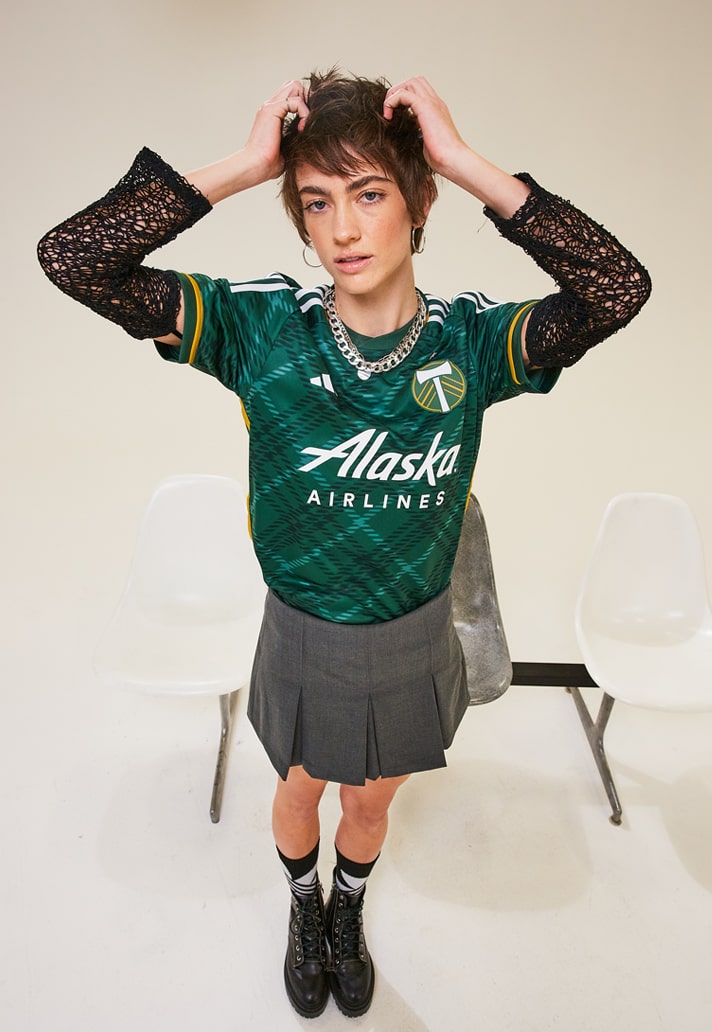
Portland Timbers Primary – 7/10
"The Portland Plaid Kit" could easily be a Celtic home shirt, with the ponderosa, shadow green and gold coming together in a plaid-clad jersey to reflect the tight-knit relationship between the club and the community. Not Portland's strongest home look in recent years, but not bad either.
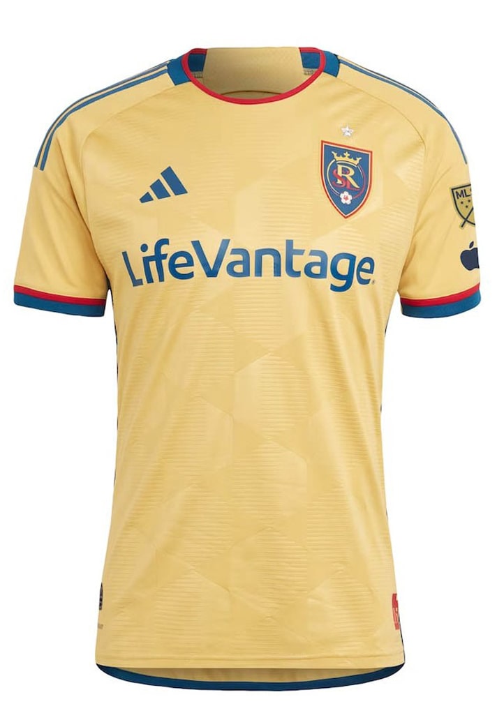
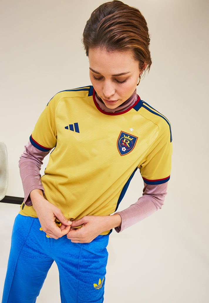
Real Salt Lake Secondary – 4/10
The new Colombia home shirt, oh no, sorry, Real Salt Lake Secondary jersey is apparently a tribute to RSL's home state of Utah. It encourages fans to "Be Bold. Go Gold" by embracing the local community's ethos of solidarity and collaboration. Just like bees, Salt Lakers are in it together... While the inspiration feels tenuous, the design is just a bit lazy. Beehive yourselves.
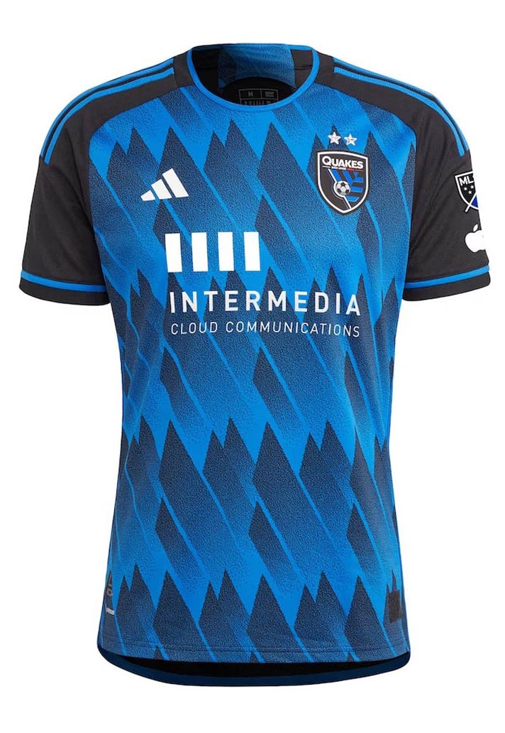
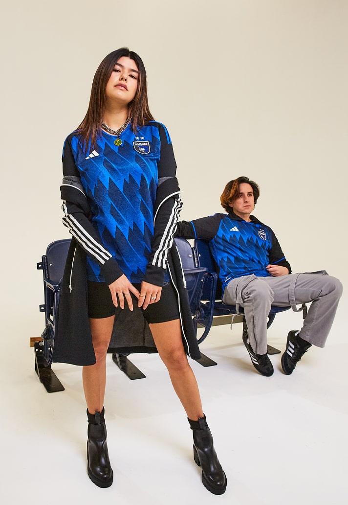
San Jose Earthquakes Primary – 8/10
Another great example of how to refresh a home look while sticking close to the club's roots and traditions, "The Active Fault Kit" sees a dark blue background accentuated by black diagonal streaks moving upwards in a seismic, tectonic pattern – similar to fault lines associated with earthquakes. Looks better without the sponsor.
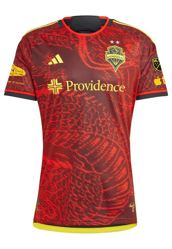
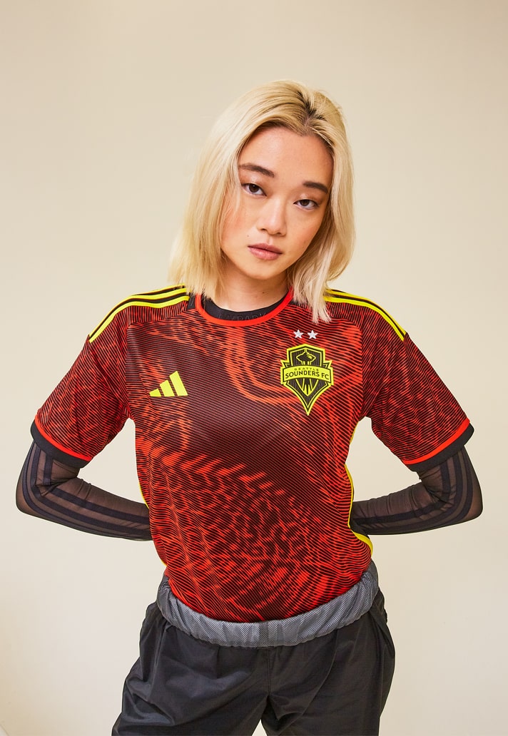
Seattle Sounders Secondary – 10/10
Too much sauce! Just look at "The Bruce Lee Kit" and marvel. Fifty years after his untimely death, the Sounders' new away strip honours a legend with deep Seattle roots and a shared commitment to harmony, self-expression, inclusion and action. Details include sunbeam yellow accents with a dragon design, as well as Bruce Lee’s official signature and the Bruce Lee Core Symbol: Yin Yang and traditional characters. So good.
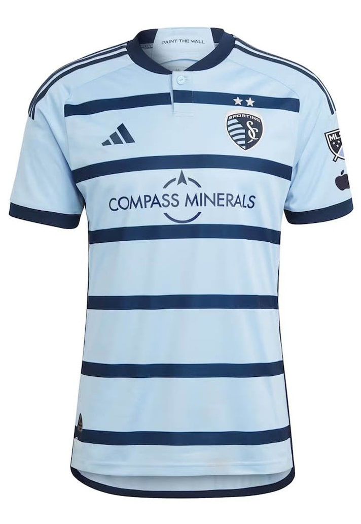
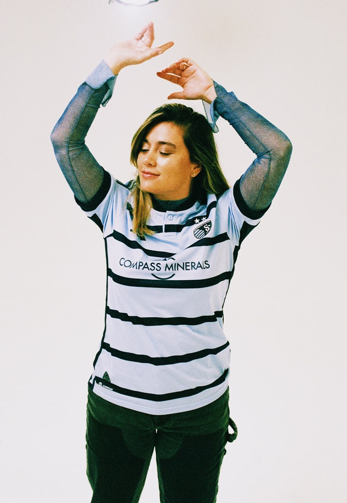
Sporting Kansas City Primary – 5/10
So, the Sporting Kansas City home jersey isn't a bad shirt on its own merits, but when you hold it next to its predecessor you get a sense of how much thought went into it... "Yeah, so if we make the hoops a little thinner... we could call it The Hoops 4.0 Kit..." Yeah, not buying that lack of effort.
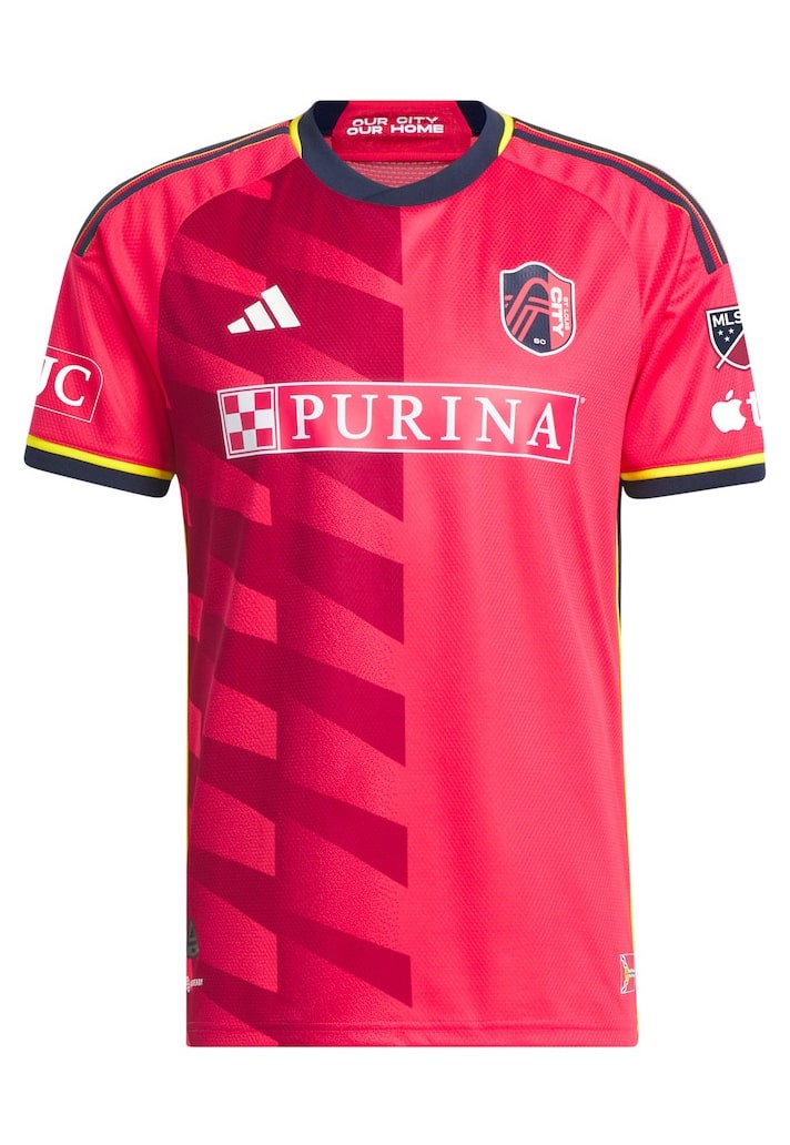
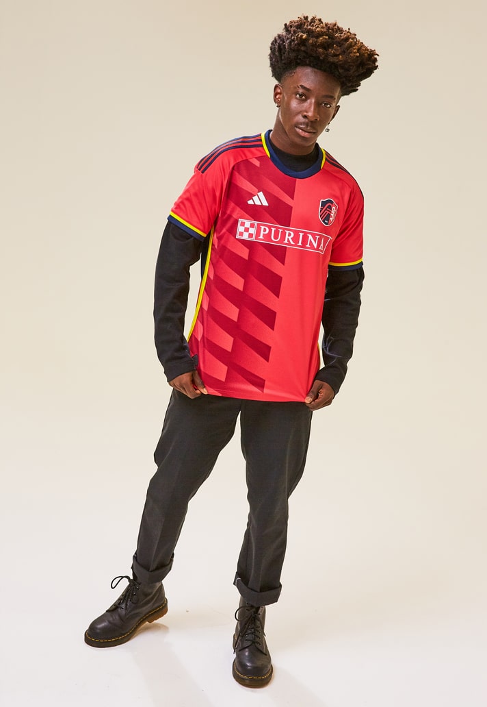
St. Louis City Primary – 7/10
A solid start for MLS new boys, St Louis City, with the club's first-ever primary shirt featuring the club’s vibrant and signature CITY Red colour with navy and yellow accents as an homage to the City of St. Louis flag – which is also displayed as a patch along the jersey’s bottom hem. The left-hand side features a geometric pattern echoing the steel plates of the Gateway Arch.
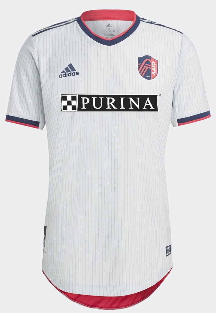
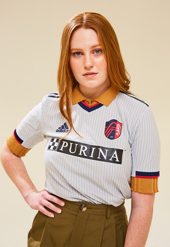
St Louis City Secondary – 7/10
For their first-ever away kit, "The Spirit Kit" comes with a design inspired by the metallic and modern design of CITYPARK. Arch grey with red accents, the shirt features subtle pinstripes and some nice collar and cuff details. Not too adventurous, but a steady start to their existence.
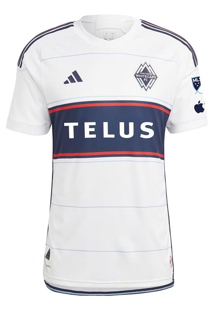
Vancouver Whitecaps Primary – 6/10
Were it not for its connection and support for the Canadian Blood Services, "The Bloodlines Kit" would be another that we would be lambasting for a lack of originality and creativity given its similarity to what came before. As it is it just about gets a pass, with the introduction of a red border on that solitary navy hoop and some subtle pinstripe hoops through the body.
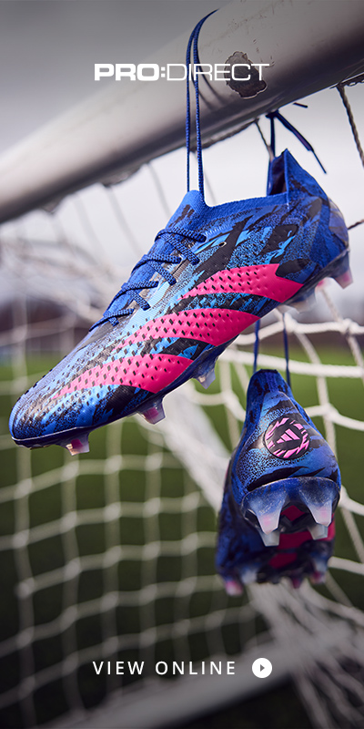
Shop 2023 MLS kits at prodirectsport.com/soccer