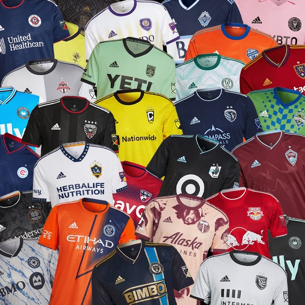
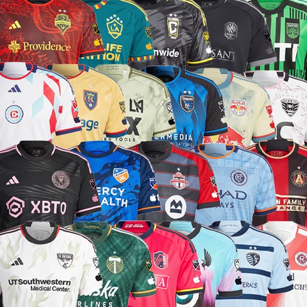
The 2024 Major League Soccer season gets underway this week, and ahead of kick off we’re taking a look at all the new kits and rating them out of 10. Because why not.
Last week saw all MLS clubs dropping their new jerseys for the 2024 season. If you’re not a U.S. or Canada native, you may be unaware of the way Major League Soccer does kits. To start with, the league has an affiliation with adidas, meaning the Three Stripes produce kits for all 29 teams. Then there’s the fact that teams only get one new kit per season, alternating between Primary (home for Europeans) and Secondary (away) – something we wouldn’t be opposed to seeing reintroduced on this side of the pond. Club’s usually always have a lighter shirt and a darker shirt, ensuring kits fulfil their main function and all teams have options that will not clash with their opponents. Makes sense, right?
With that in mind we’ve gone about doing what we do every year, which is gathering them all in one place and rating them out of 10. Will that rating have any bearing on how the team will perform this season? Of course not. But is it fun to highlight brilliance and pick holes in mediocrity? Absolutely is. So here we go...


Atlanta United Secondary – 6/10
'The Resurgens Kit' tells the story of how Atlanta's resilience transcends. The ability to overcome the pain of loss, rebuild, reimagine and come back better than before embodies the city's collective spirit. Despite the annoyingly spelt name, this is not the worst effort this season, but equally not the best. Lucky they're resilient, can come back stronger next time.


Austin FC Secondary – 5/10
'The Armadillo Kit' is an homage to Armadillo World Headquarters, the legendary music hall that was Austin's go-to concert venue in the 1970s. The design reflects the city's “all ways welcome” vibe that thrives during every matchday at Q2 Stadium. For us, not much more than a training jersey in reality. Crunchy on the outside, smooth on the inside – Armadillo!


Charlotte FC Primary – 7/10
'The Carolina Kit: Explore' is inspired by the topographical maps that showcase elevation changes stretching across North Carolina and South Carolina, from the mountains to the sea. Yeah, not bad, this.


Chicago Fire Primary – 6/10
The 'Return to Red Jersey' does what it says on the tin and marks a return to the iconic, traditional look that distinguished the Fire for their first 20 years in Major League Soccer. Clean lines and a strong visual identity. Could have done with more of a flourish to elevate it further.


FC Cincinatti Secondary – 7/10
'The Canvas Kit' is exactly that: pretty much a blank canvas upon which to create. And create adidas do, with a beautiful trim added to the cuffs and framing the body. The kit is designed to reflects the club's commitment to promoting Cincinnati's local artists.


Colorado Rapids Primary – 7/10
The 'One Flag Kit' tries something a little different, and we're all for that. Not sure what it is that's holding it back, but at least it's trying something.


Columbus Crew Primary – 6/10
While lacking an imaginative title, 'The Home Kit' is a bold representation of the club's identity. Can't help thinking of Charlie Brown though...


FC Dallas Primary – 6/10
Probably the coolest sounding kit on the list, but we're not rating them on titles. FC Dallas' new 'Afterburner' kit symbolises the next step not only in the club's journey, but also in their jersey progression from last year's 'Burn Baby Burn' kit that paid tribute to their original name in MLS, the Dallas Burn. It's not a bad design, but surely could've done something cooler around flames or something.


D.C. United Primary – 8/10
The Frederick Douglass Memorial Bridge, located just blocks from Audi Field, serves as the model for 'The Icon Kit' – driven by the goal of connecting local communities, bridging the club's past with its future, and reaching new fans. Black trimmed with red and a nice story behind the design – works for us.


Houston Dynamo Secondary – 5/10
Sporting a bright purple (the city's unofficial secondary colour) design, the 'Still Holdin'' jersey is a tribute to all Houstonians who are "Still Holdin'" it down for [urgh] H-Town. Deserves to lose points for that. As it is though, it's a bang average design, with the base colour the only thing saving it from utter mediocrity.


Sporting Kansas City Secondary – 7/10
While the title 'Diamonds Our Forever kit' jars like nails down a chalk board due to the awful grammar, the jersey itself is a nice design, with Argyle diamonds prominently placed front and centre. Unique, and that's a big bonus.


LA Galaxy Primary – 4/10
'The Angeleno Kit' was born from the fan sentiment to bring back the iconic sash, one of the LA Galaxy's original trademarks and a globally recognised, foundational design element. And you can see what they were going for with the whole negative space angle, but it just doesn't quite hit right.


LAFC Primary – 9/10
All about sleek lines for LAFC's new primary jersey. The black base overlaid with gold and carbon pinstripes lends it a classy feel. Bosh.


Inter Miami Primary – 6/10
We're liking the centralised crest and branding that falls in line with the symmetry of the new sponsor, but beyond that the '2getherness Jersey' is a fairly routine effort.


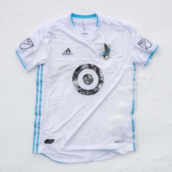
Minnesota United Primary – 8/10
Flirting dangerously on the line of tacky but ultimately ending up on the right side for us, the 'Starry Night Kit' draws influence from the majestic panorama of the Minnesota night sky. Could easily see why some wouldn't like it, but it's a ballsy effort from both adidas and the club, and we applaud it.


CF Montreal Secondary – 8/10
“La Main” is the nickname for Boulevard St-Laurent, Montréal’s central artery where east and west ends meet, a street that runs at the heart of the city, which has historically reunited its diverse communities. And that's the inspiration for the 'La Main Jersey', which sees a stylised stripe running off-centre in typically icy form. Cold.


Nashville SC Primary – 4/10
The '615 Kit' celebrates both the individuality of Nashville fans and the city they all call home. Not quite sure how it does that really, as it's a pretty tame and unadventurous design. Sure Nashville and it's fans are more exciting than this...


New England Revolution Primary – 6/10
The Revs' 2024 kit pays homage to the most defiant act in their region’s history: The Boston Tea Party. How you ask? Yeah, we're still trying to figure that one out ourselves. The design is definitely a cut above average thanks to the unique pinstripe-esque graphic, but something doesn't quite sit right about the overall aesthetic. Red sleeves perhaps?


New York City FC Secondary – 8/10
The 24/7 Kit embodies the New York City night scene and the bright lights that shine through the dark to reflect that relentless nature. It's clean and tidy in its execution but still has enough about it with the split colour scheme to elevate it above most others.


New York Red Bulls Primary – 9/10
Bold and brash, as a New York Red Bulls jersey should be. 'The Legacy Kit' nods to the club's history and taps into the beginnings of the club, paying homage to their legacy fan base and the local area. Not sure about all that, but it's visually striking, no arguing that.


Orlando City Secondary – 7/10
Nodding to both the club's 10th anniversary in MLS and their time before their Major League status, the 'Legacy Kit' brings red trim onto a purple base. Another clean look and a unique colour combo gives this one an edge.


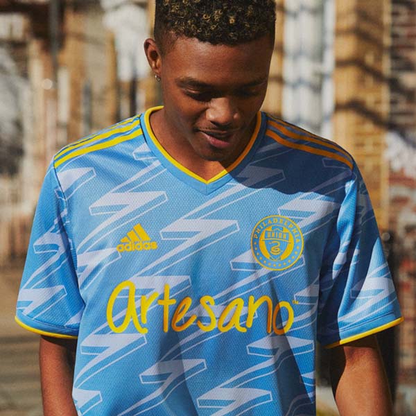
Philadelphia Union Primary – 9/10
In our humble opinion, Philadelphia Union's kits have been among the best around over the last few years, consistently achieving premium status, and the 'XV Kit' is certainly no different. The first-ever Union kit featured a wide gold stripe down the centre, and here the gap between that traditional design and the more progressive trend of Union kits in recent history is bridged to near perfection.


Portland Timbers Secondary – 9/10
Seems somewhat unfair that the Timbers get an away jersey like the 'Nature Unites Kit' – a white base embellished by unique hand-drawn leaf pattern that pays homage to Oregon's native trees, taking a focal point in the design – when many other teams have to settle for such a bland light look. This is the standard to aim for.


Real Salt Lake Primary – 8/10
Proper Barca vibes from a Real shirt? Yep. The mountains are an essential part of everyday life in Utah, providing a home for wildlife and a sanctuary for people who flock to them. The 'Peak Utah Jersey' design draws inspiration from the Wasatch Mountain range that begins 10 miles from Real Salt Lake's America First Field and can be seen from all angles inside the club's home venue. One of those shirts that actually looks better on.


San Jose Earthquakes Secondary – 4/10
2024 is the Earthquakes' 50th anniversary, making them one of the oldest clubs in the United States. The 50 Kit is supposed to be a celebration of their founding and an homage to their NASL era. The use of the throwback crest is so good, but why stop there? Feels like they thought that'd be enough, but it just isn't for what is such a big occasion. Also, that sponsor is so garish.


Seattle Sounders Primary – 7/10
Another club celebrating 50 years, and for it the Sounders get the bold 'Anniversary Kit', reflecting Seattle's tradition as one of North American soccer's most iconic clubs. A modern interpretation of vintage.


St. Louis City Secondary – 5/10
Yeah, sure, there's some subtle wavy pinstripe lines running across the 'Confluence Kit' that represent the two rivers that form the backbone of the St. Louis area, but unless you're close up you can barely see it, leaving a template that's very similar to Toronto and the Quakes. Not as bad as those two, mind...


Toronto Secondary – 3/10
No, we've not put the same shirt in twice... it just so happens that Toronto follow St. Louis alphabetically. It does, however, look like they've copied St. Louis' homework while standing in line with the 'GTA Kit', adhering to St Louis' request to make it just a little different so they don't get caught. Like the Quakes, Toronto have slapped on a different crest to normal and think that's enough. Wrong.


Vancouver Whitecaps – 7/10
Navy and gold, just works, doesn't it. Not quite on The Union's level with that colour combo, but 'The 50 Jersey' does a good job of celebrating half a century of the Whitecaps.
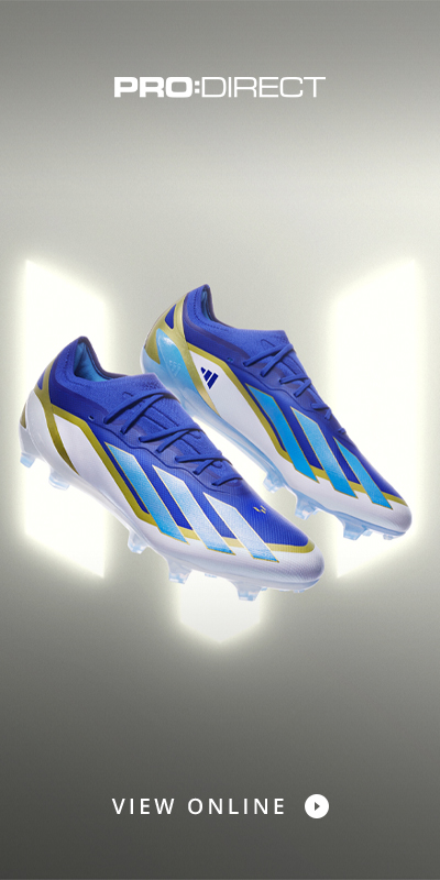
Shop MLS replica at prodirectsport.com/soccer in both Europe and the United States.