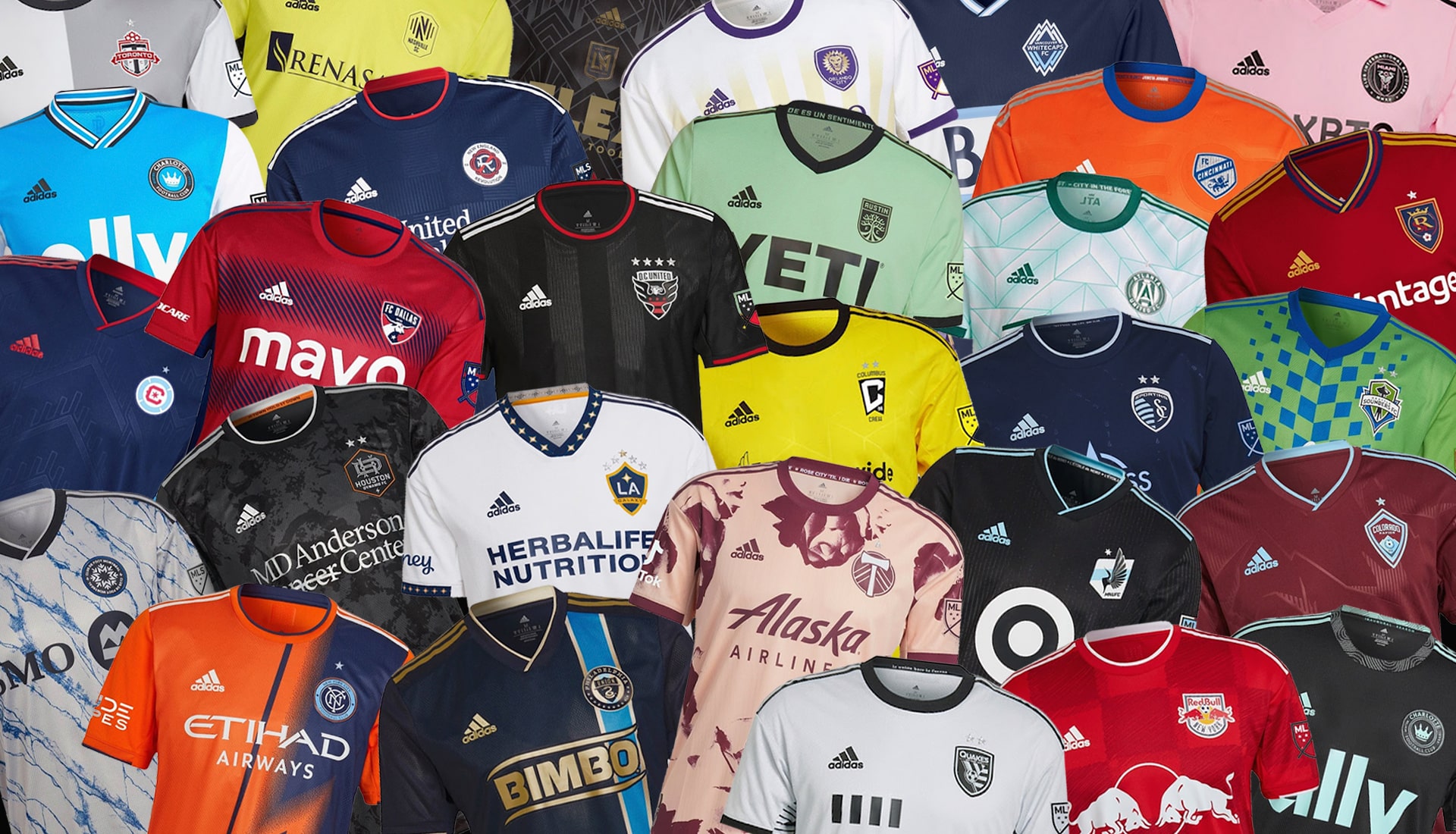
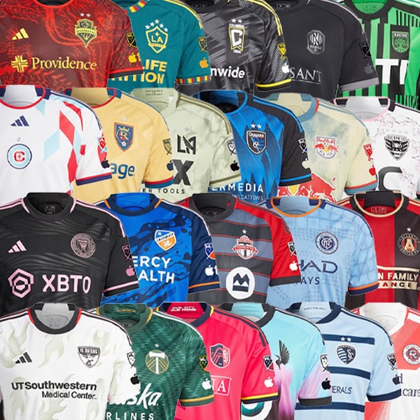
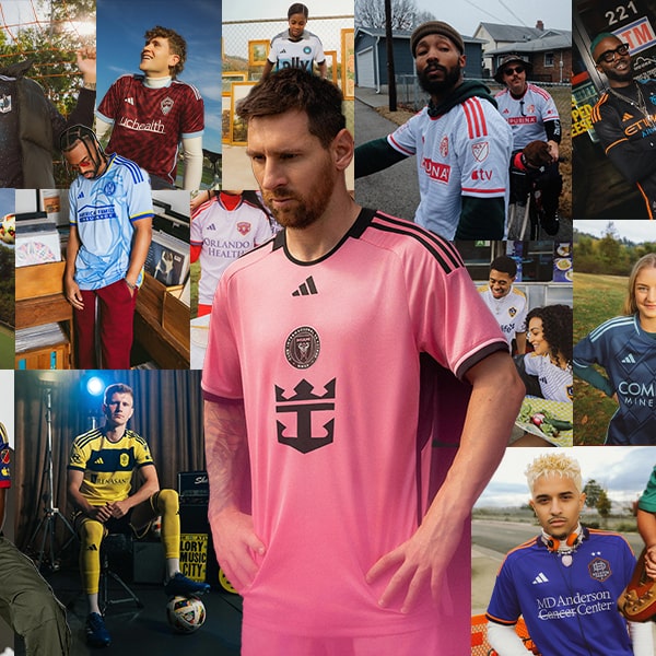
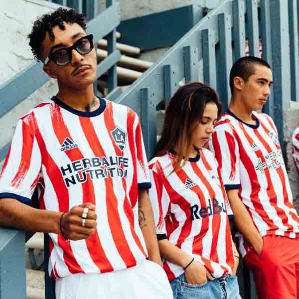
The MLS 2022 season gets underway this weekend, and Adidas have been hard at work preparing bespoke new kits for all clubs. With every one now revealed, we take to the task of rating all 28 (29 if you count both of Charlotte’s new kits).
If you’re not a U.S. or Canada native, you may be unaware of the way Major League Soccer does kits. To start with, the league has an affiliation with adidas, meaning the Three Stripes produce kits for all 28 teams. Then there’s the fact that teams only get one new kit per season, alternating between Primary (home for us Europeans) and Secondary (away) – something we wouldn’t be opposed to seeing reintroduced on this side of the pond. Club’s will usually always have a lighter shirt and a darker shirt, ensuring kits fulfil their main function and all teams have kits that will not clash with their opponents.
In the past, adidas have been accused of going down the template route too much, but this season they’ve knocked it out of the park for the most part, creating bespoke kits for each team ahead of the 2022 season, going above and beyond in ensuring each kit has its own unique feel. Whether it’s subtle additions or big and bold graphics, we’ll always favour a brave design.
So with all that in mind, here we round them up in one convenient place for you to peruse. Ratings generated using our own scientific algorithm of whether we like them or not. Agree or disagree, this is it, no changing now…
EASTERN CONFERENCE
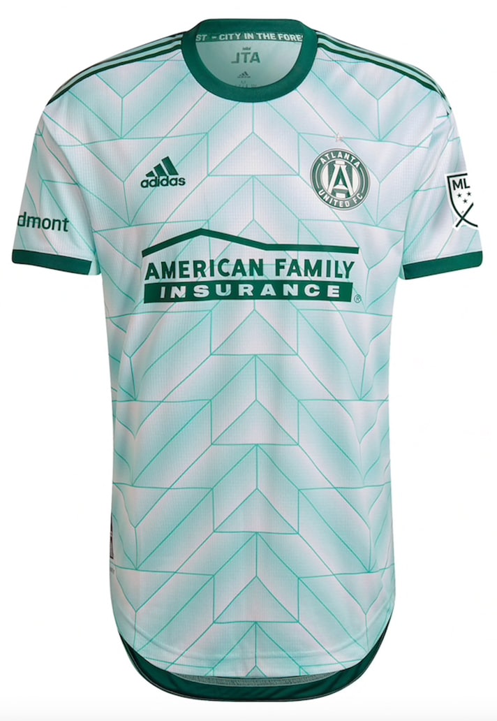
Atlanta United Secondary – 8/10
A fresh look for the 2018 Champions that features an abstract pattern of the city’s tree line to symbolise the forest that surrounds Atlanta.
Charlotte FC Primary & Secondary – 8/10
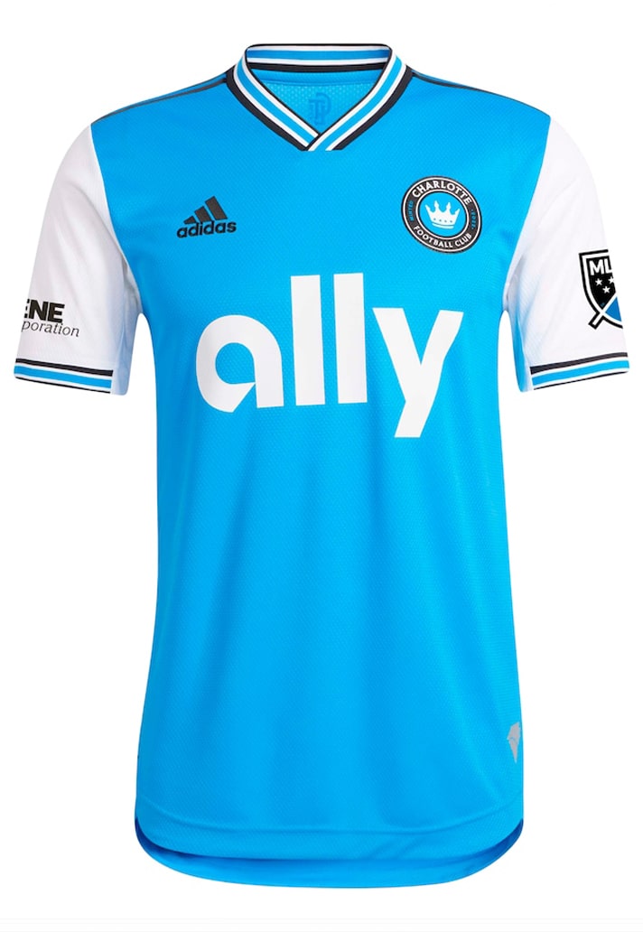
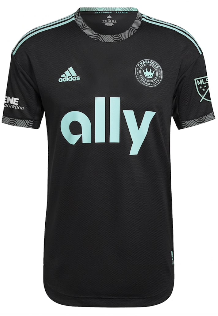
Ready for their debut MLS campaign, Charlotte unveiled the 'Carolina' primary Kit and the 'Newly Minted' secondary kit. Some Arsenal 19/20 vibes for the primary and nice black base with green elements, particularly on collar and cuffs of the secondary, gives the club a pair of great options for at home and on the road.
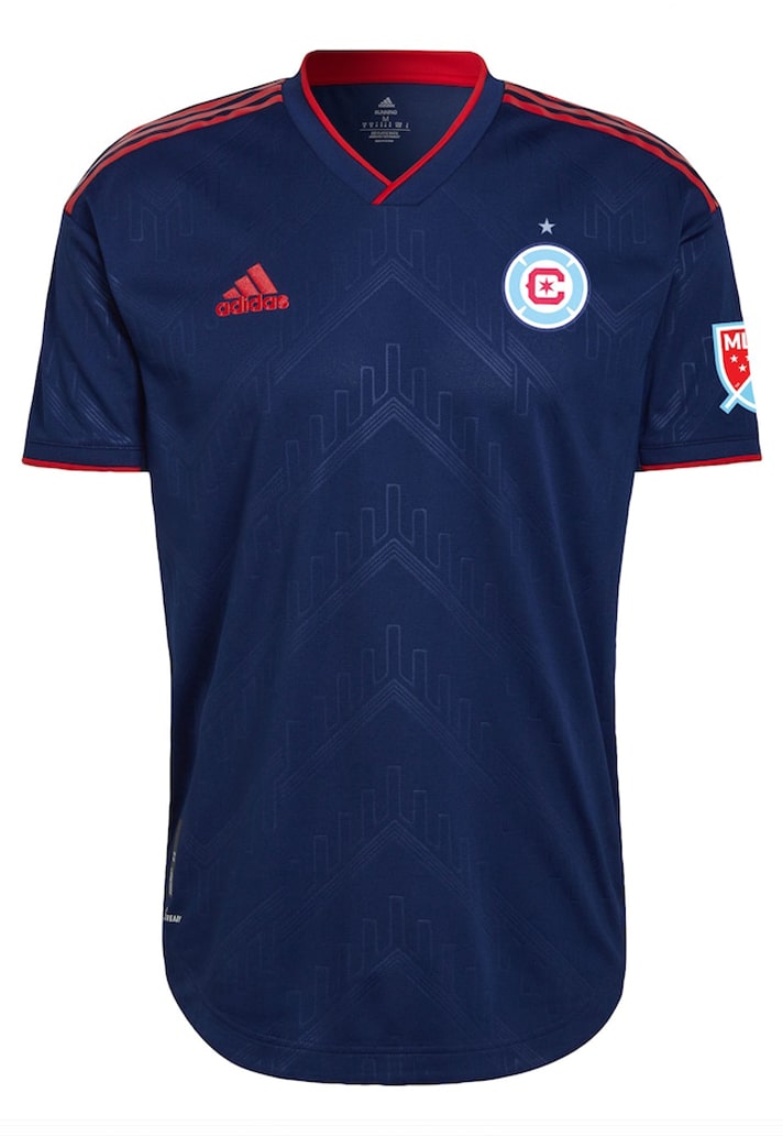
Chicago Fire Primary – 5/10
The 'Water Tower' kit pays homage to a Chicago landmark with a sublimated design, but it's not quite enough to raise this jersey design up for us. From a distance in particular it just looks a bit plain.
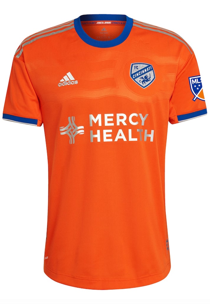
Cincinnati Secondary – 6/10
Other than being a bright and bold colour – the first orange kit in the club's history – the 'Juncta Juvant' kit doesn't offer a lot else. There's a subtle embossed pattern across the chest, but it doesn't standout.
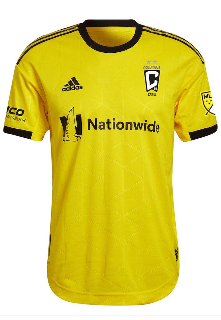
Colombus Crew Primary – 6/10
The Colombus Crew Primary jersey is called the 'Gold Standard', but it's actually yellow, right? Or do we need to get our eyes checked? Aside from that it features an Isometric Checkerboard pattern throughout.
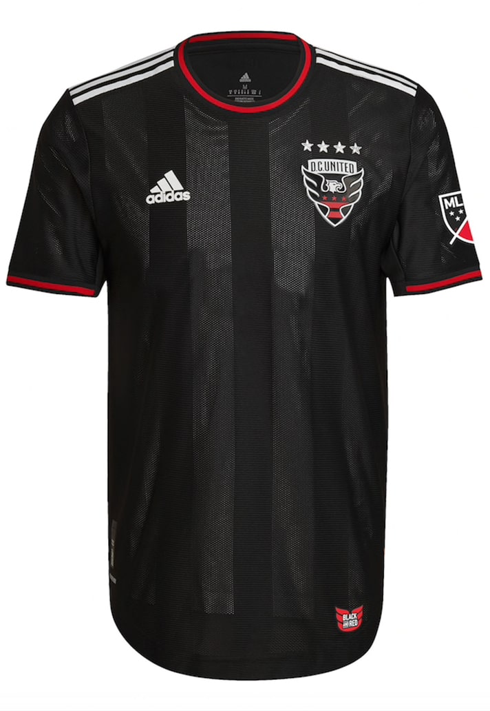
D.C. United Primary – 6/10
Another that is rather unadventurous in its design, playing safe with a black base with sublimated tonal stripes. The new sponsorship deal with XDC Network sees a tidy logo added to the shirt (not pictured).
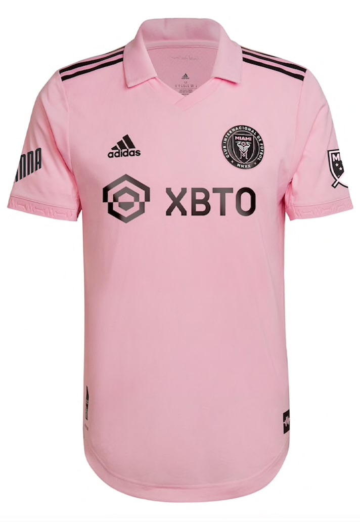
Inter Miami Primary – 8/10
Clean look in the club's traditional colours that is instantly elevated by the presence of that collar. Simple, but effective.
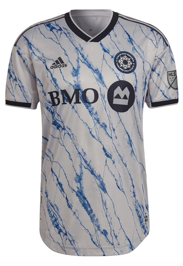
CF Montreal Secondary – 9/10
We've seen adidas dipping into Arsenal's back catalogue for Charlotte's primary jersey design, and they do the same again for Montreal's secondary, borrowing the Gunners' outstanding 20/21 away look, reinterpreted with a frosty blue execution. Ice cold.
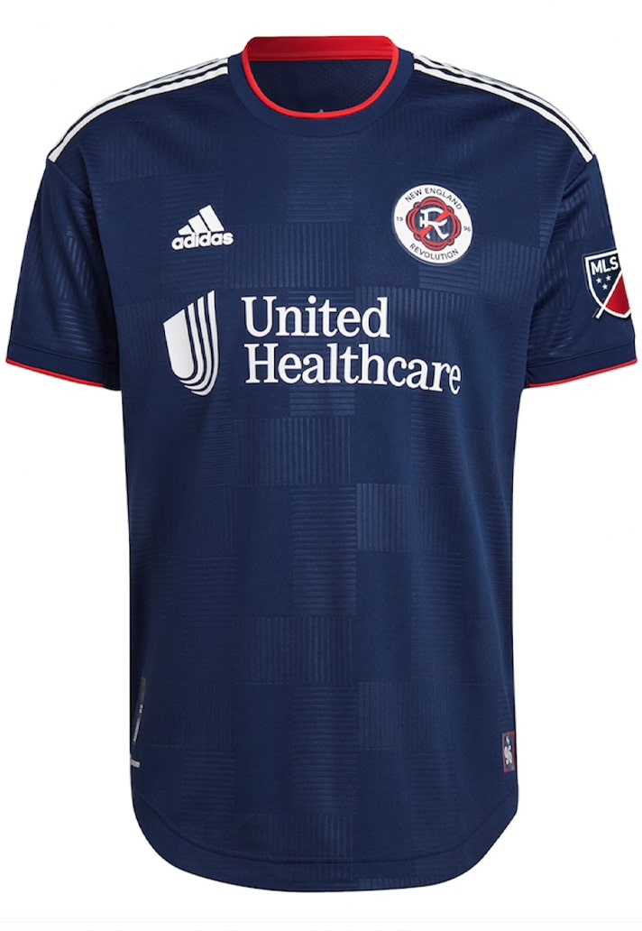
New England Revolution – 5/10
Can't really give this any different than Chicago's kit, since it's essentially the same, barring some minor tweaks. The unadventurous base does leave focus on that nice new club crest though.
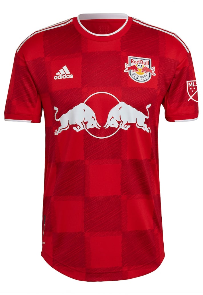
New York Red Bulls Secondary – 8/10
The '1Ritmo kit', as it has been christened, sees a scribbled chequered pattern on the red base. Certainly stands out as unique amongst the other teams in the league.
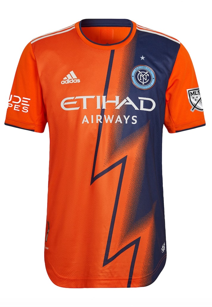
New York FC Secondary – 9/10
The MLS Cup Champions get a quite striking new secondary look in the form of the 'Volt Kit', which sees the shirt split in two with a lightning bolt graphic that runs down the centre, separating orange and purple tones.
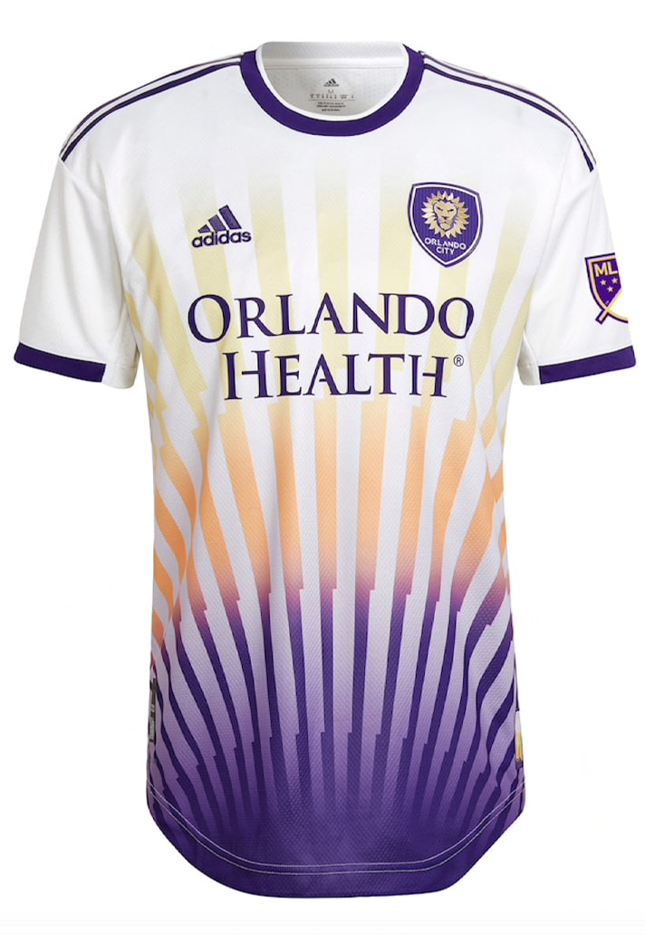
Orlando City Secondary – 8/10
From the lightning of NYCFC to the sunshine of Orlando. The 'Sunshine Kit' nods to the dazzling skies and endless summers of the Sunshine State, capturing the natural art created by Florida’s weather. Dazzling.
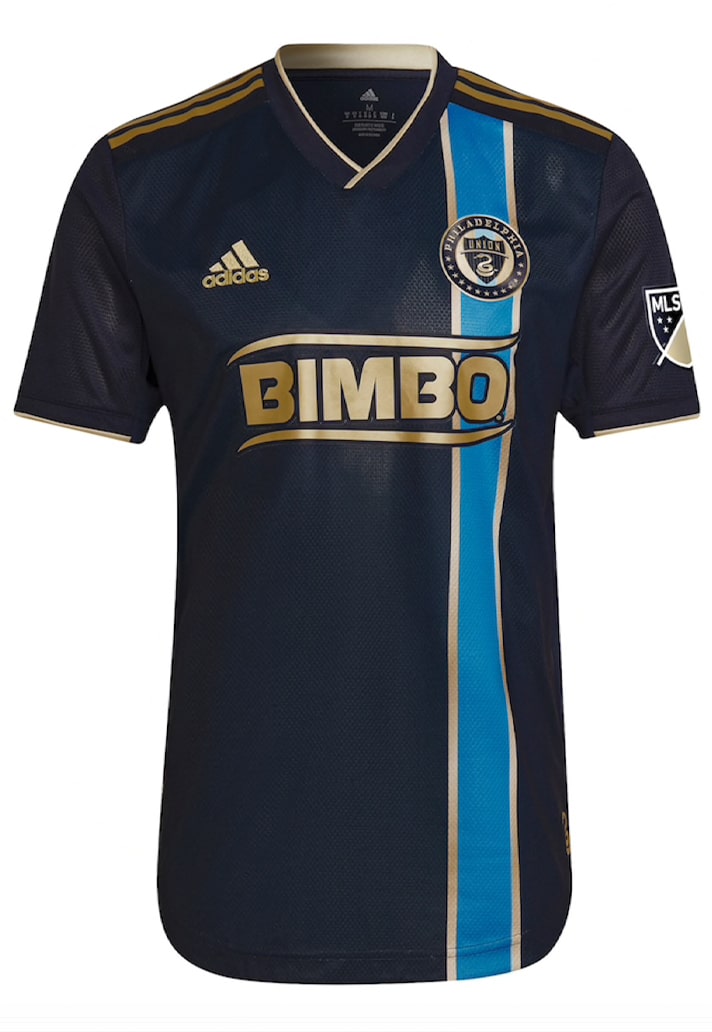
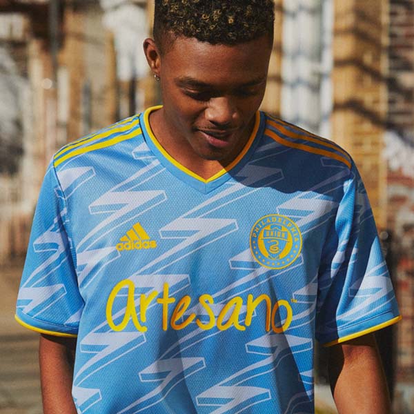
Philadelphia Union Primary – 9/10
Home shirts can sometimes be a tricky affair, tough to keep traditional and fresh at the same time, but Adidas have nailed it for The Union's new 'For U' kit, with a simple reintroduction of a single vertical stripe, shifted in tone and to the side. Underrated in our opinion.
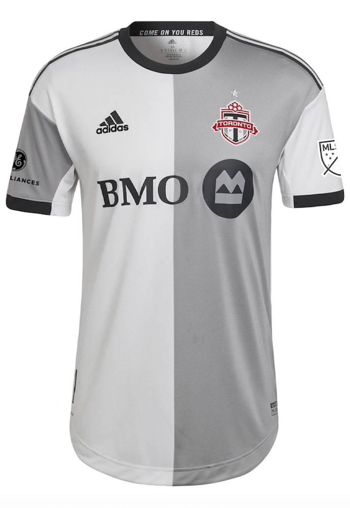
Toronto FC Secondary – 7/10
A white and silver split design uniting club and culture; city and community. A clean design that carries an easy style.
WESTERN CONFERENCE
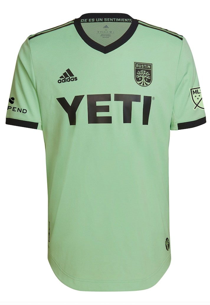
Austin FC Secondary – 6/10
Another design that is saved from sheer mediocrity by a nice colour combination. The ‘Sentimiento’ kit fully embraces the club's rallying chant of 'Verde', and for that we give credit. Expecting bigger and better in the future.
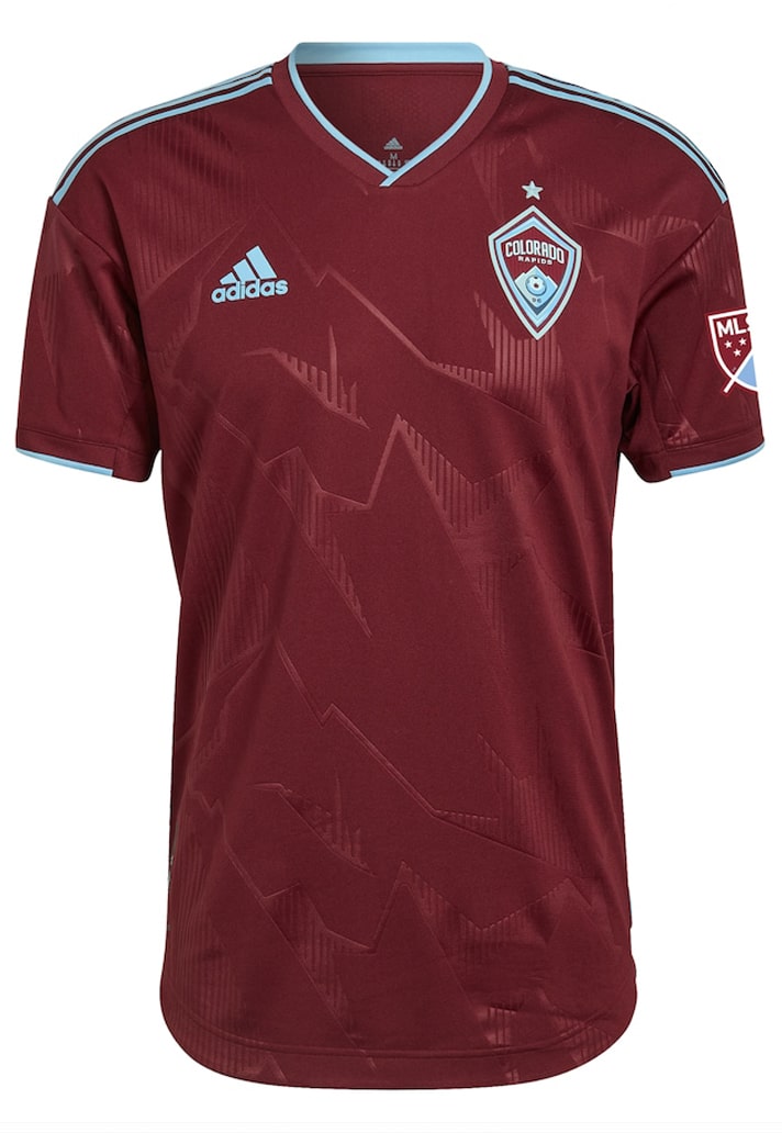
Colorado Rapids Primary – 7/10
The Rapids' new primary jersey features an abstract mountain peak emboss as a nod to the 5,280 feet of elevation they proudly call home. Another that looks better in hand than on the pitch, with the detail sadly getting lost at a distance.
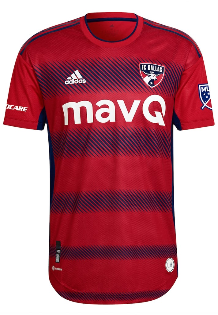
FC Dallas Primary – 7/10
The 'Crescendo Kit' represents the development and movement happening at FC Dallas, symbolised by a series of building hoops. Nice story and execution.
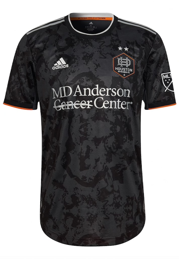
Houston Dynamo Secondary – 7/10
Houston's 'Bayou City kit' instantly conjures images of Leicester City's current home shirt and various others across Europe in the sublimated base graphic. Still, not been used on any other shirts in MLS, so stands alone in that respect.
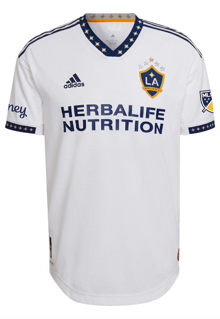
LA Galaxy Primary – 9/10
We've said it before and we'll likely say it again, but the new LA Galaxy 'City of Dreams' jersey is further evidence of how a simple addition to collar and cuffs can instantly make a design. Outstanding.
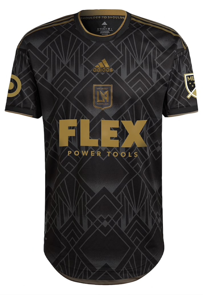
LAFC Primary – 10/10
Across town, and LAFC get an absolutely banging update to their home look. The club always look immense thanks to their black and gold home colours, but the design is elevated by a superb geometric graphic that runs throughout.
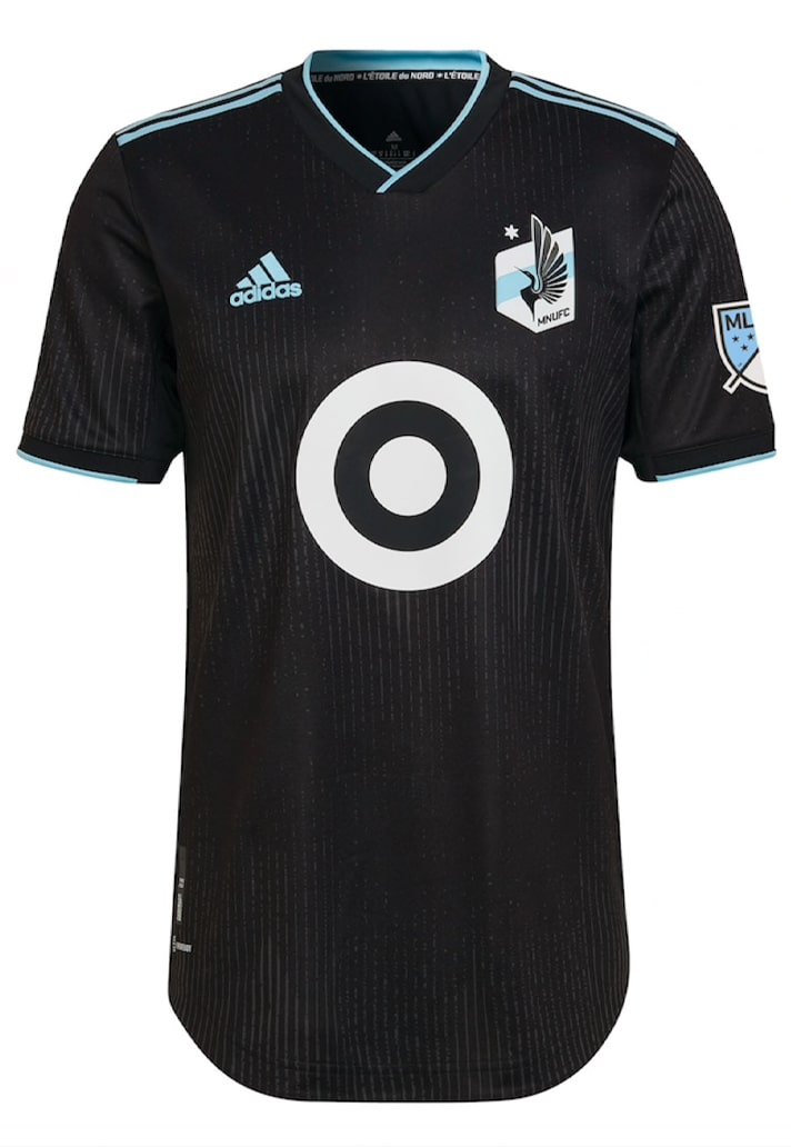
Minnesota United Primary – 7/10
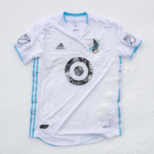
The 'Minnesota Night Kit' switches from the club's traditional grey look to black, adding in some subtle pinstripes. The ice blue on black is a nice look.
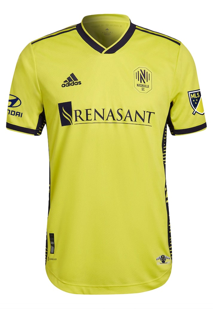
Nashville SC Primary – 6/10
The 'Homecoming Kit' celebrates new 30,000 seat stadium, the largest soccer-specific stadium in the United States and Canada. For that we would've expected something grander, but instead we get a design that's saved by the side panels, which feature signature Nashville SC “N” monogram and the soundwaves representing the rhythm and theme of Nashville SC in Music City.
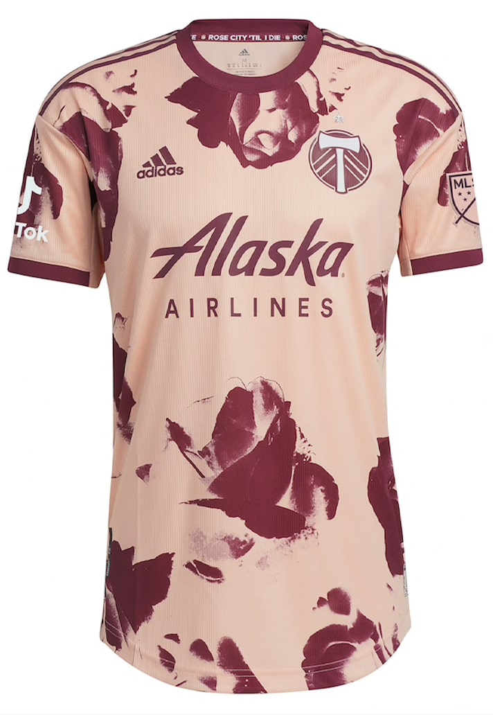
Portland Timbers Secondary – 10/10
There will be some that hate this design, and we get that. Each to their own. But if you're one of those then you're wrong. The 'Heritage Rose Kit' is a proper bespoke beauty that pays tribute to The Rose City. Really unique look, but one that we're fully into.
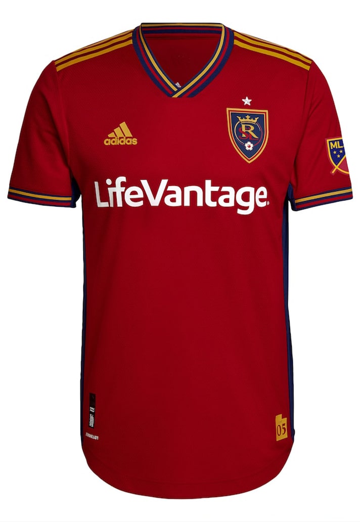
Real Salt Lake Primary – 7/10
Proper Spain vibes from the 'Believe Kit', which is only right coming from a team that uses 'Real' in their name. Very tidy collar and cuff execution, giving the 2009 championship jersey a modern twist.
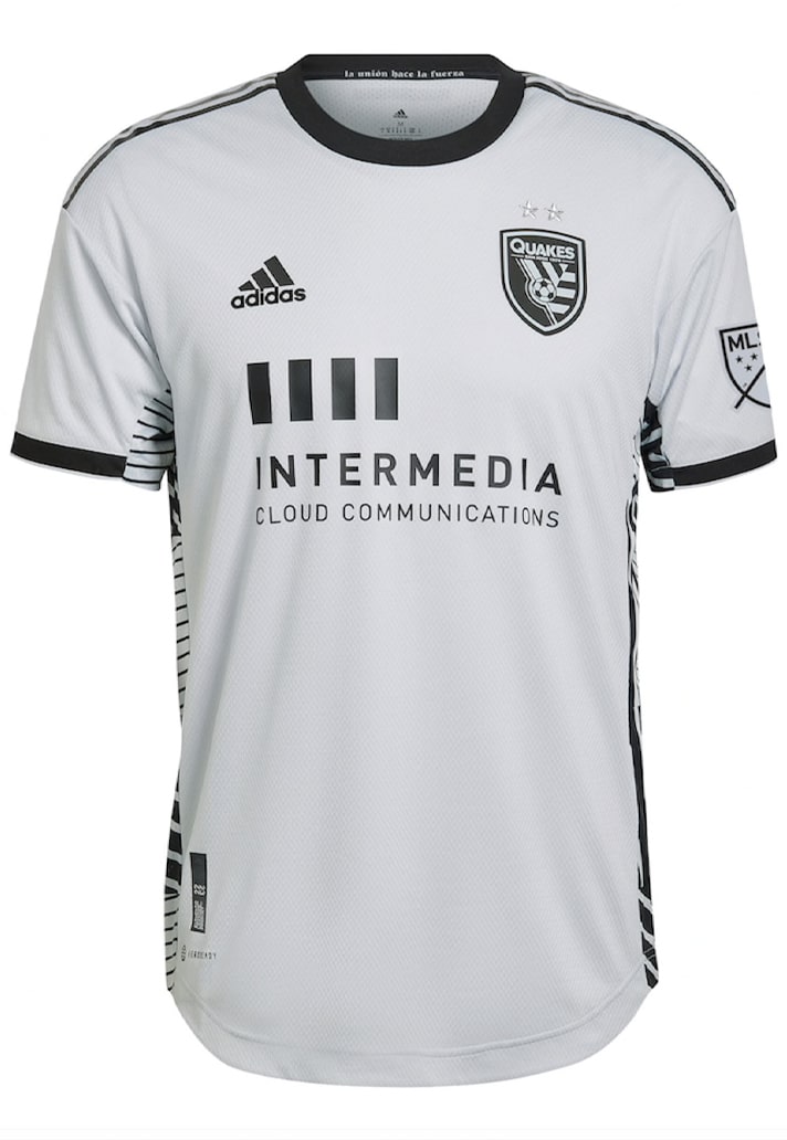
San Jose Earthquakes Secondary – 5/10
Are we being unfair in saying that the 'Creator Kit' just looks really quite drab and miserable? The grey base colour doesn't help, and it's only scraping a five thanks to the side panels, which are randomly cut from a repeating cloth, meaning no two jerseys will be the same. Nice idea, but certainly not enough to save this.
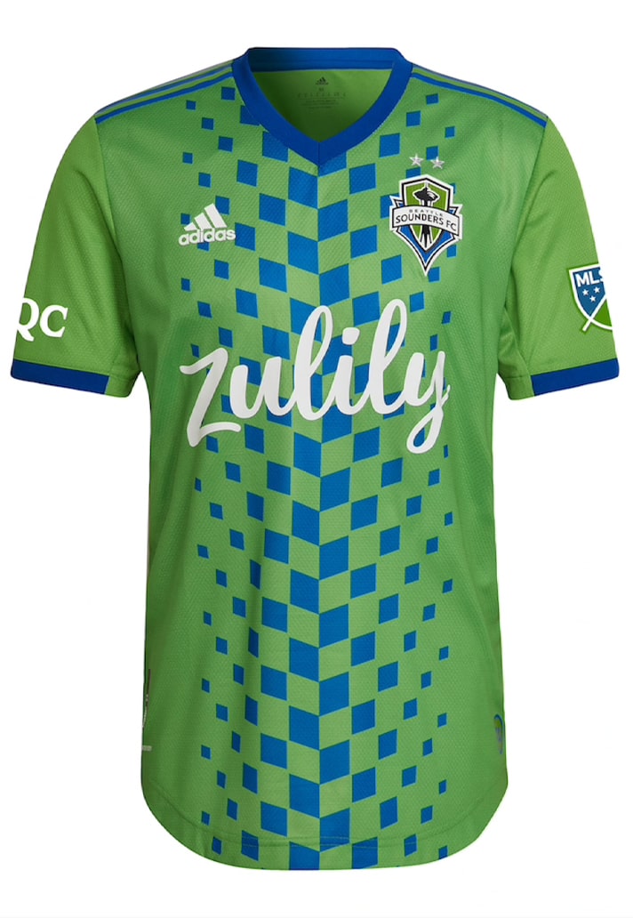
Seattle Sounders Primary – 8/10
The ‘Legacy Green’ jersey introduces a bold new element in the interconnected diamond graphic that runs down the front, representing the connection between the club’s players and its fans. The Sounders fully embracing the 'Go big or go home' mantra.
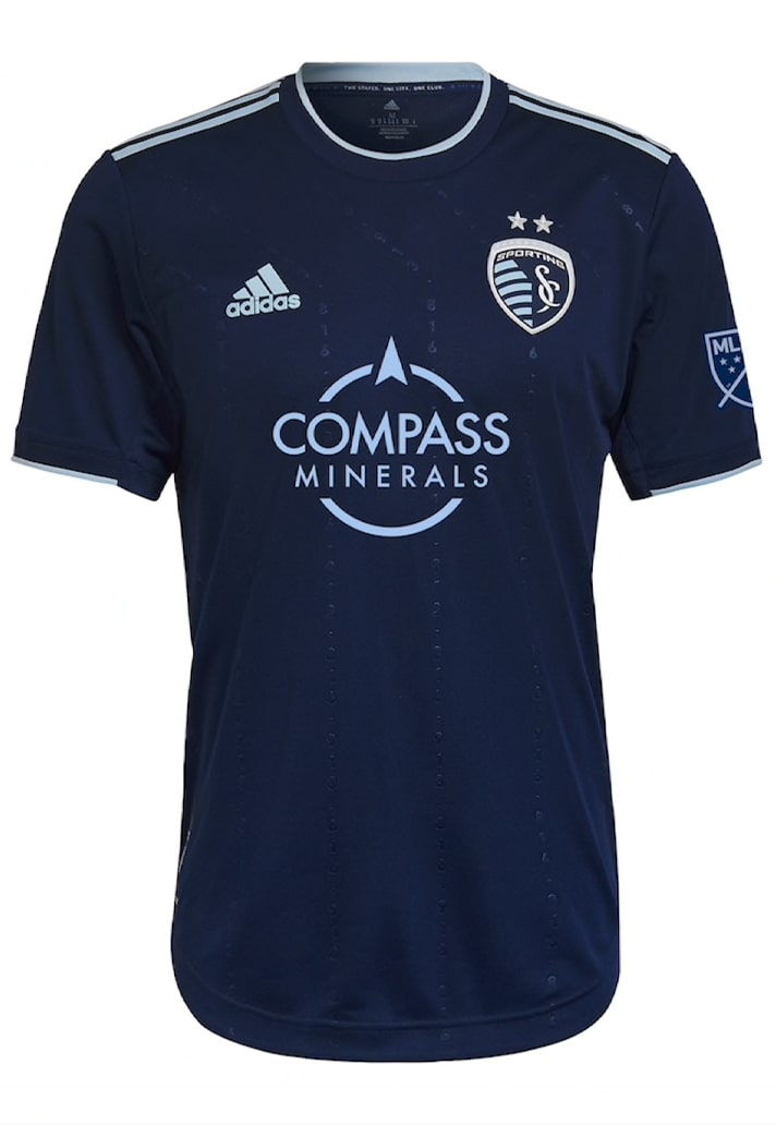
Sporting Kansas City Secondary – 5/10
Secondary kits are surely where you can go a bit more adventurous? Not for SKC it would seem. The jersey pays homage to the unique importance of the state line for both the city and the club with a subtle embossing of 913 and 816, the regional area codes for Kansas and Missouri respectively. But it's all just a bit flat otherwise.
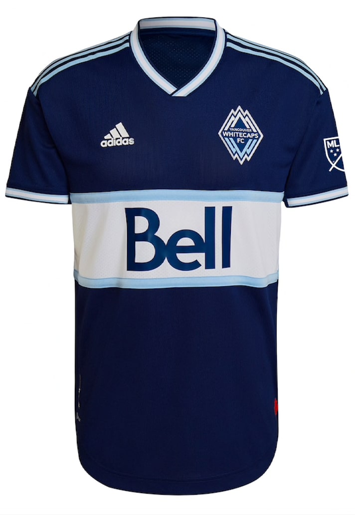
Vancouver Whitecaps FC – 7/10
Bringing the Hoop back in an alternative white-on-blue for the first time since 2010, the Whitecaps' new secondary shirt simply inverts the current primary jersey design. Bit lazy, but it works.
Shop 2022 MLS jerseys at prodirectsoccer.com
