Some shirts rely on complexity, while others rely on confidence. Sparta Prague’s 25/26 away kit, however, is a masterclass in restraint.
It’s a shirt that proves true impact doesn’t come from excess, but from precision. White and gold is a combination football rarely gets wrong, but it’s also one that demands discipline. Too much and it becomes excessive. Too little and it loses its presence. Here, the balance feels exact.
The base arrives in crisp white, clean, open, uninterrupted. Around it, gold detailing quietly frames the silhouette: the adidas mark, the club crest, the shoulder striping, subtle textural elements sitting just beneath the surface. Nothing reaches for attention. Everything earns it.
And within that kind of minimal palette, the sponsor becomes one of the most important decisions on the shirt. This is where Betano finds its place naturally.
Executed in a soft metallic gold, the wordmark feels integrated into the wider composition rather than laid over it. It mirrors the crest. It mirrors the adidas mark. It speaks the same visual language. Rather than creating contrast, it creates continuity. Because on a shirt like this, interruption would break the mood.
Instead, the sponsor becomes part of the architecture. The typography carries enough weight to hold the centre of the shirt, but it never overwhelms the identity around it. It understands the hierarchy. That’s what elevates it.


Sparta’s crest feels particularly powerful in this setting, reduced almost to a monogram, elevated through tonal execution. The three stars sit above it with a quiet confidence. Legacy without shouting about it.
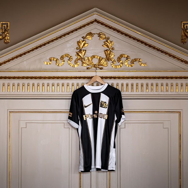
In our editorial framing, the shirt naturally leans into lifestyle territory. Styled with jewellery, layered with neutral tones, shot under warm light, it begins to move beyond football and into something closer to fashion. And crucially, the sponsor moves with it. That’s the benchmark.
Because in a world where football shirts now exist as much in wardrobes as they do on pitches, every detail matters. Sponsors can no longer simply occupy space; they have to contribute to it. They have to understand the overall composition.


Here, Betano does exactly that. Step back and the design resolves itself: White foundation. Gold detailing. Three stars. Adidas. Betano in metallic gold. Nothing competing. Nothing forced.
Sparta Prague’s 25/26 away kit is a reminder that premium design rarely comes from adding more. More often, it comes from knowing exactly when to stop. And when a sponsor understands that restraint, it doesn’t sit on the shirt. It becomes part of its elegance.