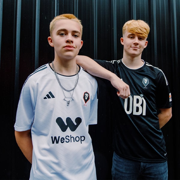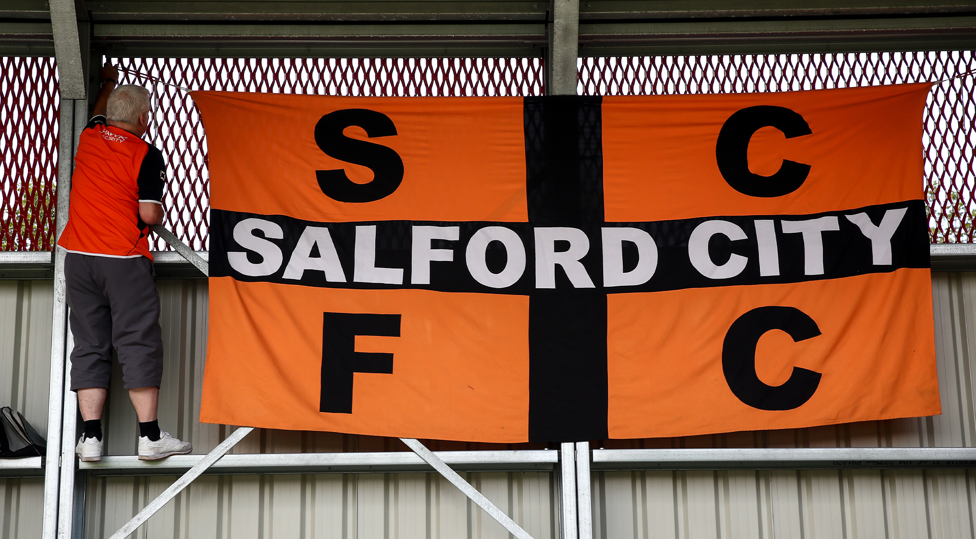
After more than a decade in red, Salford City are returning to orange for 2026/27. But with a new crest rooted in the streets and landmarks of Salford, this is about far more than changing the colour of a football shirt.
Football clubs are funny things. Spend enough time in and around one, and even the most seemingly insignificant visual details become sacred. Truth is, football doesn't like change. Make one wrong move and somebody, somewhere, will tell you that 100 years of history have been personally destroyed. Salford City, however, has never quite worked like that.
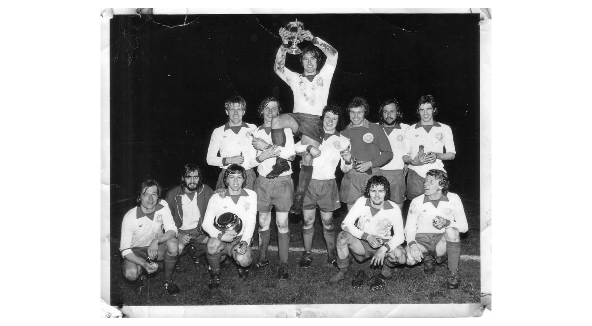
Founded in 1940, the club has existed as Salford Central Mission, Salford Central, Salford Amateurs and, since 1989, Salford City. It has worn red, white, green, blue and, most famously, orange.
Even that colour, now spoken about as part of the club's heritage, apparently arrived through circumstance when a short-of-cash Salford ended up borrowing old Blackpool kits. Somehow, though, tangerine stuck.
In 2014 when the Class of ’92 arrived at the hem of Salford City, the club swapped orange for red and a new lion-head badge followed. Much else changed at roughly the same speed.
Salford were promoted four times in five seasons, Moor Lane was rebuilt and by 2019 the club that had spent decades kicking around non-league football was suddenly in the Football League. Crowds that had once been counted in the low hundreds started arriving in the thousands.
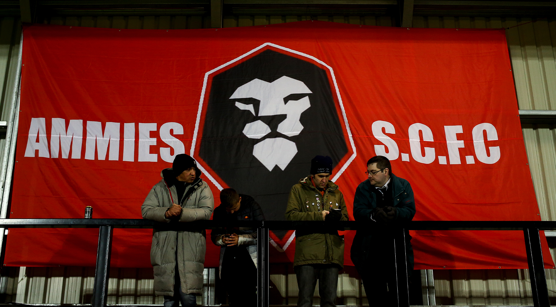
The red became part of that transformation. It looked sharper, cleaner and, for obvious reasons given those involved, a little more Manchester United. But as Salford grew into something much larger than the club the Class of ’92 had inherited, another question gradually became more important: what did a modern Salford City actually look like? The answer, it turns out, was orange.
Following a wider consultation around the club’s heritage in 2025, supporters were asked whether Salford should restore orange as its primary colour. More than three quarters voted in favour. It meant that, from 2026/27, the red era would officially come to an end and Salford would return to the colour worn for roughly four decades before the 2014 takeover.
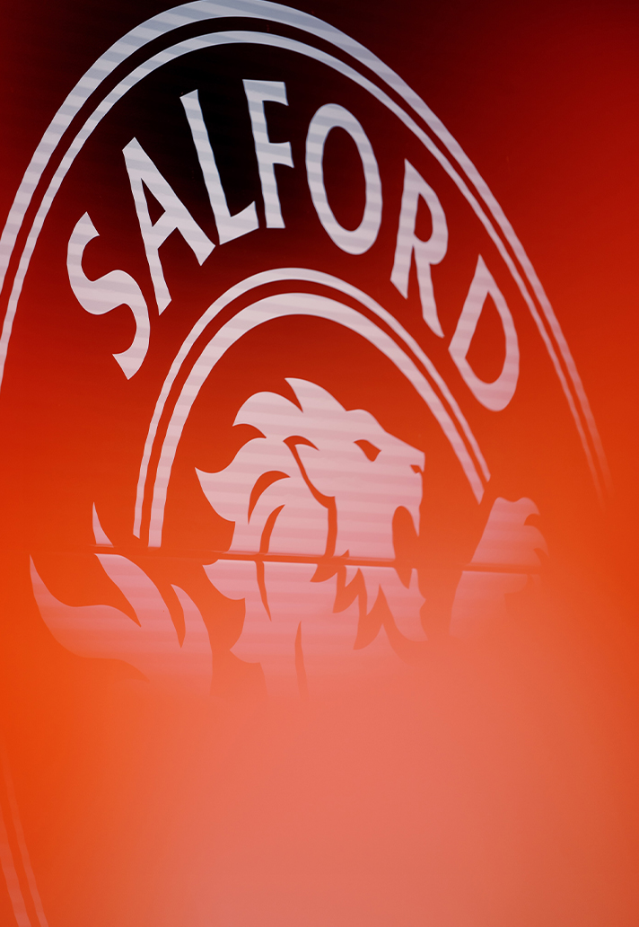
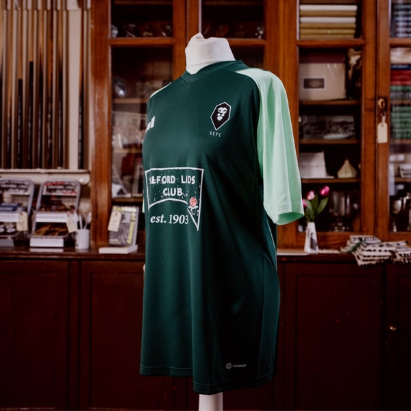
The new identity attempts to make Salford feel more like, well, Salford. Its redesigned circular crest retains the lion, but surrounds it with details drawn directly from the city: concentric rings reference the bird’s-eye view of the Salford Gasworks; a newly drawn rose takes inspiration from the famous Salford Lads Club; and the typography looks to lettering found around the city’s streets.
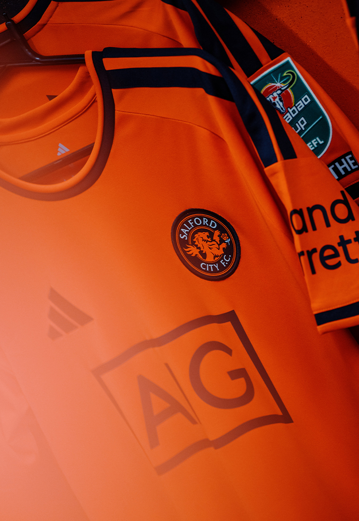
And now comes the most obvious manifestation of it all. Salford’s new adidas home shirt is bright orange, finished with black details and carrying that redesigned crest on the chest. Beckham himself described bringing the colour back as something that “felt right” for the supporters, club and wider community, while the club has talked of wanting to “paint the city orange”.
There is a neat circularity to all of this. A colour Salford supposedly adopted decades ago because it had little choice has returned because, this time, the club very deliberately chose it.
Salford City’s modern story has largely been defined by movement: new owners, new leagues, new infrastructure, new expectations and an almost comically quick journey out of non-league. And now, at last, its visual identity is catching up.
Now, just days before the start of the 2026/27 EFL season, perhaps the first time in its recent history, Salford City isn’t deciding what it wants to become – it’s working out what it wants to look like when it gets there.