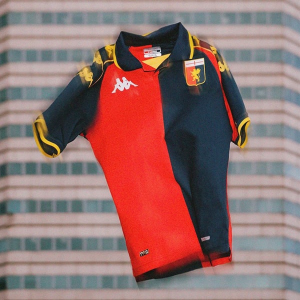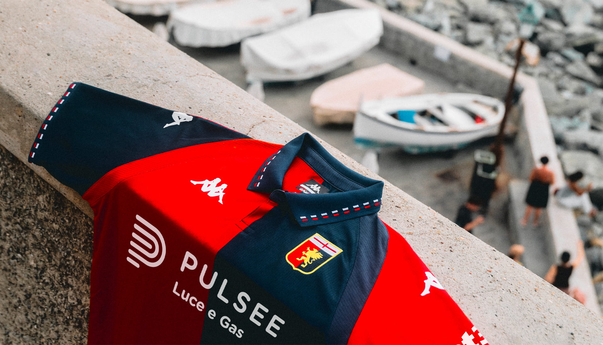
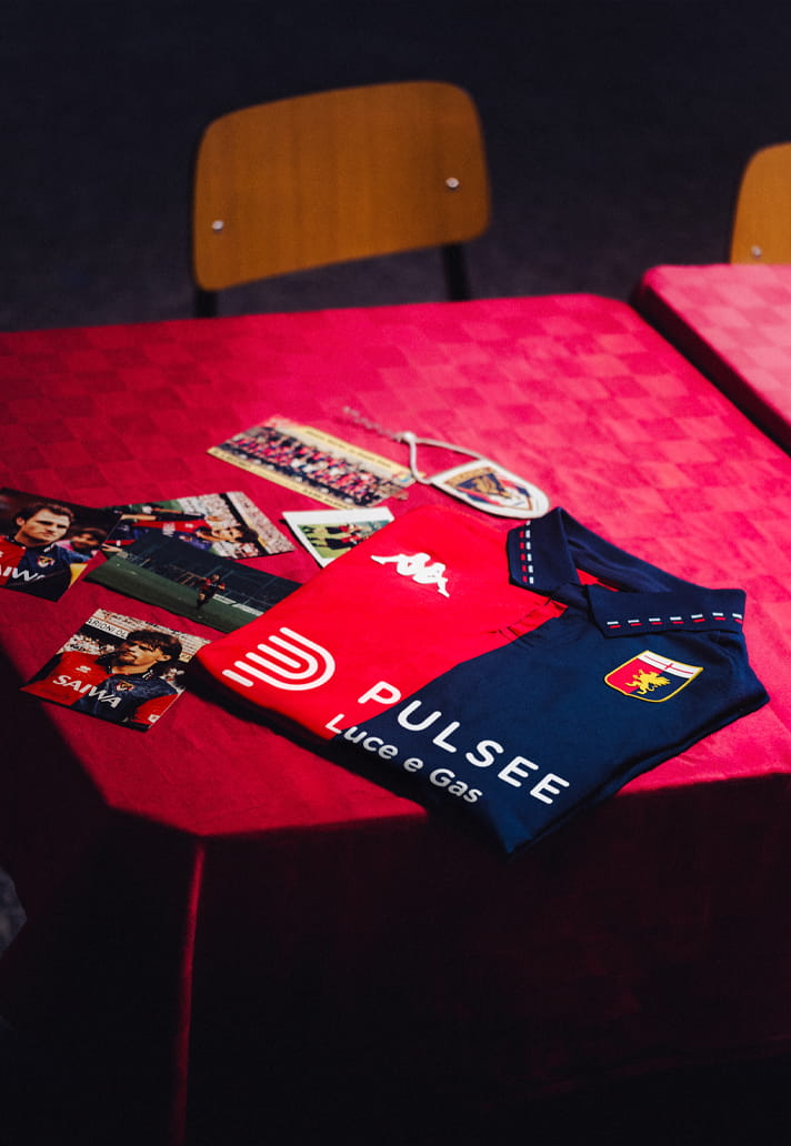
Genoa and Kappa have revealed the club’s new home shirt for the 26/27 season, a beautifully retro design. But you likely wouldn’t guess where the inspiration for it comes from.
Brands and clubs are constantly looking to the past for inspiration when designing new kits. Nostalgia remains one of the strongest selling points in football culture, with league titles, cup triumphs and promotion-winning campaigns regularly providing the creative spark. Iconic moments are revisited, celebrated and woven into modern designs through subtle nods and tributes. So it was something of a double-take moment when the inspiration behind Genoa’s new home shirt was revealed.
Designed by Kappa, the Serie A side’s latest home shirt takes its cue from Genoa’s 2-1 UEFA Cup quarter-final victory over Liverpool at Anfield in 1992. Yes, you read that correctly: not a final, not even a semi-final, but a quarter-final. Granted, the result remains a significant milestone in the club’s history, making Genoa the first Italian side to win at Anfield in European competition against Graeme Souness’ Liverpool. But is the 35th anniversary of that particular match enough to inspire an entire modern shirt design? I'm not entirely convinced.
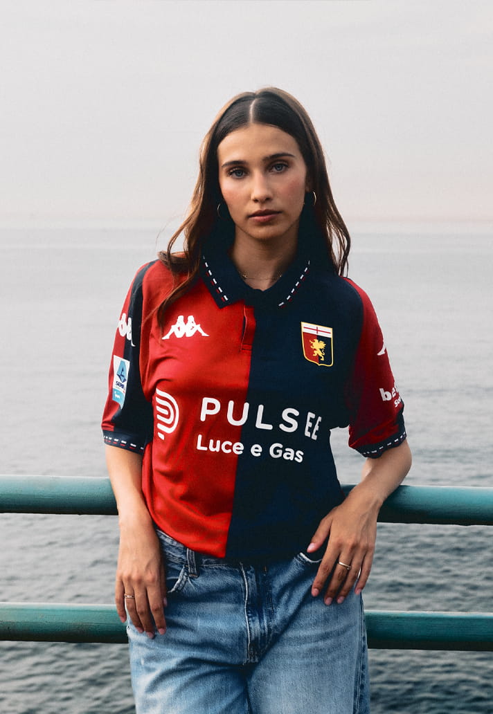
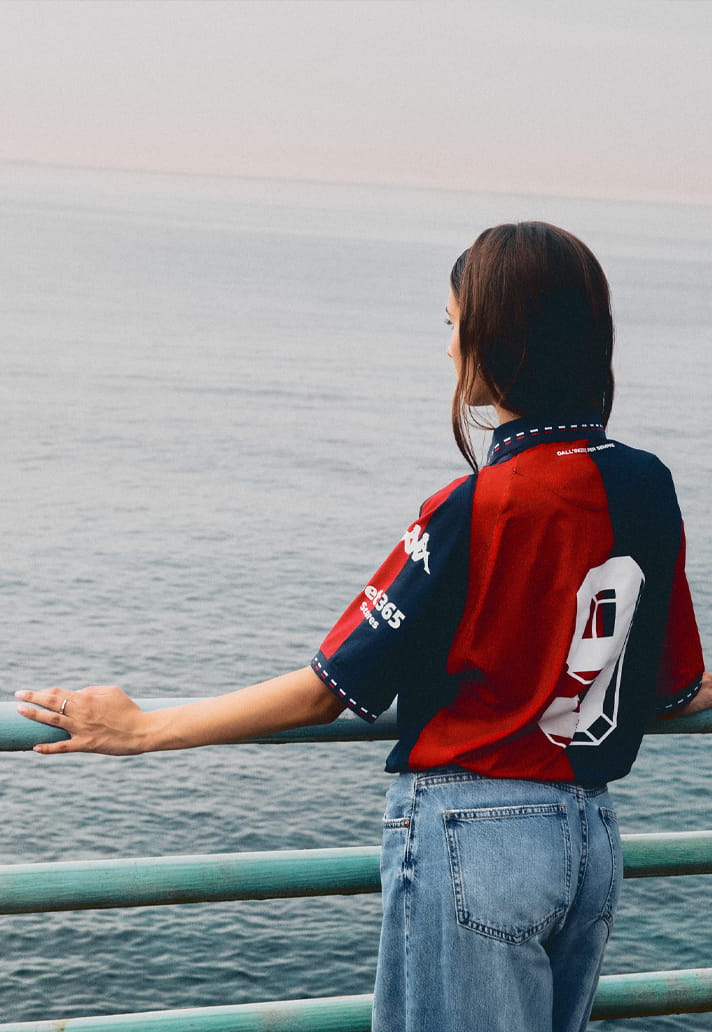
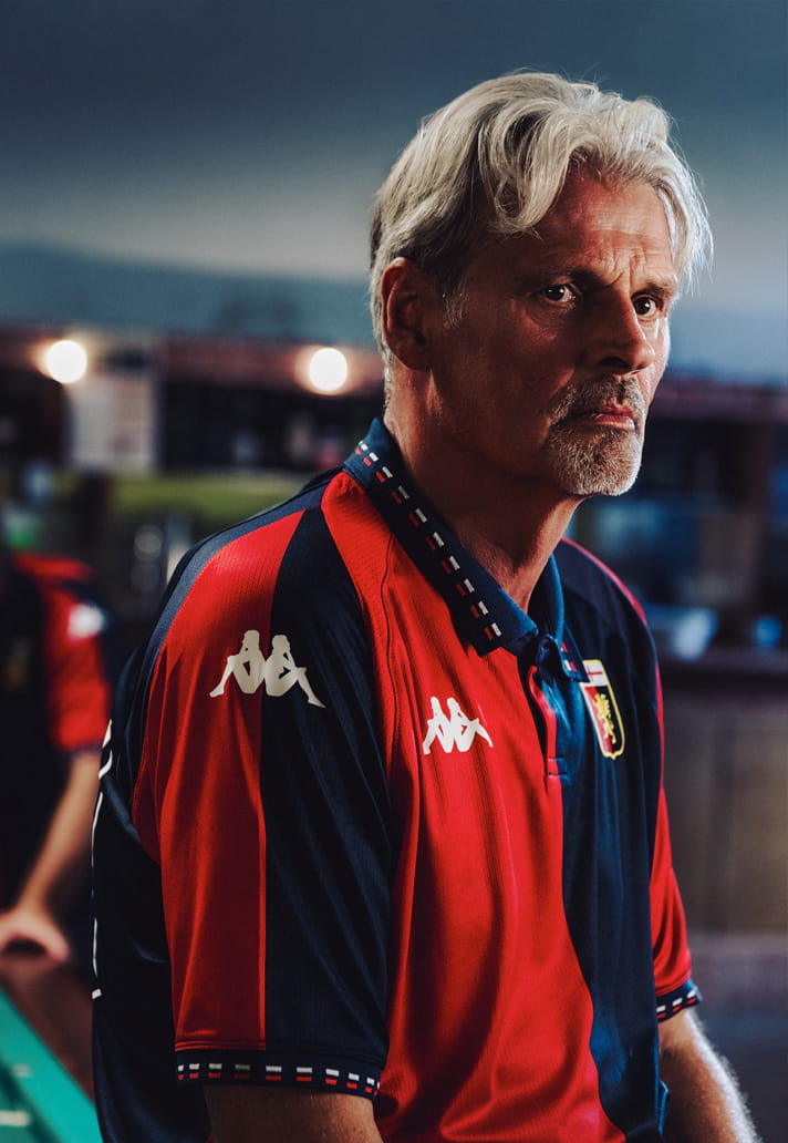
There's no denying it was an iconic moment for the Rossoblù, but it still feels like an unconventional choice. Once Liverpool supporters get over the surprise of another club commemorating a victory at Anfield, they can probably take it as a compliment. Fortunately, any scepticism over the inspiration quickly fades when you actually look at the shirt itself, because this is a stunning retro design that successfully revives some of the most recognisable aesthetic cues of the early 1990s.
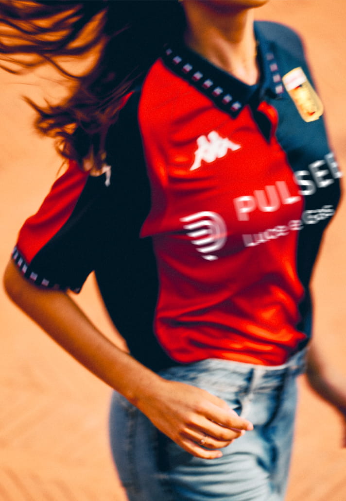
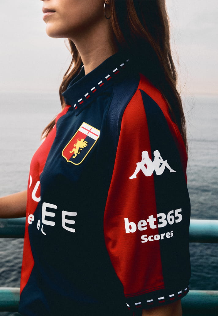
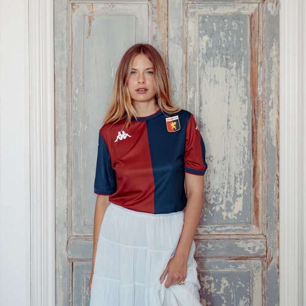
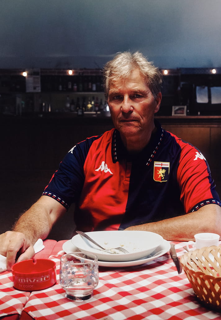
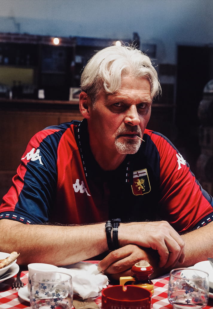
Presented in Genoa’s traditional and instantly recognisable half-and-half colourway, the shirt sees the return of a bright, vibrant red on the right side for the first time in two years, perfectly balanced by the club’s classic deep navy blue on the left. A smart polo collar adds to the throwback appeal, featuring intricate jacquard detailing in the club’s colours, while matching sleeve cuffs help tie the look together.
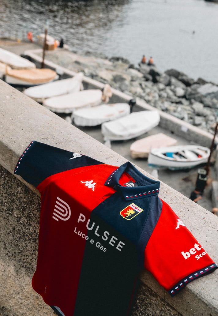
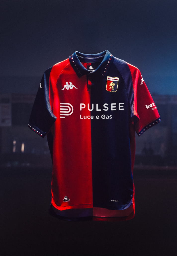
After last season’s use of a stylised Griffin emblem, the full traditional Genoa crest returns to the chest, completing a design that feels deeply rooted in the club’s heritage. Whatever you make of the inspiration behind it, there’s no denying that Kappa have delivered a shirt that captures the spirit of a classic era while still feeling fresh enough for the modern game.
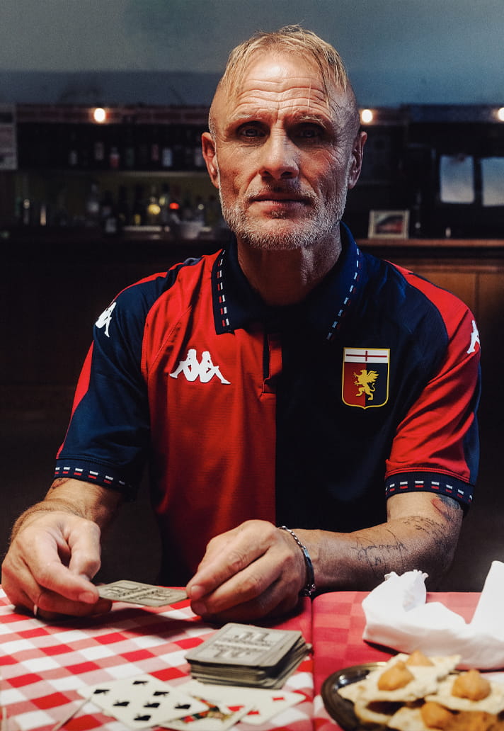

Whether Genoa’s Anfield triumph is significant enough to serve as the foundation for a shirt launch is open to debate, but the end result is hard to argue with. By blending a curious slice of club history with classic colours, retro detailing and the return of the traditional crest, Kappa have delivered a home shirt that feels authentic and full of character. The inspiration may raise a few eyebrows, but if the goal was to create something that gets people talking while looking effortlessly good, then Genoa have undoubtedly succeeded.
The new Genoa CFC 2026/27 Home Jersey is available at kappa.com