Like a football club trying to replace a longstanding and successful manager, replacing Kappa at Venezia was never going to be easy. It was going to take time to find a groove. Now it feels like Nocta may be on the right track.
Back in February, when Venezia revealed their latest chapter with NOCTA, I suggested that the club’s golden era of kit design may well have been behind them. Not because the shirts were bad, necessarily, but because they lacked the effortless magic that had once made every Venezia drop feel like an event. The execution was fine. The feeling was missing. This new 26/27 Home Shirt changes that. Not completely. Not all at once. But it’s a significant step in the right direction.
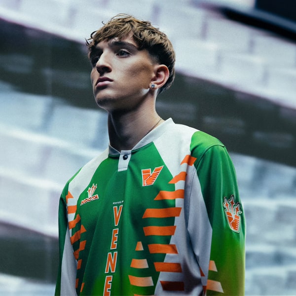
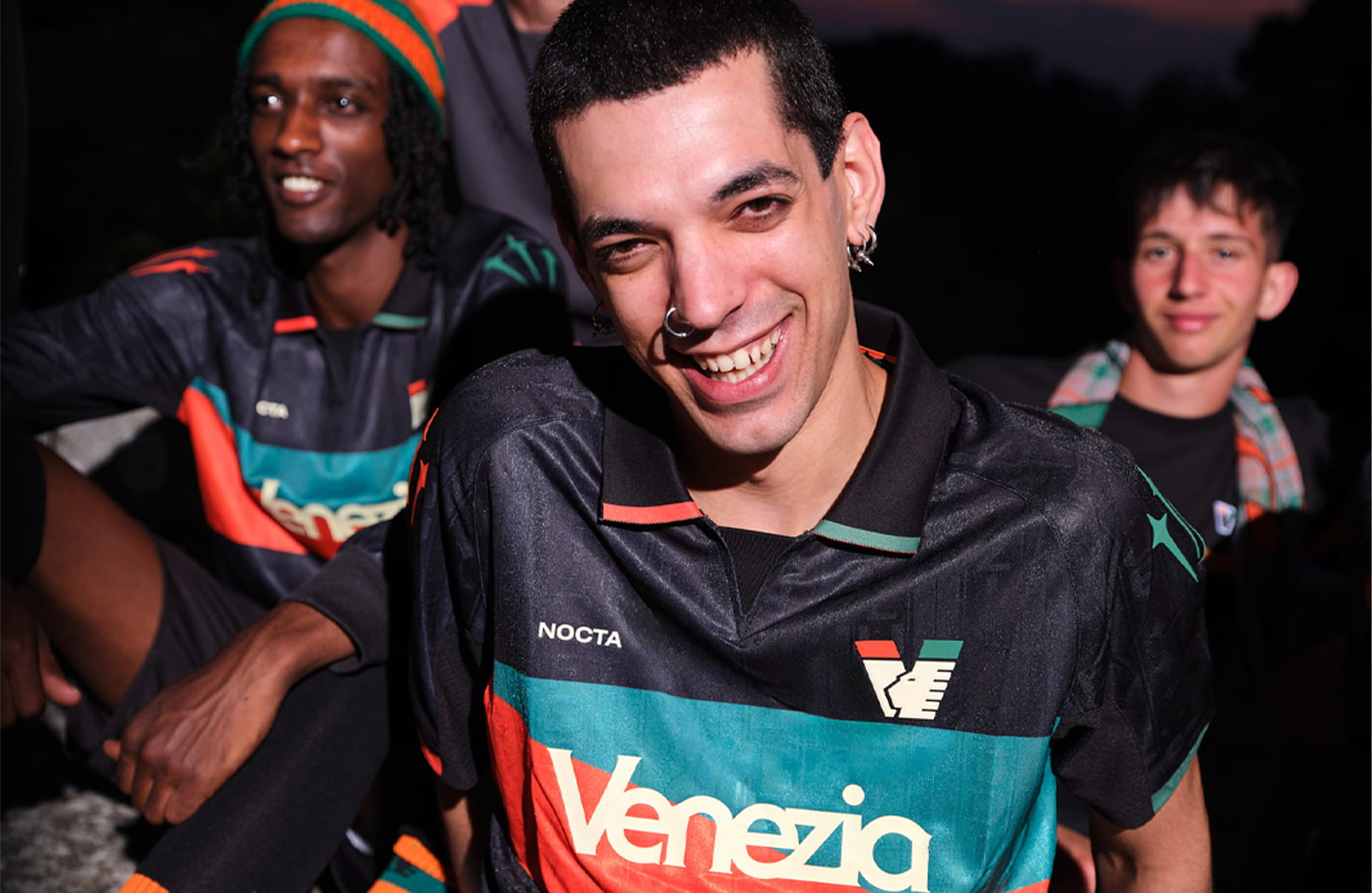
For the first time since NOCTA took over the creative reins, this feels like a shirt that genuinely understands what makes Venezia special. It doesn’t rely on gimmicks or force a fashion-first narrative. Instead, it returns to the fundamentals of the club’s visual identity and lets those do the heavy lifting. Venezia's return to Serie A is marked by a design centred on the club's colours in their purest form, with bold orange and green bands set against a predominantly black base, inspired by the flags that ripple throughout the Curva on matchdays. And the result is there to see.
Where previous NOCTA efforts occasionally felt as though they were trying too hard to prove their cultural relevance, this shirt feels comfortable in its own skin. The iconic black foundation with the orange and green bands slicing cleanly across both the front and rear of the jersey create a look that's unmistakably Venezia from every angle. And perhaps that’s the biggest compliment you can pay it.
Because while this is undeniably a NOCTA product, it doesn’t feel like NOCTA is overpowering the club. Instead, the partnership finally appears balanced. The contemporary edge remains, but it's now working in service of Venezia rather than the other way around.
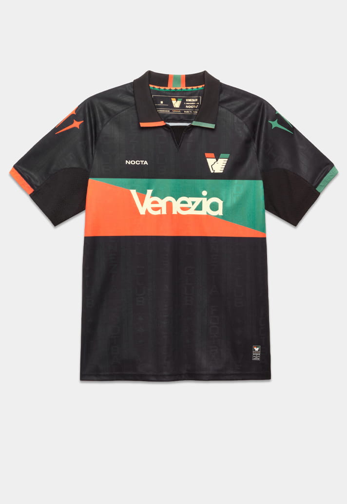
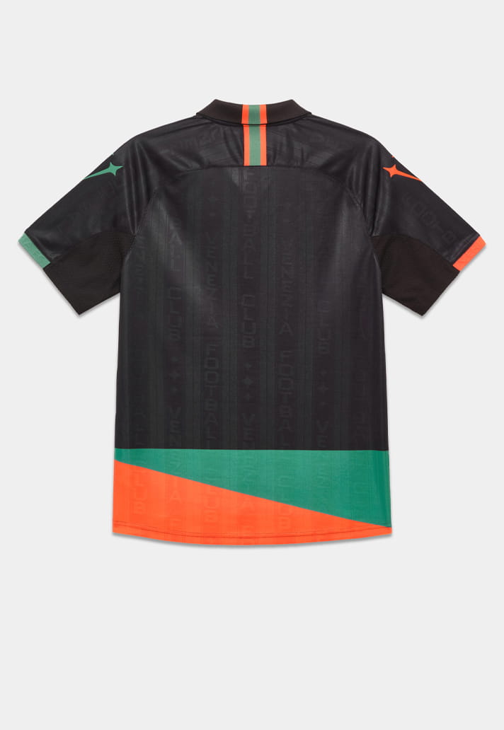
There are some beautifully considered details, too. The polo collar, finished with engineered orange and green ribbing, is a classic, while the elevated cuffs and tailored silhouette add a premium feel to proceedings. It's a design that comfortably bridges heritage and contemporary culture, and that's exactly the space Venezia have occupied so brilliantly over the last decade.
Most importantly though for me, it recaptures something that recent releases have struggled to deliver: clarity.
Venezia became football’s style darlings not because they chased trends, but because they possessed one of the strongest visual identities in the game. Black. Orange. Green. Simple. Elegant. Distinctive. The best kits in the club's modern history understood that less could often say more. This shirt understands it too.
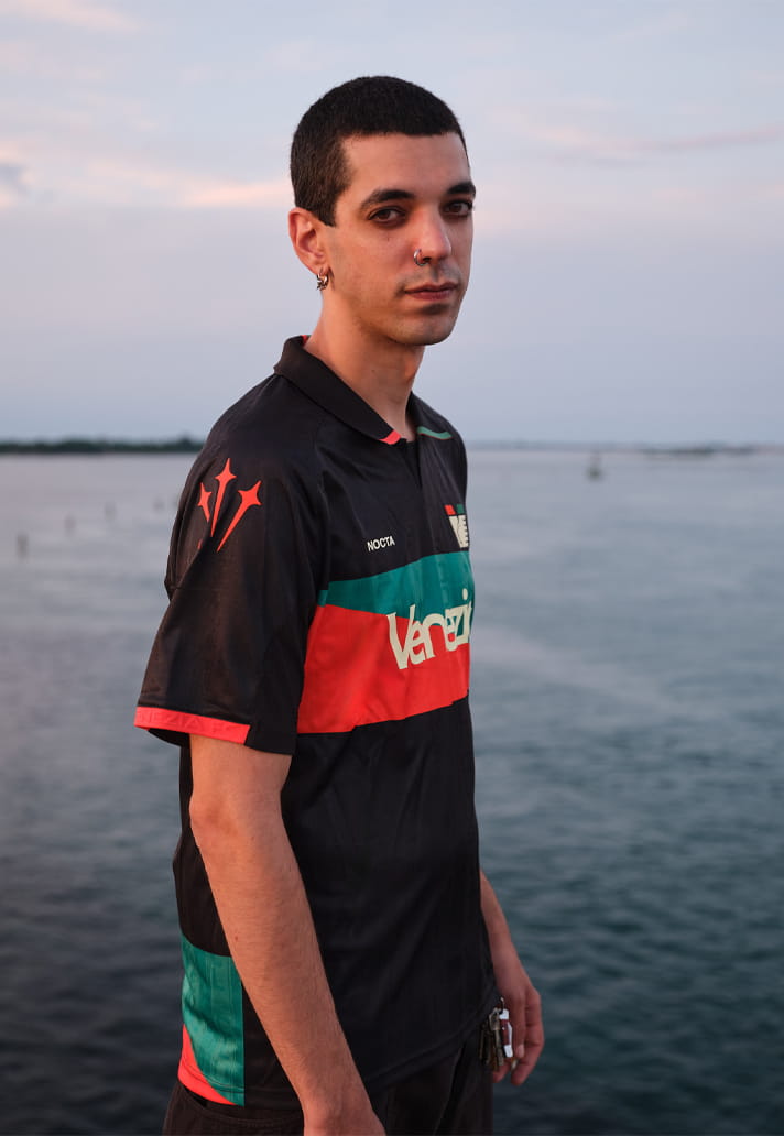
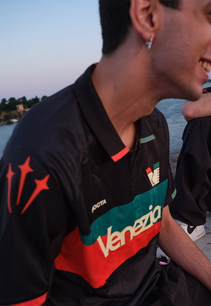
No, it may not quite reach the heights of some of the legendary Kappa-era releases that elevated Venezia into a category all of their own. Those remain a difficult benchmark for any manufacturer to match. But for the first time since NOCTA entered the picture, there’s a sense that the project is beginning to find its voice.
The Venezia 26/27 Home Jersey is available now at prodirectsport.com/soccer