There’s been no shortage of momentum around London City Lionesses over the last 18 months. Founded in 2019, the club made history in May 2025 by becoming the first independent side to earn promotion to the Barclays Women’s Super League, before backing it up with one of the strongest debut top-flight campaigns in recent memory, finishing comfortably in the top half.
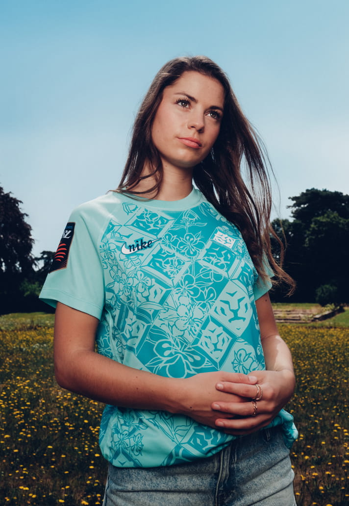
Now, with speculation continuing to build around a potential move for two-time Ballon d’Or winner Alexia Putellas, the Lionesses have unveiled their new Nike home shirt for the 2026/27 season. And it’s a kit that feels every bit as bold and ambitious as the club itself.At a time when many clubs are still relying on safe templates and predictable graphics, London City Lionesses have gone in a completely different direction. The result is one of the most distinctive shirts we’ve seen this season.
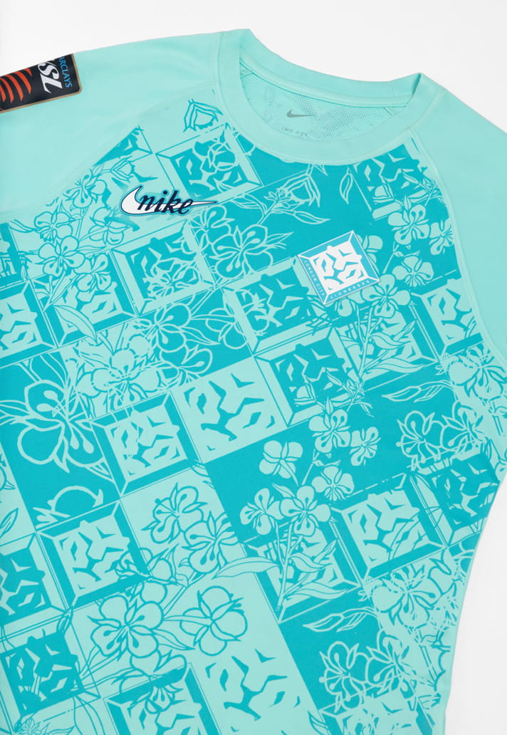
Arriving in a striking Hyperturq colourway, the new home shirt is built around the very core of the club’s identity: the badge. But rather than simply placing the crest on the chest and calling it a day, the design team have transformed it into the main event.
The shirt features a tiled graphic pattern made up of repeated club crests, disrupted and arranged in a diamond formation across the body. It’s a concept that immediately stands out, but the real beauty lies in the details.
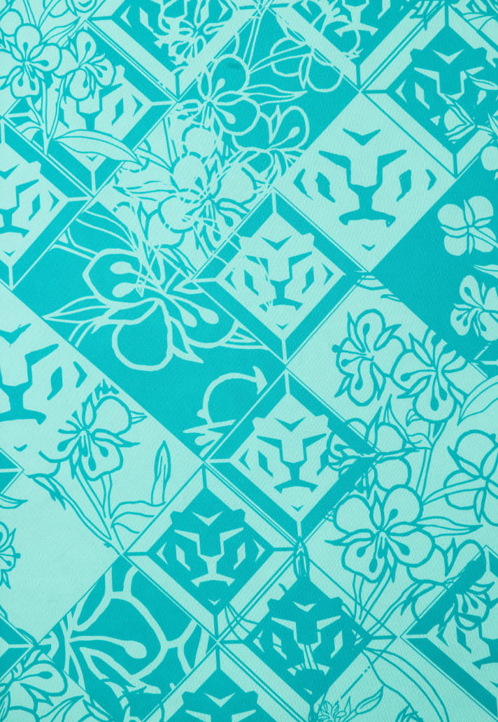
Each of the featured London City Lionesses crests was hand-crafted using traditional lino print techniques — drawn, carved and printed by hand before being incorporated into the final design. That handcrafted approach gives the pattern a unique character and texture, creating something that feels artistic rather than manufactured.
Look even closer and there’s another layer waiting to be discovered. Woven subtly into the tiled artwork is the Rosebay Willowherb, London's county flower, adding a local connection that strengthens the storytelling behind the shirt without overwhelming the overall aesthetic.
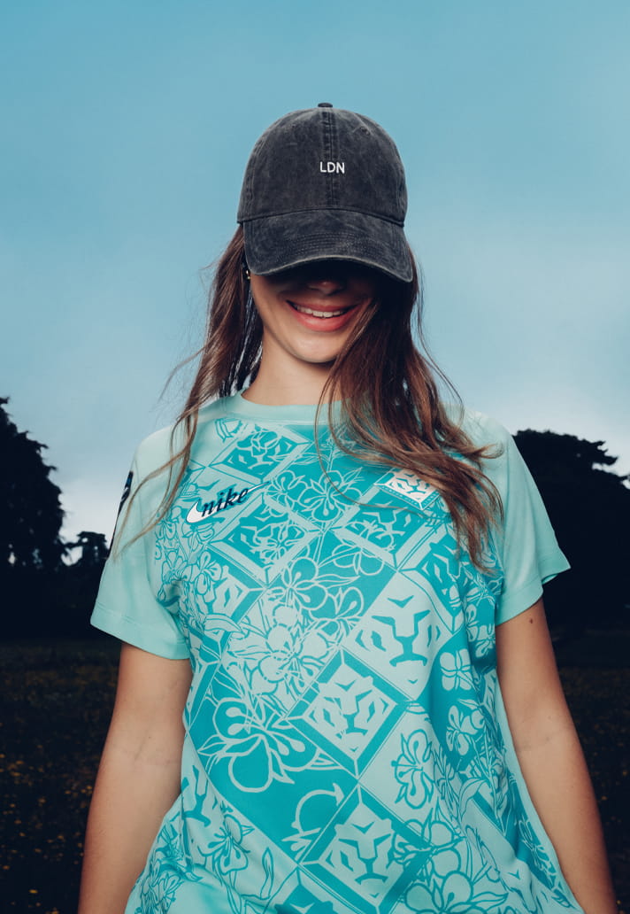
It’s this depth of thought that makes the design so successful. The repeated crests aren't simply decoration; they're identity. Front and centre throughout the jersey, they underline the creativity and individuality that has become synonymous with London City Lionesses as they continue to carve out their own path in the English game.
From a Creative Soccer Culture perspective, that’s exactly what makes this release so compelling. The best football shirts don't just display a club identity, they express it. Here, the badge becomes more than a symbol. It becomes the fabric of the shirt itself.

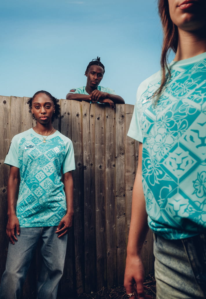
By repeating, distorting, crafting and embedding the crest across the entire design, London City Lionesses and Nike have created something recognisable without relying on convention. It’s a clever piece of visual branding that feels fresh now but also has the potential to build a long-term identity for the club as recognition grows over time.
In many ways, the concept mirrors the club’s journey. Independent, ambitious and unwilling to follow established pathways, London City Lionesses have quickly become one of the most unique stories in English football. This shirt captures that spirit perfectly.
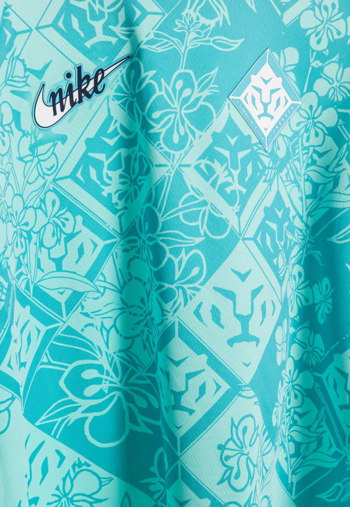

As the club prepares for its second season among England’s elite – and perhaps an even bigger chapter should the Alexia Putellas rumours prove true – they’ll do so in a jersey that is every bit as distinctive as the project behind it.
The London City Lionesses 26/27 home shirt is available to preorder here.