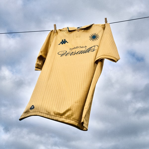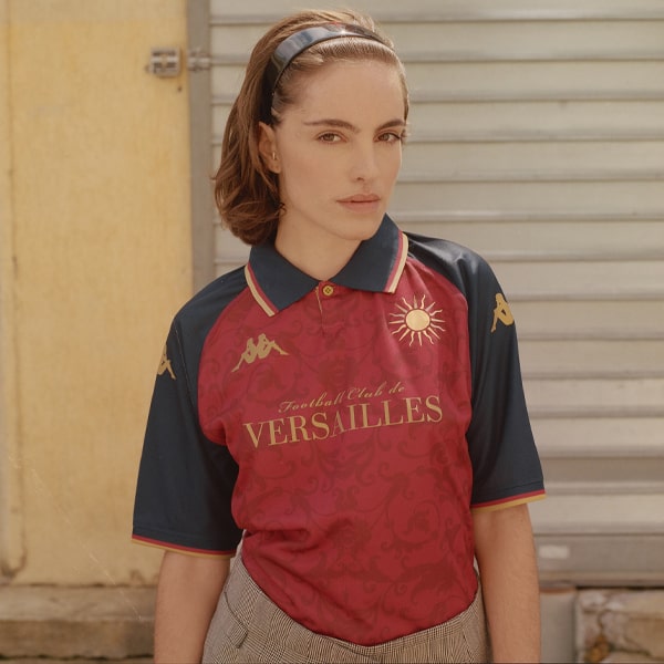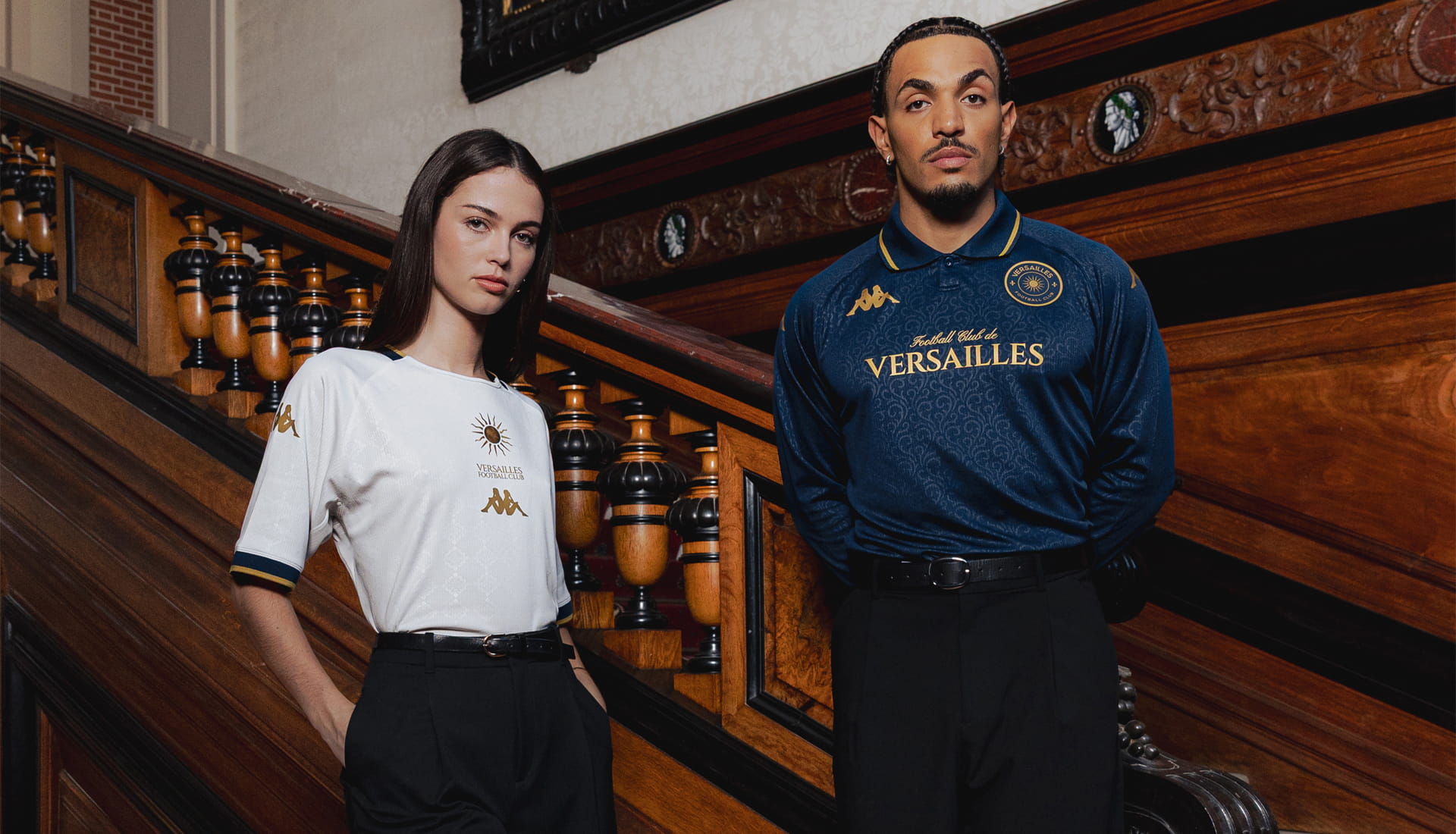
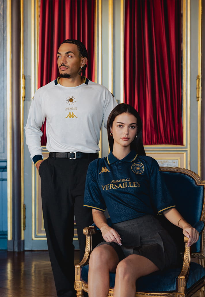
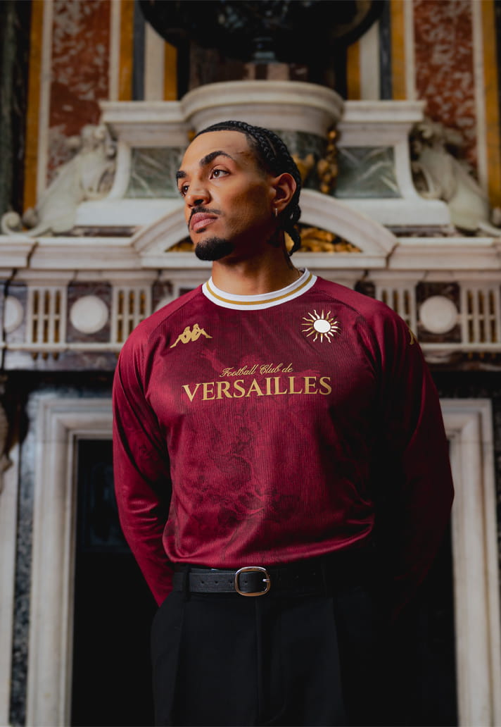
You know the old saying, fashionably late to the party? Well, it really feels like Kappa and Versailles fully embraced that approach when they launched not just one, but all three of the club’s 26/27 kits today.
First up, I want to make it absolutely clear: these are three beautiful jersey designs for the French side. Kappa and Versailles decided to take care of business in one fell (albeit somewhat late, considering the season started over a month ago) swoop, revealing the club's home, away and third shirts all at once. And my initial impression? It wasn't one of awe and admiration. No, it was more a case of: haven't I seen this before?
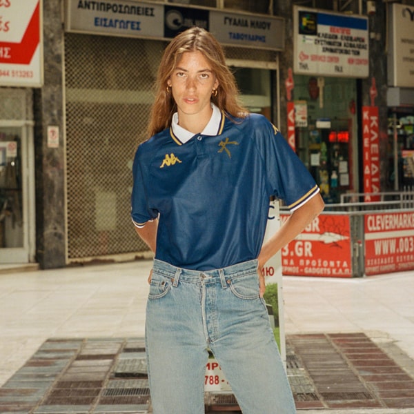
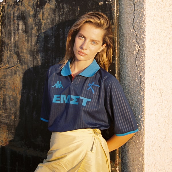
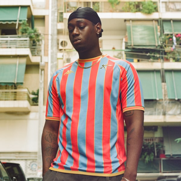
FC Versailles compete in National 1, the third tier of the French football league system. They first appeared on many people's radars during the 24/25 season when they unveiled a particularly stylish set of home, away and third kits. The fact that the home shirt bore a striking resemblance to Athens Kallithea's 22/23 home kit seemed to pass most casual observers by. At first glance, Versailles looked like another challenger stepping up to Venezia's throne as football's most stylish club. After all, they were following a very similar formula. Lower-league side? Check. Kappa-produced kits? Check. Presented through an elevated fashion-led campaign? Check. But this is where the problem starts.
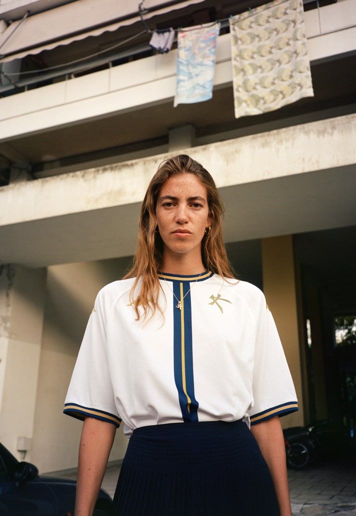
Kappa's partnership with Venezia was a genuine lightning-in-a-bottle moment. Under the stewardship of Ted Philipakos, with design influence from Fly Nowhere's Diego Moscosoni on the kits and later Bureau Borsche in shaping the club's visual identity, the project became something far bigger than football shirts. For three seasons, that combination blazed a trail and dominated jersey culture, firmly placing Venezia on the footballing map while helping usher in a new era of football-meets-fashion. The now iconic "Venezia" wordmark in the sponsor slot became a calling card in its own right.
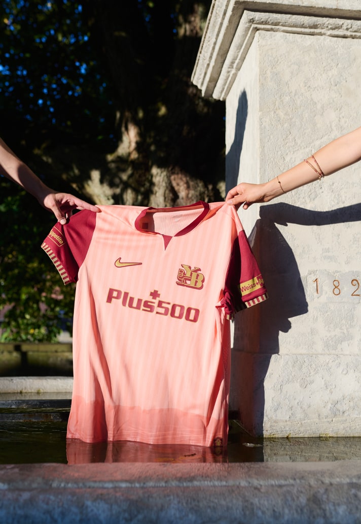
Since then, Philipakos has moved on to Athens Kallithea, continuing his work at the forefront of football fashion. Moscosoni helped oversee Venezia's transition from Kappa to NOCTA and remains involved in the club's kit design, while Bureau Borsche continue to push football's creative boundaries with projects with the likes of BSC Young Boys.
And that leaves us with one entity: Kappa.
The Italian brand has been at the forefront of football shirt design for the best part of a decade, but with Versailles it feels as though they're trying to recapture that Venezia magic. Right down to placing "Versailles" across the sponsor space, the similarities are impossible to ignore. The problem is that the moment has passed. We don't want another Venezia. We want whatever comes next.
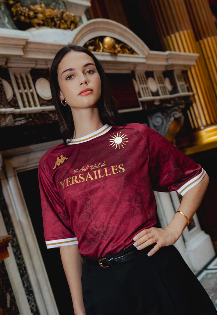
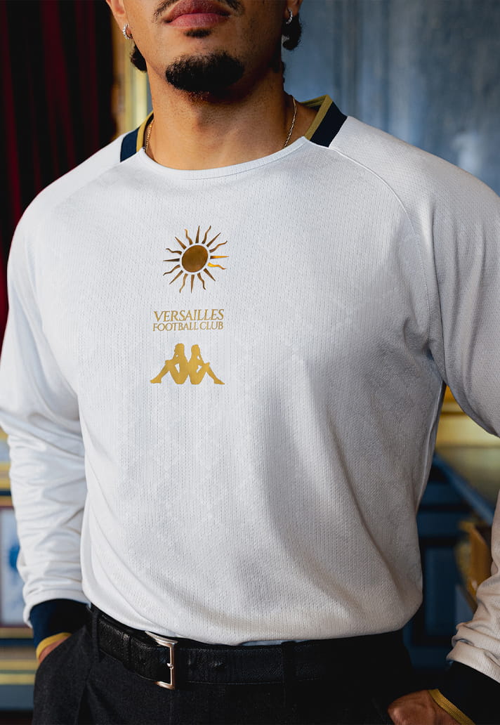
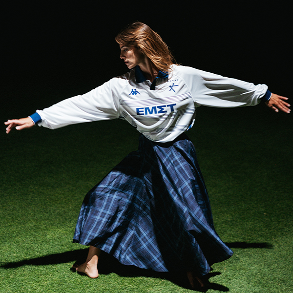
Look at Versailles' 26/27 collection and there's no denying it, it's beautiful. It's elegant. It's stylish. It's fashion-forward. But it no longer feels original. It feels expected, and that's where it falls short for me. The formula has become a little too familiar. Take a kit, place it against the backdrop of a historic building, in this case the Château de Ferrières. Add a Colorama in the background, throw in a Moroccan rug, tuck the jersey into a pair of tailored trousers and finish the look with loafers. It's undeniably effective, but it's also something we've all seen numerous times before.
In Creative Soccer Culture, standing still simply isn't an option. To stand still is to stagnate. Originality is the mother of creation, and creativity is what keeps this corner of the game moving forward.
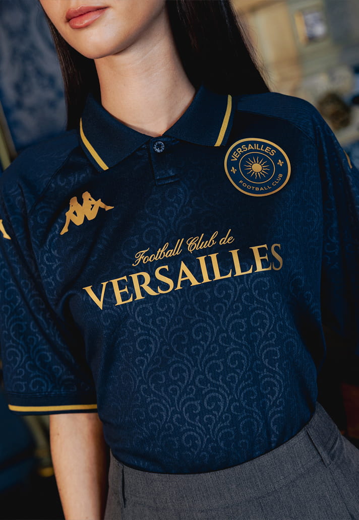
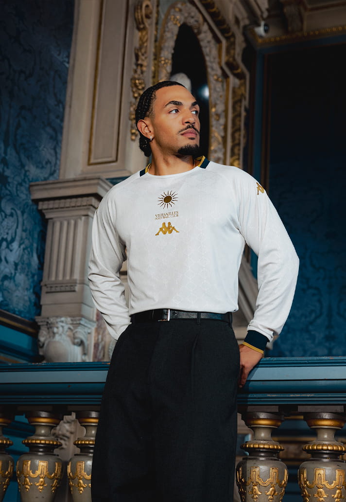
To give Versailles their due, this trilogy of shirts was imagined and drawn by Sony Ketif, and there's no AI shortcutting the process here. Just honest-to-goodness design inspired by architecture, ironwork, Baroque painting and the wardrobes of historical figures such as Louis XIV, Marie Antoinette and Napoleon Bonaparte. It's a collection that pays vibrant tribute to French elegance and prestige. A few years ago, these kits would've been, and probably should've been, the talk of the town. 2022 me would've been all over them. But this isn't 2022. Times change, trends evolve and Creative Soccer Culture refuses to stay still.
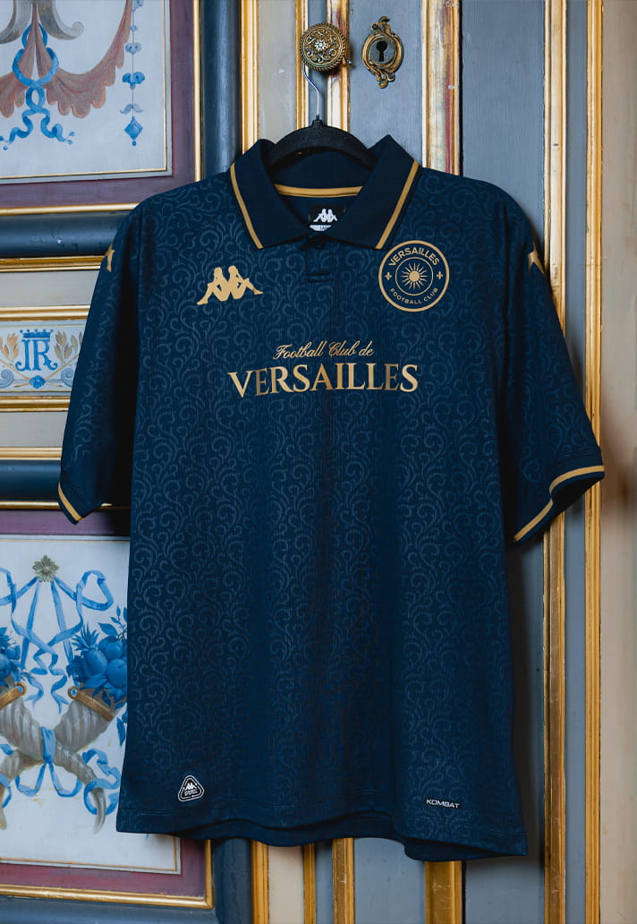
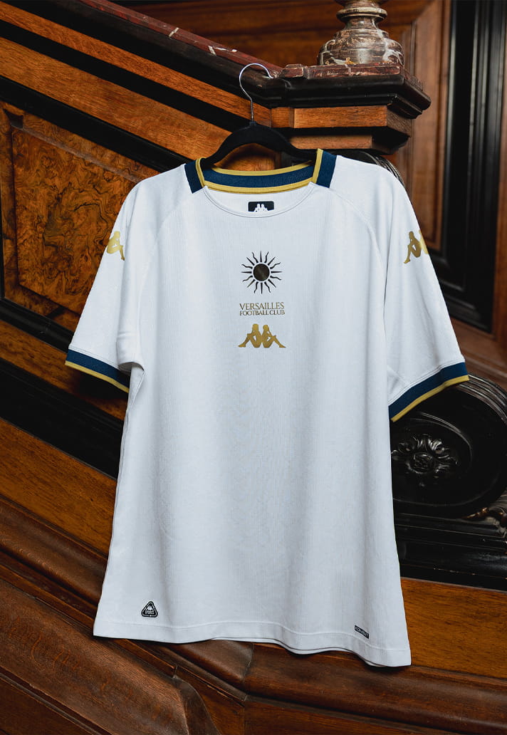
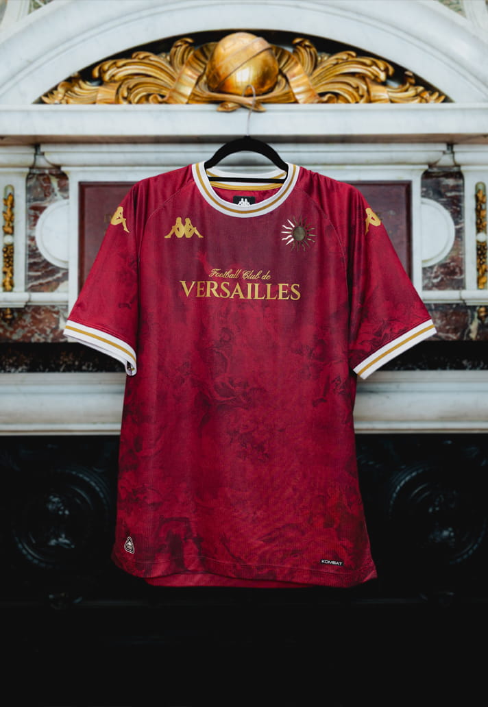
That's ultimately what makes the Versailles release such an interesting one. The issue isn't the quality of the shirts. In fact, the quality is undeniable. The issue is that they're arriving in a landscape that Kappa helped shape but no longer lead. What once felt disruptive now feels established. What once felt revolutionary now feels familiar. And maybe that's the fate of every great idea. Eventually, innovation becomes convention.
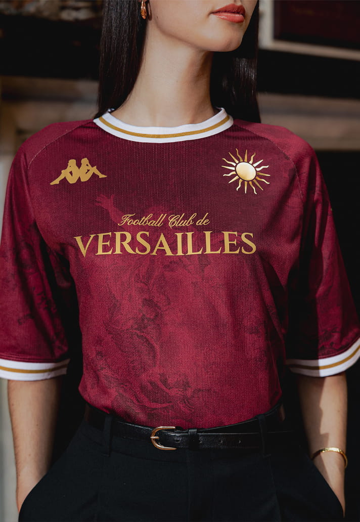
The challenge for Kappa, Versailles and the rest of football's fashion elite isn't proving they can create beautiful kits. They've already done that. The challenge is identifying the next frontier, finding the next visual language that captures the imagination in the way Venezia once did. Because if Creative Soccer Culture has taught us anything over the last decade, it's that today's trendsetter quickly becomes tomorrow's template. And right now, for all its beauty, this Versailles release, and its adjoining campaign, feels a little too much like a template.