Chivas de Guadalajara’s new third kit from Nike caught my attention not just because is delivers a design that celebrates Mexican heritage, but also because it experiments with one of football’s most sacred traditions: crest placement.
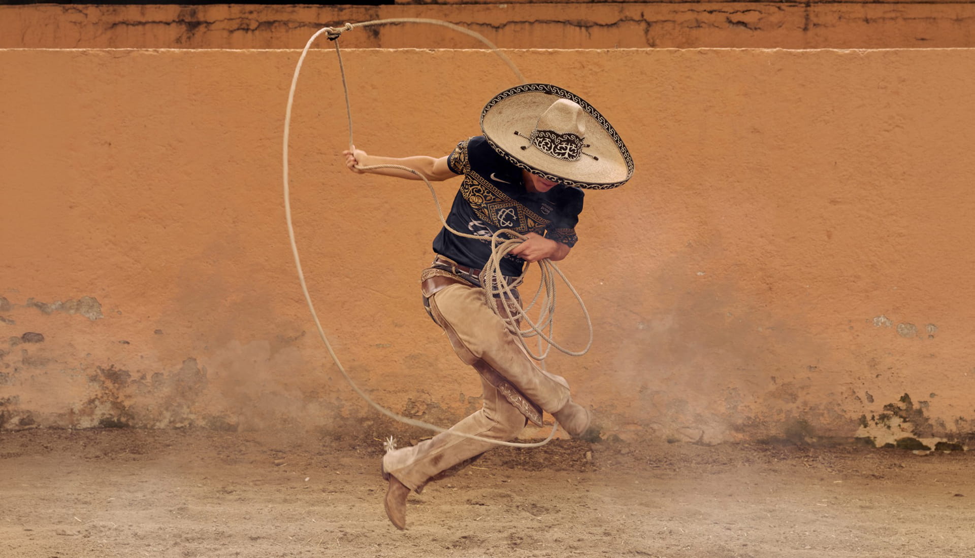
Inspired by charrería, widely recognised as Mexico’s national sport, the design of Chivas’ new third jersey pays tribute to a cultural tradition that has become deeply woven into the country's identity. The result is a shirt that feels rich with storytelling, blending references to Mexican craftsmanship and sporting heritage into a distinctive black-and-gold look.
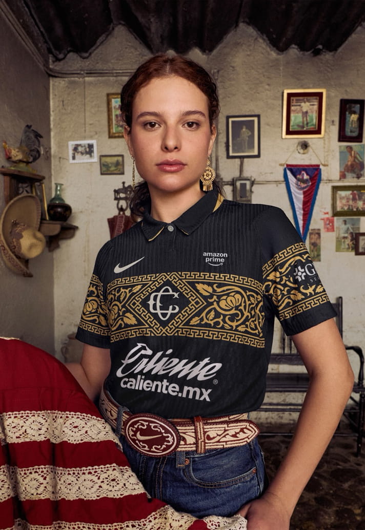
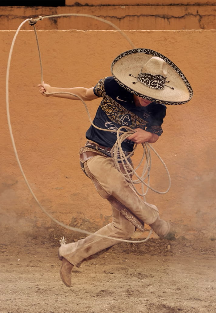
The base of the shirt arrives in an elegant black colourway, accented with gold detailing inspired by the iconic charro suit. Running across the chest and sleeves is an ornate graphic pattern influenced by piteado belts, a traditional form of decorative leatherwork known for its intricate stitching and craftsmanship. It gives the shirt a premium, almost ceremonial appearance, standing apart from the more common performance-focused aesthetics seen across modern football kits.
It’s a beautifully intricate look with plenty of meaning, but for me, it only serves as a platform upon which the real story of the design stands out, front and centre. See, Rather than placing the club crest in its traditional position over the heart, Nike and Chivas have opted to feature the club’s original 1908 emblem in the middle of the chest. The historic badge, made up of intertwined "C" and "G" lettering, serves as a nod to the club’s earliest visual identity and creates a focal point that immediately draws the eye. That in itself is not particularly unusual – shirts often feature centralised crests and branding. But with the Swoosh branding remaining in place on the right of the chest, it’s the choice to feature a sponsor on the left that’s interesting. Yes, it lends the look some symmetry, but could there be some accidental potential in this?
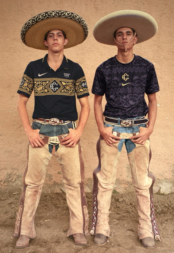
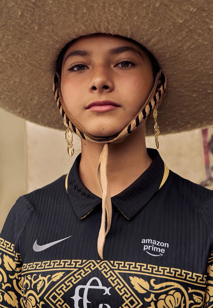
Don’t get me wrong, this is Mexico, where any space on a shirt is (excuse the – in this case – rather appropriate pun) prime real estate for sponsors to take up position. At first glance on this jersey it feels like a genuinely rebellious design choice. The campaign imagery shows off two variations of the shirt – one with the club’s main sponsor in place, and one without. And, playing the hypothetical game, if the look without the main Caliente sponsor were the official on-pitch look, then this would be a bold shift in convention of swapping the club crest and sponsor positioning.
But alas, Chivas’ primary sponsor will remain prominently displayed across the front of the shirt, meaning the additional sponsor appearance is less a case of commercial interests taking over club territory and more a creative use of otherwise available space. You can’t argue with the fact that the layout actually places greater emphasis on the historic club crest, elevating it to the most prominent position on the shirt while surrounding it with references to the club’s heritage.
Club crest and sponsor talk aside, the charrería influence extends beyond the graphic elements. Chivas and Nike have also developed a bespoke typeface for player names and numbers, designed specifically for this kit. Drawing inspiration from the visual language of charro culture, the custom font helps tie every aspect of the design back to the same central theme.
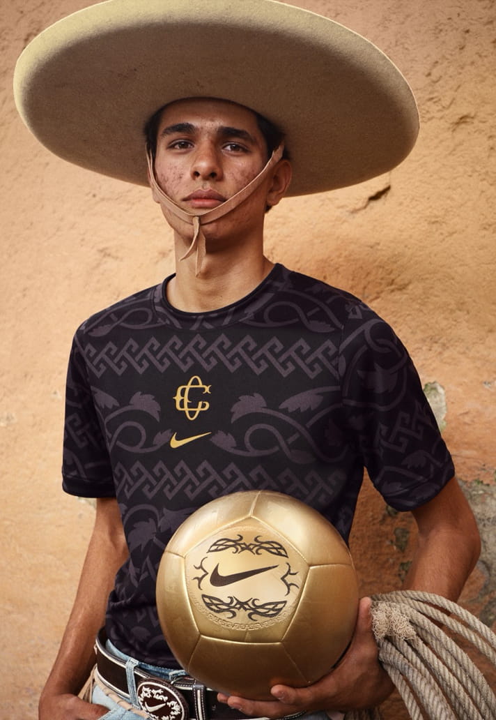
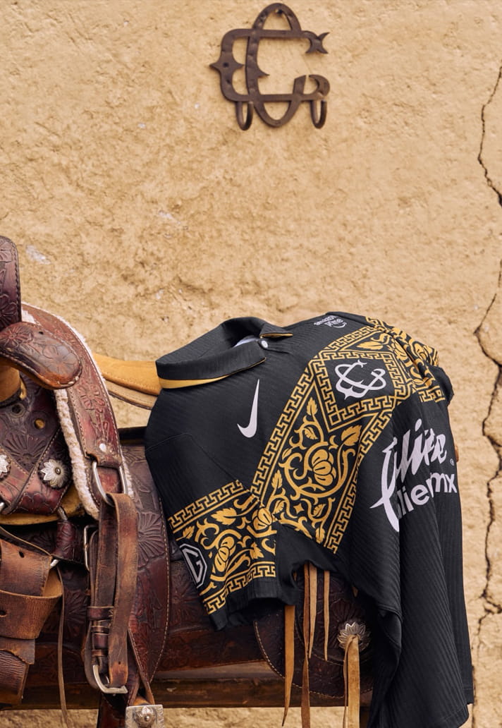
From the piteado-inspired detailing to the historic crest and custom typography, the shirt feels remarkably cohesive. Every element feeds into the wider narrative, creating a kit that celebrates both the traditions of charrería and the long history of one of Mexico’s most iconic clubs.
The Chivas Guadalajara 26/27 third shirt is available from the club's online store.