


The illustration style of Josh Parkin is playful yet triumphant. His latest football inspired project digs into the kit bag and pulls out a right good selection of gloves from years gone by. ‘The Goalkeepers Union’ is a celebration of a piece of product that although may be a little under looked, is very much appreciated.
Turning some focus to the world of goalkeeper gloves, where did the inspiration come from on these?
We see new football boot artwork popping up every day on the likes of Instagram and twitter. It all begins to look the same after a while, and there’s only so much you can do. I wanted to take a step back and look beyond the obvious, so decided to maybe look at goalkeeper gloves. The thing that nailed on the idea was a visit to The Yorkshire Sculpture Park to see the KAWS exhibition. If you strip back the colour on the print, you can really begin to get a KAWS vibe from the piece. The big, bubble like Mickey Mouse hands provide a humorous outlook on something that is often taken for granted, goalkeeper gloves.
The project seems like a beautiful opportunity to reminisce - how did you pick out the gloves you wanted to include in the illustration?
Instagram accounts like @josiesdad and @theglovebag where a real help in bringing to my attention the most iconic brands/ models of the 70’s and 80’s. I then looked at keepers from the 90’s to see what they were wearing between the sticks. I then went as far as trying to track down the gloves I remember my mates at school wearing between the cones at primary school in the early 2000’s. So I guess you can say there’s something in there for everyone. I’m sure 90% of people will be able to look at the print and be like ‘ahhh sweet, remember them!?’ At the end of the day that’s what I wanted, for my artwork to be a conversation starter, for people to stand around and bring up old memories and old stories.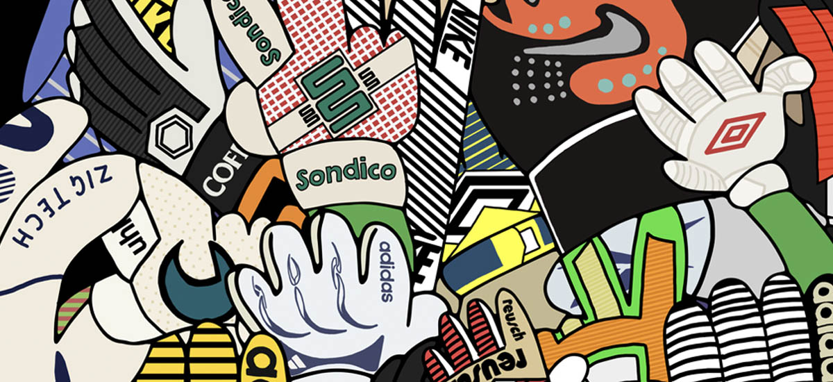
I really like how the print looks once framed. The sheer number of models and colours give the effect that they’re bursting out of the frame. This was a bold move for me, and a risk if anything. Anyone familiar with my work will know that I like to work with black ink, adding colour only when necessary.
Goalkeepers are often overlooked when it comes to the football world - we're always talking about the outfield game, did that come to mind with this piece? There's a lot of nostalgic numbers in there.
I wanted to look further than illustrating boots and kits. After testing the water in a couple of Goalkeeper facebook groups, and quizzing instagram accounts created for goalkeepers only, I really grasped the Goalkeepers Union mentality. I wanted to recognize the amount of development and designing that goes into creating the product. The colours, panels and contrasting materials create an interesting result. I like how the appearance changes as the hand moves, and that’s why there’s so many different hand poses.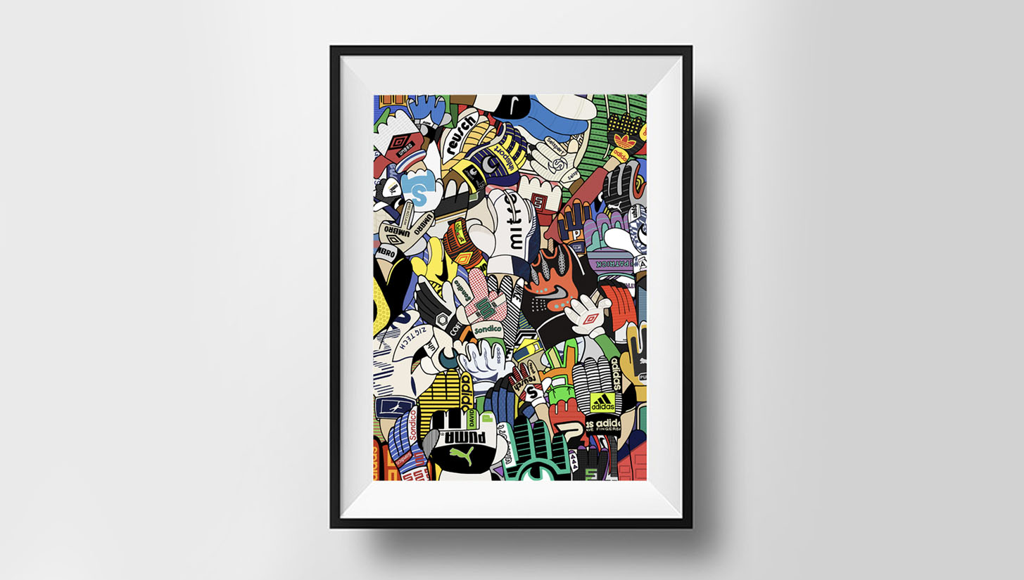
What's the plan with the design, will it be going on sale? It'd look the part framed in a studio...Have you thought about where you can take the idea next?
Prints can be bought directly from my site: www.joshparkyart.bigcartel.com. The plan next would be to develop the print and take it further. I’d love to help out the independent glove manufacturers. Maybe create a piece that is made up entirely of these smaller brands. There’s also scope to create a print surrounded by gloves worn by the keepers in the Euro 2016 competition, that way we can use more international brands, and look at how each glove may be customized to suit specific keepers, for example, colours and cuts.
A celebration that will reach out further than just the keepers - Whether it's for your floodlit mid-weeker or end of season finale, we've all bought a pair of gloves. You can pick up a print here. Look out for Josh's Radabe print while you're there. Such a gem.


