
Club crest and logo redesigns are nothing new, but we’re now in an era where less is more, where one of the driving forces behind a new look will be a streamlined appearance that’s more social media-friendly. On the back of Inter Milan’s newly revealed club crest, we’re taking a look at the best footballing rebrands in recent years.
Football fans are a fickle bunch by nature. They cry for the advancement of their respective teams, desperate for any route to success, but at the same time they fear change. Tamper with the traditions of their club and you will inevitably invoke their wrath. Case in point: the club logo redesign.
Rarely will the reinvention of a club crest ever not court controversy. Sometimes its absolutely justified (we’re looking at you Leeds United circa 2018), but often it’s just a matter of a period of readjustment, getting used to something new, letting it settle, and before long you can barely even remember what the old crest looked like.
So a new crest or logo redesign is always going to walk a fine line: get it right and you’re looking at a fresh visual identity that can usher in a new era for a club, hopefully one that will be linked to an ongoing period of success, elevating it to iconic status. Get it wrong and it becomes a laughing stock; to the fans, the hierarchy will have committed a cardinal sin, messing with the very essence of the club. They will not forgive, while all rival fans won’t let them forget.
But we are now entering a period where football is reaching far beyond the borders of the white lines on the pitch, and clubs are evolving to become more than just a team. So the club crest redesign is not just about the modernisation of a logo, it’s about rebranding for a global audience on a digital stage, most recently exemplified by Inter Milan's change. And so, as football gets with the times, we look at the best crest rebrands in modern football.
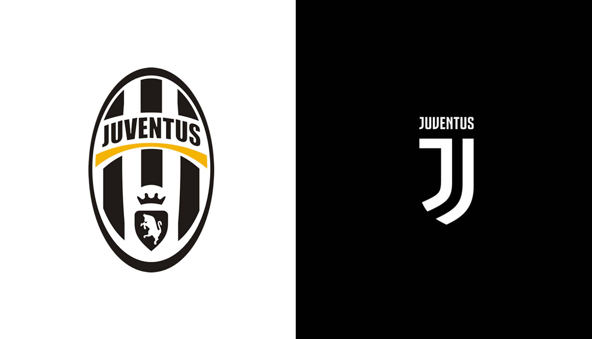
Juventus
The first big club to move towards a more stripped back and streamlined design came from Juventus in 2017. Initially met with a wave of criticism, the new logo removed the silhouette of a charging bull, as well as the crown, bold black and white stripes, and the team name underlined in yellow, replacing it all with a simplistic design that represented the very essence of Juventus: the distinctive stripes of the playing jersey, the Scudetto – the symbol of victory – and the iconic J for Juventus.
The first thing to understand with this move was that it was more than just a new logo, it was Juve’s move to become a global brand, something larger than 11 men on a pitch. It’s an extension of the football team, and you only have to look at how seamlessly it transitions onto streetwear. Add in one of the most popular athletes in the world in Cristiano Ronaldo, and what you have from Juventus over the last half a decade is a masterstroke in marketing.
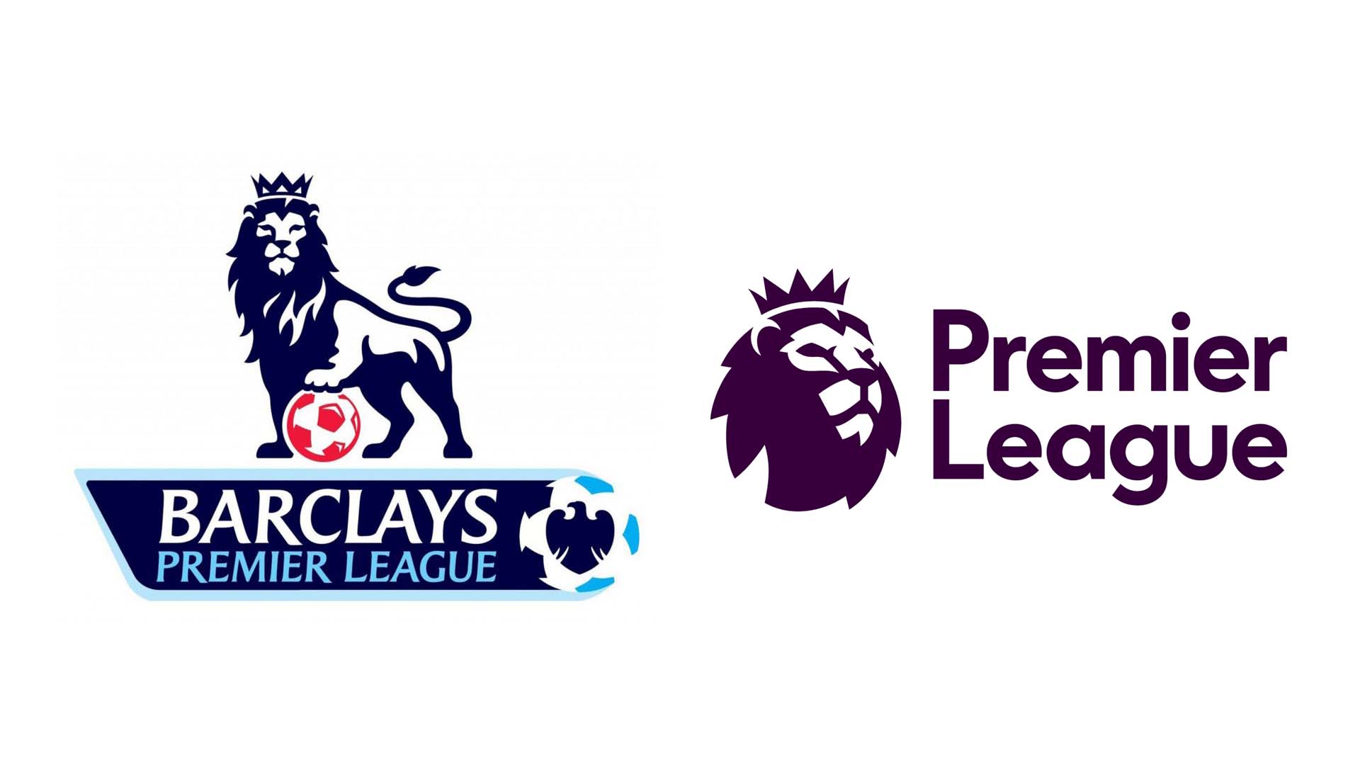
The Premier League
Rebranding the worlds most loved football league whilst keeping its 20+ year heritage intact was always going to be a delicate balancing act. Following in the footsteps of the MLS, who showed off their new look in late 2014, the Premier League rebranding was unveiled in early 2016, and it saw a design that brought the lion icon into modern times, with a look that can be used across all platforms and devices seamlessly, shedding all the unnecessary trimmings.
It brought fresh, exciting colours into play with a new text that felt friendlier and more inviting, reflecting the league itself and its inclusivity. Other leagues followed soon after, including Serie A, but the Premier League, as the most watched league in the world, absolutely nailed this one.
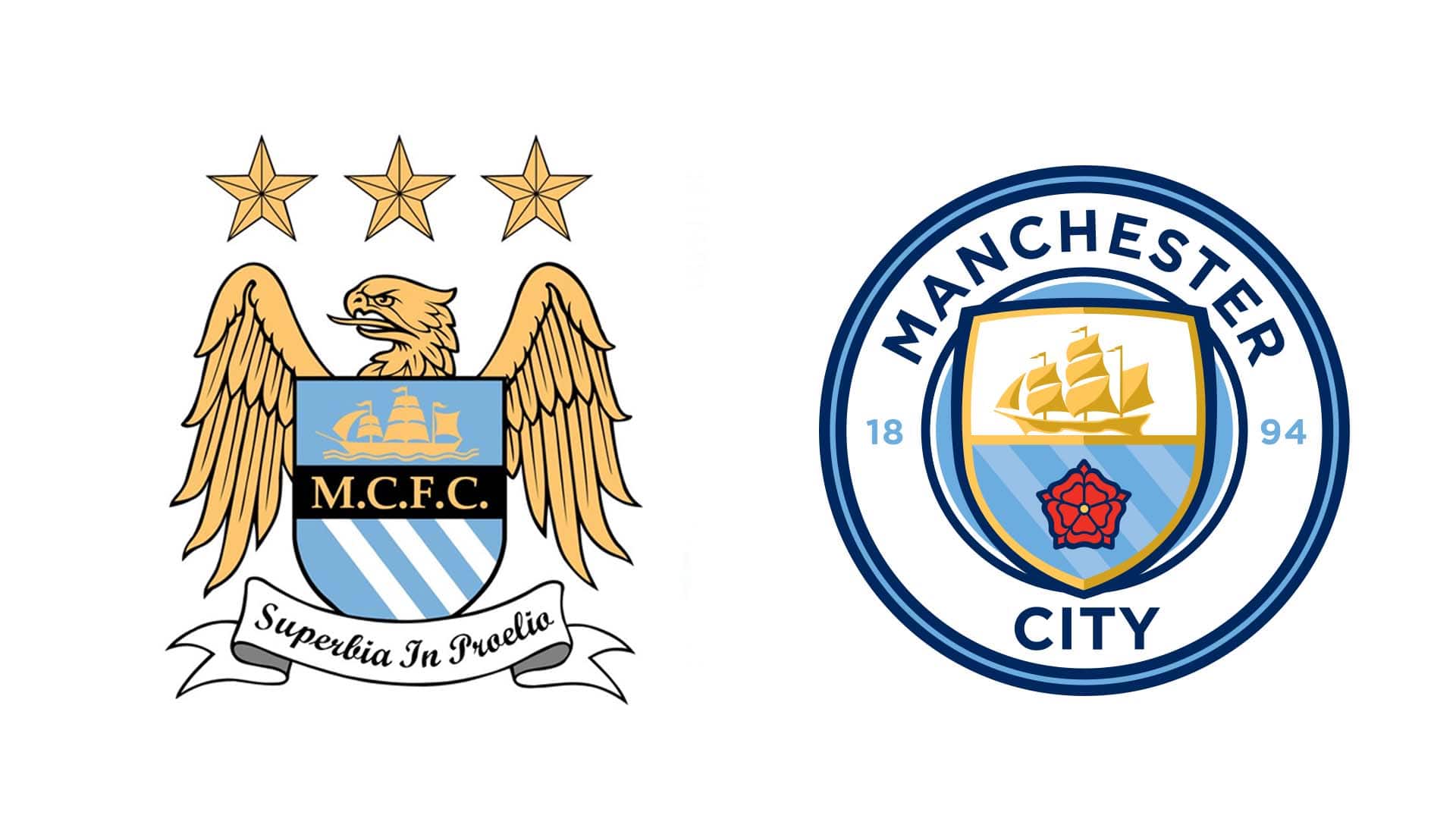
Manchester City
For their rebranding, Manchester City actually looked to the past for inspiration, reverting to a look that was more like the club crest that had been in use between 1972–1997, and era that saw the club playing in the second and third tiers of English football. Now City are a multi-billion pound club who are very much in a new era of continuing success, focused on becoming the dominant force in world football. And they needed a new look to represent that. Gone were the golden eagle, the stars, the motto and the letters “FC.”, though the ship stayed and it was joined by the returning red rose and circular design from their earlier logo. The design also added “1894”, the year the club was established.
The look sat in-line with City's American and Australian sister clubs, New York City and Melbourne City FC, all of whom are owned by Sheikh Mansour and the City Football Group. Makes a certain amount of sense to align the brands under one umbrella, and this has been executed well.
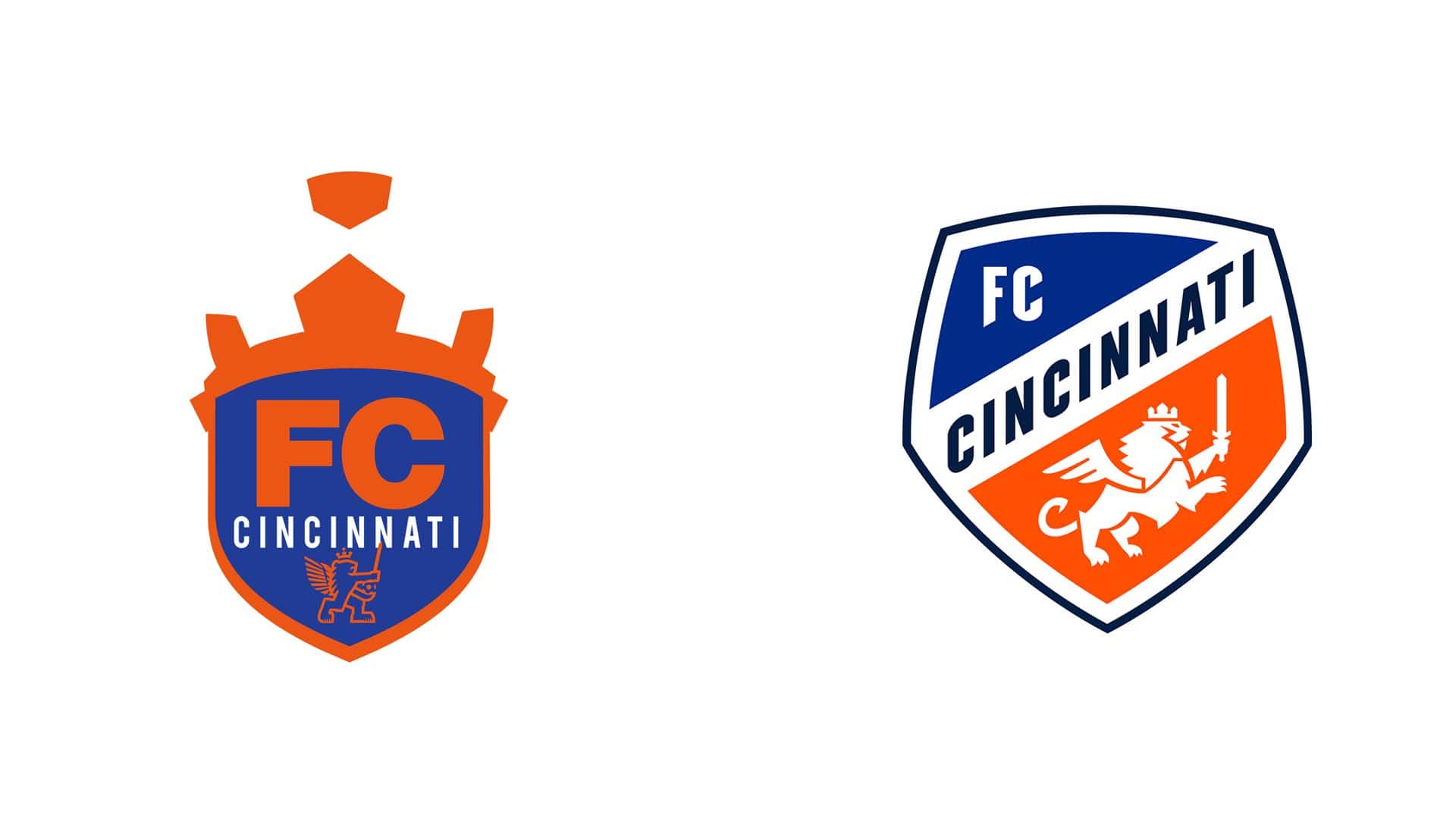
FC Cincinnati
Not only did FC Cincinnati manage to streamline their look, they also managed to crowbar in more meaning to their new club crest than any other we’ve seen, and all in time for their MLS debut in 2019, following their three-year long stay in the USL. Designed by the same team behind the Juventus rebrand, the new crest celebrated the cities German roots, the lion’s crown is a nod to the ‘Queen City’, while the seven points of its mane are a nod to the seven hills of Cincinnati. The three-feathered wing represents the club’s three-year journey to MLS and, finally, its tail takes a distinct “c” shape.
It was a nice rebranding that retained the essence of the original logo, while updating for the new, greater challenge that lay ahead.
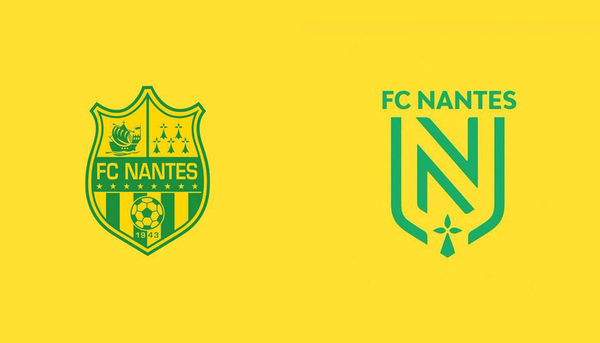
FC Nantes
Following very directly in the footsteps of Juventus, in 2019 FC Nantes went solidly down the minimalist root, doing away with anything superfluous from the crest that had been in use since 2009, instead settling for a minimalist interpretation of ’N’. Again, as with Juventus, initial opinion was that the change was too much for such a historic club. But in retrospect, the rebranding was once again made to strengthen the brand and increase the teams’ reputation through a more readable logo that could adapt on different platforms. And as far as that brief goes, it was job well and truly done.
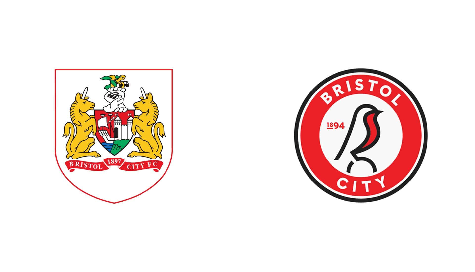
Bristol City
OK, so not one of the bigger teams or brands on this list, but really that makes what Bristol City did in 2019 all the more impressive. Following several phases of design, which included consultation with fans and a focus group that represented a cross-section of supporters, Bristol City launched their new club crest, recalling the robin of their nickname in a clean, minimalist approach that was set to usher in a new era for the club. You see a number of powerhouse teams across the globe mess these types of moves up, so kudos to the Bristol City hierarchy for getting this one so spot on, especially considering how radical the changes were.
Special mentions for Sydney FC, West Ham, D.C. United, and Atlanta – all very decent redesigns.


