With the release of the Roma 21/22 third shirt, New Balance have completed their first set for the Serie A side. Now that latest shirt comes under our ‘Dropology’ lens, as part of the series that looks for the story behind the design of some of the biggest drops.
New Balance certainly had their work cut out for them when they took on the Roma partnership, taking over where Nike left off. But with the release of the club’s third shirt the American brand has completed a set of four that more than lives up to the demands of the club’s faithful. Taking a deeper focus as part of our ‘Dropology’ series, we spoke with Rob Sheldon, Head of Football Product at New Balance, to get the low down on the final Roma shirt for the 21/22 season, which sees the return of the Lupetto, the iconic wolf emblem that first featured on the jersey in 1978 and has since become an integral part of the club’s identity.
While there's so many clubs on the planet, there are few that have reached an iconic status – how would you describe Roma?
There’s very few teams globally, in fact not just limited to football, that evoke such a visceral response in the way that Roma do. They belong to a small collection of entities that have such a powerful presence. When you look into Roma, you can’t detract from the power of the city itself – it holds such an identity for the club in the way few cities do. Also, the legacy of the moments the club has achieved and experienced, the iconic players who have worn the shirt and the fans – there’s a different level of passion that the fans have for Roma.
I think the fans offer something detached in a beautiful way from the rest of the world. Romanistas in Italy and abroad, worldwide, there’s a unique essence of support. Their being is not something that’s happened overnight, it's been built over time. It’s so unique in that sense.
With all the history and such a legacy, what's it been like to work with the club?
From the first exchange it’s been really satisfying to be met with a team and a culture there that was really palpable from the first discussion. You could see that they’re a club building towards something new. Obviously we were on the outside looking in until that point and when we crossed through, it exceeded all expectations. What we found with the club is that they are the ideal custodians of the city.
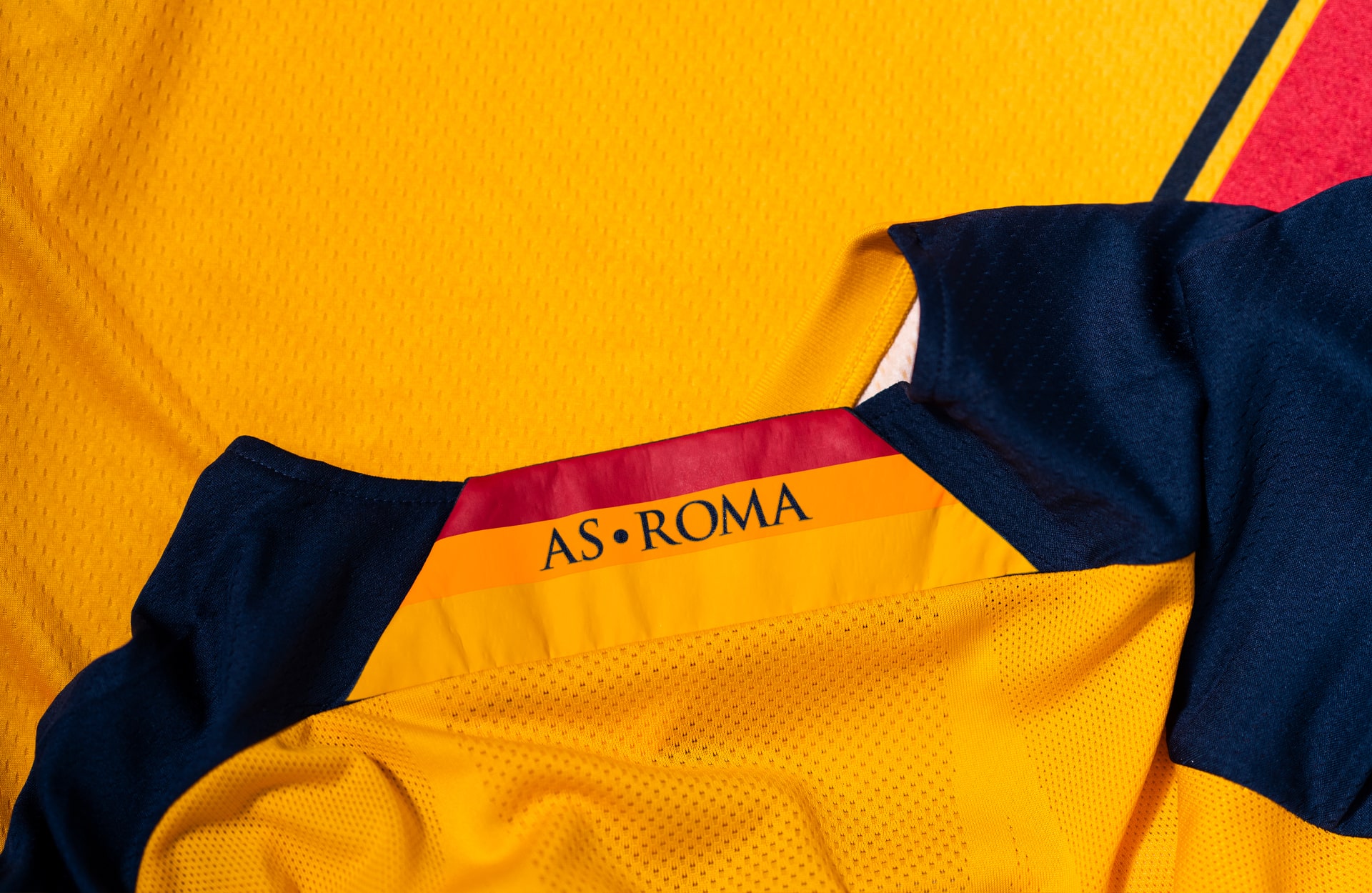
From day one, we really wanted to communicate to them that we wanted to preserve the integrity of the kits. We wanted to make sure that we present a very distilled and considered view of Roma. We wanted to be hugely respectful on the delivery of the colour of the jerseys, how we used the crest and probably year one was about building that trust and showing we have that huge respect for the club and their identity. We recognise that Roma doesn’t belong to us, we’re here to celebrate what they stand for through our work.
There’s very few teams globally, in fact not just limited to football, that evoke such a visceral response in the way that Roma do. They belong to a small collection of entities that have such a powerful presence. When you look into Roma, you can’t detract from the power of the city itself."
How would you describe the ambitions of the club and their tastes? They’re forward thinking when it comes to how they use social media, is it the same with their approach to product?
The club has this really helpful balance about their identity. It’s relatable, understandable but progressive. You can see that there’s a real desire to respect the past and what has gone before. They want to celebrate the past but not be bound by it. In that respect we can see similarities in the way Roma and New Balance share the same view. All the way through the process it’s been about provenance and progress in equal measure.
The third kit is often a chance for a club to unleash a wilder side or offer something different to the away or third – what was the aim with this piece?
As we grow into the partnership, you’ll see our philosophies play out. The home kit was one that was so important to truly feel like a Roma kit. It was more about restraint of design. You’ll see with the away and third kits over the years that things will start to stretch and distort more creatively. Something with the third kit we wanted to tap into was the patterns you see in kits. Quite often they act as a base pattern rather than actually interacting with the kit.
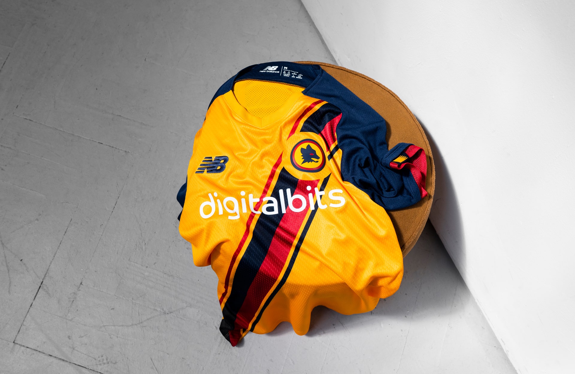
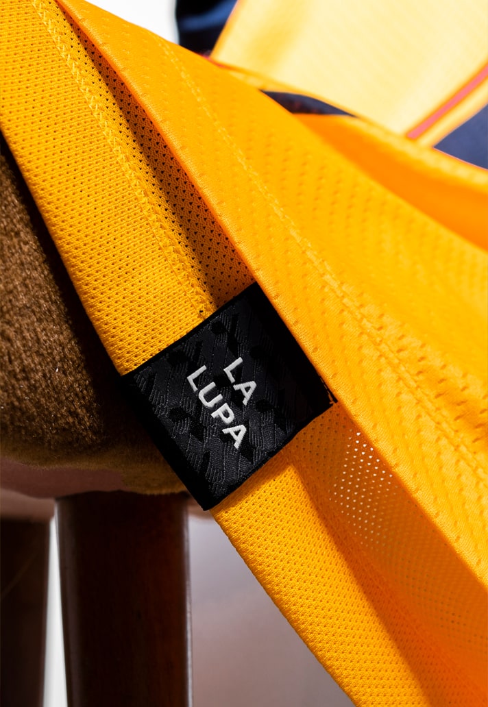
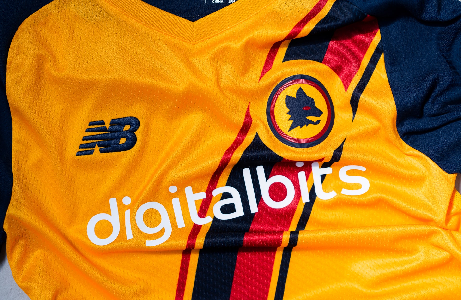
We designed the stripes on the third kit to work with the components of the jersey. We also wanted to tap into the match day environment for inspiration. We thought about the ‘Curva Sud’ and the flags, the flairs and the colours that are so vivid there. We wanted to look at the sash design and use it to frame something within the jersey. One part of that which is unique to Roma is the iconography that is linked to the club. One of those which is very evident is the wolf. La Lupa. It’s so powerful and something the fans really connect with. So we wanted to separate that out. We wanted to use the sash to elevate that badge.
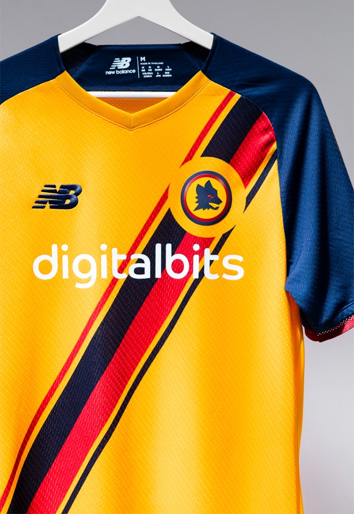
Hard to find a more character heavy badge in the game – what did you want the feeling of the shirt to be emotionally?
From an internal point of view we had to treat the badge with reverence. I think it would have been wrong to distort or overcrowd such an iconic badge. So we wanted that to sing as the most prominent aspect of the shirt. If you remove the crest, we want people to understand that it remains a jersey that people can only relate to as a Roma jersey. It should feel very unique to Roma. Once you then overlay the wolf, it takes on a whole new level of significance to the fan base.
We wanted to depict the jersey in a way that really draws in the eye. We wanted to convey that we were listening to those credible voices within or around the club and present them with something that genuinely represents their team and their city. It felt that that was the most important aspect to convey.
What trends have you seen that you wanted to bring through into this piece?
For us it’s about remembering the unique space a football jersey sits in. It’s such a symbolic connection between fans and clubs and it has to be credible. It has to be something fans want to wear as an extension and outpouring of their support. It’s got to work as a performance piece on pitch first and foremost but we always have to keep in mind that fans choose how to show their support and love for the club in different environments.
That comes into the design process when you think about the aesthetic of a jersey – it has to be wearable wherever fans go. That’s a challenge but you’re always trying to find a balance. We don’t try and relate to specific trends and let that way of thinking block the objective of creating something that's a real representation of the club. We look more at how the trend of the fan is changing and how the football shirt now finds itself in different environments than it has done previously – that’s both on or off the pitch.
Pick up the Roma 21/22 third shirt at prodirectsoccer.com