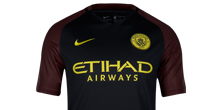
Manchester City are buzzing for the new 2016/17 season with a bee-autiful away kit inspired by famous black and red kits of City’s past and a Manchester icon: the worker bee.
That worker bee has been synonymous with Manchester since the early nineteenth century when it was first used to symbolise the city’s rapid growth during the Industrial Revolution. Since 1842 Manchester’s coat of arms has featured seven worker bees, and the insect can also be seen throughout the city on buildings, bridges, bollards, and a floor mosaic in the Town Hall. That's your history lesson done. So why isn't the kit black with yellow stripes? We'll it's more subtle than that.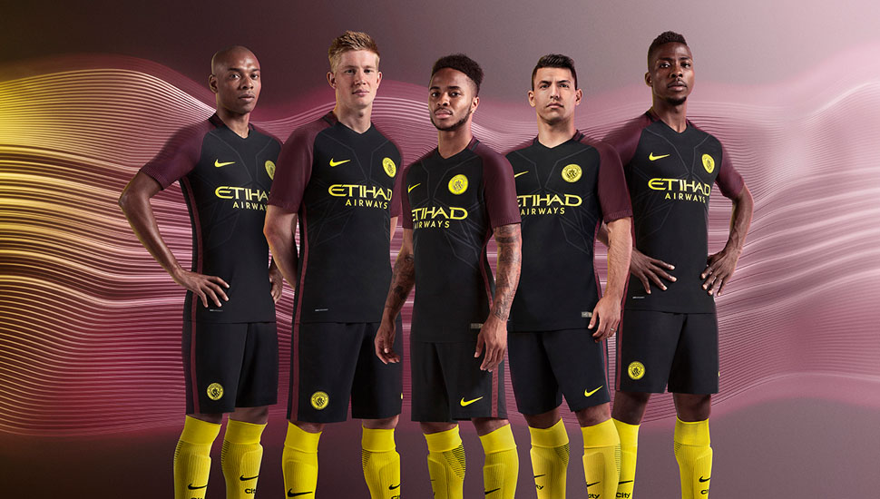
The new away kit’s distinctive black body and red shoulder and sleeves are embellished with vibrant yellow detailing. Yellow runs throughout the kit, notably in the new club crest on the shirt and shorts, the Nike Swoosh and the Etihad Airways logo. Shades of red have been a feature of Manchester City away kits throughout the modern age, most memorably in the iconic red and black striped away kit of the 1960s, worn in the Club’s 1969 FA Cup Final victory and more recently in 2011-12, another historic title-winning season. 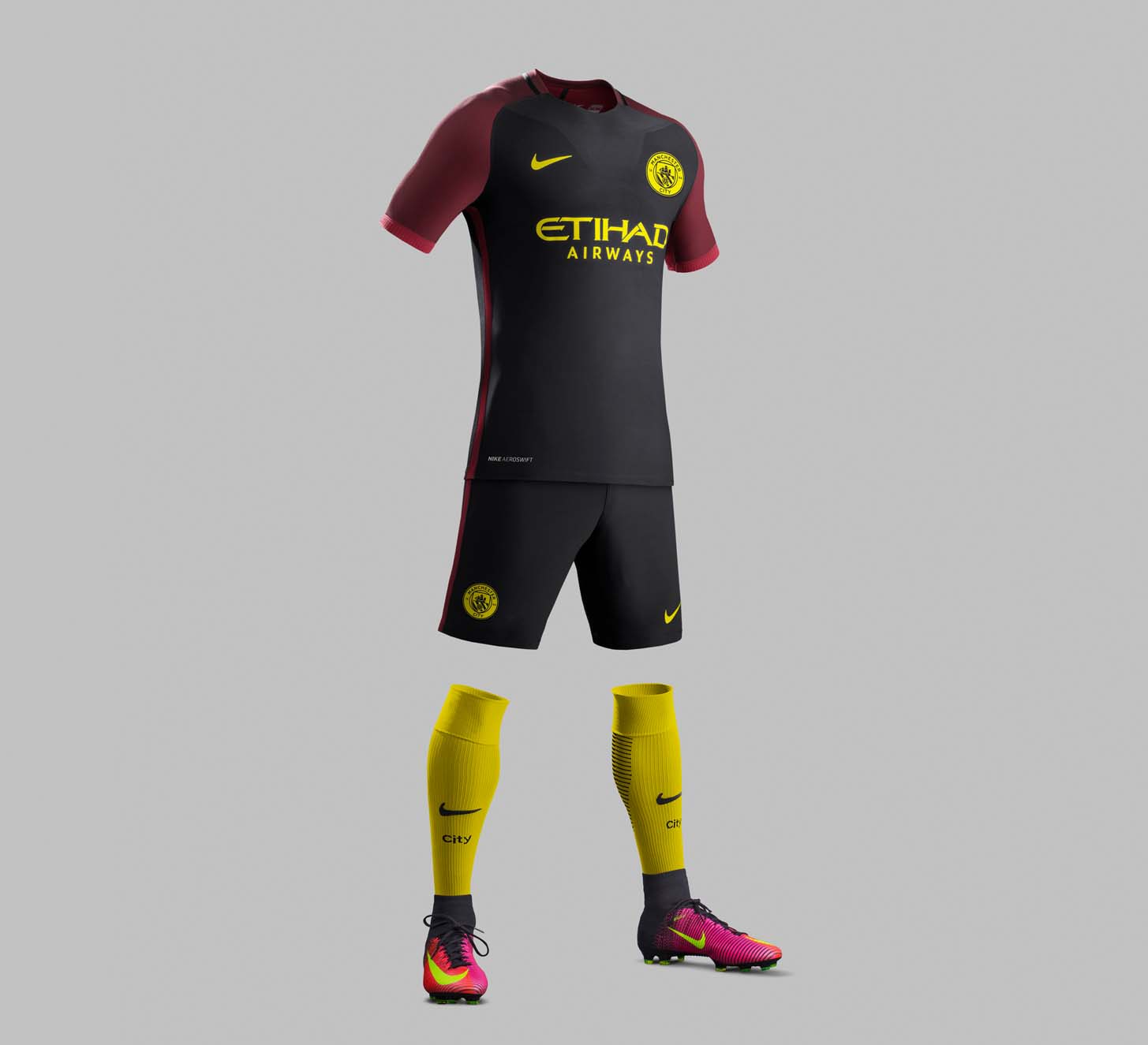
Want one? Pick it up here.