With every Premier League club having now unveiled their home shirts for the impending 2018/19 season, we've ranked them all from worst to best. Yeah, tin hat firmly on. Enjoy scrolling down and furiously disagreeing with all of them.
A few rules to remember before you get going. 1) If your club is near the bottom, this isn't because we hate your club – It's simply because your kit's a bit nasty this year. 2) Ugly sponsors deduct big points, regardless of the effort made by a brand. 3) There ain't all that much between some of them, but someone has to be bottom. Soz Southampton.

20 | Southampton – Under Armour used to make some decent kits for Spurs. This looks like a kit that would be on an early 00s club website where you could vote for your favourite. This is the one that would always finish bottom with 8% of the vote. The expanded stripe around the Under Armour logo is irritating.

19 | Newcastle – It's actually a smart little design this. Absolutely butchered by that monstrosity of a sponsor. A running theme for Newcastle in recent seasons.

18 | Burnley – Ugly sponsors murdering perfectly acceptable football shirts number 382.

17 | Crystal Palace – See Burnley, see Newcastle. PUMA must be credited for trying something a bit bespoke but it's still a bit naff. Not helped by another nasty logo from the influx of betting sponsors.

16 | Watford – Let's be more positive. We like how the sponsor incorporates some red to complement the Watford crest. Shows that if sponsors play ball you can use them to a design's advantage.

15 Cardiff – Safe. Inoffensive. Not red. Cardiff fans will be satisfied. Not sure that the Malaysian tourism board are bothered if you visit Malaysia or not though to be honest.

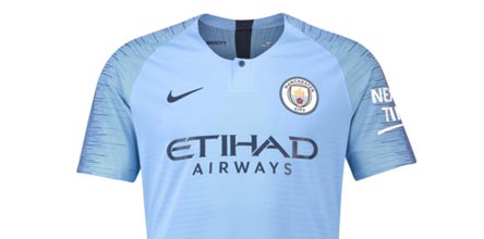
14 | Man City – That irritatingly thin collar looks like the actual collar has been cut off. Still a big fan of those AeroSwift sleeves, even if they are on almost every Nike kit.

13 | Huddersfield – Love those Umbro cuffed sleeves more than the new Huddersfield club crest. As for that sponsor, proper invading the personal space of the Double Diamond and Terrier. Back the f**k off.

12 | Leicester – Nice touches of gold complemented by the King Power crown. Nice little diagonal design. Not upsetting many Leicester fans, this one.

11 | Brighton – Quite like the chunky stripes. The red Swoosh offers the little something to stop it from being bland, and it's matched by a red tab on the rear of the neck too. Simple but stylish or bland and boring. Your choice.

10 | Wolves – Good to see Wolves bring back a bit of gold to the Premier League. It's a big time colour for a club to lead with, but it's always the most recognisable, even if it is a bit orange this year. Safe sponsor that even uses a W logo, perfect.

9 | Bournemouth – Would be higher up if that logo was smaller. Would be lower down if that logo didn't perfectly match the kit colour scheme.

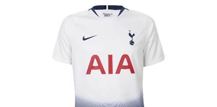
8 | Spurs – Still undecided whether we love it or hate it, so it drops somewhere in the middle. Decent marks for trying something different, but that sponsor is massively taking advantage of a plain white canvas.

7| Man United – Until Chevrolet move on Man United kits are always going to be hindered. Plus, as with the Spurs shirt, it looks like the players are wearing their shorts really high on TV with that striped design.

6 | Fulham – Something a bit old school about the Fulham home shirt this season. It's hard to hate Fulham isn't it? Going to Craven Cottage is like going to your girlfriend's parents house in Cheshire, it's just lovely and nice. Monochrome design with a little pop of colour on the crest. Smart.

5 | Arsenal – PUMA are in their last year of their Arsenal contract and they've finally delivered a decent design. Easy to see why it split opinion on release, but it's alternative and that's tough to execute well on home shirts so shackled by tradition. Job well done.

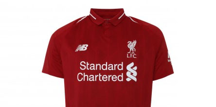
4 | Liverpool – Red and white with a lovely little fold over collar. That subtle pattern running across the body is all that was needed. Less is more here.

3 | Everton – We're not hiding the fact that we're big fans of the Double Diamond taping on the cuffs of Umbro shirts this season. It ties together the brand's shirts perfectly without having to supply them all with the same template. Lose the Angry Birds sponsor and it's a real contender.

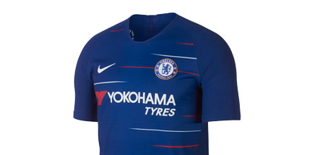
2 | Chelsea – Chelsea are reaping the rewards of one of the few Nike shirts where the Swoosh have designed something completely bespoke. Just the right amount of flair to bring to life the often mundane plain blue home shirt.

1 | West Ham – There's something beautifully British about the West Ham home shirt. A stunning design by Umbro, a strong club crest and vibe that has us wishing that the club still played at Upton Park. The Hammers take our number one spot.
Go on. Tell us how wrong we were...