This week saw Aston Villa and Wolves become the final two Premier League clubs to reveal their 2019/20 home shirts. The full cast is now complete, and while a few clubs are still yet to unveil their new away designs we're taking a look at all 20 home shirts that'll be on show when the new campaign kicks off next month. 6 adidas, 4 Umbro, 3 Nike, 3 PUMA and one each for Errea, Kappa, New Balance and Under Armour. We'll mark them out of ten while we're here. Tin hat on.
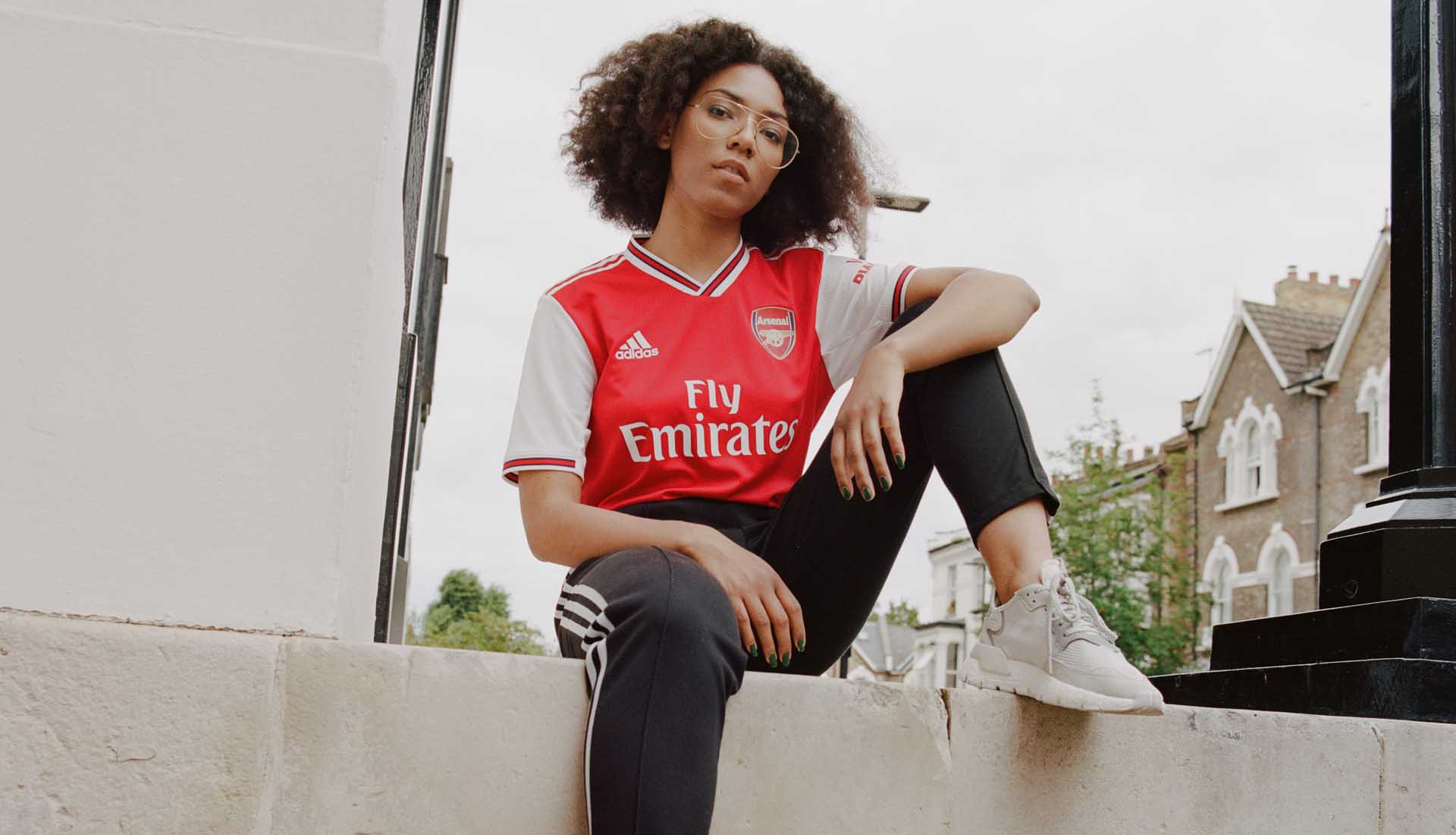
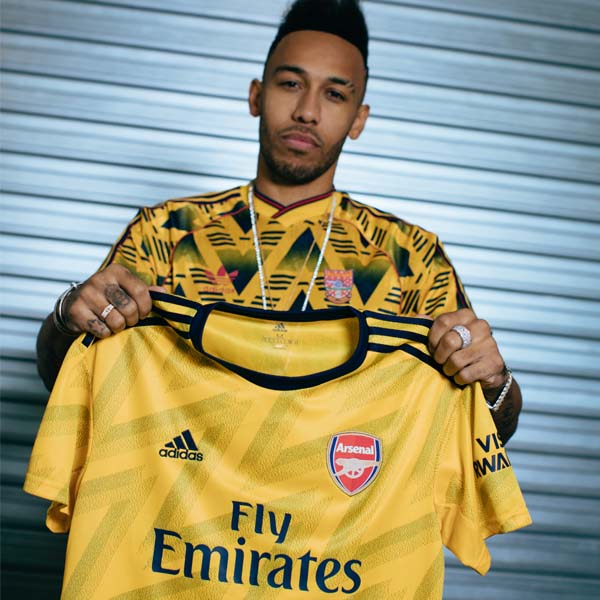
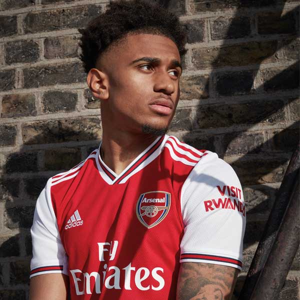
The return of adidas has lent the new Arsenal home shirt a retro vibe that we’re all for. Classic all-over red body, complemented by popping white sleeves and contrasting collar and cuffs emblazoned with a central red stripe and black trimming. Nailed it. 10/10
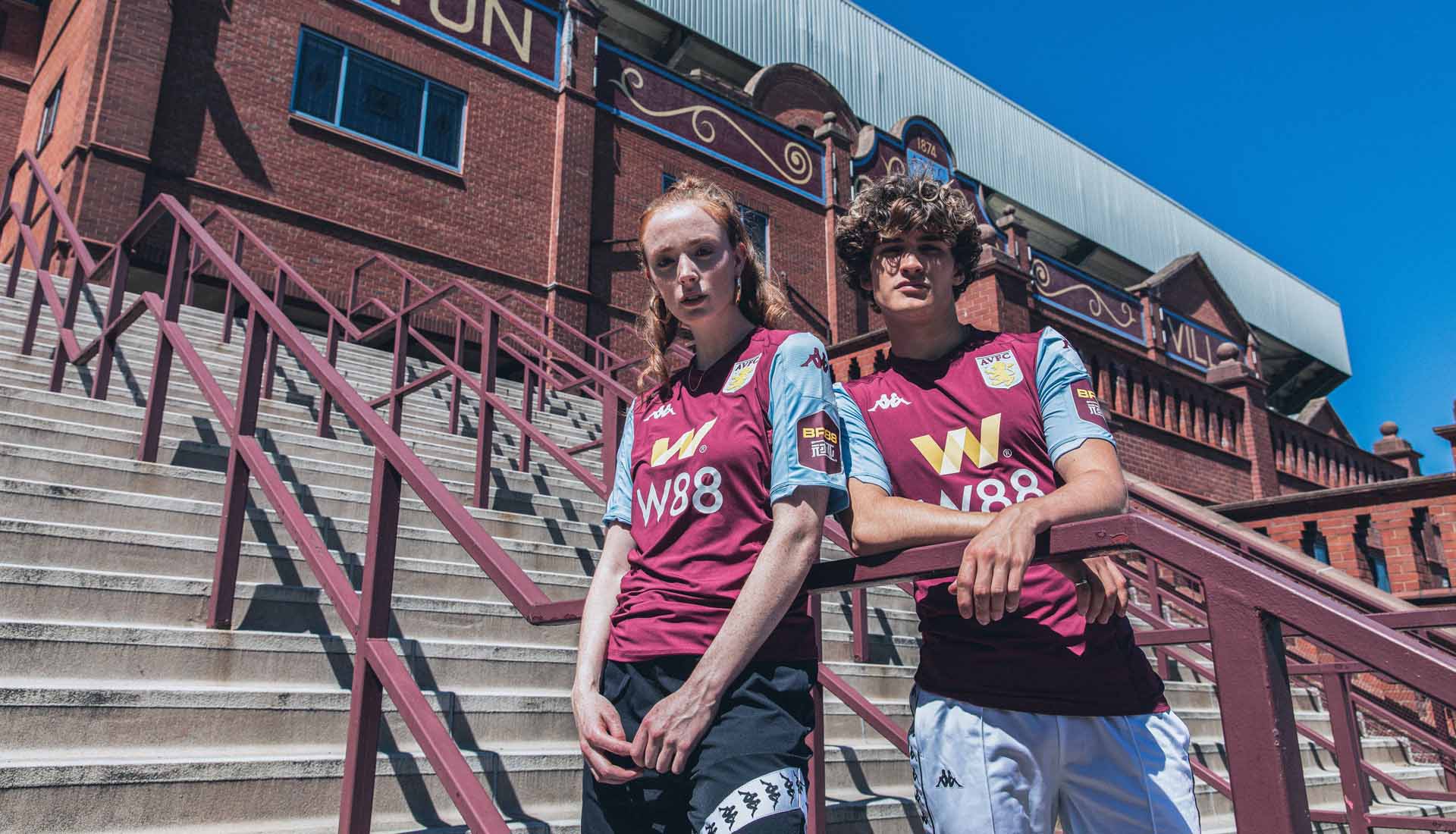
Aston Villa
Another first, this time for the Kappa x Aston Villa partnership. Claret and blue is always a difficult hand to be dealt, and this season sees three Premier League clubs in the combination. The Villa kit takes on a fairly standard claret body and blue sleeve design but that Kappa logo is always good for an extra couple of marks. Sponsors are a bit heavy, mind. 5/10
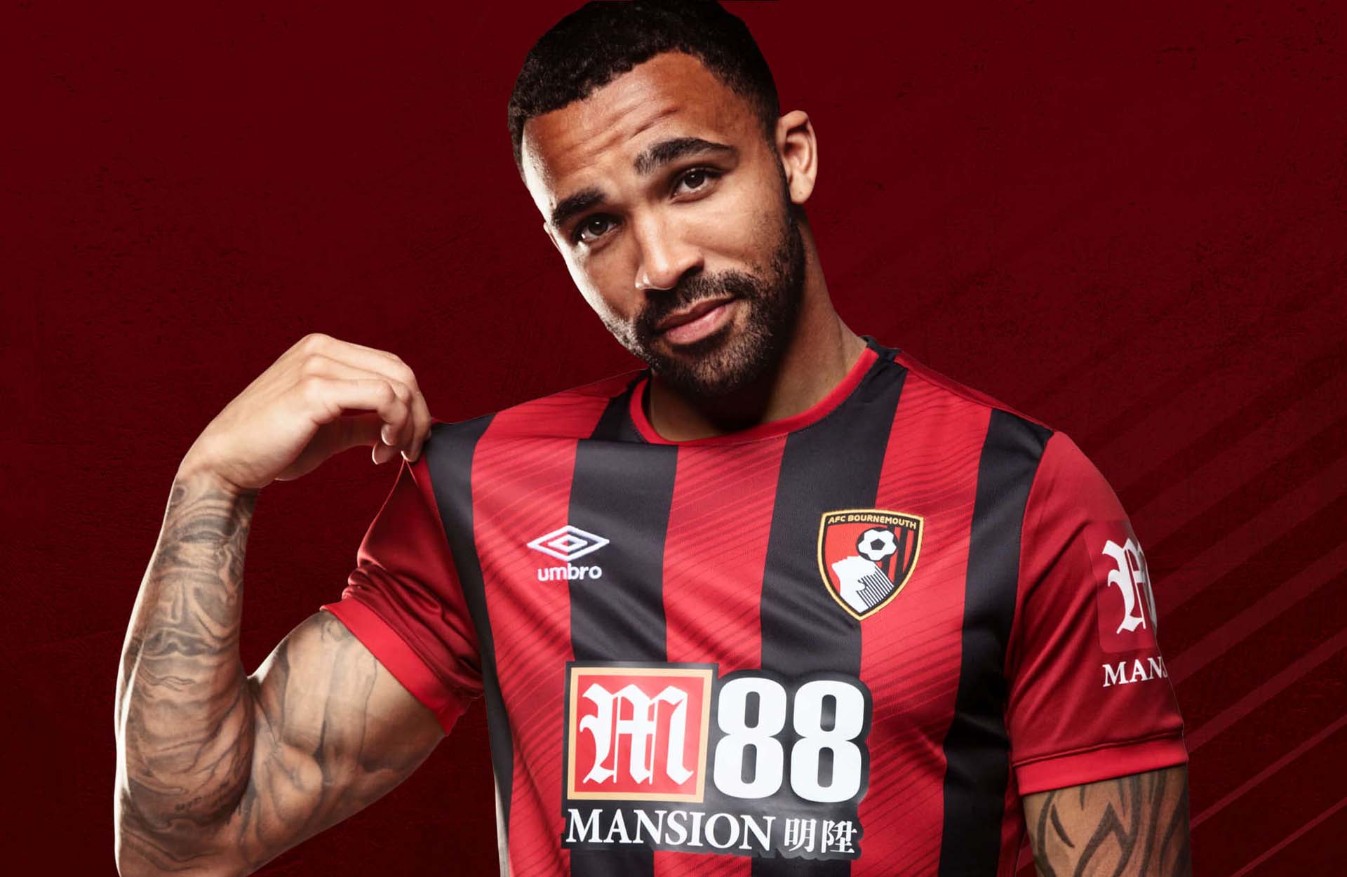
Offering a tidy tweak on the traditional design, Umbro have added some fine details to the Bournemouth home shirt. Diagonal patterned fabric features throughout the red stripes, inspired by the detail within the club’s iconic Dickie Dowsett crest. A nice twist on the Cherries’ classic striped style. The sponsor taking on the club's colours helps too. 7/10
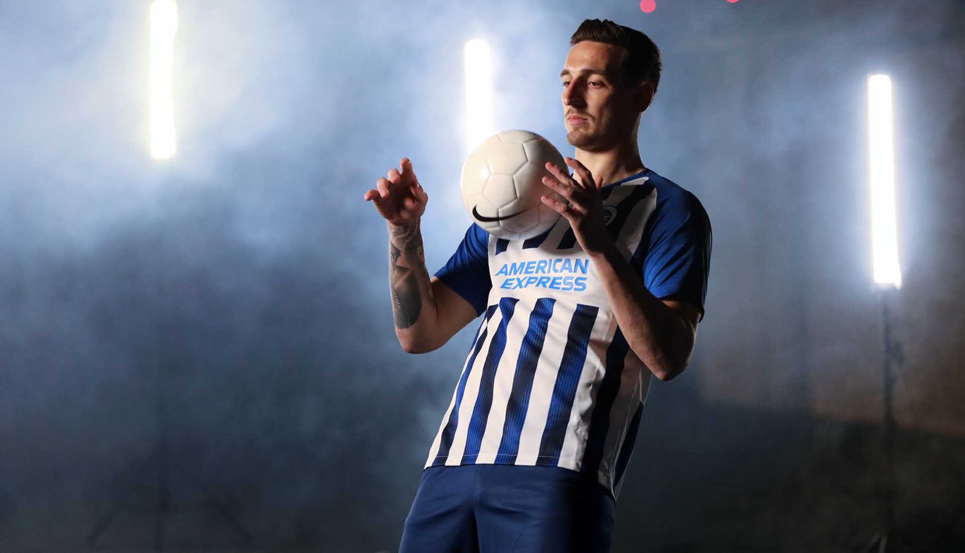
Brighton
Another fresh twist on a classic look, with Nike introducing gradients of black into the blue and white stripes. The stripes are also narrowed down from last season for an all round pleasing aesthetic. Simple addition for a strong look for the Seagulls. Not much to dislike here, but not much to get too excited about either. 6/10
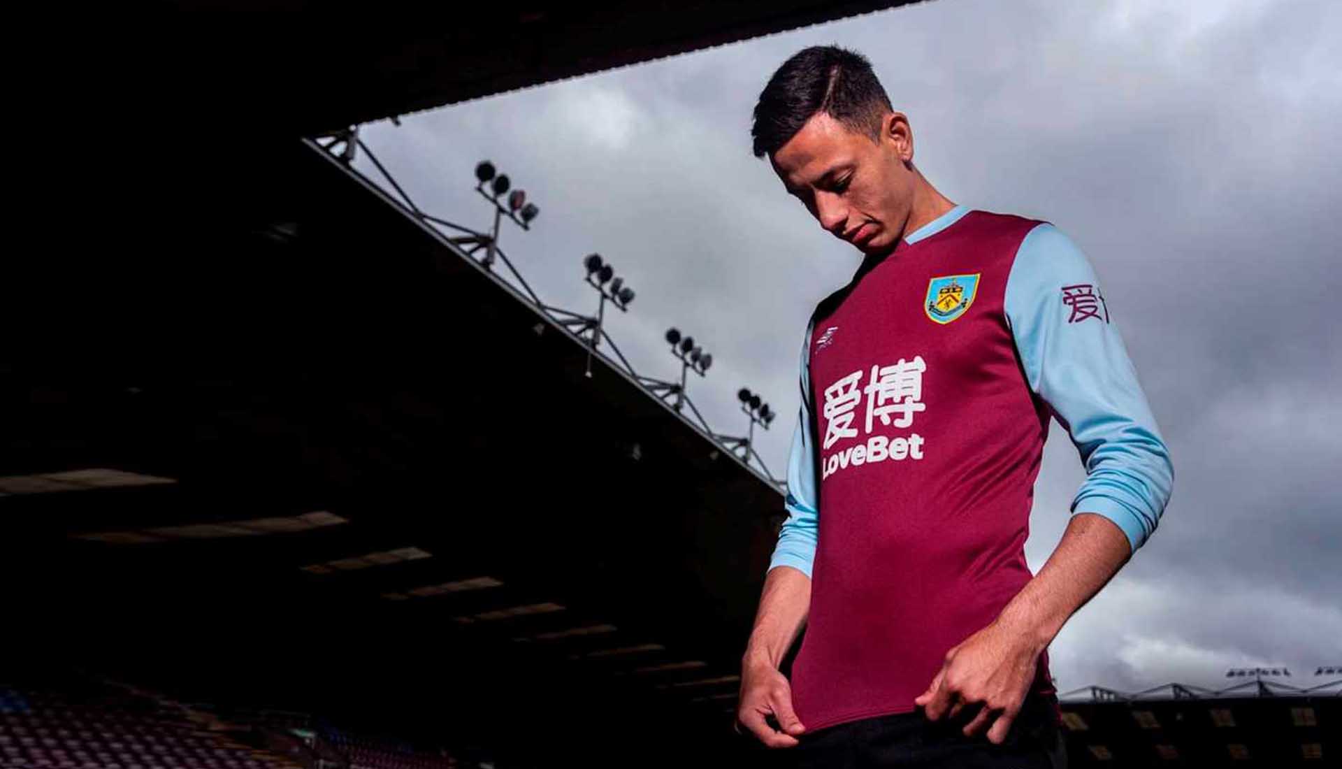
Burnley
Burnley and Umbro get their partnership underway with the second of the claret and blue offerings on the list, and to put it simply, it's a cleaner than Villa's so it gets one more mark. Not sure about 'LoveBet'. Nothing to love about refreshing the Iranian Second Division scores in the early hours of Monday morning trying to chase the money you lost on your weekend accumulator. 6/10
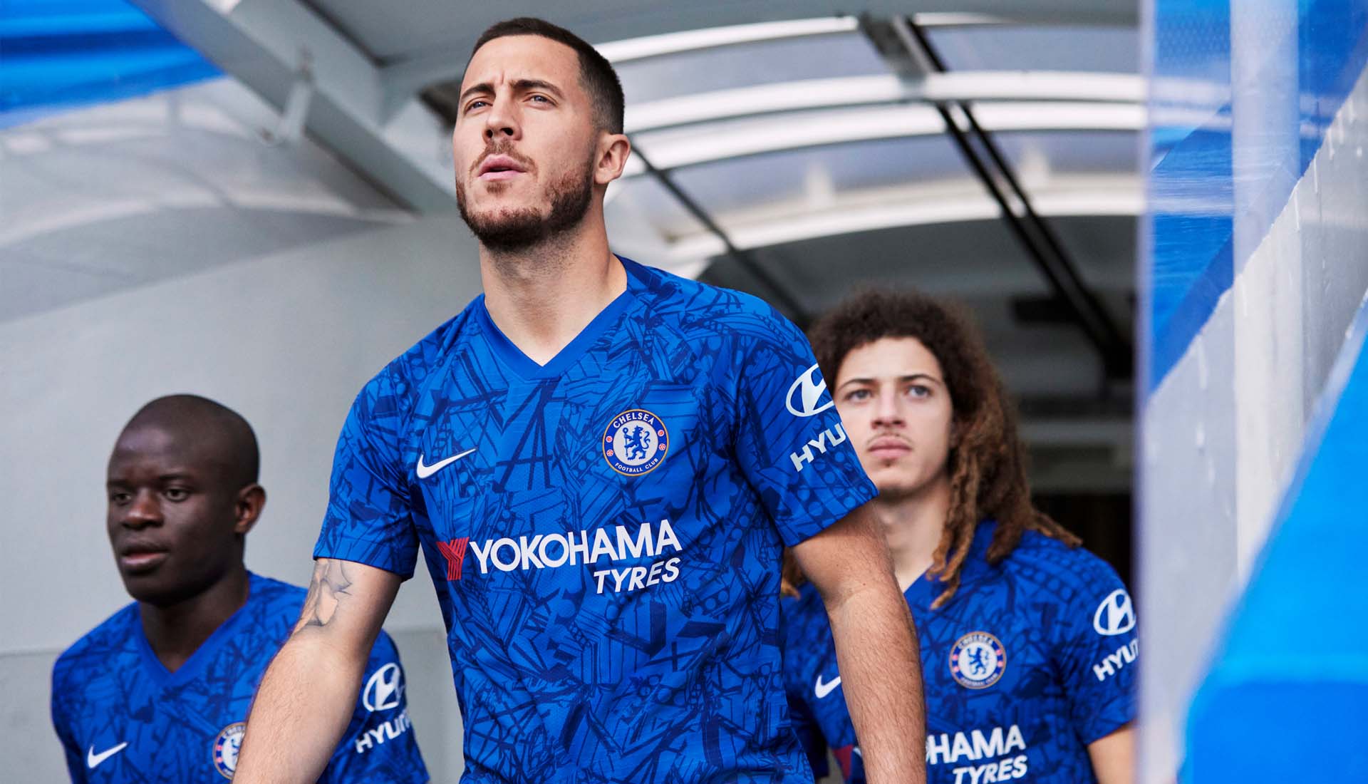
Nike have tried something here, drawing inspiration from the architecture of Stamford Bridge. Would’ve been a nice homage if, as planned, they were leaving the Bridge, but that ain’t happening (unlike the man front and centre of their launch campaign) and so it leaves the shirt not quite hitting the right mark. Applaud the attempt at something different from Nike, execution just isn’t quite there. Can't do a plain blue shirt every year can ya? In 20 years time this will be a banger of a retro shirt. 5/10

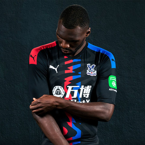
Here’s an example of how the introduction of simple things can boost the appeal of a shirt. For the Palace home shirt, PUMA introduced white detailing for the first time in 10 years. One minimal sponsor away from being right up there, this. Into it. 8/10
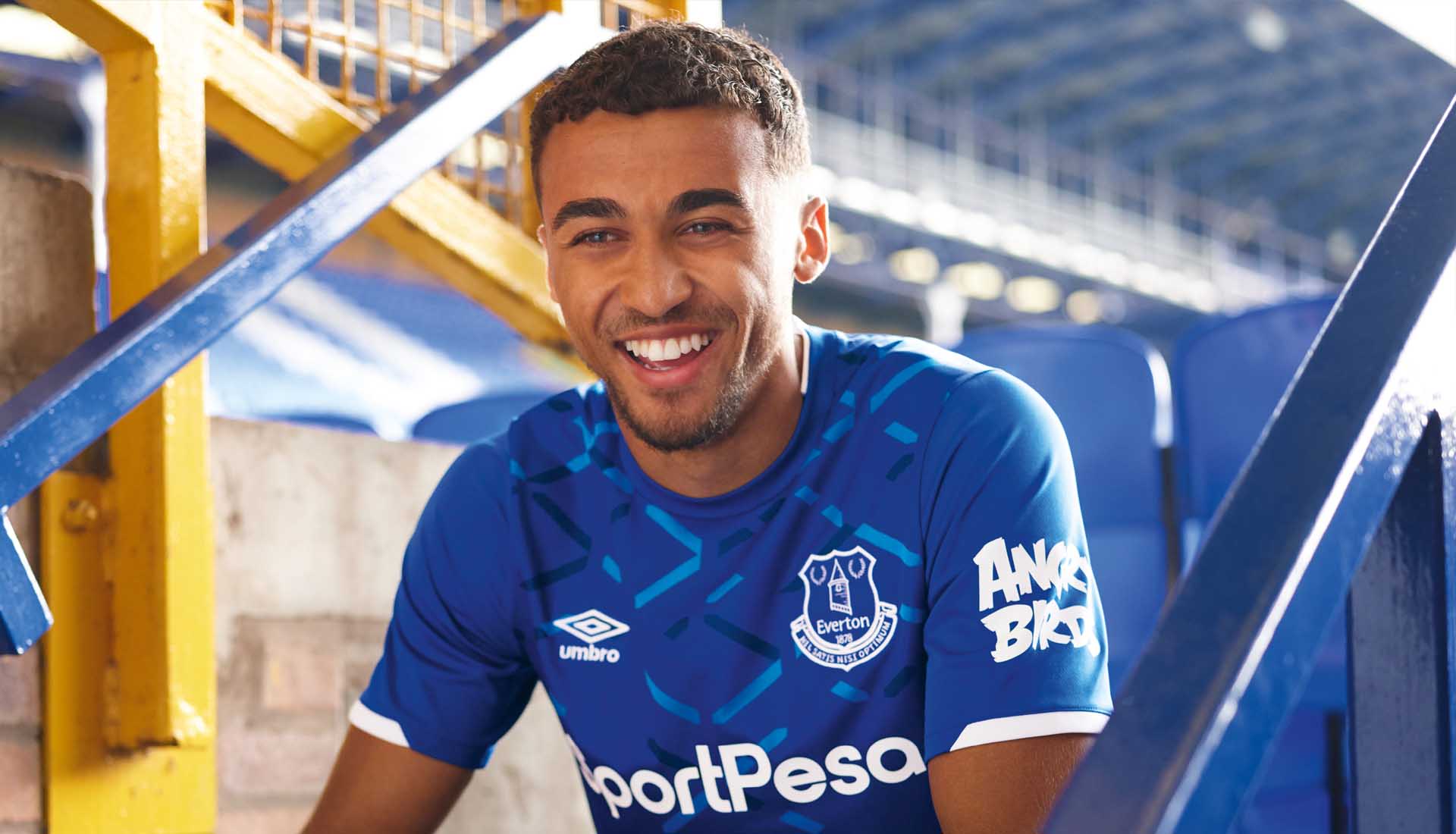
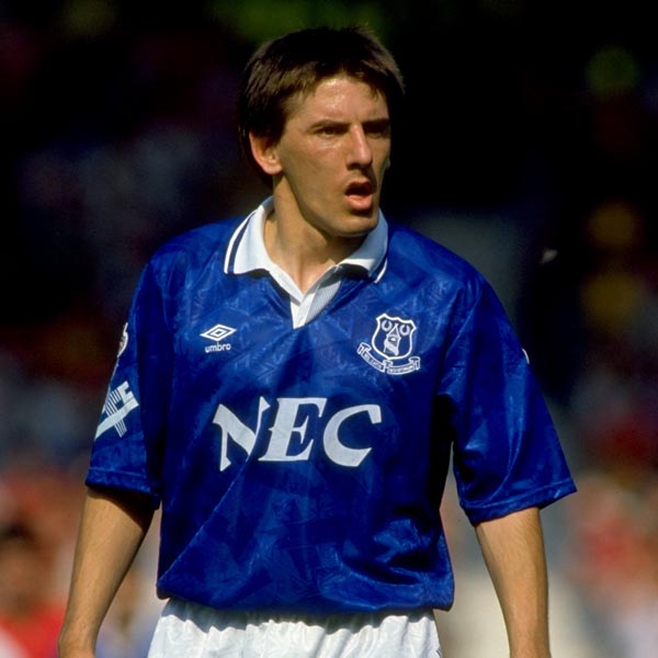
Another blue shirt that draws inspiration from the club’s home ground, Umbro go a lot more subtle for the Everton shirt, restricting the graphic based around iconic and identifiable elements of Goodison Park to just the chest. One that Toffees will probably be reasonably happy with. Angry Birds, though. How is that still a thing? 6/10
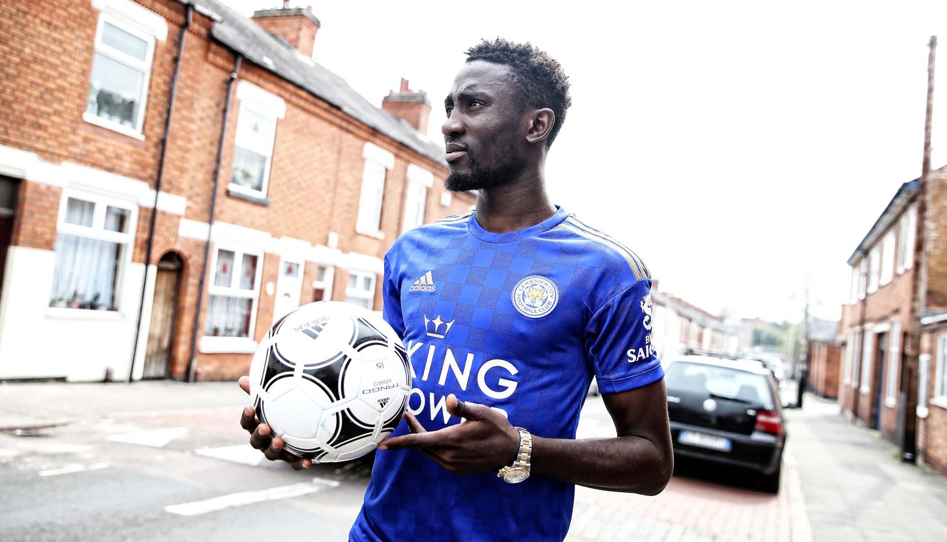
The Foxes get a bold new addition to their home shirt from adidas, in the form of some gold detailing and checkerboard design. The gold detailing might have come a few seasons too late, but it's a decent little number. 6/10
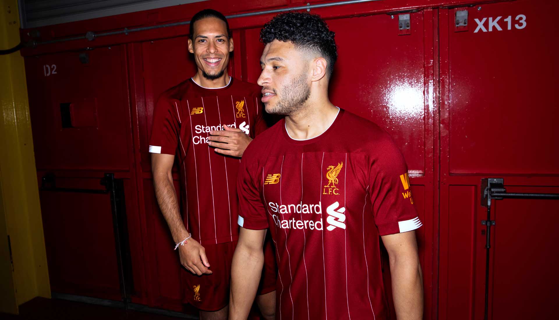
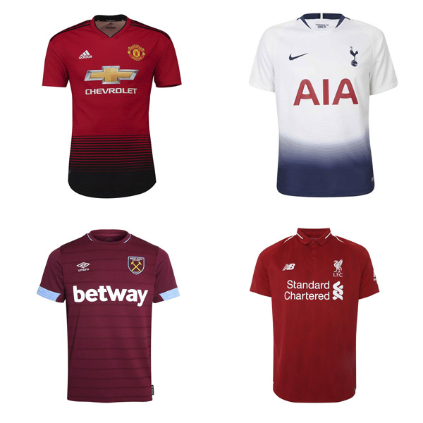
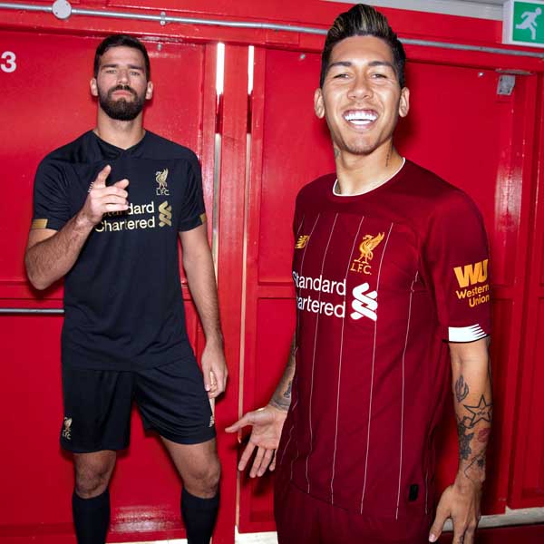
For what could possibly be the last Liverpool home shirt from the brand – with their deal with the Reds set to expire at the end of the season – New Balance introduce pinstripes that were last seen in the early 80s. Some nice little nods to club legend, Bob Paisley add another layer to the design. 8/10
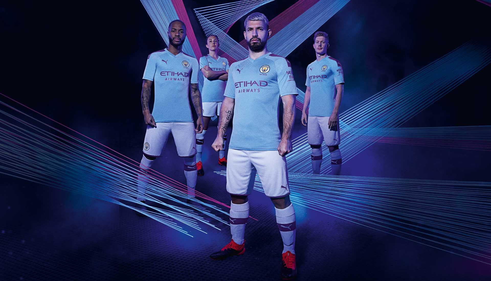
Kicking off the new deal with PUMA, Manchester City’s home kit sees the introduction of a consistent purple trim for the first time. A woven jacquard wave pattern runs through the shirt acting as a visual representation of the looms which were integral to the industrial revolution in Manchester, harking back to the true grit, fight, and character of the city. Decent enough start for PUMA and City. But too much purple? Maybe. 6/10
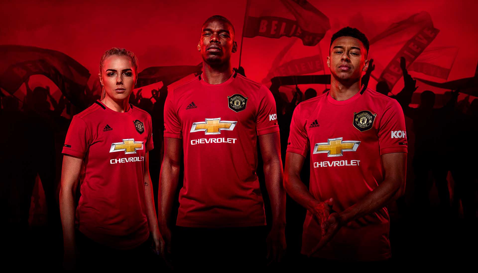
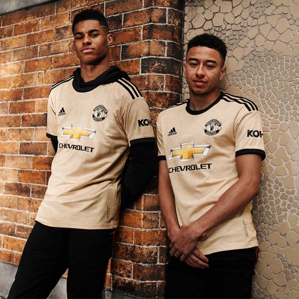
Treble season callouts are the theme for the Man United home shirt, with this season being the 20th anniversary of that momentous achievement. Retro crest, red stripes, black details. The best United shirt of the Chevrolet-sposnosred era. 8/10
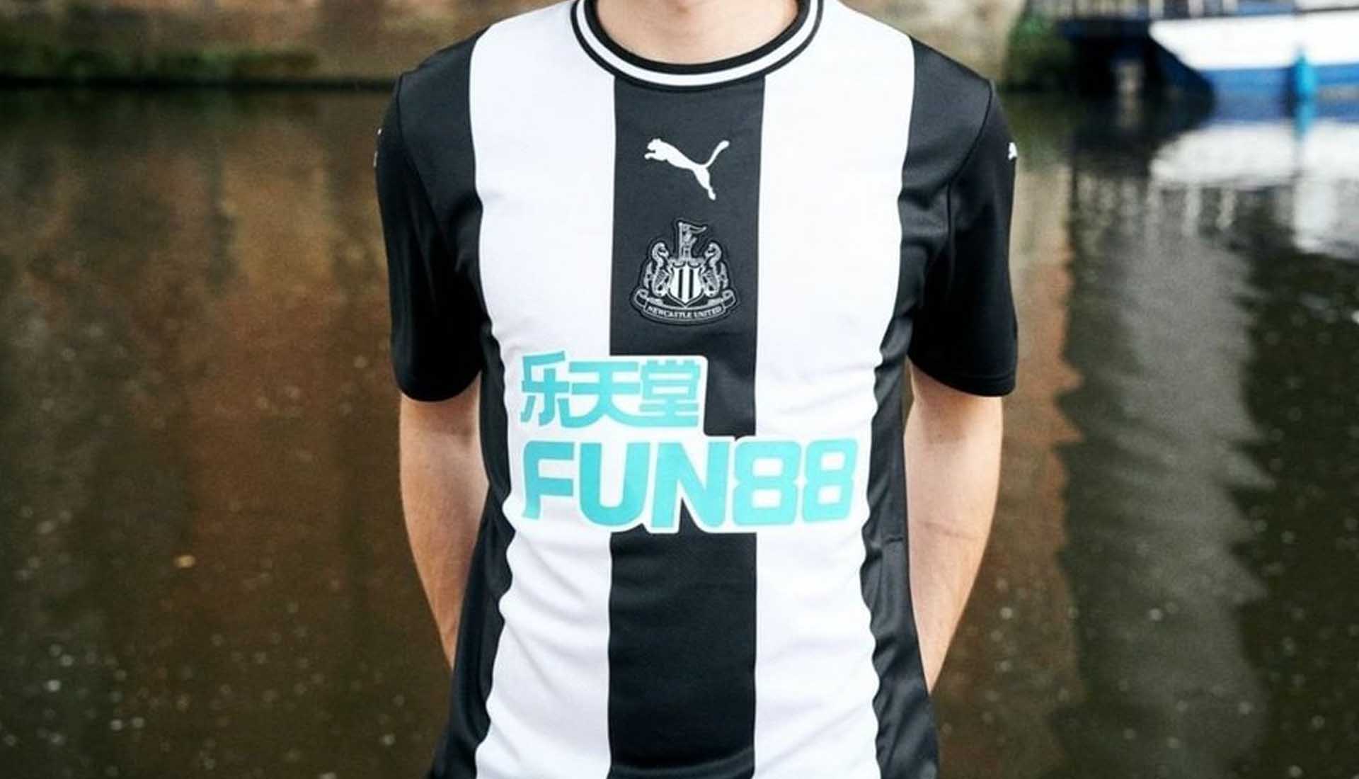
The perfect example of a sponsor butchering the aesthetics of a football shirt. PUMA stripped away the colour of the Newcastle home shirt, embracing the monotone look even on the crest. Everything lined up centrally for some black and white symmetry… and then FUN88 came along and sh*t on it. 5/10 (10/10 without the sponsor)
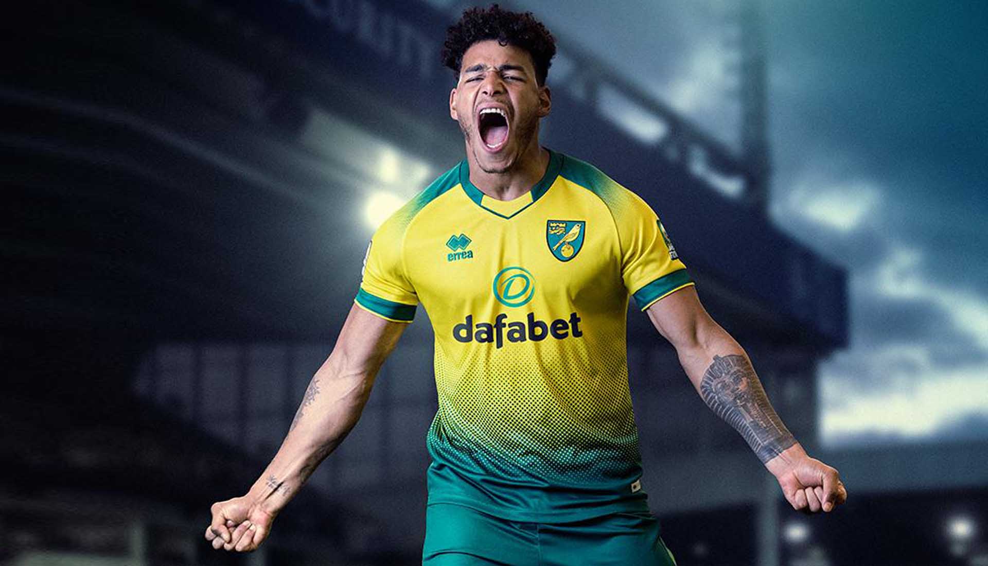
Norwich City
Let’s be honest, the yellow and green of newly promoted Norwich are probably the hardest colours to work with on this list. So kudos to Errea for producing this strong effort that sees a blend execution from the bottom up and across the shoulders. Good effort considering. 7/10
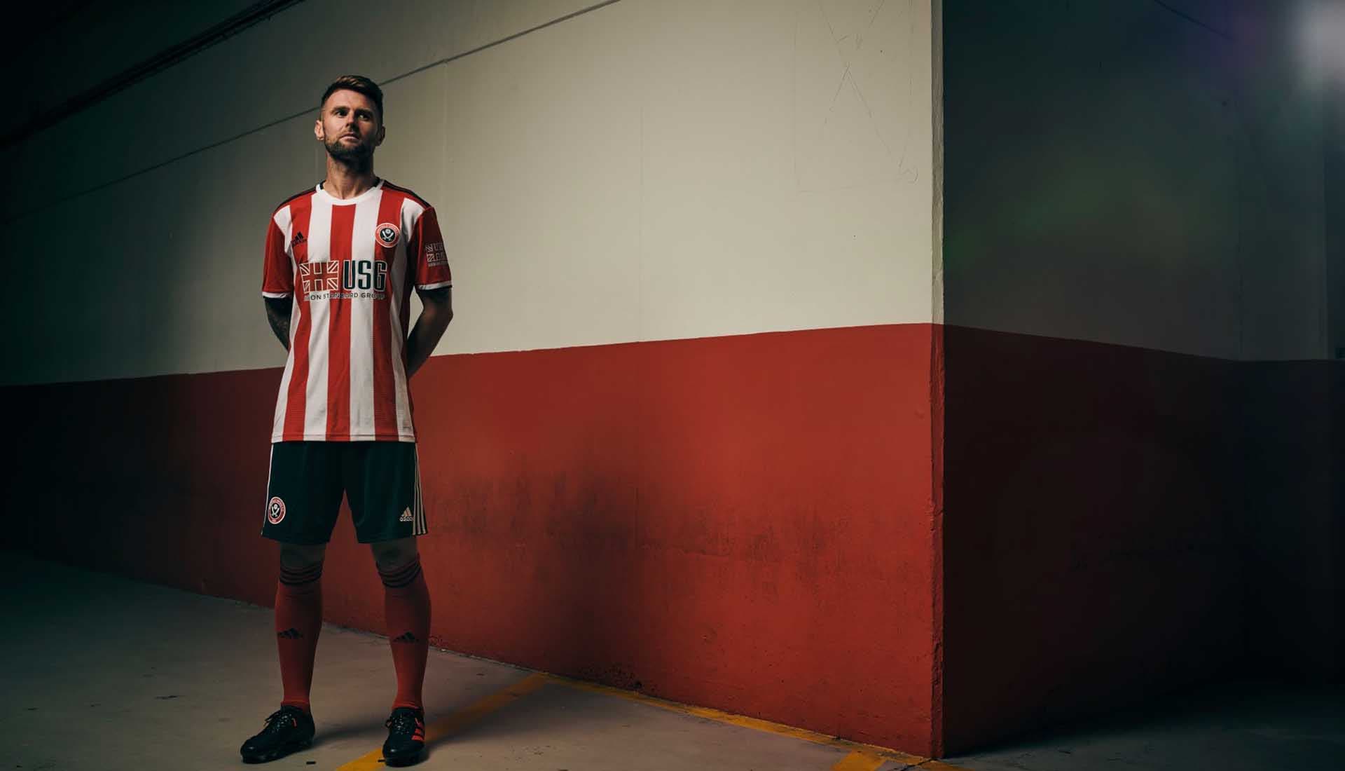
The Blades’ home shirt for their first season back in the Premier League adopts the traditional red and white stripes, but with a little corrugated addition on the edges. Not enough to stick this up in the upper echelons of our ratings, but a tidy look from adidas none-the-less. For a squad compiled purely of players from the British Isles, the sponsor logo is relevant. 6/10
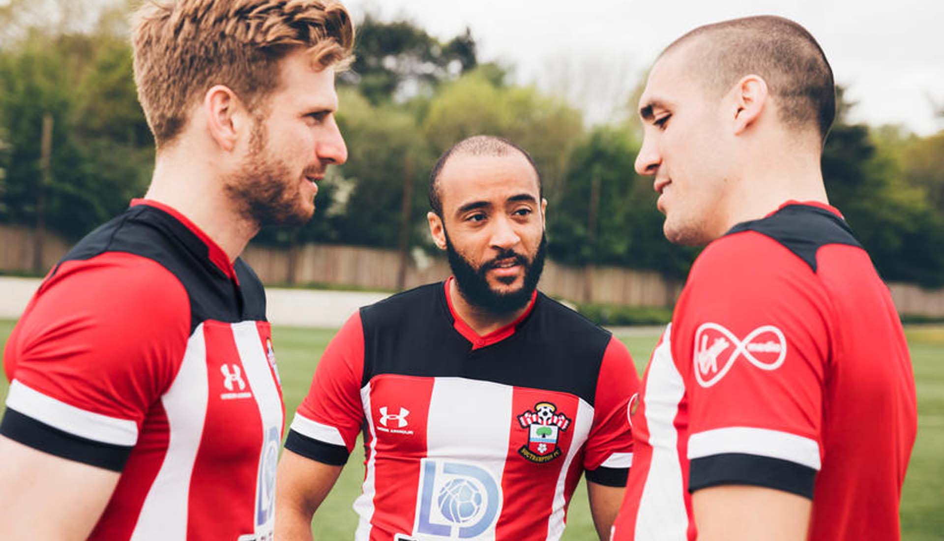
Under Armour give an example of trying to do something a little bit different to set a design apart, but failing, pretty miserably. The Saints’ home shirt sees the traditional red and white stripes joined by a big block of black on the upper third. Kinda looks like the shirt hasn’t finished loading. Nah. 3/10
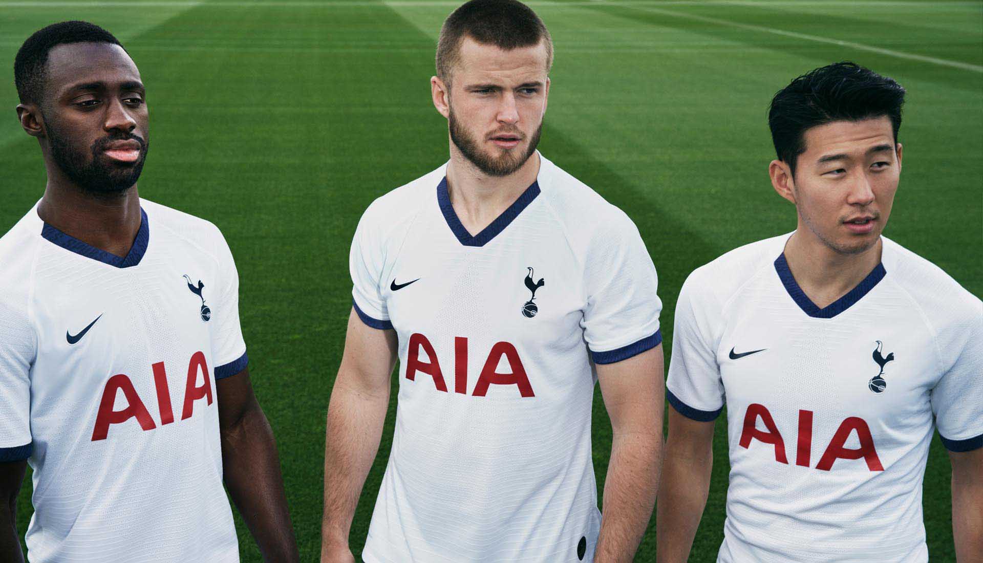
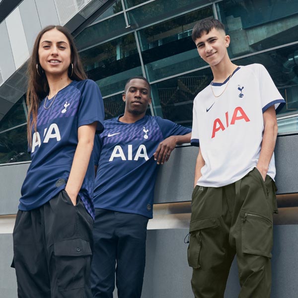
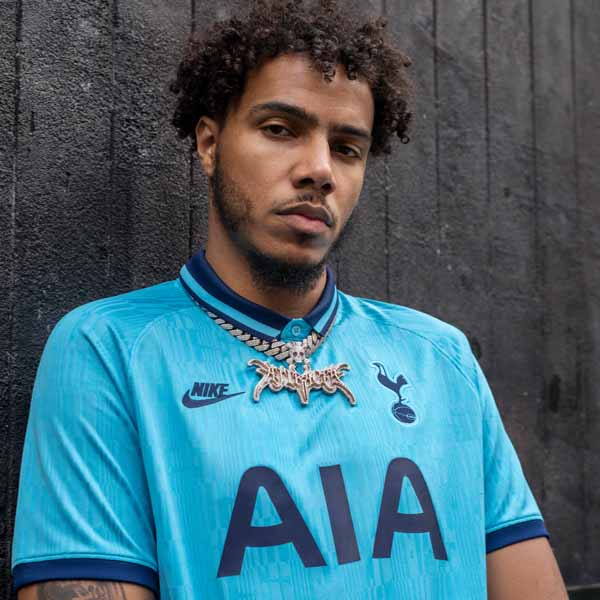
Spurs home shirts have got to be one of the toughest to keep fresh in the Premier League, with only so much you can do with a white base. And this effort from Nike feels a little like they felt the same way. The addition of some hard-to-see ‘Spurs’ detailing in the collar and cuff is nice up close, and the pattern base does enough to save it from mediocracy. From a distance though, it's basic. Sponsor is still a bit dominant. 6/10
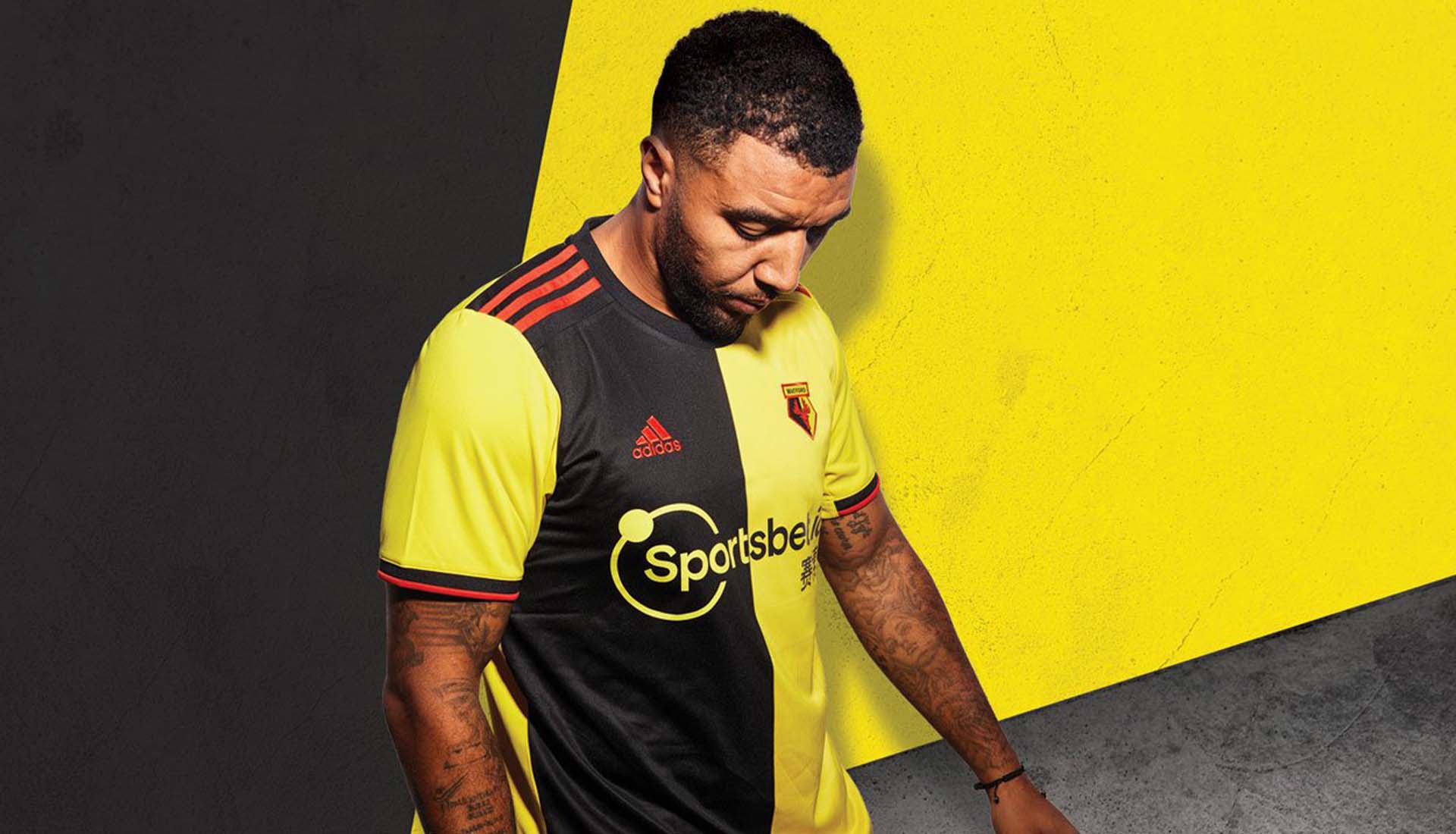
Watford
The Watford home shirt gets a nice switch up, flipping from stripes to a half-n-half design that’s accented by red trim, combining the three colours of the club to good effect. Nice way of tying in the sponsor logo with the overall design of the shirt. Newcastle and FUN88 take note. It's one that might split Watford fans, but for everyone else it's a smart change. 7/10
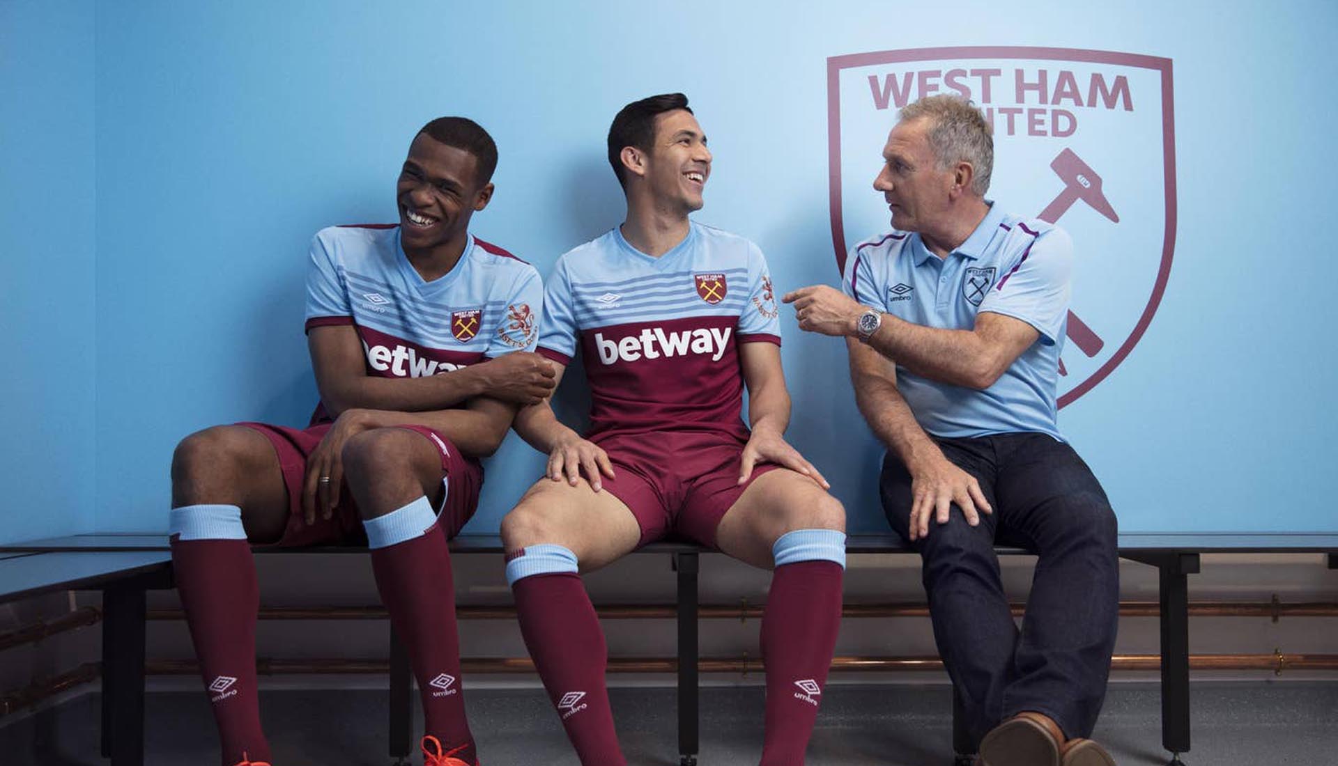
How do you keep a home shirt looking fresh? Here’s how. Umbro take the convention of a claret body and blue sleeves and rip it up, instead presenting the Hammers with a completely fresh take that sees blue covering the upper portion of the shirt. 2019/20’s claret kings, no competition. 9/10
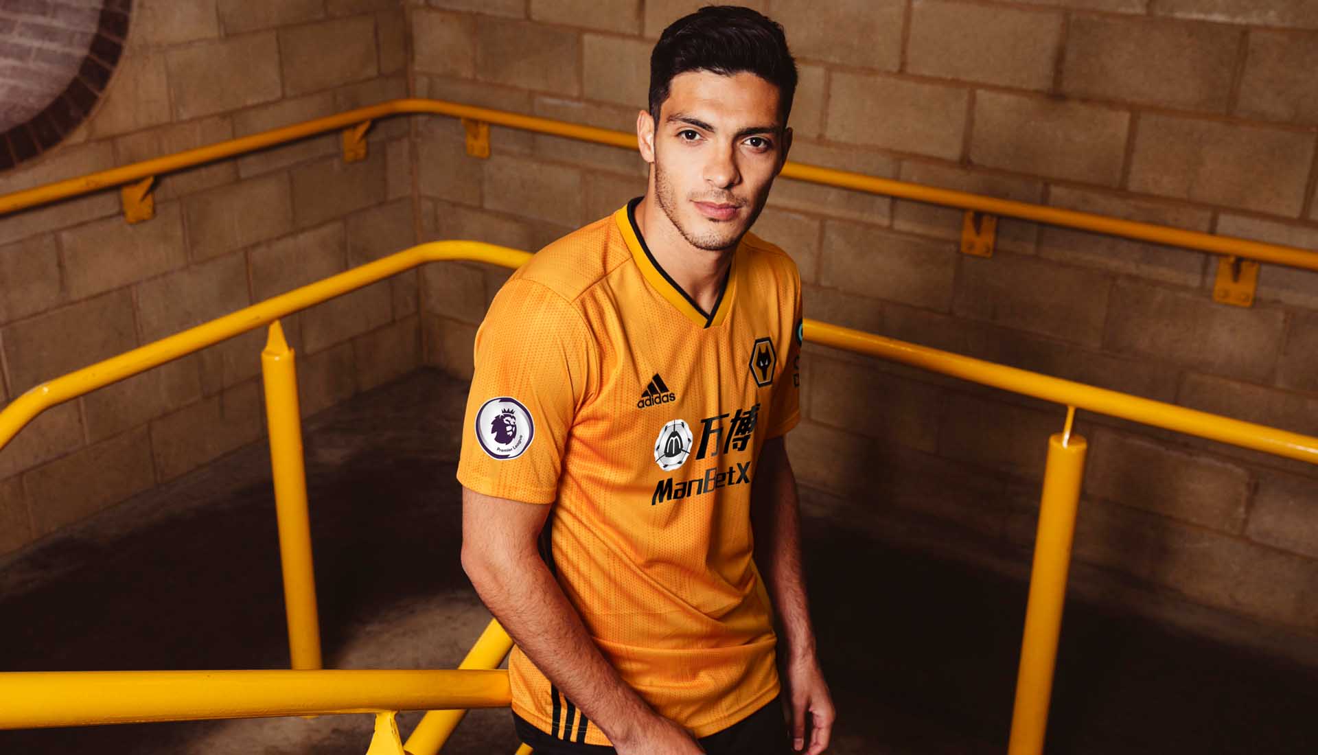
Wolverhampton Wanderers
Wolves head into the 2019/20 season with a template design from adidas, that sees a gradient effect lending the usual old gold/orange base a greater depth. The Three Stripes are moved to the side and a tidy retro collar complete the look, but it is a design they'll share with other adidas clubs in 19/20. 7/10
Shop all 2019/20 Premier League replica at prodirectsoccer.com

