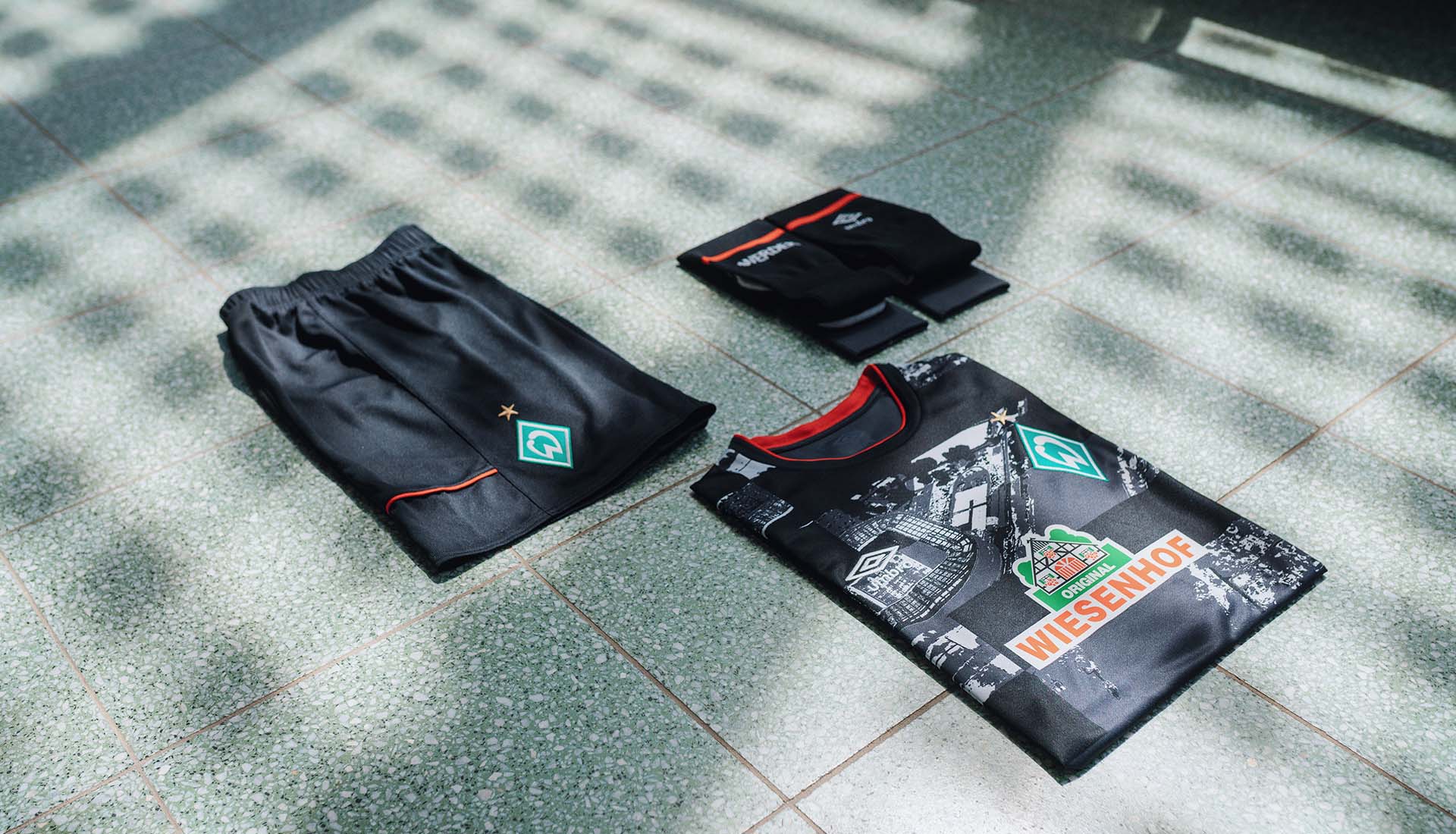
Werder Bremen finished off the 19/20 season by debuting their new ‘City’ kit, with a design from Umbro that pays homage to the close-knit relationship between the club and its hometown.
Werder Bremen closed out their 19/20 season by retaining their Bundesliga status after a 2-2 draw against Heidenheim in the second-leg of the relegation play-off ensured their place in the league on goal difference. A nervy affair, but it also served as the perfect platform for Werder to debut their new ‘City’ third shirt for the 19/20 season, allowing fans, players and staff alike now look ahead after a stuttering campaign.
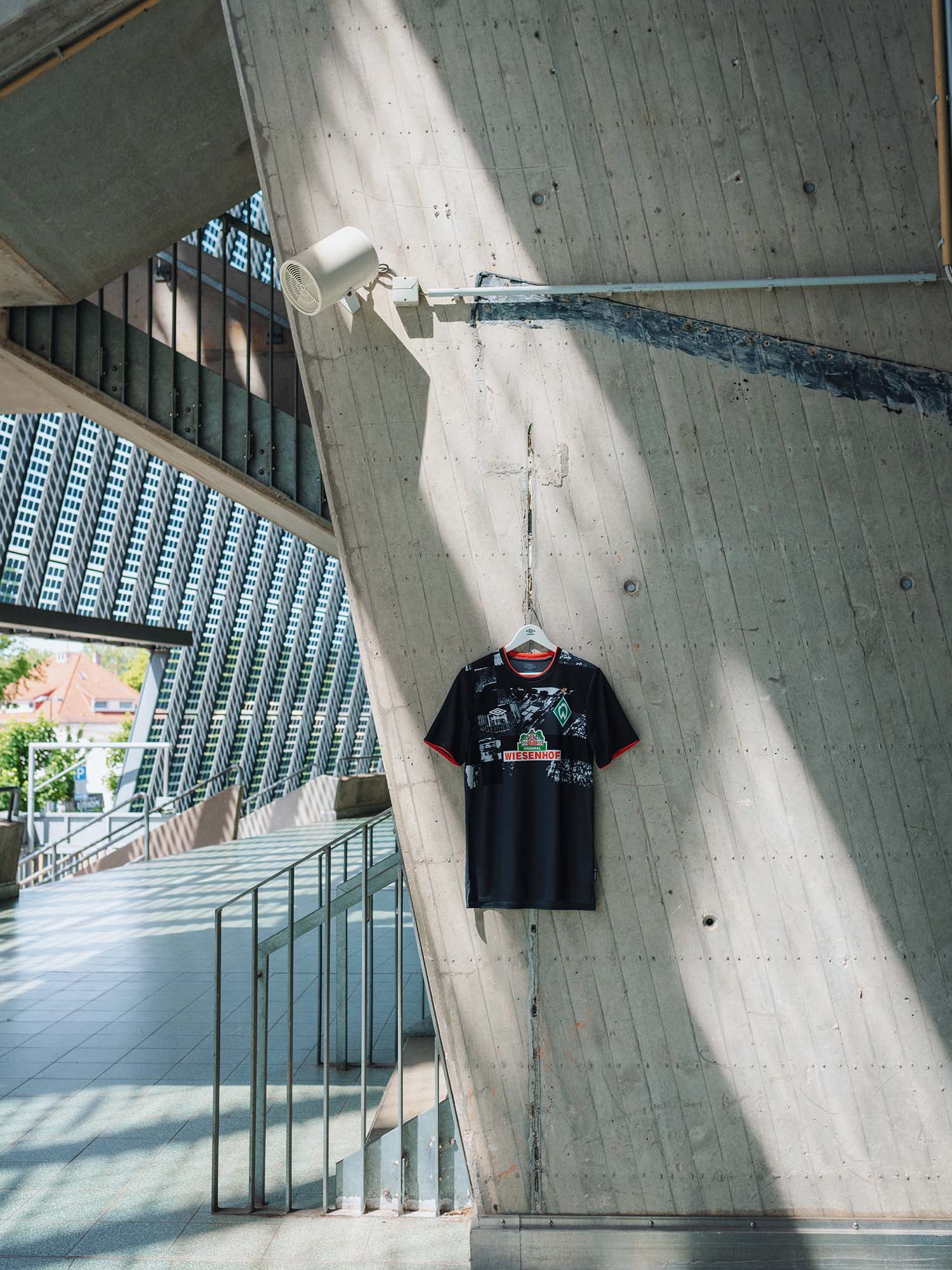
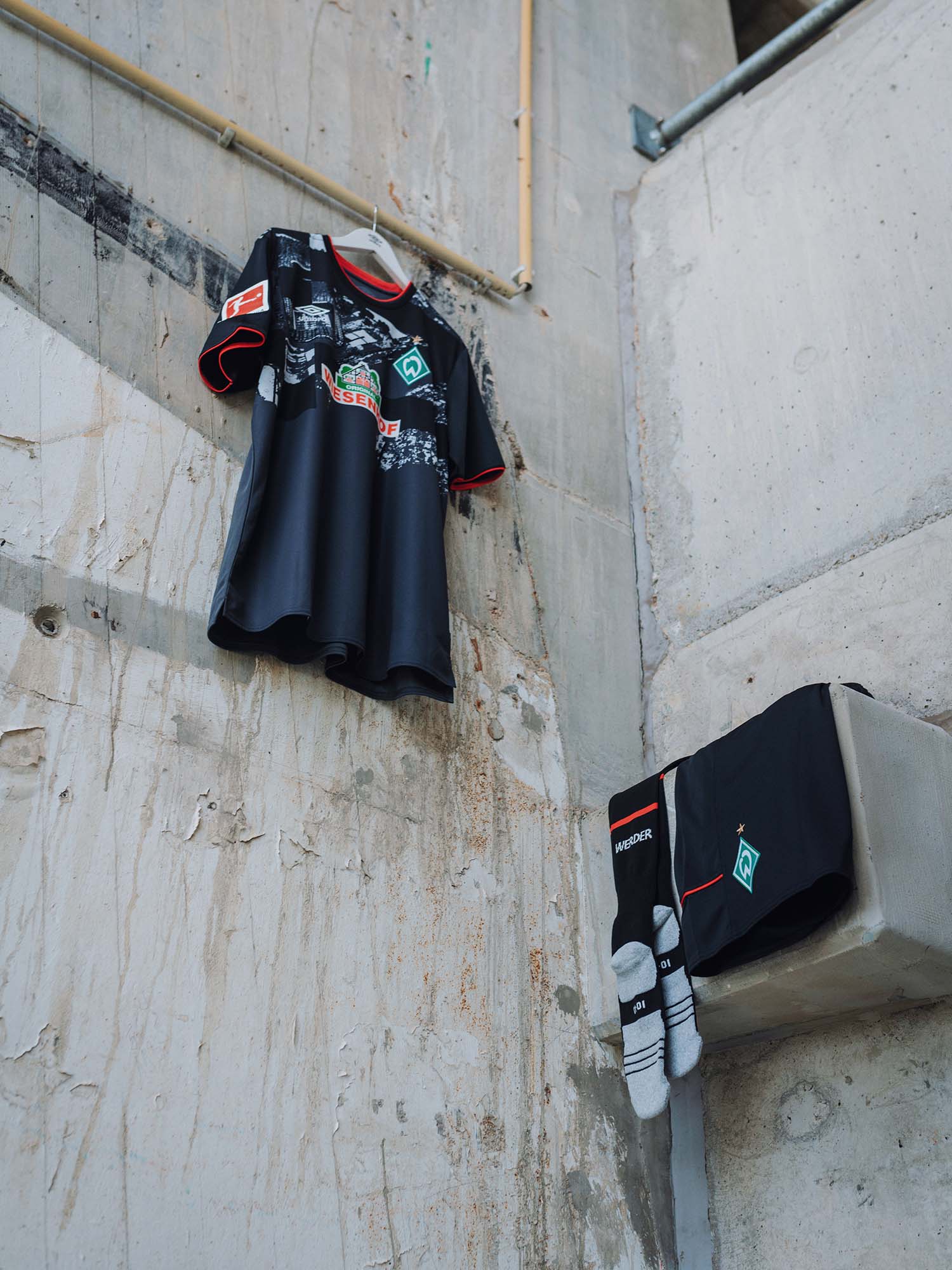
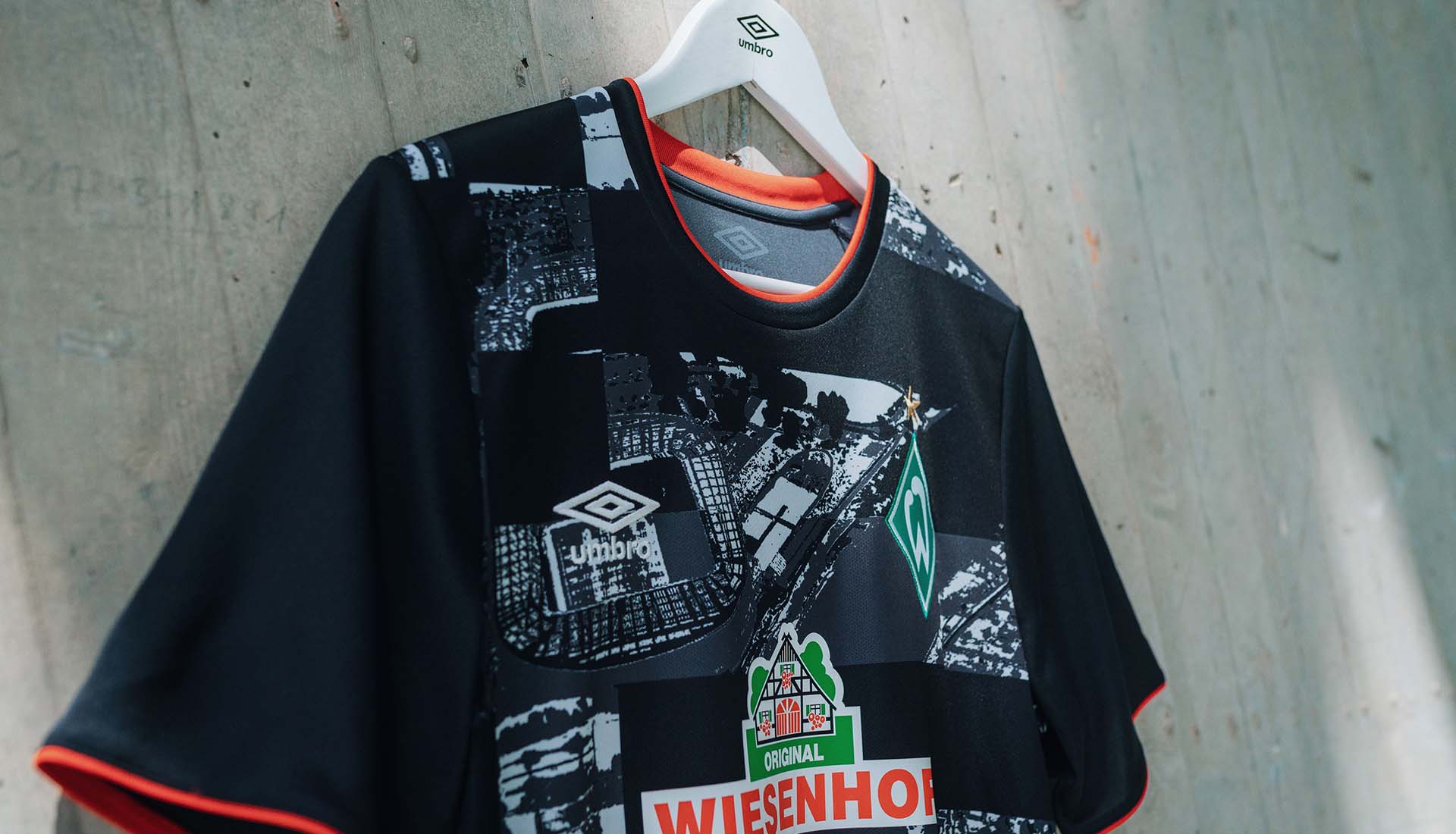
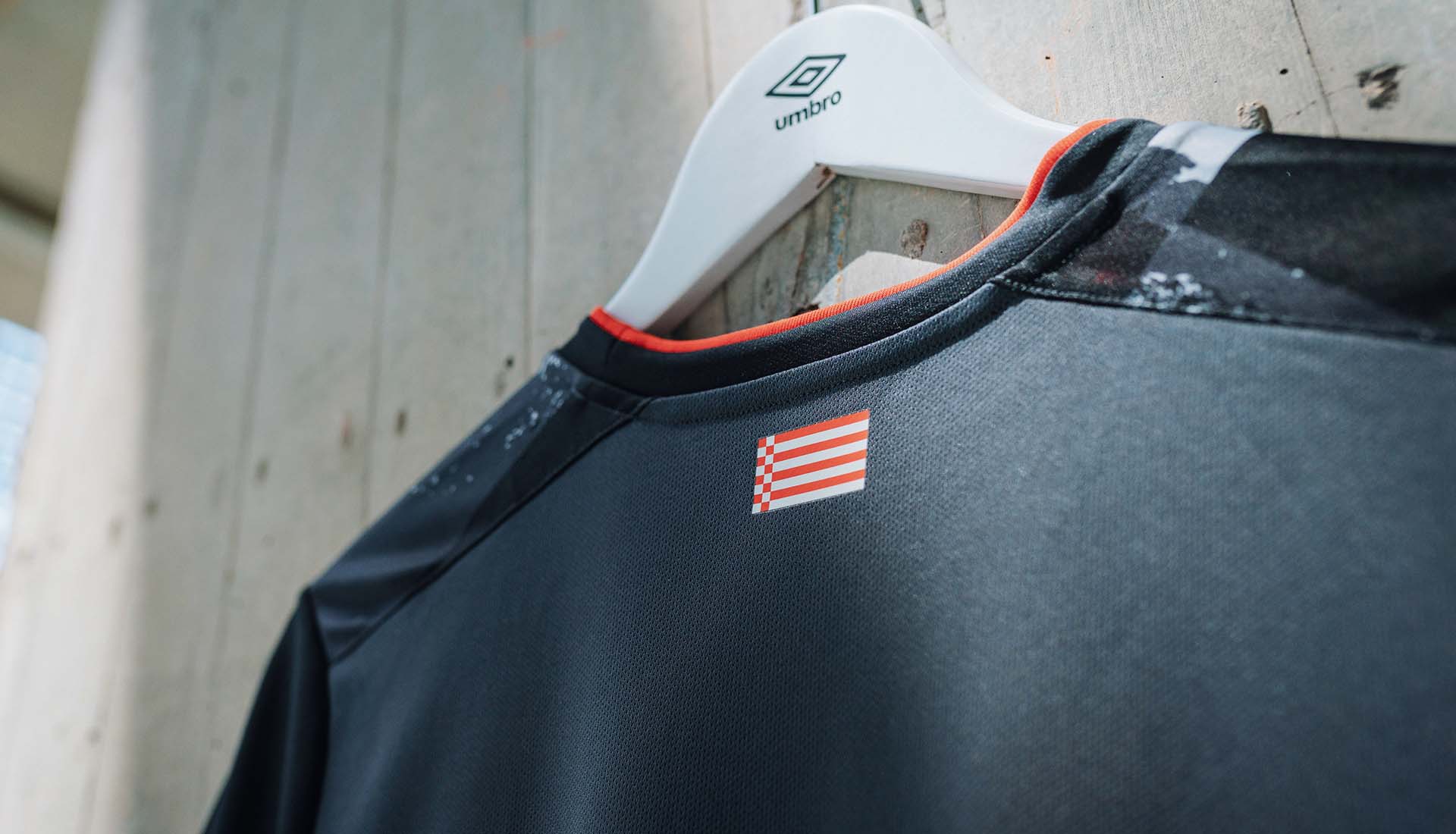
The design of the shirt sees the sleek dark base for the strip embellished with red collar and sleeve tips, and white across a conceptual chest print. And it's that front print that really grabs the attention. It's an abstract print, constructed from aerial photography of the club’s pioneering, solar-panel covered wohninvest WESERSTADION. Both the colours of the detailing and the pattern of the chest print is taken from the city’s famous ‘Bacon’ flag.
The shirt was launched under the “Raute. Lebenslang Raute” (“Diamond. Lifelong Diamond”) campaign, and it serves as a collage of connection between fan and player, stadium and city. The shadows formed by the iconic solar panelled exterior of the stadium casts tessellated diamond patterns on featured WB players and members of the Werder club community. Separate but ever connected, the first time models of the kit are seen holding out a single hand to form one half of Werder’s diamond-shaped crest, as the players do the same on the alternating hand.
Pick up the Werder Bremen 20/21 'City' shirt at umbro.co.uk