
Fans’ love for a club always runs deep. But just how deep? That’s the question Umbro have asked with their latest initiative, which has seen a special edition shirt produced for Werder Bremen, using fan tattoos in a design created by Dutch Football jersey designer and artist Floor Wesseling.
Building off the success of their ‘For The Love Of Shirts’ competition last season and continuing to celebrate their clubs around the globe, Umbro present ‘How Deep Is Your Love?’, an initiative that delves into the connections between fans and their teams, manifested through the symbolic tattoos that supporters adorn their bodies with. And the first club in focus is Werder Bremen, who have had a special version of their third shirt created by Umbro brand collaborator Floor Wesseling of Blood In, Blood Out, which the 2. Bundesliga side will wear in their final away game of the season, this Sunday against Erzgebirge.
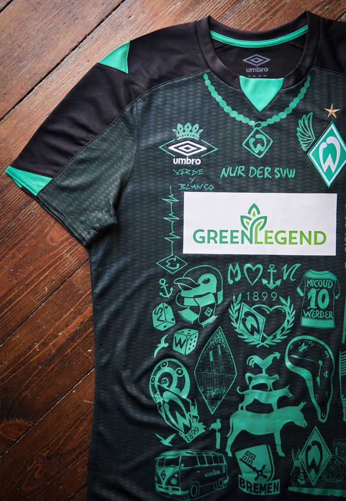
The ‘How Deep Is Your Love?’ Initiative saw more than 300 fans submitting their tattoos and stories, and the result is a unique take on the club’s third shirt, featuring 39 different tattoos from fans and three players: Marco Friedl, Leonardo Bittencourt und Anthony Jung. We took time to speak with the shirt’s designer, Floor Wesseling, to get the inside story on the unique and passion-infused project from his perspective.
You’ve obviously worked with Umbro before, but how did this opportunity come around?
Blood in Blood out has good relations with genuine football brands that make class shirts. The contact with Umbro is very tight as they are open to working with creatives that understand football and have a close connection to the culture. We already did some great projects together and when the idea came to do this project for Werder, working on a fan related design, the collaboration was easily started.
Was there any hesitation on your part when it came to accepting this project?
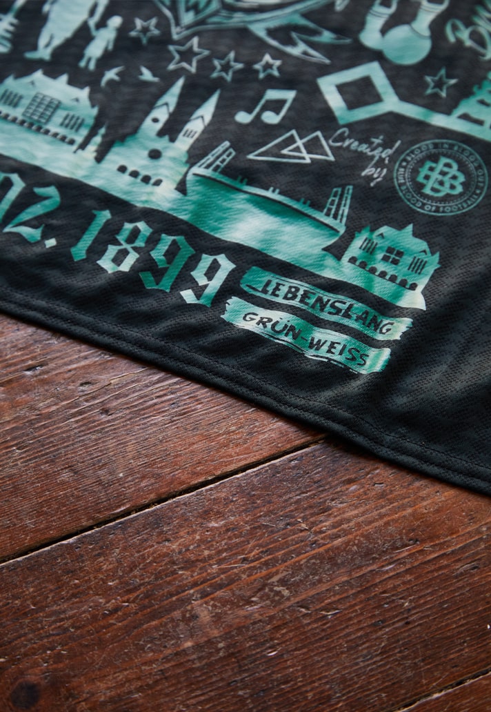
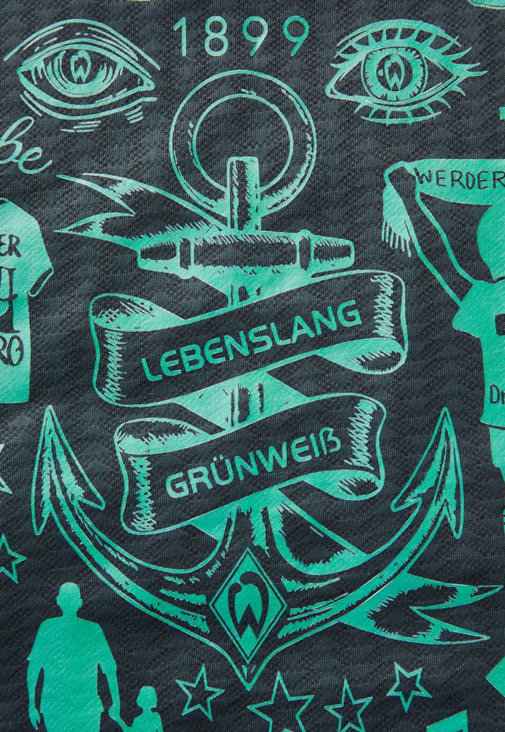
Not at all! I thought it was a very cool approach on making a shirt more valuable to fans in general, adding personal bits to a kit in a way I’ve never seen before. Tattoos are personal, you have them for life, the same as your choice of your club. Once a Werder supporter, always a Werder supporter. ‘Lebenslang Grun Weiss.’ To express that feeling on a shirt was a great and exciting challenge.
Talk us through the process behind this design?
The Umbro and Werder team called out to all the Werder fans to send their club related tattoos. We collected the final submissions and started making a rough draft on our desk with cut out printouts looking for a right layout for the front and back. It was a bit of a puzzle but most pieces were quickly combined.
Then we traced the tattoos manually in illustrator and started making the real collages for the front and back of the shirt. As we used a screen print solution we had to look at details, line width etc. After some technical test, sampling and design decisions we ended up with this result
What were the specific challenges surrounding it?
Yes, we worked with existing shirts, already with crest and sponsors, different sizes and volumes. The post embellishment technique is sensitive as well as limited. Part of the design decisions are obviously related to the production. Others like going monotone in Werder green weren’t, that just felt right.
Were you involved in the initial conception phase for “How Deep Is Your Love”, or did you come in at a later stage?
We came in at a later stage with this title but ‘How deep is your Love’ is an extension of Umbro’s ‘For the love of shirts’ which we worked with before. So with that in mind we just cracked on.
What were Werder like to work with?
Werder is a great club to work with. The team is very open to ideas and very supportive when it comes to materials, technical suggestions and they have a great staff helping out as well as their embellishment partner WKS textile. Werder made it an easy job for me and my design team.
Were you involved in picking out the tattoos/stories that made the cut? If so, what were the factors that were taken into account and what was it that stood out about the ones that were selected?
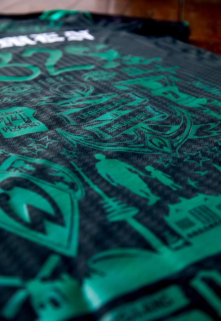
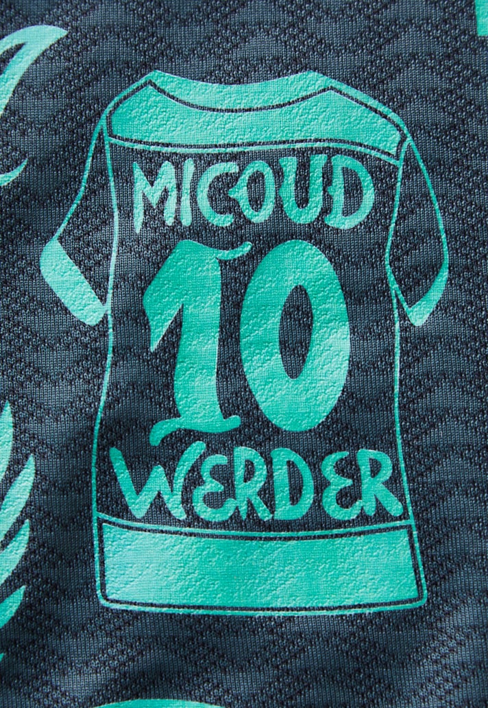
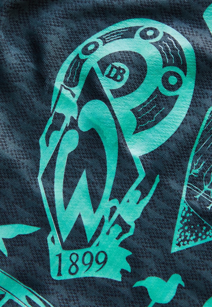
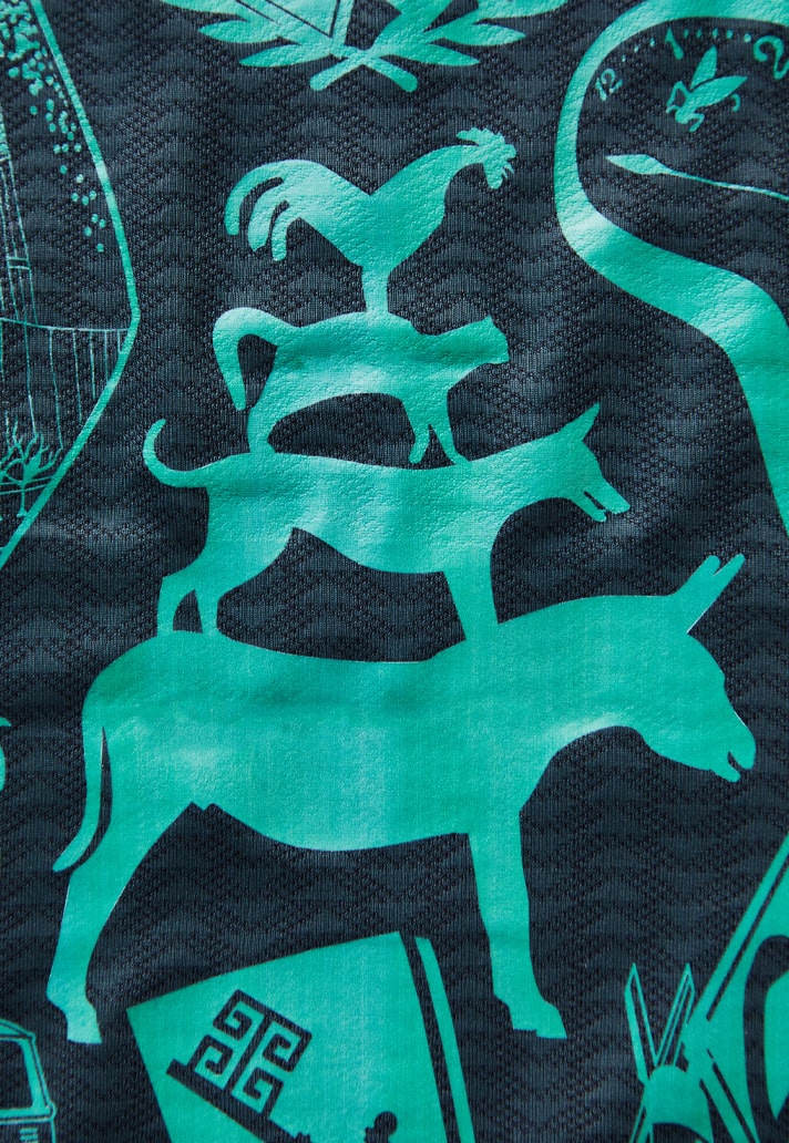
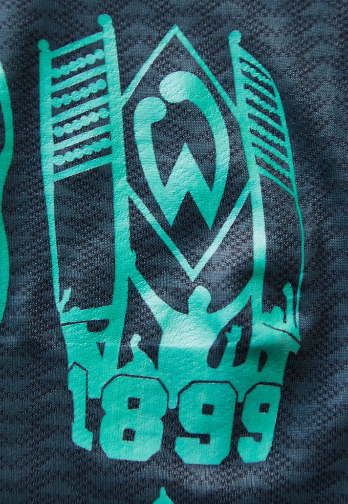
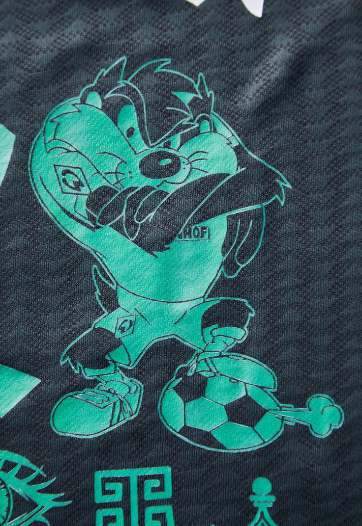
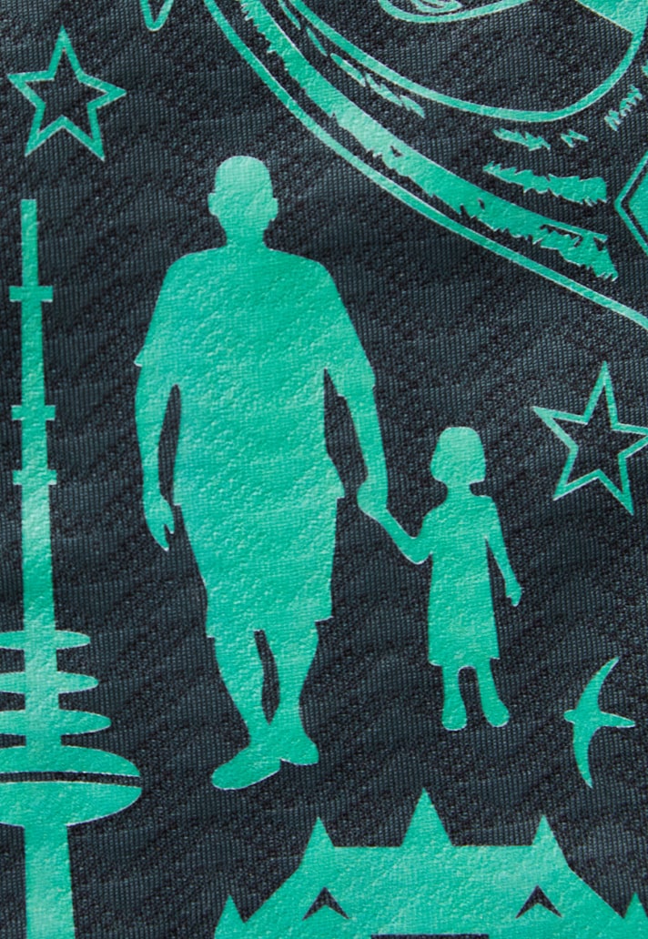
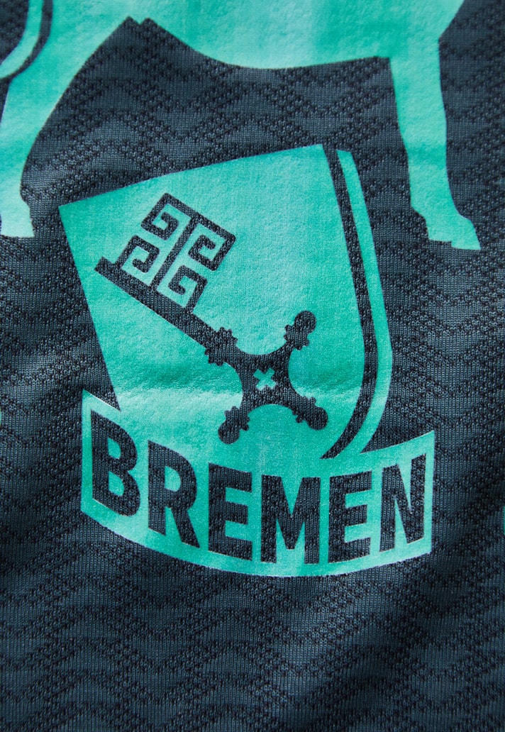
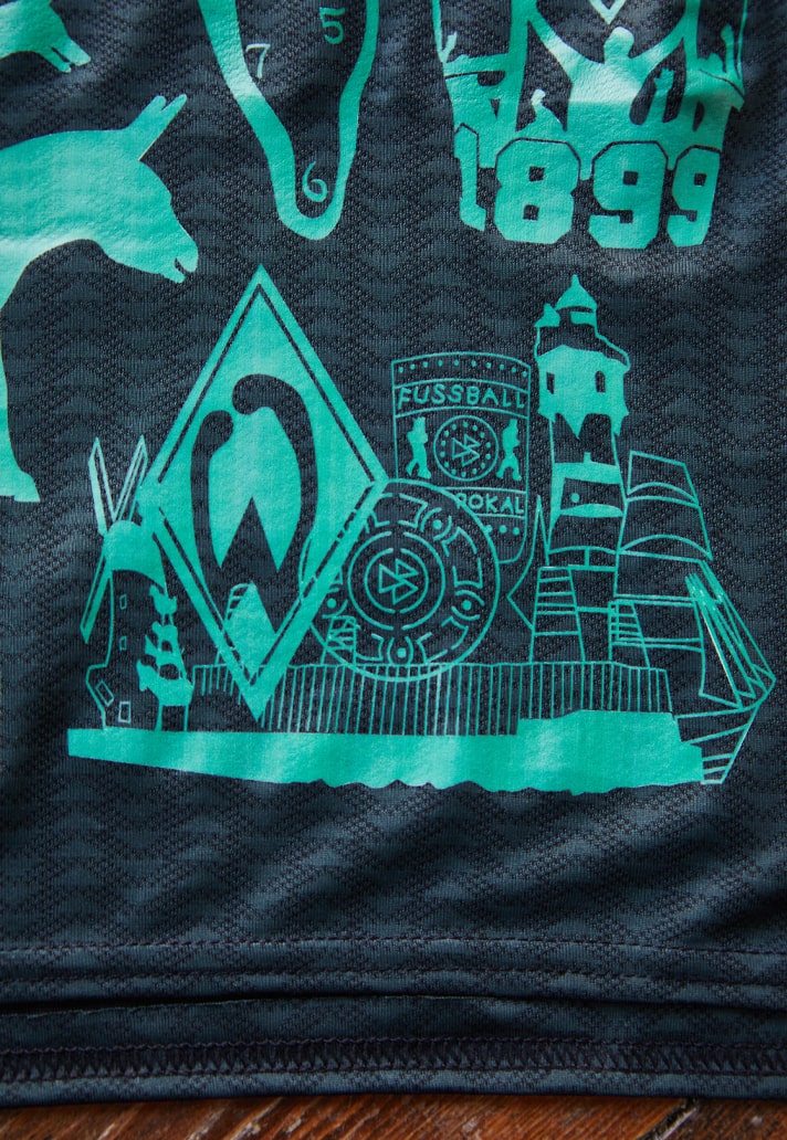
I think out of the thousands submitted we received about 300 and chose the final 30 to 40. We picked tattoos that were very original, sometimes one representing many (classic Werder icons like the W-eye, the city key, or the animals from the Bremen fairytale) and others that are small and personal. Tattoos didn’t necessarily have to be beautiful, a placement on the body could be cool too (like on feet), or a weird one like a silly typeface or cartoon. If some big sleeves or backsides were too big, we would take a piece or wording out of it to make such a tattoo still part of the design.
Did you have a favourite tattoo/story?
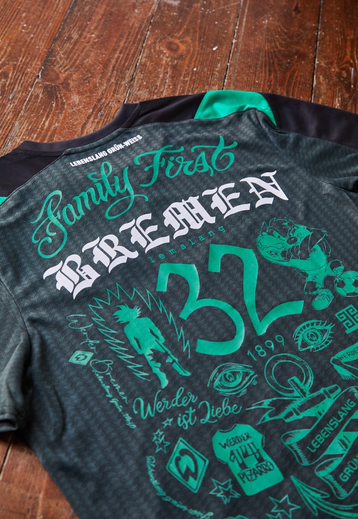
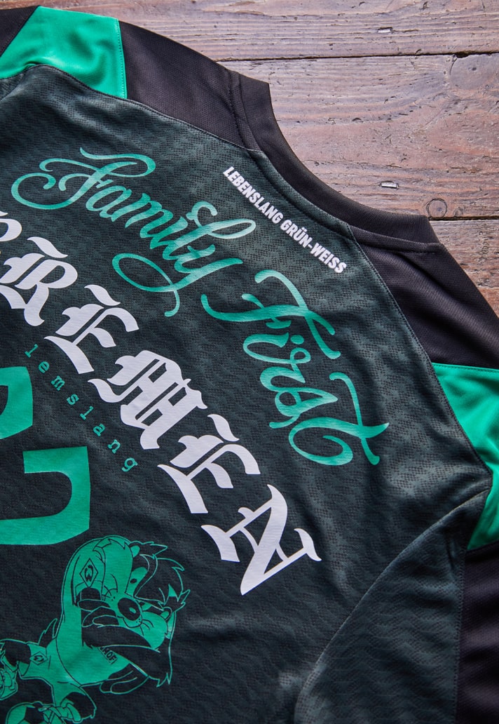
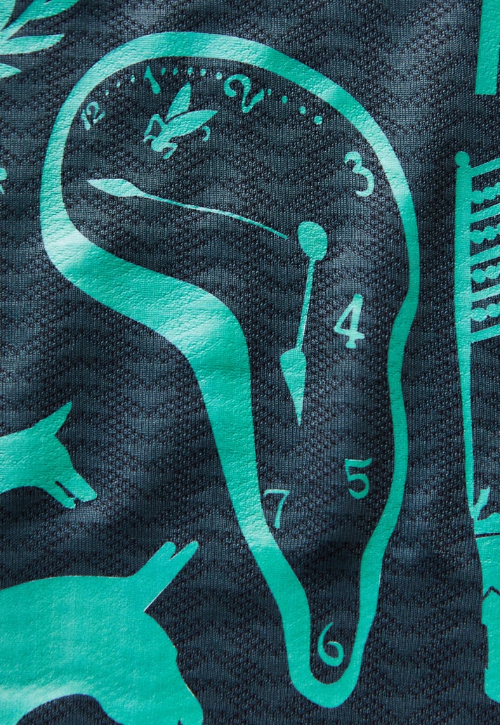
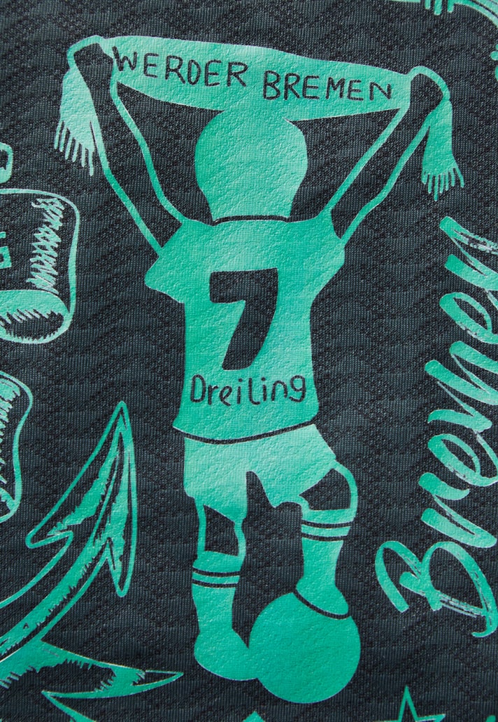
We loved the idea of having some player tattoos as part of the project, so the shirt isn’t just representing the fans. I really liked that idea and three players are now integrated into the design: Friedl, Jung and Bittencourt. I love the Dali clock tattoo, you might wonder why it’s part of the design, but it’s one of Jung’s tattoo (part of his right sleeve). Also the Family First of Bittencourt is great. It’s between his neck and his chest, we placed it on the back and it's almost an umbrella of the Werder vibe, part of the club’s DNA. The subtle and very first and personal tattoo of Friedl I love as well; two triangles and his number 32.
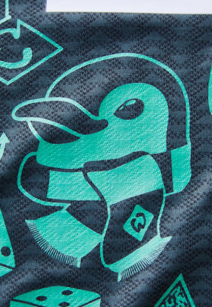
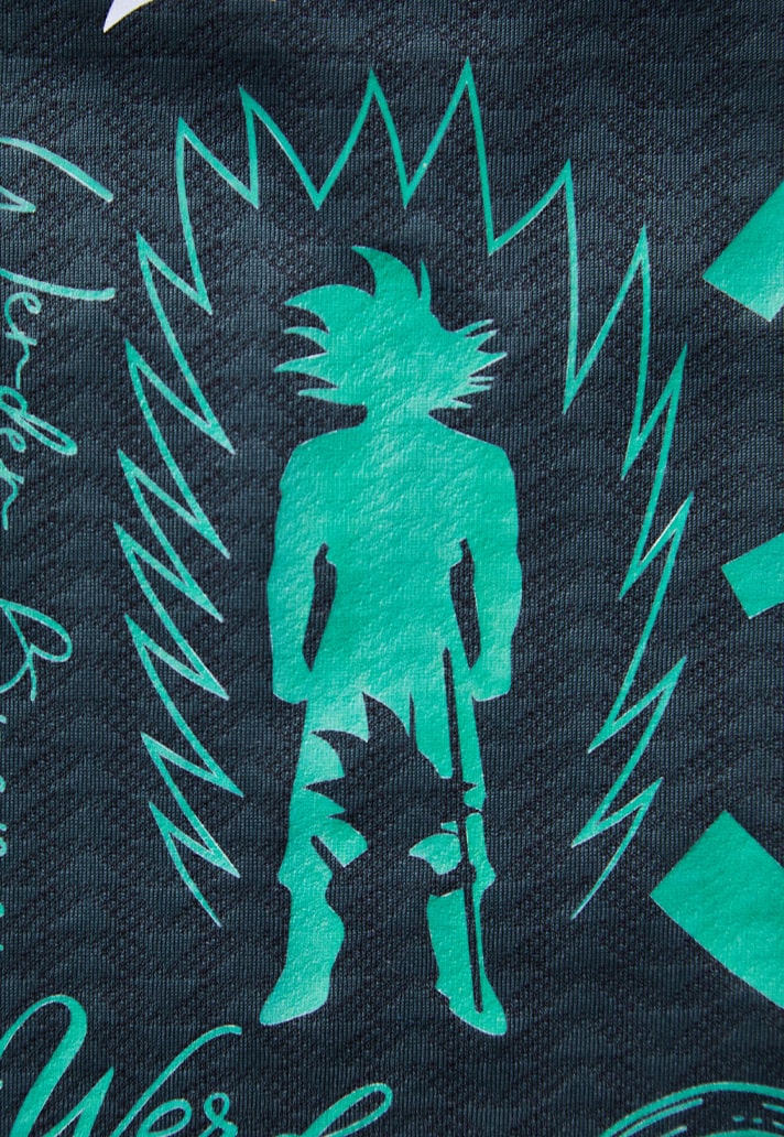
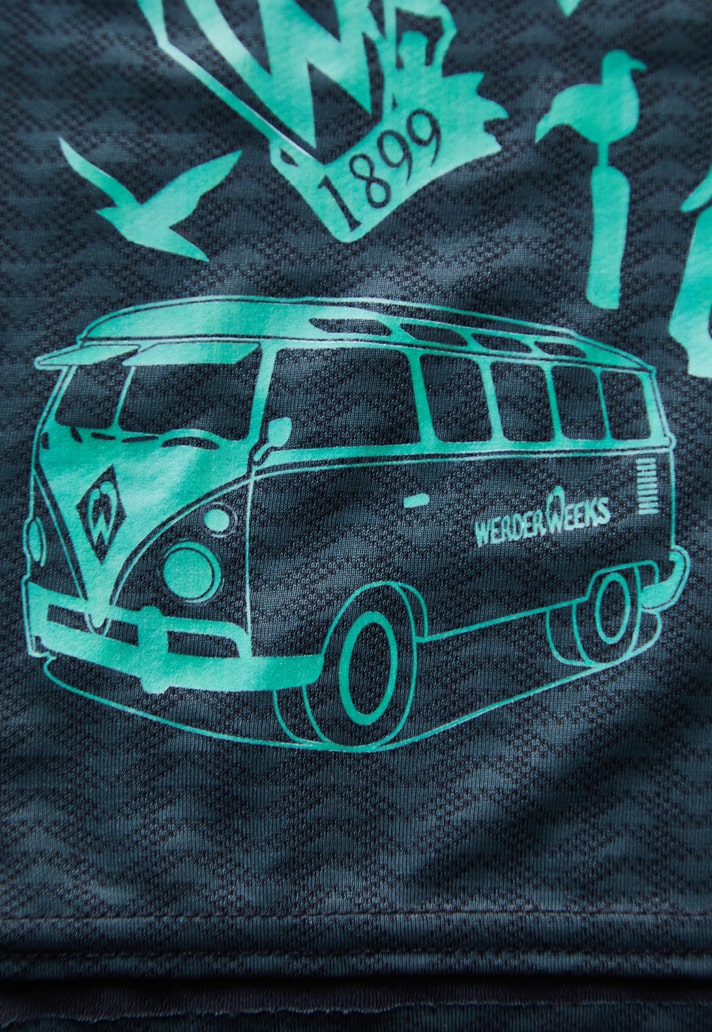
Other stuff I really enjoy are the little shirts that were on someones feet, the silly 1899 in a rigid typeface shared on two people’s heels, the odd manga figure, the classic gothic BREMEN typo, little details as the wings, the neckless, the penguin – man, so much!
Were there any tattoos that posed more of a challenge in terms of incorporating them into the design, and did that factor into the choices at all?
Those bigger tattoos were often great but way too big to use entirely. So we used parts of them. Other tattoos were absolutely cool but way to detailed for the technique, we couldn’t apply these unfortunately
Did the fact that this shirt is set to be worn by Werder in their last game of the season add any restrictions to the design, for example having to adhere to league regulations?
I was afraid of league regulations and yes the German second league argued the legibility of the names and numbers even though these are white on our tonal green design. Legislation states we needed to add the Werder Bremen official wording as well above the numbers. In the end the players will only wear the design on the front.
Your previous mash up collaboration with Umbro was obviously created for the fans. How do you feel knowing that this one is set to feature in an actual match?
That’s an amazing gift to the project, not just for myself, but especially super cool for the fans and the club. The shirt will become even more credible to everyone that supports Werder Bremen.
What are you most proud about with this shirt?
I’m always very proud when my design can be part of a big professional football club. I’m just a designer from Amsterdam and it’s great when you see your work worn by players and fans internationally. The project seemed a big challenge beforehand but with the swift assistance from the club and its partners it was quite a quick and pleasing result. The process was quite linear with almost a destined end result. It was very satisfying seeing the design coming to life. Seeing it on pitch will be the cherry on top.
What are your favourite elements?
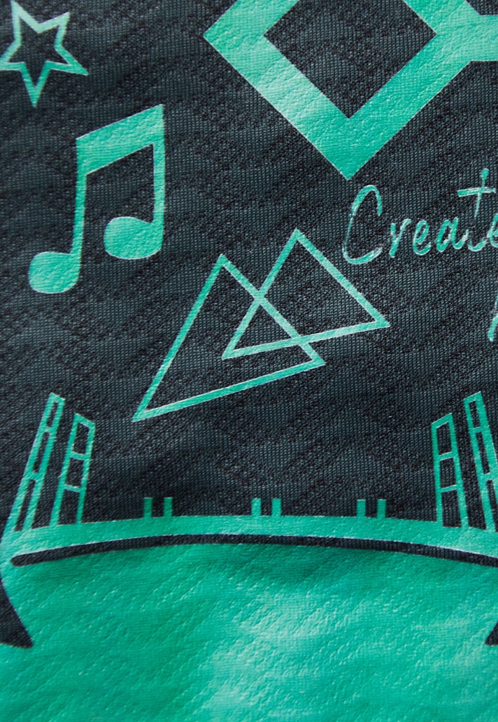
I think the tattoos I mentioned before and I like the elements like the wings and the crown around the logos on the chest. It’s what I used to do as a graffiti artist, adding bits to tags and pieces to emphasise coolness, or just bragging you’re the best. There are a few tattoos I really like, also the wording Bremen in white on the back. What I like about the entire look as well is that it feels like those skater-tattoo canvasses that collect different little ones that end up as a cohesive collage.
I hope the Werder fans really like this one!
The special edition Werder Bremen third shirt is available now at werder.de


