Over the last few seasons prematch shirts have come into a world of their own, becoming a part of the club’s visual identity alongside the home, away and third shirts. And with many clubs unveiling their options for the 20/21 season, we take a look at the best on offer.
Some may say that the freedom of design that’s offered to prematch shirts offers up better options than their in-game counterparts, however, with the influence of the fashion world lending a greater depth to the regular home, away and third kits in particular, that gap is being rapidly closed. But prematch shirts still offer a timeless, lower cost alternative, with some wild looks that are unlikely to ever fully make that transition into the actual game. With the Champions League and Europa League still ongoing, many teams have taken the opportunity to show off their prematch attire ahead of the coming season, and that's where we'll start as we gather the best we’ve seen so far...

Style kings PSG were always going to have a cracking design to sit alongside their regular home, away, third and even sometimes fourth kits. Yeah, if you can't get enough of the Ligue 1 champions, then you won't be disappointed. The design sees a base red with blue accents finished with a sublimated graphic that reads ‘PARIS’ throughout, finding that balance between flamboyant and fashionable as PSG so regularly do.


Both Manchester clubs debuted their new prematch shirts before being unceremoniously dumped out of their respective competitions. The Manchester City continues the shattered pattern of the home shirt, albeit with a darker base that inverts its colours. The Manchester United shirt follows a template approach that adidas have rolled out across all their primary teams, presented in a red and black colouring.


Unlike adidas, Nike have taken a far more bespoke approach to their prematch designs, and this is evident in both the Chelsea design and, looking further afield, in the Club América shirt. For the former, a combination of different shades of blues are arranged in a mix of stripes, creating a deep texture.
For the latter, the club crest acts as more than just inspiration, enlarged and wrapped around the body. Proper wild by European standards, but probably fairly normal in Mexico. Mad, and we love it.

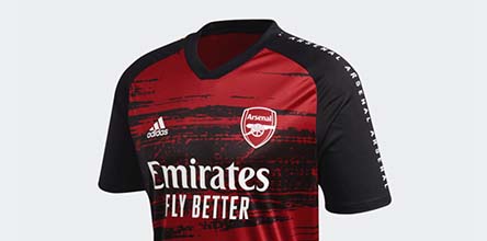
That template approach is seen for Arsenal, with a slightly different shade of red and the obvious team details being a differential from the United shirt. The distorted graphics across the front of each of the Three Stripes shirts is unique, while the addition of the team name running down the shoulders appears on each.
This design is seen again on the Juventus shirt, although the bespoke graphic looks all the better in the monochromatic look. Finished with gold details, this is right up there.


Are Bayern Munich set to be Champions of Europe? Quite possibly, but not as far as prematch shirts go in our eyes. It's good, don't get us wrong, with the red details popping off the grey base and graphic that here is positioned on the upper quadrant of the shirt. But it falls short due to the uniform nature and a slight lack of risk.
Real Madrid are the final adidas team to have debuted their prematch shirt, and it sees pink details popping on the white and blue base. Those pink details obviously hinting at the appearance of the colour on both the home and away shirts for a nice link.

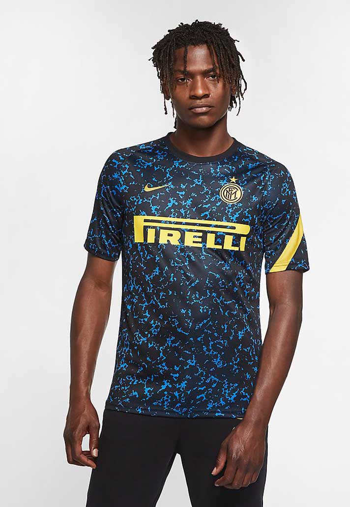
Then we make the move into the realm of shirts that have been released but are yet to debut. Starting things off is Inter Milan, who have already received one of the best home shirts of the season, and now they go and get this beauty as just a prematch shirt. Most teams would kill for this as a home or away kit. But it forms part of a wider collection that is likely to be the envy of most other teams.
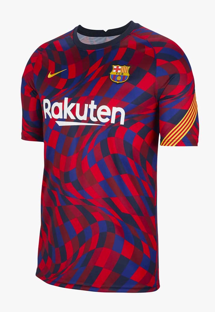
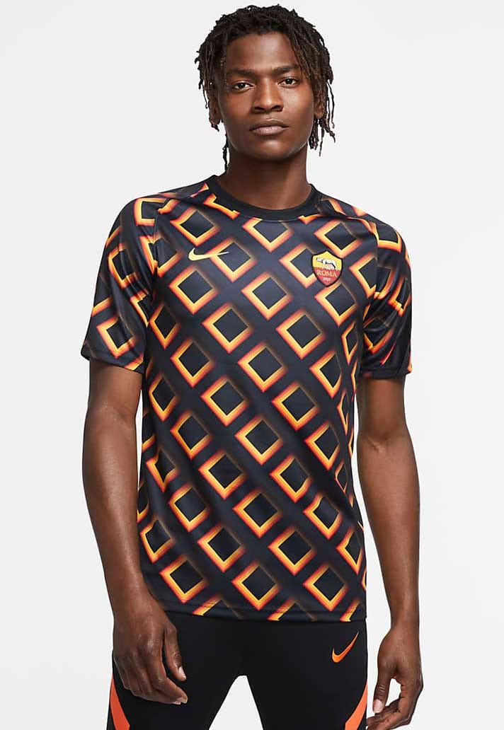
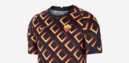
More bespoke beauty comes for both Barcelona and Roma. Barca are blessed with a wavy distortion of last season's chequered home shirt, complete in the classic colours of the club, while Roma, now in their last season with Nike, features a wild square-based repeating design throughout the whole body and sleeves.
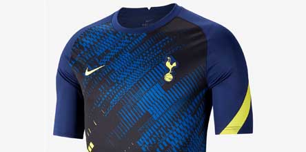
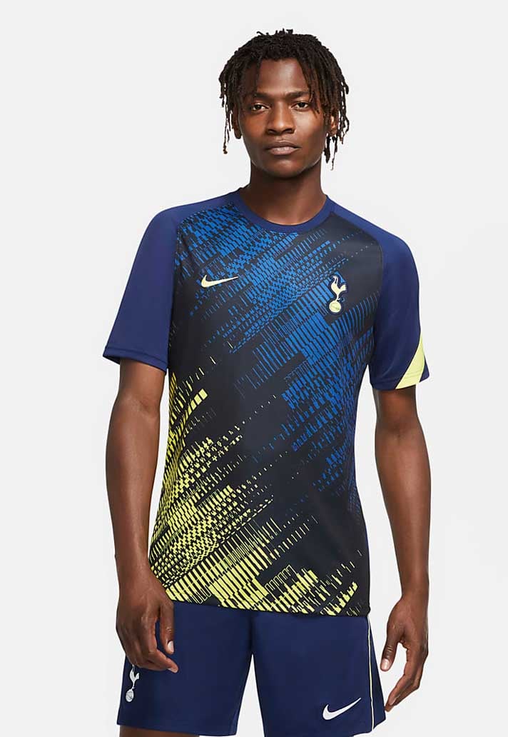
Spurs and Liverpool receive special treatment in that both teams are provided with two versions of their prematch shirts. The Spurs shirt sees diagonal shades of blue combined with dashes of contrast yellow in a striking graphic. Those colours are switched out for black, white and pink in keeping with the training collection, also giving an indication of what the away shirt might hold.
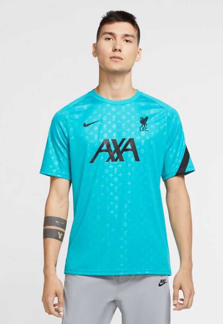
The Liverpool shirts are slightly more reserved, coming in either a black base or the teal of the away shirt. Sublimated logos appear throughout, while red details pop for one and black on the other, for a subtle – if unadventurous – option.
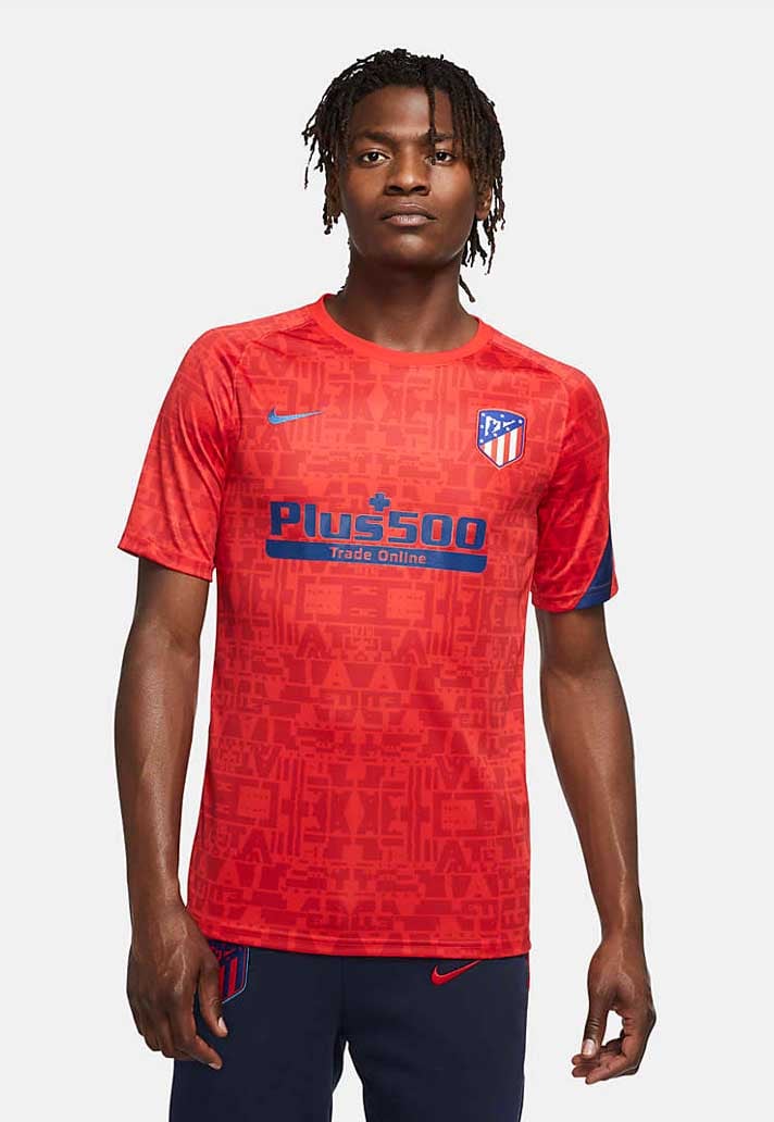
Much like Liverpool, Atletico Madrid's prematch shirt features a subtle sublimated graphic print through the whole body, and it's finished off with blue accents.
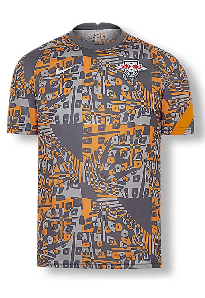
And we finish up on what has to be one of the wildest designs of the lot. The RB Leipzig shirt is absolute madness, and you're either going to love it or hate it. We're firmly routed in the former approach, while this design encapsulates what we said at the beginning about prematch shirts being able to go where regular shirts can't. We're not even going to try and describe this one. Just feast your eyes.
Shop all prematch shirts at prodirectsoccer.com