Some clubs seem to get all the luck when it comes to shirt designs. While many teams are happy to get one banger, here we’ve rounded up what we think are the ten best dressed sides from Europe, no matter what kit they opt to wear from their wardrobe. Yep, this is the Top 10 kit sets for the 23/24 season.
We’ve been through our Top 10 European home, away and third shirts of the 23/24 season, and now we get down to the collective wardrobes of clubs from the continent. See, some club’s are fortunate if they get one decent shirt design for a season. If you’re really lucky, you may even get two. But then there are those jammy teams who hit the mark with all three of their strips. Given some of the atrocities on display at times, It feels unfair that any one team should be so well dressed, but with adidas and Kappa in particular upping their design game to all new heights this season, there are several teams across Europe that just standout amongst the rest. So, here we pick out the 10 best kit sets for the 23/24 season.
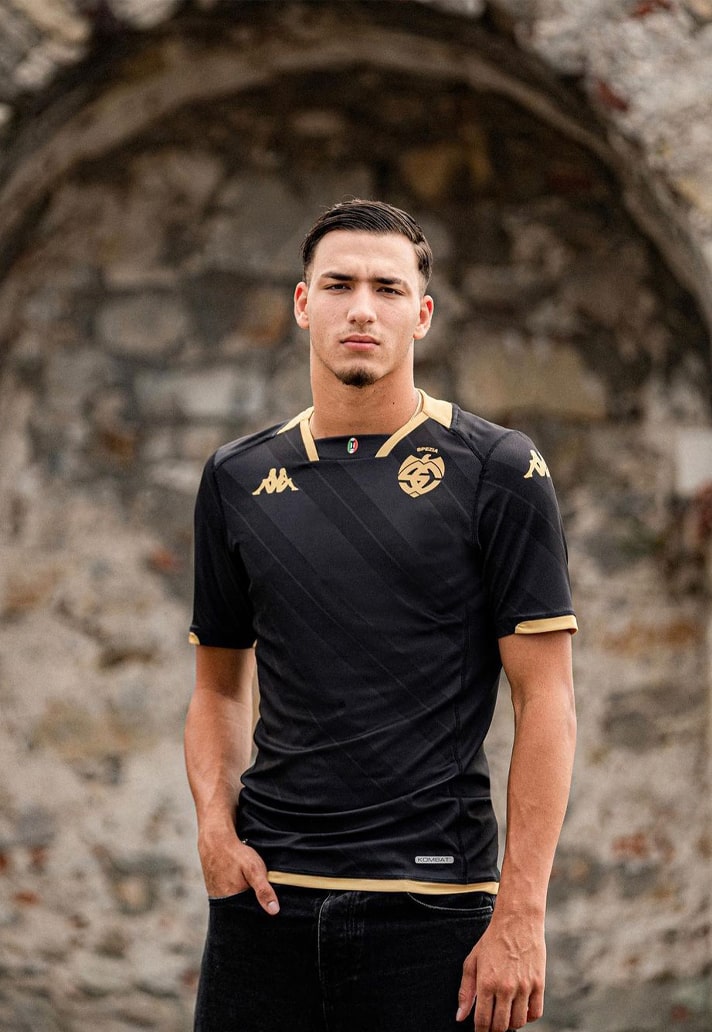
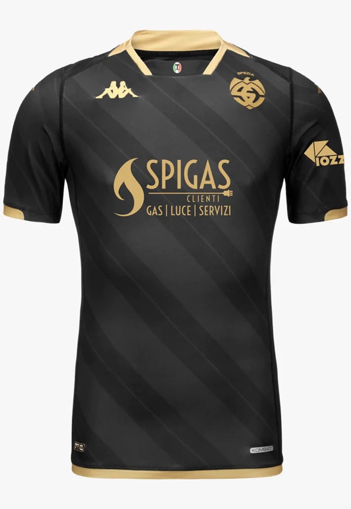
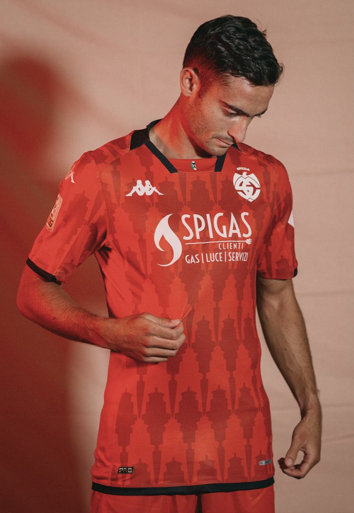
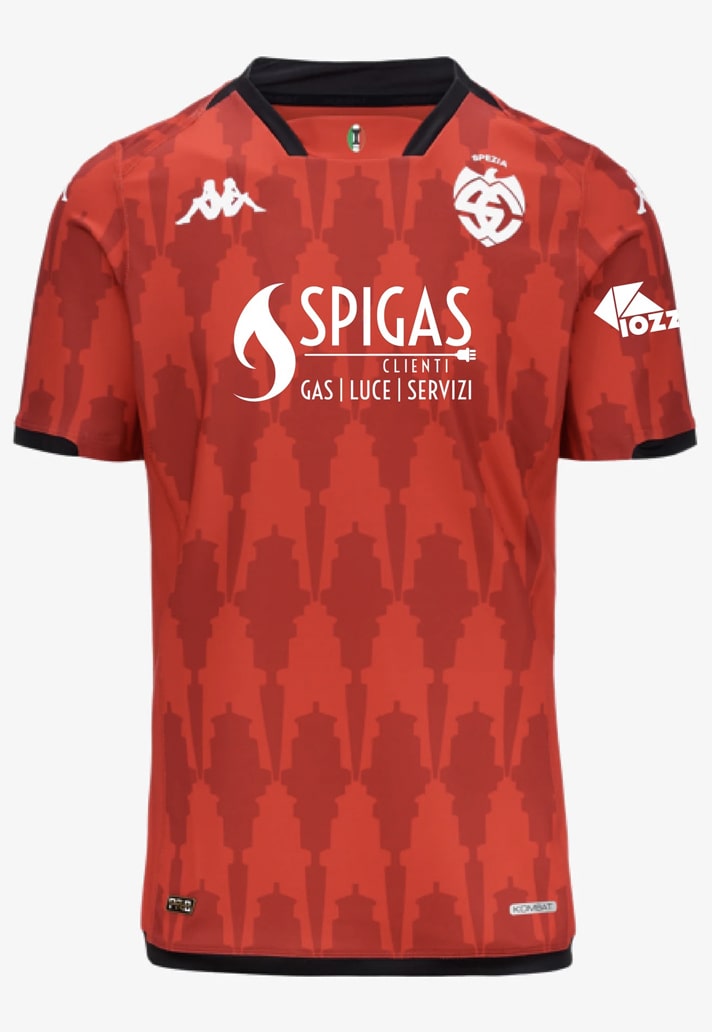
10. Spezia Calcio
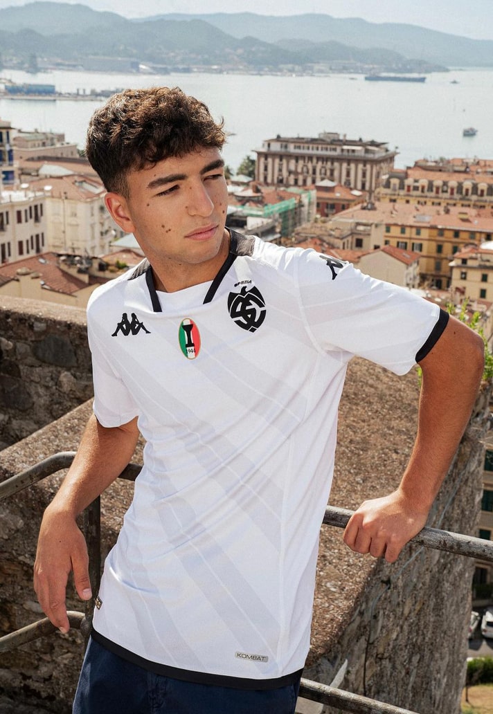
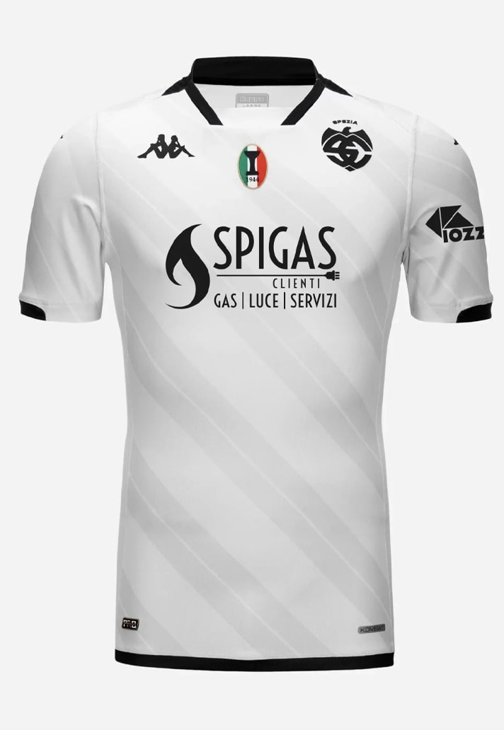
Spezia take up the number 10 spot as the first of several Kappa-faced outfits. Sleek inverted monochrome home and away kits are joined by a final flourish in the third shirt that ties into the club's link with its home city. All three linked nicely by that by that collar execution.
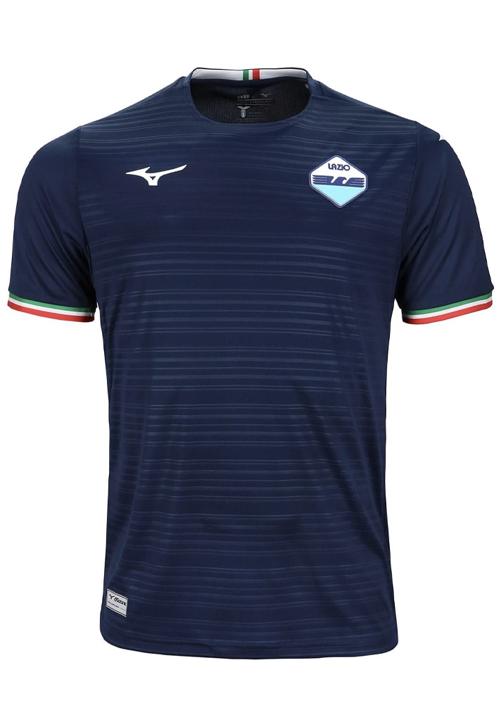
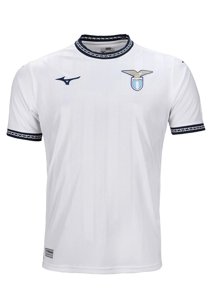
9. Lazio
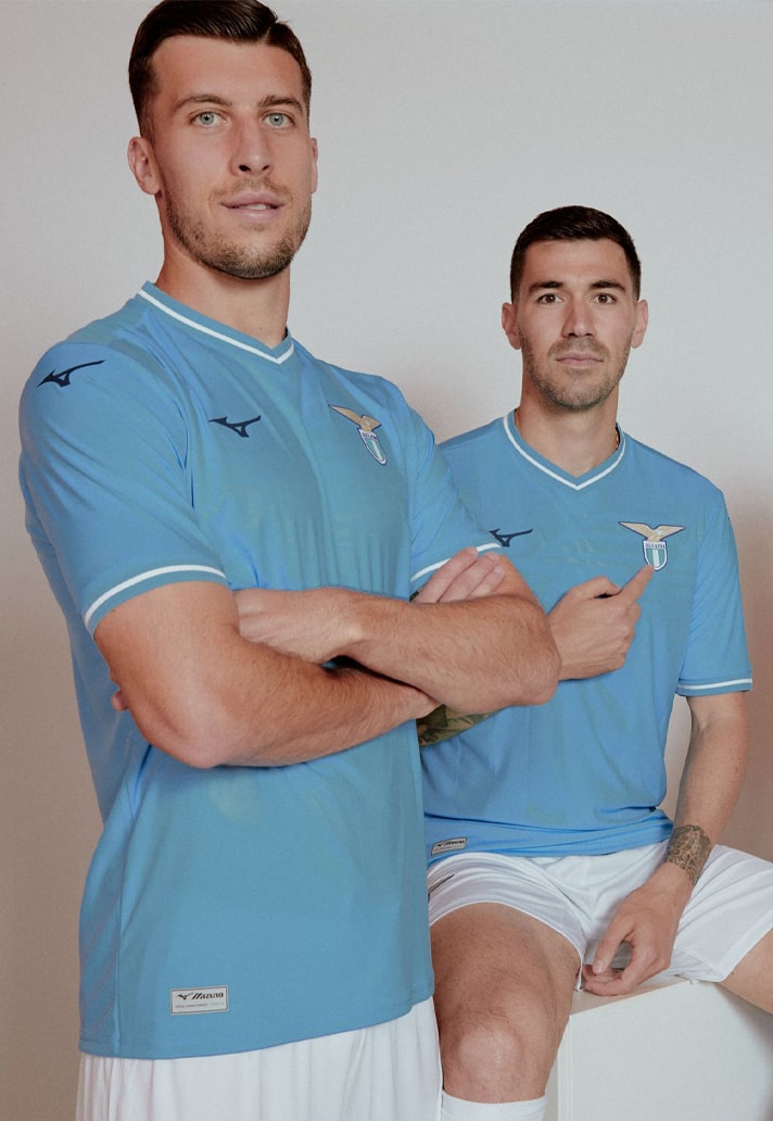
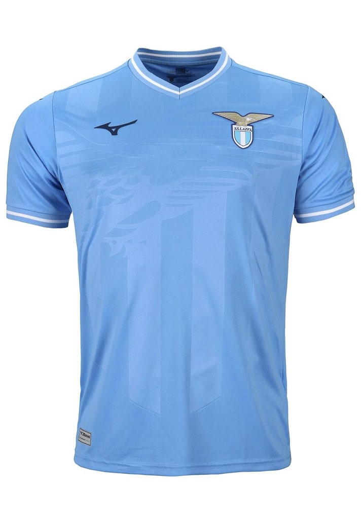
How good is it to see Mizuno back in at the top level of the European kit game? Lazio get their position on this list thanks mainly to the finer details of their kits; that embossed graphic of the crest dominating the home shirt, the fine horizontal pinstripe effect and Italian tricolore on the cuffs of the away, and finally some further embossed details and that collar and cuff finish on the third. Clean and tidy.

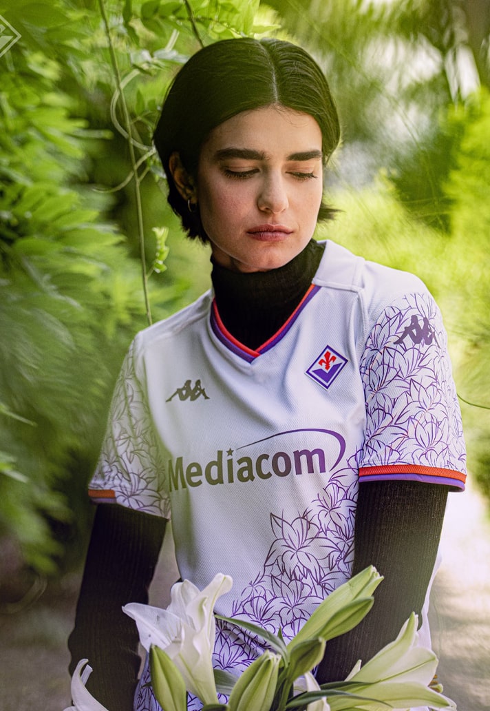
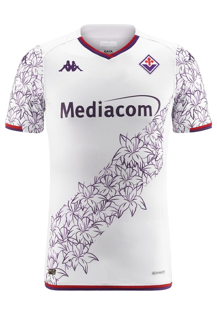
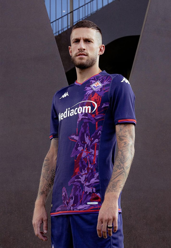
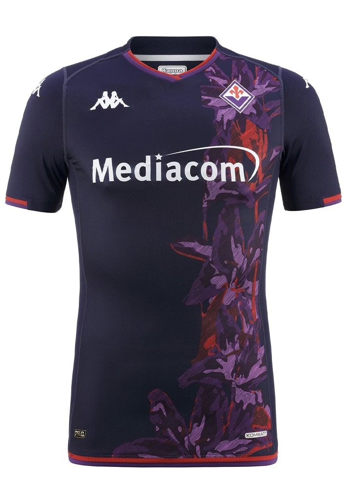
8. Fiorentina
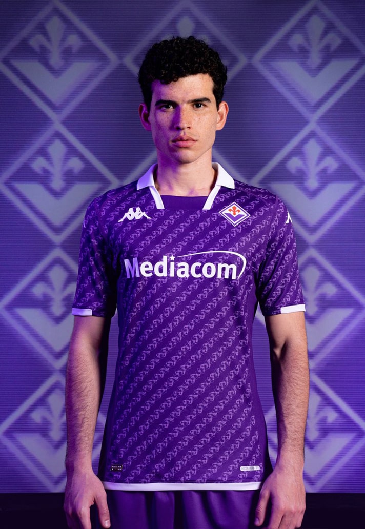
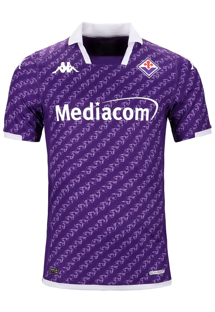
The only thing preventing the Fiorentina set from ranking higher is the fact that we still can't quite wrap our heads around having essentially the same colour home and third shirts... That being said, all three are beautiful designs, linked by the use of lilies, the quintessential symbol of the city of Florence and Fiorentina as a club since it was founded.
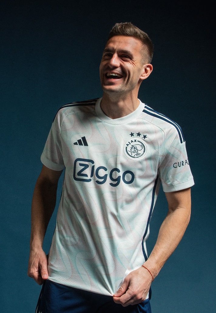
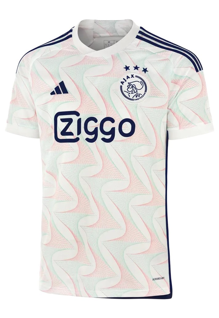
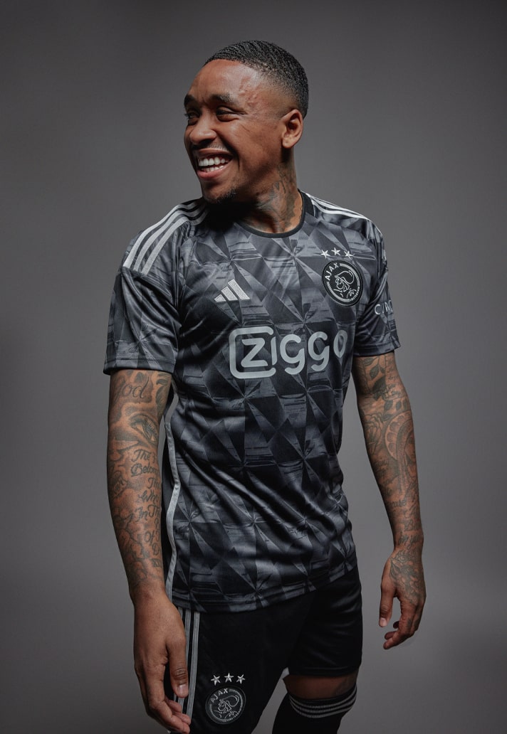
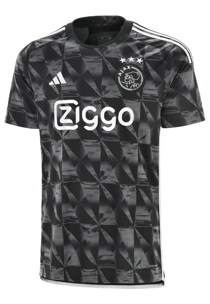
7. Ajax
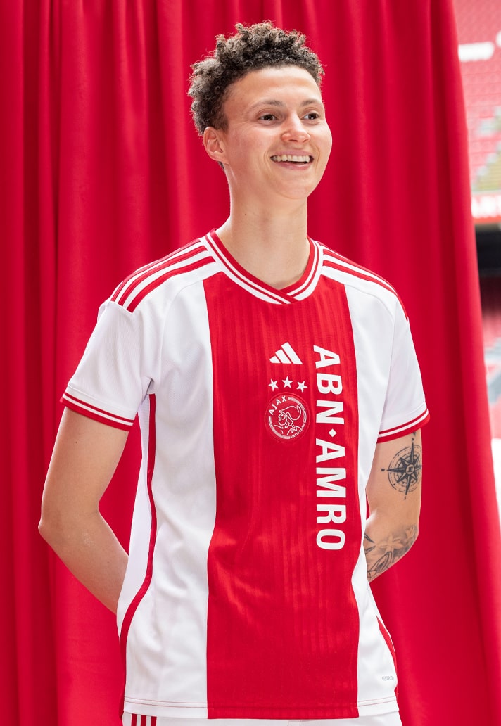
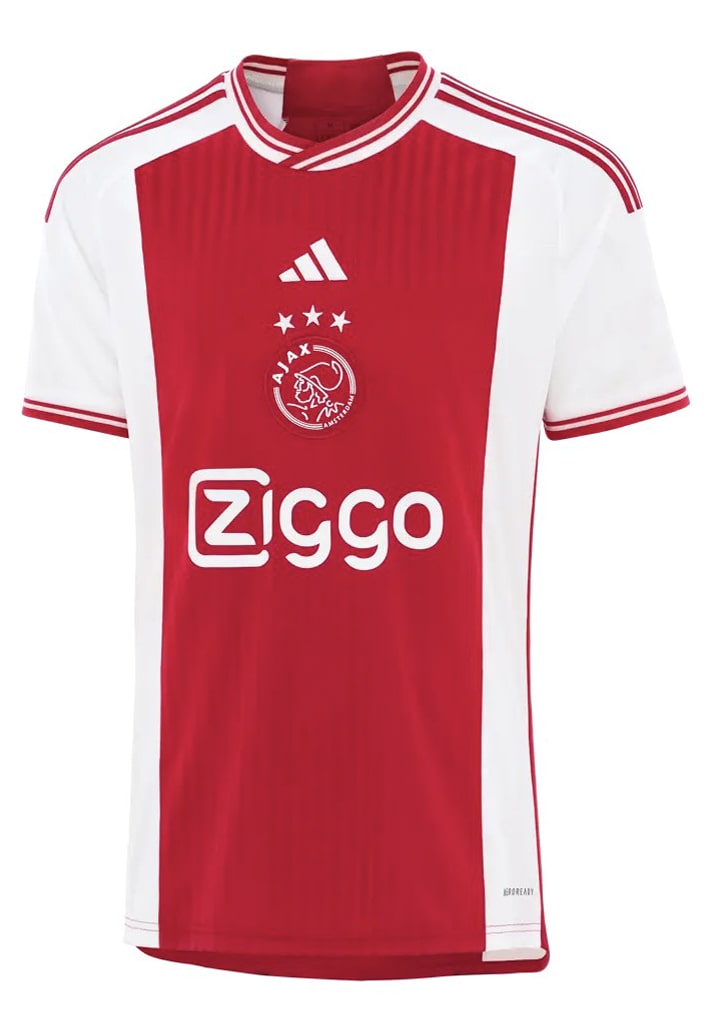
Whilst arguably not quite at the heights of recent seasons, adidas once again bless Ajax with a triple hit of kits that most clubs would happily trade for. The home is a strong traditional affair (and we love the throwback sponsor on the women's kit), the away is a grower, with a turquoise/light print pattern throughout to embody the contemporary, forward-facing nature of Ajax as a club, and the third takes inspiration from Diamonds in a nod to the youth academy and what they so often turn up.
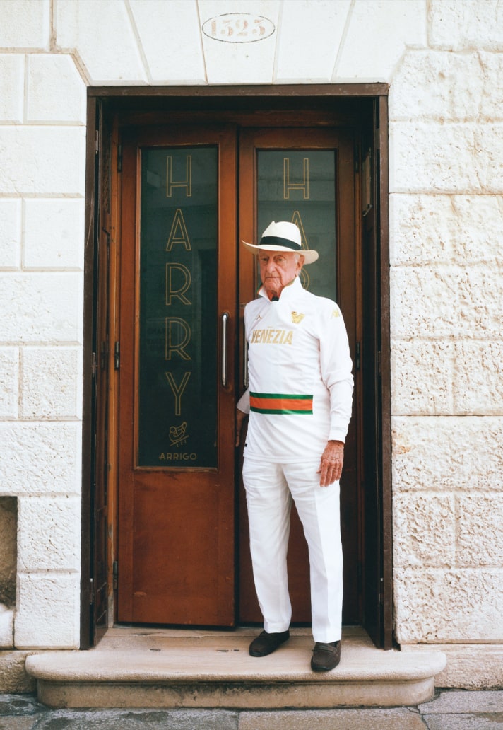
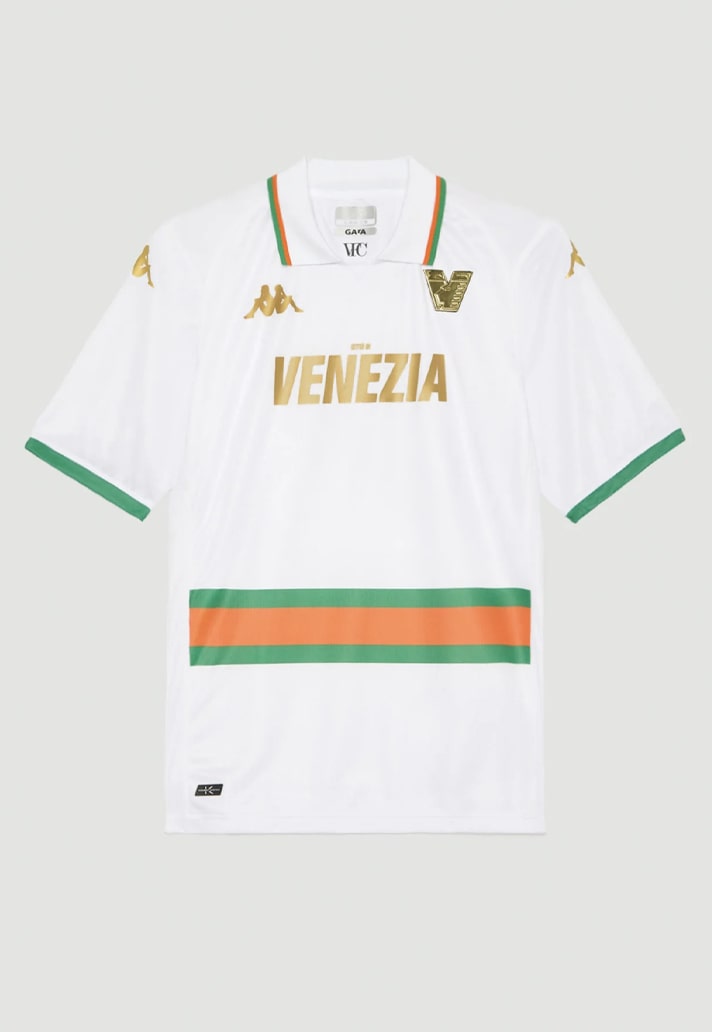
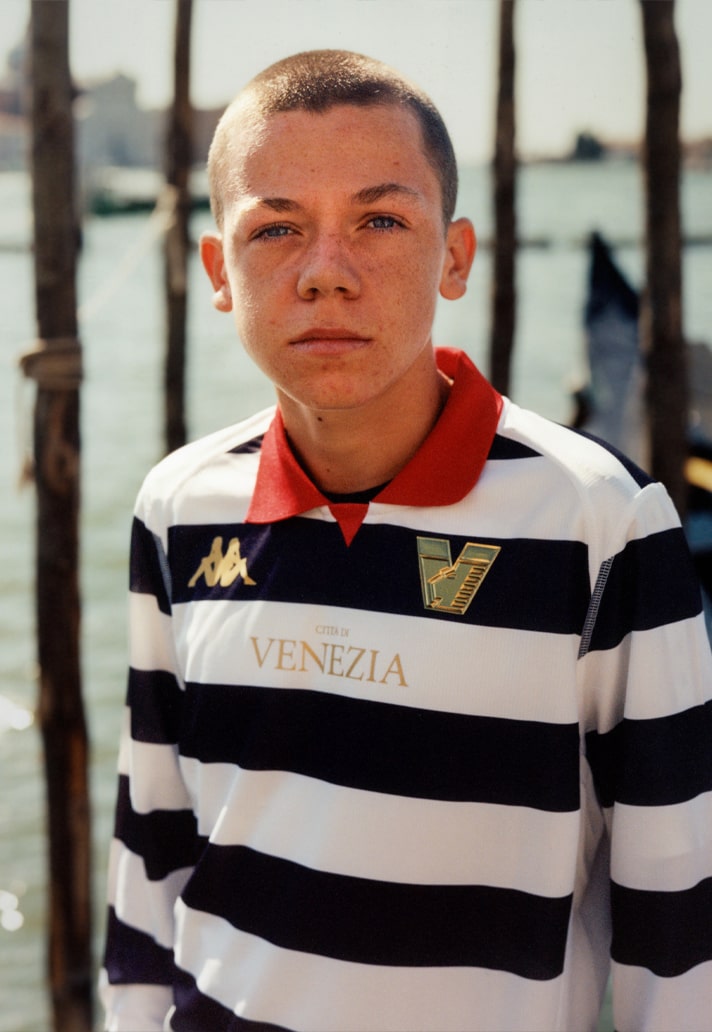
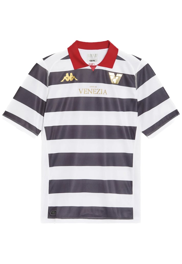
6. Venezia
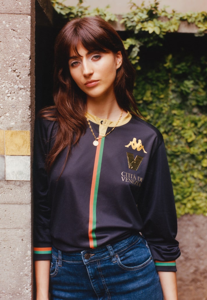
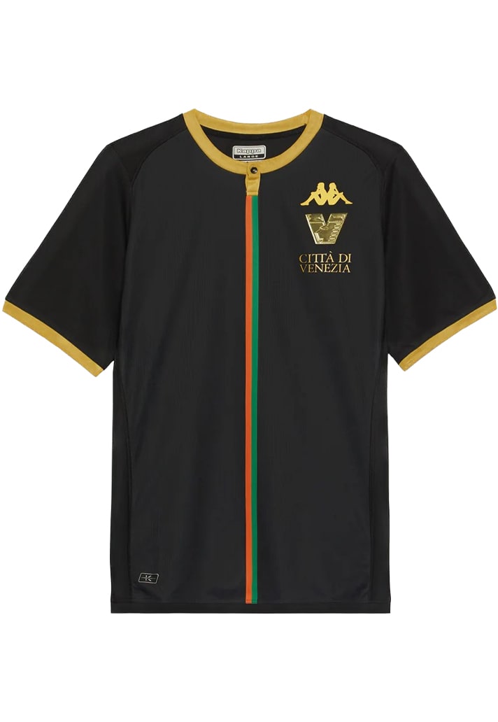
There's been a big change for Venezia this season, with the appearance of a sponsor on their kit for the first time in many years. It drastically alters the aesthetic of all three of their kits (some more than others), but we're including this set on the virtue of it being sponsorless when released, with the trademark "Venezia" print being in place. Could this be the last time we see the Italian side on these types of lists?
The collection bucks trends through opting against what is viewed as traditional placement of things like the club crest and branding, stacking them on one side for the home shirt, while thee away shirt plays with the positioning of what one would expect to be a solitary chest stripe. And the away shirt finishes things off with a unique look that pays tribute to the humble Venetian Gondolier.
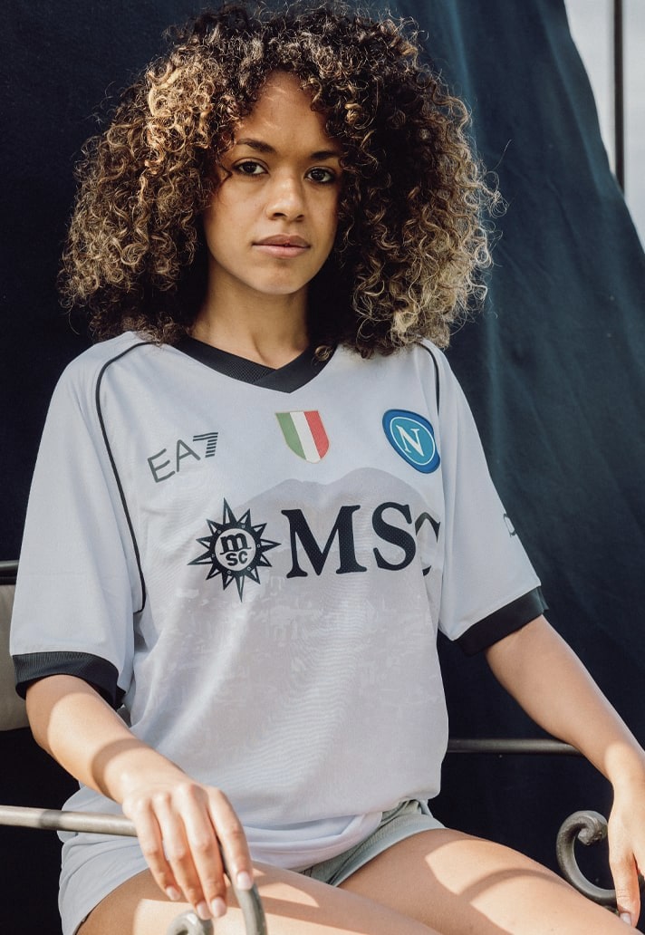
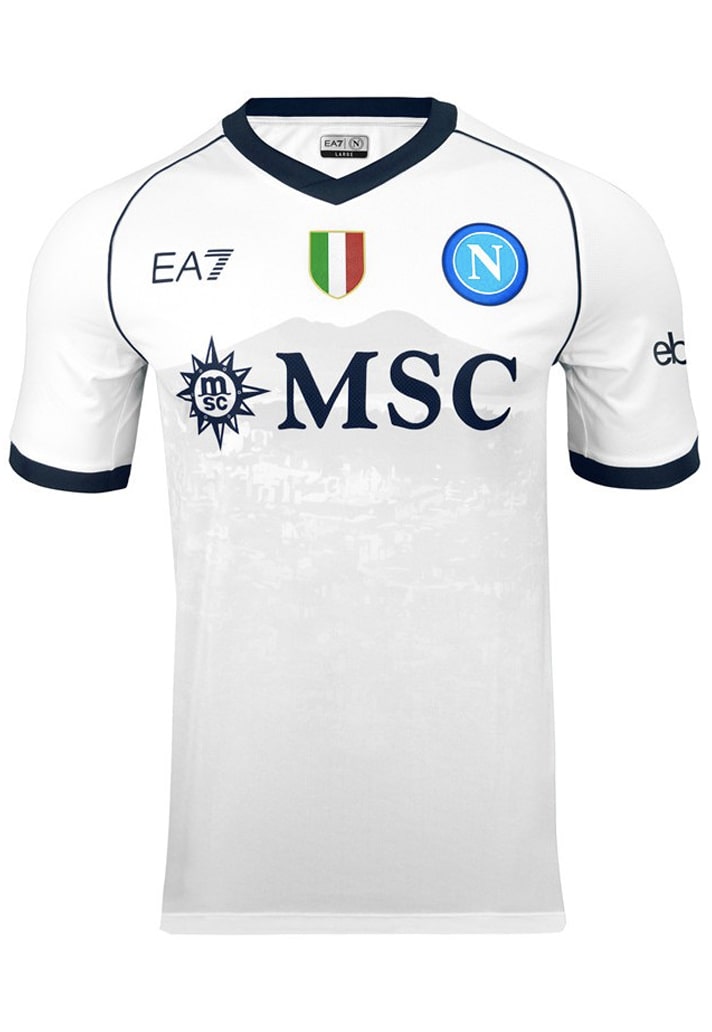
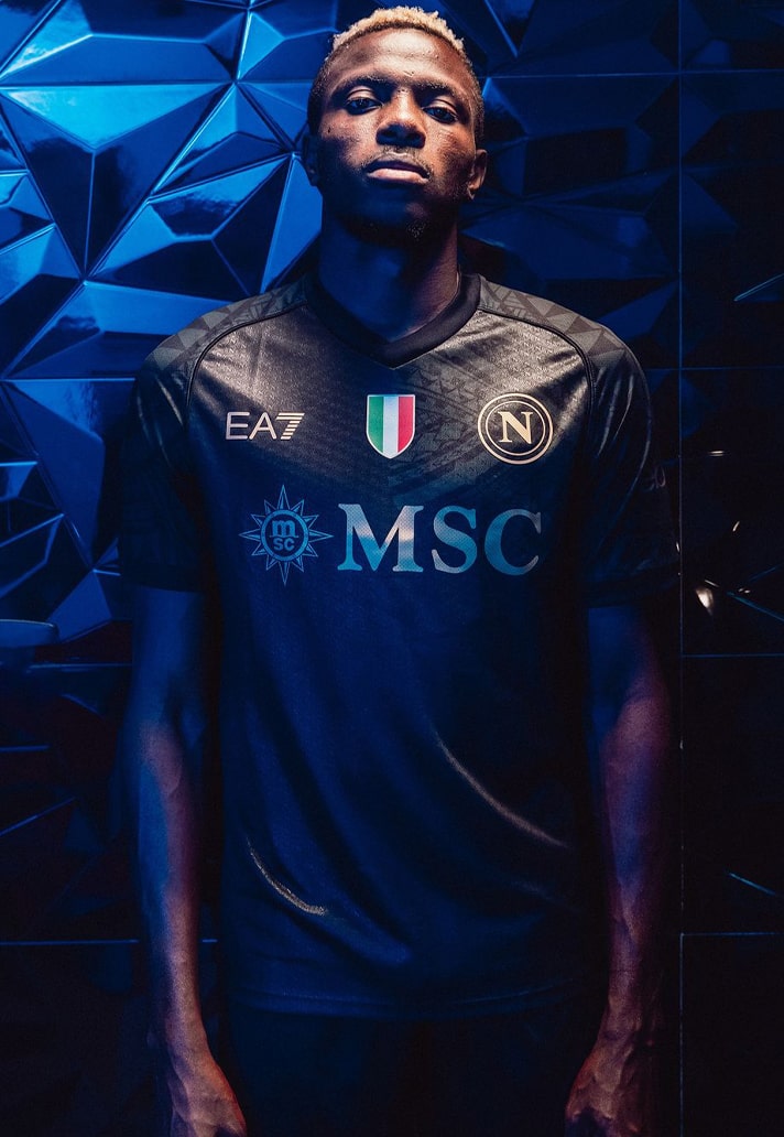
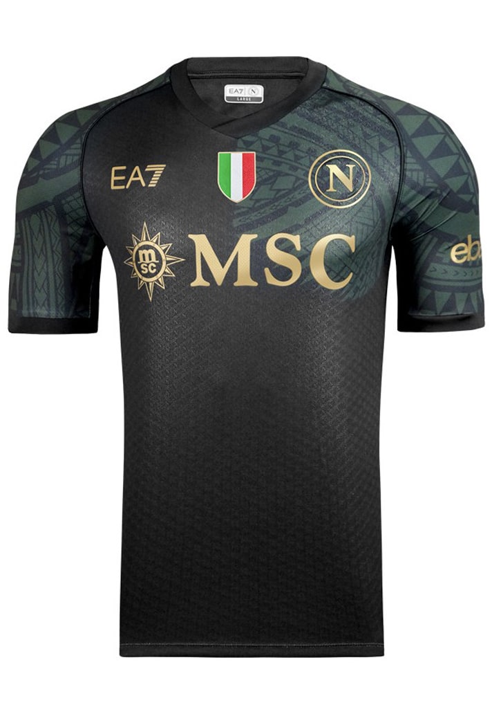
5. Napoli
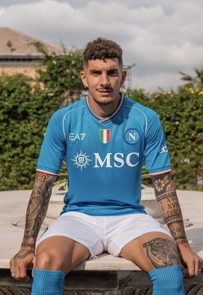
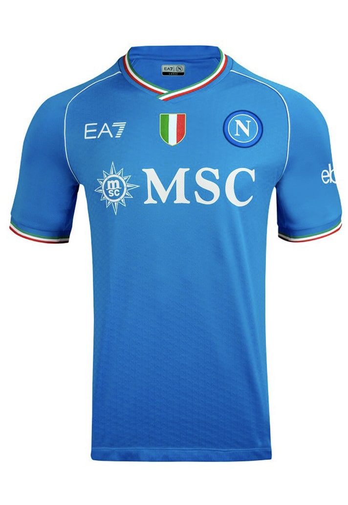
Into their third year of partnership, and EA7 have really hit their stride with the current Serie A champions – hopefully we’re now onto more of a quality-over-quantity approach, although the recently-released Halloween kit may suggest that we're still getting the quantity, just with the added quality.
The home shirt really leans into the Scudetto, with the Triclore collar linking nicely. The away shirt features a digital and stylised print of Vesuvius in Naples, a symbol of the city's identity, while the third shirt features a sublimated graphic on a black base, embellished by bronze accents.
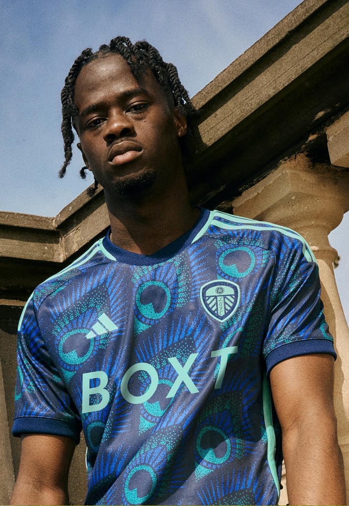
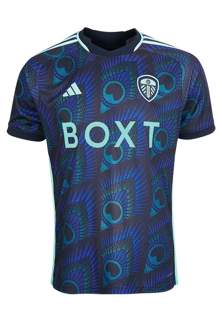
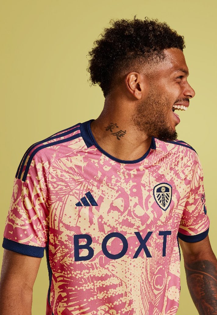
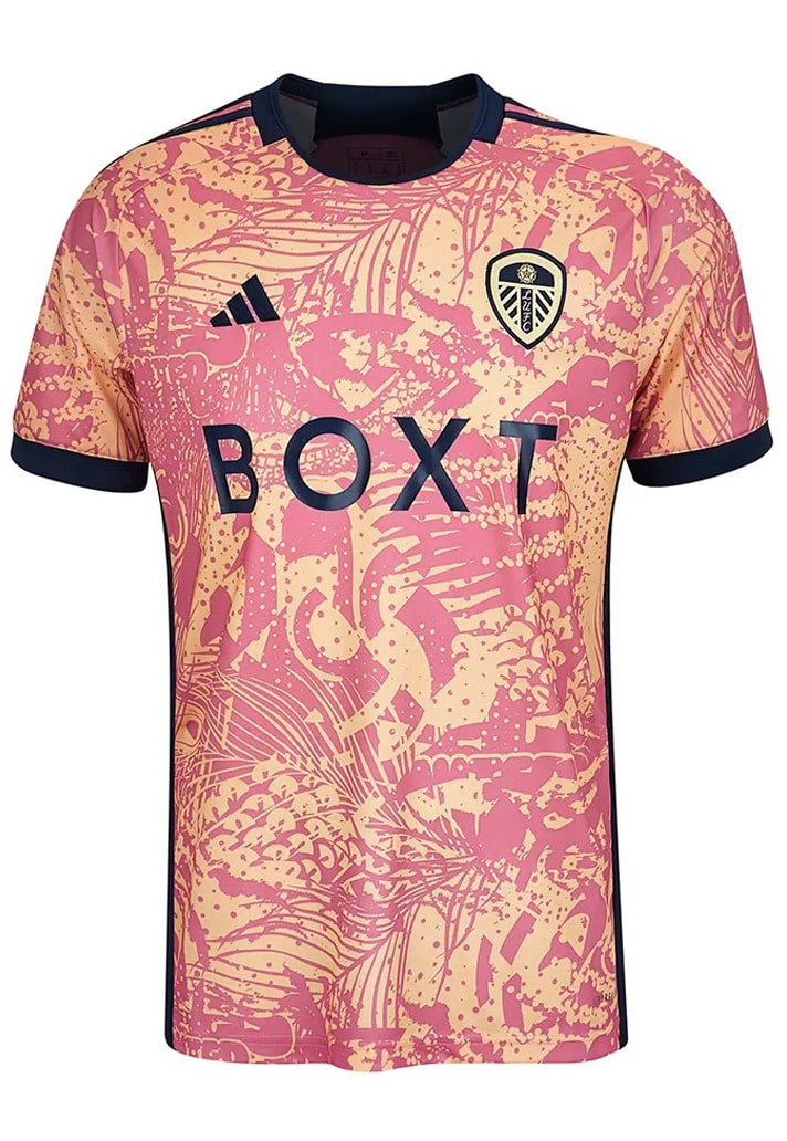
4. Leeds United

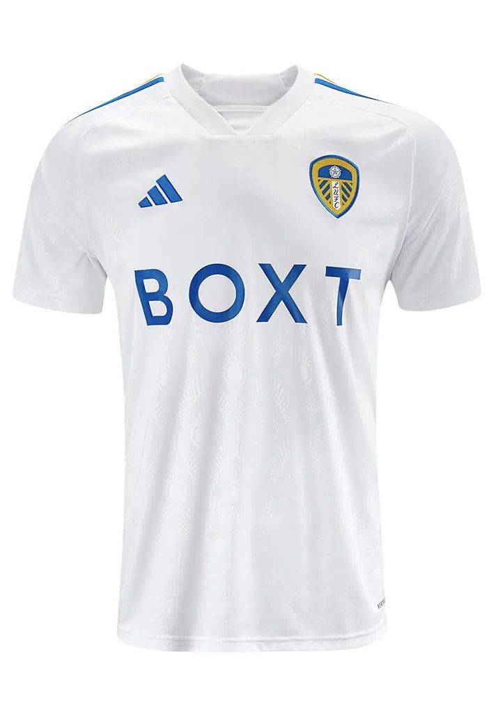
Only shame with Leeds' kit set is that it deserved to be in the Premier League, seen by the millions of watching fans worldwide. As it is though, the adidas triple hit is on display in the Championship, but that doesn't detract from what's been accomplished by the Three Stripes, ably assisted by Acid FC, who had more than a hand in all three designs.
The running theme here (always love a good running theme in a set) is the peacock, a symbol of the club that was used on teh club crest in the early 1980’s, a time when the club was affectionately known as the Peacocks. For the 23/24 set, there's a subtle peacock imprint on the home design, a slightly more flamboyant look for the away, and then an absolute shackles-off effort for the third shirt.
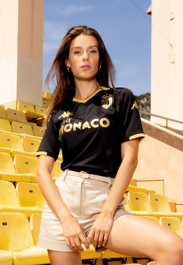
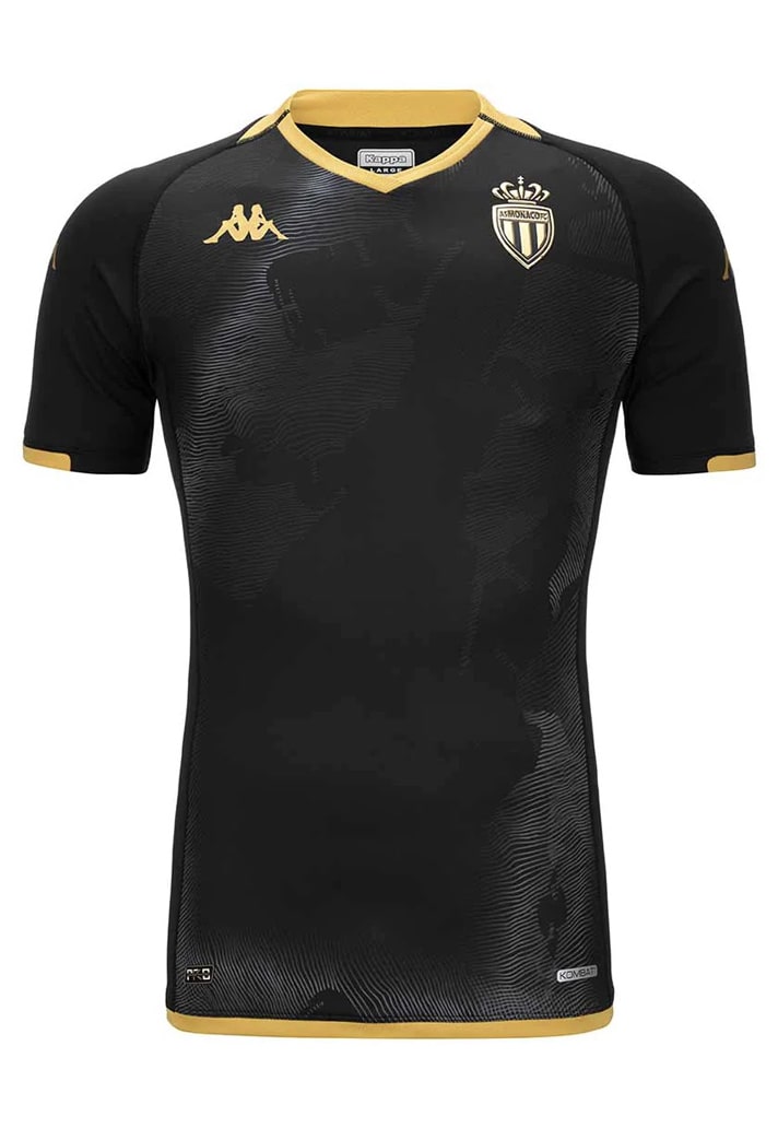
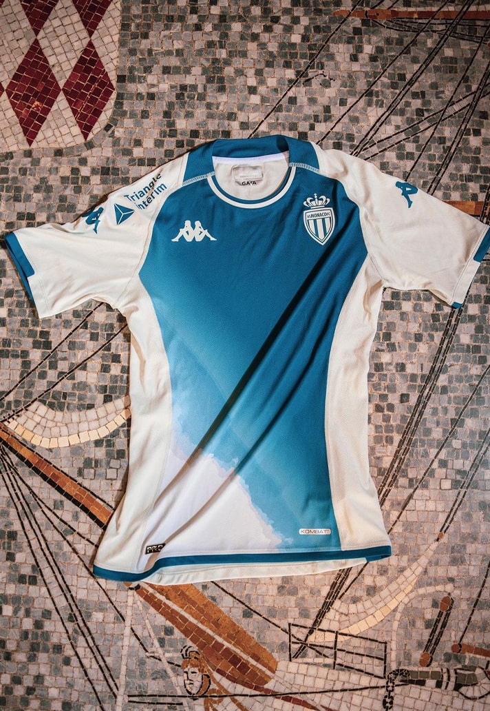
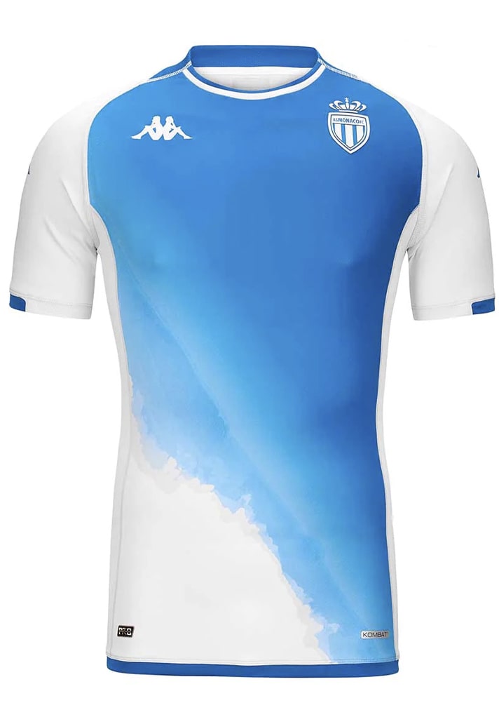
3. AS Monaco
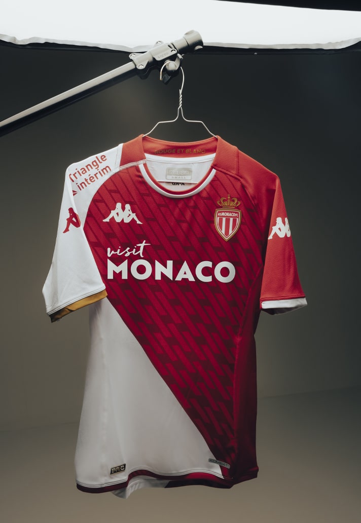
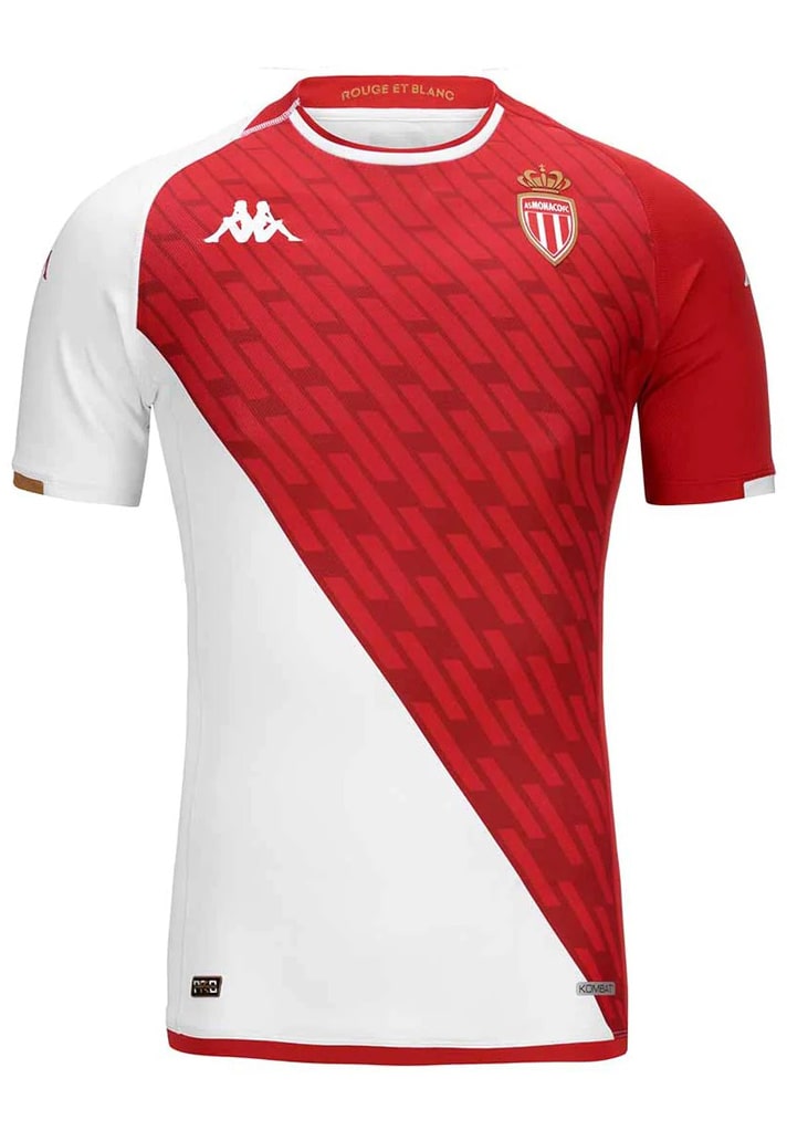
AS Monaco are one of those clubs who almost always look good, helped in large part by that unique diagonal design. For 23/24, Kappa elevated that design through the use of a sublimated graphic in the red section, while a tonal black base for the away was embellished by gold trim. The third shirt then went back to the diagonal of the home, switching out red for blue to symbolise the principality's position on the Mediterranean.
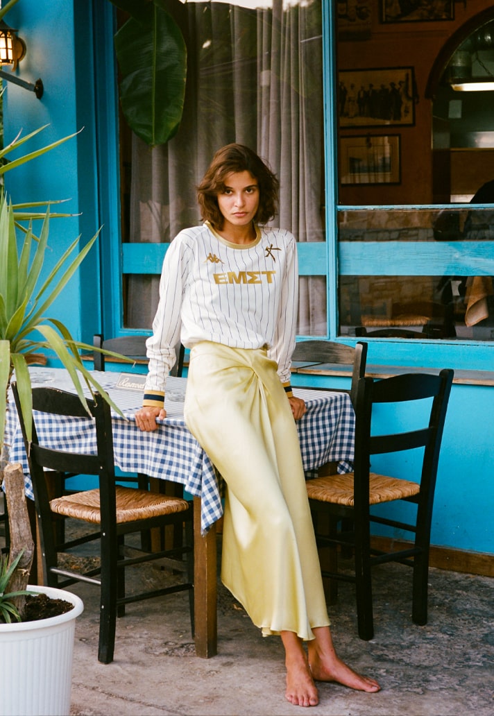
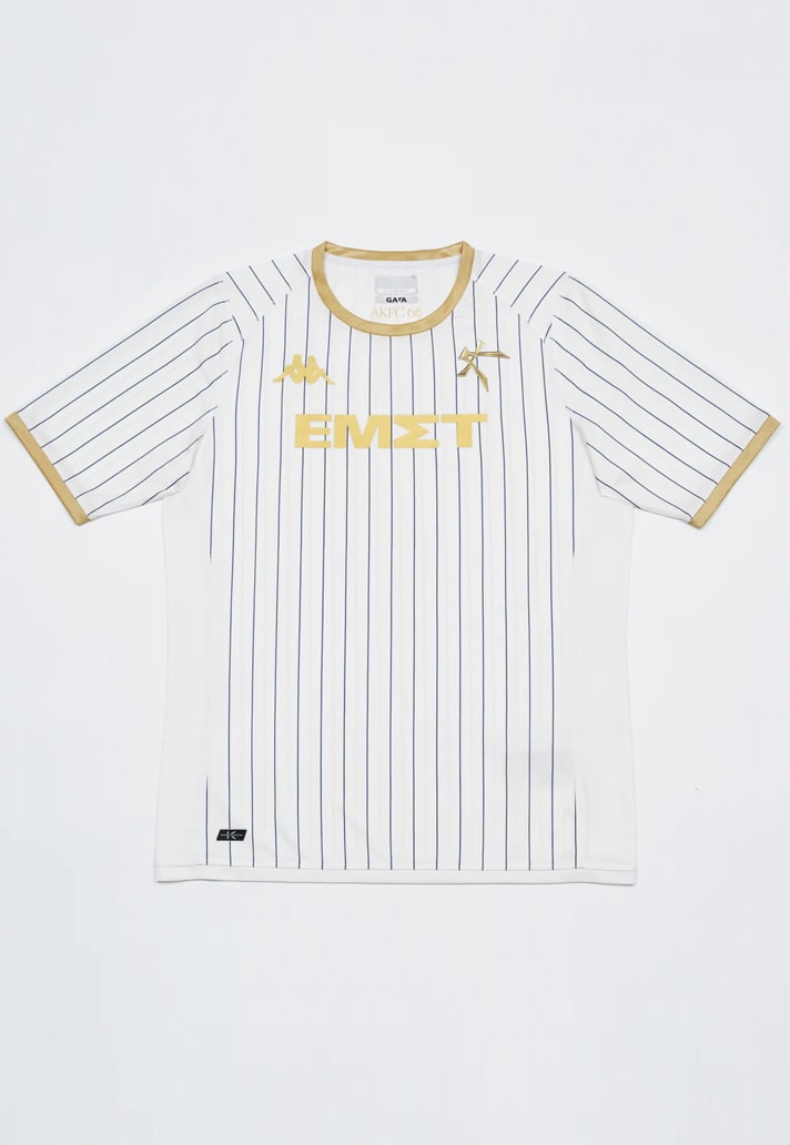
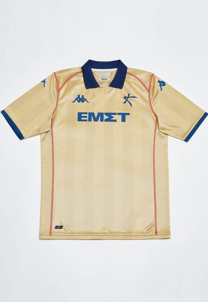
2. Athens Kallithea
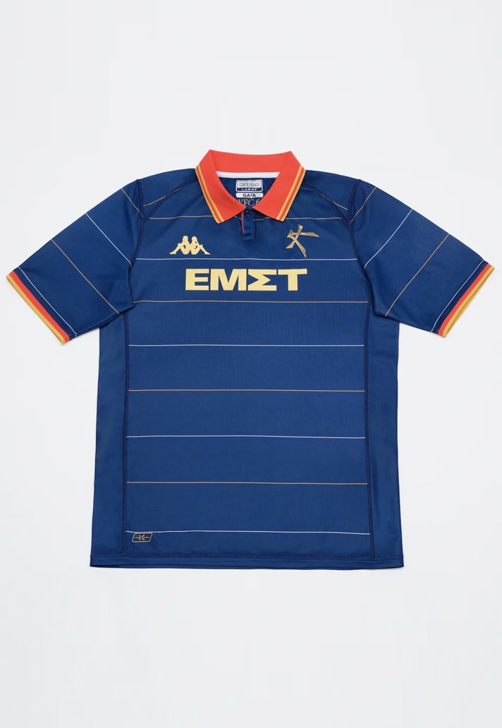
At first arriving as a contemporary to Venezia, Athens Kallithea are now in a strong position to usurp the once reigning monarch of the kit design space, continuing to deftly traverse that football-fashion space. That's once again in example with their latest kit set from Kappa and Bureau Borsche.
The home shirt features a navy base with delicate horizontal pinstripes and a red pop in the polo-style collar, while the away shirt sees an elegant white base overlaid by vertical pinstripes, with golden accents elevating the whole presentation. Finally there's the balls-out third shirt, which arrives in a rich gold shade with blue accompaniments in the collar and cuffs and red stitch lines that altogether instantly bring to mind Arsenal’s 2001/02 away shirt – and that’s no bad thing.

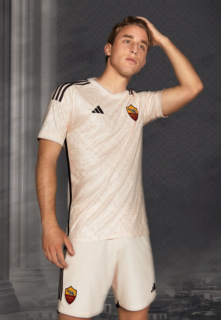
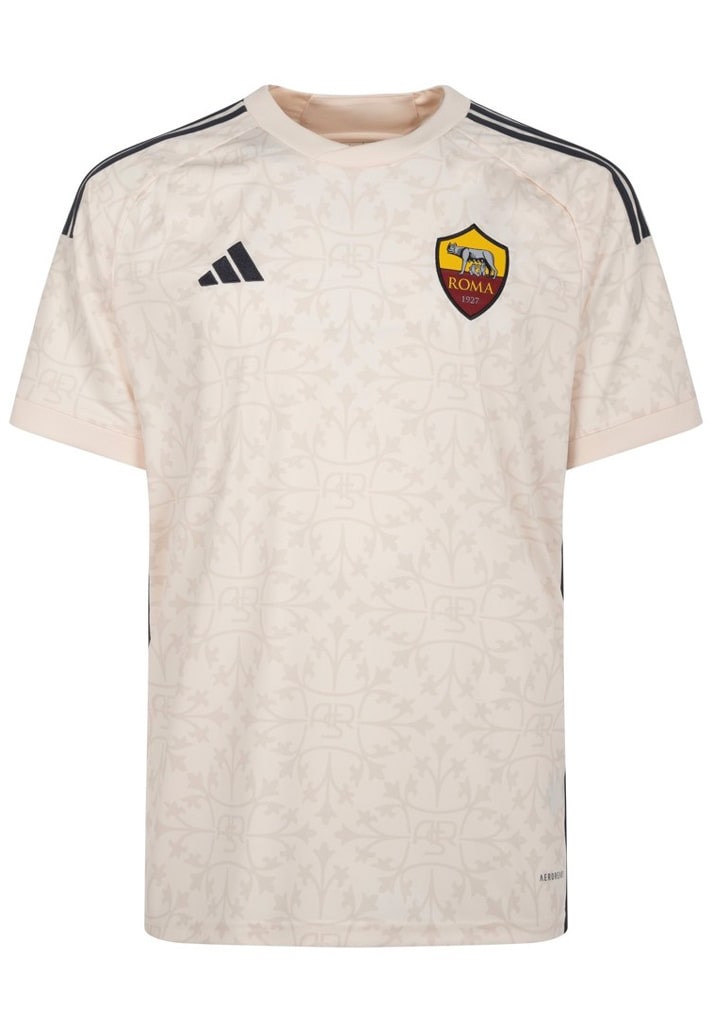
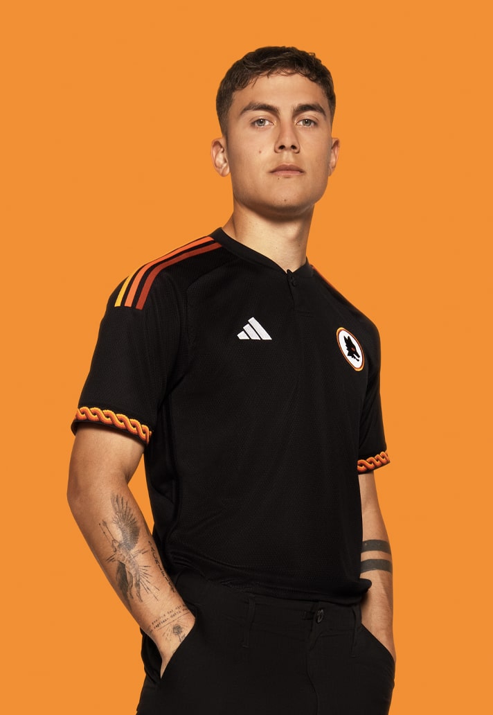
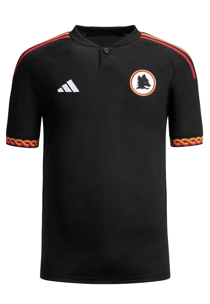
1. AS Roma
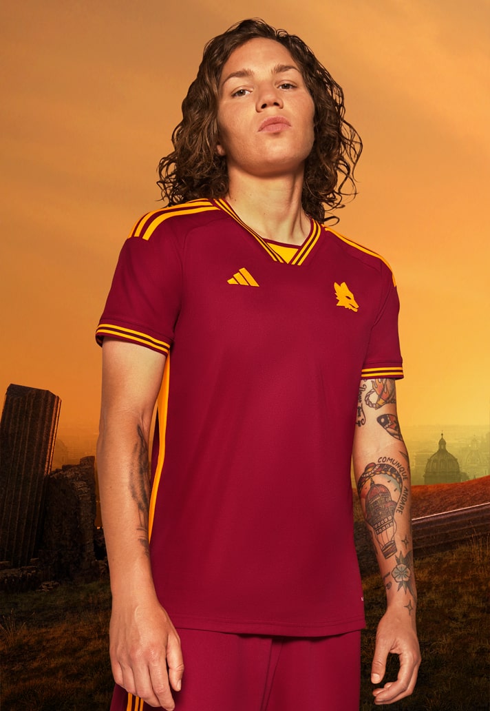
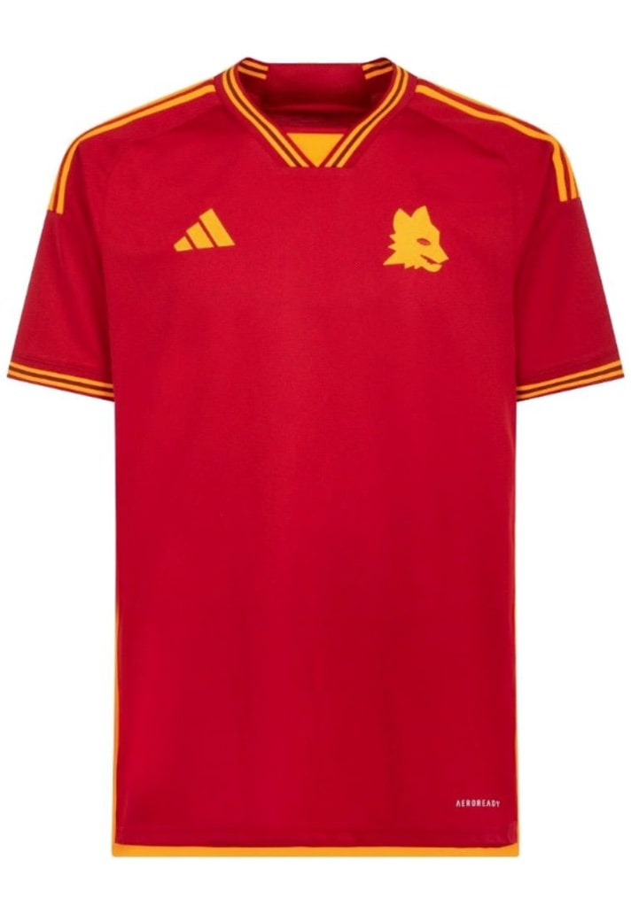
The only fear with AS Roma and adidas's new partnership, which was rekindled this season, is have they peaked to early? For how can you possibly top this set of three? It's sooo good, perfectly balancing the traditions of the side (say hello to that stripped back Lupetto crest on the home shirt) and the thirst for something that transcends the boundaries of the white lines on a football pitch.
All three kits at once provide a modern look whilst also encapsulating Rome’s ancient allure. It's quite the feat, and here, Rome reigns supreme.
Honourable mentions for Genoa, Manchester City and Bari, who all narrowly missed out on a place on this list. Can't fit them all in!
Shop 23/24 season replica at prodirectsport.com/soccer