
With the majority of European leagues getting underway this weekend, we’ve taken the opportunity to pick out our top 10 home shirts of the campaign.
As is well known, home shirt design is a tricky field to navigate; you have to appease the club, being bound by certain traditions and expectations, but you also have to keep things fresh and progressive in what is an ever-changing landscape. It’s therefore not all that often that you get much in the way of groundbreaking designs, but here we’ve picked out what we feel are the strongest home designs of the lot from Europe, striking that perfect balance of tradition and progression. Kappa and Adidas leading the way with a lot of representation from Italy…
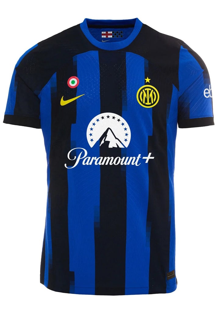
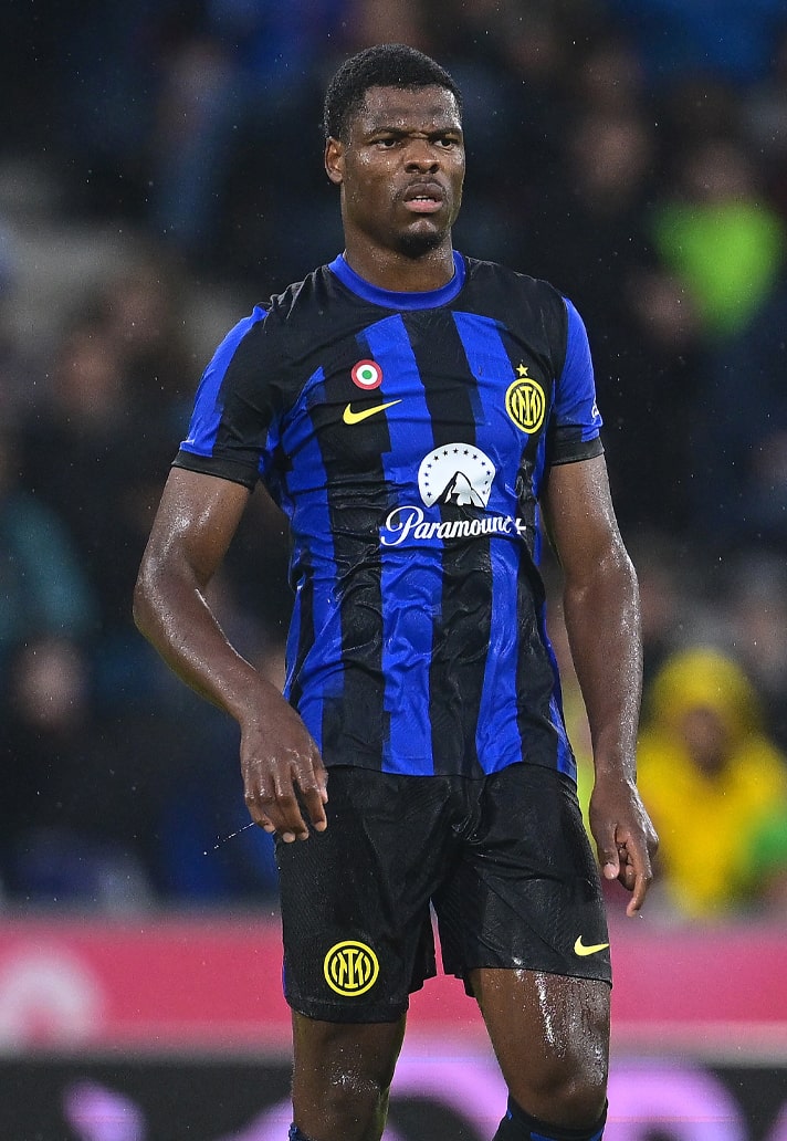
10. Inter Milan
Nike blurring the traditional black and blue lines of the Nerazzurri with a fluid design representing the multiple facets of a club that is constantly evolving. Never sold on the mix up of colours from sponsor to branding and club crest, but it works OK here.
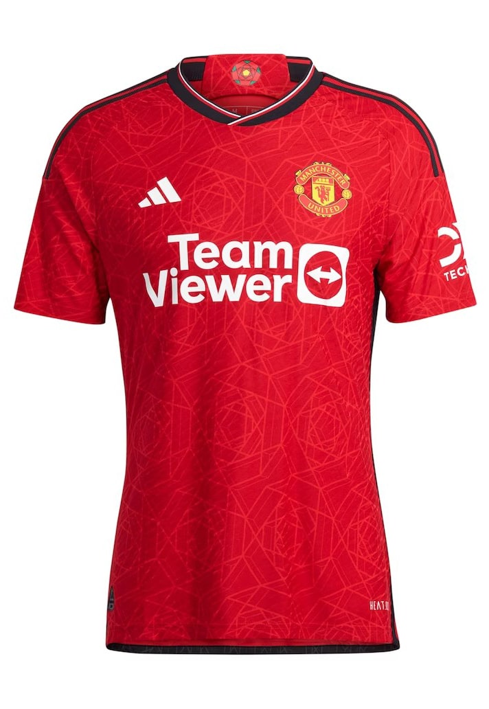

9. Manchester United
Some United fans feel that they're hard done by when it comes to their designs from adidas in the past, with more attention going to other clubs. But the Three Stripes have delivered this season for the Red Devils, with a home design that features the iconic red rose, which appears in a geometric pattern through the body.
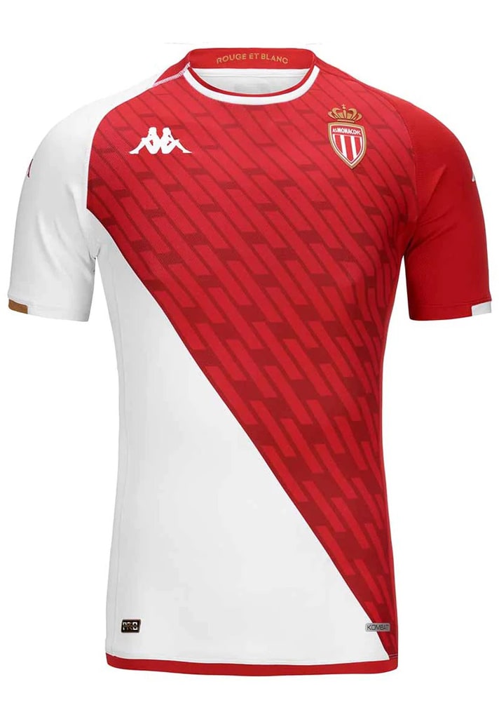

8. AS Monaco
Imagine this beauty being the worst of your kit set! Shows the levels that Kappa have been operating at this season. The 55° Diagonal split of red and white around the whole shirt is joined by a repeating quadrilateral graphic through the red portion, lending the design a greater depth.
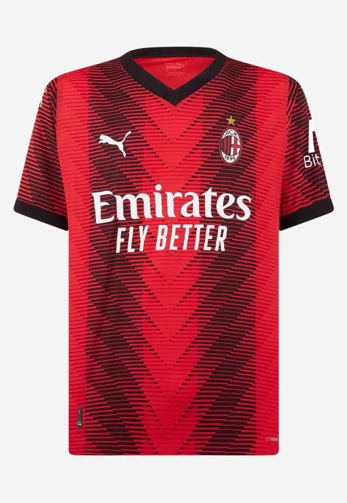

7. AC Milan
The design of the AC Milan home shirt from PUMA brings the club and city of Milan closer than ever, with a new repeat graphic drawn from the letter M blurring the traditional red and black stripes. Double the meaning, double the pleasure.
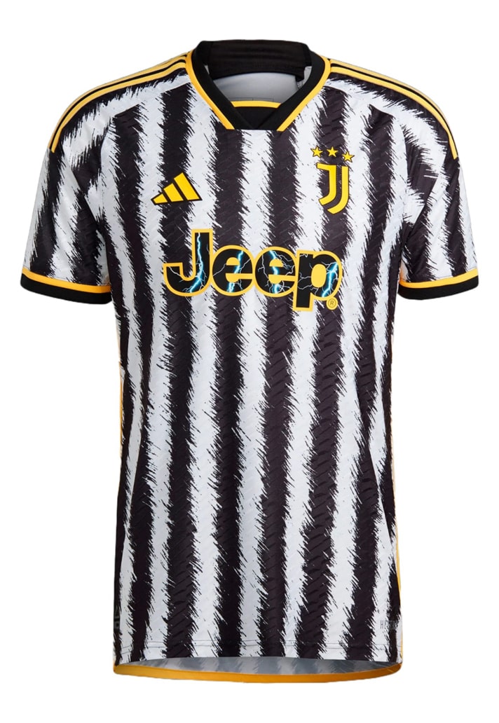
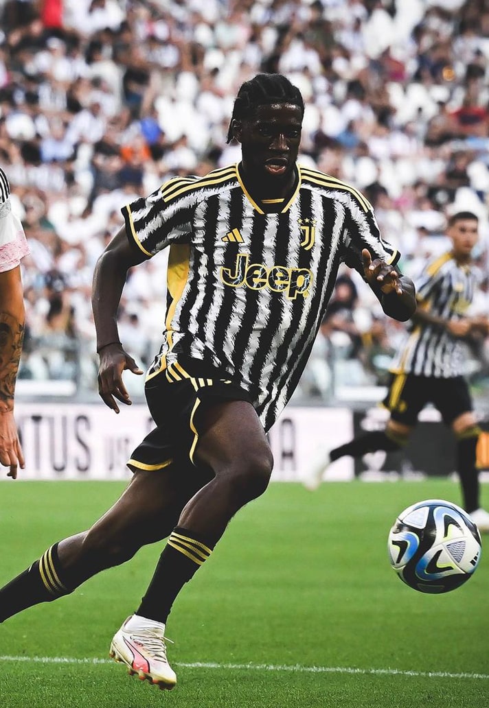
7. Juventus
Weirdly, the Juventus home shirt is quite divisive, but for us it's a great reinvention of the club's classic look, inspired by zebras. OK, that last bit doesn't make it sound great, but this is a shirt that definitely looks better on pitch. Underrated.
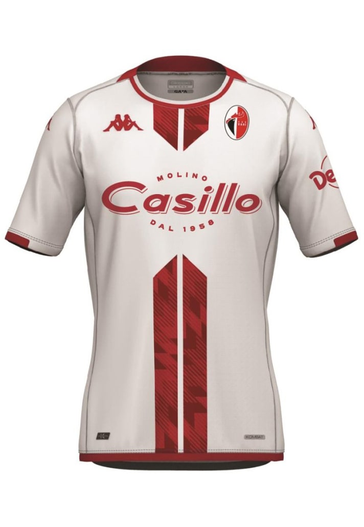

6. SSC Bari
Such a simple design on the face of it, but so effective in its execution. That graphic that runs through the red stripes also carries across to the away shirt, which is a nice bit of continuity. But we're here for the home shirt, and it's a rare example of a sponsor aiding the overall aesthetic.
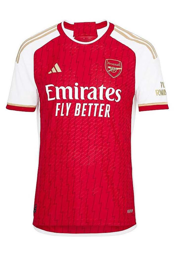

5. Arsenal
Arsenal have been blessed once again by adidas, who continue the run of releasing brilliant takes on the Gunners' home shirt (the away shirt may be a tad more divisive!). Sure, the inclusion of gold may have been a tad premature after they let the Premier League slide, but it's a lovely accent colour here.
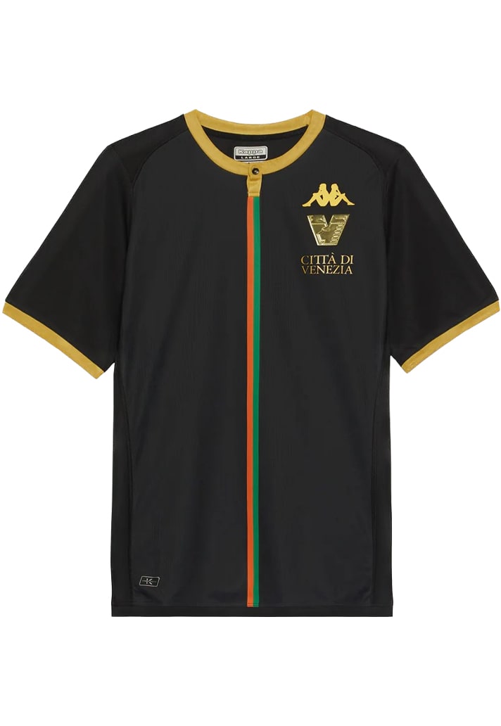

4. Venezia
Some will love it, some not so much, but for us the Venezia home shirt continues in the trailblazing trend that's been a hallmark of the club in recent seasons. Look around, you won't find anything else like this.
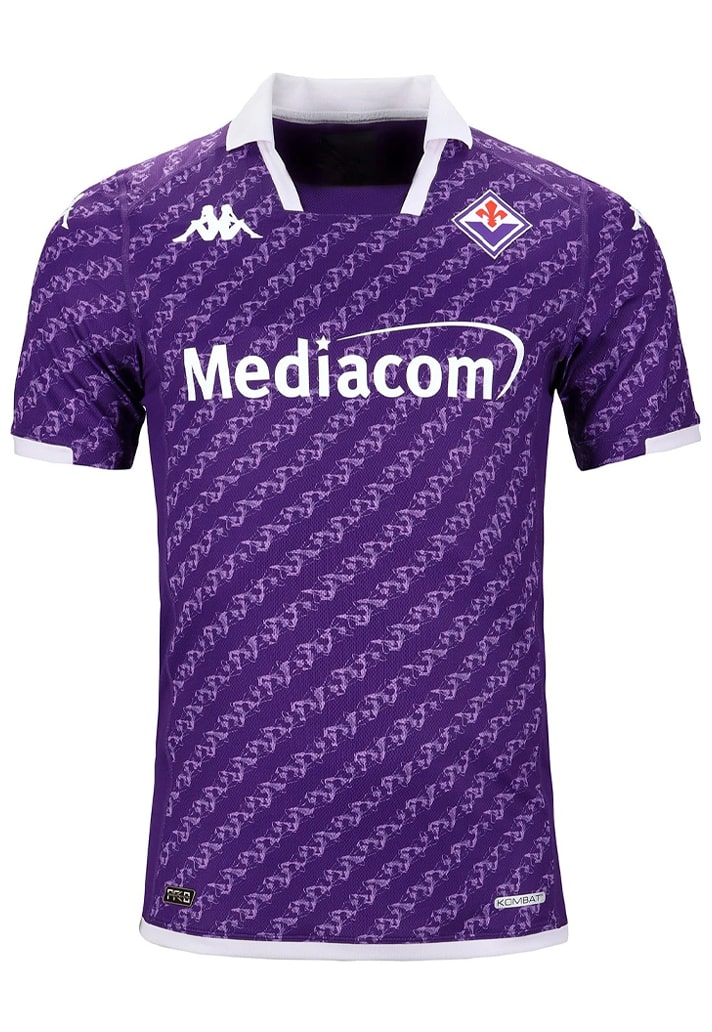
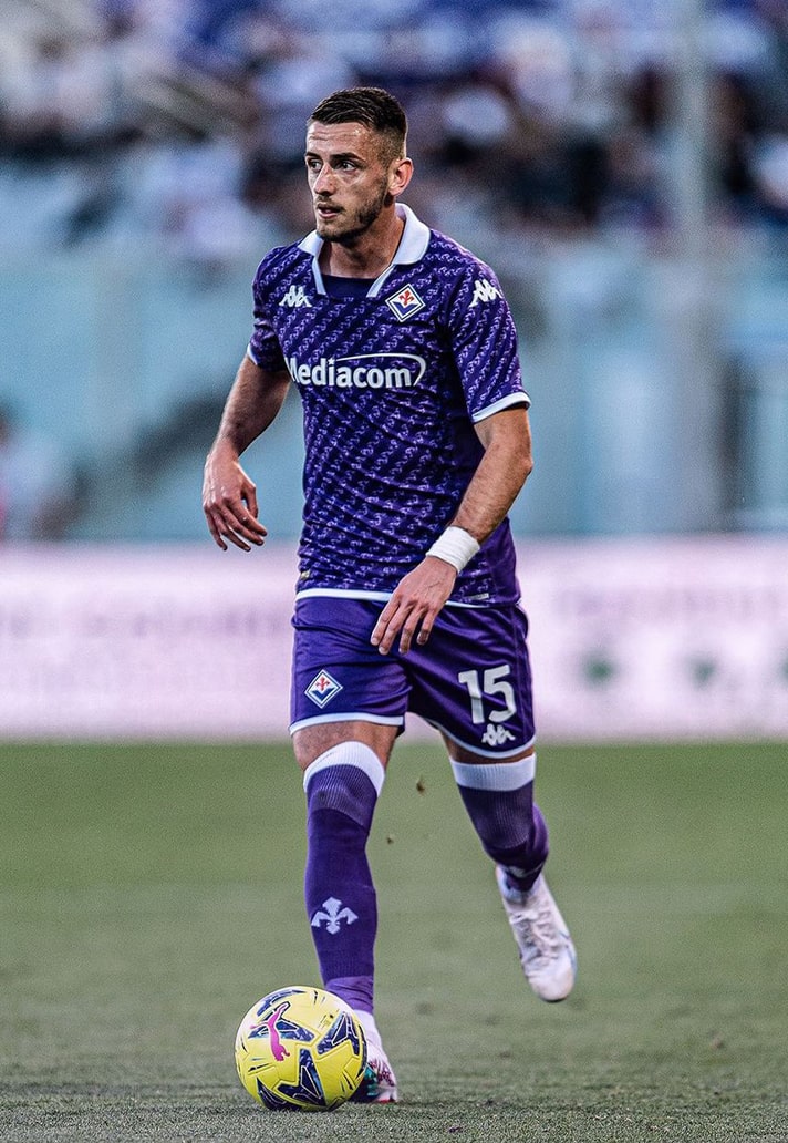
2. Fiorentina
Few home kits in the world of football hit quite as hard as the purple hues of Fiorentina, and to keep it fresh Kappa turned to lilies, the quintessential symbol of the city of Florence and Fiorentina as a club since it was founded, with an all-over graphic running throughout, topped off by a white collar.
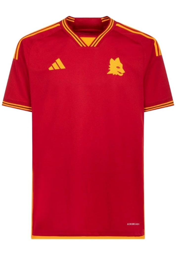

1. Roma
Was it ever going to be anything else? Roma and adidas got the latest stint of their partnership underway with this absolutely sublime effort, simplifying the whole kit, from the crest out, to provide plenty of retro feels.
Honourable mentions for Real Madrid, Crystal Palace, SCU Torreense, Athens Kalithea (not yet properly released, otherwise a shoe-in).
Shop 23/24 replica at prodirectsport.com/soccer


