Manchester City are champions of England once more, and now attention turns to the next campaign, with teams starting to release their new kits for 23/24, and we’re rounding them all up as and when they get released.
With 20 teams releasing two, three or sometimes even four kits a season, it can be hard to keep up. But to help out on that front, we’re rounding them all up in one place as and when they drop, giving you a look at what teams will be wearing both at home and on the road in the 23/24 season.
ARSENAL
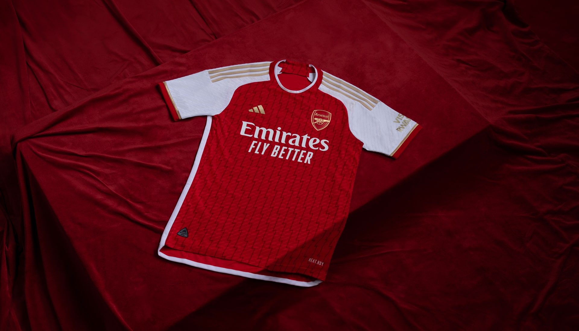
Home
A design that's said to celebrate the 20th anniversary of the 2003/04 ‘Invincible’ season, the Arsenal home shirt is yet another example of adidas consistently delivering for the Gunners. The less said about the gold trim being in place because everyone thought Arsenal were going to win the Premier League before falling short, the better.
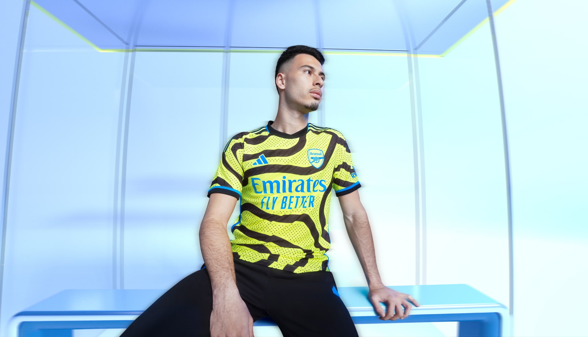
Away
Celebrating the club’s Islington roots, the shock-yellow base of the Arsenal away shirt features fluid black lines inspired by the map of Islington. Might be a grower. Might not.
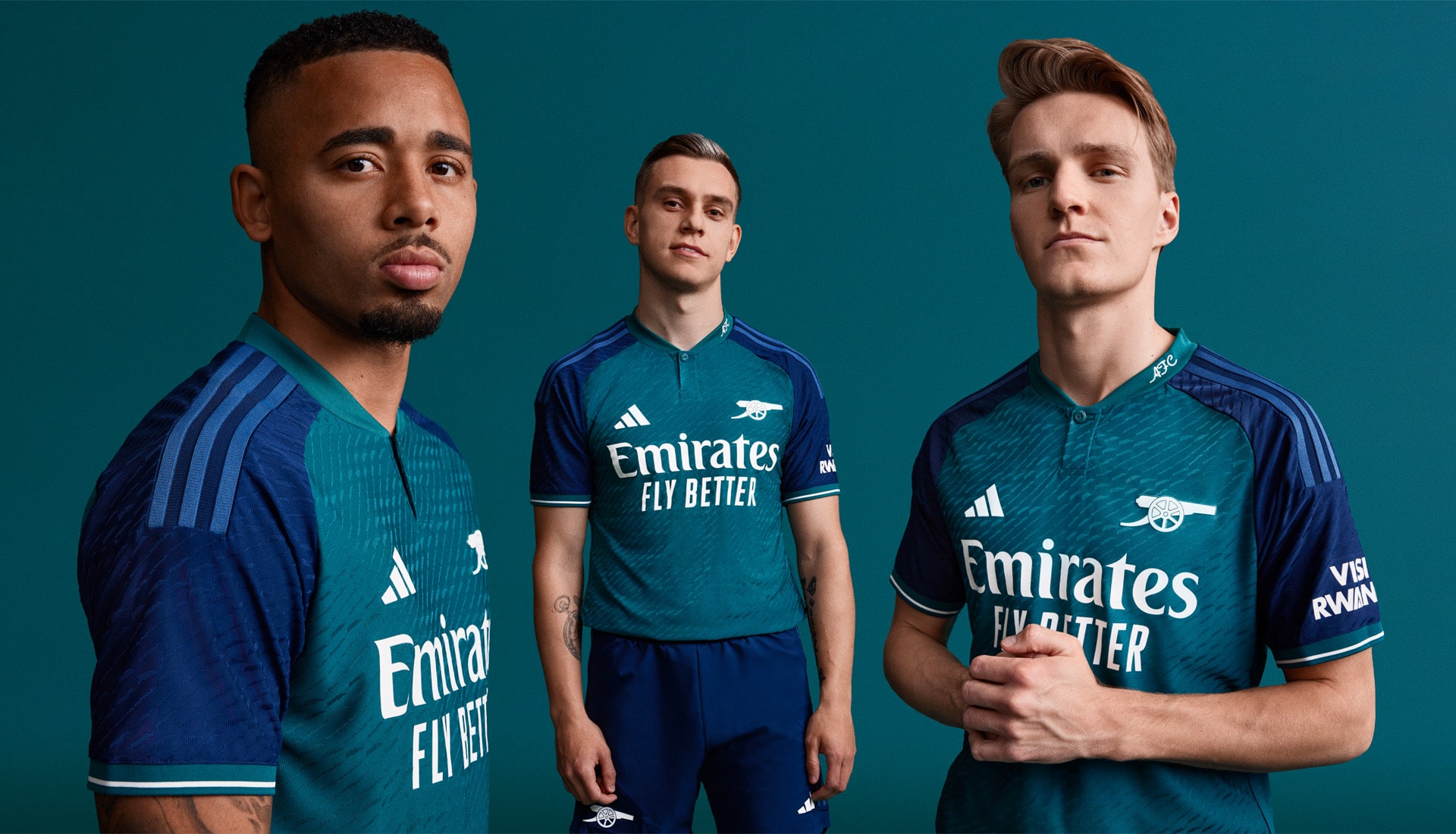
Third
Taking more than a dose of inspiration from the 1982/83 away shirt from Umbro, the Arsenal third shirt virtually recreates that look, right down to the simplified cannon crest, in use for the third season in a row.
ASTON VILLA
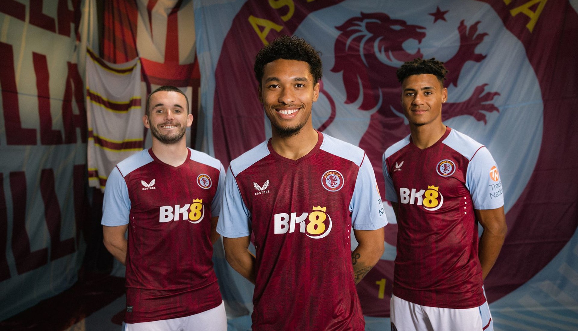
Home
The second Aston Villa home shirt from Castore, and the first to feature the club's redesigned crest, it also boasts a subtle print of soundwaves taken from fans singing the ‘Allez, Allez, Allez’ chant at Villa Park.
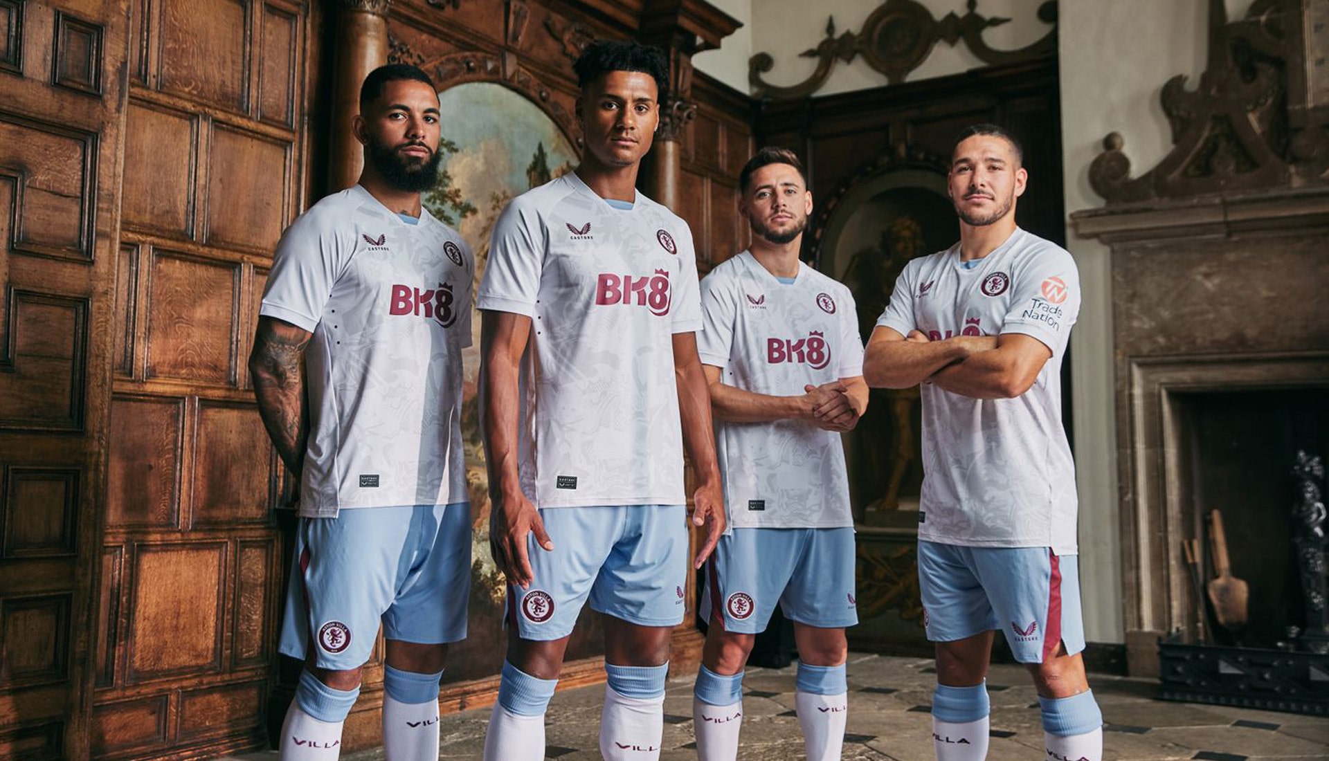
Away
A unique design that showcases the lions that have represented Aston Villa throughout its existence, the new away shirt is a visual timeline print that tells the story of the club’s proud journey since its foundation in 1874.
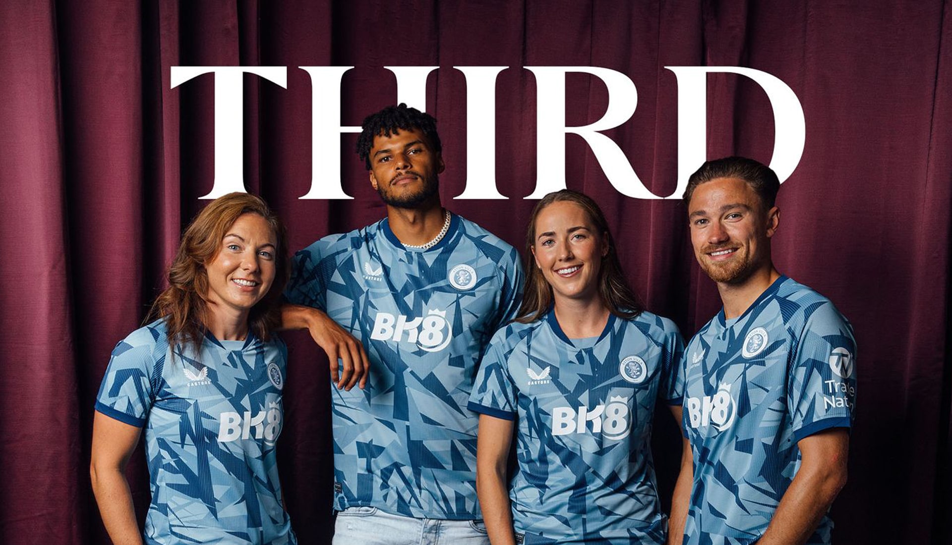
Third
The Villa third shirt design is a blend of contemporary graphic trends for a fresh new kit – featuring stylised v-neck collar construction, off-shoulder contrast piping, underarm and side body mesh panels with a raglan sleeve design.
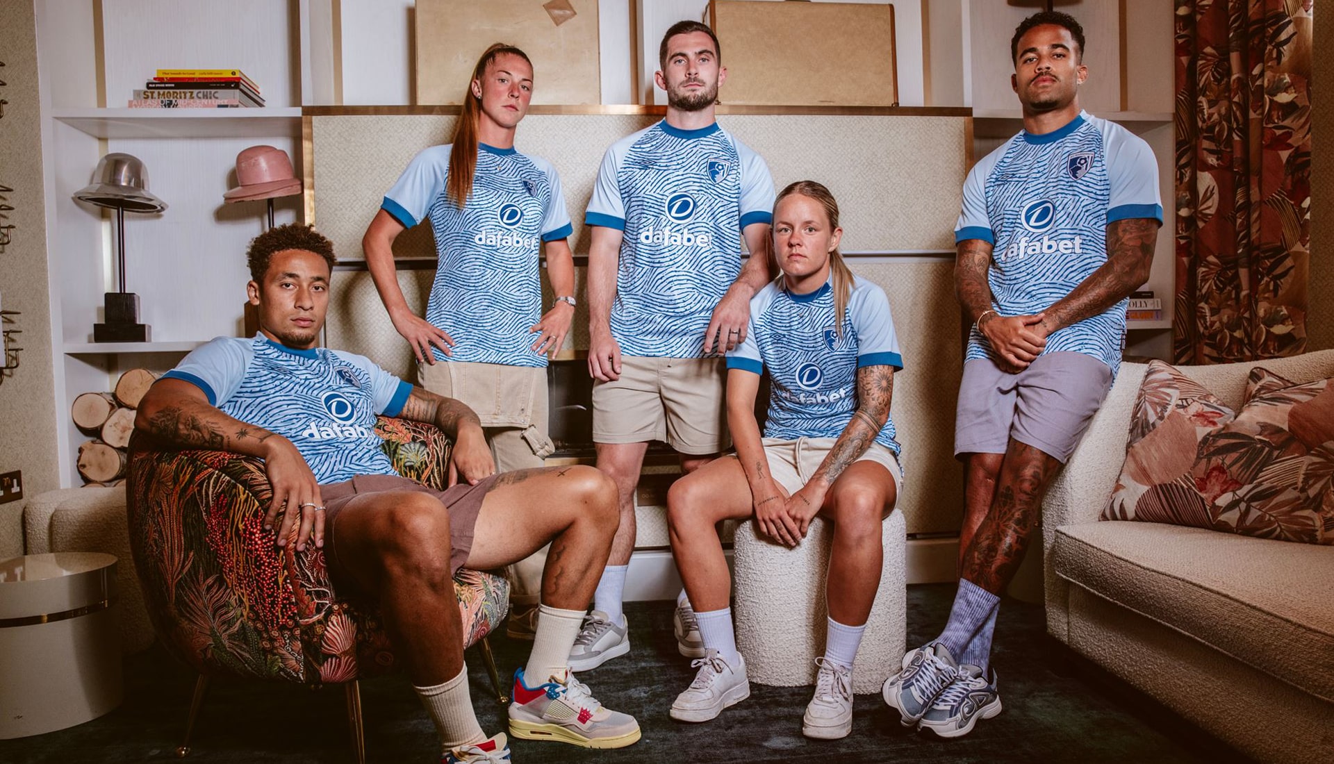
BOURNEMOUTH
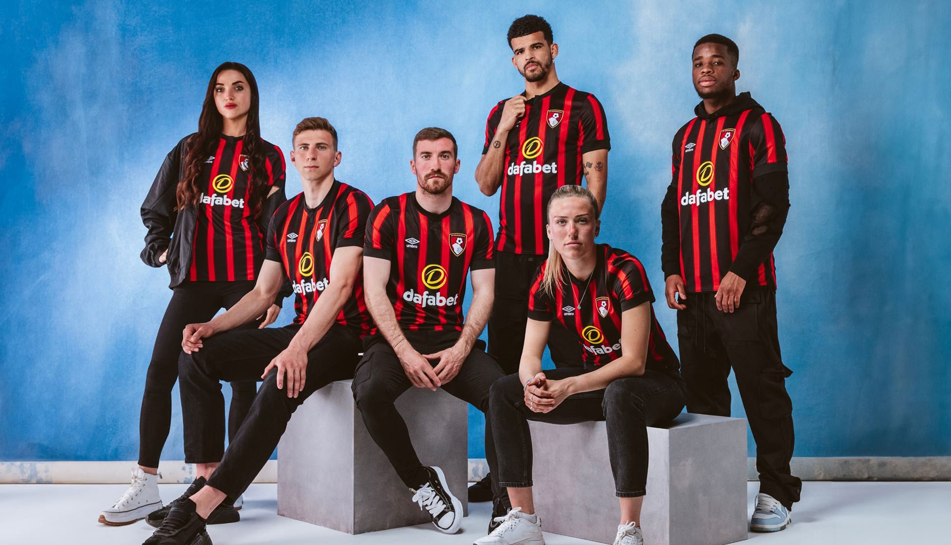
Home
Following last season's lightning bolt design, Bournemouth move back to something a little more traditional. The black stripes have been thickened up a bit, with the red obviously giving ground, but it makes for a nice Rossoneri-esque look that we're all for. Still that pesky sponsor holding the whole thing back though...
Away
Inspired by the waves synonymous with the south coast, the Bournemouth features an omphalodes blue base with stylish celestial and dark blue design and trimming.
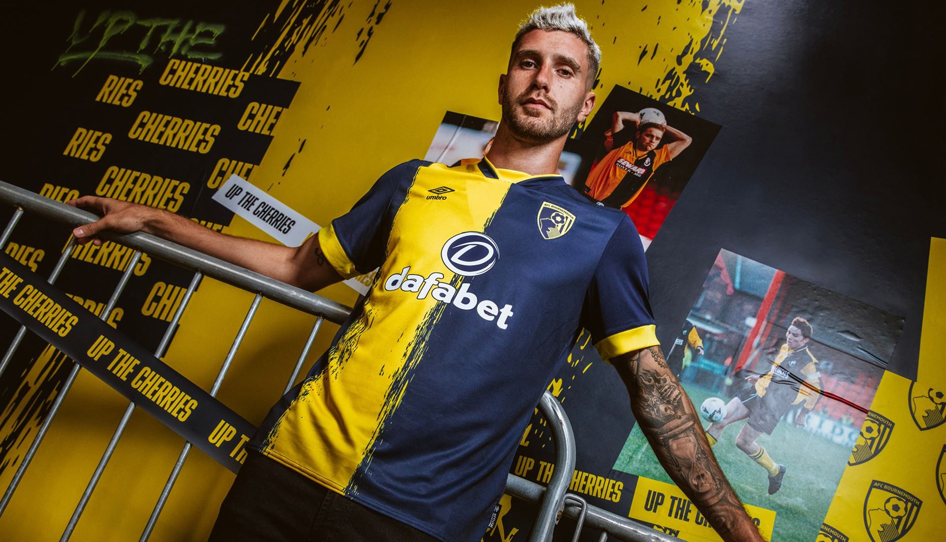
Third
Taking inspiration from the 1996/98 cult classic, which was worn by the likes of Ian Cox, Matt Holland and Steve Fletcher, the Bournemouth third shirt sees a return of the yellow and navy split, reworked through a merging graphic.
BRENTFORD
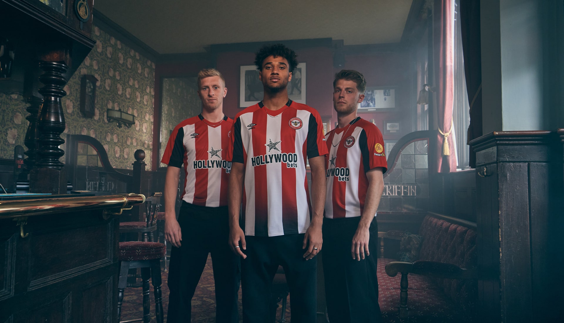
Home
Brentford's new home shirt from Umbro continues a trend the club has set over the last few years, in that it will be worn for both the 2023/24 and 24/25 seasons. The design incorporates the club’s ‘bee sting’ graphic with a red to black fade, that also features on the shorts. There is a stronger presence of black in this year’s jersey creating a bold Brentford look.
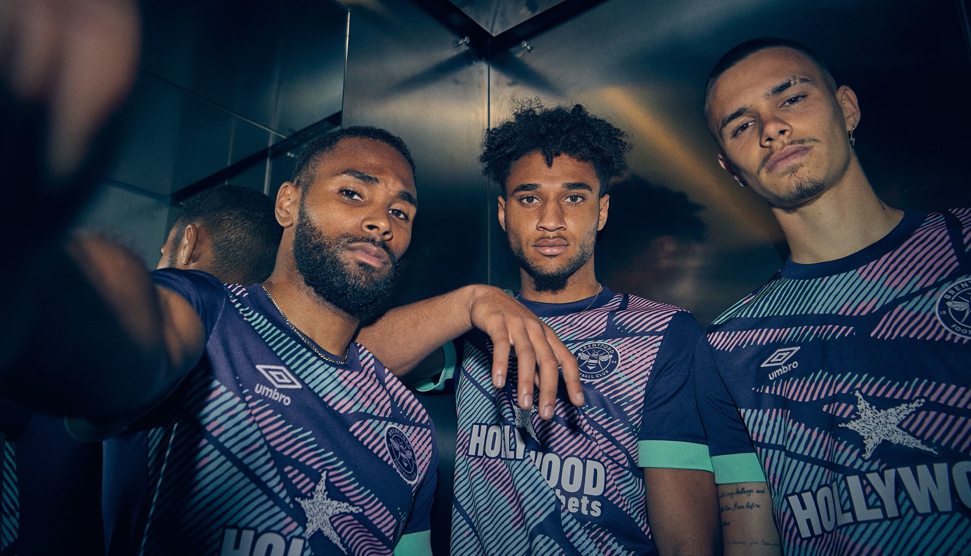
Third
So, with Brentford commendably rolling over their away shirt from last season, as they will do next season with this season's home shirt, we then get a third shirt to round out the Bees wardrobe. And speaking of bees, the Umbro-produced kit features a bold and bright design illustrating a close-up of the wing of a bee.
BRIGHTON & HOVE ALBION
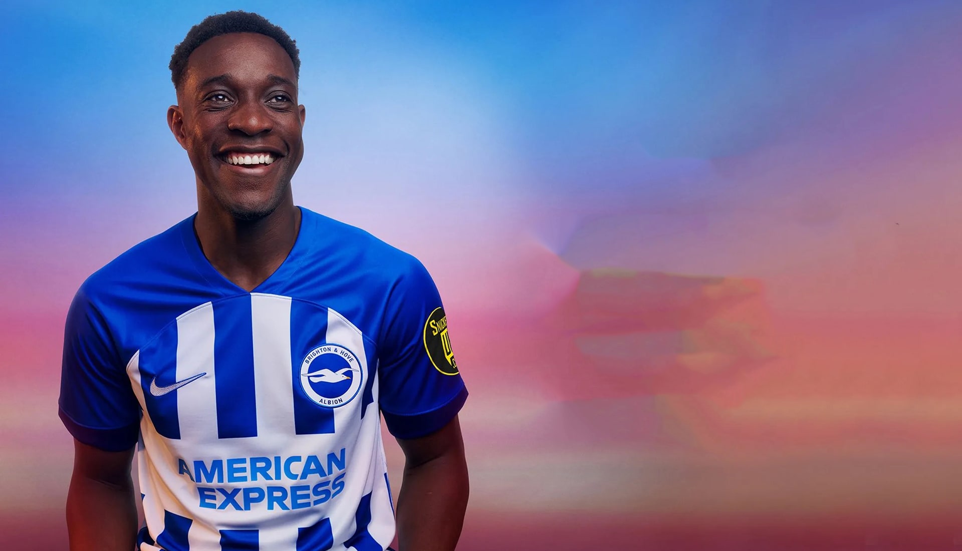
Home
Ready for the adventure of European football, the Brighton home shirt is pretty unmistakably Brighton... not much more to say about it than that really.
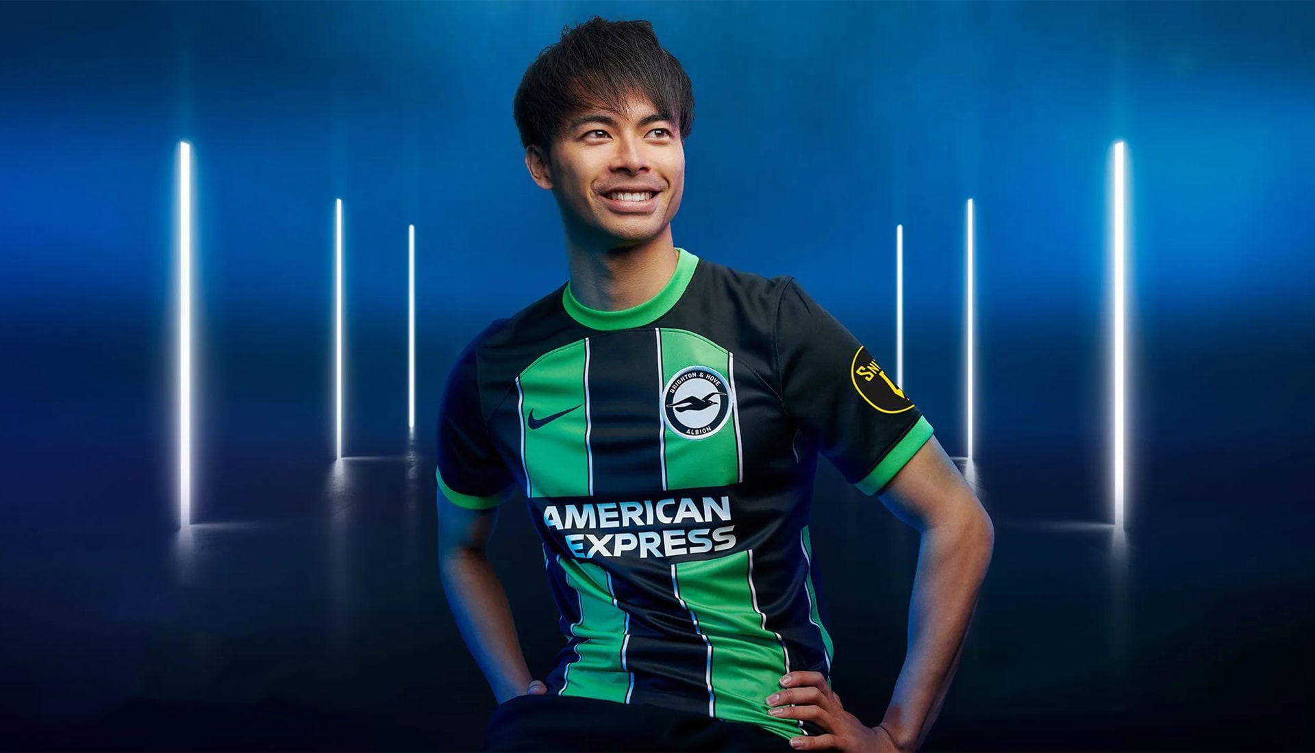
Away
Ten years on since the popular green and black striped away kit, it’s back with an upgrade. Arriving ahead of the home shirt, the away features bold black and green stripes with white pinstripe detailing.
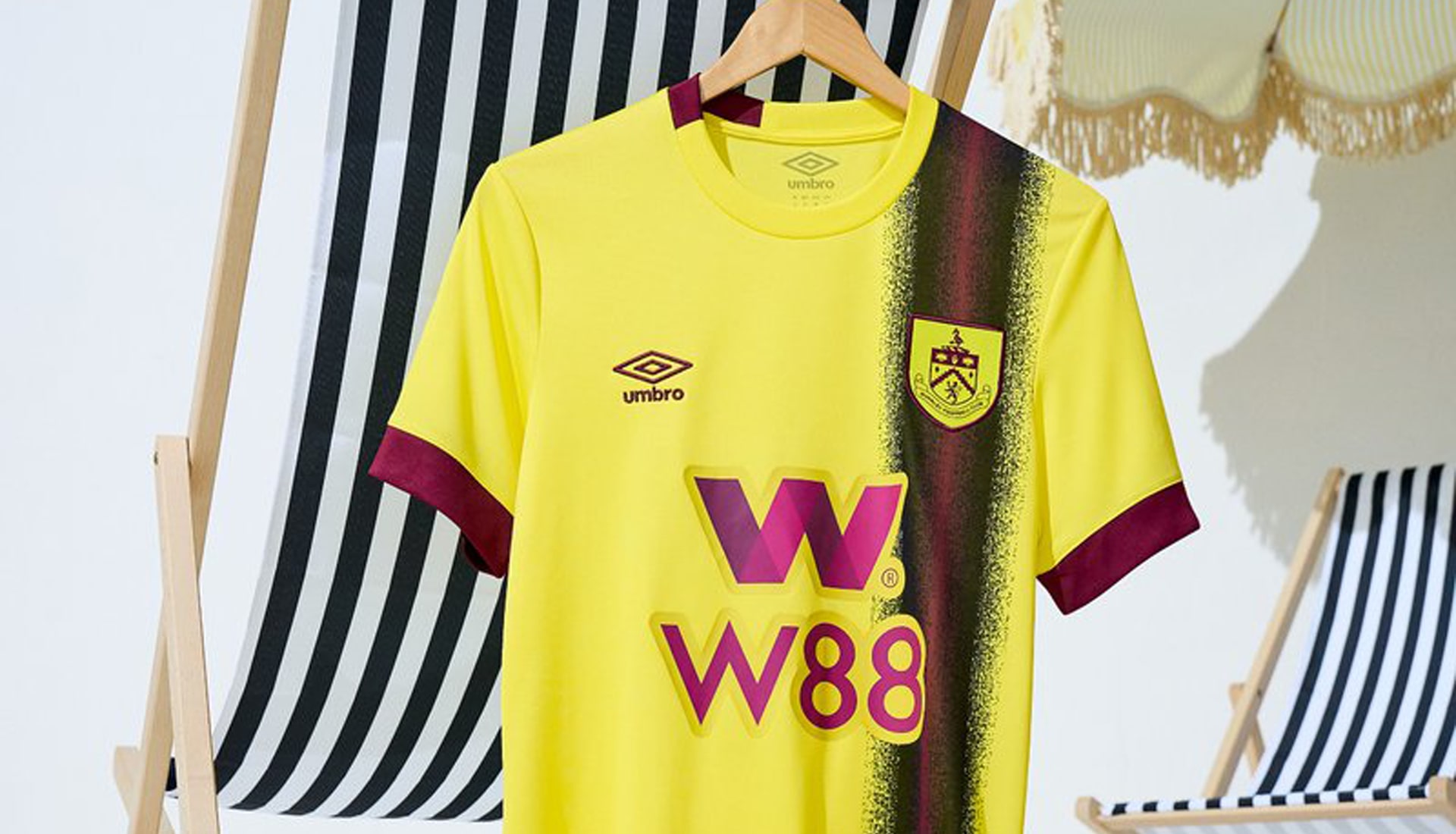
BURNLEY
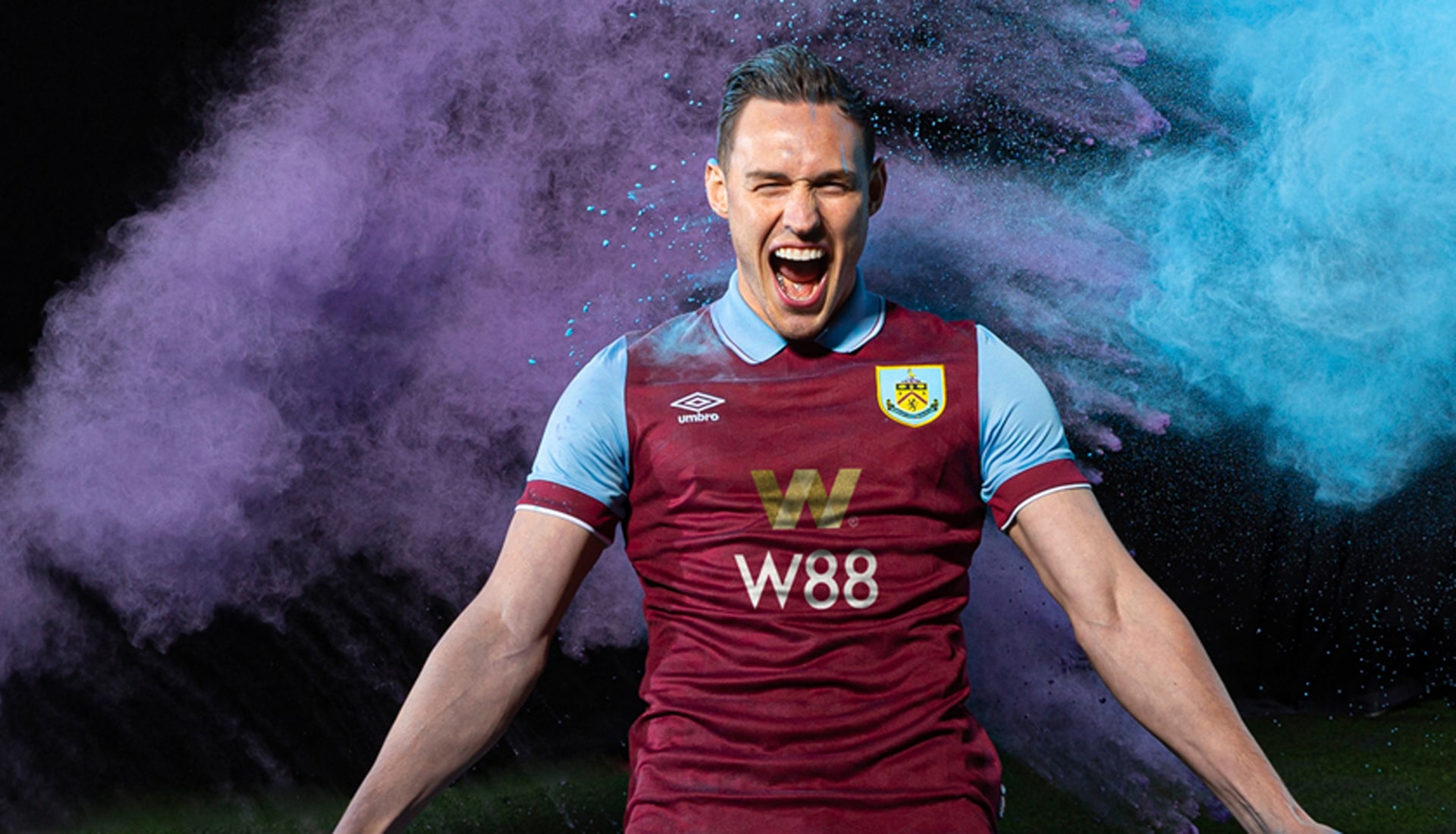
Home
Back in the big time, the key theme of Burnley's new home kit is respecting the old but embracing the new, with a design inspired by the 1994 home shirt. It sees the return of a classic collar in what is a very traditional design. No nonsense here.
Away
For the Burnley away shirt, Umbro revise the fan-favourite 1994 kit, with the yellow base playing host to an off-centre claret stripe that's bordered in black. Claret then finishes the design on the collar and cuffs. Not sure why the sponsor logo then has to be a slightly different shade of claret – jarring.
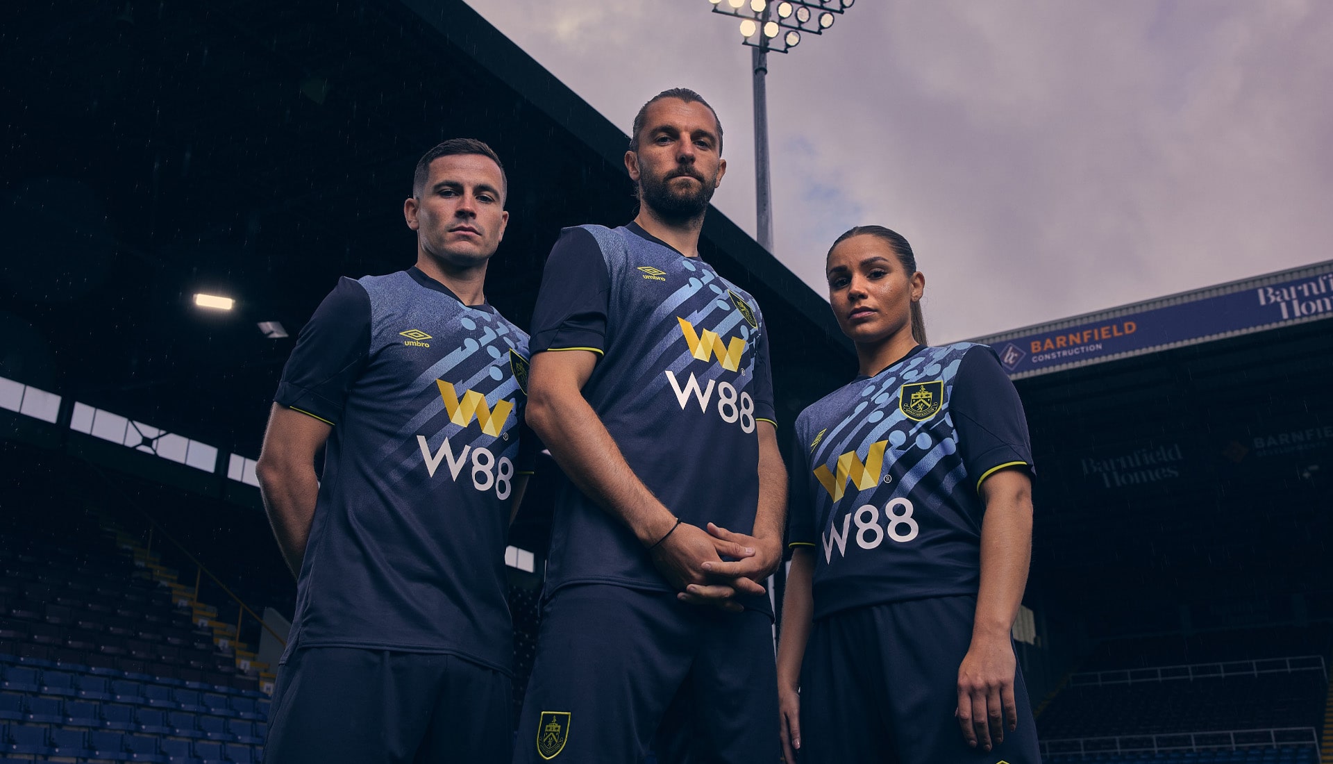
Third
Inspired by the iconic floodlights at Turf Moor, the design of the Clarets third shirt features a special graphic centred around the club crest and stretching out across the front. Yellow accents then pop on the otherwise dark design.
CHELSEA
Home
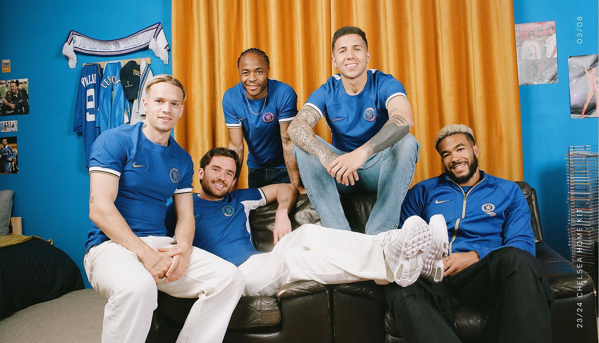
Taking a touch of inspiration from the 97/98 wardrobe, the Chelsea home shirt sees the inclusion of white panels under the arms, lifted straight from the aforementioned design, along with an iridescent club crest. The lack of sponsor leaves this one feeling a little incomplete on reveal... sponsor could make or break it.
Away
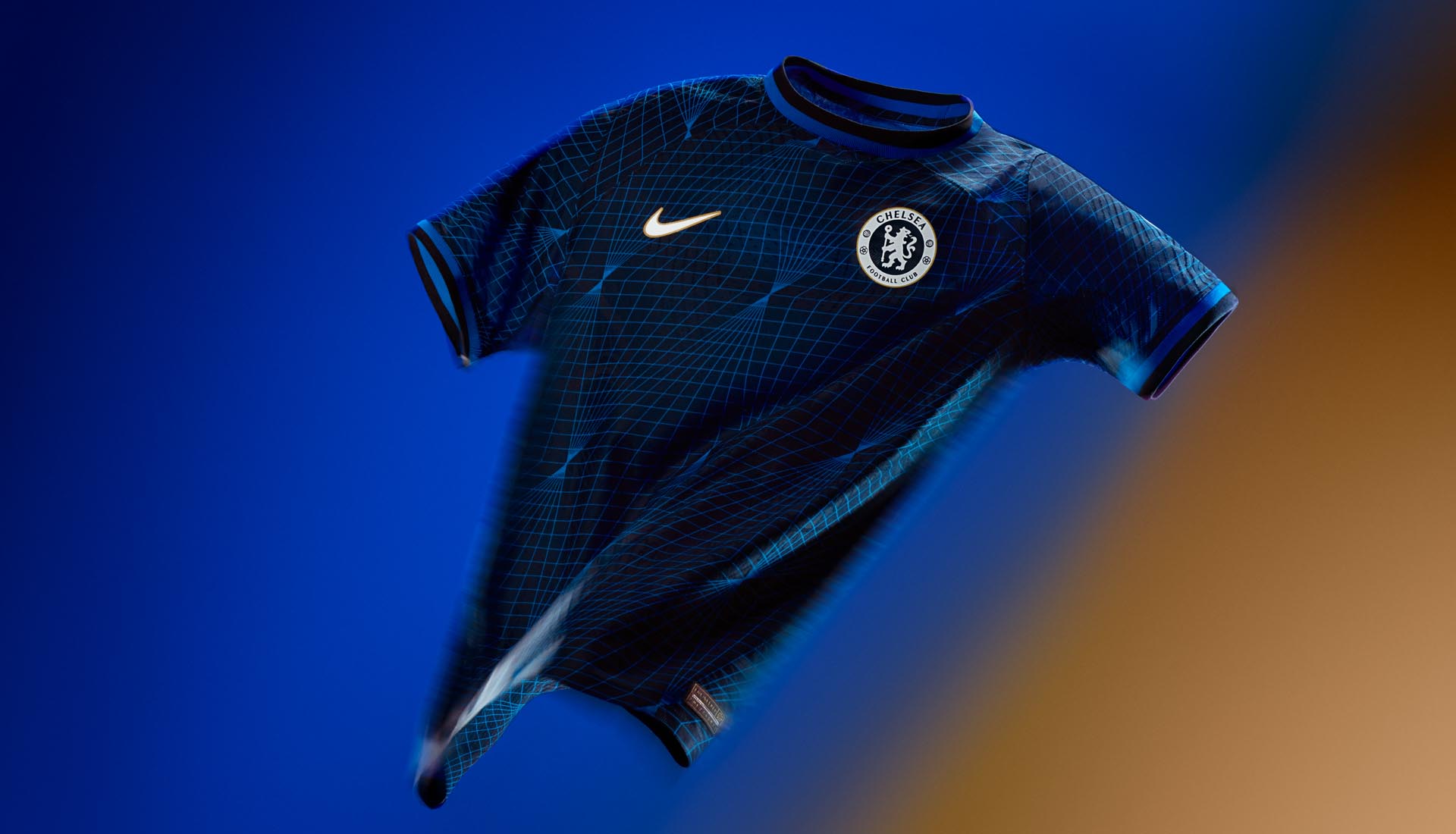
With contrasting pitch blue and soar shades, the diamond geometric patterning on the Chelsea away shirt is inspired by the club's heritage ‘90s kits and the glamour of the King’s Road but brings an aesthetic that does not shy away from the cutting edge.
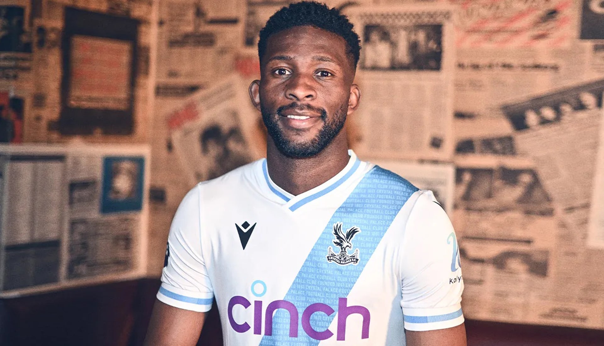
CRYSTAL PALACE
Home
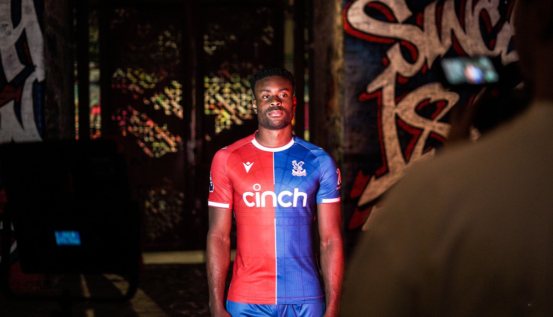
The Palace home shirt is made of a 50/50 red and blue split to celebrate the 10 year anniversary of their promotion to the Premier League. It also features a subtle sublimated silhouette of the original Crystal Palace, where the club was founded in 1861 and played from 1862. Nice touch.
Away
Palace's away kit is an eye-catching amalgamation of the club’s history and its ever-popular sash design from the 1970s, with the main colours – sky blue and white - harking back to the club’s origins from 1861. Contained within the sash are the words ‘Crystal Palace Football Club Founded 1861’, repeated over and over.
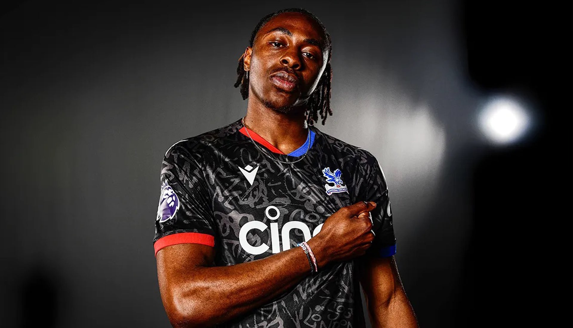
Third
The Palace third shirt features south London-inspired graffiti prominently, with dye-sub graphics containing the words ‘SOUTH LONDON & PROUD’ amalgamated with street-art designs to represent the club’s SE25 roots. The shirt is trimmed in red on its right-hand side, and blue on its left, with these colours also appearing on the sleeve cuff and sides.
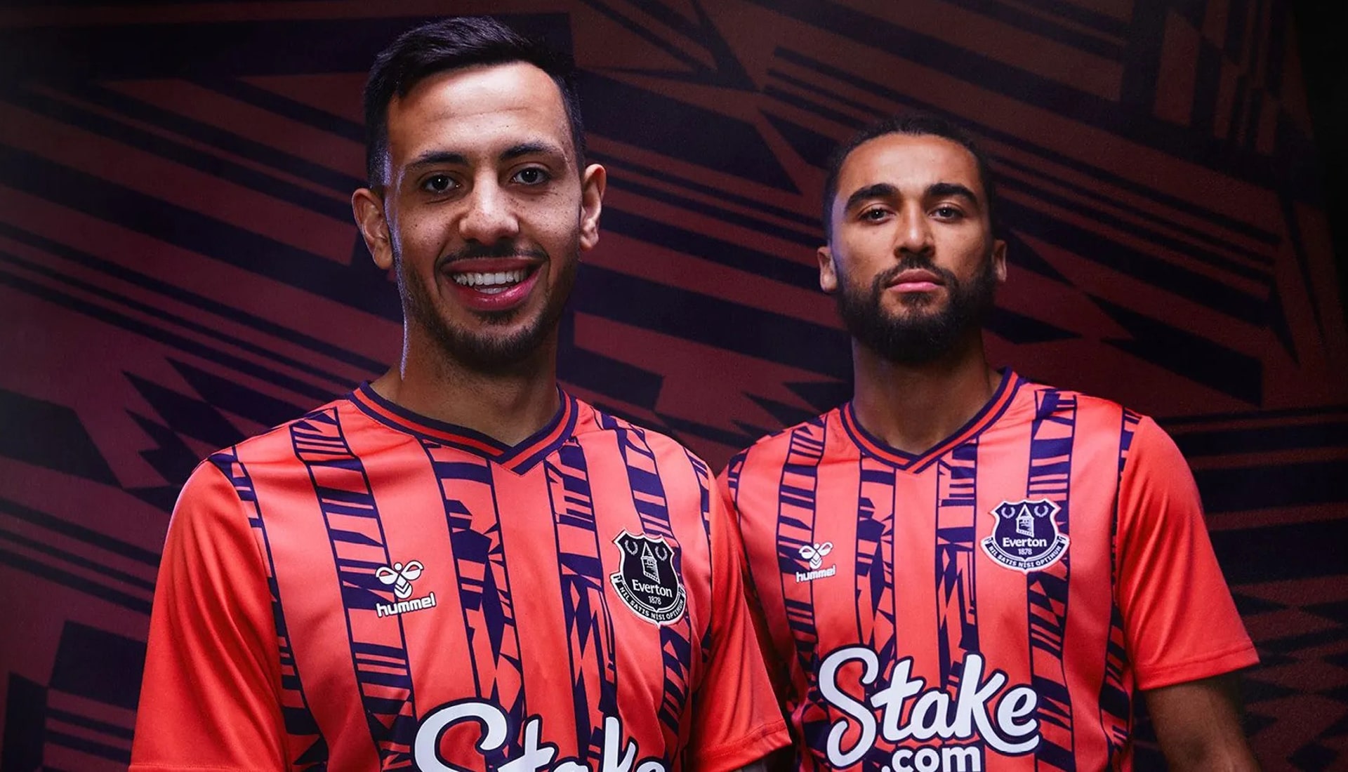
EVERTON
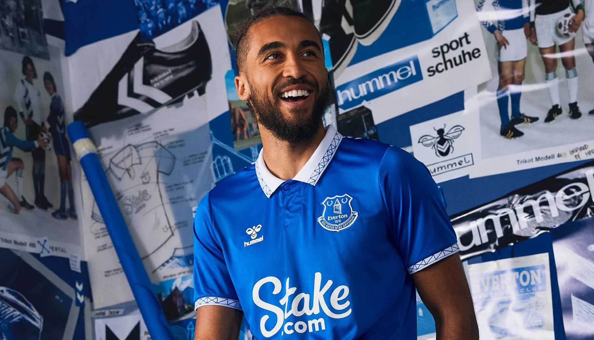
Home
For the first time in a decade, an Everton home shirt will feature a collar. And what a collar! It features a design that pays homage to Goodison’s famous Archibald Leitch pattern on its trim, and is repeated on the sleeve cuffs, perfectly framing the shirt.
Away
Rewinding back to the 90s, the coral and navy Everton away shirt takes its colour scheme and vertical stripes from the away kit worn by the Club from 1992 to 1994, while the change strip of the following two years – 1994 to 1996 – provides the inspiration for its bold, striking pattern.
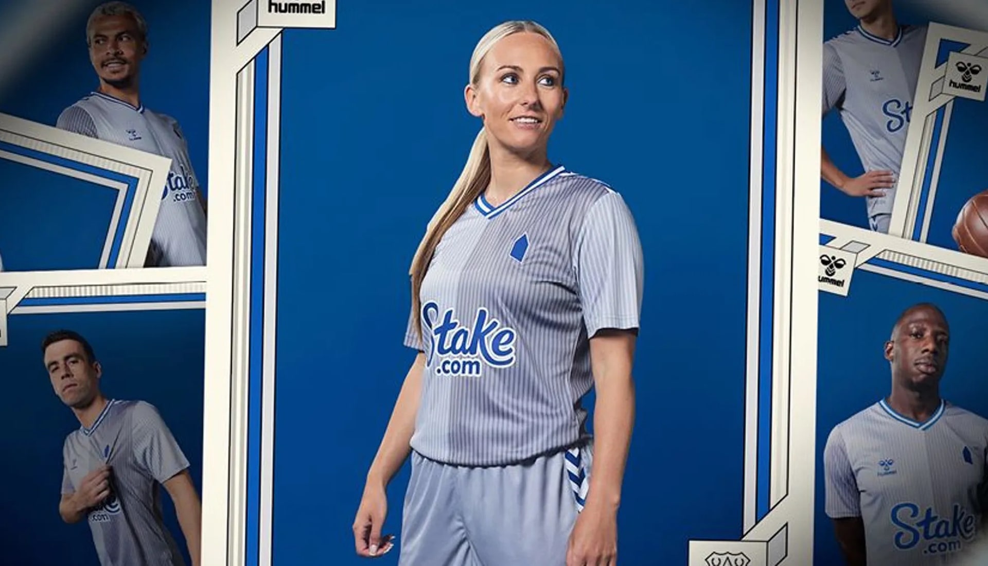
Third
Another hummel shirt inspired by the Denmark national team's 1986 World Cup design. It's Everton's first grey strip since 2017/18, and the pinstriped shirt provides a striking contrast between ultimate and neutral grey tones, a white base palate, and the traditional Everton blue, which is accentuated in key features, including the stylish V neckline and modernised shoulder chevrons.
FULHAM
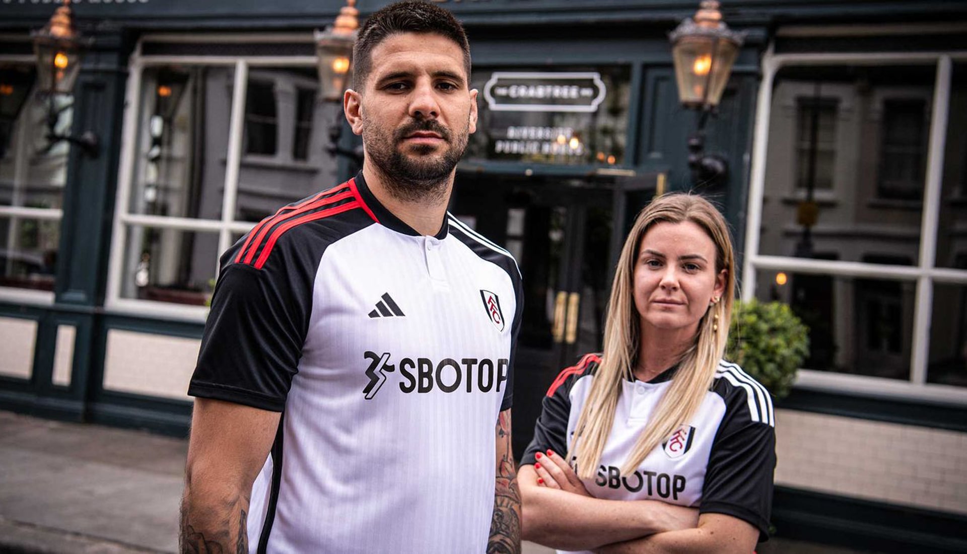
Home
The Fulham home shirt features a twist on the traditional white look, with black shoulders paired with the adidas Three Stripes in red and white colours on the right and left shoulders respectively.
Away
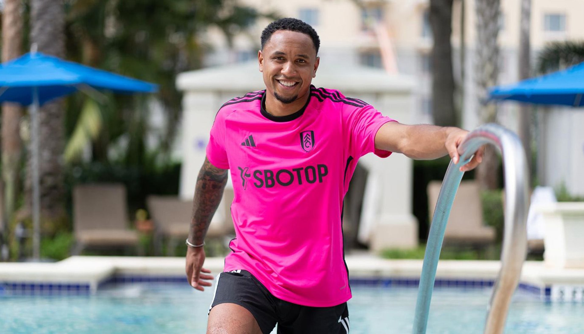
And the award for "hardest shirt to miss" goes to Fulham. The new away kit sees the Cottagers step out on the road in an all-shock-pink kit; black accents in the branding, sponsor and club crest complete the look.
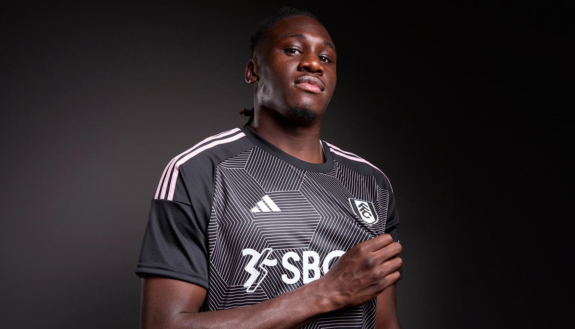
Third
Inverting the colours of the away shirt, although toning down teh vibrancy of the ink, the Fulham third shirt sees a black base overlaid through the body with a hexagonal pinstripe pattern, while the sleeves remain solid black with the Three stripes riding down the shoulders in the same pale pink.
LIVERPOOL
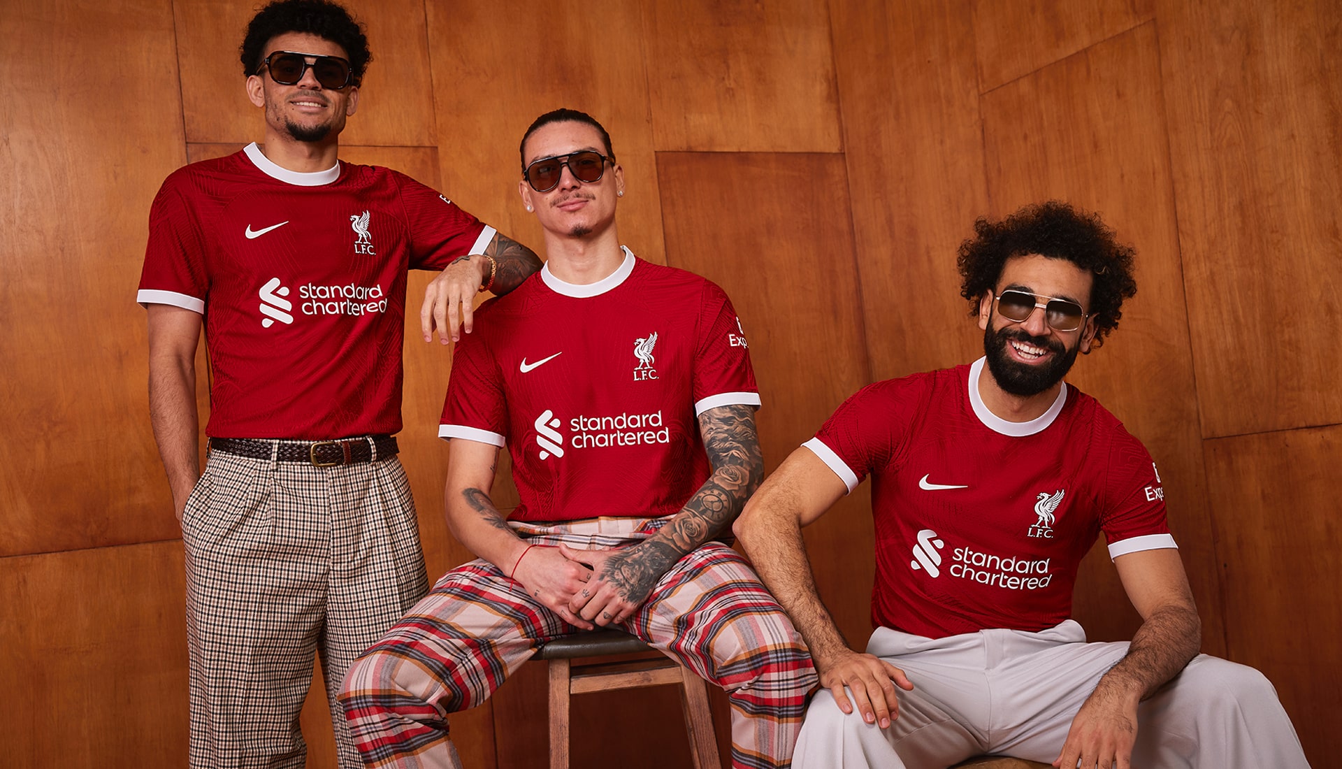
Home
The addition of white collar and cuffs gives this design from Nike a throwback vibe to the 60s and 70s, specifically nodding to the jersey worn by the legendary ’74 squad – the re-birth of Shankly’s second team who triumphantly won the FA Cup.
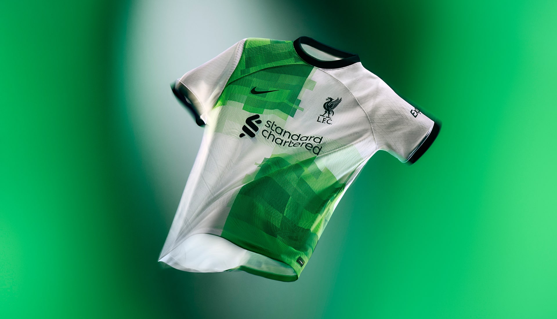
Away
Liverpool's second offering of the season pays homage to the iconic 1995/96 away shirt, with a modernised take that presents the quartered white and green look in a pixelated execution.
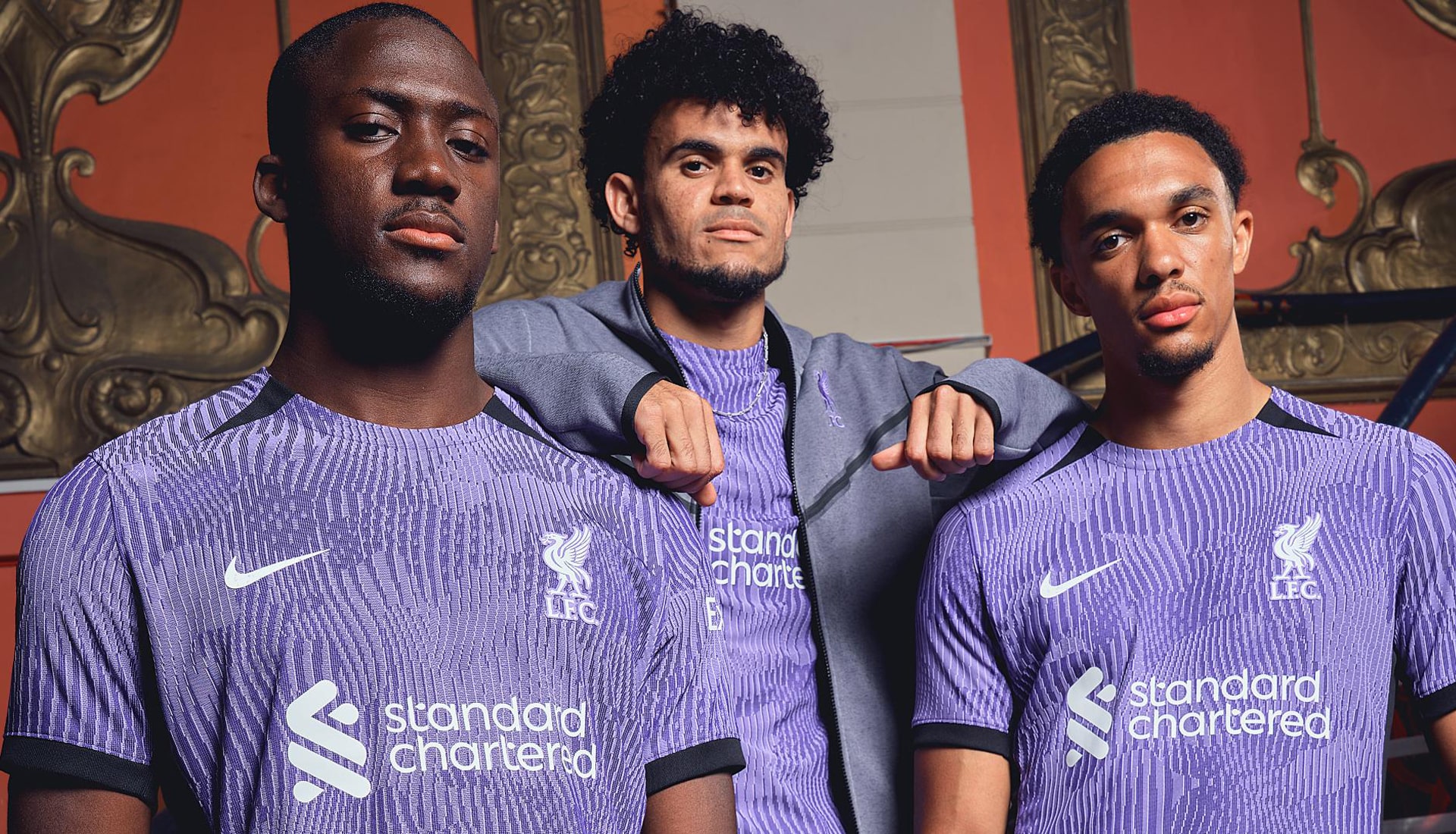
Third
Arriving in a striking purple ripple pattern with black sleeve cuff, black collarbone inserts and black side panelling, the LFC third shirt sees a return of a colour that's seldom been used, but that stands out as pretty unique. Unless you line up against Fiorentina that is.
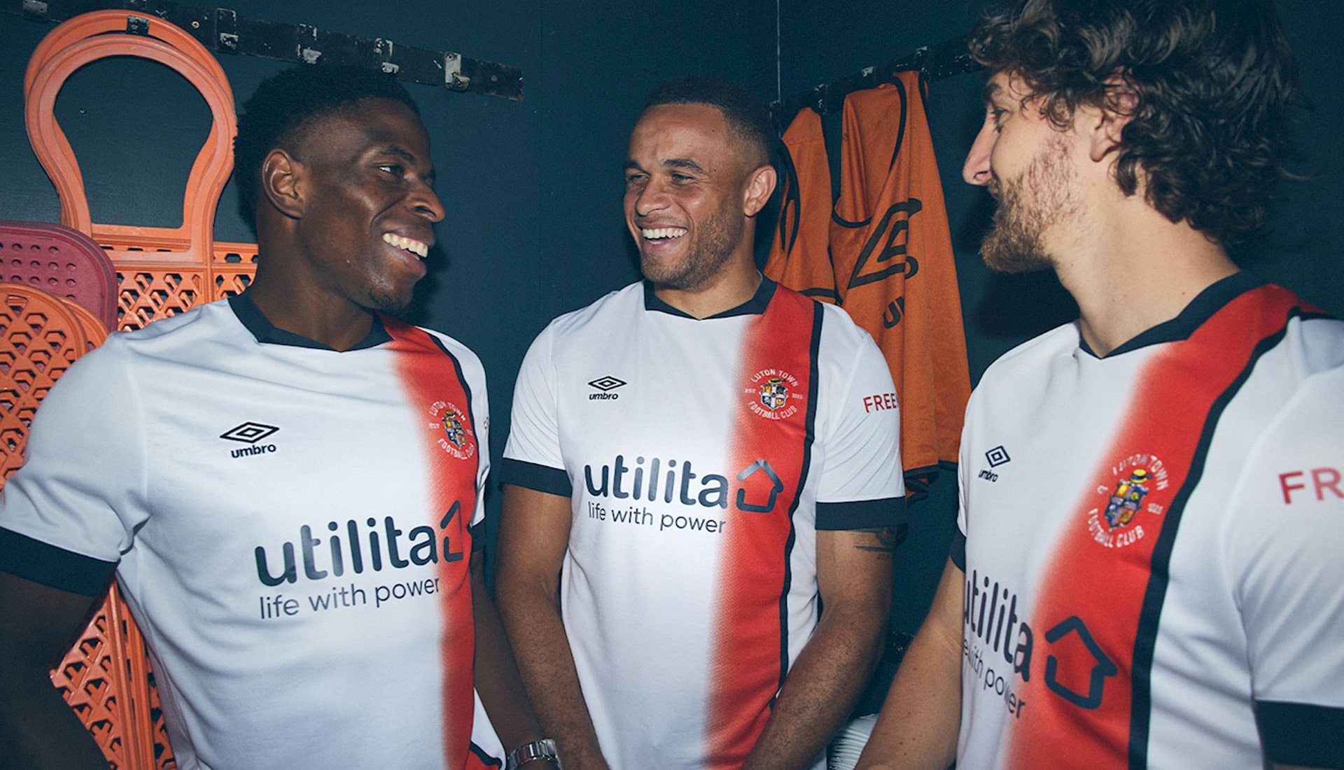
LUTON TOWN
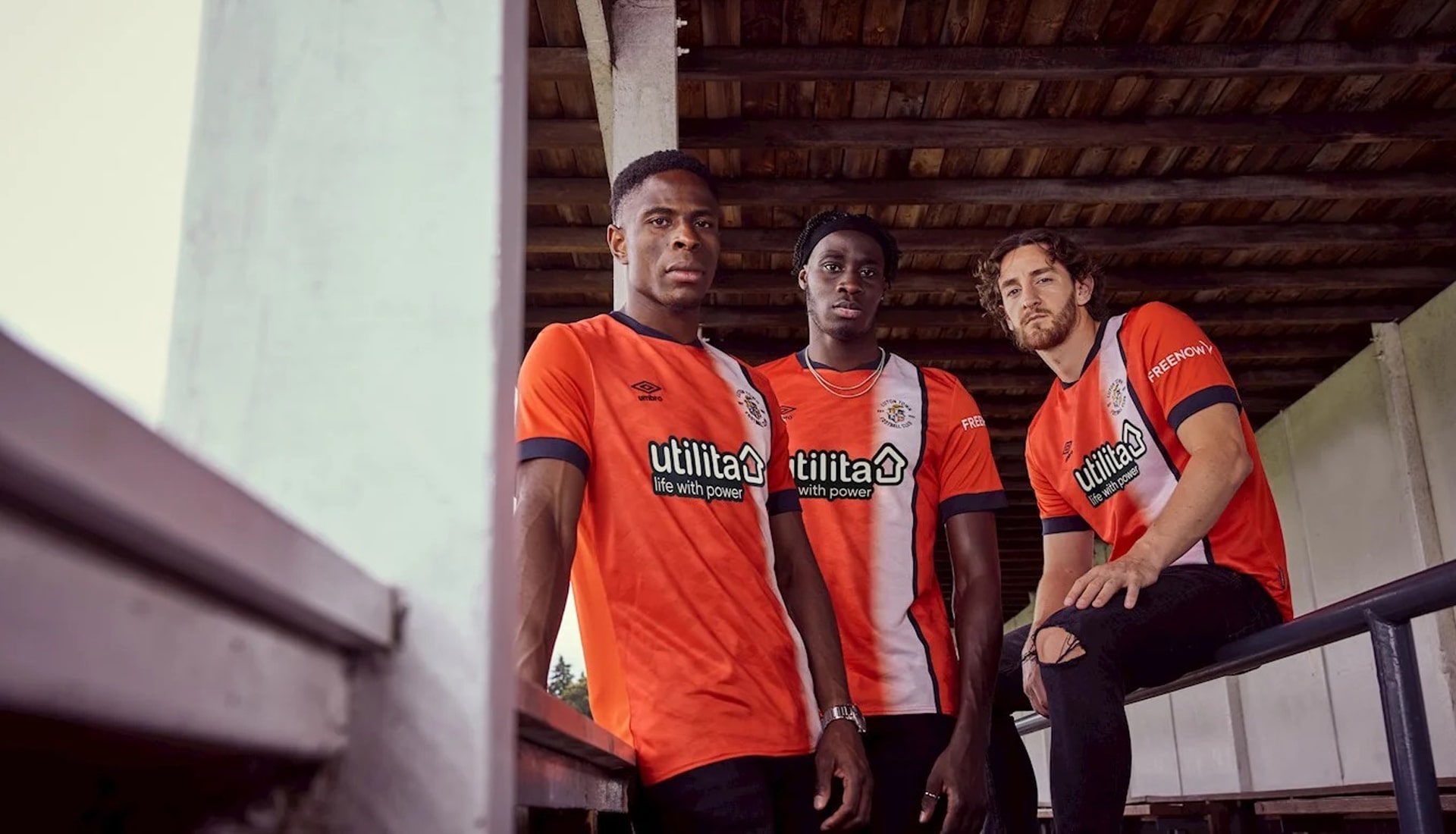
Home
The new boys in the Premier League, Luton get their classic orange base with a returning off-centre white stripe, last seen in 2012/13 but made iconic in the 70s.
Away
Simple and effective, the Luton Town away shirt simply inverts the colour scheme of the home shirt, with a white base joined by that off-centre stripe, here in orange. Navy accents complete the look. Some might think it lazy, but we're all for inverted options for alternate shirts, if it's done right.
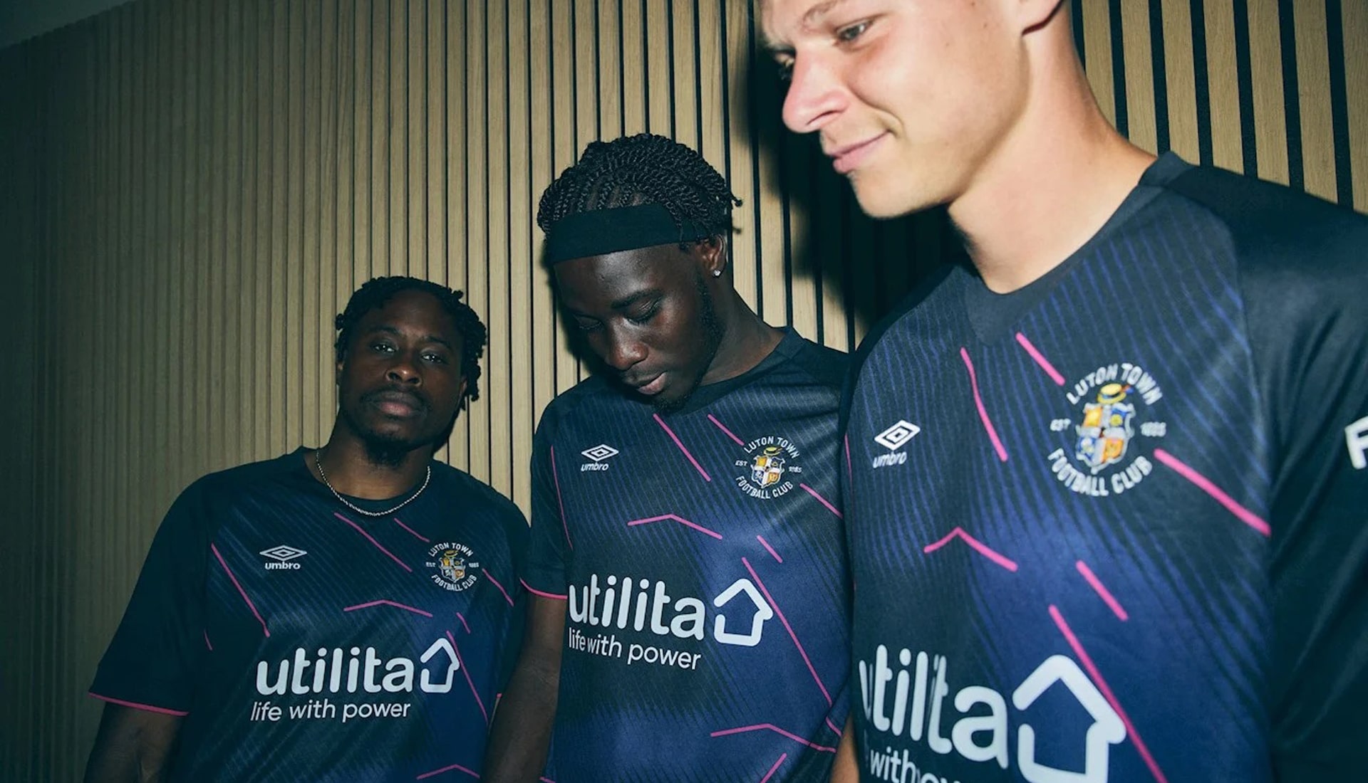
Third
Luton's navy and pink third shirt is inspired by the club's first ever colours and is bares the aerial outline of Kenilworth Road from above.
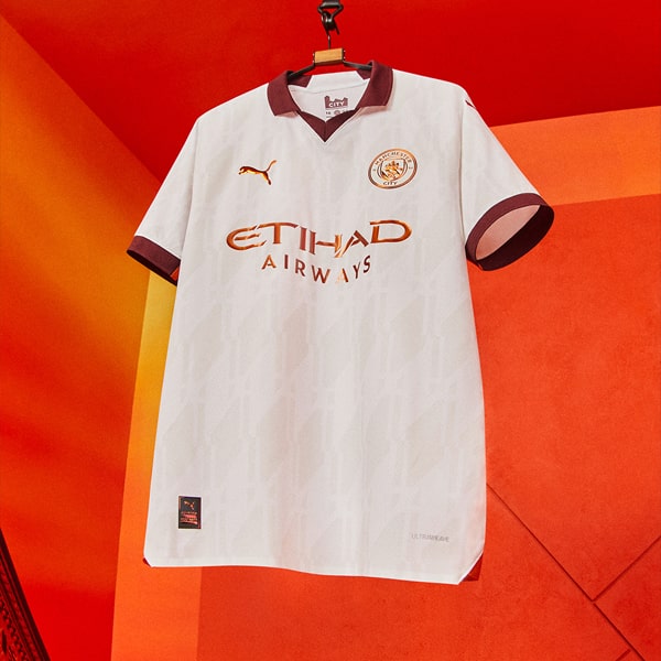
MANCHESTER CITY
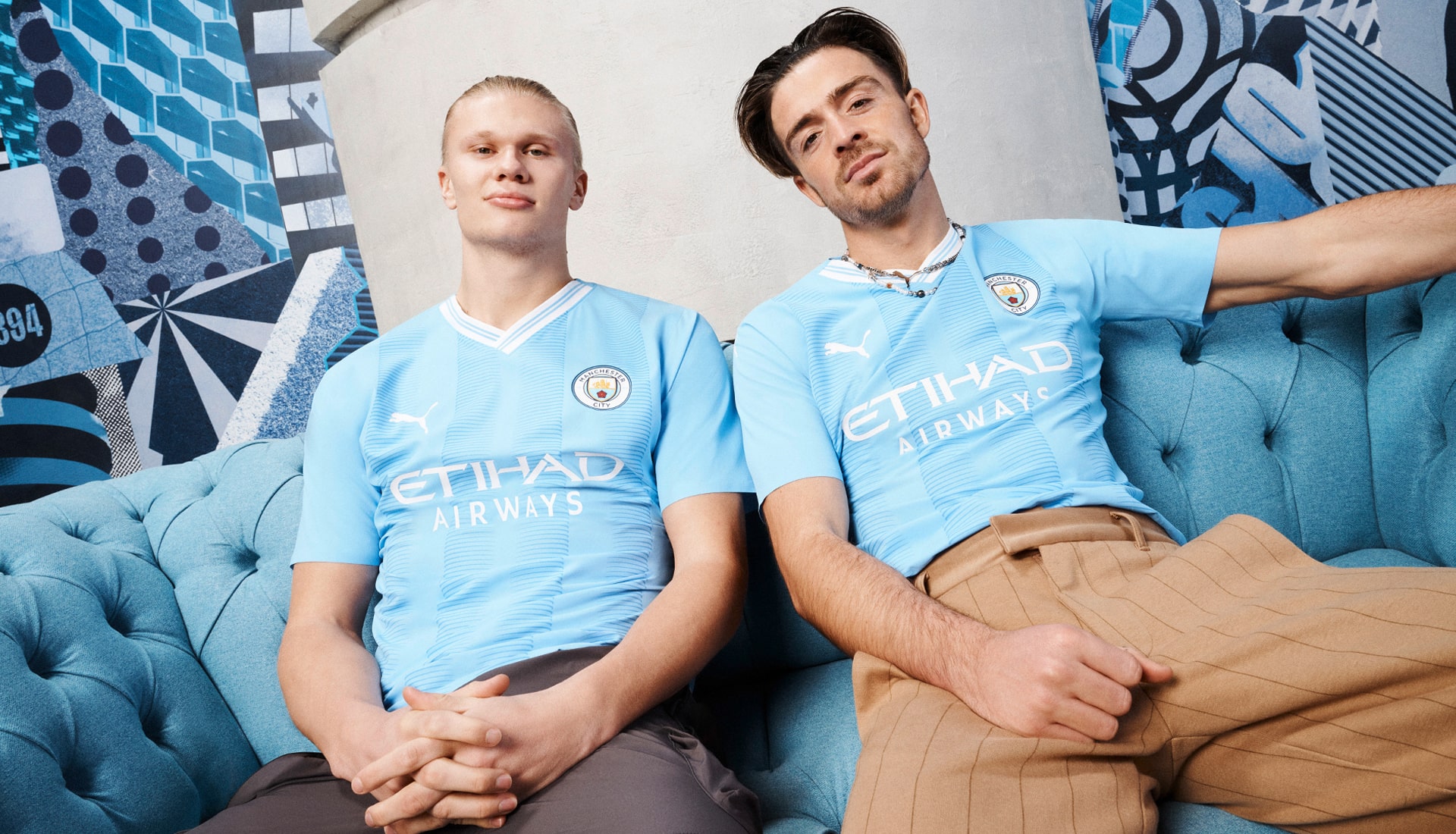
Home
Celebrating the 20th anniversary of their switch to the Etihad Stadium, the Manchester City home shirt has tonal stripes inspired by the four giant turrets visible from the outside of the stadium.
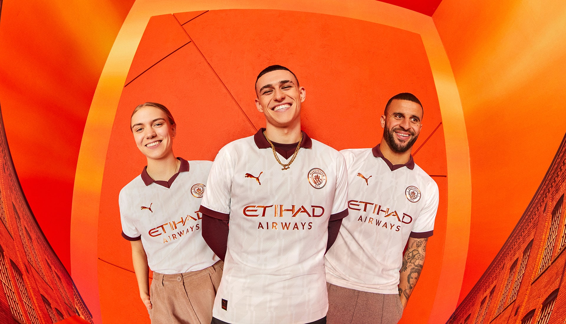
Away
The City away kit is inspired by the towering mills, buzzing warehouses and industry of the city itself, with an all-over tonal graphic print that gives the shirt a retro feel, drawing inspiration from archival weave patterns from Manchester.
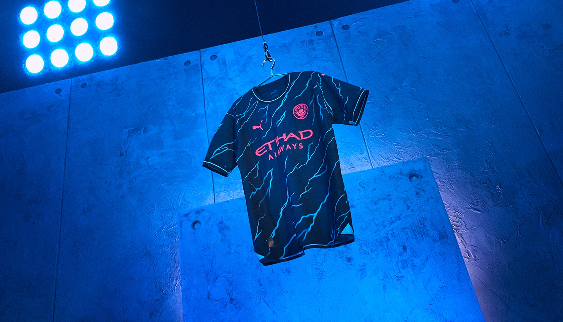
Third
City's 23/24 third kit is the manifestation of City's electrifying style of play. The jersey’s design features an electric spark pattern throughout, fused with neon pink versions of the Club crest and partner logos. Striking stuff.
MANCHESTER UNITED
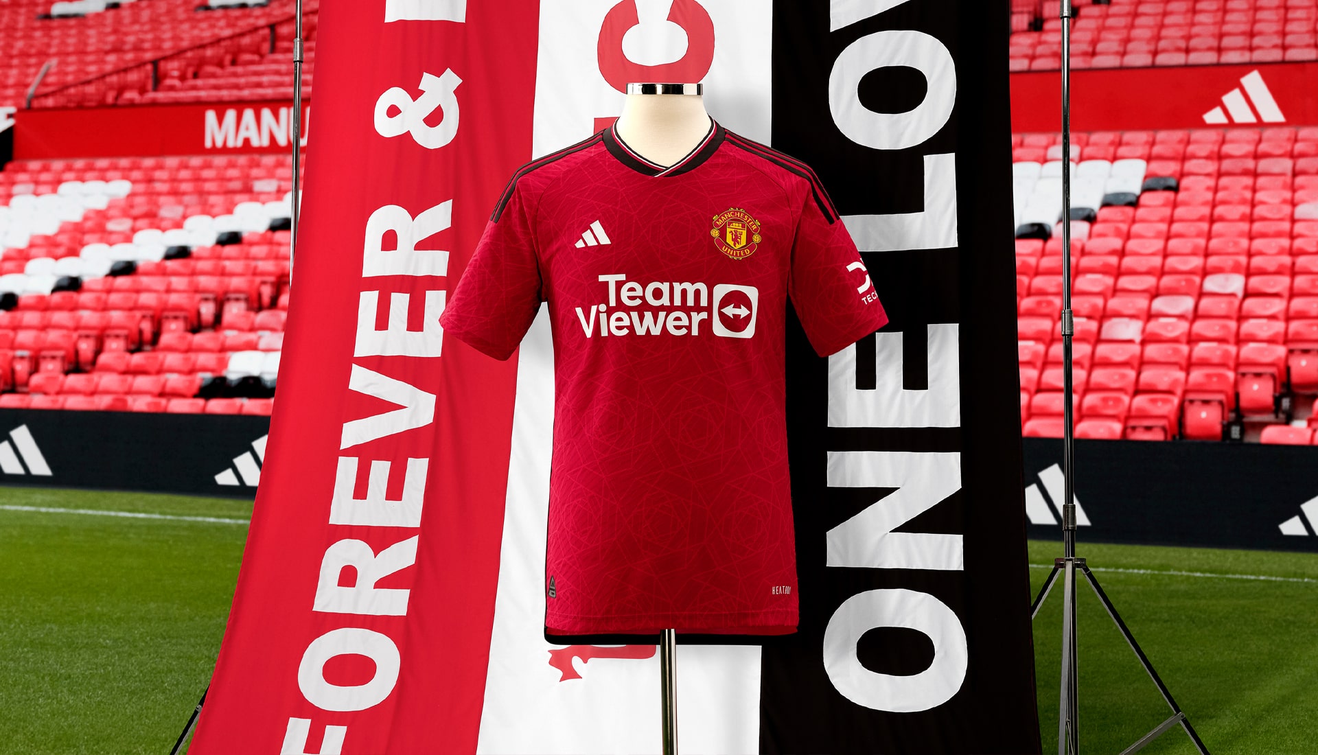
Home
Inspired by the industrial heritage of the city, the Manchester United home shirt features a black v-neck collar and a subtle pattern of the Lancashire red rose across the shirt – a nod to their historic home county.
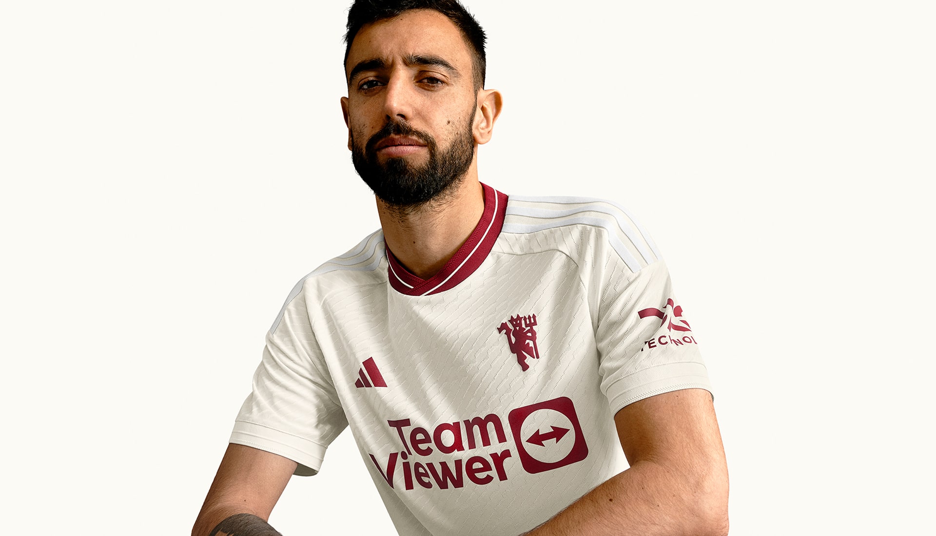
Away
Inspired by the club’s past but redefined for a new generation of stars on the biggest stage, the Man United away shirt features a divisive design that harks back to the first away shirts the club ever wore, taking colour inspiration from the aesthetic of Manchester itself. Lot of hate for it, but is it actually as bad as people say?
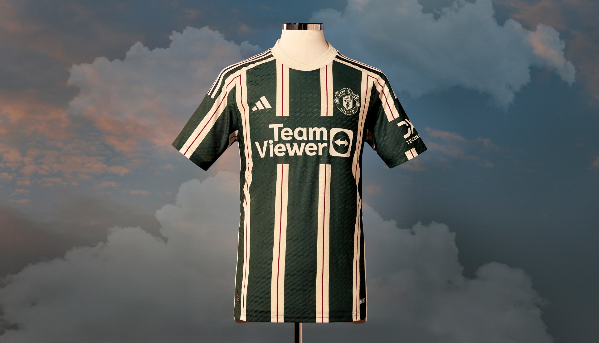
Third
Stripping things right back to ensure that all attention is on that simplified club crest, appearing on a United shirt for the first time in over 50 years, adidas took inspiration from the jersey worn in the 1909 Cup winning season, with a crisp cloud white base providing the perfect backdrop for the simplified Red Devil emblem to stand out.
NEWCASTLE UNITED
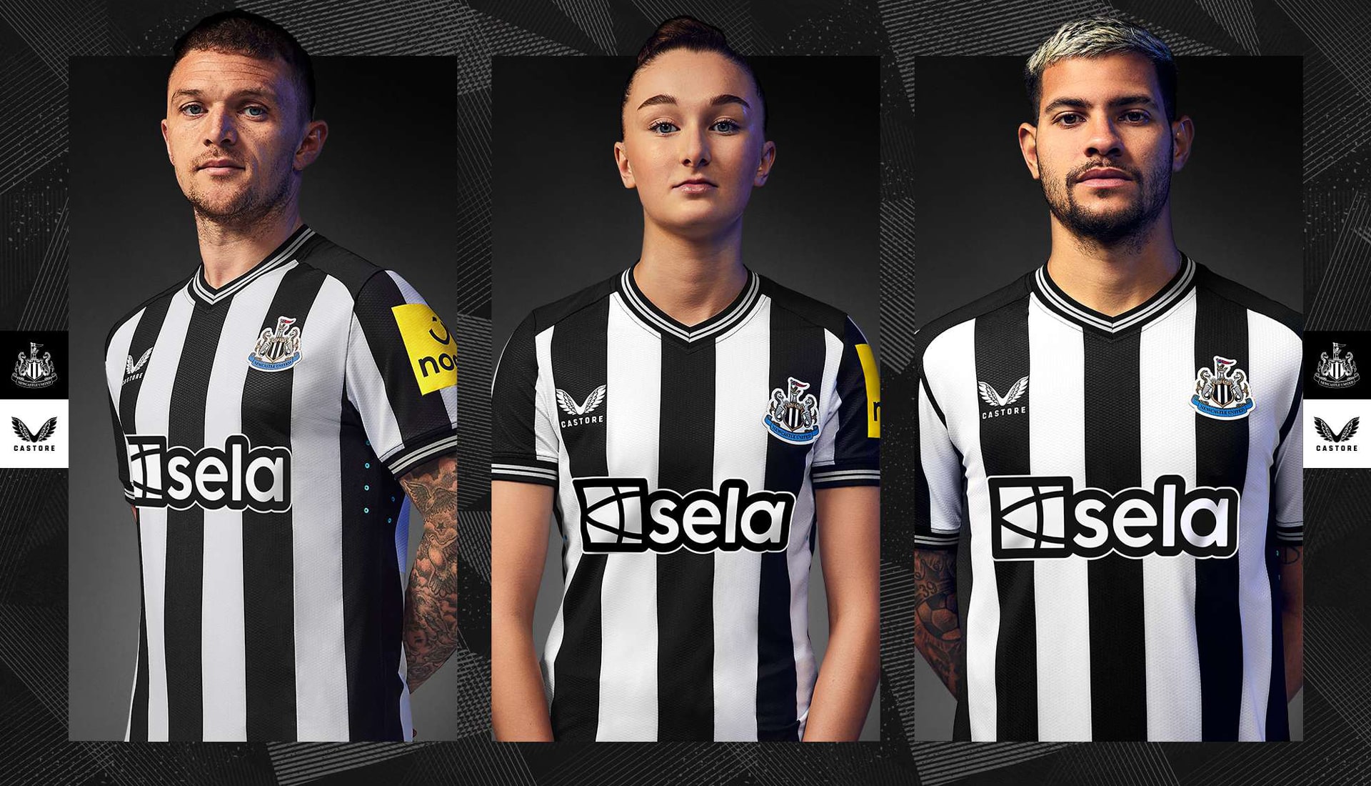
Home
Paying tribute to the rich heritage of the Club, while encompassing a slick, modern style and key high-performance features required for elite level sports, the Newcastle United home shirt does everything you'd expect from a Newcastle United home shirt. Simple, effective.
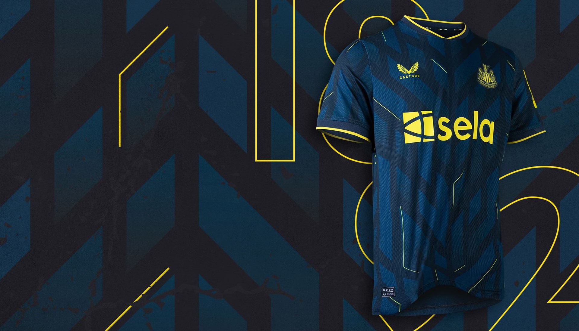
Away
Once again showing a clear influence from their benefactors, the Newcastle away shirt from Castore looks more than a bit like the Saudi national team. Strong sublimated graphic through the body and a nice black and white detail on collar and cuffs, nodding to the Toon's traditional home look.
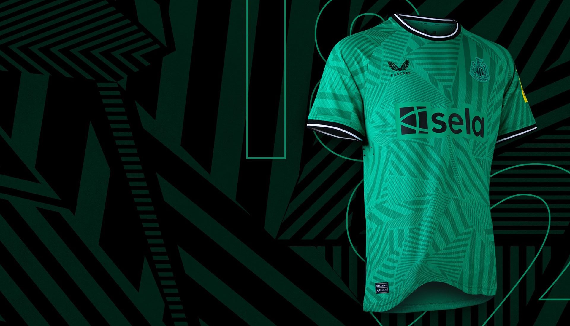
Third
Completing Newcastle's set for the 23/24 season, the third shirt arrives in a carbon and navy blue base with electric yellow trims. A chevron-esque graphic runs through the body, lending added definition to the design.
NOTTINGHAM FOREST
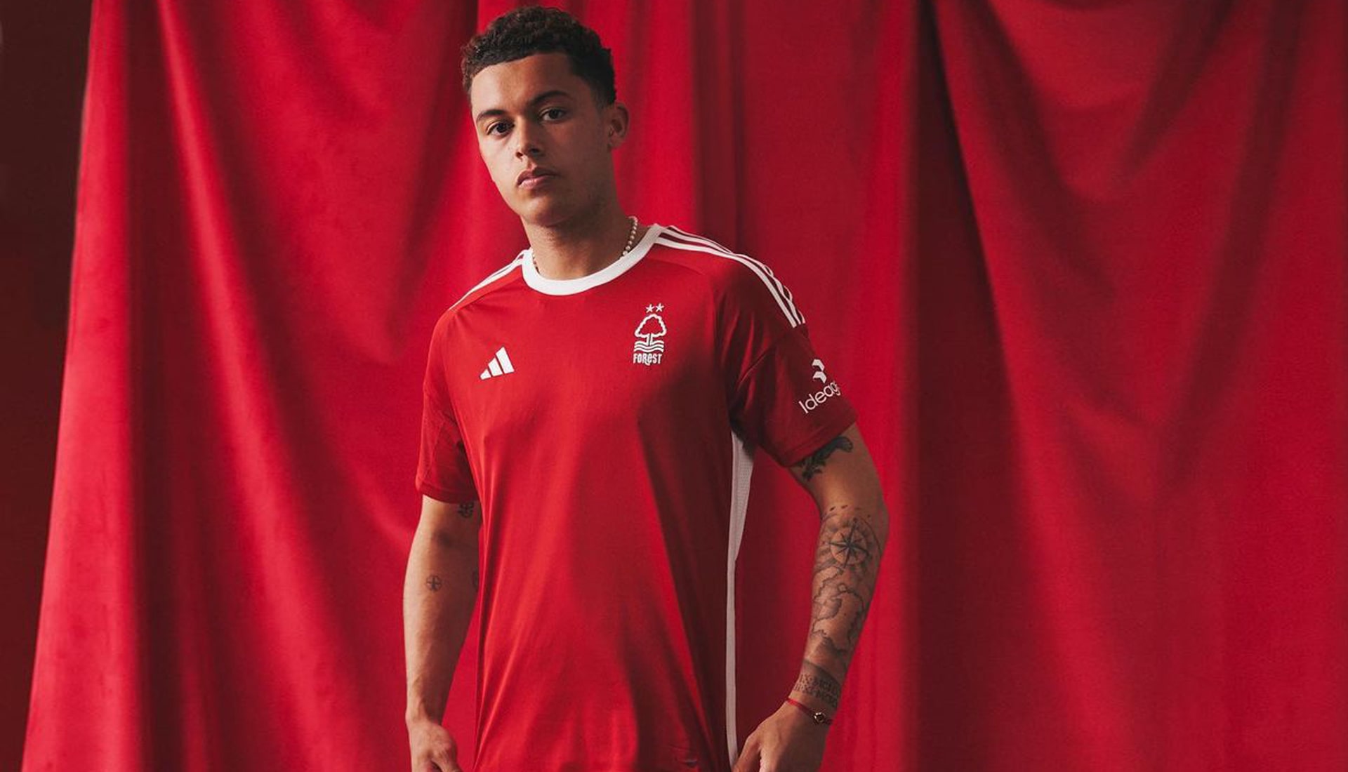
Home
Re-establishing the club's historic relationship with adidas, the classic Garibaldi strip is instantly recognisable, drawing influence from the Forest kits worn during their memorable European Cup wins in 1979 and 1980.
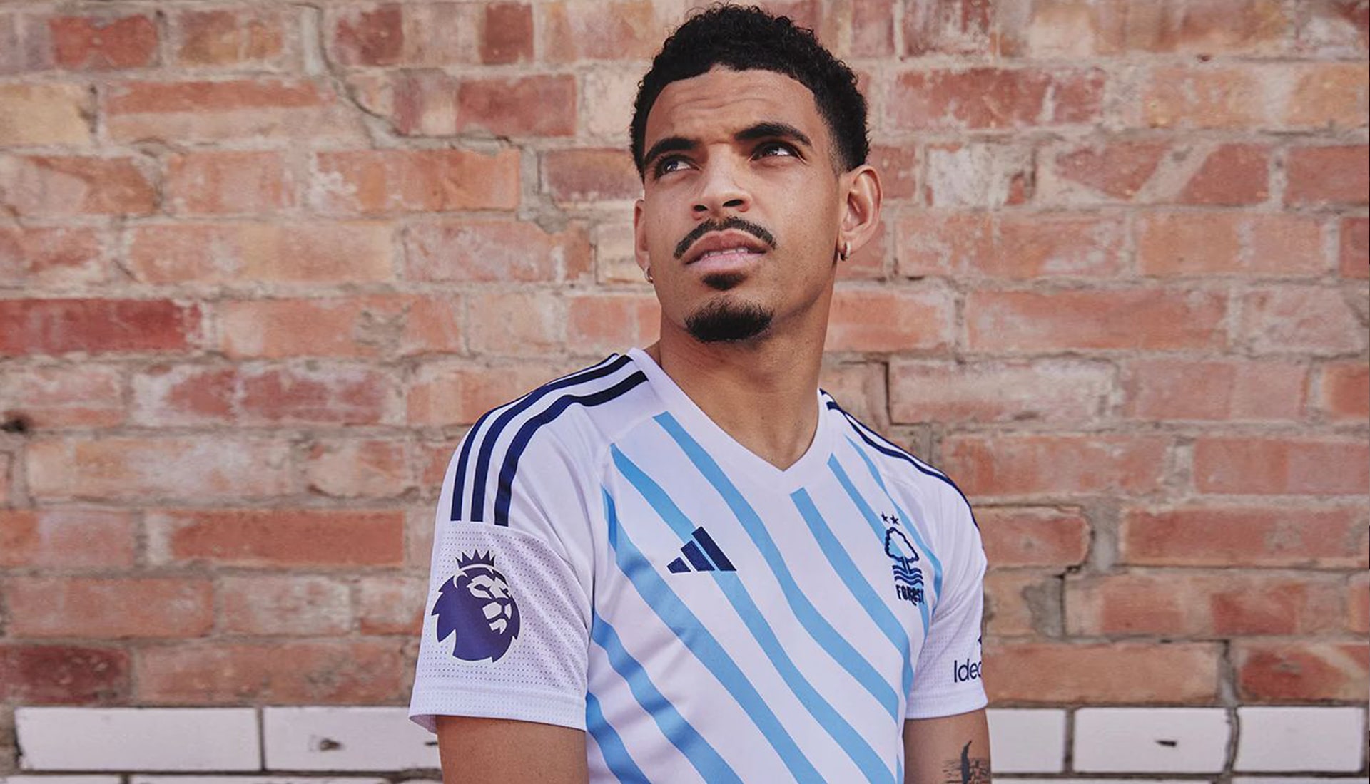
Away
The new Nottingham Forest away shirt pays homage to the River Trent, with wavy light blue stripes adorning the front of the white shirt.
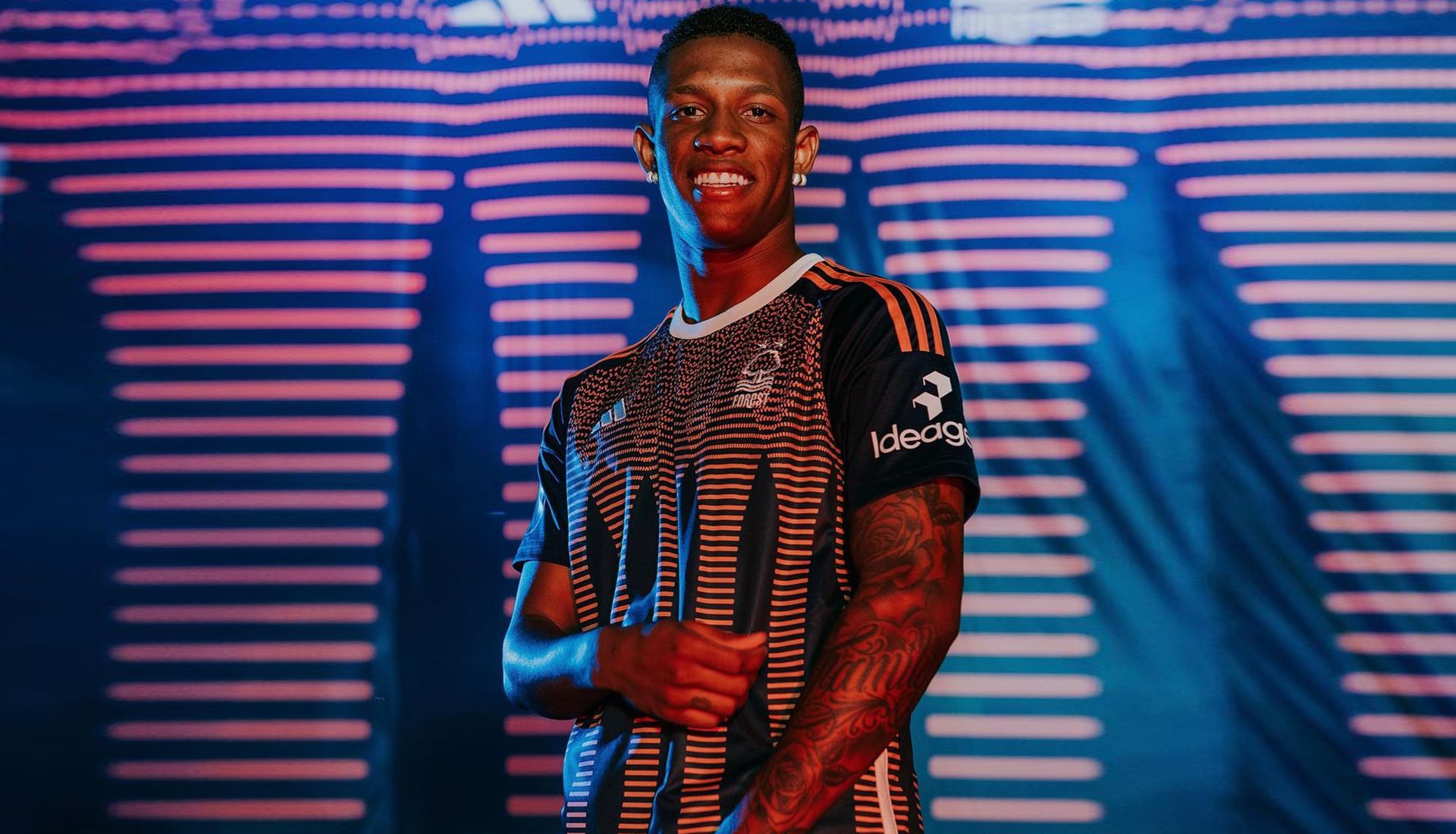
Third
The first team to complete their set, Forest took care of business in one swoop. Although the third hasn't officially been released for retail ATTOW, it was revealed along with the home and away, and gives us a navy base paired with a salmon graphic overlay.
SHEFFIELD UNITED
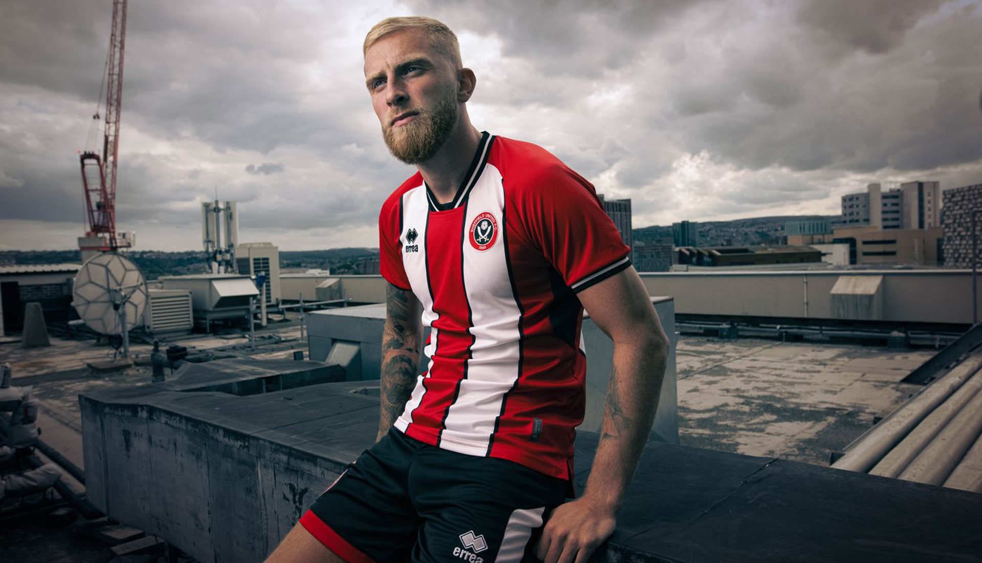
Home
Back in the Premier League, Sheffield United's traditional red shirt adorned with two thick white stripes, captures the essence of the city's rich industrial history, paying homage to its steel heritage and the 1998 home shirt.
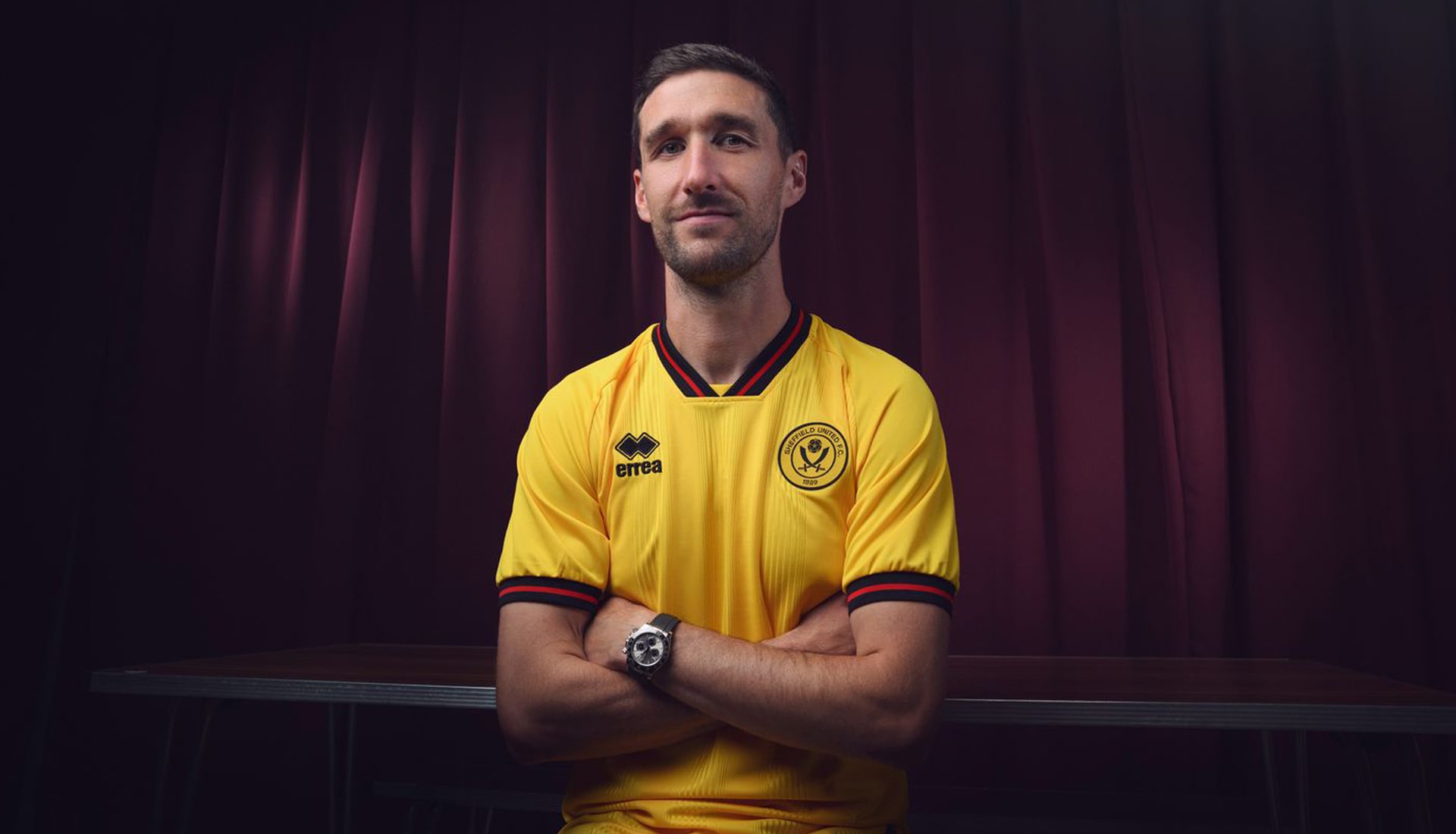
Away
The Blades' away shirt brings back a colour associated with United away kits throughout the 80s and early 90s, an era where the side rose from division four to the top flight of English football. The yellow strip is made from a jacquard fabric with thin stripes woven into the material. Black and red elasticated ribbed collar and cuffs finish the look.
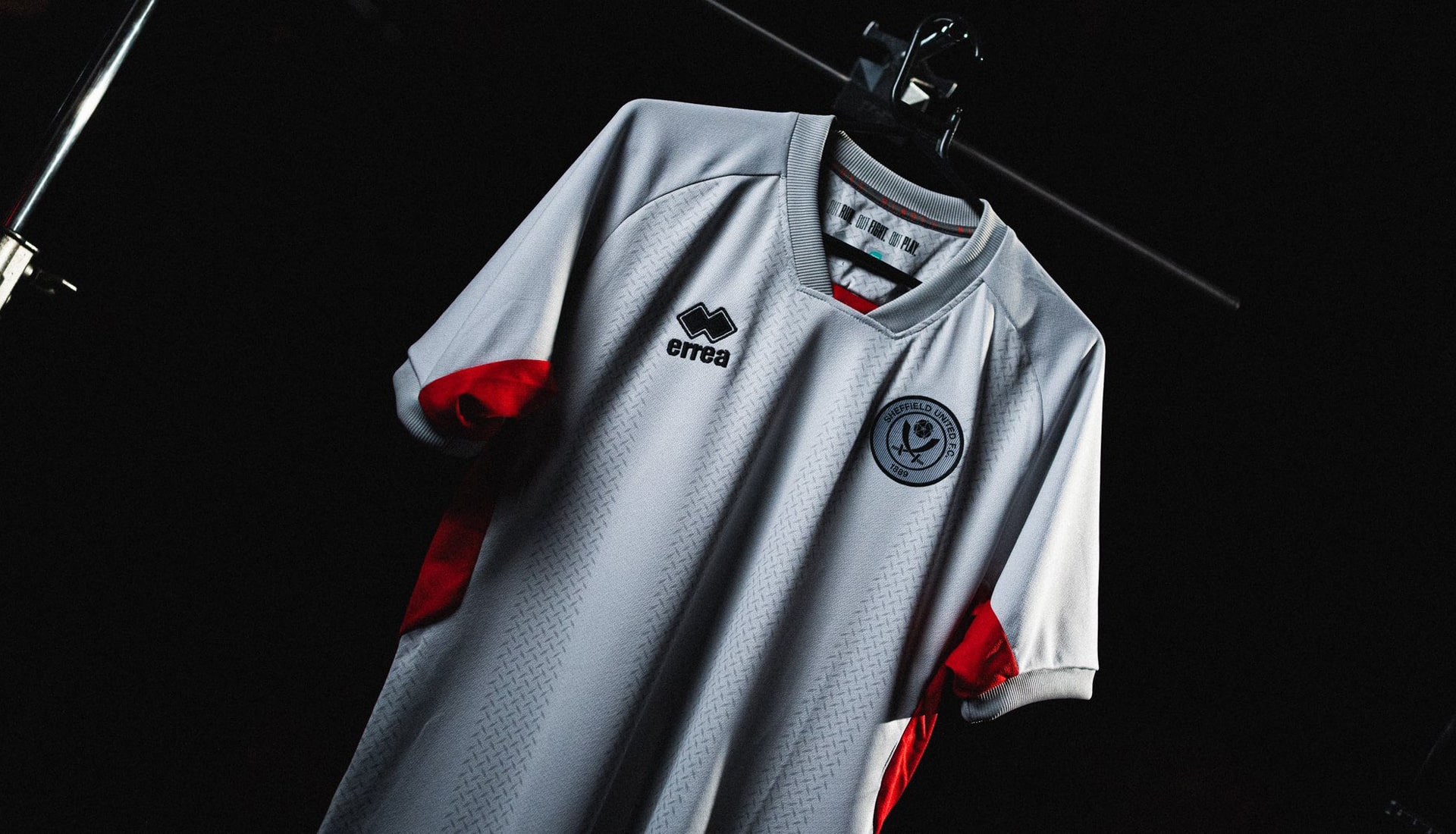
Third
Continuing to draw inspiration from Sheffield’s steel making past and representing hard work and determination, the Blades' third shirt comes in a light grey material overlayed with a steel pattern. That no-nonsense base is joined by red accents in the collar and along both sides of the torso. Ready for the business of staying in the league...
TOTTENHAM HOTSPUR

Home
Inspired by the sounds of N17 and the nation's broadcasting history, the Spurs home shirt features a subtle pattern of overlapping circles and lines throughout, lending a deeper texture to the traditionally lily white look.
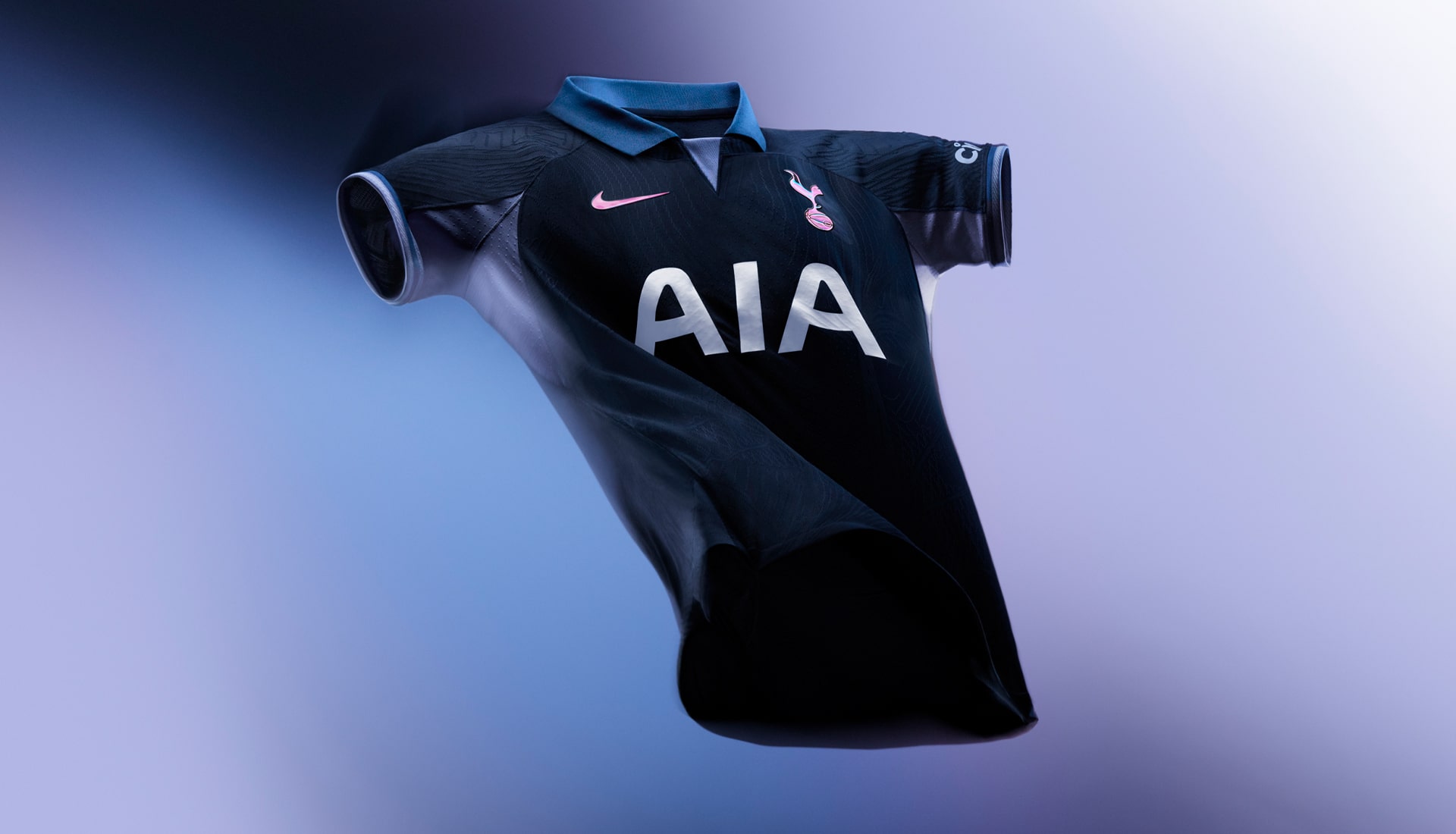
Away
An all-Navy design for Spurs' away shirt takes cues from kits of the past, with a retro high-buttoned collar and layered colours complementing a holographic cockerel crest and Nike swoosh.
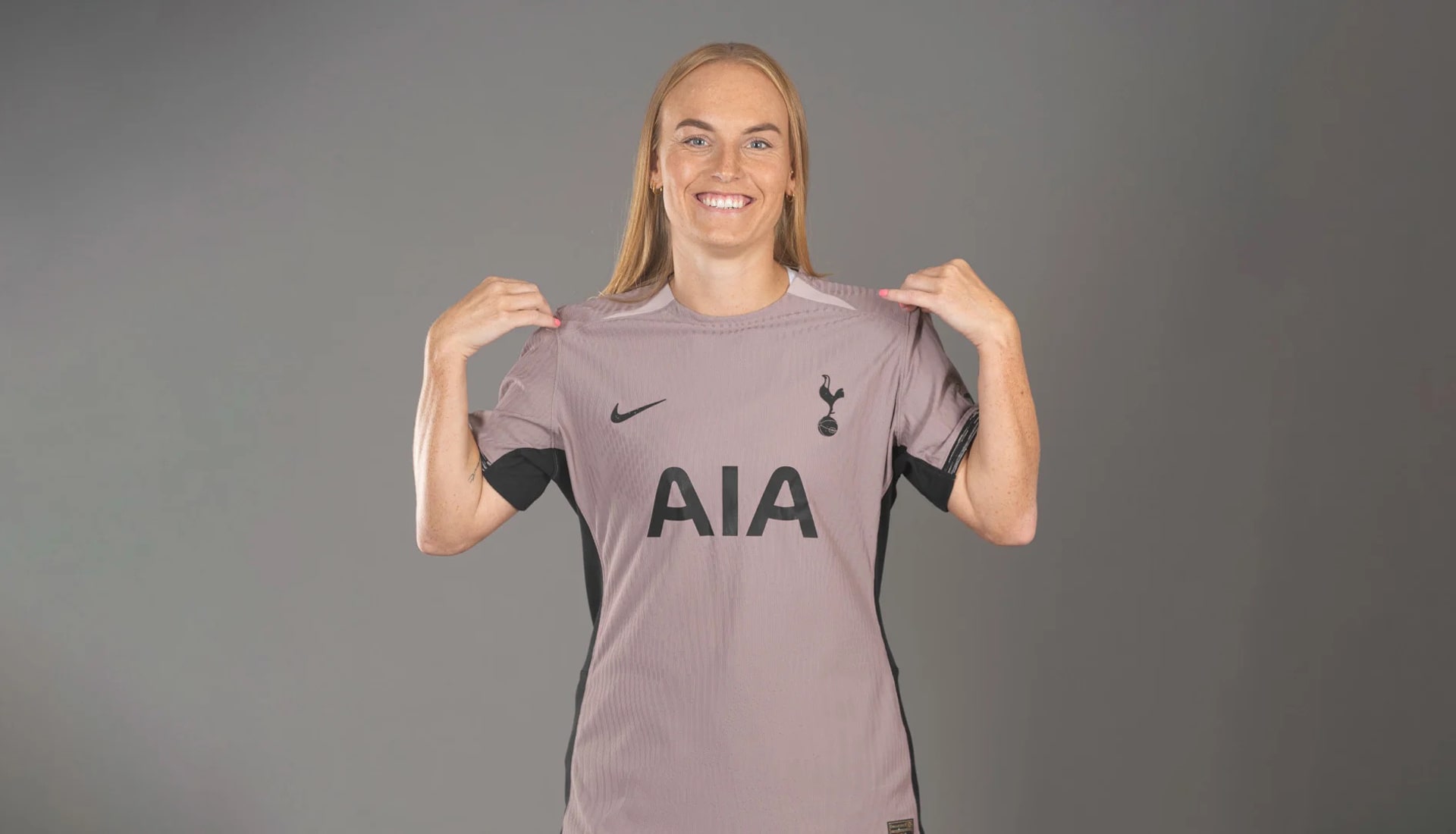
Third
The new Spurs Third Kit is inspired by nature, with taupe haze-coloured shirts created using sustainable pattern cutting, including the use of recycled materials.
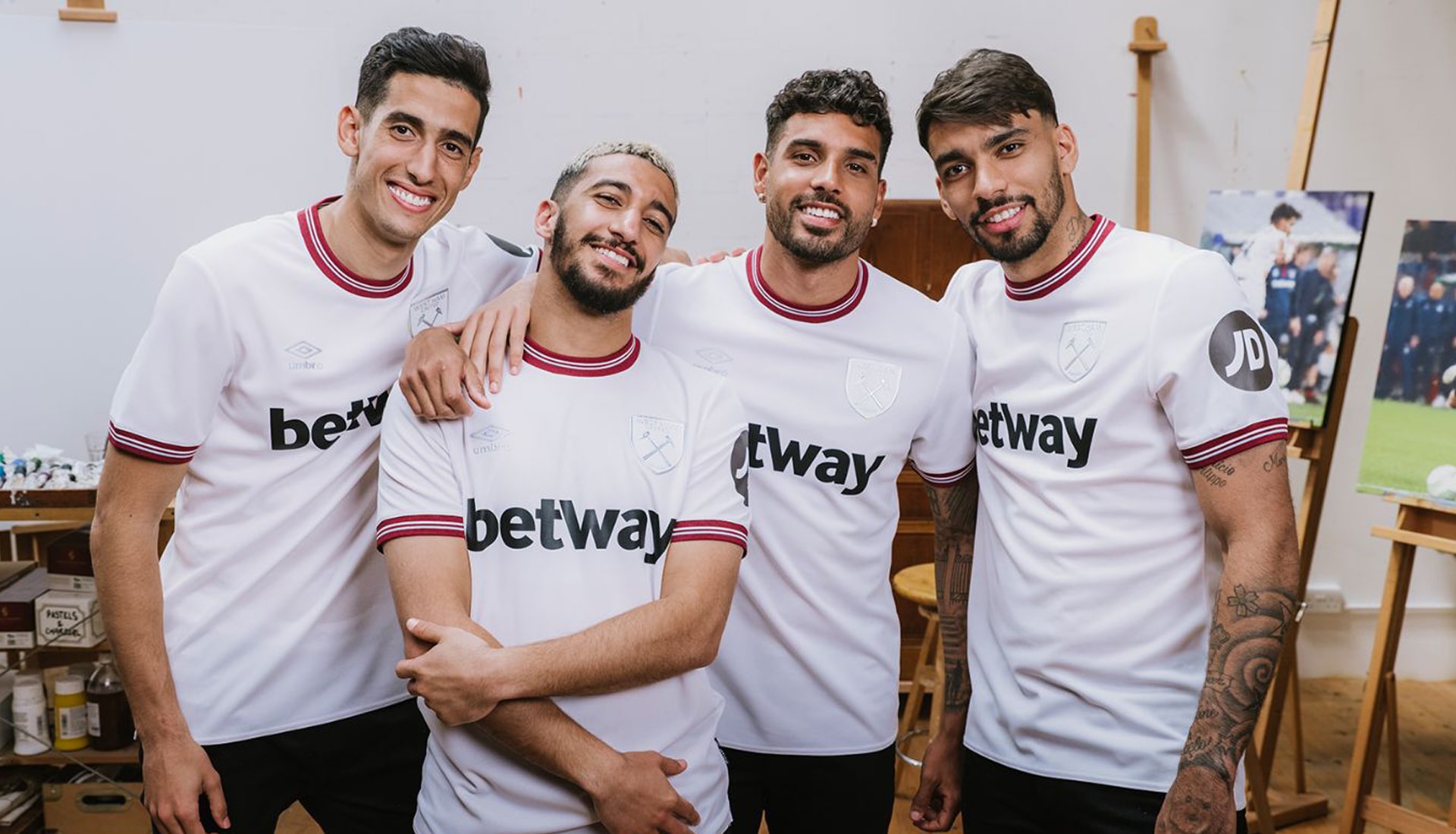
WEST HAM UNITED
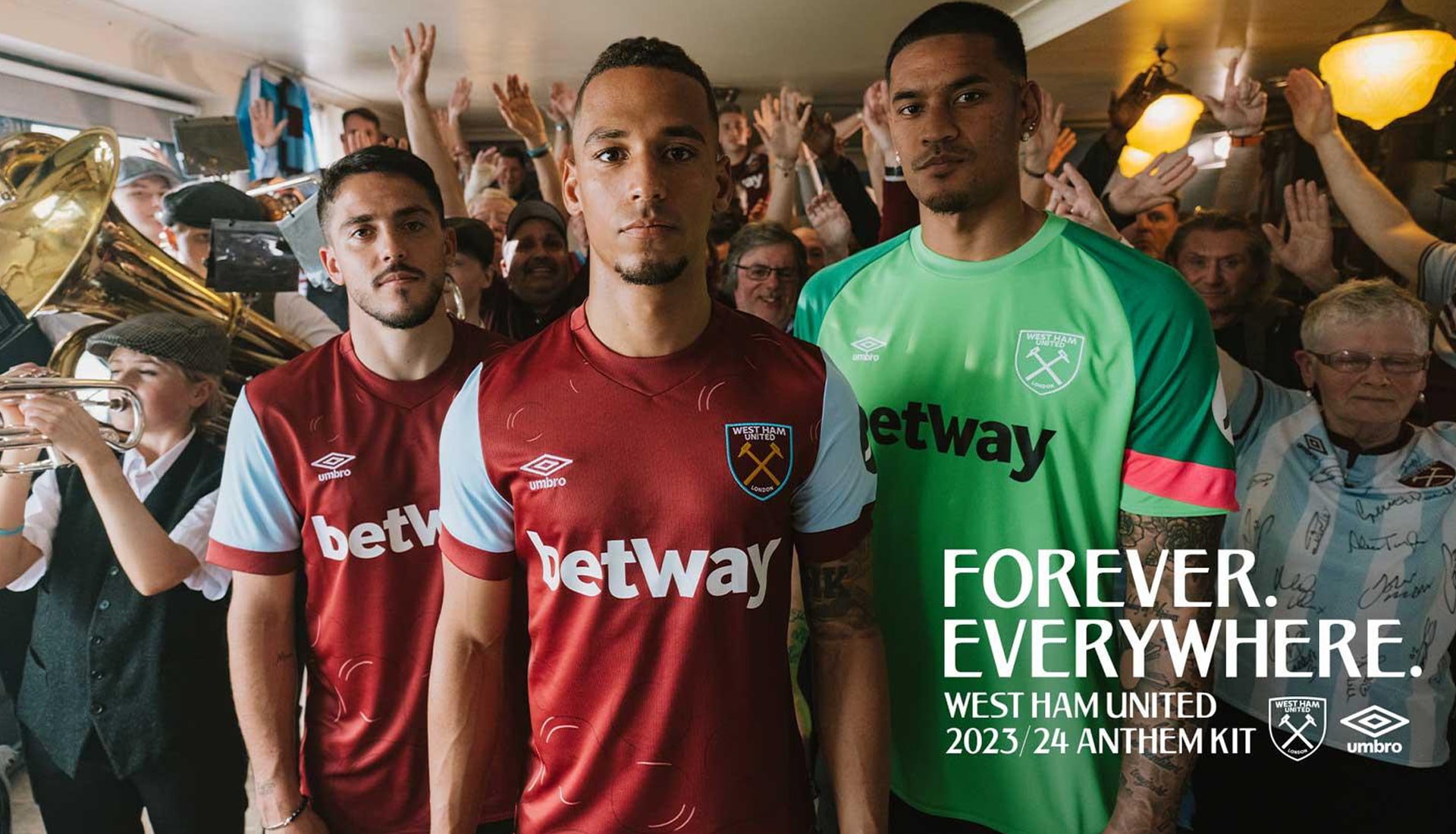
Home
At first glance its a fairly routine and traditional take for the Hammers' home shirt, but Umbro have gone a bit further than that – rightly or wrongly – with the club's iconic anthem, I’m Forever Blowing Bubbles, being woven through what has been dubbed the "Anthem Kit", taking the form of a distinctive Bubbles pattern.
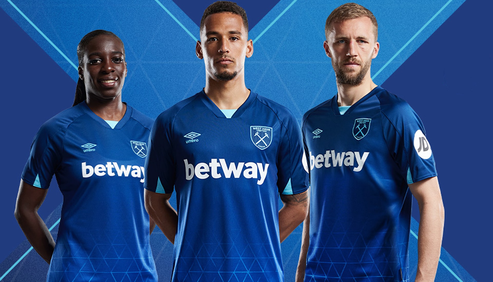
Away
For their away shirt West Ham get a classic, elegant all-white outfit with subtle flashes of claret and blue. the club crest, and Double Diamond branding are both iridescent, enhancing the simple design of the new kit. Betway and JD sponsors sadly stick out like a sore thumb.
Third
Inspired by the club's iconic east London home and uniting Hammers all over the world, the West Ham navy blue third shirt features a triangulated lattice pattern which immediately recognises the emblematic floodlight design at London Stadium, a theme echoed in the sky-blue triangle details at the V-neck collar and sleeves.
WOLVERHAMPTON WANDERERS
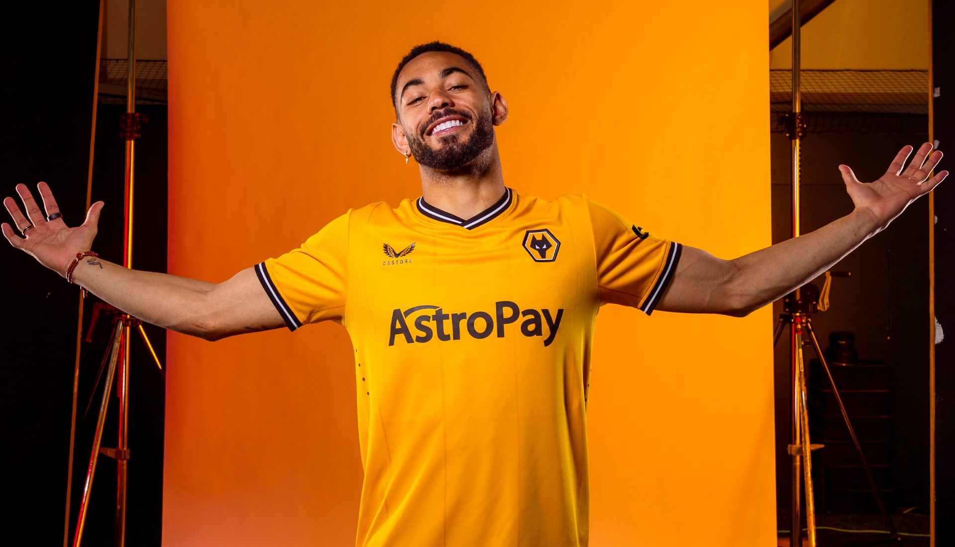
Home
Pretty unmistakably Wolves, the gold strip reintroduces a subtle pin stripe pattern through the body, which nods to the historical days of the 1980s and Wolves legends such as Andy Gray, Mel Eves and Kenny Hibbitt.

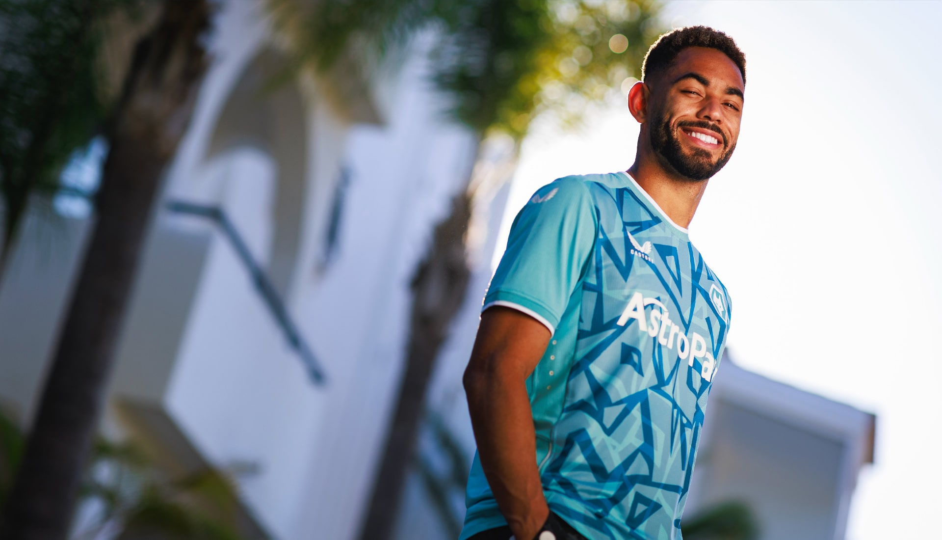
Away
One of the rare instances where an away shirt was launched before the home shirt, Wolves got a design that once again nodded to the club's strong links with Portugal. The look is inspired by the geometric architecture and tile patterns found around the Iberian Peninsula.
Third
The design for the Wolves third shirt is an abstract graffiti style print, providing a new look made up of a combination pagoda blue and sea jet tones.
Shop 22/23 Premier League Replica at prodirectsport.com/soccer