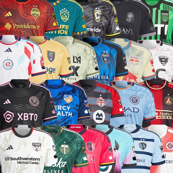
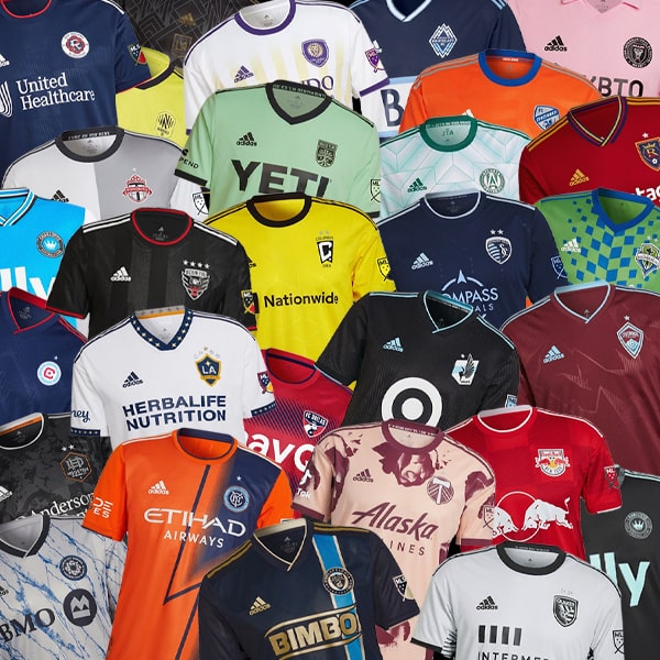
With the 2021 MLS season set to get underway in just over a week, all 27 teams have now unveiled their new jerseys for the campaign. From the majestic to the mediocre, they’re all produced by adidas, and we’ve rounded them up for you to cast your eyes over and judge accordingly.
Continuing the tried and tested pattern of alternating kit releases, this season provides yet another varied array of primary and secondary (or home and away if you prefer) jerseys. In case you were unaware, MLS teams retain a kit for two seasons, so if a club received a new home kit last season they'll keep it and unveil a new away design for this campaign, which will then last two seasons. Keeps things fresh and easy on the wallet. Of those two kits, one will be light and one dark, serving as a very specific contrast, which is essentially what a change strip is designed for.
Further to that straight forward approach, all kits are produced by adidas, with the German brand holding an exclusive deal with MLS that’s reportedly set to run until 2024 and it’s worth a cool $700 million. But unlike the 2020 jerseys, which featured a uniform return of the EQT Stripes, 2021 is a much more varied bag. And, of course, most of them come with their own unique names. So let's dive in...
EASTERN CONFERENCE

Atlanta United Primary
A special kit for a special season for Atlanta United, as they unveil the ‘BLVCK KIT’, which is released to celebrate five years of Atlanta United in the MLS. Trimmed in gold and packed with meaning, this is one sleek design, and a very tidy refresh of the traditional home look.


Chicago Fire Primary & Secondary
The only pre-existing franchise on this list to get two kits once again, thanks to last season's logo change. But with another mooted change ahead of the 2022 season, due to fan backlash for the new crest, don't expect this to be the last season the Fire get a double drop. Dubbed the 'Lakefront Kits', the designs are influenced by the people of Chicago and the city itself.

FC Cincinnati Primary
The ‘Dynamic Kit’, gives the third-year club a new look as they prepare to open West End Stadium in mid-May. The jersey features a navy blue base with orange and blue pinstripes, a nod to the exterior LED Fins on the West End Stadium exterior.

Columbus Crew Primary
Another one that takes inspiration from a new stadium, the new Crew jersey draws from the iconic architecture of the New Crew Stadium, which is set to open in July. As a result, the jersey is rather aptly known as the ‘Inaugural Stadium Kit’. Guess it makes sense. The sublimated graphic is a nice touch, though we're not sure about the grey pairing of the jersey with yellow shorts and socks...

DC United Secondary
The lighter coloured jerseys that often feature as clubs' secondary looks can sometimes veer into the realm of being mundane and somewhat unidentifiable. Thankfully for DC United fans, the 'Marble Jersey' avoids that trap thanks to a nice sublimated pattern and some nice collar and cuff trim.

Inter Miami Secondary
Dubbed 'La Palma', the name of Inter Miami's new secondary jersey comes from that embossed pattern on the black base: subtle, sleek, but absolutely fitting the bill of capturing the club’s identity and adding a unique flourish to the shirt. Set for a second season of style.

CF Montréal Primary
CF Montréal unveiled what is their first jersey since announcing an identity change this past January. Gone is the 'Impact' of their name, instead replaced by the simple impact of this striking design. The new CF Montréal logo is embossed over the entire jersey, and there's a DNA band alongside the neck tape, serving as a reminder of the club's history and roots.

Nashville SC Secondary
Nashville SC unveiled ‘Vibe II’, their new secondary shirt for the 2021 season, which has been inspired by the beat of Nashville, the rhythm of the game, and the sonic qualities from Music City. An acoustic blue base with an electric gold trim at the top bring a dynamic contrast to the club's primary electric gold kit. The front of the jersey and the sleeves feature the club’s primary logo in a sublimated detail “N” shape for an added level of identity.

New England Revolution Secondary
Inspired by the block work of American Revolution Era war forts in the area as well as the home supporters section of their stadium, New England Revolution unveiled their Secondary Jersey for the MLS 2021 season, aptly named ‘The Fort’. So just a white kit with some shadow on one side, yeah? Different colour Three Stripes and cuff details add a nice finish though, but we're not buying the whole 'Fort' thing.

NYCFC Primary
The NYCFC ‘Bronx Blue’ design features the Club’s iconic blue colourway with a tonal striped pattern inspired by the different uniforms of New York City's municipal workers. The white trim details give a nostalgic nod to NYCFC’s very first jersey design from 2015, but takes on a modern, contemporary design. Screams of sister club Manchester City, but the way they're romping towards the Premier League title at present, that's no bad thing.

New York Red Bulls Primary
Known as the ‘1Beat’ kit, New York Red Bulls' new 2021 primary jersey has been designed to not only be worn on matchdays, but also infused with everyday lifestyle. That unique cheque pattern design at its centre was created to celebrate an integral part of the Red Bulls' matchdays and their supporters who champion it, representing the energy and the dynamic of the club on and off the pitch.

Orlando City Primary
The 'Thick N Thin' jersey celebrates the club's fans... no, not their physical stature. The design is inspired by the City’s unwavering and irreverent fanbase and the manner in which the Orlando community exemplifies resilience through thick and thin, ups and downs, rain or shine. Get it now?

Philadelphia Union Secondary
One of the first to drop, and instantly one of the best. The “BY|U” kit is a first for many reasons though, including the lightning pattern and bold blue and yellow. But most importantly, the jersey was designed start-to-finish by a group of fans, the Union Creators’ Collective, and it features a blue base with a tonal lightning pattern with bolt yellow accents – simply striking.

Toronto FC Primary
The 'A41' (All For One) jersey features a red base with black trim details, most notably in the diagonal line gradient that dominates the front. Inside the collar is the slogan "Club. City. House. Supporter." On the bottom left is a jock tag with the slogan "All For One " and four symbols for the club, city, house and supporters.
WESTERN CONFERENCE

Austin FC Primary
Gearing up for their inaugural season in the MLS in 2021, Austin FC unveiled their first-ever primary jersey. The club’s signature 'verde and black' identity is prominently established in a vertical stripe pattern. The pattern is a reinforcement of the two intertwined oak trees featured within the Club crest – representing the Club and the City – which grow stronger together.

Colorado Rapids Secondary
Now, the Colorado Rapids 'Class 5' secondary jersey may look like another whiteout kit but it's actually listed as "Dash Green/Bold Green". The design pays tribute to the natural landscape that the club calls home (yes, they live in the snowy mountains) but within that light green, if you look really close, there's topographical maps of Colorado’s six “14ers,” meaning mountains that rise above 14,000 feet. Is it green? Looks white to us. Might need to get our eyes checked...

FC Dallas Secondary
As FC Dallas enters its 26th season in MLS, their new secondary jersey offers a nod to the team’s North Texas soccer roots, by featuring powder blue as the jersey’s primary colour. This honors the Dallas Tornado, the North American Soccer League team founded by the late Lamar Hunt, whose family owns and operates FC Dallas. Sprinkled throughout the front of the jersey are blue and red design elements that represent FC Dallas’s regular colours and the Texas state flag. Lot of meaning wrapped up in a nice design.

Houston Dynamo Primary
Incorporating their new hexagonal crest and iconic orange colourway, the new Houston Dynamo Primary jersey is somewhat uninspiring. You'd think the debut of a new crest would call for an impressive platform on which to show it off. But as it is, take the bold orange colouring away and this is not much more than glorified team wear. Shame as so much more could be done.

LA Galaxy Secondary
The clean white look of LA Galaxy is well known, but it’s with their secondary shirt that they get a little more play. The design is born from the club’s culture, celebrating the vibrant community of supporters and the spirit of the city of Los Angeles. As well as the modern look, the jersey also comes with a nod to the past, having been inspired – in part – by the sights and sounds of the club’s Rose Bowl Stadium days.

LAFC Secondary Secondary
Taking on some golden hues to signify not only success, but also the community’s resilience, conductivity, radiant warmth and its shine, the LAFC secondary jersey is known as the 'Heart of Gold', and it's dedicated to healthcare and essential workers of L.A. All about that cuff trim... just goes to show how the simplest additions can instantly elevate a design. Many teams could and should take note.

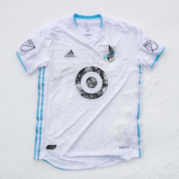
Minnesota United Secondary
Minnesota announced the 'River Kit' as the first all-blue kit for the club since they joined MLS in 2017. And that's pretty much where the highlights end. There was some talk of embossed ripples that adorn the top, evoking the bodies of water that connect the state, but we're not buying that. Another one that veers dangerously close to 'team wear', with nothing unique to call it out.

Portland Timbers Primary
Taking things back to the beginning, Portland Timbers unveiled their new primary jersey, which features a design that is an update of the club’s inaugural MLS primary kit from 2011. Part Robin Hood, part Incredible Hulk, all unique to the Timbers. The jersey sees the return of the collar and button design – the first time since 2017 and the fourth time in their relatively short history. Used to good effect along with the chevron 'stitch' feature that runs down the centre.

Real Salt Lake Secondary
The beauty of the Real Salt Lake Secondary jersey is in the close up details. Sure, at first glance this may look like yet another white jersey – and it is, don't get us wrong – but the sublimated graphic that runs throughout calls out Utah's natural surroundings, iconic club imagery and the "punk attitude of Real Salt Lake's most avid supporters". Just a shame it's somewhat lost in the whiteout look.

San Jose Earthquakes Primary
The 'First Star' jersey is the Quakes’ first with a primarily blue colour scheme since 2016, breaking a four-year run of black jerseys. It's a modern take on the team’s look from 2000/02, in which the team returned to its original name Earthquakes from the Clash and won its first MLS Cup championship in 2001. The team’s victory in MLS Cup 2001 is forever remembered and celebrated with the first of two stars above the team’s crest.

Seattle Sounders Secondary
Unbelievably wavy. Seattle Sounders linked up with former players and local musicians, including Sir Mix-a-Lot and The Black Tones, to unveil “The Jimi Hendrix Kit”, which drew inspiration from legendary musical artist and Seattle native Hendrix. The design combines purple, orange and yellow as an homage to Hendrix’s love of colour and psychedelic patterns. Too much good going on here...

Sporting Kansas City Primary
With a good cause rooted at its heart, the Sporting Kansas City Primary jersey builds on the heritage and culture of a popular look for the club, evolving the look of the hooped 2014/15 and 2016/17 secondary jerseys. It features a return of the iconic Sporting Blue and Dark Indigo horizontal stripes.

Vancouver Whitecaps Primary
Tradition sits at the heart of the Vancouver Whitecaps 2021 ‘Hoop jersey’ – or more in the midriff to be precise. The blue hoop that dominates the design continues on from the last home jersey from 2019, returning after a period of absence, and here it’s been cut from three different fabrics and sewn on to the front.
Shop 2021 MLS jerseys at prodirectsoccer.com