OK, so the title of this piece is a little tongue-in-cheek. But when you look at Spezia Calcio’s new 2026/27 kits, it's hard not to feel that they deserve a bigger stage than Serie C.
Following relegation from Serie B last season, the Ligurian club find themselves preparing for life in Italy’s third tier. The expectation will be that Spezia bounce straight back at the first attempt, and if appearances count for anything, they will certainly look the part as they attempt to do so. The frustration is that just as the club has unveiled arguably its finest set of Kappa-designed kits to date, it has also reached its lowest league standing in years. With the greatest respect to Serie C, these are kits that deserve to be seen.
Of course, kits do not win football matches. But they can tell stories, celebrate identity and strengthen the bond between club and supporter. In that regard, Spezia and Kappa continue to set an impressively high standard.
There has always been something strikingly elegant about Spezia’s commitment to a monochrome aesthetic. The club’s home and away kits have long relied on black and white as the foundation of their identity, and over the past four seasons Kappa have refined that approach to near perfection.
There is an unfortunate irony to the partnership, however. As Spezia’s kits have gone from strength to strength, the club’s fortunes on the pitch have moved in the opposite direction. Since Kappa took over as technical sponsor, Spezia have slipped from Serie A to three seasons in Serie B and now into Serie C.
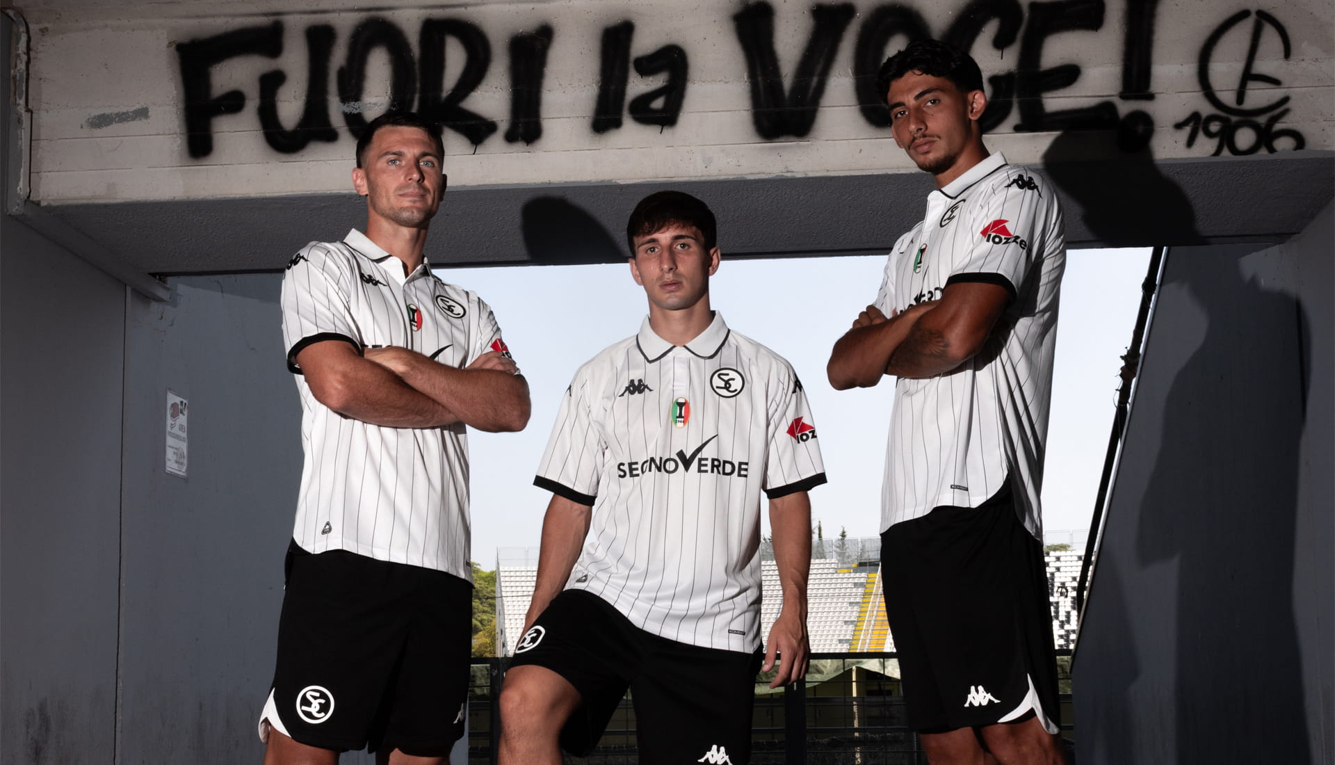
Still, this is a discussion about design rather than results. And viewed purely through that lens, there is a strong case that the 2026/27 home and away shirts are the best of the collection so far. Fittingly, they arrive in a season that marks Spezia Calcio’s 120th anniversary.
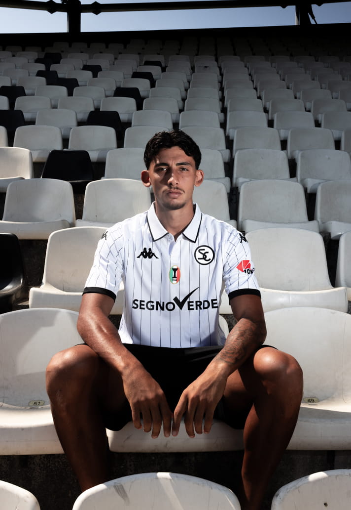
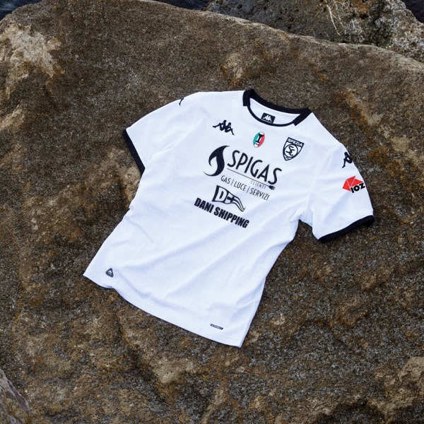
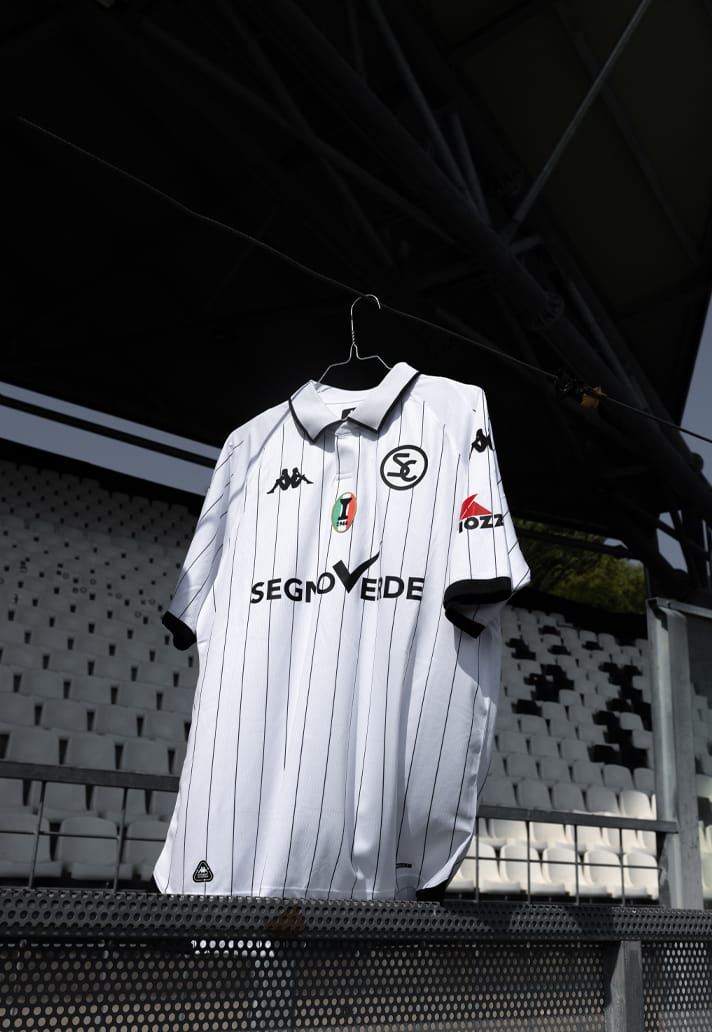
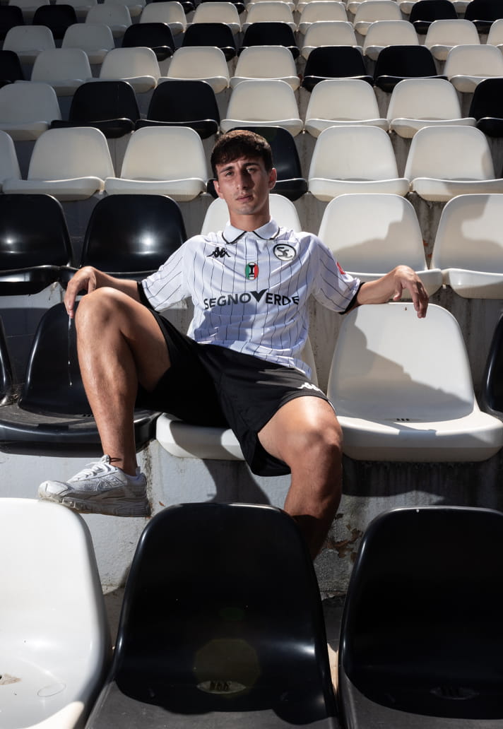
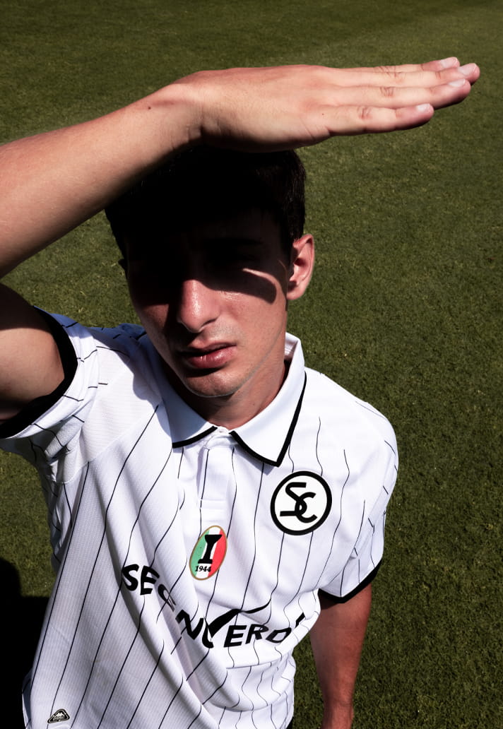
The home shirt is a celebration of heritage done with restraint and confidence. Built around the traditional white base that has defined Spezia for generations, the design remains faithful to the club’s identity while introducing one of the most welcome details supporters could have hoped for: the return of pinstripes.
The subtle vertical striping adds depth and character without overwhelming the shirt's clean appearance. It is a classic touch that connects the present with the past, giving the kit a timeless quality while still feeling modern.
In many ways, it captures exactly what an anniversary shirt should be. Respectful of history, but not trapped by it.
While the home shirt leans into tradition, the away kit takes a more contemporary route.
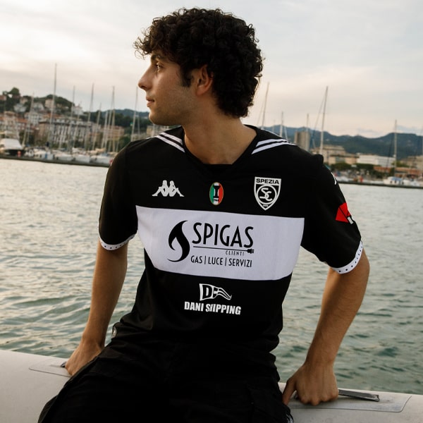
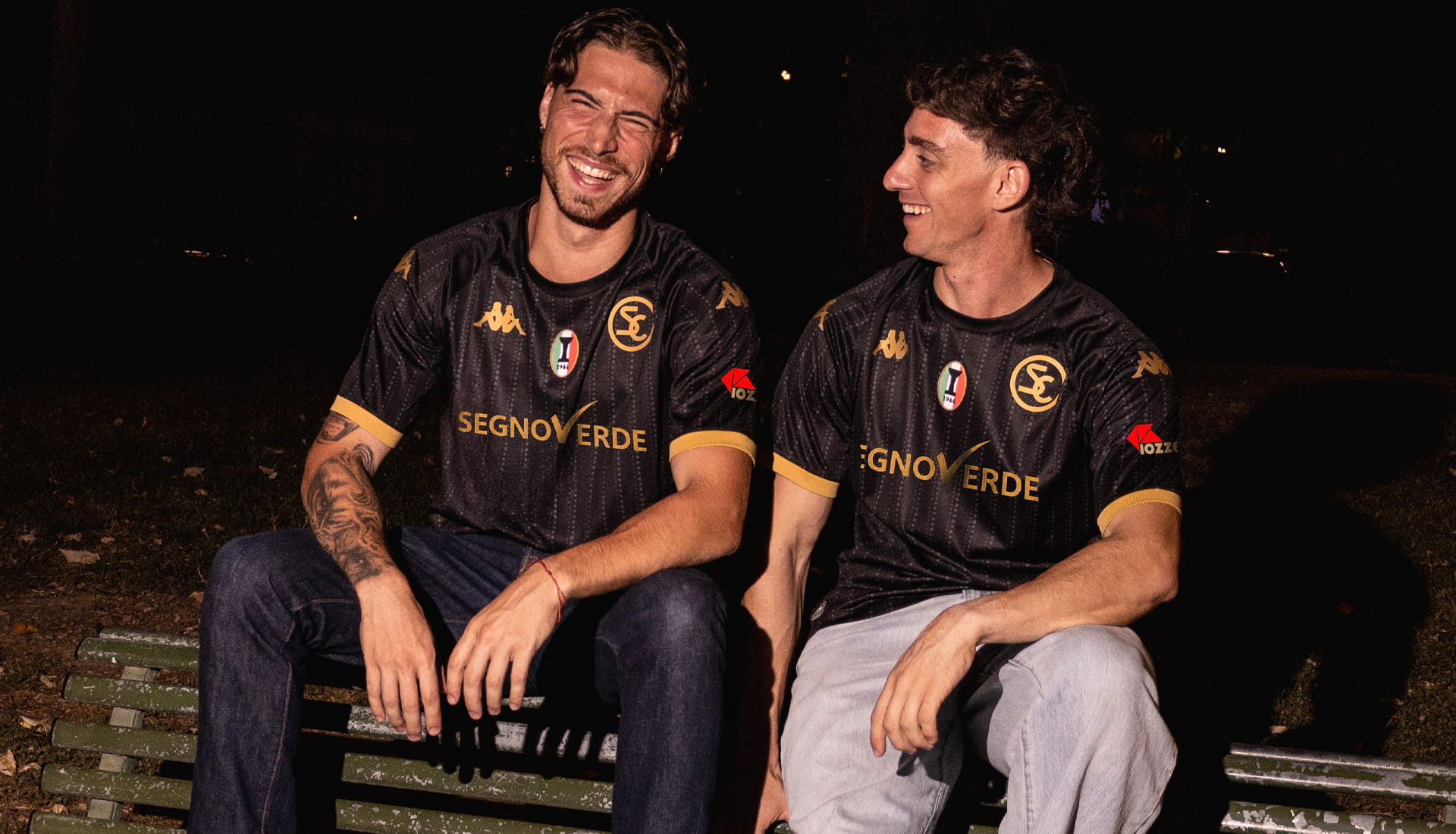
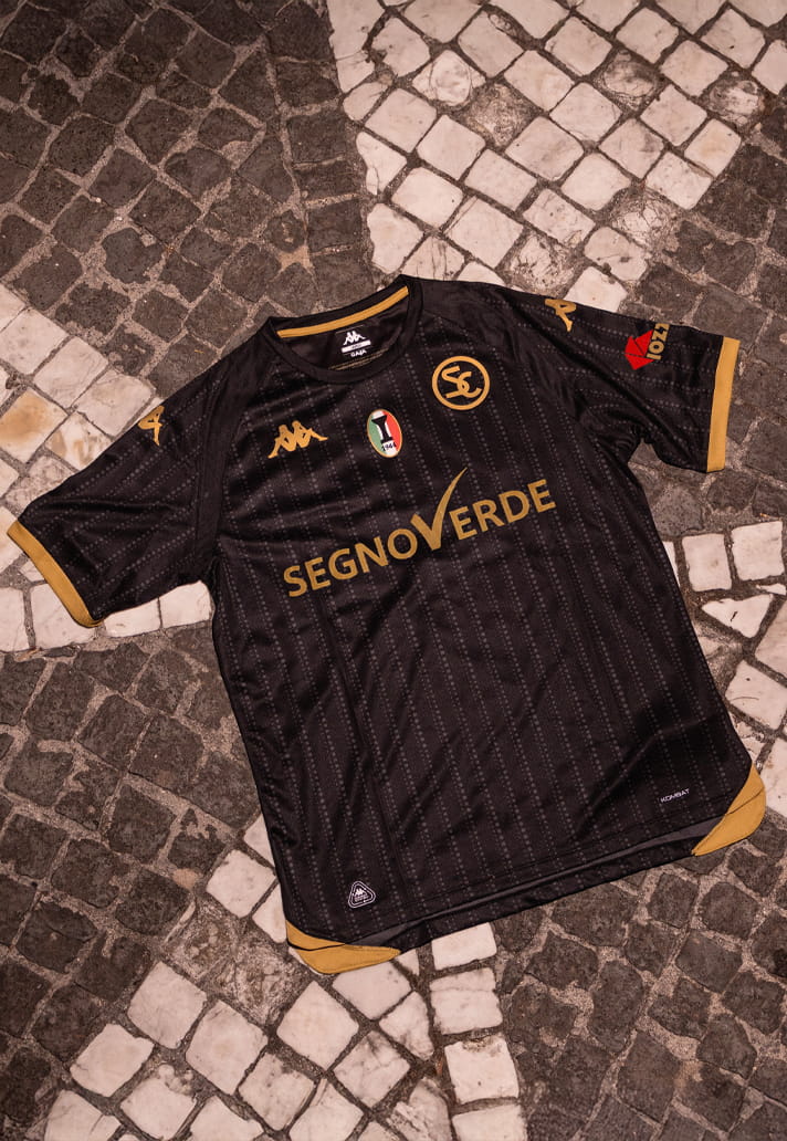
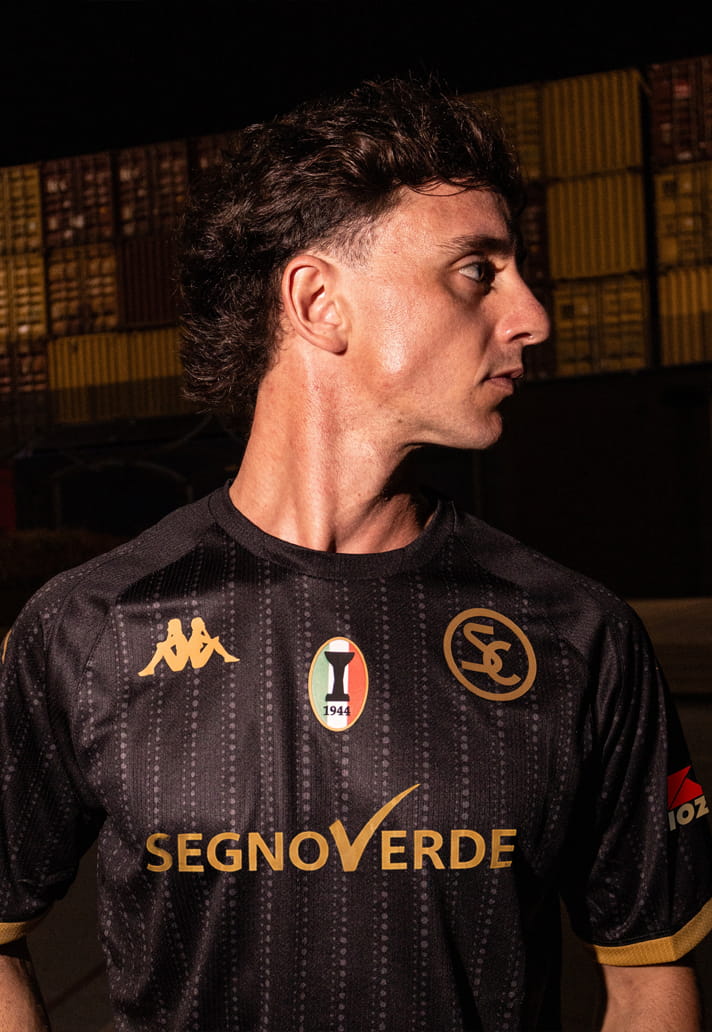
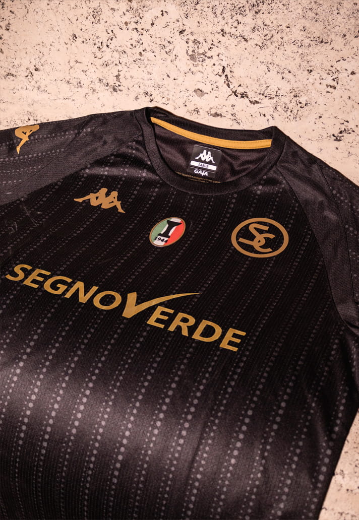
Inspired by the atmosphere and mystery of the night, the shirt is built on a deep black base, elevated by tonal vertical patterns that introduce texture and movement across the fabric. The effect is understated but highly effective, creating visual interest without compromising the minimalist style that has become synonymous with Spezia.
Gold detailing on the collar and sleeve cuffs provides the perfect finishing touch. The contrast between black and gold gives the shirt a premium feel, resulting in a design that is as sophisticated as it is striking.
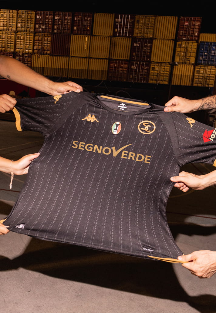
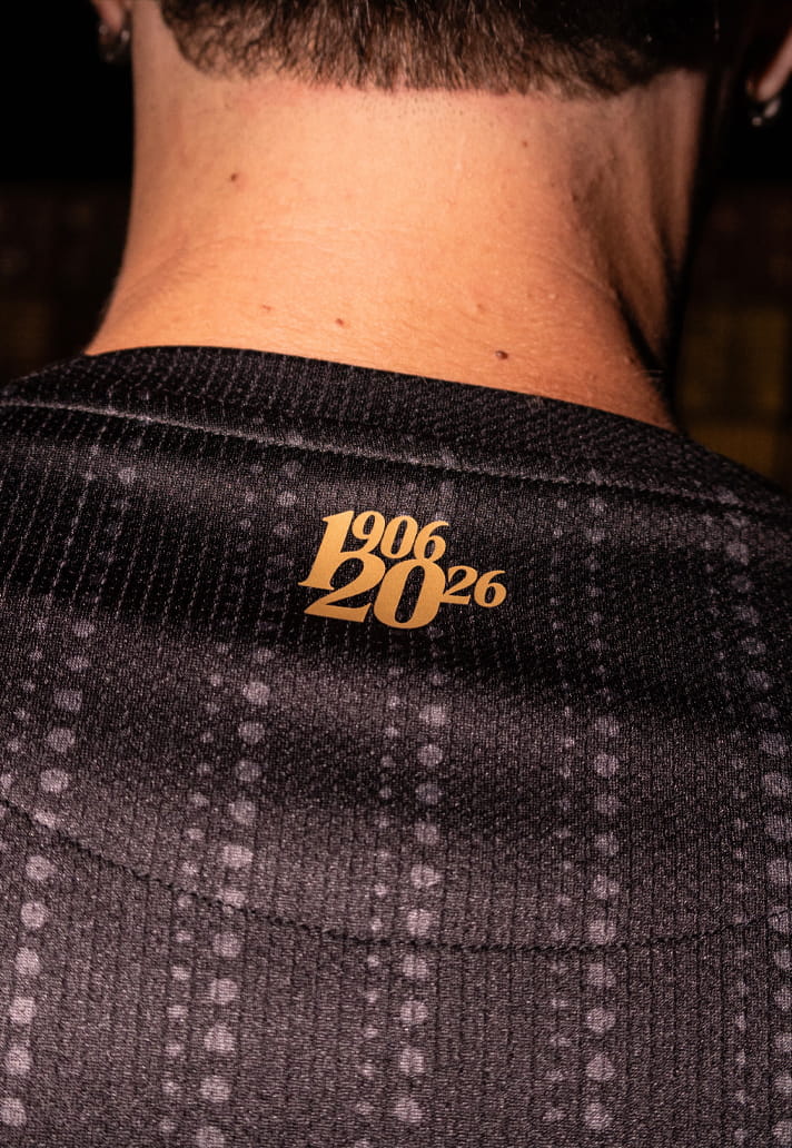
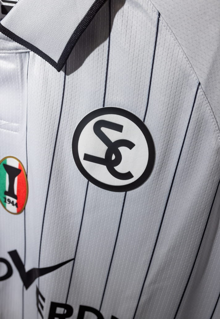
What makes both shirts especially compelling is the detail woven into them. Displayed proudly on the chest are the club crest, the iconic SC monogram and the 1944 Scudetto badge, commemorating the remarkable achievement of Spezia's legendary Vigili del Fuoco side.
The tribute goes beyond the external design, too. Inside the collar of both shirts appears a quote from Paolo Ponzo, taken from A. Napoletano's Santa Domenica: “Every player who wears this shirt must feel honoured on the one hand, and deeply responsible for what it represents on the other.” It’s a message that has accompanied Spezia across the country for years, reminding players of the history, pride and responsibility attached to representing the club.
These details help transform the shirts from attractive pieces of sportswear into meaningful symbols of identity.
If the home and away kits represent Spezia's commitment to monochrome consistency, the third kit has become the canvas for creativity.
Over the last few seasons, Kappa and Spezia have developed a habit of producing some of the most interesting alternative shirts in Italian football.
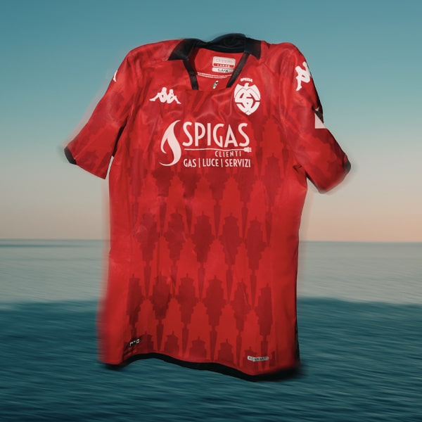
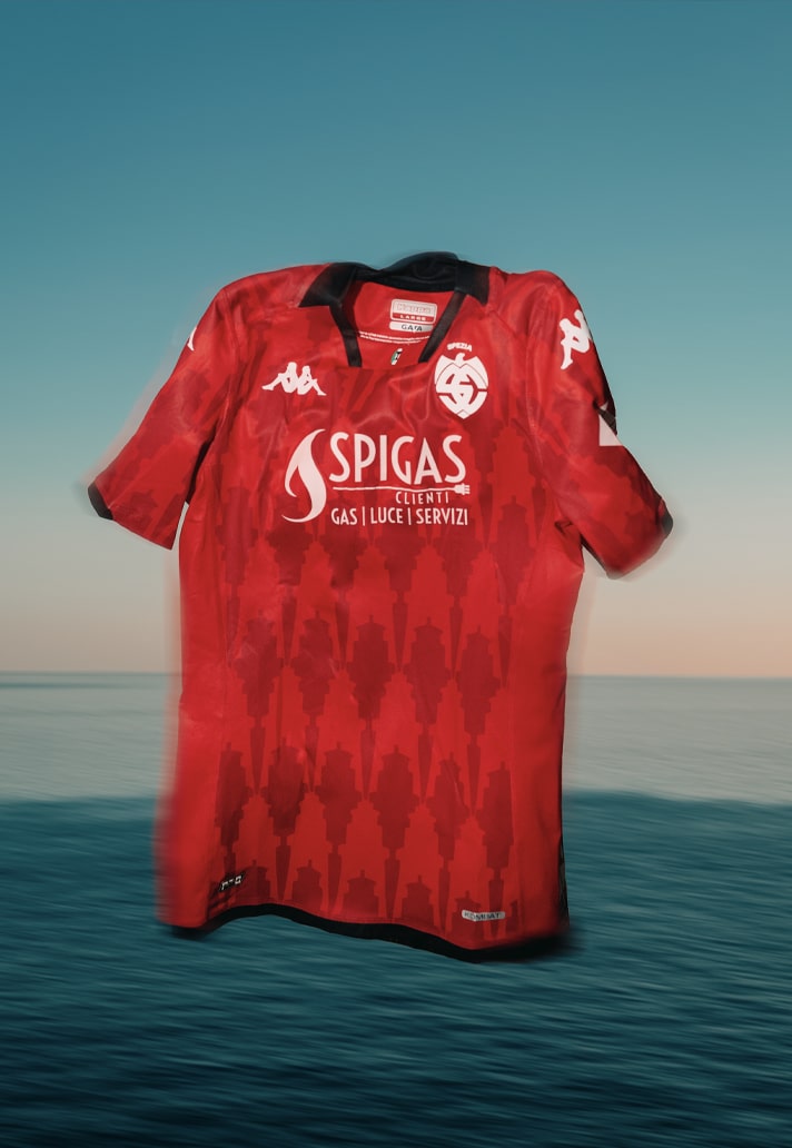
In 2023/24, supporters were treated to a striking red strip that celebrated both the city of La Spezia and the club’s connection to it, incorporating a tonal lighthouse graphic into the design.
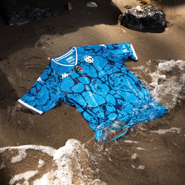
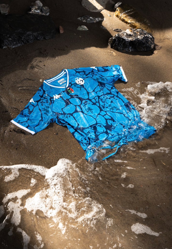
The following season brought a vibrant blue shirt inspired by the seabed of the Gulf of Poets, using patterns that evoked the way sunlight refracts through the water onto the ocean floor.
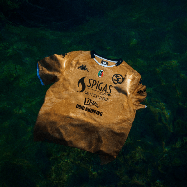
Last season's third kit may have been the standout of them all: a stunning gold jersey inspired by the region's fishing heritage, featuring details drawn from ropes and nautical knots.
Given that track record, anticipation is already building around what Kappa have planned for this season’s third kit. If recent history is anything to go by, expectations are understandably high.
Ultimately, Spezia find themselves in the unusual position of having kits that reflect a level of prestige their recent performances have not. The club's on-pitch struggles have seen them slide down the Italian football pyramid, but their visual identity remains among the strongest in the country. The 2026/27 collection is another reminder of just how effectively Kappa and Spezia understand the balance between heritage, simplicity and storytelling.
Now all that remains is for the team to match the quality of the shirts they're wearing. Because while Serie C may be where Spezia find themselves today, these kits feel like they belong on a much bigger stage.