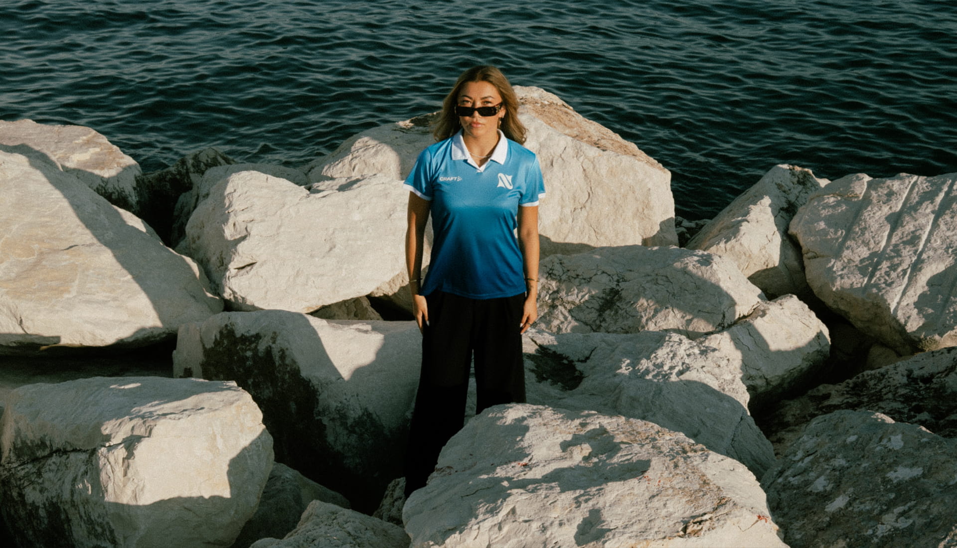
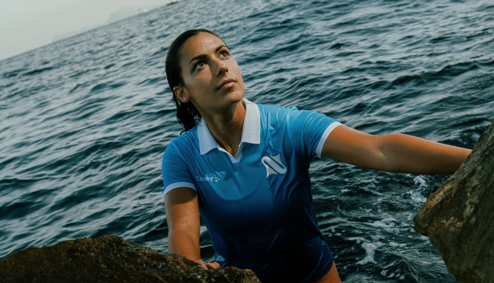
If there was one theme that’s emerged across women's football in recent years, it was confidence. Confidence to do things differently. Confidence to move away from established norms. And, increasingly, confidence to step out from the shadow of the men's game and build identities that feel entirely their own. That's exactly what La Napoli Women have done.
The Italian side have unveiled their new 2026/27 home shirt, designed in collaboration with Modì, and while the jersey itself is a standout piece of work, it's what it represents that makes it so significant. See, this isn't just a new kit launch. Looking at the bigger picture, it's the latest example of a women's club reclaiming ownership of its story, its image and its future.
For years, the club existed as "Il Napoli Women". A small detail, perhaps, but one that always felt slightly out of place. The masculine article was borrowed by default, attached to a team that was forging its own path within the women's game. Now, though, the club has made moves to change that, officially becoming "La Napoli Women". In so doing they embrace a feminine identity that's more authentic to both the team and the city it represents. It's a subtle shift on paper, but in reality it's a statement.
After all, Naples' own origin story isn't rooted in a male figure. According to mythology, the city takes its name and spirit from Parthenope, the siren whose legacy remains woven into Neapolitan culture. It's a distinctly feminine foundation, and one that the club's previous identity never fully reflected. The rebrand changes that, finally aligning the badge, the name and the team wearing it.
And rather than simply announcing the change, the club has embedded it throughout an entirely new visual identity. The lettering flows with the movement of water, echoing the sea that has shaped Naples for centuries. It feels fluid, organic and uniquely its own. Not a cosmetic logo refresh, but a visual language built around a story that's long been waiting to be told. And the new home shirt acts as the perfect canvas for that evolution.
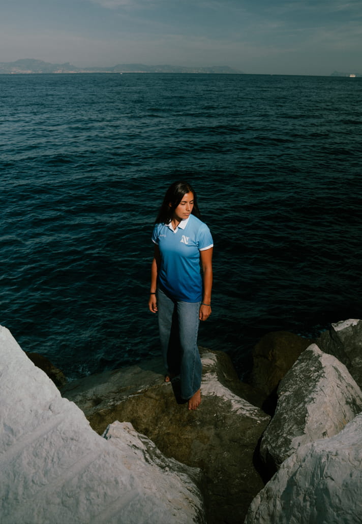
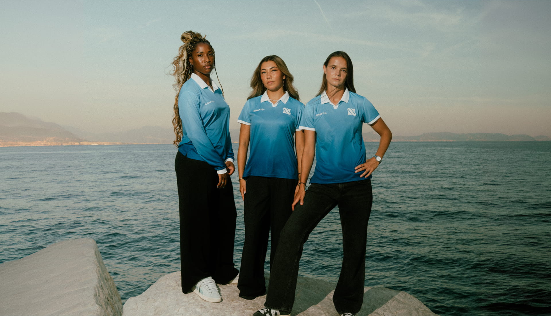
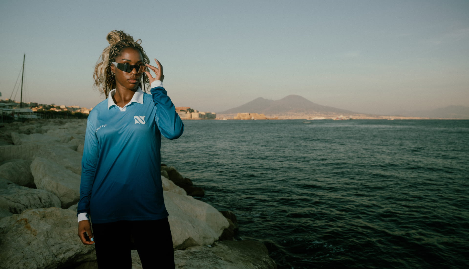
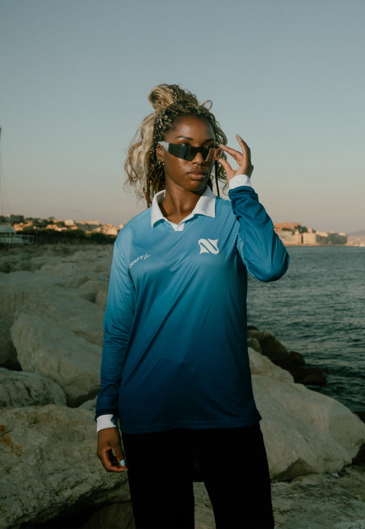
Created alongside Modì, the jersey celebrates the city's inseparable relationship with the sea through a striking gradient effect that extends across the entire design. Moving from lighter tones to deeper blues, the shirt explores the waters that surround Naples, travelling from surface to depth in a concept that is both visually distinctive and deeply connected to place.
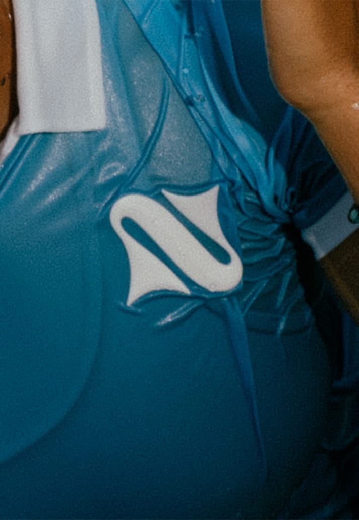
At the heart of the design sits the club's new crest. Applied as a three-dimensional pearl-white PVC patch, it stands proudly against the lighter areas of the shirt, ensuring the new identity takes centre stage. The treatment adds texture and depth, highlighting the unique lines of the badge while showcasing how the broader branding system can be expressed beyond digital and print applications.
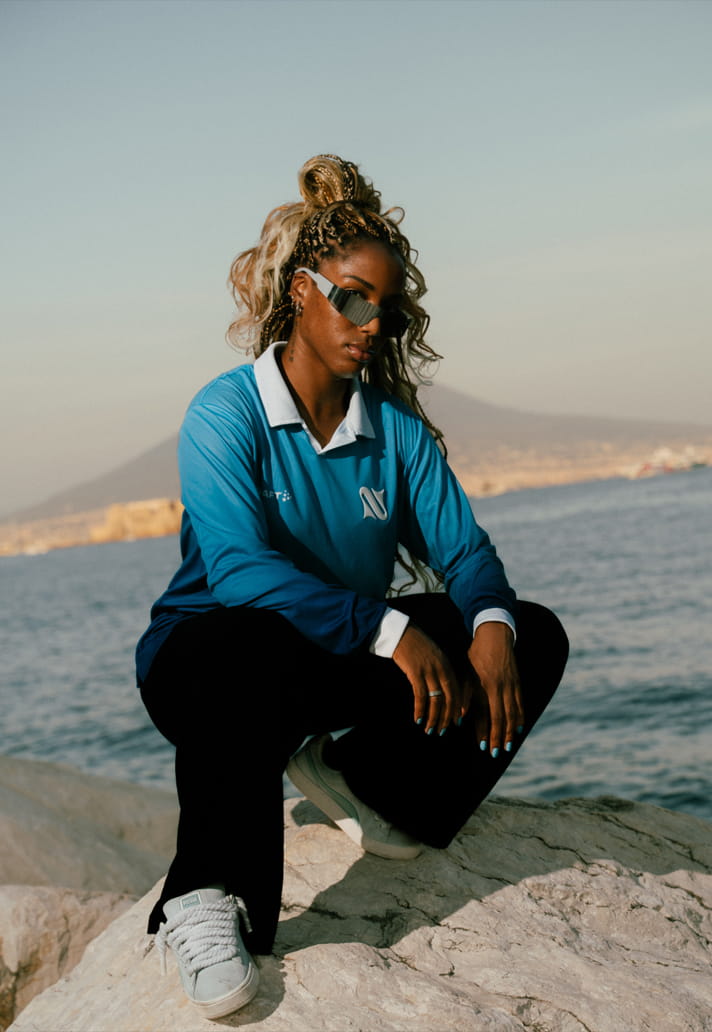
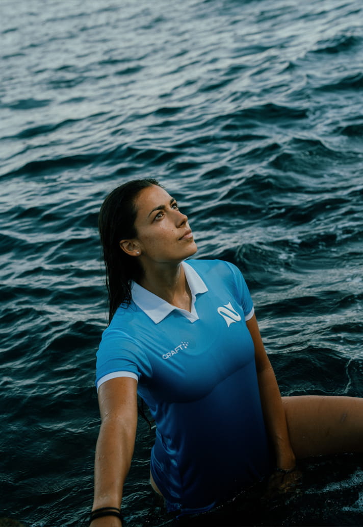
The shirt itself arrives in the form of a technical polo, available in both short- and long-sleeved versions, with an ergonomic construction specifically developed for the women's game. It's another subtle reminder that this project hasn't been approached as an adaptation of something built elsewhere. Every detail has been created with the players and the team in mind.
Finishing touches come through a crisp white polo collar, providing contrast against the layered blue tones beneath. It's clean, elegant and unmistakably Italian. But perhaps the most meaningful detail sits right at the base of that collar. "La Napoli.” Two words that encapsulate the entire project.
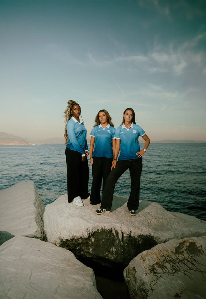
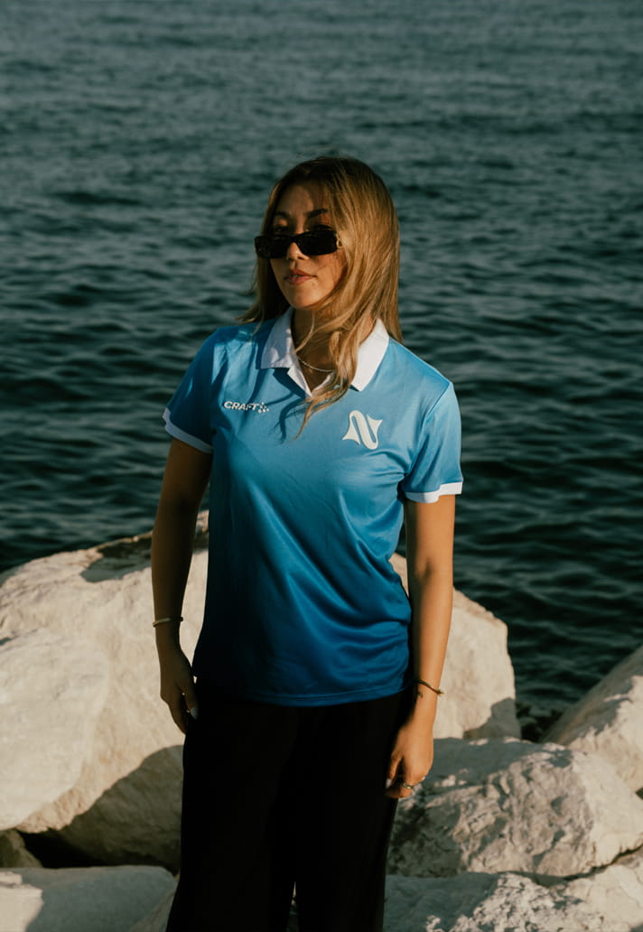
Because while the shirt is undeniably beautiful, its importance lies in something bigger than aesthetics. Much like the growing number of women's clubs choosing their own creative direction and visual identity, La Napoli Women are demonstrating that independence doesn't mean disconnecting from tradition. It means defining it on your own terms.
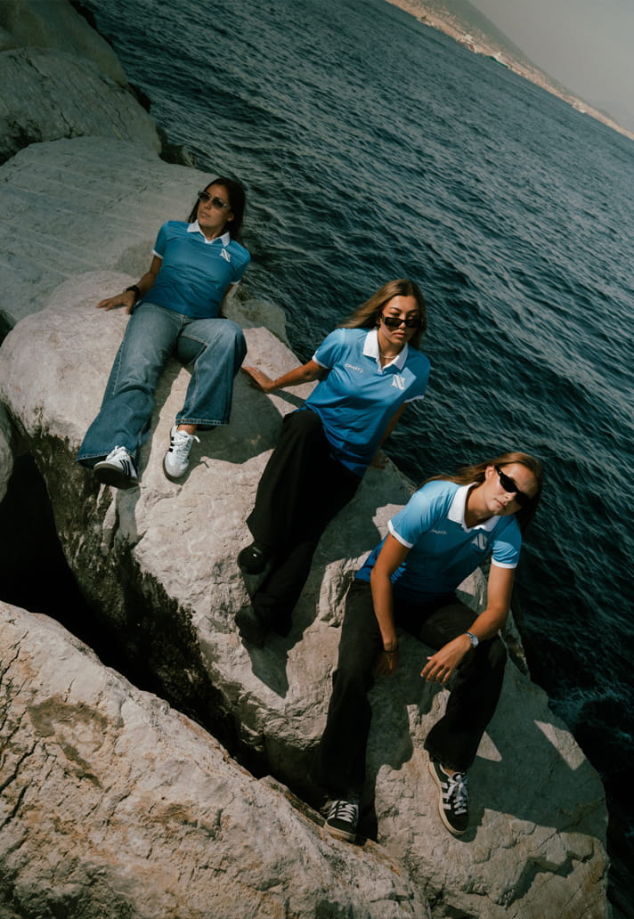
As part of the club’s ambition to bring the message and culture of women’s football in Italy to an increasingly broad audience, the jersey will also be available to purchase in a unisex fit.