A new series showcasing the beautiful letters and numbers created for the 2015/16 European season. First up, it's the Blues.
Typography plays an iconic part in creating that perfect football kit; the two go together like studs on a boot. Not something specifically new to the modern game, we have been treated to an enormous array of typographic brilliance throughout the life-span of the game.
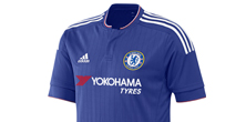
With Chelsea tuning their retro dial for an updated 2015/16 typeface, we take a closer look at the letters and numbers that the London club will use for their English Cup and European matches this season.
The Premier League champions gave us another look at the design this week, wearing their 2015/16 adidas away kit for the first time as they beat Barcelona on the last leg of their North American pre-season tour.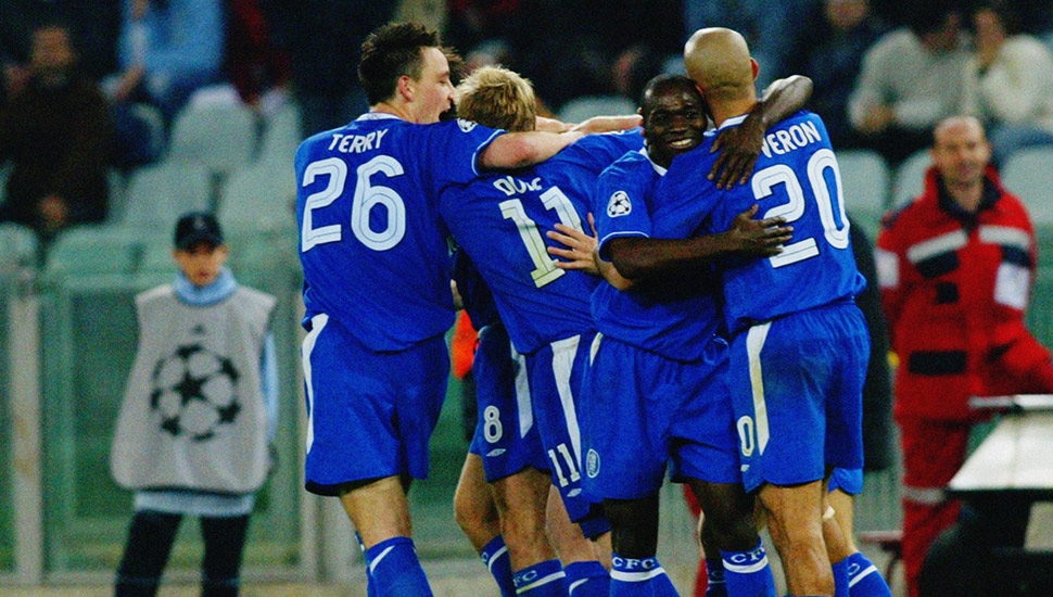
A creative approach that's often underappreciated, Chelsea's new design is a lively inlined font that's a complimentary addition to an already very smart set of kits. As all English clubs are forced to carry the same font in the Premier League, this typeface will be used in all English Cup and Champions League matches for Chelsea throughout the upcoming season.
Reminiscent of 2003 and Chelsea's Umbro era, it's been brought up to scratch with subtlety and an all round strong finish.